IB Psychology Graph and Chart Interpretation
 Call Kai
 Learn
Learn Practice Test
 Spaced Repetition
 Match
Match Flashcards
 Knowt Play
1/21

Earn XP
Description and Tags
Vocabulary terms and definitions for interpreting various graph types and data features within IB Psychology foundational concepts.
Name | Mastery | Learn | Test | Matching | Spaced | Call with Kai | Chat |
|---|
No analytics yet
Send a link to your students to track their progress
22 Terms
Independent Variable (IV)
The variable being manipulated or measured — always on the horizontal axis (x-axis).
Dependent Variable (DV)
The variable being measured as a result — always on the vertical axis (y-axis).
Line Graphs
Visuals used to show changes in a variable over time or across conditions.
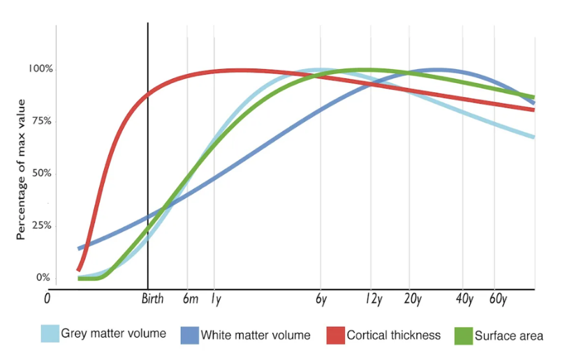
Line Graphs Key Features to Identify
Trend direction (increasing, decreasing, stable).
Rate of change (steep vs. gradual).
Peaks and troughs (highest/lowest points).
Intersection points (where lines cross, indicating comparison).
Trend Direction
A feature of line graphs used to identify if data is increasing, decreasing, or stable.
Bar Charts / Histograms
Visuals showing comparisons between different groups or categories.
Bar Charts / Histograms Key Features to Identify
Height differences (which group scored highest/lowest).
Patterns across groups.
Variability between bars.
Example application: "How do memory scores differ across age groups?"
Scatter Plots
Visuals used to show the relationship or correlation between two variables through patterns of dots.
Scatter Plots Key Features to Identify
Pattern of dots (positive correlation = upward trend; negative correlation = downward trend; no correlation = random).
Strength of correlation (tight cluster vs. spread out).
Outliers (points far from the trend).
Positive Correlation
An upward trend in a scatter plot indicating a direct relationship between variables.
Negative Correlation
A downward trend in a scatter plot indicating an inverse relationship between variables.
Outliers
Data points that are far from the trend or beyond the whiskers in a box plot.
Box Plots (Whisker Plots)
Visuals showing the distribution and spread of data, including median, quartiles, and range.
Median
The middle line in the box of a box plot representing the central value of the data set.
Interquartile Range
The box size in a box plot which represents the spread of the middle data.
Pie Charts
Visuals displaying proportions or percentages of a whole through slice sizes.
Area Graphs
Visuals showing cumulative change over time or stacked categories.
Longitudinal Studies (Graphing)
Typically use line graphs to demonstrate development or effects over time, such as cognitive development with age.
Correlational Studies (Graphing)
Typically use scatter plots to examine links between variables, such as stress vs. memory performance.
Scale
The numerical ranges found on the axes of a graph.
Trough
The lowest point on a line graph.
Peak
The highest point on a line graph.