H2 - Exploratory Data Analysis (EDA)
1/8
There's no tags or description
Looks like no tags are added yet.
Name | Mastery | Learn | Test | Matching | Spaced |
|---|
No study sessions yet.
9 Terms
Wat is EDA
Critical first step in analysing data
People are not very good at looking a columns of numbers / spreadsheets and determining important characteristics of data
EDA allows to
Visualise distributions and relationships
Detect mistakes
Check assumptions
EDA methods
Ordering: Stem-and-leaf plots
Grouping: frequency displays, distributions, histograms
Summaries: summary statistics, standard deviation, box-and-whisker plots
Classificatie van EDA
2 soorten
Graphical or non-graphical methods
Non-graphical: calculation of summary statistics
Graphical: summarize data in a diagrammatic or pictorial way
Univariate or multivariate
Univariate: investigate one variable (data column) at a time
Multivariate: investigate two or more variables at a time to explore relationships (typically bivariate)
Almost always a good idea to perform univariate EDA on each of the components of a multivariate EDA before performing multivariate EDA
Univariate Non-Graphical EDA: Data
categorical data
quantitative data
frequency distribution tables
For categorical data: range of values and frequency (or relative frequency) of occurrence for each value are of interest
Tabulation of frequency is the best univariate non-graphical EDA for categorical data
Univariate EDA for a quantitative variable is a way to make preliminary assessments about the population distribution of the variable
Noteworthy characteristics:
Central tendency
Spread
Modality (number of peaks)
Shape (heaviness of the tails)
Outliers
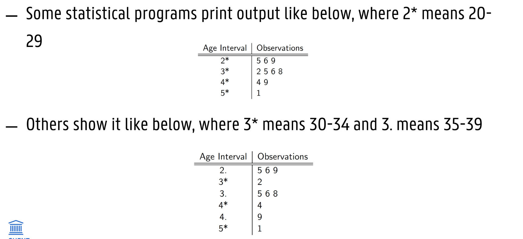
Frequency distribution table
Shows number of observations for each range of data
Intervals can be chosen
Cumulative frequency distribution table
Show frequency, relative frequency and cumulative frequency of the observations
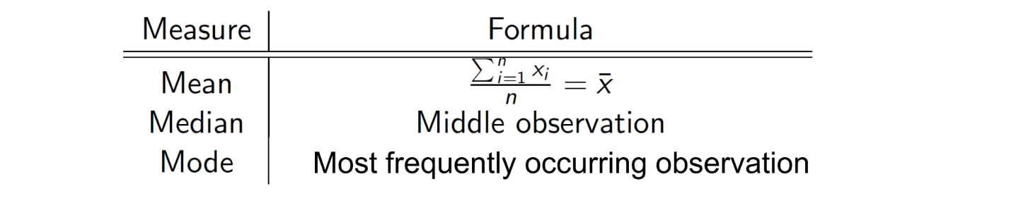
Univariate Non-Graphical EDA: Central tendency
mean, median & mode (3)
EX vraag vorig jaar mode
Median
If there are an even number of observations take the average of the two middle values
Median is considered a better measure of central tendency than mean for skewed distributions
E.g. median income of US families is $43.318, while mean is $60.828 (US census Bureau 2004)
Mode is more helpful for categorical data
Unimodal: single peak in distribution vs bimodal / multi-modal (two or more peaks)
Symmetric distributions: mode = mean = median
Skewed distributions: mode is on the other side of the median from the mean (see examples later on)
Univariate Non-Graphical EDA: Spread
Range
Sample variance (s²)
sample standard deviation (s)
quartiles (ex)
Spread is an indicator how far away from the center we are still likely to find data values
Range
Range = max-min
Difference between maximum and minimum values
-> Not a robust measure of spread: outliers heavily influence range
Sample Variance
Calculated for a list of numbers (n observations labelled x1 to xn) based on their deviation from the mean
Sample variance = mean of the squares of the individual deviations
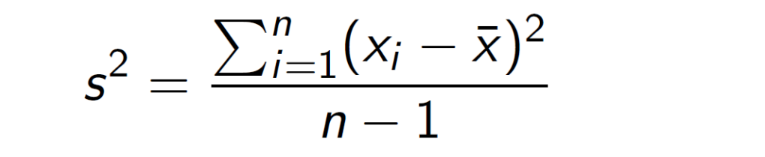
The bigger the deviations from the mean, the bigger the variance
Fairly robust measure of spread
Sample Standard Deviation
Sample standard deviation = square root of the sample variance

Interpretation: sample standard deviation gives an idea of how much observations differ from the mean
Quartiles
Quartiles are the three values which divide the observed data into even fourths
One quarter of the data fall below the first quartile (Q1)
One half fall below the second quartile (Q2) = median
Three fourths fall below the third quartile (Q3)
Q1 = median of lower half of data
Q2 = median
Q3 = median of upper half of data
IQR = Interquartile range = Q3 – Q1
Contains 50% of data
If IQR is high the data is more spread out
Extreme outliers have little or no effect on the IQR
Robust measure of spread
The rth percentile, Pr
Value that is greater than or equal to r percent of data samples
Or less than or equal to (100 - r) percent of the data samples

Univariate Non-Graphical EDA: Stem-and-leaf plots
Substitute for histogram (see graphical EDA)
Easier to make by hand
Shows all data values and the shape of the distribution
Univariate Graphical EDA:
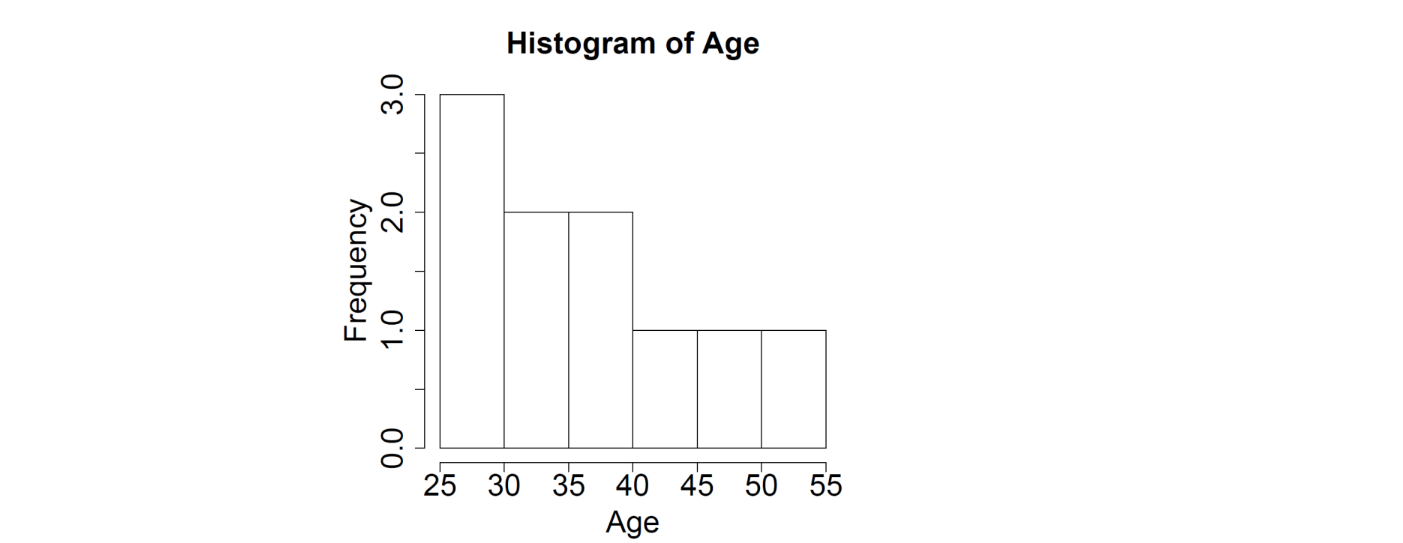
Histogram
boxplots (EX)
Histograms
Graphs are generally better to use in presentations than tables as they allow rapid identification of a trend
Histogram = barplot of frequency or relative frequency distribution
Boxplot / Box-and-whisker plots display
Upper hinge = Q3 = third quartile
Lower hinge = Q1 = first quartile
Interquartile range (IQR) = Q3 - Q1
Contains middle 50% of data
Upper fence: upper hinge + 1.5*(IQR)
Lower fence: lower hinge – 1.5*(IQR)
Outliers: data values beyond the fences, typically individually plotted
Lower and upper whisker ends are drawn to the smallest and largest observations within the fences
Boxplots provide robust measures of center and spread as well as providing information about symmetry and outliers

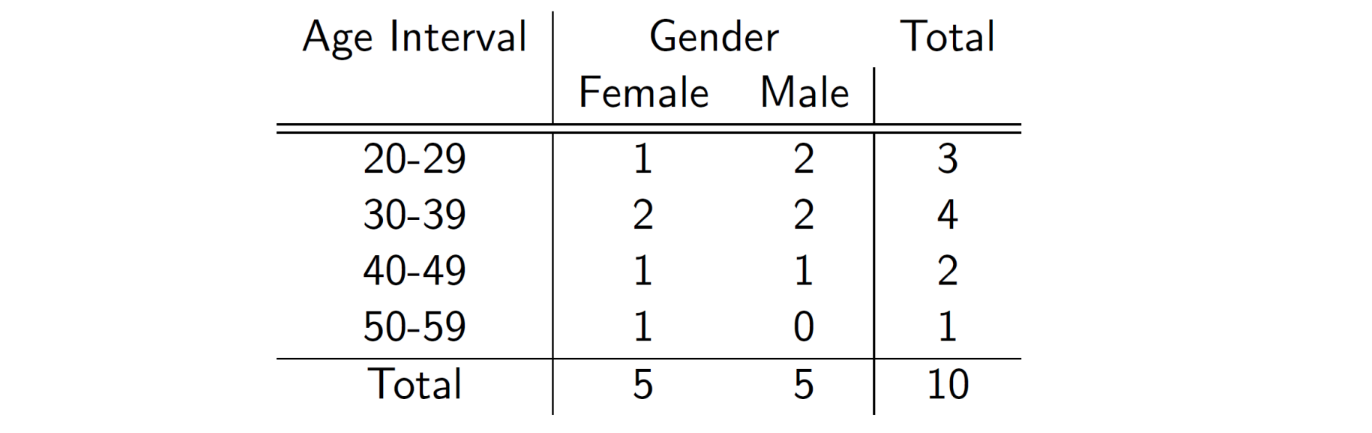
Multi-Variate Non-Graphical EDA:
2 categorical variables
1 categorical and 1 quantitative variable
2 quantitative variables (EX)
2 Categorical Variables
frequency table
1 Categorical And 1 Quantitative Variable
Stratified stem-and-leaf plots

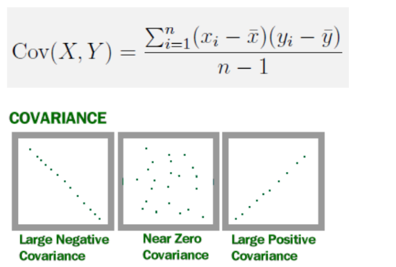
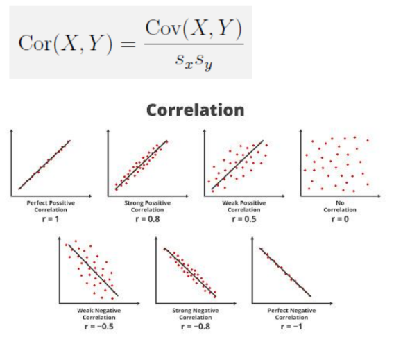
2 Quantitative Variables
Basic statistics of interest
-> belangrijkste hiervan wat betekent covariance en correlation nu eig?
Covariantie meet de richting van het lineaire verband tussen twee variabelen.
Positieve covariantie: als de ene variabele toeneemt, neigt de andere ook toe te nemen.
Negatieve covariantie: als de ene toeneemt, neigt de andere af te nemen.
Nabij nul: weinig tot geen lineair verband.
Correlatie meet zowel de richting als de sterkte van het lineaire verband tussen twee variabelen, en is geschaald tussen -1 en +1.
+1: perfecte positieve correlatie
-1: perfecte negatieve correlatie
0: geen lineair verband
Multi-Variate Graphical EDA:
1 Categorical And 1 Quantitative Variable
2 Quantitative Variables
Common Distribution Shapes (EX)
1 Categorical And 1 Quantitative Variable
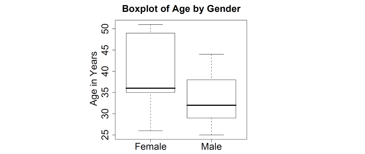
Side-by-side box plots
Allows to compare the distribution of the continuous variable (age) across values of the categorical variable (gender)
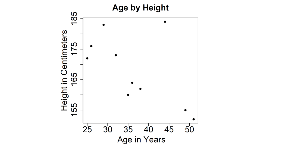
2 Quantitative Variables
Scatterplot: Visually display the relationship between two continuous variables
Common Distribution Shapes
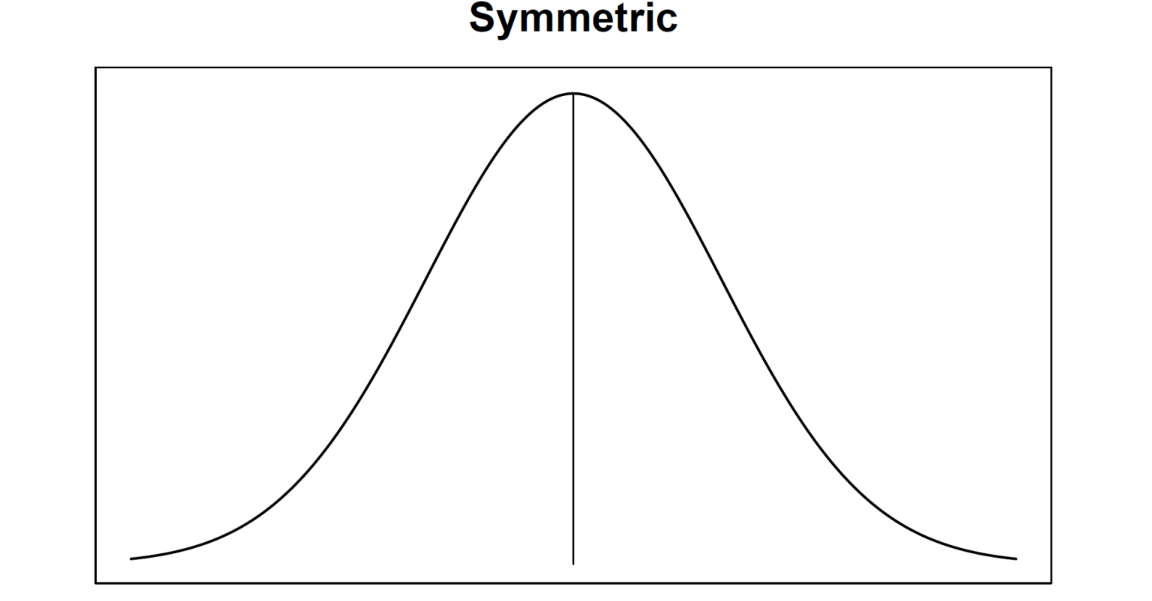
Symmetric distribution
Left tail looks like right tail (mirrored)
Mean = Median = Mode
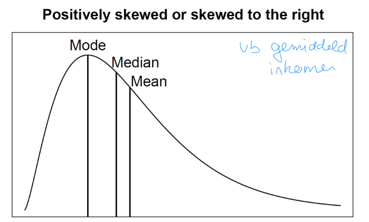
Positively skewed
Longer tail in the high values
Mean > Median > Mode
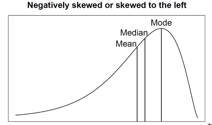
Negatively skewed
longer tail in the low values
Modes > Median > Mean