CSCE530 Chapter 2 Flashcards
1/23
There's no tags or description
Looks like no tags are added yet.
Name | Mastery | Learn | Test | Matching | Spaced |
|---|
No study sessions yet.
24 Terms
Scatterplot
Simple 2D visual of the relationship between two variables.
Convex hull
Points on the edge of the smallest (convex) perimeters surrounding the data. Trimming them off may display better relationships between the variables.
Chi-plot
Graphical method for judging whether two variables are independent. Based on where larger values of one variable tend to occur with larger values of the other.
When is a chi plot independent?
When all the points of the plot fall within a region. If points are outside, the two variables may be related
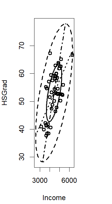
Bivariate boxplot
2D analogue of a boxplot. Displays two ellipses centered at the bivariate center.
Explain the ellipses in the bivariate boxplot
Smaller ellipse - central 50% of the data
Larger ellipse - contains all data except for outliers
Bivariate center - cross of the two regression lines display for X and Y
Explain the angles of a bivariate boxplot
Acute - strong correlation between the two variables
Right - weak correlation between variables
Bubble plot
shows three variables on a 2d plot. 2 are plotted as a scatter plot. the third is plotted as a circular bubble around each dot, indicating size
Scatterplot matrix
A q by q array of 2D scatterplots from data set with q variables
3D Scatterplots
Scatter plots in a 3D form. Drop lines can make them more interpretable
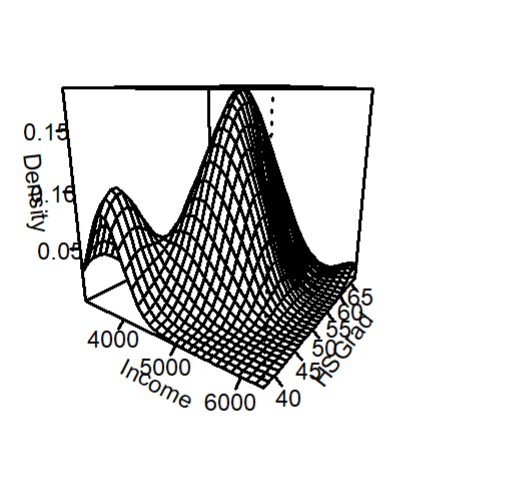
Bivariate Density
Conditioning Plots
scatterplots of 2 variables, conditional on the value of a third variable. Especially useful if the third variable is a categorial variable.
Star plot
Magnitudes of q variables can be represented for each observation. Q points on a star, each length represents the value for the observaiton. May be useful to standardize/scale the variables first
Chernoff Faces
Each multivariate observation is displayed with a face. Ex: wide mouth may mean large fifth variable
Radar plots
Like star plots, but more modern. Allows multiple observations to be place don top of each other.
Side by side boxplots
Show graphically information about how a continuous variable is realted to a categorical variable. Separate box plots show the distribution at each level of the categorical variable
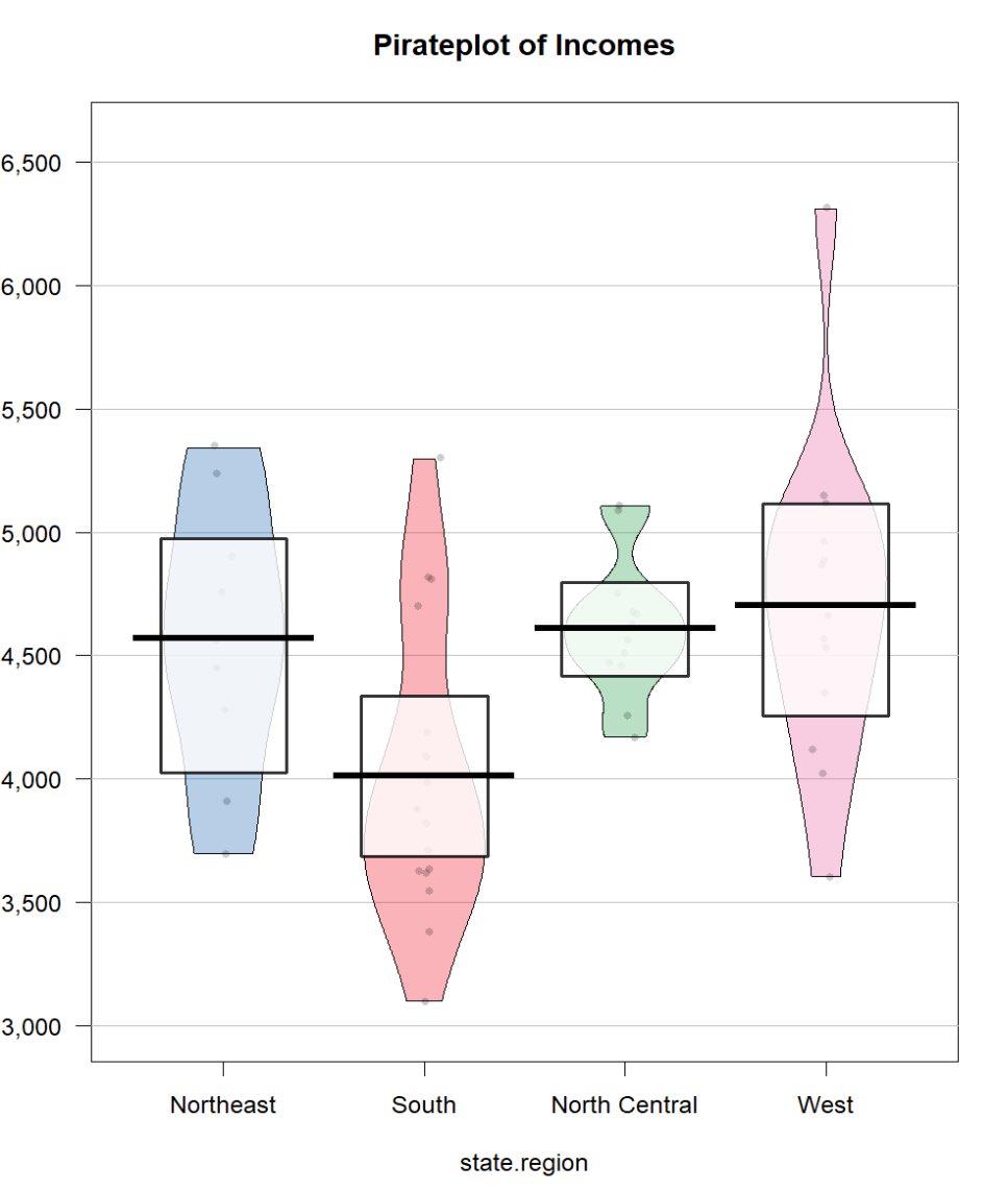
Pirate Plot
Like a more advanced side by side boxplot. Show more information about the continuous variable
Animation plots
Appear like videos. Sequence of static plots for information that changes over time.
Profile plot
Simple way to display multivariate observations graphically. Show connected line segments where the height at each joining point is the value of a variable for thatobservation.
Andrews Plots
Convert each data vector into a Fourier series and the resulting curves are plotted together. Plotted on (- pi, pi)
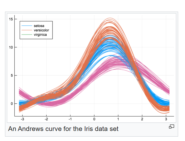
Advantages of an Andrews plot
The distance between curves reflect the pairwise distances between observations correctly
Disadvantages of an Andrews plot
the roles of the individual variables are not as apparent in Andrews plots as in other types of plots
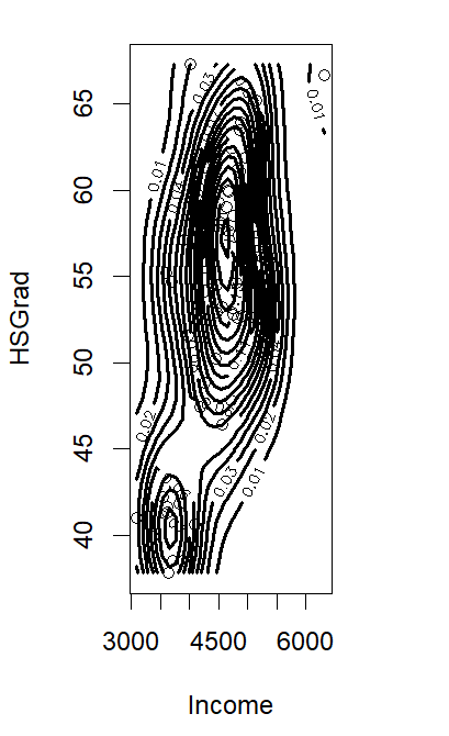
Contour Plot