Lecture 7: Data Visualization
1/26
There's no tags or description
Looks like no tags are added yet.
Name | Mastery | Learn | Test | Matching | Spaced |
|---|
No study sessions yet.
27 Terms
Data Visualization
A visualization is a means of communicating data, primarily through imagery, that is both readable and recognizable
The data typically is abstract
The visualization can help transform the invisible to be visible
Images serve as the primary means to communicate the data, but also can be accompanied by other communication means, such as text
In terms of being readable and recognizable, the visualization must provide a way to learn something about the data
Data visualization also can be described as blending the art of design with the science of data
For instance, while the data that you show might be complete and accurate, many other design elements need to be considered to best engage your audience
Data visualization can be a very powerful way to transform data into actionable insights and these skills are becoming increasingly important
Introduction to Data Visualization
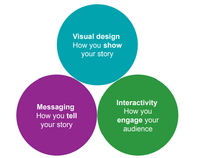
Many times, when you hear about data visualization, you also hear about storytelling
That is because the most effective visualizations incorporate a storytelling approach
Memorable: stories will make it easier for the audience to connect and remember the information you are trying to convey.
Relatable: stories lead to emotional coupling. Both the storyteller and the audience go through and relate to the same experience
Lead to action: research shows that storytelling can engage parts of the brain that lead to action
Types of Data Visualization
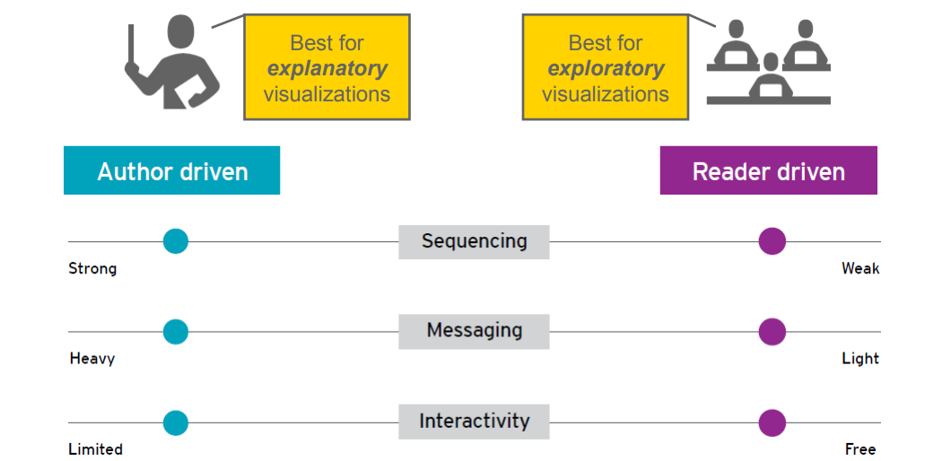
There are two main types of data visualization: exploratory and explanatory
Exploratory Data Visualization
Exploratory visualization is what we do to understand the data, e.g., to develop and assess a hypothesis or question or find a pattern in the data
Allows the audience to explore data for further analyses
Is conducted for a problem that has not been clearly defined
Explanatory Data Visualization
Explanatory data visualization explains what the audience needs to know
Shows specific relationships in data, such as link between causes and results
Visualization Design
Design principles
Pre-attentive attributes:
Emphasis
Quantity
Color
Choosing the right chart
Visualization viewing patterns
Tufte’s Principles of Graphical Excellence
Gestalt psychology is a philosophy of the mind of the Berlin School of Experimental Psychology
Gestalt principles describe how our mind organizes individual visual elements into groups to make sense of an entire visual
You can use these principles to highlight important patterns and de-emphasize nonimportant patterns
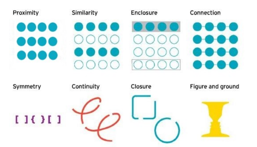
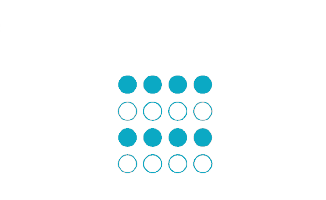
Proximity [Gestalt Principle]
You see the dots that are closer to each other as part of the same group so you see three rows of dots instead of four columns of dots because they are closer horizontally than vertically

Similarity [Gestalt Principle]
You see similar-looking objects as part of the same group
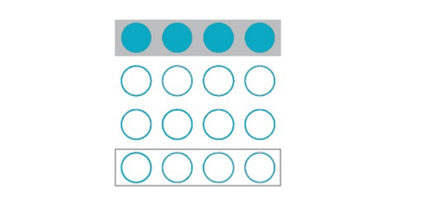
Enclosure [Gestalt Principle]
You group the first four and last four dots as two rows instead of eight dots
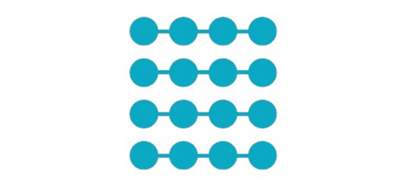
Connection [Gestalt Principle]
You group the connected dots as belonging to the same group
Symmetry [Gestalt Principle]
You see three pairs of symmetrical brackets rather than six individual brackets

Symmetry [Gestalt Principle]
You see one continuous path instead of three arbitrary ones

Closure [Gestalt Principle]
You automatically close the square and circle instead of seeing three disconnected paths

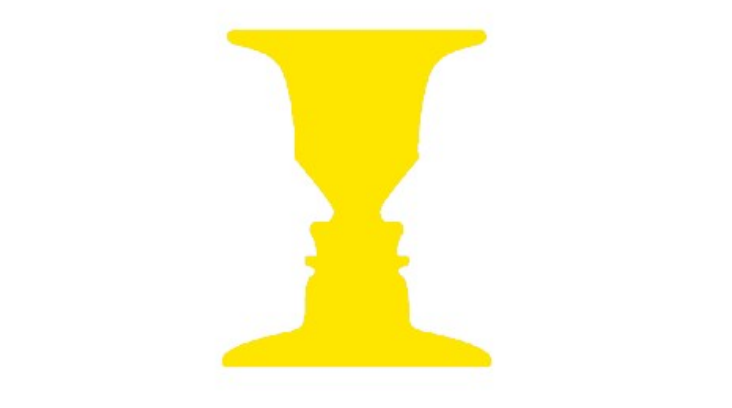
Figure and Ground [Gestalt Principle]
You either notice the two faces or the vase
Whichever you notice becomes the figure and the other the background
Tufte’s Principles
Edward Tufte is an American statistician and professor emeritus of political science, statistics and computer science at Yale University
He is known as a pioneer in the field of data visualization and has written four books about information design.
Tufte’s principles highlight that “excellence in statistical graphics consists of complex ideas communicated with clarity, precision and efficiency
Tufte Principles: Data-to-Ink Ratio
Tufte believes you should show the data and essentially maximize the data-to-ink ratio
This essentially means you should remove all non-data ink and redundant data ink, often referred to as chart junk
The idea here is that less can be more
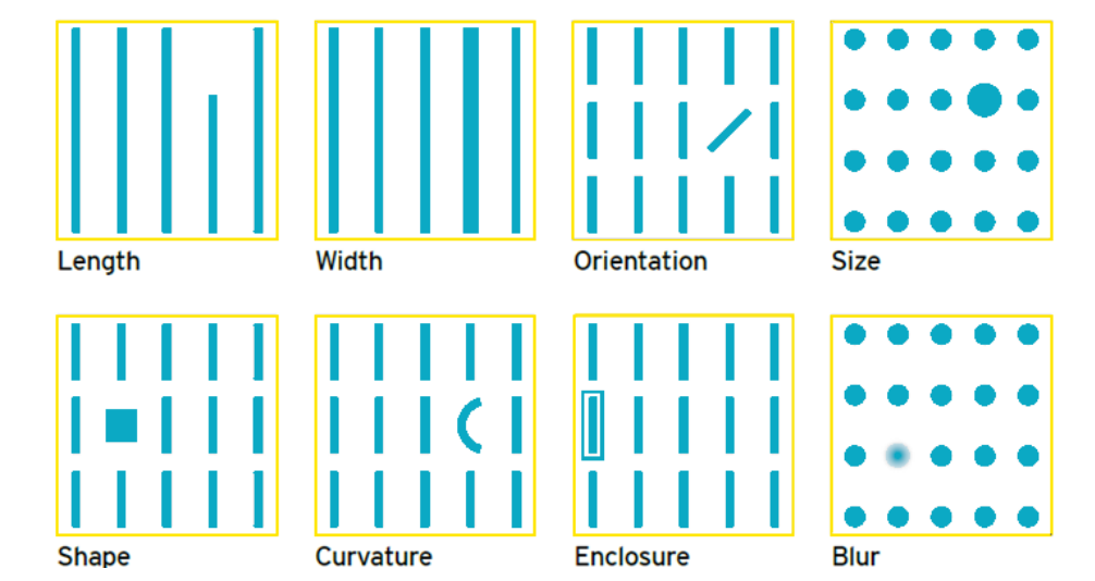
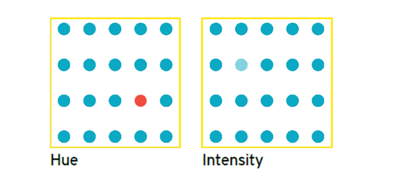
Pre-Attentive Attributes
Good design leverages pre-attentive processing in our brains
Pre-attentive processing is tuned to detect a specific set of visual attributes, which results in certain elements standing out — all without conscious thought
Visual tools that aid in pre-attentive processing include:
Emphasis
Quantity
Color
Emphasis [Pre-Attentive Attributes]
The form, position, motion or color within your design can emphasize your data
Form
Position
Motion

Color
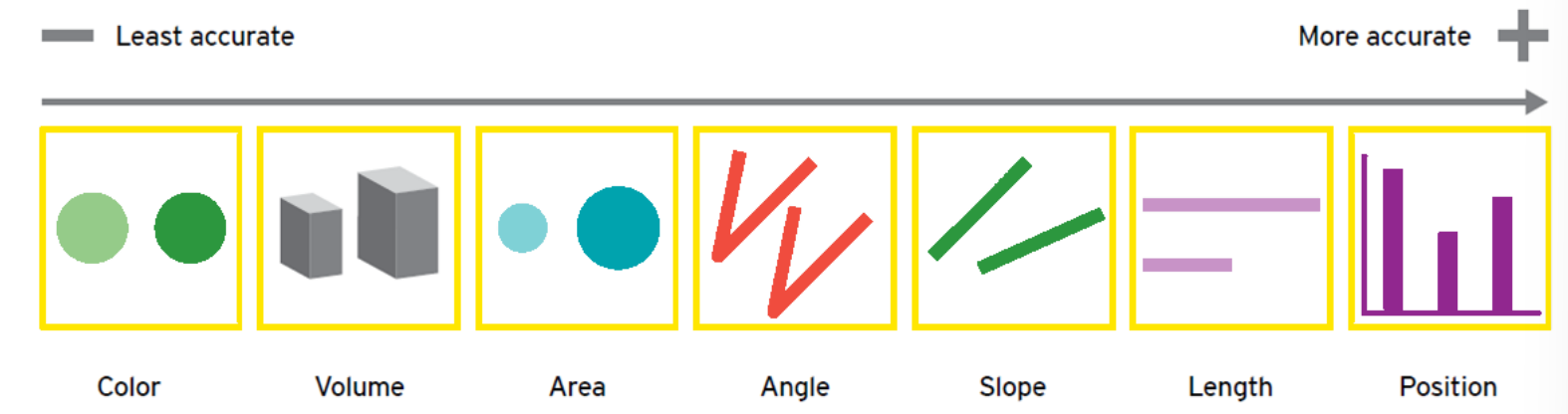
Quantity [Pre-Attentive Attributes]
When comparing quantity, there is a range of visual tools that can be used
However, the level of accuracy relative to the type of visualization is important to understand
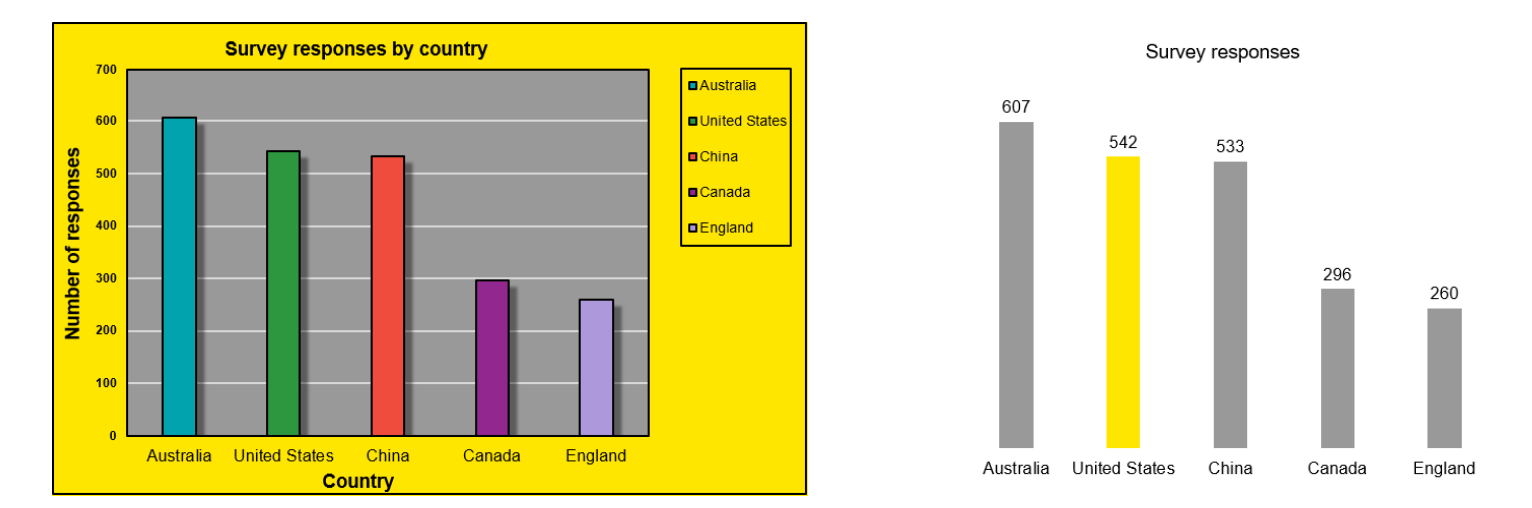
Color, through hue, saturation or density, is the least accurate way to compare quantity, while position is the most accurate, as shown in this chart
Color [Pre-Attentive Attributes]
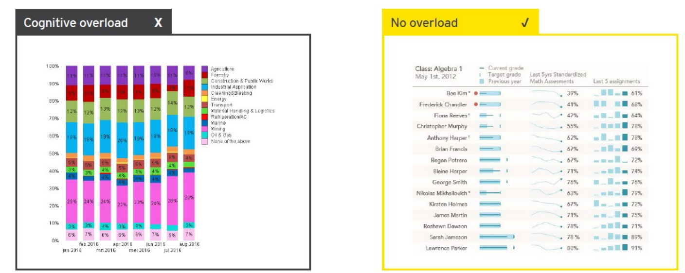
No Color Overload
Using color can be a very effective way to make data stand out; however, often color is not used effectively
Use color to emphasize information creating overload
Be Consistent and Effective When Using Color
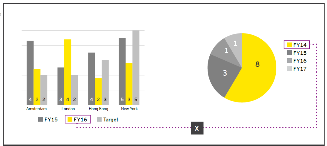
Cater the Color for Your Audience
Conveys meaning
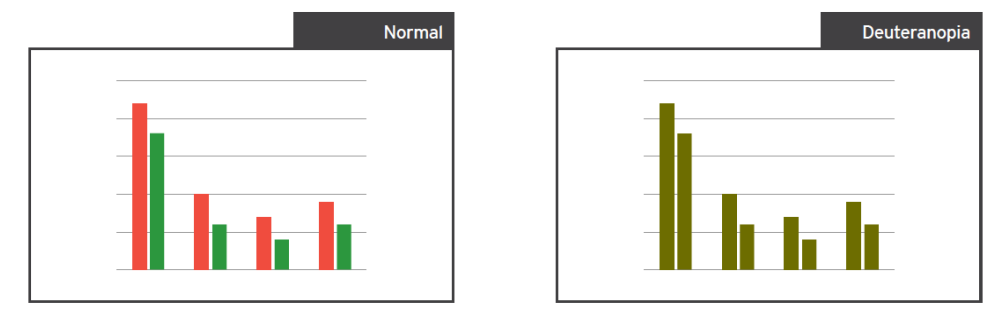
Red and green considerations:
Cultural differences
Color blindness
Brand considerations
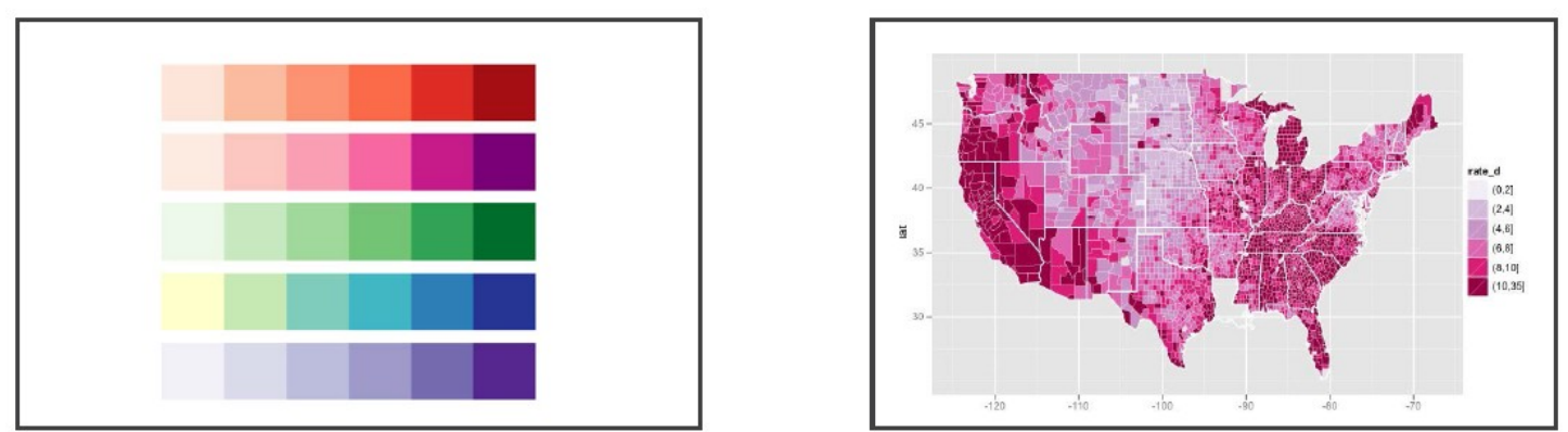
Understand Color Context
As mentioned previously, colors can show quantities and a range of colors is effective for this purpose
Additionally, darker hues should denote larger quantities
Many visualization tools provide pre-assigned color palettes that have been well thought out to improve visualizations
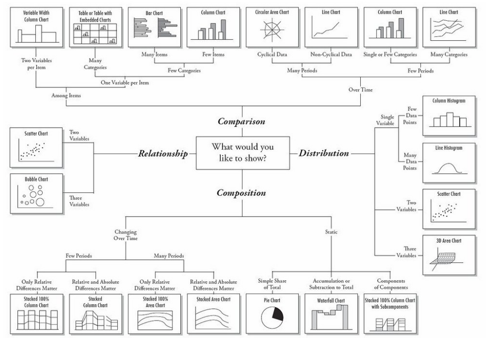
Choosing the Right Chart
There is a wide variety of charts that you can use for your data visualizations
Charts can include graphs or plots, diagrams, tables or maps
Each chart has a different functionality to show the data you are trying to convey more effectively
This is a flowchart tool by that helps you to decide what type of chart to use
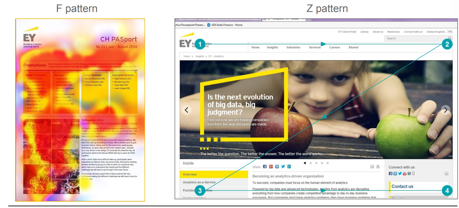
Visualization Viewing Patterns
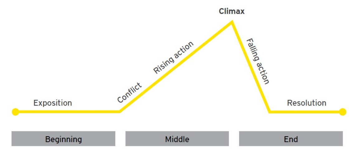
Narrative Framework for Data Stories
Author-Driven vs. Reader-Driven Approach
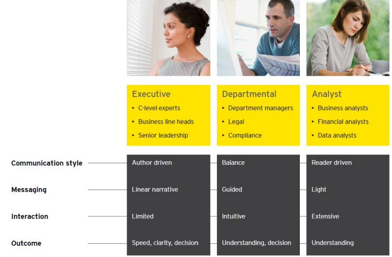
Understanding Your Audience
Conclusion on Data Visualization
The analytics mindset includes the ability to interpret and share the results of data analytics techniques with stakeholders
Data visualizations are a very powerful way to interpret and share results
What you learned in this module about effective design principles of data visualizations, storytelling principles, and frameworks for data visualizations and more should improve your ability and strengthen your analytics mindset