Etc1010 graphing
1/29
There's no tags or description
Looks like no tags are added yet.
Name | Mastery | Learn | Test | Matching | Spaced |
|---|
No study sessions yet.
30 Terms
Basic template for graphing
Code: ‘
ggplot(data, aes(x = ..., y = ...)) + geom_... + labs(
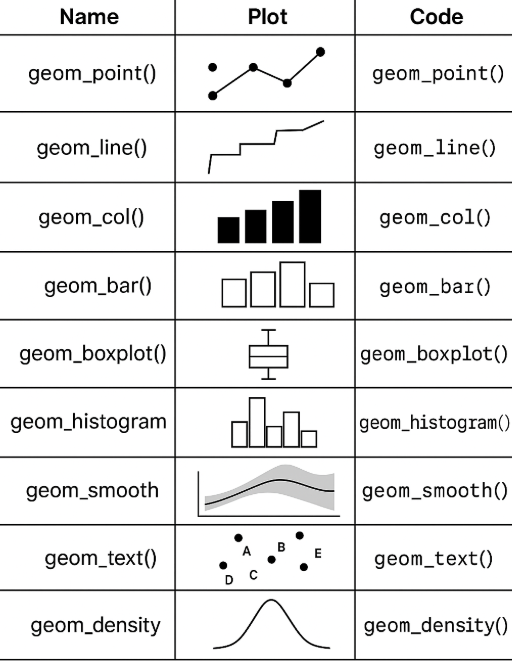
What are the main geom functions used
geom_point()– scatter plotgeom_line()– line plotgeom_col()– bar plot (height = value)geom_bar()– counts automaticallygeom_boxplot()– boxplotsgeom_histogram()– histogramgeom_smooth()– adds trend line
When do you use fill vs colour in ggplot2?
What does each one affect?
Which geoms use them?
FILL
Fills the inside of shapes (like bars, boxes, densities).
Used in:
geom_bar(),geom_col(),geom_boxplot(),geom_density(),geom_histogram(),geom_area().
Example: ggplot(data, aes(x, fill = group)) + geom_bar()
This makes sure each group has a different colour
COLOUR
Changes the border of shapes or the color of lines/points.
Used in:
geom_line(),geom_point(),geom_bar(),geom_boxplot()
Example: ggplot(data, aes(x, colour = group)) + geom_point()
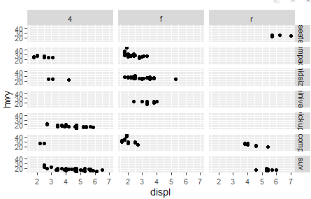
Code: facet_grid()
Creates a matrix of plots: one variable for rows, another for columns.
Useful for seeing interaction effects between two categorical variables.
Eg.
ggplot(mpg, aes(displ, hwy)) + geom_point() + facet_grid(class ~ drv)
This will create a grid of scatter plots where each row corresponds to a different car class and each column corresponds to a different drive type drv
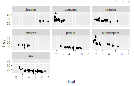
Code: facet_wrap
Creates individual plots for each level of one categorical variable in a grid layout.
Use when you want to split data into subplots based on one factor.
Eg. ggplot(mpg, aes(displ, hwy)) + geom_point() + facet_wrap(~ class)
This will create a series of scatter plots, each representing a different class of car laid out in a single row or column
How to add labels
Code: labs()
Eg. ggplot(data, aes(x, y)) + geom_point() + labs(title = " Title", x = "X Axis Label", y = "Y Axis Label", colour = "Group”)
Colour=”Group” shows the legend title
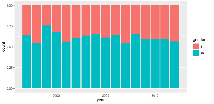
Code: position = “fill”
Stacks the bars in a way that each bar's height is proportional to the total
Eg. ggplot(tb_au, aes(x = year, y = count, fill = gender)) + geom_col(position = "fill")
geom_point()
Used for scatter plot
Shows correlation between x and y
Geom_line()
Line Plot
Shows trends over time
Geom_col()
Bar Plot where height is based on values in dataset
Geom_bar()
Bar Plot where height (y) of bar is the number of times x has occurred
Geom_boxplot()
Box Plot
Shows IQR, median, max and min of values
Geom_histogram()
Histogram
Shows distribution of values
Geom_smooth()
Adds smooth line to show trends in scatter plots
Eg.
ggplot(data, aes(x, y)) + geom_point() + geom_smooth()
Code: ylim()
Sets the min and max of the y axis
Eg. geom_point() + ylim(0,100)
Code: position=”dodge”
Plots side-by-side bars instead of stacked
Opposite of posiiton=fill
Eg. geom_col(position=”dodge”)
Code: “position=stack”
Bars are stacked on top of each other
Different from code: “position=fill” because heights are not scaled to 100%
geom_vline()
Adds a vertical line on graph
Eg. geom_vline(xintercept = avg_hp,
linetype = "dotted",
size = 4,
alpha = 0.6,
color = "green")
This adds a vertical line where x=avg_hp
Linetype: makes the line dotted
Size: Changes thickness of line
Alpha: Makes the line slightly transparent (0=invisible, 1=opaque)
Colour: Makes the line green
Geom_text()
Adds a label to the line
Eg. geom_text(aes(x = avg_hp + 3, y = 30),
label = "Mean",
angle = 45,
colour = "blue",
size = 7)
avg_hp+3: This is the x position of the text
y=30: This is the y position of the text
label: The word that’s displayed
Colour: Changes the colour of the word
Size: changes the size of the word
Geom_hline()
Adds a horizontal line to graph
Eg. geom_hline(yintercept = avg_mpg,
linetype = "dashed",
size = 1.5,
alpha = 0.7,
color = "purple")
yintercept: Shows where the line will cross y axis
linetype=makes it a dashed line
size: Changes the thickness
Colour: Changes the colour
geom_text()
Adds text to graphs:
Example:
geom_text(data=mpg, aes(label = model), size=4)
data: shows dataset being used
label: showing the model name as the label
size=size of the font
geom_label
Same as geom_text but has a rectangle behind writing
Eg. geom_label(aes(label = model),
data = best,
nudge_y = 2)
label=showing the model name as the label
data: shows dataset being used
Code: nudge_y
Pushes the label up or down
Eg. (nudge_y=2)
Label moves 2 points up
Code: nudge_x
Moves label side to side
Eg. (nudge_x=2)
Code: “geom_label_repel()”
Places labels on graph and automatically prevents any overlap
Eg. geom_label_repel(data = best, aes(label = model, colour=model))
Code: “fct_reorder()”
Orders variables based on median of n
Eg.
ggplot(aes( x = fct_reorder(manufacturer, n), y = n))
Code: “Scale_x_continuous()”
Customises numbers on x axis
Eg. ggplot(data, aes(x = var1, y = var2)) +
geom_point() +
scale_x_continuous(breaks = seq(0, 100, by = 10))
x-axis goes from 0,100 and counts by 10
Code: “Scale_y_continuous()”
Customises numbers on y axis
Eg. ggplot(data, aes(x = var1, y = var2)) +
geompoint() + scale_y_continuous(breaks = seq(0, 100, by = 10))
y-axis goes from 0,100 and counts by 10
Code: “scale_fill_discrete()”
Changes names of legend
Eg. scale_fill_discrete(breaks = c("f", "m"), labels = c("female", "male"))
In the legend, changes f to female and m to male