summarizing data (test 1)
1/21
There's no tags or description
Looks like no tags are added yet.
Name | Mastery | Learn | Test | Matching | Spaced | Call with Kai |
|---|
No analytics yet
Send a link to your students to track their progress
22 Terms
pic
pic
descriptive statistics (numerical data)
measures of central tendency (typical)
mean
median
mode
measures of dispersion (spread or variability)
range
interquartile range (IQR)
variance, standard deviation
skewness
mean
average value of sample distribution achieved by…
sum of all values / # of all values
sensitive to outliers and can be affected by “skew“ in the data
should only be calculated for continuous data that is normally distributed
ex: BP/HF staging
median
the “middle“ value of a sample distribution
remember our sample distribution
4 8 X 12 100
given an even number:
(8+12) / 2 = 10
so the mean was 31 but median was 10
strength of the mean is more appropriate with skewed data
may be used in not only continuous, but also ordinal data
mode
# that most frequently occurs in a data set
preferred in nominal data, wen central location if nonnumeric
nominal date is usually depicted by rate, %, and ratios
range
difference between the highest and lowest values of a data set
useful in setting limitations in the expectations of effect for a given intervention
a measurement of precision or consistency of data set
large: the effects of in intervention may very greatly between individuals
small: we can predict with reasonable certainty the effect of our intervention
let’s say we measure baseline % LDL for 1000 people, followed by giving them atorvastatin 20 mg for 3 months
highest reduction → 40%
lowest reduction → 5%
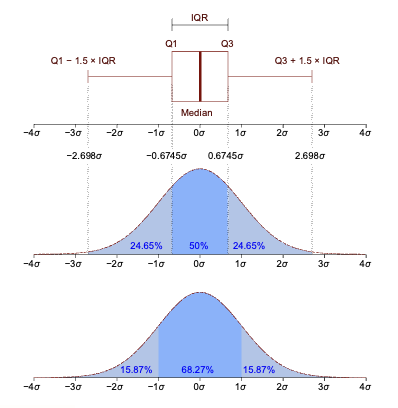
interquartile range
difference between the 75th and 25th percentiles of the data
useful graphical representations of a probability distribution
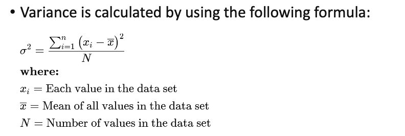
variance
how far the values of a variable lie from the mean
mathematically defined as the average squared distance of values from their means
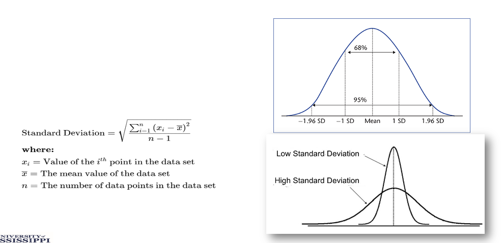
standard deviation
indicates how spread out the data is and to what degree the data is dispersed away from the mean
low, small range of values, and data is clustered around the mean
it is the square root of the variance
is sensitive to outliers in the data
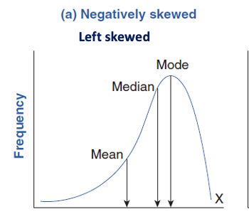
left skew
negative direction
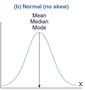
normal (no skew)
normal curve represents a perfectly symmetrical distribution
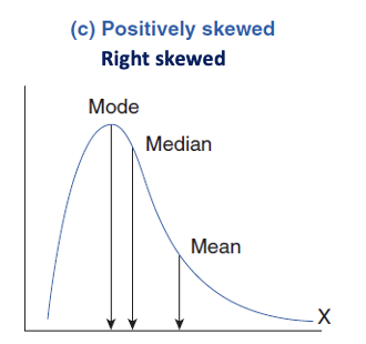
right skew
positive direction
frequency table
the simplest for of visual representation
it organize discrete or continuous data at any level of measurement
bar chart
graph discrete, categorical data (nominal/ordinal scale)
shows the frequency counts of values for the different levels of a categorical or nominal variable
one axis represents a measured value, or show other statistics, i.e., percentages.
the other axis of the chart shows the specific categories
can be plotted vertically or horizontally
histogram
graph continuous data that have been apportioned into discrete categories
plots the distribution of a numeric variables values as a series of bars
each bar typically covers a range of numeric values called a bin or class
a bar’s height indicates the frequency of data points with a value within the corresponding bin
has numerical groups ie age groups and bars touch
bar chart used categorical data ie your favorite color
pie chart
represents proportions or relative quantities of values
limited to small number of categories
contingency table
observations are cross-classified according to their membership in the categories of the variables
we can use mode for nominal data
how else can we describe nominal data?
ratios
proportions
precentages
proportion
the # of observations (a) with a given characteristic divided by the total # of observations (a+b) in a given group
(a) / (a+b)
always defined as a part divided by the whole
percentage
simply a proportion x by 100
[(a) / (a+b)] * 100
ratios
# of observations in a group with a given characteristic divided by the # of observations without the given characteristic
(a) / (b)
always defined as a part divided by another part