Bastardized Type, Measuring Up, Type Spacing, Logo Design (Terms Quiz #2)
1/60
There's no tags or description
Looks like no tags are added yet.
Name | Mastery | Learn | Test | Matching | Spaced | Call with Kai |
|---|
No analytics yet
Send a link to your students to track their progress
61 Terms
bastardized type
letterforms that have been altered on the fly mechanically rather than designed carefully
examples of bastardized type
squashed, stretched, bold with outline
how do you bastardize a typeface to make it bold?
increase the stroke weight
how can you tell that a typeface has been bolded in a bastardized way?
creates uneven thicks and thins where there aren’t any, shrinks counters, uneven overshoots and cap heights
what is a dead giveaway that a typeface has been bastardized?
horizontal strokes are thicker than vertical strokes
how can you tell a typeface has been italicized in a bastardized way?
slant is too hard, exaggerated thicks and thins
how can you tell a typeface has been condensed in a bastardized way?
letters are extremely skinny, exaggerated thicks and thins
how can you tell a typeface has been extended in a bastardized way?
length of horizontal strokes stretched
how to avoid accidental bastardizing in Illustrator?
hold shift when resizing letters and let go of mouse BEFORE the shift key
how to avoid bastardizing?
research typefaces on websites like Adobe Fonts and DaFont to find official variations
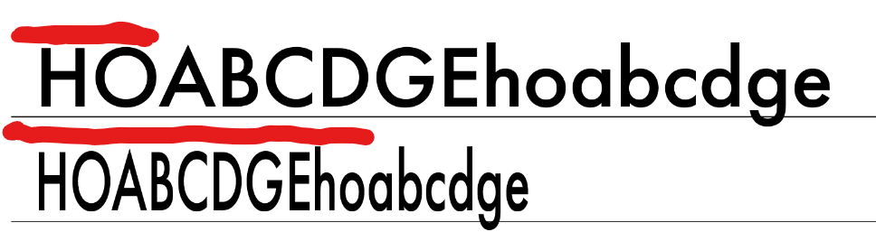
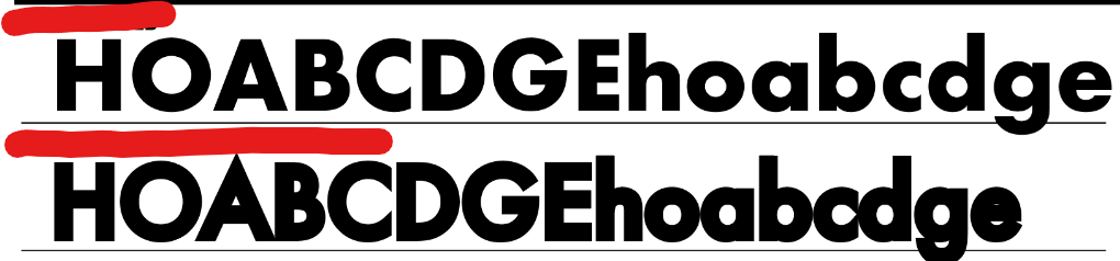
is this typeface bastardized condensed or official condensed? (roman above for reference)
bastardized condensed
is this typeface bastardized condensed or official condensed? (roman above for reference)
official condensed
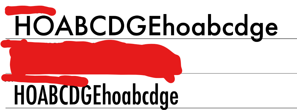
is this typeface bastardized bold or official bold? (roman above for reference)
bastardized bold
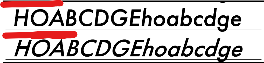
is this typeface bastardized italic or official italic? (roman above for reference)
bastardized italic
what roots does modern type measuring come from?
letterpress printing
body
size of character plus room built in so that lines of type don’t crash into one another
body size equals…
point size
what does point size depend on?
x-height, cap height, descenders/ascenders, built in vertical spacing
what does 1 point equal?
the width of a human hair
72 points equals…
1 inch
12 points equals…
1 pica
6 picas equal…
1 inch
heights are measured in…
points
width of columns are measured in…
picas
text type is usually __ points or smaller
12
average size of copy/text type?
8 to 12 points
average size of footnotes?
6 points or smaller
display type is usually __ points or bigger
36
average size of headlines?
36 points or bigger
average size of subheads?
14 to 32 points
who should you consider when designing type?
your audience
typography golden ratio
determines best size for headings by multiplying body text by 1.618
typography
the art of making words say more than their letters spell
what is the goal of text spacing?
create an even typographic color
kerning
the space between a pair of letters
letterspacing
overall spacing of letters in a word
wordspacing
space between words
kerning is described in ______
pairs
what can bad kerning do to a word?
it can make it look like two completely different words with a different meaning
what can bad kerning do to letters?
it can make two letters look combined into a new letter
what letter pairs are routinely kerned?
WA, AV, TA, LY
how to kern in adobe products?
put cursor between letters, hold option, then use left or right arrow key
trio kerning
cover all but 3 letters, kern, then keep moving one to the right until complete
how to judge kerning
put colored rectangle behind, turn type upside down, or take a step back
what do you do when normal kerning doesn’t work?
adjust the letterform by making it an object and moving small pieces OR making a ligature
how to adjust letterspacing in adobe products?
use cursor to highlight whole word, hold option and use left/right arrow keys
rules for letterspacing
don’t add too much to lowercase letters, don’t add too much to condensed typefaces, be careful about adjacent spacing
what is adjacent spacing?
making sure the space between type and objects is greater than or equal to the space between letters
what is the right amount of wordspacing?
generally equal to a lowercase l
logo
serves to represent an organization or company through a visual image that can be easily understood
what do logos use?
symbols, stylized text, or both
what makes a logo work?
audience appropriate, distinct, easy to recognize, scalable, long-lasting
types of logos
abstract mark, mascot logo, emblem logo, lettermark, pictoral mark, wordmark
abstract mark
represents essence of a company without showing what they do
combination logo
mark and typography together in a logo
emblem logo
logo that uses a shape to contain typography that represents the name of a company
mascot logo
logo that uses a character to represent the personality of a company
letterform logo
logo that uses only the first letter to represent a company
monogram
logo that uses initials to represent a company
wordmark
logo that uses distinct text-only typographic treatment of the name of a company
what makes a wordmark work?
uses letterforms uniquely, distinct typeface, communicates essence of brand, memorable, appropriate audience, scalable