Arch 352 Final BUILDING RECOGNITION
1/62
Earn XP
Description and Tags
Match building to name, also has buildings significance underneath
Name | Mastery | Learn | Test | Matching | Spaced | Call with Kai |
|---|
No analytics yet
Send a link to your students to track their progress
63 Terms
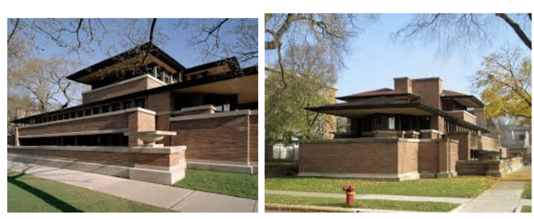
Robie House, Chicago IL, 1906-09 — Frank Lloyd Wright
Prairie style: long horizontal planes, low-pitched roof, suppressed basement
Continuous ribbon windows; no separate rooms visible from exterior
Entry hidden at the rear — compression into large interior space
Built-in furniture integrates interior as designed totality
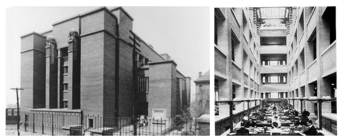
Larkin Building, Buffalo NY, 1903 - 1904 — Frank Lloyd Wright
Inward-facing office building; no windows on street, all light from interior atrium
Prairie house ideas applied to a commercial program
Air-conditioned — one of the first American buildings with mechanical climate control
Demolished 1950 — example of his work lost to neglect
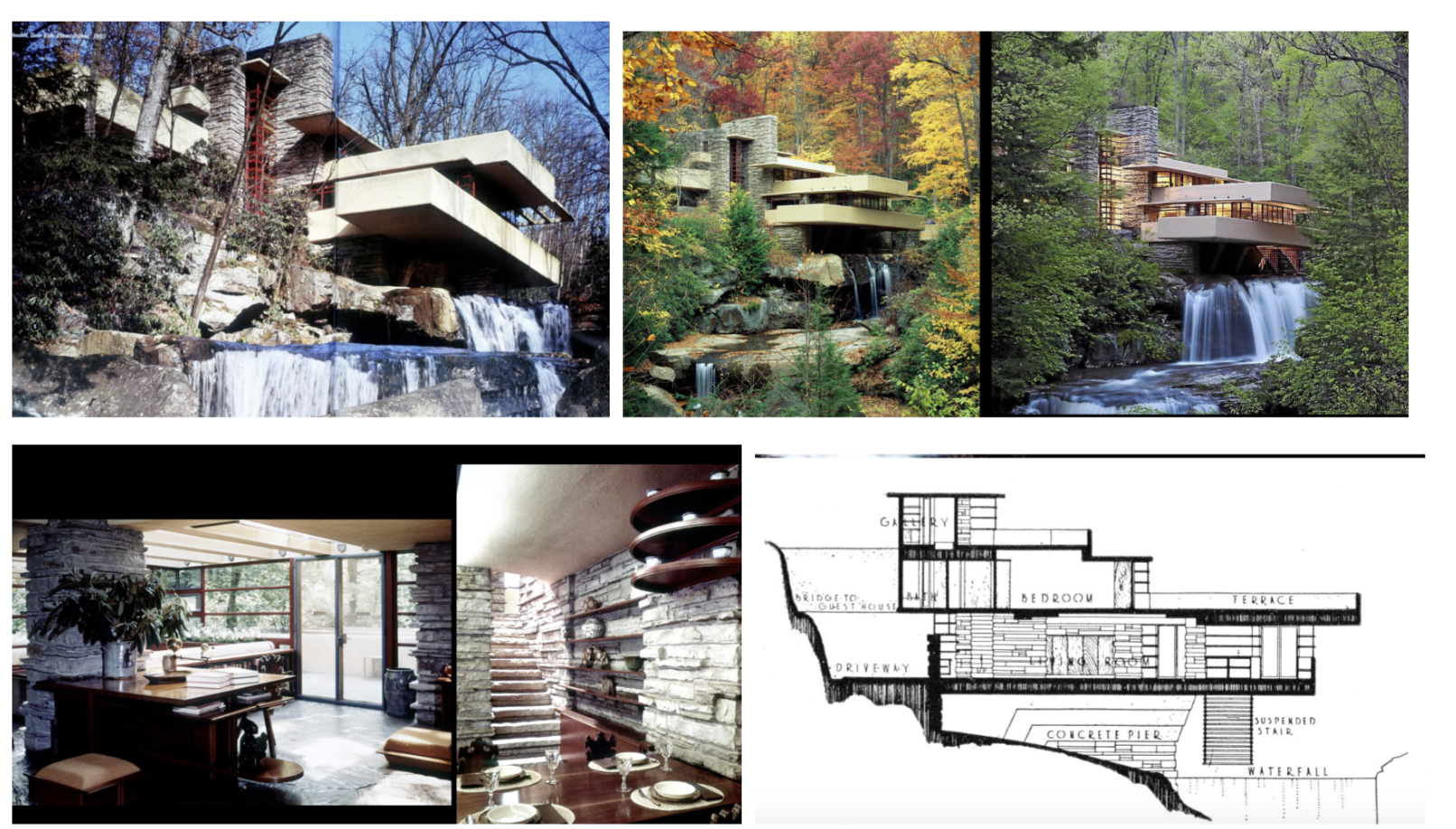
Kaufman House “Fallingwater”, Bear Run PA, 1935 - 1937 — Frank Lloyd Wright
Cantilevered concrete trays over waterfall; house built over, not facing, the falls
Flagstone floor, rough stone walls — natural and industrial materials in dialogue
Stair goes down into creek — direct connection to water
Responds to International Style but is distinctly Wright's personal vision
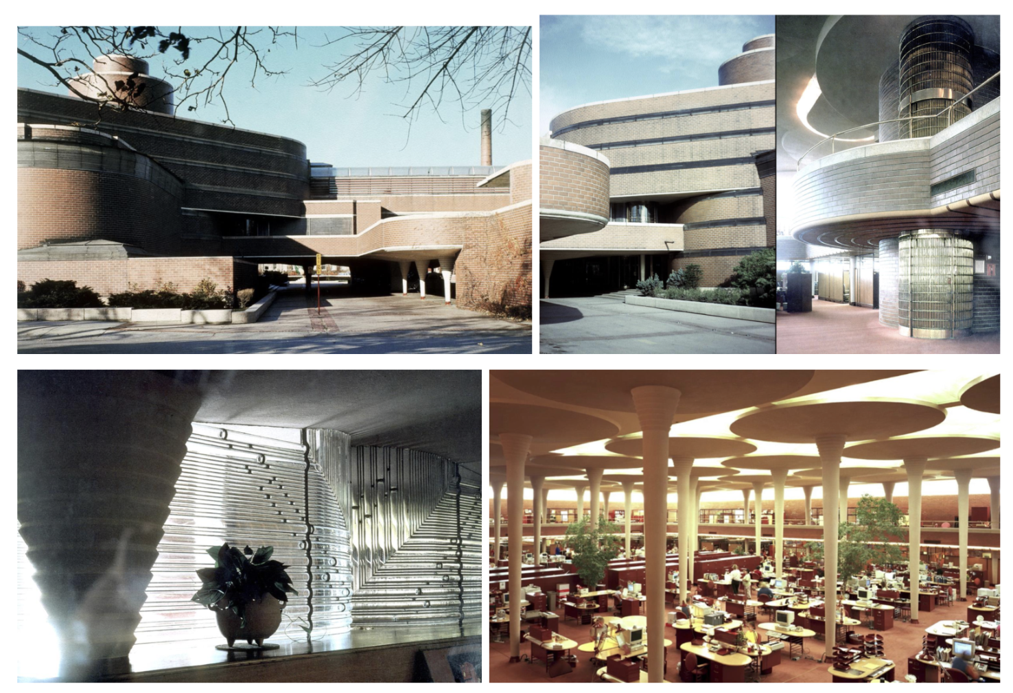
Johnson Wax Administration Building, Racine WI — Frank Lloyd Wright
"Lily pad" columns: dendriform concrete columns with disc tops; had to fight building codes
Glass tubing at cornice line brings light in but prevents viewing out
Similar program to Larkin: inward-facing clerical space with central atrium
Art Deco aware but entirely personal — not art deco, not International Style
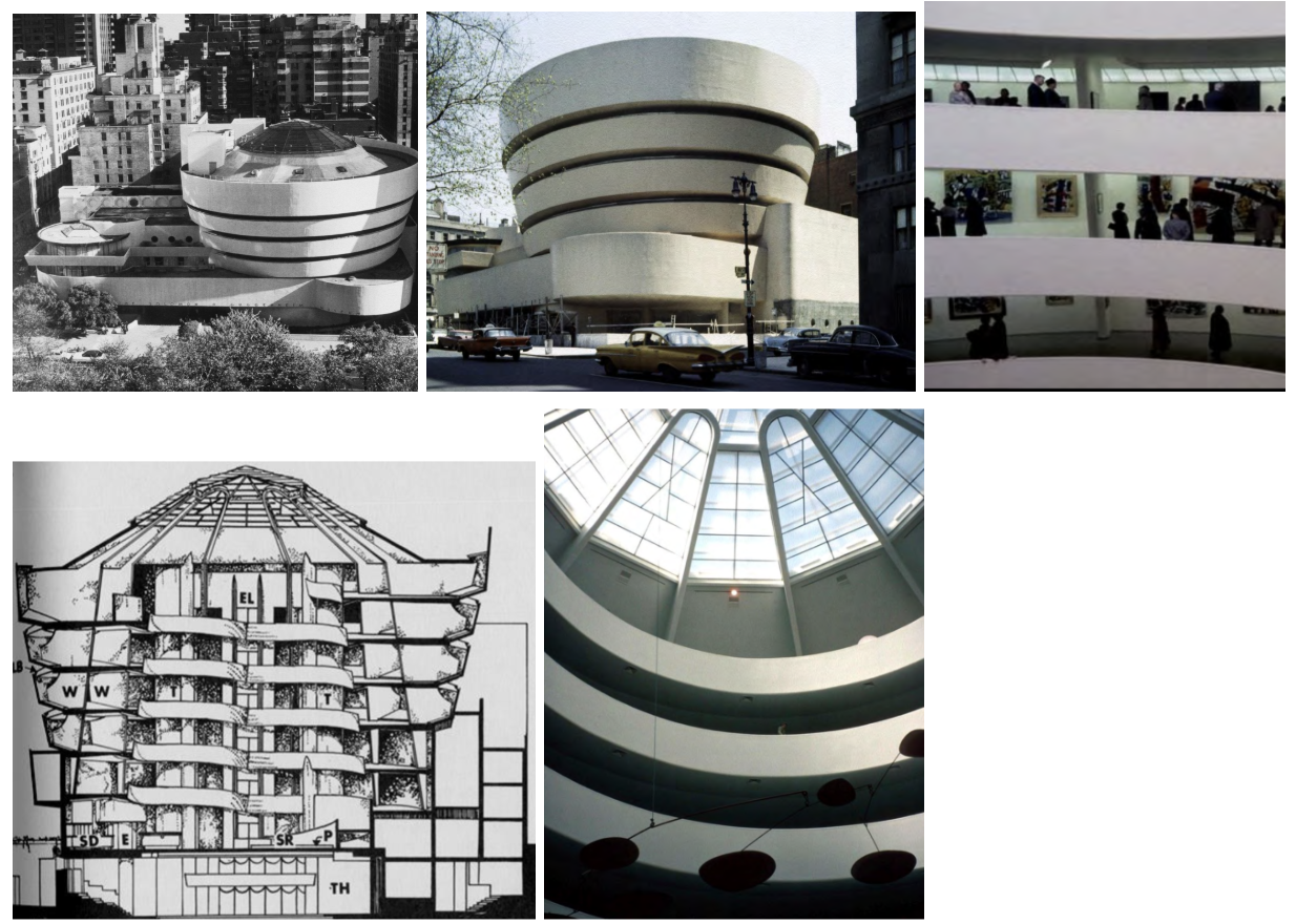
Guggenheim Museum, New York NY — Frank Lloyd Wright
Continuous spiral ramp replaces conventional gallery sequence
Takes elevator to top; walks down ramp viewing art on curved walls
Highly controversial: painters objected to curved walls for flat canvases
Building as pure sculptural object in the city — form dominates
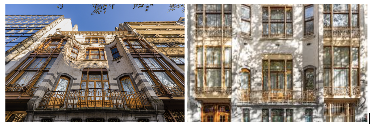
Solvay House, Brussels, 1895–97 — Victor Horta
Private townhouse for an industrial chemist — Horta's new clientele was the emerging professional upper-middle class, not the traditional aristocratic elite.
Curvilinear Art Nouveau ornament pervades every element: doors, handrails, ceilings, light fixtures, stairs — Horta designed the building, finishes, and furniture as a unified whole.
Exposed iron columns inside are wrapped in organic ornament — structure is present and honest but dressed in the new aesthetic language.
Stained glass, curved stone, woven carpet, and floral light fixtures — sensory integration of all surfaces into one continuous decorative system.
Key example of Art Nouveau's total design integration: no element is left to chance; architecture and interior decoration are one.
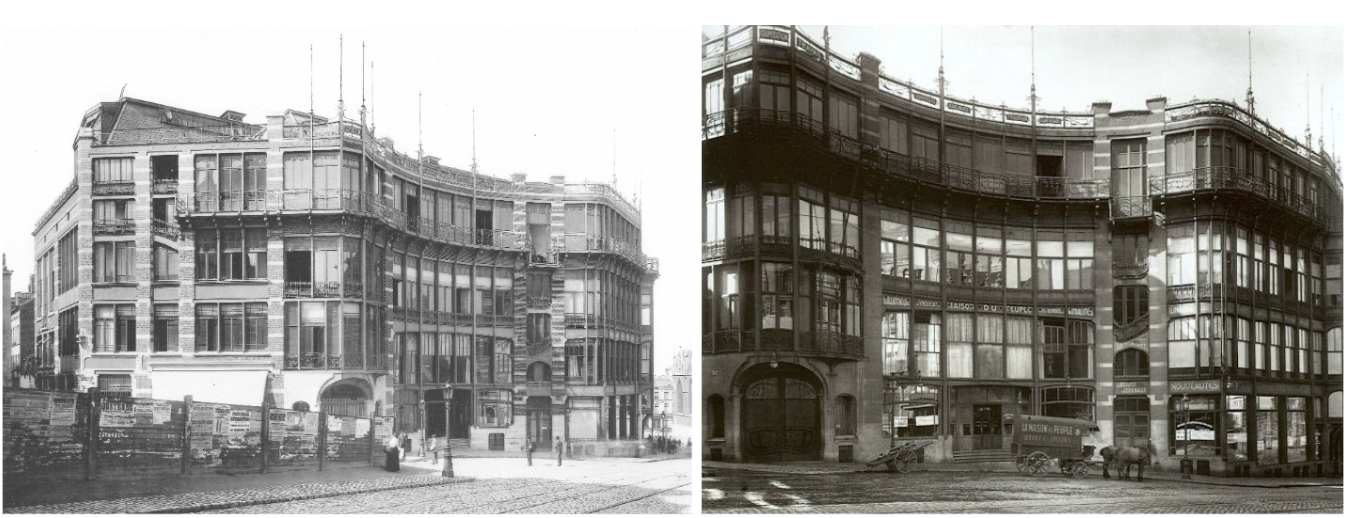
Maison du Peuple, Brussels, 1897–1900 — Victor Horta
Workers' cooperative building — Art Nouveau applied to a socialist political purpose, not just bourgeois taste; appealed to both professional class and workers' democratic movement.
True curtain wall on the exterior: non-load-bearing iron and glass facade is structurally innovative for its date — wall as enclosure, not structure.
Curvilinear iron trusses support the auditorium ceiling — revealed, not concealed; celebrating new technology rather than hiding it behind ornament.
Form, structure, and purpose unified — the construction logic and the aesthetic are one and the same.
Demolished 1965 — a significant architectural loss; demonstrates that even revolutionary buildings can be erased by later development.
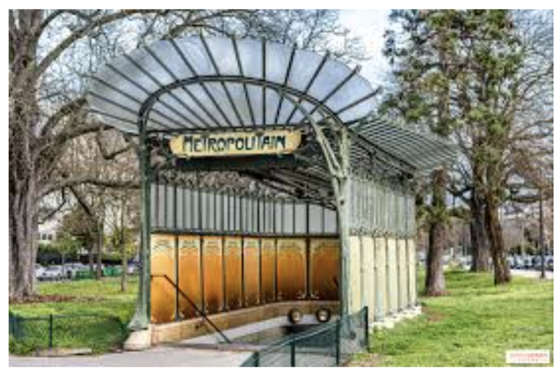
Metro Station Entrances, Paris, France, 1894–98 — Hector Guimard
Most important work — responds to the new technology of underground subway tunnels; problem: how to signal a new urban infrastructure in a welcoming, legible visual language.
Repetitive cast-iron parts in curvilinear plant-stem forms — lights look like flowers, roofs like insect wings; the industrial system is given an organic, living form.
Consistent character across all entrances: makes entry points unmistakably legible in the city while remaining stylistically unified — a coherent urban design system.
Initially controversial — clashed with the heavy stone buildings of Paris; gradually accepted, now protected historical monuments.
Solves a real design problem: guides people to underground tunnels through a surface expression that is both practical and extraordinary — one of the first pieces of branded public infrastructure.
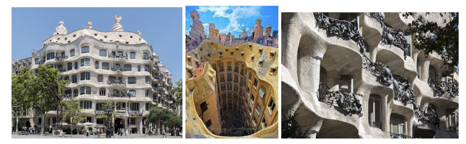
Casa Milà, Barcelona, Spain, 1905–10 — Antoni Gaudi
Most complex plan in architectural history — no two rooms alike, no straight walls, irregular courtyard spaces; the plan is driven entirely by the undulating exterior form.
Facade inspired by rocks worn by the sea — Gaudi drawing directly from the natural landscape of Barcelona's beaches; each stone custom-cut to match the curve of the balconies.
Balcony metalwork looks like seaweed; roof is irregular with sculptural chimneys and ventilation shafts — architecture as total organic environment.
Stone is self-supporting with iron only for reinforcement — no conventional structural frame; structurally extraordinary and entirely original.
His buildings are so personal and idiosyncratic that they founded no school — fascinating but not influential in the way Berlage or Behrens were.
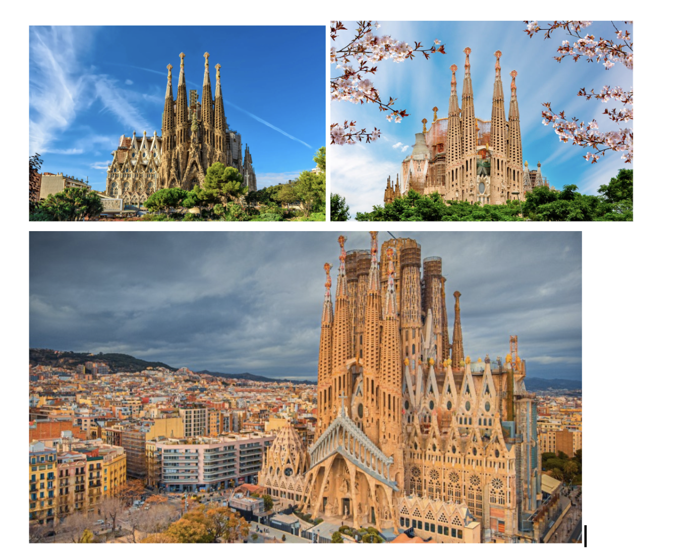
Church of the Sagrada Família, Barcelona, (1884), 1910–26 — Antoni Gaudi
Begun as a conventional Gothic church 1884 — once Gaudi took over, everything above ground level became his imagination; stone construction, cave-like carved facades.
Final central tower completed 2026; interior work projected to finish 2034 — construction has spanned over 140 years across multiple architects interpreting Gaudi's vision.
When Gaudi died the construction team worked from his models and drawings, but the style evolved as different architects interpreted and extended his intentions.
Extraordinary craftsmanship throughout: spiral staircases, light entering through the tower sides, stone dressed to flow together as one organic whole.
His buildings are so personal to him that they are not influential in the way other major architects' works are — a singular achievement, not a model for others.
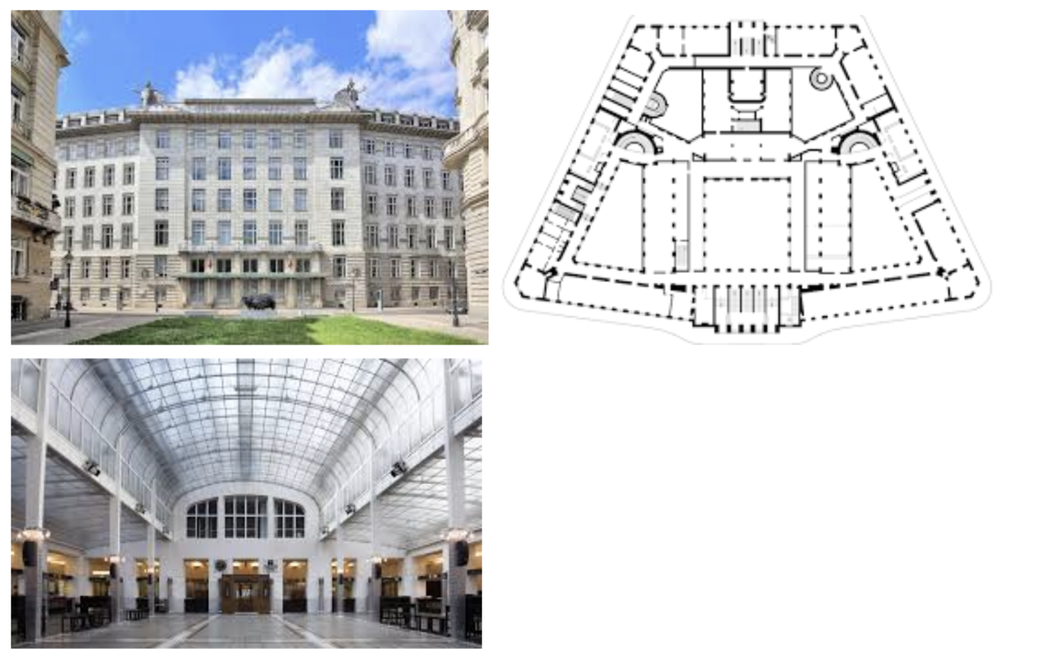
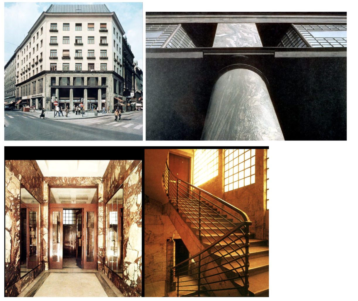
Postal Savings Bank, Vienna, Austria, 1904–06 — Otto Wagner
Extraordinarily important building — Wagner pursues a rational style: bilaterally symmetrical plan (traditional) but built with modern technology and honest materials.
Marble cladding panels are not load-bearing masonry — we can see the thickness of the stone, the metal bolts attaching it to the frame; construction is not hidden but celebrated.
Glass-block floor and metal-and-glass roof over the central banking hall; aluminum used throughout as a new modern metal — material honesty and functional clarity.
Hot-air heating pipes with metal grilles are left exposed on the banking hall floor — beginning of the 20th century, technology is not hidden but integrated as design.
Entrance, stair, materials, and spatial character are all designed to accommodate specific functions: grand at the center for public interaction, lower and quieter at the tellers — architecture shaped by use.
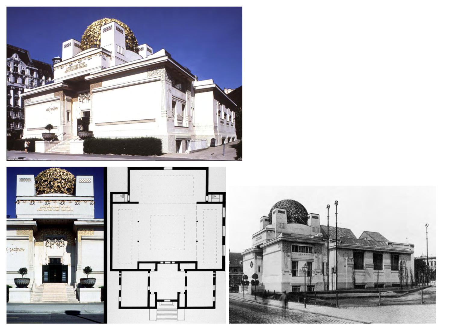
Secession House (Gallery), Vienna, Austria, 1897–98 — Joseph Maria Olbrich
Exhibition space for the Vienna Secession — the institution that broke from conservative academicism to champion new art; architecture as a declaration of cultural independence.
Famous inscription: 'Der Zeit ihre Kunst, der Kunst ihre Freiheit' — 'To every age its art, to art its freedom'; the building announces its purpose philosophically.
Gold laurel dome — 'the golden cabbage' — gilded filigree cast iron over a clean white cubic volume; ornament is geometric and abstract, not historicist.
Geometric simplification of ornament: moves away from curvilinear Art Nouveau toward the abstraction that will define Modernism — a transitional building.
Establishes both an institution and a spatial idea: the white cube gallery for exhibiting contemporary art becomes one of the most influential room types of the 20th century.
Goldman Building (Michaelerplatz), Vienna, Austria, 1910 — Adolph Loos
Sits directly opposite the Habsburg Hofburg Palace — a deliberate confrontation with imperial Vienna; the building's plainness is a political as well as aesthetic act.
Ground floor and mezzanine: polished green marble columns and classical base — then upper residential floors with bare plaster and plain window openings: no ornament whatsoever.
Called 'the house without eyebrows' — Emperor Franz Joseph was reportedly so offended he had the palace curtains drawn on the side facing the building.
'Ornament and Crime' (1908) essay: applied ornament wastes labor and money, becomes obsolete, is a sign of degeneracy — modern people do not need it. This argument launched the Modern Movement's anti-ornament position.
Anticipates the International Style's rejection of applied decoration by a full decade — the most radical pre-WWI building in Vienna.
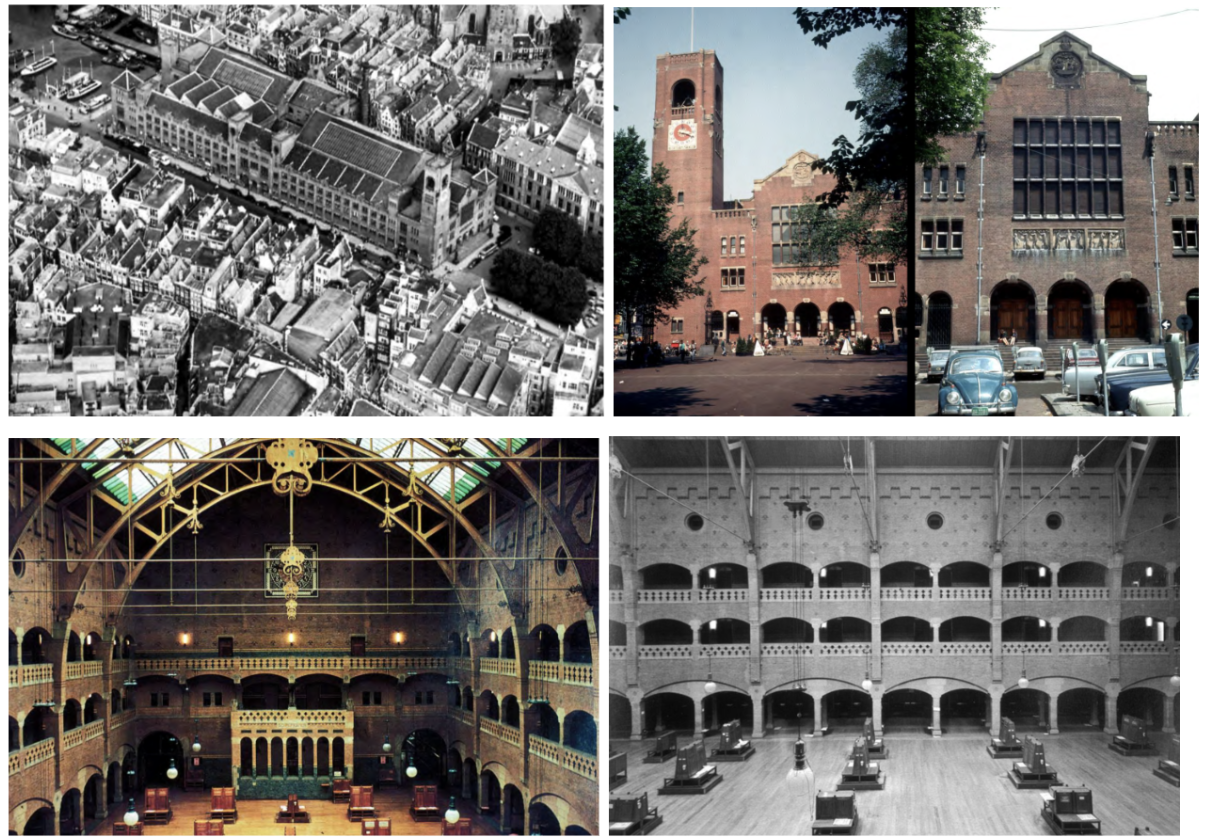
Exchange (Beurs van Berlage), Amsterdam, 1896–1903 — Henrick Petrus Berlage
Key idea: structural rationalism — the building should reveal how it stands up; every material is where it needs to be structurally; no ornament hides the load paths.
Stone used only where arches transfer load into walls (keystones, headers); brick corbels out at exactly the right point to carry steel trusses — structure as legible diagram.
Interior trading hall: grand space with balconies, visible steel trusses corbelled out of the brick walls, secondary columns carrying non-structural wall loads — you can read every structural decision.
Influenced both the Amsterdam School (extended his craft emphasis into expressionism) and De Stijl (took his rationalism into pure abstraction) — the hinge figure of Dutch modernism.
The logic of structure as aesthetic becomes a foundational idea of the Modern Movement — visible here a full decade before Gropius or Mies.
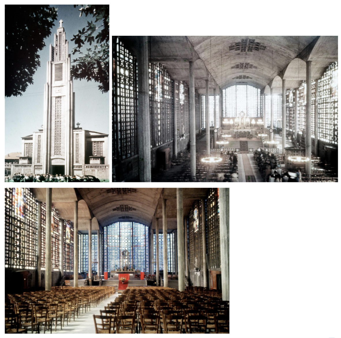
Church of Notre Dame du Raincy, near Paris, 1922–25 — August Perret
Looks generic from the outside — traditional basilica plan with side aisles — but the interior is extraordinary: an achievement in reinforced concrete.
Thin-shell concrete barrel vaults get their strength from curved form, not thickness — very slender columns; the structure is efficient and visually light.
Perimeter walls are precast concrete screens filled with stained glass — the entire wall glows; the building feels like a glass cage lit from within.
Proves that reinforced concrete can produce sacred, beautiful architecture — tradition (Catholic basilica) and progressive structure (concrete) are not opposites.
Primary influence: Perret showed concrete was an acceptable architectural material, not just industrial; trained Le Corbusier in this lesson.
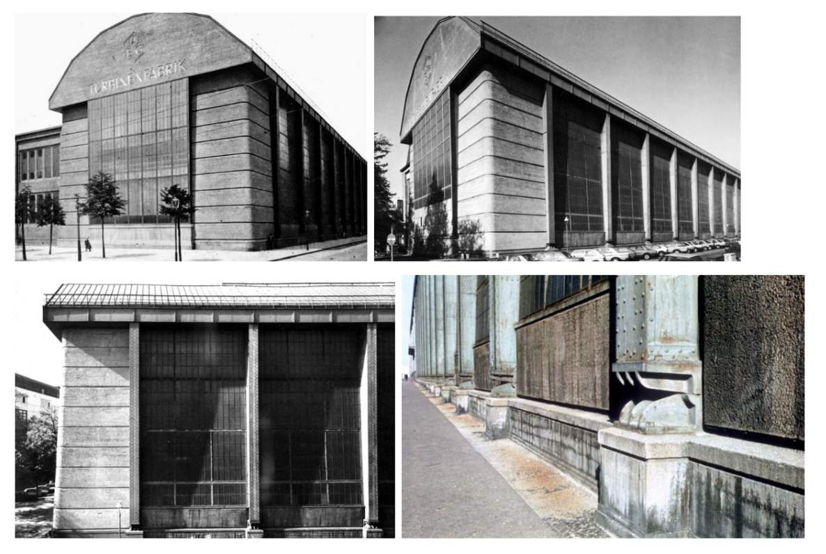
AEG Turbine Factory, Berlin, Germany, 1908–09 — Peter Behrens
AEG was Germany's largest electrical manufacturer; Behrens designed its buildings, products, graphics, and typefaces — the first total corporate identity program in history.
'A temple to industrial power' — steel and glass treated with the dignity usually reserved for civic or religious architecture; factory design elevated to high architecture.
No historical ornament — the side elevation reads like classical columns but is entirely steel plate with rivets; industrial structure given monumental form without fake decoration.
Roof cantilevers support the columns, making the building appear to hang rather than sit — could not have been built this way even 20 years earlier; modern technology makes it possible.
The office that trained Gropius, Mies, and Le Corbusier simultaneously — the single most important teaching environment of the entire Modern Movement.
Faguswerke (Fagus Shoe Factory), Alfeld-an-der-Leine, 1911–13 — Gropius & Meyer
The glass corner: glazing wraps around the building corner with no corner column — the wall is not structural, it is pure enclosure; a revolutionary idea for its date.
Cantilevered concrete staircase floats behind the glass with no visible column support — stairs appear to hang in mid-air; glazing can now float around corners.
Brick and steel look lightweight, almost as if they hang rather than sit on the ground — a new aesthetic of lightness derived from structural honesty.
Clock on the facade: factories are now time-regulated modern institutions — architecture communicating organizational values.
Together with the Model Factory at the Werkbund Exhibition (1914), establishes Gropius as the leading German modernist before WWI and directly anticipates the Bauhaus curtain wall.
Bauhaus, Dessau, Germany, 1925–27 — Walter Gropius
First large building of the new Modern Movement — the coalescence of De Stijl, Constructivism, Futurism, and structural rationalism into one building.
Pinwheel plan with no axial center — to understand the building you must move around it; modern design requires a moving observer, not a fixed classical viewpoint.
Each wing designed for its specific function: studios face north (even light), workshop wing has the glass curtain wall, bridge links administration — functionalism made spatially visible.
Glass-and-steel curtain wall on the workshop wing — they were inventing this technology as they built it; asymmetrical composition, cantilever balconies, flat roof, smooth white surfaces.
School trained students in all branches of design simultaneously (furniture, typography, weaving, lighting, graphics) with architecture as the culmination — a unified vision of modern design education. Closed by Nazis 1933.
Glass Pavilion, Werkbund Exhibition, Cologne, 1914 — Bruno Taut
Entry point into Expressionism — architects and artists who believe in subjective, free form-making (Kunstwollen); the building exists to create emotional and sensory experience.
Built entirely of glass products to display what glass can do — glass block stairs, hanging glass chandeliers, reflective tile pool, colored glass walls: a complete sensory environment.
Visitor choreographed through a spatial sequence of extraordinary spaces: entry hall, ascending glass-block stairs, circular pool room — architecture as emotional journey.
At night the whole building would have glowed — an illuminated lantern in the exhibition landscape; the experience of glass as a luminous, transformative material.
Only partial photos survive — the experience must be imagined; shows the limit of the photographic record for understanding spatial architecture.
Città Nuova [New City] exhibit, 1914 — Antonio Sant'Elia
Futurist ideology in drawn form: the world is now technological — culture must be too. No nature; only power lines, dams, and infrastructure drawn with lines conveying speed and motion.
Marinetti's Futurist Manifesto (1909): celebrate speed, machines, industry; architecture must express this technological reality — an ideological statement as much as a design.
All drawings, never built — Sant'Elia died in WWI 1916; the ideas existed only on paper, which made them infinitely reproducible and influential.
Contribution to Modernism: the moral argument that technology must be embraced and expressed, not hidden behind ornament or historical forms.
Culture should be technological — this ideological position passed through the Modern Movement even when the specific Futurist aesthetic did not.
Schroeder House, Utrecht, Netherlands, 1923–25 — Gerrit Rietveld
Canonical De Stijl work — planes in space, abstract lines, primary colors (red, blue, yellow, black, white): a Mondrian painting turned into a three-dimensional building.
Upper floor walls are all moveable sliding and folding panels — the entire floor can be one open space or divided into rooms; the free plan taken to its most literal and dynamic expression.
Cantilevered deck on the second floor with metal handrail lines, casement windows: every element reads as an abstract line or plane in space, not as a traditional architectural element.
Corner window: two pieces of glass meet at the corner with no structural support visible — transparency and gravity seem to be defied; the corner dissolves.
Directly influenced Mies van der Rohe: the Barcelona Pavilion takes De Stijl's free-plane logic and adds luxurious materials — a clear line of descent.
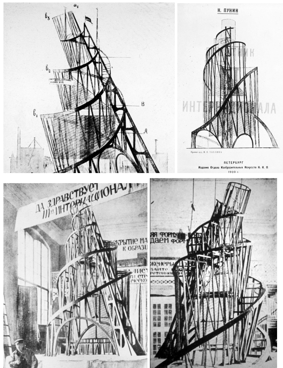
Monument to the Third International project, 1920 (Moscow) — Vladimir Tatlin
Most ambitious project of the period — attempts to create a completely non-representational, abstract monument; breaks free from all historical or figurative tradition.
Russian Constructivism: the Communist Revolution (1917) was expected to produce a new architecture aligned with industrial technology and collective social purpose.
An abstract asymmetrical spiral in iron, taller than the Eiffel Tower — inside, different volumes (cube, pyramid, cylinder) rotate at different speeds: one per year, per month, per day — a giant abstract calendar and clock.
Never built — the post-Revolution economy was in tatters; Tatlin built a large model on a wheeled wagon to demonstrate the concept.
Key characteristics of Constructivism: industrial materials, engineering aesthetics, social/political purpose, dynamic geometric forms — all present in one unbuilt vision.
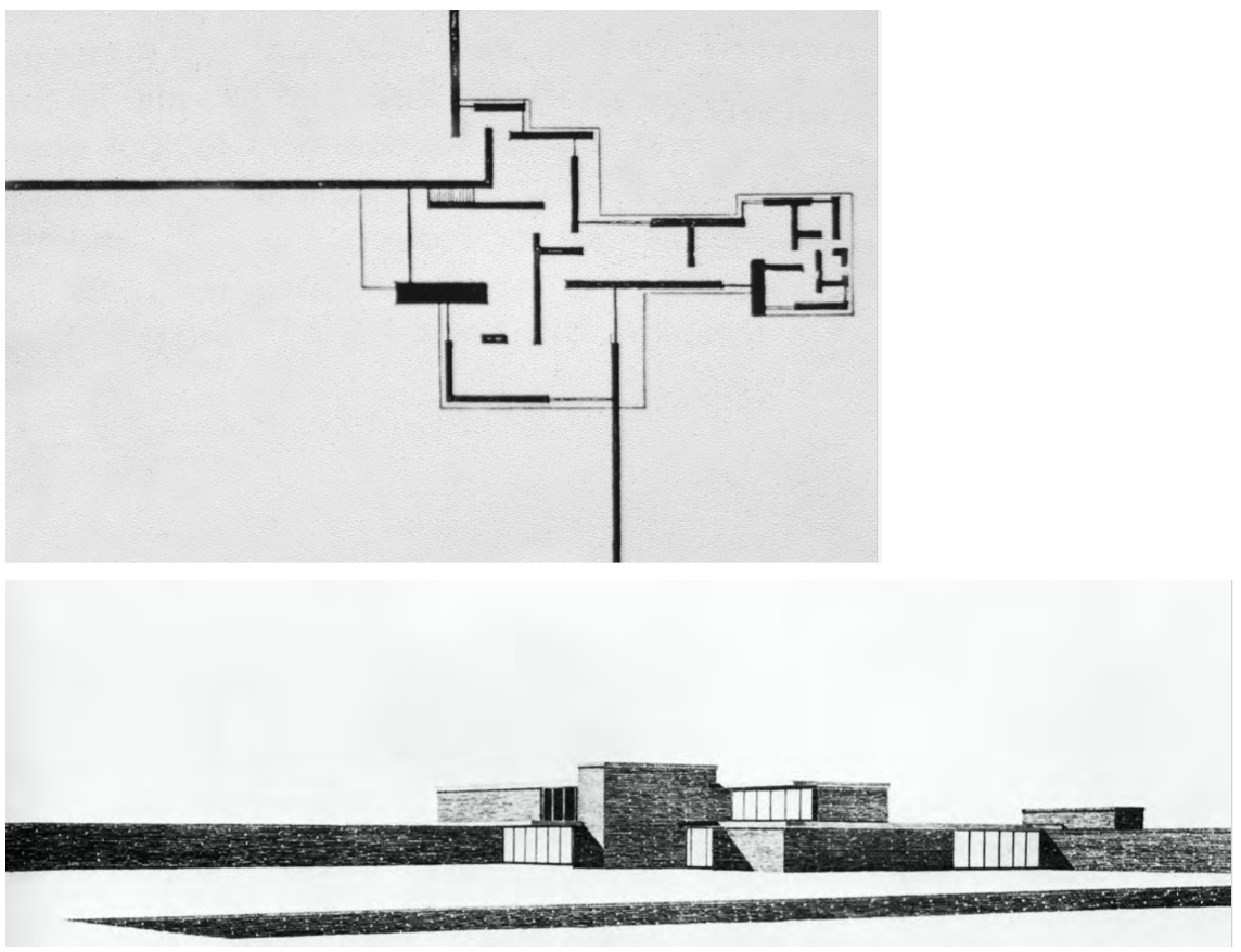
Brick Country House Project, 1924 — Ludwig Mies van der Rohe
Plan shows walls extending past the building edge into the landscape — walls as spatial directors, not room enclosures; the plan is pure spatial composition.
Draws directly on De Stijl but adds Mies's precision and material specificity (brick) — foundational for the Modern Movement's development of the free plan.
Unbuilt — more influential as a published plan than most built buildings; immediately recognized as a breakthrough in spatial thinking.
Step-by-step development of design clarity and structure: his unbuilt projects of the early 1920s are experiments that become the foundation for the Barcelona Pavilion.
Shows Mies's hard-edged objectivity: not willing to commit to Expressionist subjectivism, he pursues order, clarity, and structural logic from the start.
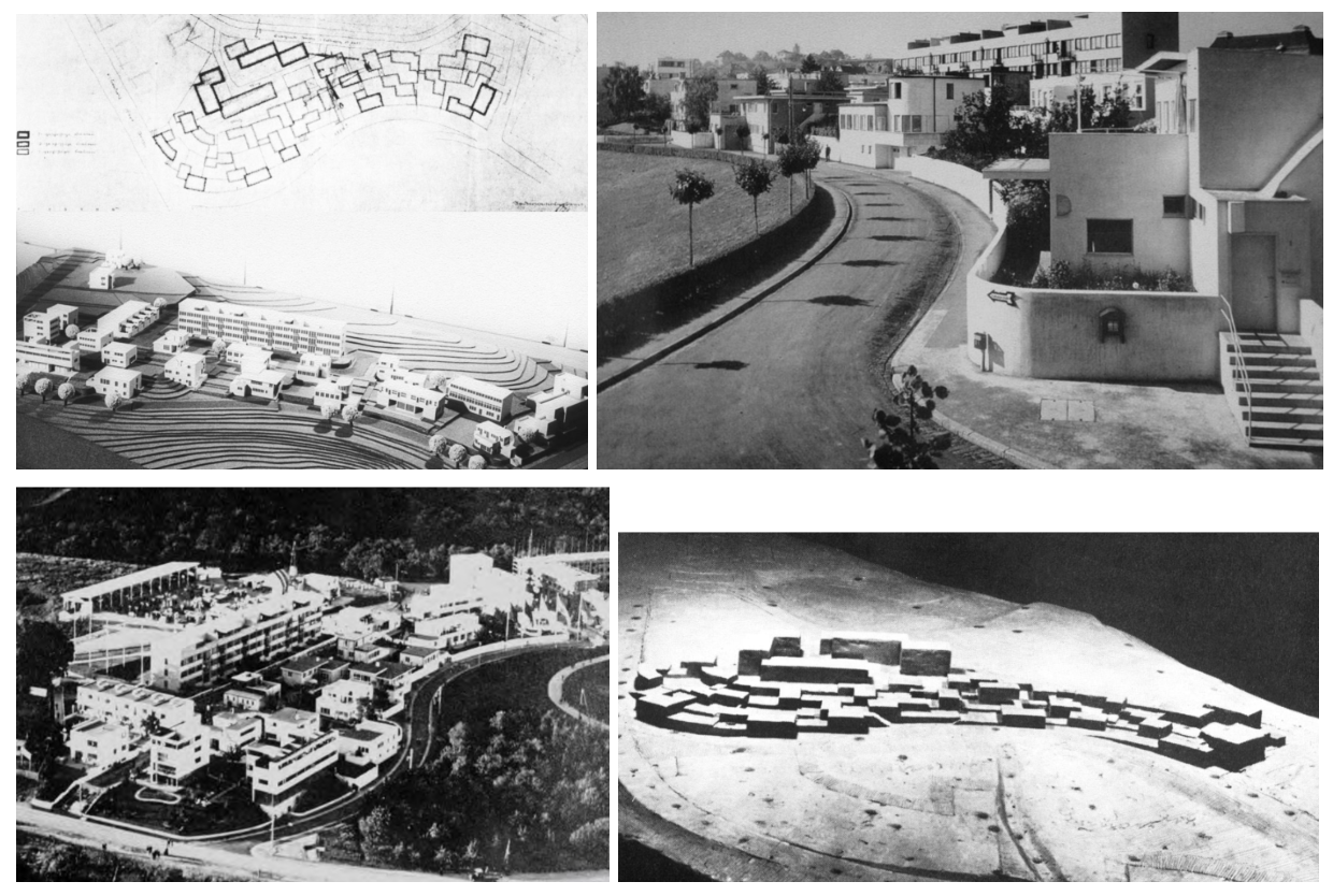
Weissenhof Housing Project, Stuttgart, Germany, 1925–27 — Ludwig Mies van der Rohe
First major collective demonstration of International Style principles — 17 architects including Le Corbusier, Gropius, Oud, Scharoun, Behrens, Bruno Taut.
Mies coordinated the project and imposed design standards: smooth white surfaces, flat roofs, horizontal windows, minimal ornament — buildings look similar because Mies managed them.
Opens as a housing exhibition so the public can see new directions in housing — sets the visual standard for what Modern architecture looks like to a broad audience.
Mies's own apartment block: frame structure with infill walls (walls carry no structural load), bands of windows on each floor, steel-frame windows.
Importance: defined the International Style as a collective movement and showed that Modern architecture could house ordinary people, not just wealthy clients.
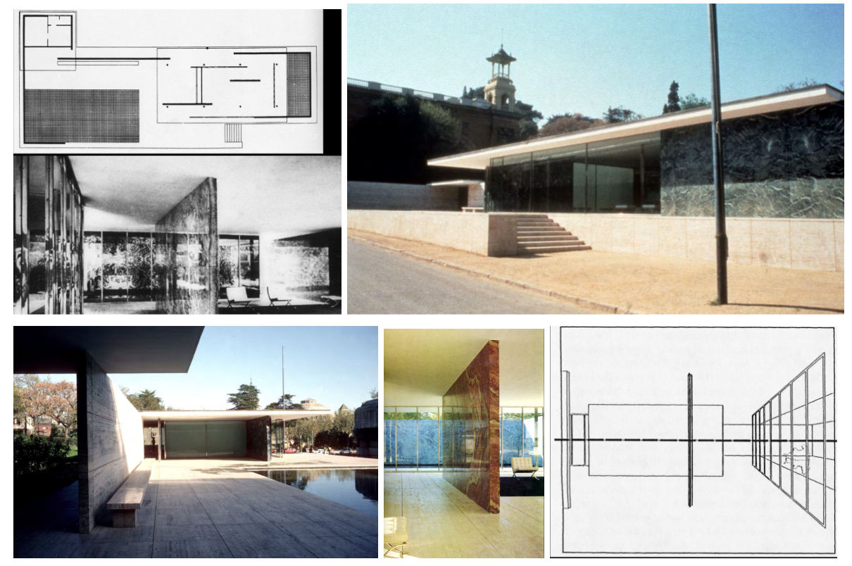
Barcelona Pavilion, Barcelona, Spain, 1929 — Ludwig Mies van der Rohe
Reception pavilion for the German nation at the Barcelona Exposition — almost no program; pure architecture built to be experienced.
8 cruciform chrome-coated steel columns carry the roof; walls of marble, tinted green glass, and onyx float freely — the ultimate demonstration of the free plan.
Materials are luxurious without being historical: travertine floor, Roman marble walls, black glass-lined pool, chrome columns — richness through material quality, not ornament.
Horizontal center line aligned at average male height — Mies's alleged attempt to give the space an anti-gravity feeling: floor and ceiling as equivalent planes; the space feels weightless.
Demolished when Nazis came to power; reconstructed 1986 because its influence was so immense — one of the only buildings rebuilt because the world needed it back as a reference.
Tugendhat House, Brno (Czechoslovakia), 1928–30 — Ludwig Mies van der Rohe
Enter from street side (upper level) — plain and private; main drama is the glass wall on the garden side below: all about orientation and how you pass through the house.
Chrome cruciform columns are the sole interior structural support throughout — all walls are completely free to shape space, dividing the living room from the study with a curved onyx partition.
Glass wall on garden side descends into a slot in the floor — the entire glass panel slides down, fully opening the room to the garden; no screen at all.
All furniture designed by Mies — chrome-coated steel; the interior is as carefully controlled as the architecture.
Most expensive house of its era — pushing material and technical boundaries simultaneously; gone through restoration but essentially the same design.
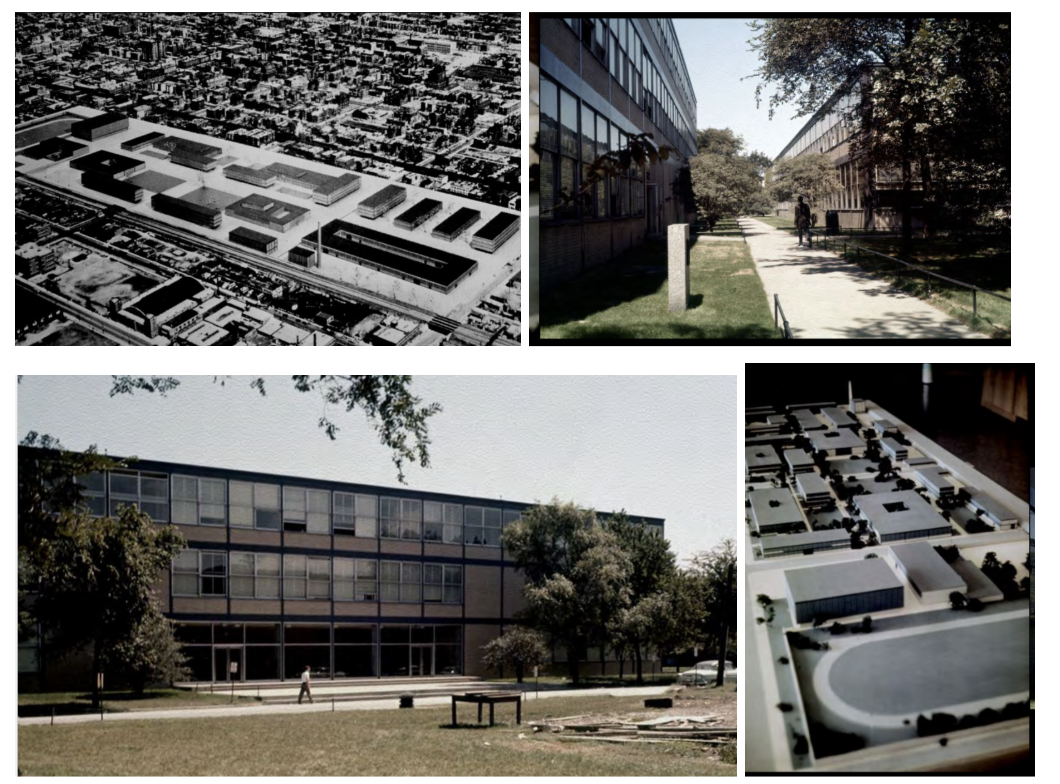
IIT (Illinois Institute of Technology), Chicago IL, 1939–55 — Ludwig Mies van der Rohe
Mies put in charge of the architecture program and commissioned to redesign the entire campus — unprecedented control over a complete urban environment.
Consistent palette across all campus buildings: steel painted black, pale yellow brick, and glass; rectilinear grids carry the design logic from building to building.
Chicago fire code required structural steel to be fireproofed in concrete — the visible 'columns' are brick-clad; the actual steel is hidden inside. Ironic for Mies's program of structural honesty.
Affirms: 'God is in the details' and 'The problem with the 1920s was freedom; the problem now is order' — from open experimentation to disciplined refinement.
Became the model for post-war American architecture school campuses: rectilinear, consistent material palette, architecture expressed through structural order.
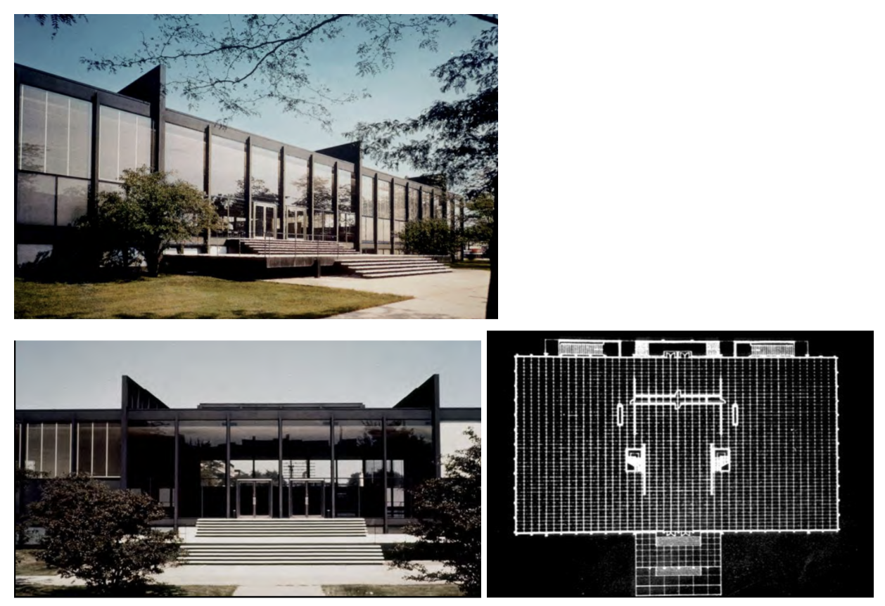
Crown Hall, 1953–56 — Ludwig Mies van der Rohe
Largest building on the IIT campus — the architecture school; a simple steel-and-glass pavilion.
Column-free open floor: steel structure is on the exterior, basement holds all services and mechanical systems so the main floor is completely open.
You can see straight through the glass exterior from one side to the other — pure transparent volume; maximum openness for a studio environment.
Mies makes grand architecture by focusing on a few carefully refined details and delegating all complexity to the basement — simplicity above, infrastructure below.
Embodies his idea that the architecture school should be an open, undivided studio — the spatial ideology of the building mirrors the educational philosophy.
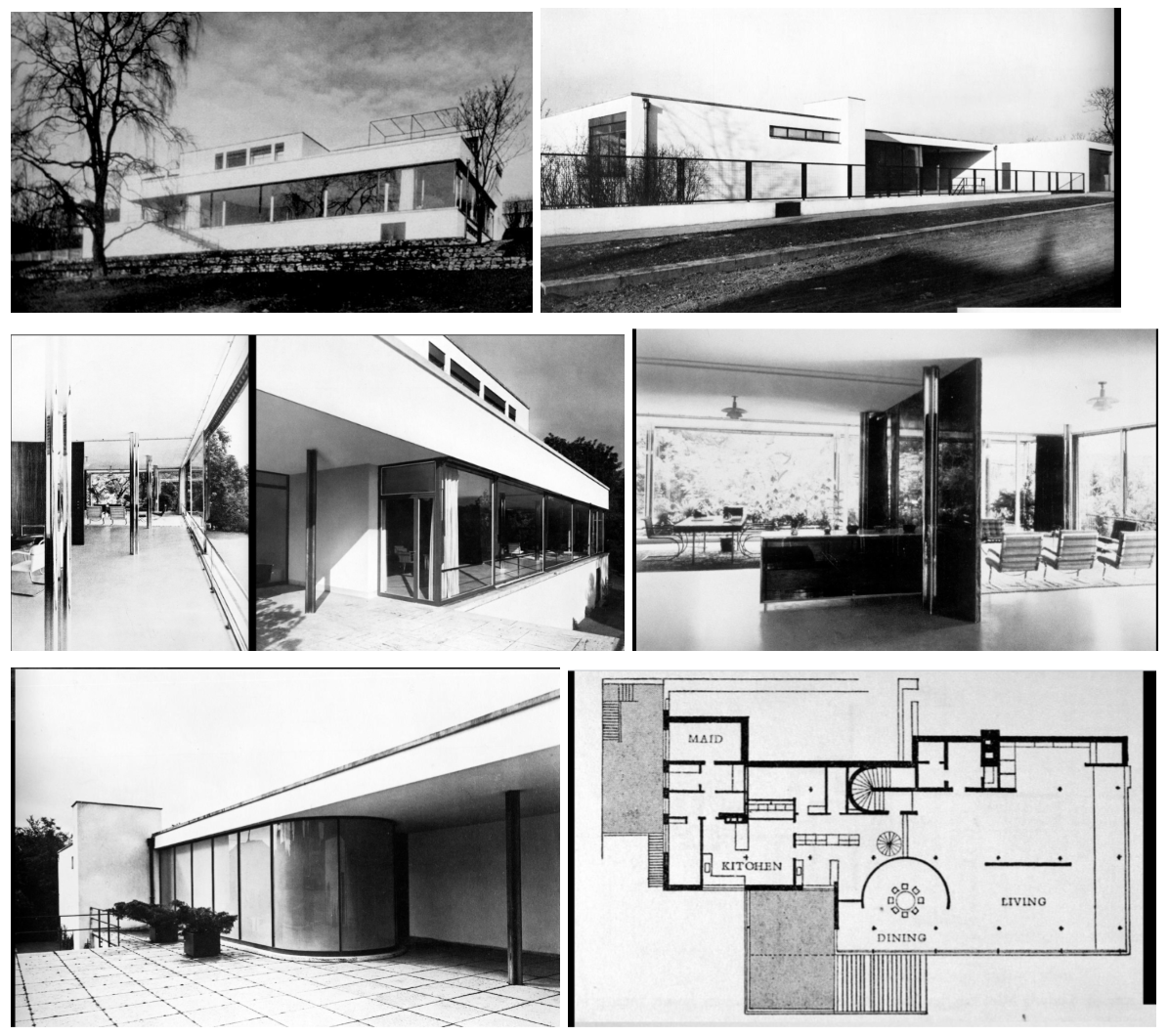
Farnsworth House, Plano IL, 1946–50 — Ludwig Mies van der Rohe
Single rectilinear glass volume sitting in a field — 8 cruciform steel columns support the roof and floor slabs; building floats above the ground on pilotis.
Almost entirely glass enclosure: maximum transparency, minimum enclosure; central core holds two bathrooms, kitchen, and mechanical — everything else is open.
All water, electrical, and mechanical runs through the space beneath the floor slab — infrastructure hidden below, pure space above.
A failure as a house — overheated in summer, no visual privacy, very difficult to live in — but architecturally it is the most radical house ever built; now a National Trust property requiring reservations.
Skin and bone construction taken to its absolute limit — the ideal of the free plan and glass enclosure fully realized at the expense of practical livability.
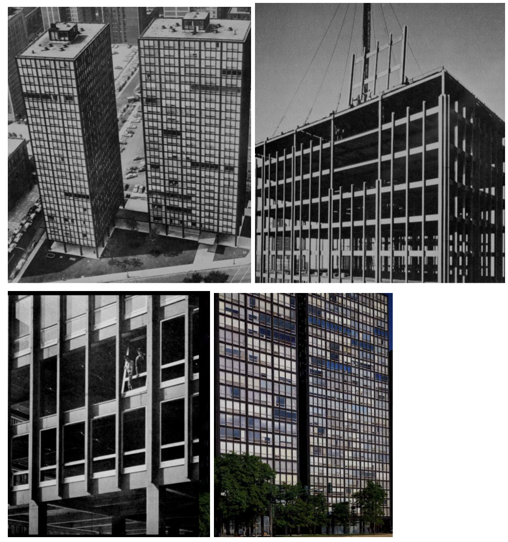
860 Lake Shore Drive [apartments], Chicago IL, 1949–51 — Ludwig Mies van der Rohe
Two identical glass apartment towers — elementarist composition on the Chicago skyline.
Aluminum windows and steel I-beams welded to the exterior: industrialized components read as the expression of construction and its process; the I-beam as symbol of the industrial age.
Repetitive modular bays — standardization and order as the architectural ideal; each unit is a standard element that makes an ordered building.
Set the visual template for the postwar glass apartment tower worldwide — every residential glass tower from 1960 onward responded to or reacted against this.
Developer originally resisted the style; believed no one would accept it — shows how new the glass tower aesthetic still was at mid-century.
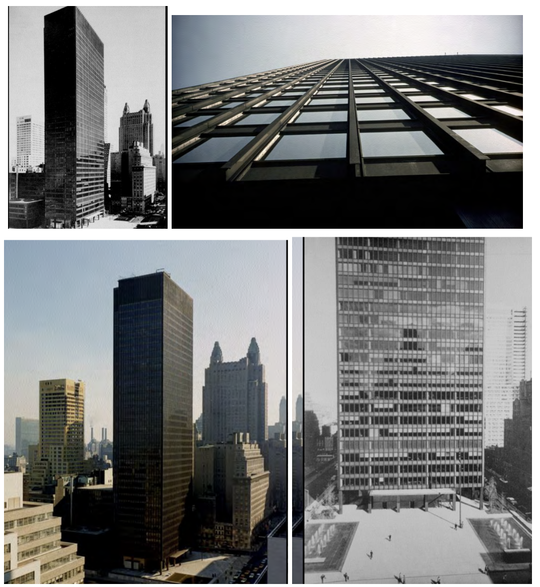
Seagram Building, New York NY, 1954–58 — Ludwig Mies van der Rohe
First skyscraper to voluntarily set back from the street to create a public plaza — giving up rentable land for urban space; unprecedented in commercial development.
Continuous bronze-tinted glass curtain wall rises straight from the plaza with no setbacks — the ultimate 'skin and bone'; you can read the columns through the curtain windows.
Bronze I-beams welded to the exterior are structurally unnecessary (actual structure is fireproofed inside) — an aesthetic expression of structure, not literal structural honesty.
Set the visual standard for postwar corporate architecture worldwide — every glass office tower from 1960–1990 responded to or reacted against this building.
Symbolized American corporate power, efficiency, and technological confidence — the International Style becomes the official language of postwar capitalism.
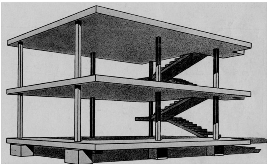
"Maison Dom-Ino" project, 1914 — Le Corbusier
NOT a real house — a conceptual structural diagram: flat concrete slabs carried by slim columns with a staircase at the side; walls carry no load whatsoever.
Name: 'Dom' (domus = house) + 'ino' (dots where columns are, like domino tiles); developed while Switzerland was neutral and Europe destroyed itself in WWI.
Why important: liberates the plan entirely — walls can go anywhere, or be removed; Le Corbusier spent his entire career exploring what could be done with this structural idea.
Generator of the Five Points — the Dom-Ino diagram makes the free plan, free facade, pilotis, and roof garden all possible in one structural move.
Allowed flexible placement of walls and standardized housing production — mass-producible structural system with infinitely variable interiors.
Villa Stein, Garches, France, 1927–28 — Le Corbusier
Front and rear facades completely free of columns — facades are hung on the structure, not structural themselves; horizontal ribbon windows run continuously.
Column grid varies (A-B-A-B rhythm): narrow bays for service, wide bays for living — this idea of pairing service and served bays became popular in laboratory buildings globally.
Flat roof turned into usable terrace — building takes its ground footprint and gives it back to the sky; one of the Five Points demonstrated.
Le Corbusier is very interested in the vertical (double-height spaces, tall outdoor terraces) — a key distinction from Mies who emphasizes the horizontal.
One of the first uses of a structural grid to organize diverse programs; facade is free of columns on both front and back — five-point principles clearly demonstrated.
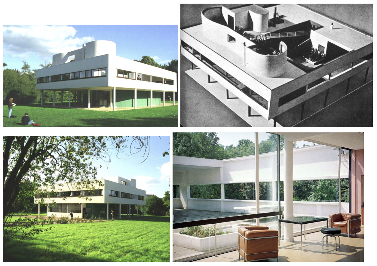
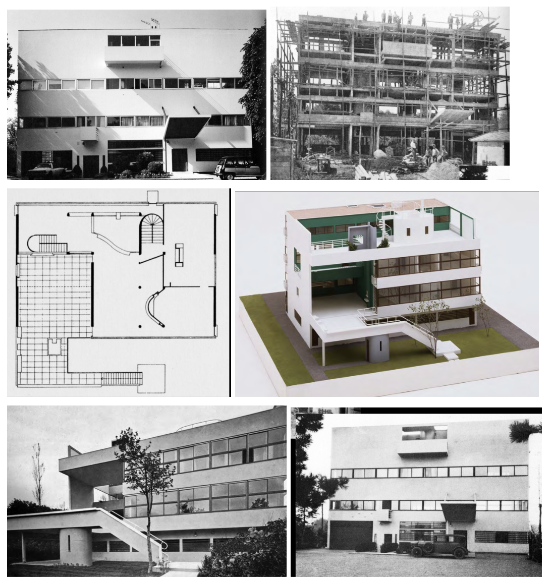
Villa Savoye, Poissy (near Paris), 1929–30 — Le Corbusier
Purest demonstration of all Five Points: (1) pilotis, (2) free plan, (3) free facade, (4) horizontal ribbon windows, (5) roof garden — the canonical example.
'Object in a field': elevated white box sits in landscape like a free-standing Greek temple — autonomous, not contextual; emphasizes the building as independent object.
Promenade architecturale: the ramp is the spine of the house, leading from garage through main floor to roof terrace — Le Corbusier choreographed the space; movement IS the experience.
Failed practically — leaked, poor roof construction, turned into a barn during the German occupation, damaged in WWII — but succeeded theoretically; restored and now canonical.
From the roof terrace you look back and see the ramp that brought you up — the whole journey is visible; the building makes its own spatial narrative legible.
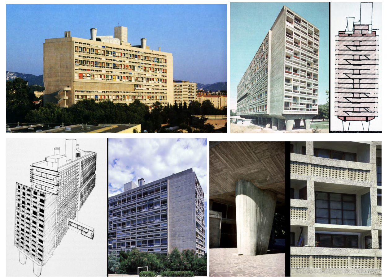
Unité d'Habitation, Marseilles, France, 1947–52 — Le Corbusier
'Vertical city': 337 apartments plus shops, hotel, gym, and rooftop nursery and running track — a complete urban neighborhood stacked in one slab.
Béton brut — raw board-formed concrete left exposed as the finish; the board marks and rough texture become the aesthetic: this is the origin of Brutalism.
Interlocking duplex apartments accessed by internal 'streets' every three floors — the bottle-rack section; units interlock like bottles in a rack for efficient stacking.
Raised on massive concrete piers (pilotis) — ground plane flows freely beneath as communal landscape; Five Points applied at urban housing scale.
Most copied and most criticized postwar housing model — source of both the best and worst mass housing projects built globally in the following decades.
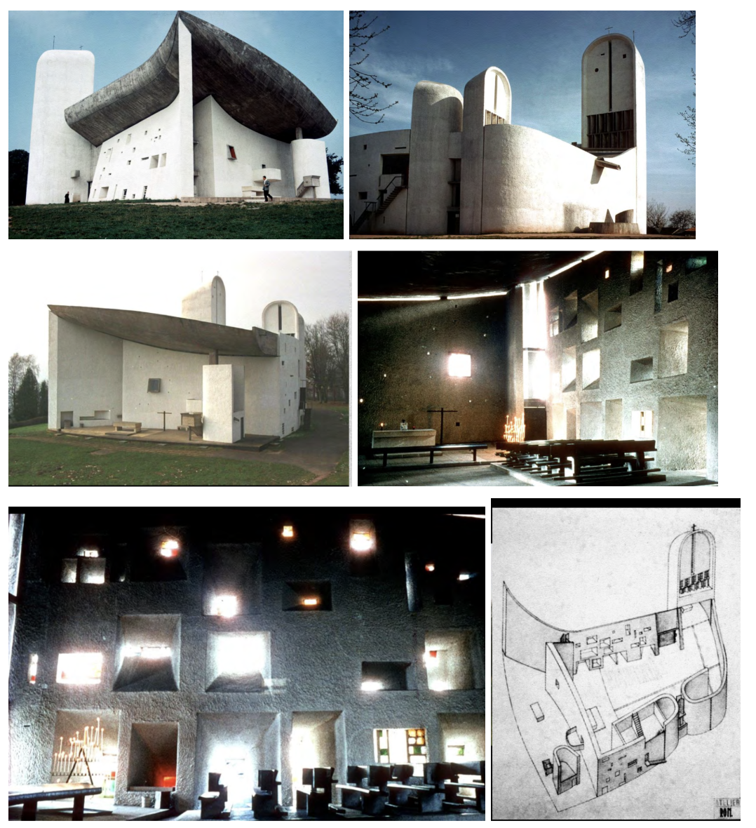
Notre Dame du Haut (chapel), Ronchamp, France, 1950–55 — Le Corbusier
Radical departure from his own rational modernism — a pilgrimage chapel of pure sculptural form; work of pure intuition rather than rational system.
Thick curved concrete walls with deep-splayed window openings of varying sizes — light enters as colored shafts that change through the day; light is the primary architectural material.
Roof form inspired by a crab shell Le Corbusier collected — expressive, not geometric logic; walls have texture, thickness, and depth unlike his earlier white rational surfaces.
Directly challenged CIAM's rational orthodoxy and opened architecture to phenomenological, sensory, and spiritual concerns that would define the 1960s and 70s.
Inspired the generation of Kahn, Utzon, and Scharoun — the postwar search for 'meaning' in architecture begins with this building's break from the rational Modern canon.
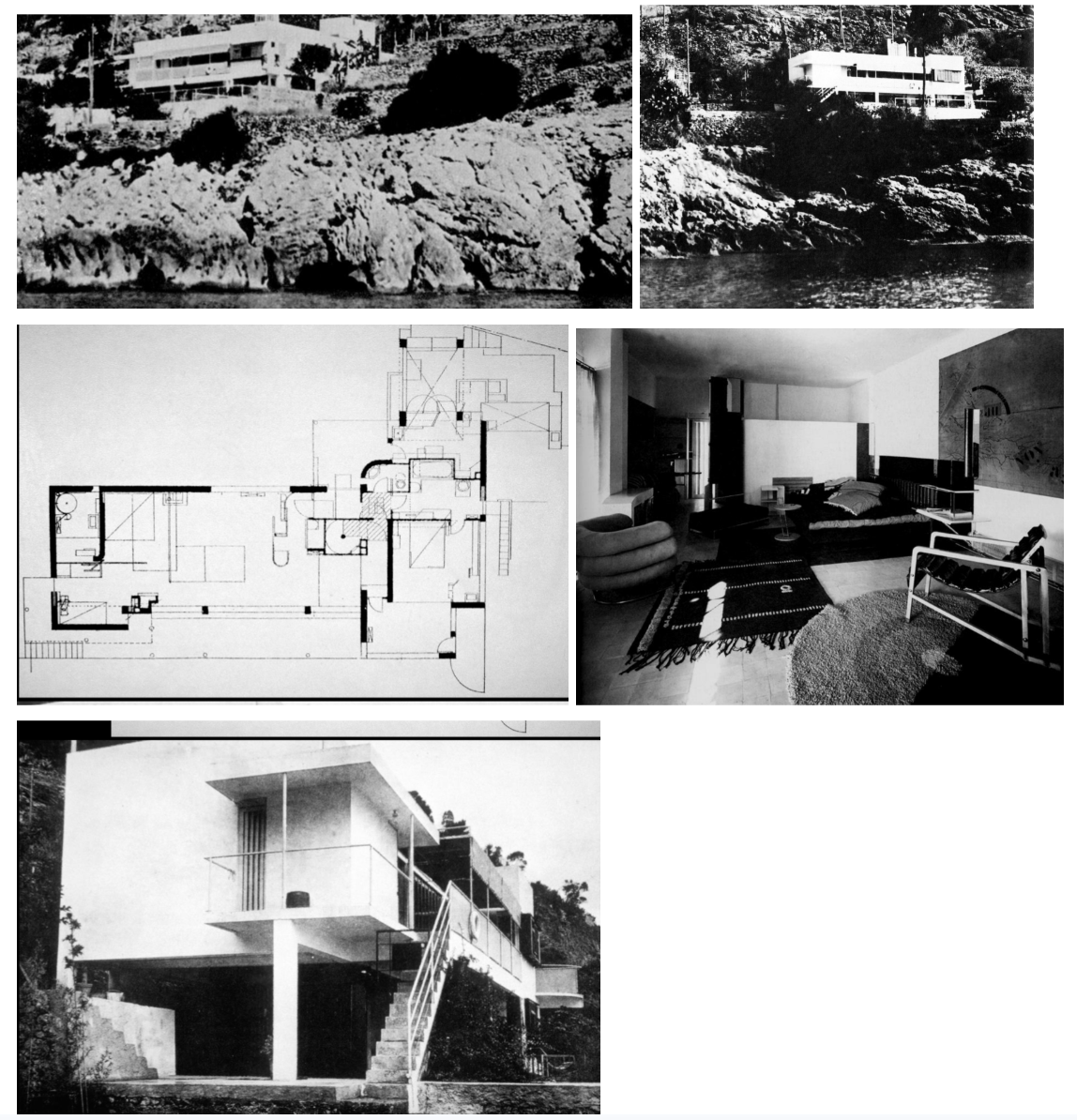
E-1027 (Badovici House), Roquebrune, France, 1926–29 — Eileen Gray
Abstract name: E = Eileen, 10 = J (Jean Badovici), 2 = B, 7 = G — witty, independent, and deliberately non-monumental.
White concrete box on rocky Mediterranean landscape — objectif: the contrast of rough rock and smooth white concrete makes the building read as a pure object placed in nature.
All furniture and textiles designed by Gray — fully integrated interior environment; shows the same total-design ambition as Horta but in a Modern vocabulary.
Cantilevered elements, floating in space; living room at center, private bedrooms to one side — functionally clear and spatially generous.
Significant building — shows that other architects (including women) were catching on to the Modern vocabulary independently; Gray is an important figure often overlooked in the standard narrative.
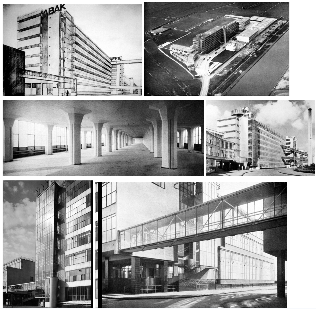
Van Nelle Factory, Rotterdam, Netherlands, 1927 —
Brinckman and Van der Vlugt (w/ Mart Stam)
Tobacco factory — one of the only buildings using vocabulary as ambitious as the Bauhaus at this moment; a true metal-and-glass curtain wall at urban scale.
Concrete frame with mushroom columns spreading the load for heavy machinery floors — thin curtain walls of metal and glass are possible because the structure is entirely internal.
Diagonal conveyor belt bridges link volumes — industrial movement made architectural; the building shows how its technology actually works.
Horizontal layers, vertical elements, sweeping curve — a celebration of glass, metal, and industrial technology; shows what these materials can really do.
Electric lighting throughout — demonstrates that modern manufacturing no longer depends on exterior windows for illumination; the factory is a fully artificial environment of light and glass.
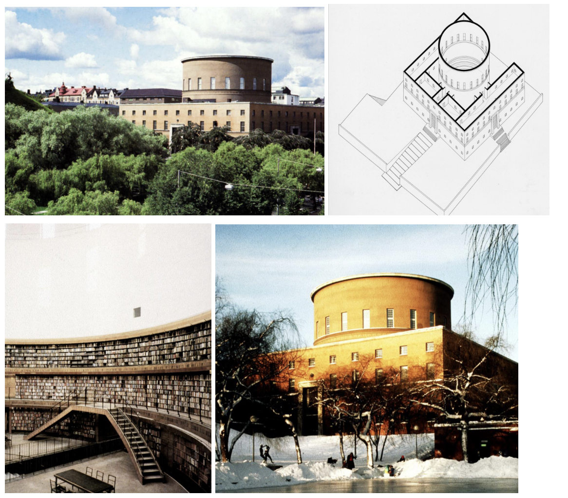
Stockholm Public Library, Stockholm, Sweden, 1920–28 —
Asplund began as a neoclassicist and transitions to modernism — this building is about two-thirds of the way through that transition; crisp geometry with residual classical elements.
U-shaped plan wrapped around a central cylindrical drum (the main reading room) — geometrical simplicity but still bilaterally symmetrical; a foot in two worlds.
Interior: cylindrical wall of bookshelves rising to clerestory windows wrapping all the way around — a noble, rational civic space lit from above.
Brick exterior with steel and concrete structure inside; a little trim around the door, red brick steps — simplified classical features, abstracted but not fully abandoned.
Shows how an architect can draw from the past and create a completely new design poised on the verge of modernism, but not completely there — a useful transitional example.
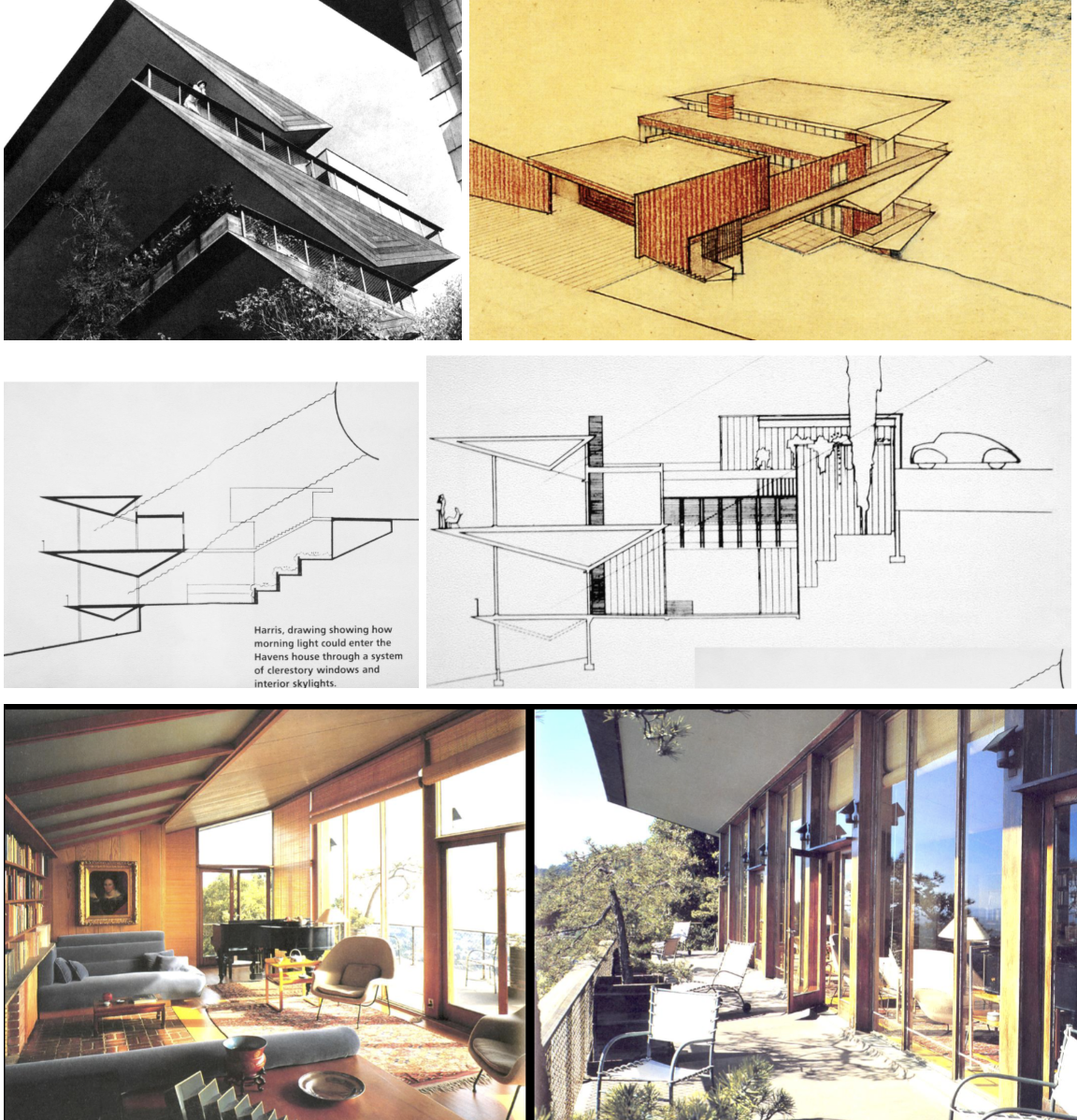
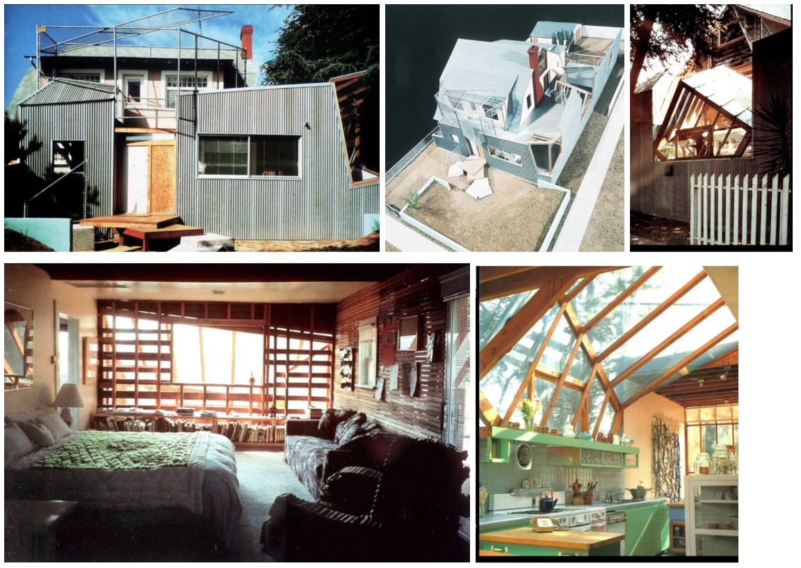
Weston Havens House, Berkeley CA, 1939–41 — Harwell Hamilton Harris
Regional modernism in redwood — Modern principles (floating planes, asymmetrical composition, open plan) applied using local California material that ages naturally.
From the street the house looks nondescript and hidden — not about showing off to passersby; oriented inward toward a private garden with dramatic views outward.
Sectional diagram shows three triangular abstract forms; continuous glass on garden side: interior and exterior flow as one continuous space.
Light manipulation from two sides; landscape grows up around the building — the house sits comfortably in its site rather than imposing on it.
Materials in this case: redwood accepts aging naturally, supposed to be ageless — regional modernism means accepting that materials do age and responding appropriately to place.
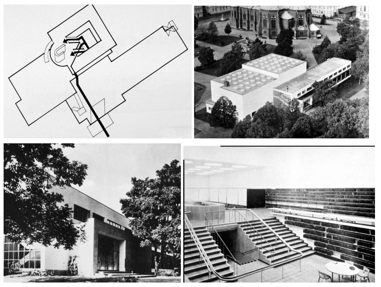
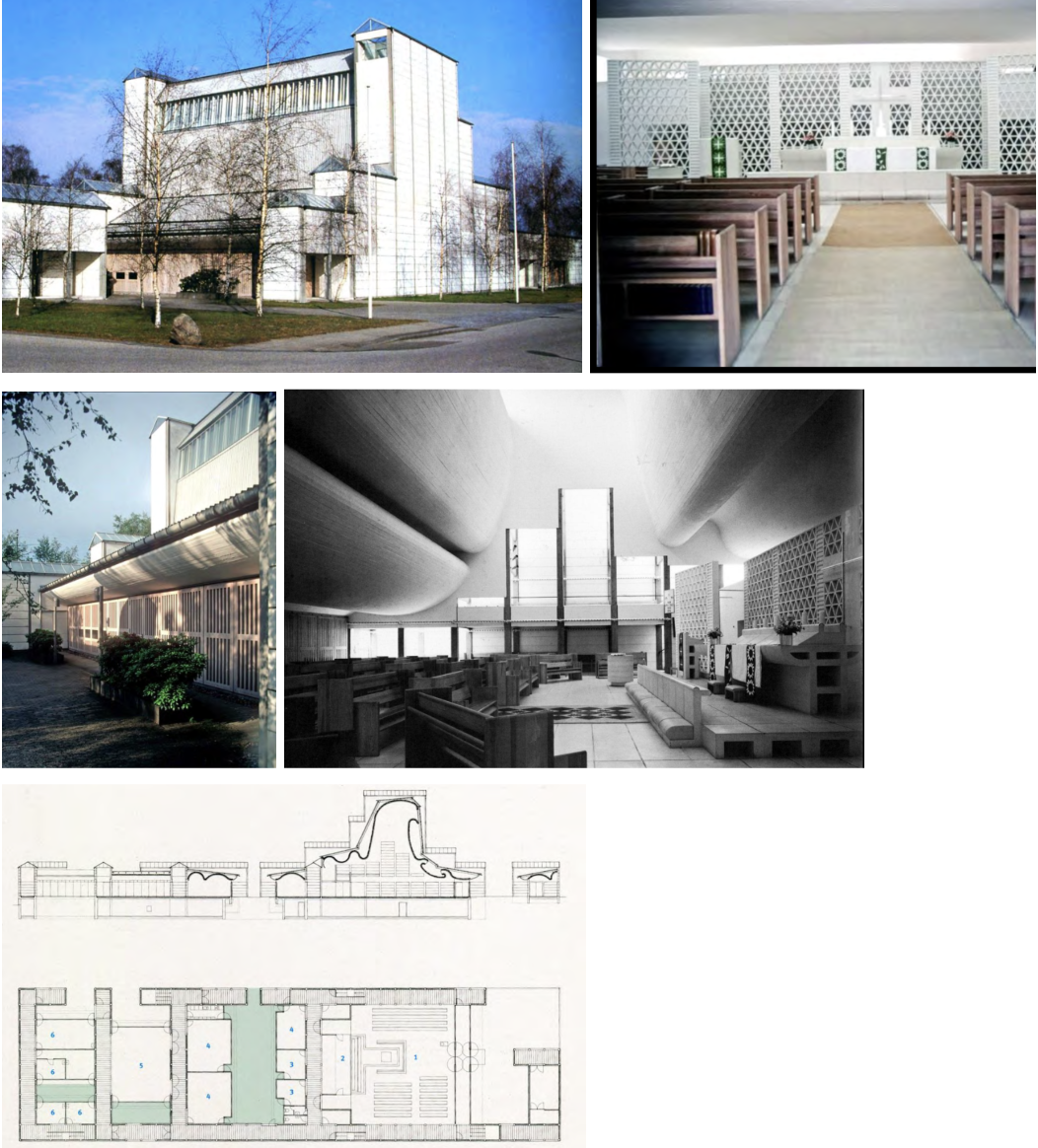
Library, Viipuri, Finland, 1927–35 — Alvar Aalto
Circular skylights distribute even, glareless reading light — designed by calculating light angles to prevent glare on book pages; humanist attention to the act of reading.
Used a mountain-range sketch as a design metaphor for the plan and section — 'We don't build metaphors, we build buildings for human use'; the metaphor guides without dictating.
Lecture hall with undulating wood ceiling — acoustically excellent; timber is warm and improves sound quality; a warm material appropriate to Finland.
Juxtaposition of library volume and auditorium volume — elementarist composition; not understandable from a single point of view.
Aalto's hallmark humanist modernism: he always asks what the human being actually needs in this space, then designs for that specific human function.
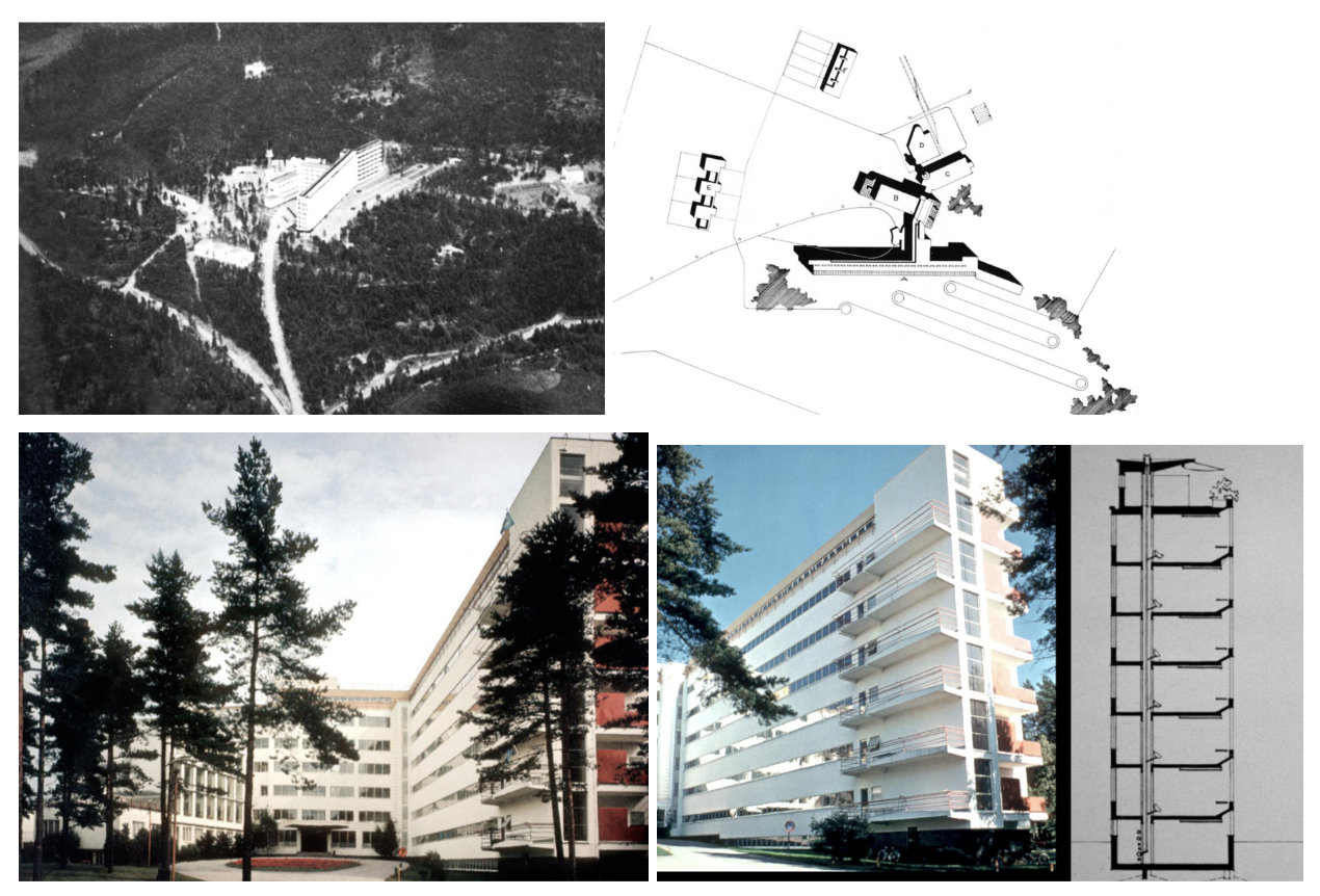
[Tuberculosis] Sanatorium, Paimio, Finland, 1928–33 — Alvar Aalto
Elementarist composition: each wing has one specific function — (A) patient rooms face sunlight, (B) dining room like a greenhouse, (D) medical exam rooms; the massing tells you what is inside.
Patient room ceilings painted light blue like the sky — deliberate; for patients lying in bed staring up at the ceiling all day, the ceiling color is their primary visual environment.
Sink redesigned so water hits the back of the basin rather than the bottom — quieter for other patients; Aalto went to a hospital, experienced it as a patient, then redesigned based on that experience.
Dining room designed like a greenhouse with flowers — patients in Finnish winter can still be surrounded by living, growing things; humanist design at the level of the smallest detail.
Balconies float in space for sunbathing — tuberculosis patients were believed to recover through sunlight and fresh air; the architecture directly supports the medical treatment.
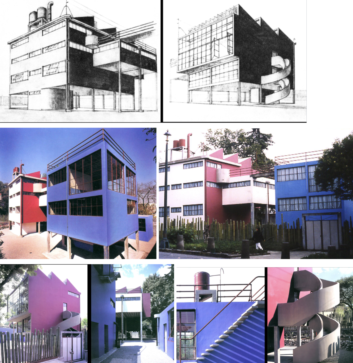
Rivera-Kahlo Residences/Studios, Mexico City, Mexico, 1929–30 — Juan O'Gorman
O'Gorman read Le Corbusier in Spanish translation and filtered the Five Points through Mexican vernacular culture — vivid folk colors (red and blue), cacti as fence.
Roof decks, clerestory windows, spiral stair, large glass areas, cast-in-place concrete — Le Corbusier's vocabulary fully present but expressed in Mexican terms.
Colors are intense: the rich blues and reds typical of Mexican small towns; cacti integrate specifically Mexican vegetation as the boundary of the site.
When Diego Rivera and Frida Kahlo lived in these houses they filled them with folk art, colonial artifacts, and the art of other modern artists — Modern is the setting for Mexican artworks and emerging ideas.
Architecture using modern circumstances and adapting it to the region — one of the clearest examples of regional modernism.
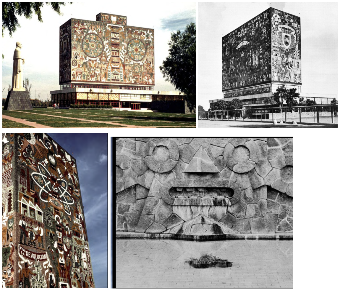
University Library, University City, Mexico City, 1950–53 — Juan O'Gorman with Gustavo Saavedra and Juan Martinez de Velasco
Post-war: National Autonomous University of Mexico — first and largest university in Latin America; the library is a major cultural statement.
Big concrete volume with almost no windows — books protected from sunlight; surfaces covered entirely in mosaic murals depicting Mexico's past and future, meant to inspire.
Juxtaposition of the tall book-storage tower and low horizontal reading volume — idea of juxtaposing two distinct elements goes back to elementarism.
Modern but also Mexican: celebration of the Revolution, science, and indigenous culture — sculptural elements reflective of Mexico's pre-Spanish past.
Most extreme example of regional modernism: Modern structure (concrete frame, pilotis, flat roofs) + Mexican cultural expression (mosaic iconography at building scale).
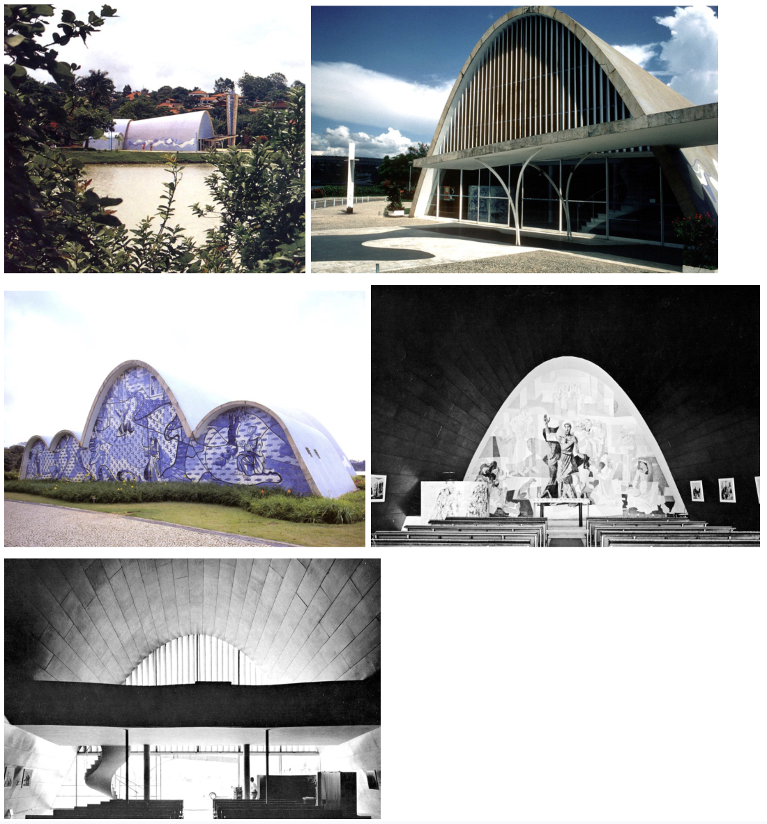
Church of St. Francis of Assisi, Pampulha, Minas Gerais, Brazil, 1943 — Oscar Niemeyer
Parabolic concrete shells — a geometry only possible in concrete; an entirely new form for a church building that draws on the Brazilian baroque tradition of expressive, curvilinear form.
Has all the elements of a traditional Roman Catholic church (nave, bell tower, sacristy, robing room) but expressed in purely modern sculptural forms.
Exterior mosaic mural by artist Portinari — mosaic tile, not paint; integration of fine arts into modern architecture at building scale.
Niemeyer responds to Brazilian culture: baroque tradition, sensuality, curving forms, the joy of structural virtuosity — almost feels he is showing off what you can do with concrete.
Shows Modernism adapting to Brazilian cultural sensibility — parabolic forms impossible in any other material; concrete becomes the vehicle for national cultural expression.
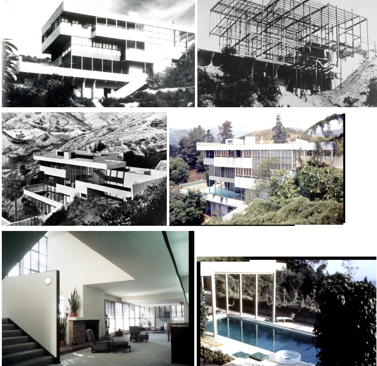
Lovell House, Los Angeles CA, 1928, — Richard Neutra
Philip Lovell: radio health influencer who wanted a house embodying 'healthy living' — smooth surfaces to not collect dust, swimming pool for exercise, open air.
Steel-frame house — remarkable for the late 1920s in America; shows how fast European modernist ideas were spreading across the world.
Three levels with concrete trays, stucco cladding, large glass areas — all elements of European modernism adapted to the California climate and hillside site.
Swimming pool at the lowest level — healthy exercise integrated into the architecture; stucco curves at top of plaster surfaces to minimize dust-collecting corners.
Comparable to Fallingwater in its cantilevered horizontal trays — Neutra's house came first; clear that Wright had seen Neutra's ideas when he designed Fallingwater.

Philadelphia Savings Fund Society Building, Philadelphia, 1931–32 — Howe & Lescaze
First modern skyscraper in Philadelphia — all modern movements adapted to the skyscraper type; a multi-part building with very strong functional clarity.
Curved corner banking lobby at base (huge glass volume); office tower rises above with the structural frame expressed on the exterior — each part tells you what it does.
Strong expression of verticality: 'tall building should look tall' — structure highlights the tallness; cantilever construction makes the tower read as a continuous vertical element.
Elevators and services have their own clearly expressed shaft — an early example of what Kahn would later formalize as served and servant spaces.
George Howe converted from designing homes for the wealthy to the Modern Movement — shows the penetration of Modernism into mainstream American professional practice.
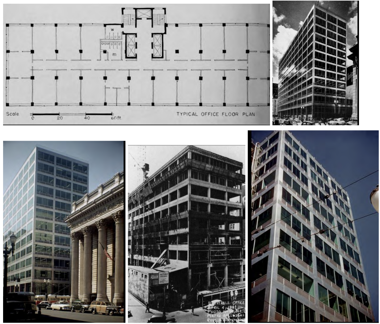
Equitable Building, Portland OR, 1944–47 — Pietro Belluschi
First modern office building in the US with a metal-and-glass exterior wall revealing a structural frame in rectangular form — a landmark in the American adoption of the International Style.
Aluminum cladding — available in the Pacific Northwest because of hydropower resources and wartime aircraft industries; a regional material used in a modern way.
Reinforced cast-in-place concrete structure; curtain wall of aluminum and glass; rectangular block and office program — pure functionalism.
Shows that regional material conditions (abundance of aluminum, Pacific Northwest climate) can inform and shape a modern building without compromising its modernity.
Belluschi demonstrates that the International Style could be adapted to specific American regional contexts — not just a transplant from Europe.
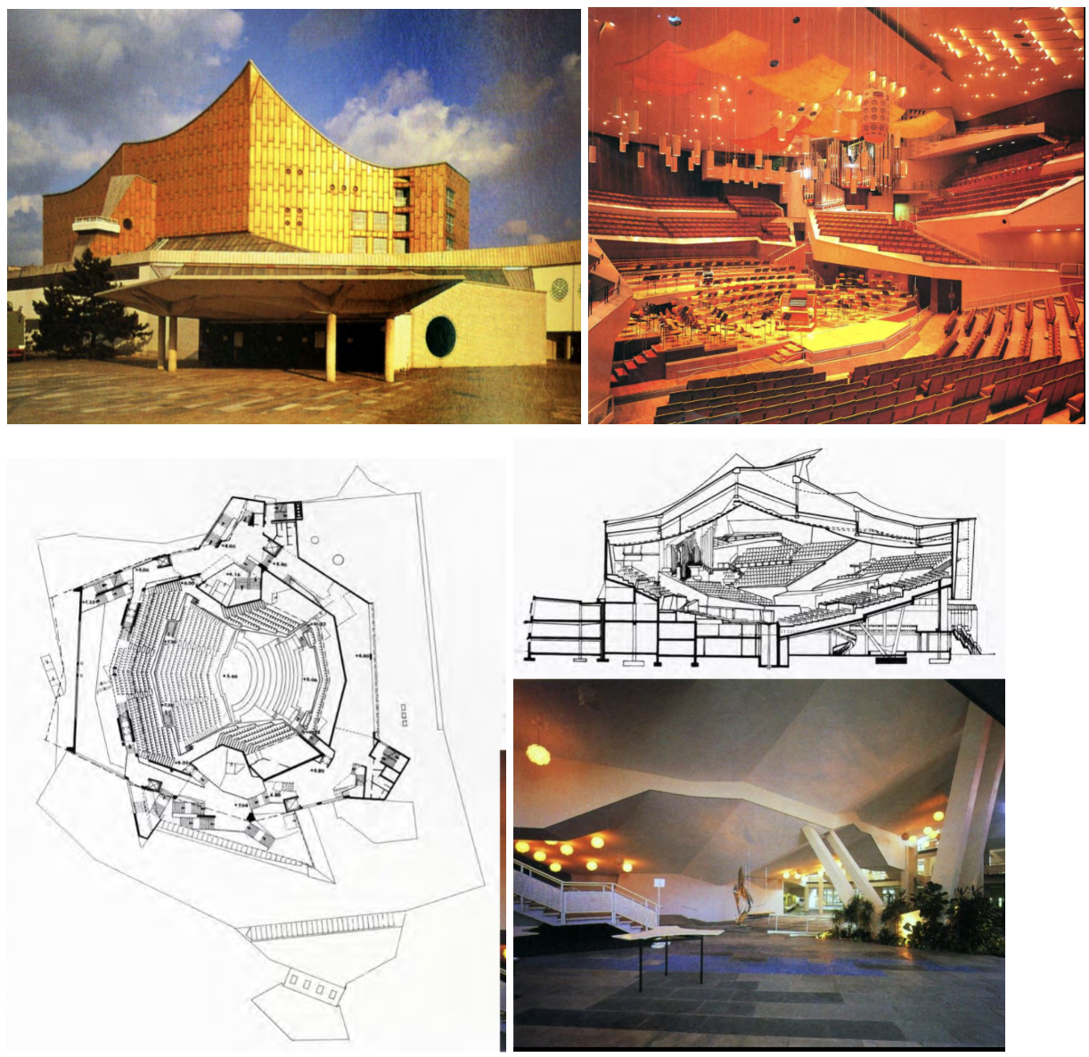
Berlin Philharmonie Concert Hall, Berlin, Germany, 1959–63 — Hans Scharoun
Orchestra at center; audience surrounds it in terraced 'vineyard' sections — radical break from the traditional proscenium concert hall; every seat has a direct sight line.
Dynamic sculptural exterior — irregular tent-like concrete form; the building is in West Berlin, meant to express the freedom of the West against East German authority.
Very powerful both politically and architecturally: the Philharmonie was a cultural statement as well as a building; so much creative work concentrated in one institution.
Acoustic quality was central to every spatial decision — post-war Expressionism demonstrates that Modernism need not be rectilinear; form can follow acoustic and democratic gathering needs.
The intimate relationship between orchestra and audience — no one is far from the music; the concert hall as a democratic gathering of equals rather than a hierarchical auditorium.
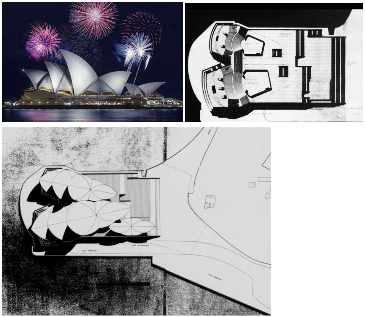
Sydney Opera House, Sydney, Australia, 1957–73 — Jørn Utzon
Shell roofs resolved geometrically by extracting all shapes from a single sphere — elegant structural logic that made an otherwise unbuildable form achievable; first major use of computer structural analysis.
Won the competition as a sketch — Philip Johnson championed it in the jury; built entirely differently from the original drawings.
Utzon resigned during construction due to client conflict — completed by others; raises fundamental questions of authorship, compromise, and the identity of a building.
Became a global symbol of Australia and Sydney — architecture constructing cultural national identity; arguably the most recognizable building of the 20th century.
Wrapped by water on three sides, approachable only from one — the siting and the shells together create an unmistakable silhouette that defines its city.
Bagsvaerd Church, Copenhagen, 1969–76 — Jørn Utzon
Plain white-glazed tile exterior — doesn't look like a church; modest and ordinary on the outside; the architecture withholds its drama until you are inside.
Interior: curved concrete ceiling vaults catch daylight from above and reflect it through the sanctuary — quality of light changes throughout the day; serenity through light, not imagery.
Light comes from above (skylights at the apex of the curves), reflects off curved concrete surfaces — spiritual quality achieved without windows in the traditional sense.
International structural logic (concrete shell construction) combined with local restraint (Danish simplicity, natural light, material honesty) — a serious alternative to American Postmodernism.
Section shows curved concrete clear-span elements creating extraordinary interior space invisible from the outside — the drama is all internal, reserved for those who enter.
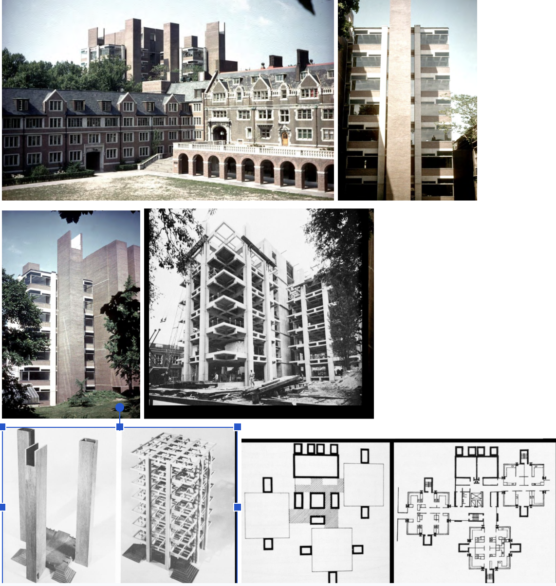
Richards Medical Labs, U. Penn., Philadelphia PA, 1957–64 — Louis I. Kahn
Served and servant spaces made physically visible in the massing: brick towers (servant: exhaust, stairs) flank open lab floors (served) — infrastructure as architecture.
Column-free lab floors — can't predict what scientists want to do; the served spaces are open planes that scientists can arrange as they like.
On a very tight site, squeezed between existing buildings — the vertical tower strategy solves the problem of fitting mechanical systems into a dense urban block.
Drew enormous attention as a new approach — no universal spaces; addresses real problems architects face in lab design: separating mechanical from usable floor area.
Windows were unshaded; direct light came right through — scientists put up aluminum foil; Kahn realized he needed to address natural light differently in later buildings.
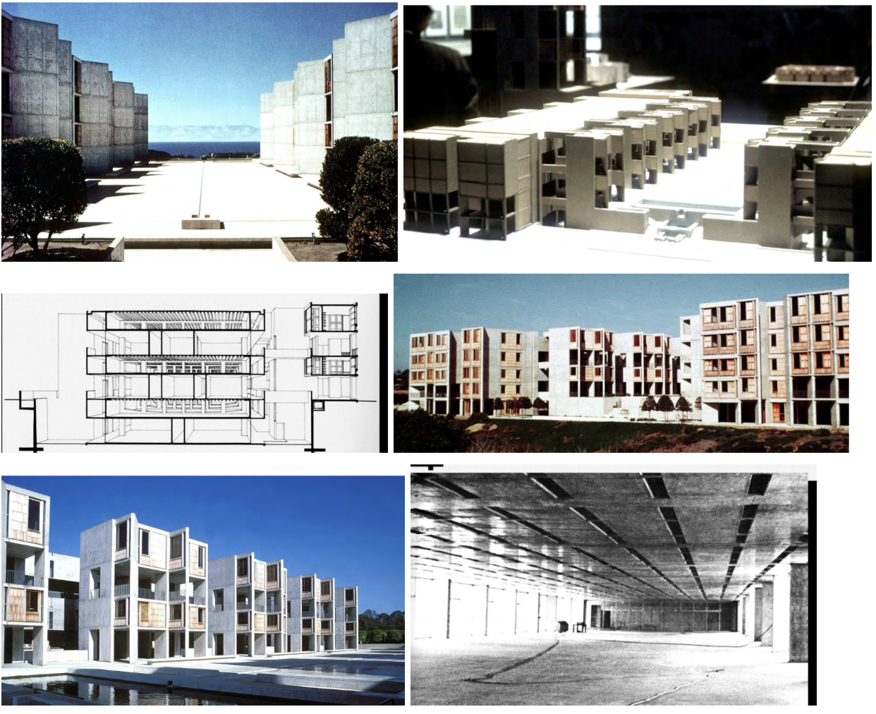
Salk Institute for Biological Studies, La Jolla CA, 1959–65 — Louis I. Kahn
Massive concrete service towers (servant) flank open lab floors (served) — interstitial floors between the labs carry all mechanical services, spanning with steel trusses; now a standard lab building strategy.
Study towers rotate to overlook the Pacific Ocean — individual intellectual life (solitary) expressed against the collective rhythm of the lab block (communal); Kahn wanted a space where Picasso would feel welcome.
Central court: travertine plaza with a thin water channel bisecting it toward the Pacific — one of the most powerful public spaces in American architecture.
Precise cast-in-place concrete with form ties that resist bulging — all joints between pours are planned and designed as a pattern; concrete as a material of the highest precision.
Vertical dimension of served and servant: offices are not on the same floor as labs but in towers above; interstitial mechanical floors in between — any pipes can be run without disturbing scientists.
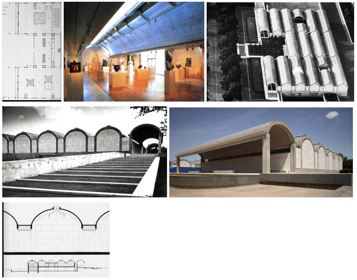
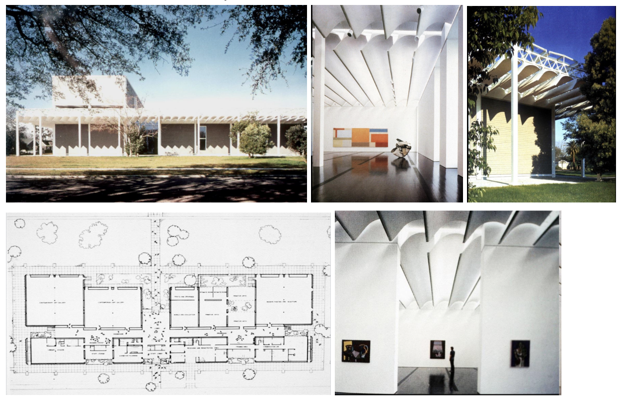
Kimbell Art Museum, Fort Worth TX, 1966–72 — Louis I. Kahn
Concrete cycloid vaults with a linear slot through the center — the keystone is left out so the vault works as a self-supported cantilever; natural light enters through this slot.
Silver aluminum reflector below the skylight slot diffuses daylight without direct sun on the art — harsh Texas sunlight solved through precise architectural form; light as the primary material.
Travertine where walls are non-structural, concrete for reinforced structural elements — you can read the order of the structure of the building from the materials.
Quality of craft and detail is world-class — has world-wide fame for the quality of its design, the use of natural light, and the precision of its construction.
Most art in the Kimbell is sculpture and not vulnerable to direct light — Kahn understood the collection and designed for it; architecture in service of the specific art it houses.
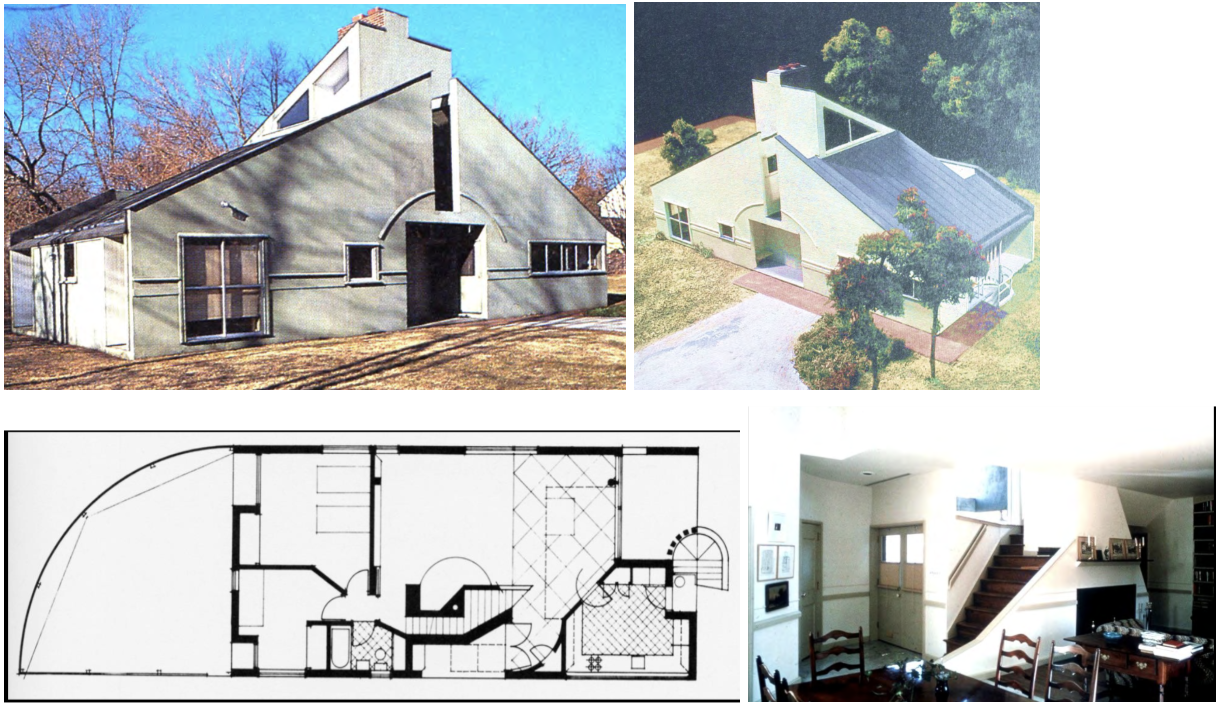
Vanna Venturi House, Chestnut Hill PA, 1962 — Venturi & Rauch
Founding work of Postmodern architecture — the split gable takes a conventional house form and deliberately violates it; takes the form of a gable and then splits it at the center.
Venturi's thesis (Complexity and Contradiction in Architecture, 1966): 'I prefer elements that are hybrid rather than pure… messy vitality over obvious unity.' Architecture should be complex, not reductive.
Off-the-shelf aluminum windows, plain brick, ordinary materials — making architecture out of things that are ordinary; parallel to Pop Art's use of commercial imagery.
Large decorative arch over the entry does nothing structurally — Modernism banned this; Venturi argues symbolism is a legitimate architectural value.
Built for his mother — characterizes it as a 'decorated shed': a building that uses applied signs and ornament to communicate, rather than a 'duck' where the whole form IS the symbol.
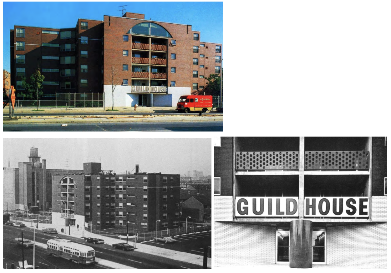
Guild House, Philadelphia PA, 1960–63 — Venturi & Rauch
Quaker home for the elderly — design should accommodate actual users, not be modern and avant-garde; ordinary plain red brick, off-the-shelf windows, white glazed brick easy to clean.
Giant sign over the entrance states the building's name and purpose — the building doesn't attempt to symbolize its function, it literally tells you what it is.
Original design had a TV antenna on the roof — 'elderly people watch a lot of TV'; Venturi admits he was inspired by Pop Art's celebration of ordinary commercial imagery.
'Inside has one function, outside has one function; we make architecture that meets in between and serves both but only for their own functions' — very literal in design.
Decorated shed strategy: an ordinary building (shed) with applied signs/ornament to communicate meaning — distinguished from a 'duck' where the whole building IS the symbol.
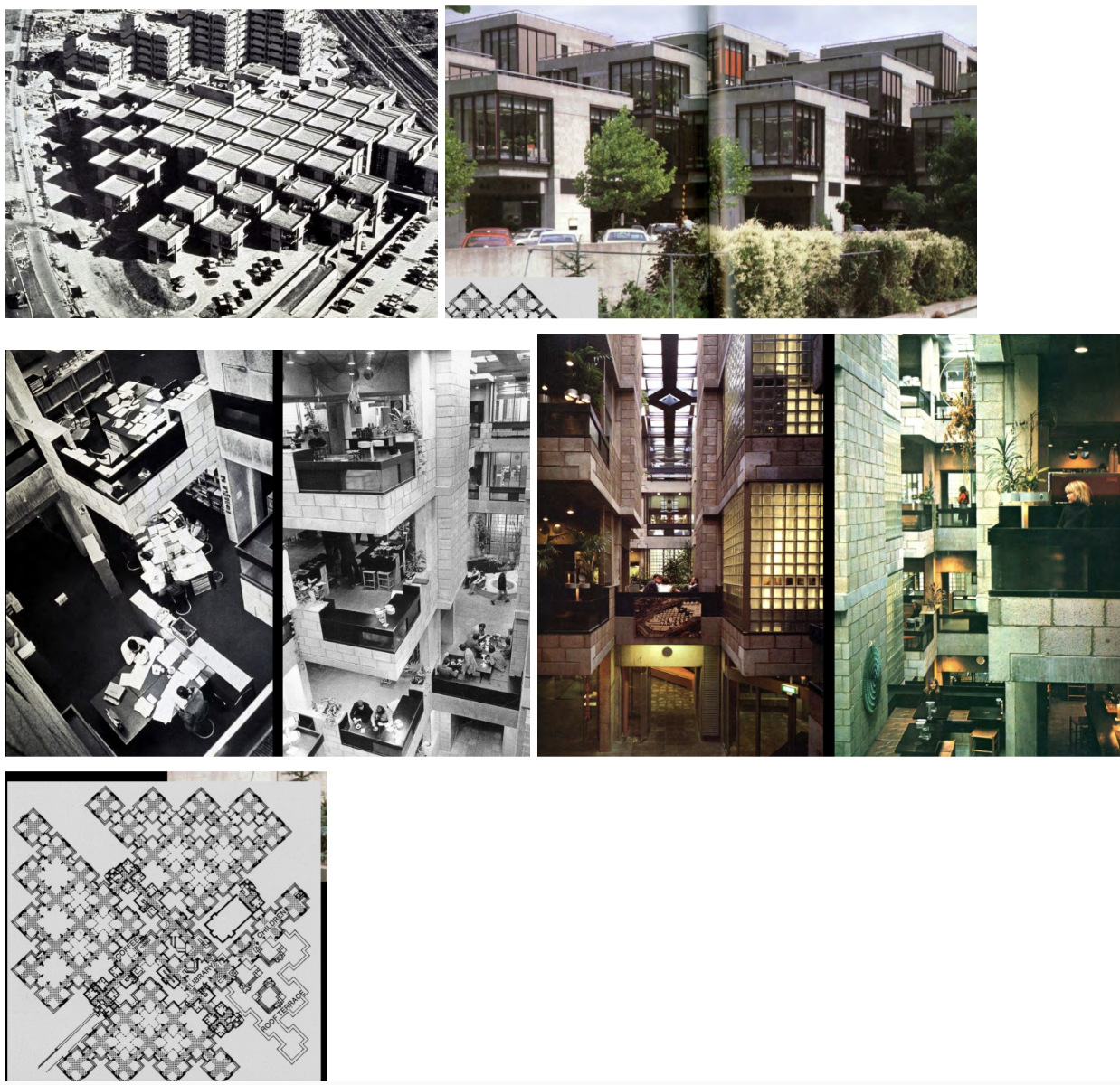
Central Beheer Office Building, Apeldoorn, Holland, 1968–72 — Herman Hertzberger
Interested in structuralism: finding an order and using it to create a larger complex — what is the space office workers need? Can that become a unit module?
Square modules repeated throughout — comes from a standard model that is fairly easy to construct; reusable framework with unit masonry that allows change over time.
Employees decorate their workspaces with plants, photos, and objects — architecture that accommodates individual expression within a systematic structural order.
Like a maze with light coming through from multiple directions — complex spatial experience from a simple structural logic; circulation corridors, glass corners.
Built for one company so it doesn't need to be rented out — can be specific and idiosyncratic rather than generic; a serious humanist alternative to American Postmodernism.
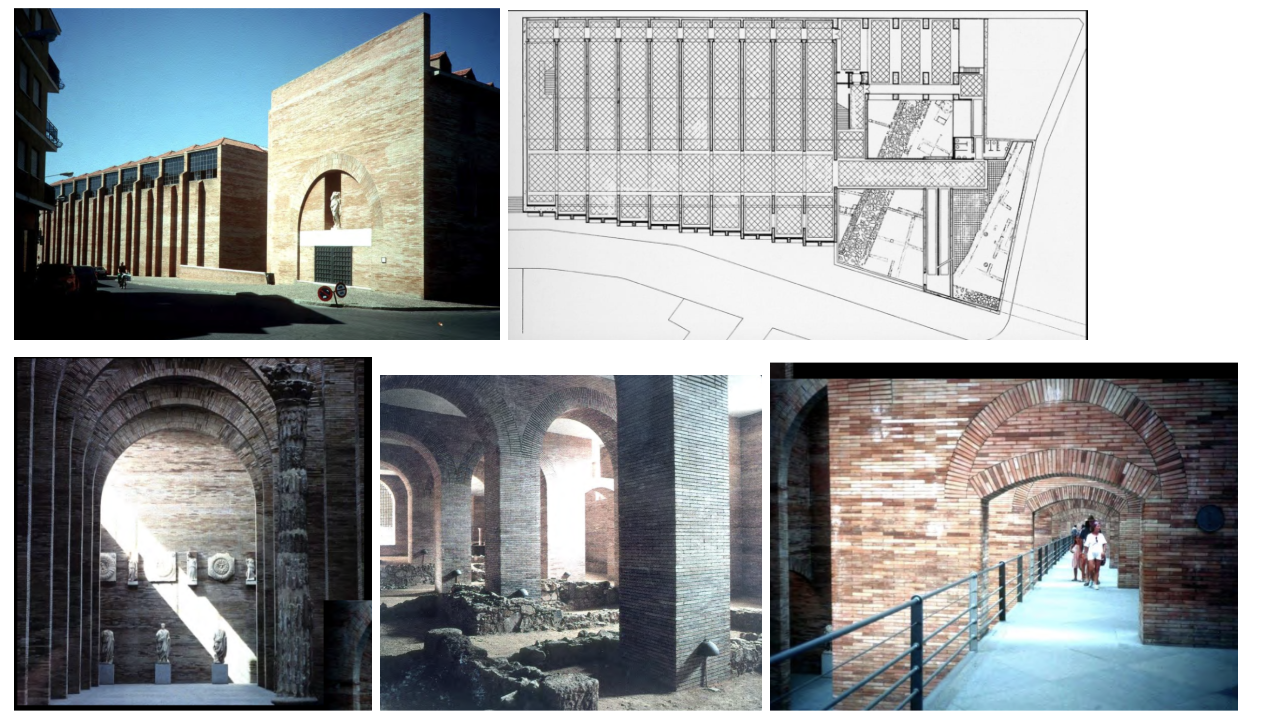
National Museum of Roman Art, Merida, Spain, 1983–85 — Rafael Moneo
Merida founded 24 BC — most important Roman city in Spain; the modern town is largely built over the ruins; the museum has an excavation that shows part of the actual Roman city in the basement.
Walls built of Roman brick — same size and bond as ancient construction; concrete floors are clearly modern: present and past built on top of each other in one building, materially distinguished.
Series of galleries made by parallel walls with spanned Roman arches — echoes the Roman building type without copying it; construction reflects what Rome is.
Artifacts displayed against the walls as highlights; galleries receive light from above (adobe); you can look down at the walkway from upper levels.
Shows the past and present built on top of the present — a serious, material response to historical continuity; an alternative to postmodernism's ironic surface references.
Gehry House, Santa Monica CA, 1978–79 — Frank Gehry
Bought an ordinary Dutch Colonial bungalow and wrapped it in chain-link fence, corrugated steel, and exposed wood studs — cheap industrial Los Angeles urban materials used expressively.
Like a collage with mixed materials — in places he uncovered the structure, added volumetric windows, left walls deconstructed at various points; hybrid building.
The original house is preserved inside — new construction surrounds and interpenetrates it; not at all relating ironic elements to the past.
A completely different way of thinking than anything seen before — deconstruction of the conventional house, not Post Modern irony, not rational Modernism.
Launched Gehry's career as the leading figure of deconstructivist architecture — uses industrial materials from the everyday urban landscape as high architectural expression.
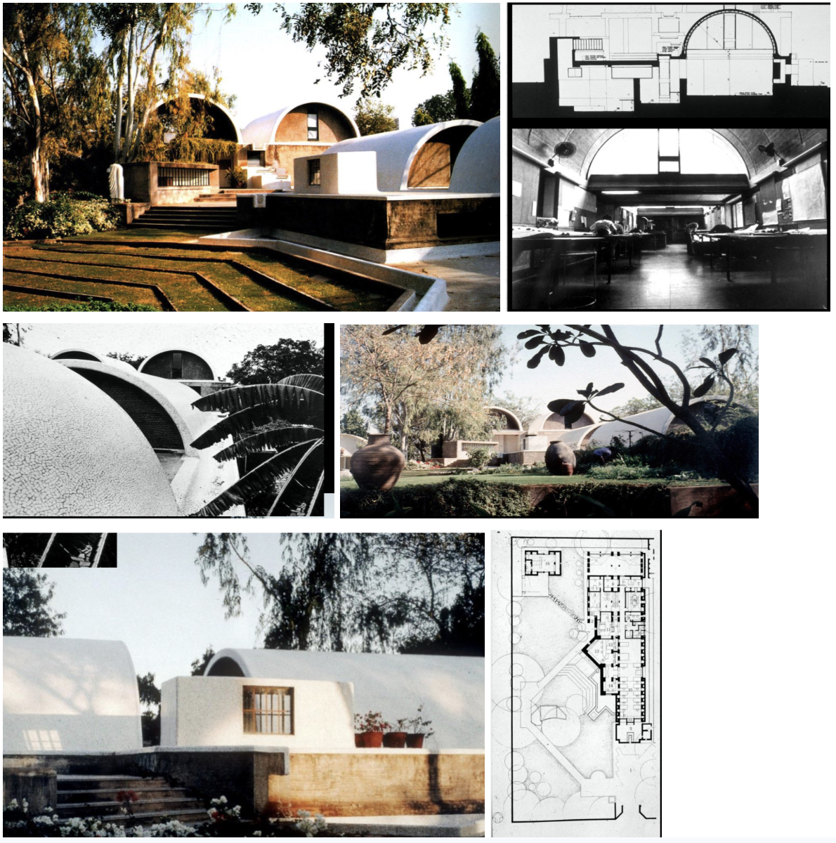
"Sangath" (Architect's Studio), Ahmedabad, India, 1979–81 — Balikrishna V. Doshi
His own studio — 'Moving together through participation': earth-hugging cast-in-place barrel vaults clad in tile; Indian vernacular forms appropriate to the hot, dry climate.
Building partially below grade for coolness — passive cooling without mechanical systems; roofs shed water and are reused as irrigation for the landscape.
Clerestory windows at the base of the vaults: light comes from above and the side, deep into the partially subterranean space; climate-responsive and architecturally generous.
Influenced by Kahn but doesn't copy him — Doshi creates his own interpretation of space that responds to the specific climate, culture, and site of India.
Sits comfortably in nature; responsive to place — shows the global diversity of post-1975 architecture: Modern principles + regional climate response + personal expression.
Menil Collection [Museum], Houston TX, 1981–86 — Renzo Piano
First building Piano built in the United States — art museum in a hot and humid Houston climate; regular steel frame with an unusual roof to filter light.
Ferro-cement 'leaf' pieces slightly tilt for the sun — never direct sunlight comes into the gallery spaces, but the space is fully illuminated; no direct sun damages the artwork.
Low residential-scale building in a Houston neighborhood — deliberately not monumental; sits quietly in the urban fabric rather than imposing on it.
Focuses on quality and craft through simplicity of plan — galleries above, basic plan, attention to the detail of the roof's sun-filtering mechanics.
Shows something technologically advanced through apparent simplicity — an alternative to American Postmodernism; technology in service of light, restraint, and human scale.
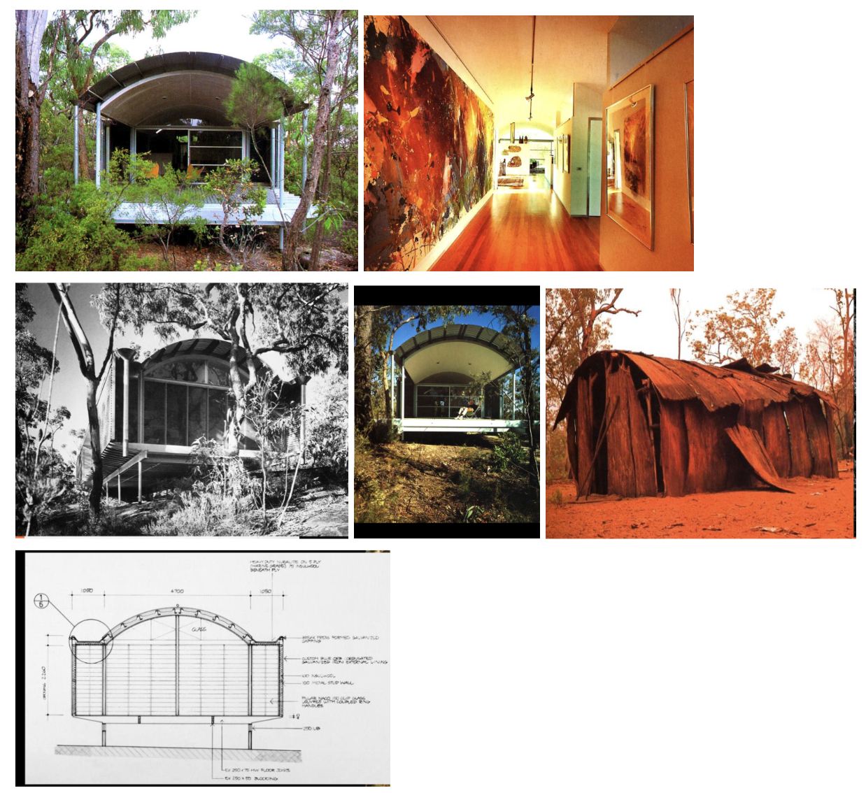
Ball-Eastaway House, Glenorie, New South Wales, Australia, 1980–83 — Glenn Murcutt
Developed architecture that responded specifically to Australia — dry, vegetated landscape; drew international attention with simple materials and a building that touches the earth lightly.
Curved roof designed to prevent leaves from settling and to manage rainwater; raised on very thin supports — the goal is not to disturb the ground; sustainability as architectural principle.
Used simple materials; the building reacts to sun and wind — decks positioned for wind protection; all in recognition of the conditions of this specific place.
Influenced by indigenous Australian dwelling knowledge — local knowledge is a source of design intelligence, not something to be overcome.
Artist retreat nestled in a forest — 'touch the earth lightly': Modern principles (rational structure, minimal material) + specific climate and landscape response at their most rigorous.
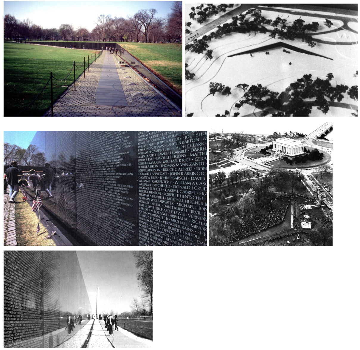
Vietnam Veterans Memorial, Washington DC, 1979–82 — Maya Ying Lin
Requirement: enough space to display all the names of the people killed in the war; designed as an undergraduate Yale studio project — design can come from anyone.
Seen as a cut in the earth that has been polished — minimalism; two polished black granite walls that meet at a vertex, each arm pointing toward the Lincoln Memorial and the Washington Monument.
Names in the order of death — not alphabetical; you search for a name, moving through time and loss rather than through a directory.
Deeply controversial when selected — now universally regarded as one of the most moving memorials ever built; shows the power of restraint and abstraction in commemorative architecture.
The visitor's reflection appears in the polished granite alongside the names — you see yourself with the dead; the most intimate and devastating spatial effect in contemporary memorial design.