5th & 6th (1st & 2nd)
1/24
There's no tags or description
Looks like no tags are added yet.
Name | Mastery | Learn | Test | Matching | Spaced | Call with Kai |
|---|
No analytics yet
Send a link to your students to track their progress
25 Terms
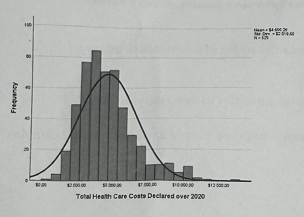
#5—>What does the histogram show
It shows the overall distribution of total health care costs. Most customers have lower-to-middle costs, but there is a right tail, meaning some customers have very high costs.
#5—>What does “right-skewed” mean here?
It means most customers have lower or moderate health costs, but a smaller number of customers have very high costs, creating a long tail on the right side of the histogram.
#5—>Why is the histogram useful for the marketing recommendation?
It shows that the company should not treat all customers the same, because most customers have moderate costs but a smaller group has very high costs.

#5—>What does the boxplot show in question 5?
It compares total health care costs across regions. The median costs are fairly similar, but some regions have more variability and high-cost outliers.

#5—>What do the dots above the boxplots mean?
They are outliers, meaning customers with unusually high health care costs compared with others in the same region.
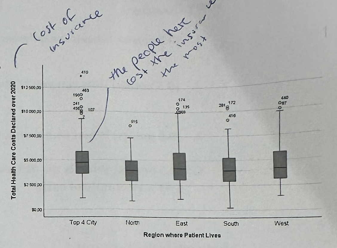
#5—>Which region seems important from the boxplot?
Top 4 City seems important because it has several high-cost outliers. This suggests the company should pay attention to high-cost customers in large city areas.
#5—>How do the histogram and boxplot work together?
The histogram shows that total costs are right-skewed overall, while the boxplot shows where high-cost outliers appear across regions. Together, they suggest the company should identify and manage high-cost customer segments.
#5—>Marketing recommendation
The company should focus on high-cost customers because the cost distribution is right-skewed. It should use region as one segmentation variable, especially monitoring high-cost outliers in Top 4 City, but combine region with health and demographic variables before making pricing decisions.

#6А1—>In Part A, what does the mean of cost_cat mean?
Since cost_cat is coded 0 = low cost and 1 = high cost, the mean shows the proportion of high-cost customers. A mean of 0.3431 means about 34.3% are high-cost.
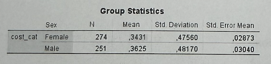
#6А1—>What does the Group Statistics table show in Part A?
Females have a high-cost proportion of about 34.3%, and males about 36.3%. The difference is very small.
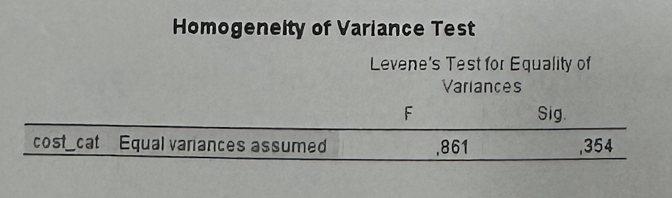
#6А2—>What does Levene’s test tell us?
It tells us which row to use in the independent samples test. Since Sig. = 0.354 > 0.05, we use the “Equal variances assumed” row.
Rule:
If Levene Sig. > 0.05 → use “Equal variances assumed.”
If Levene Sig. < 0.05 → use “Equal variances not assumed.”
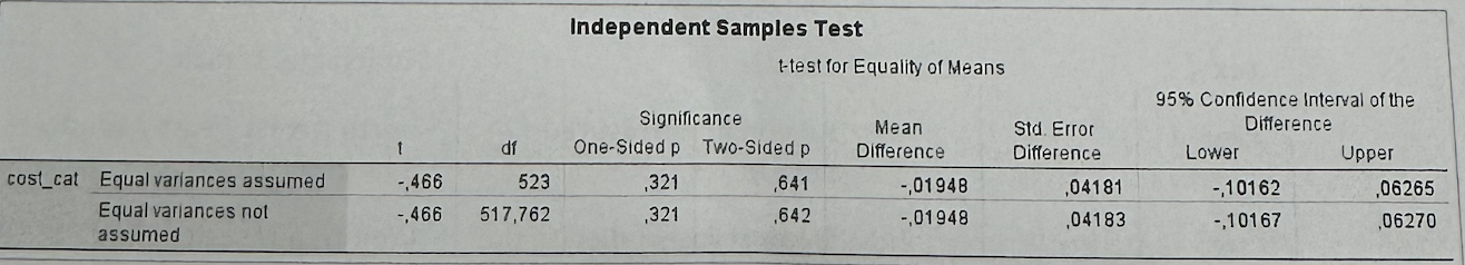
#6А3—>How do we interpret p = 0.641 in Part A?
Since 0.641 > 0.05, there is no statistically significant difference between males and females in cost_cat.
#6А3—>What is the marketing implication of Part A?
Sex is not a useful segmentation variable for identifying high-cost customers, because males and females do not differ significantly in cost category.
#6А—>Marketing recomendation
Part A compares cost_cat between females and males. Since cost_cat is coded 0 = low cost and 1 = high cost, the mean can be interpreted as the proportion of high-cost customers. The Group Statistics table shows that females have a mean of 0.3431, while males have a mean of 0.3625. This means that around 34.3% of females and 36.3% of males are high-cost customers, so the difference is small. Levene’s test has Sig. = 0.354, which is above 0.05, so I use the “Equal variances assumed” row. In the Independent Samples Test, the two-sided p-value is 0.641, which is above 0.05. Therefore, the difference between males and females is not statistically significant. As a marketing implication, sex should not be used alone as a segmentation variable for high-cost customers.
#6B1—>What does the Descriptives table show in Part B?
It shows the average health care cost by region. Top 4 City has the highest mean cost, about $5,112.82, while North has the lowest, about $4,049.63.

#6B1—>Why do we read the Descriptives table before ANOVA?
The Descriptives table shows the direction of the differences: which regions have higher or lower average costs.
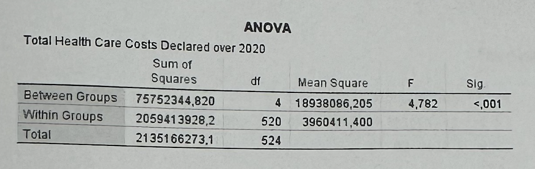
#6B2—>How do we interpret ANOVA Sig. < 0.001?
Since p < 0.05, average health care costs differ significantly across regions.
#6B2—>What does the F-statistic tell us?
It tells us whether the differences between group means are large compared with the random variation within groups.
F ≈ 1 → Groups are similar.
Large F → Groups are more different than expected by chance.
Larger F = stronger evidence that at least one group mean differs.
#6B2—>What does ANOVA not tell us?
ANOVA tells us that at least one group mean is different, but it does not tell exactly which regions differ from each other unless we have post-hoc tests.
#6B—>Marketing recomendation
Region is useful for segmentation because average health care costs differ significantly across regions. Top 4 City seems especially important because it has the highest average cost.
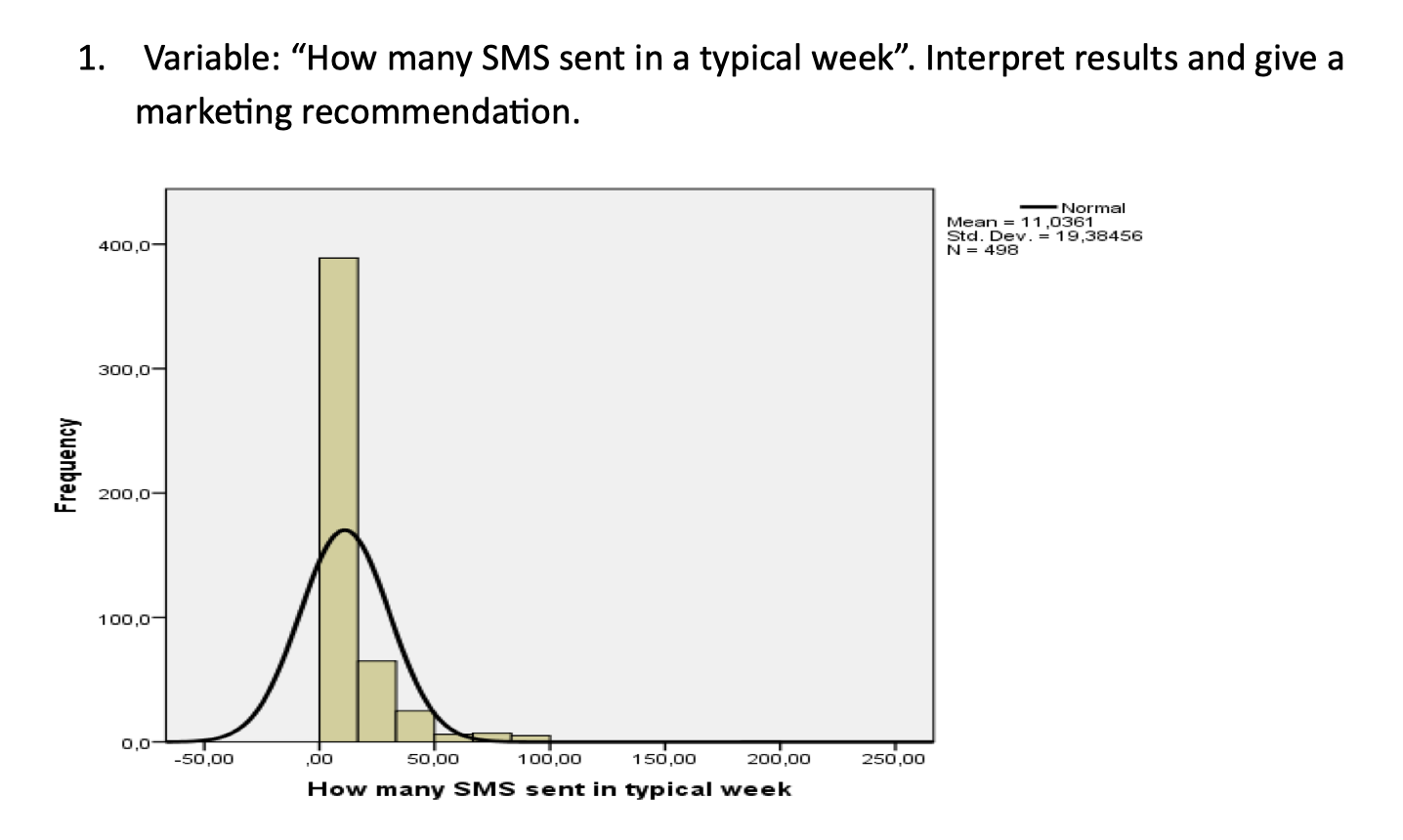
#1—>What does the histogram show?
It shows the overall distribution of SMS sent per week. Most people send few SMS, but a few people send many, so the distribution is right-skewed.
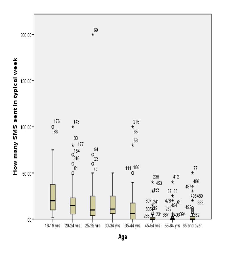
#1—>What does the age boxplot show?
SMS usage seems higher and more variable among younger people, while older age groups tend to send fewer SMS. Some age groups contain high-use outliers.#
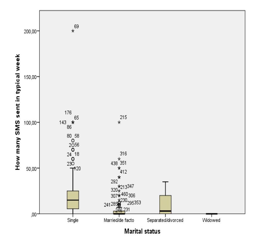
#1—>What does the marital status boxplot show?
Single respondents appear to use SMS more and show more variability, while other marital groups seem to have lower SMS usage.
#1—>Marketing recomendation
Segment customers by SMS usage. Use SMS campaigns for heavy SMS users, especially younger/single users, and use other channels for low-SMS users.
#2—>