CP321 Knowledge Flashcards
1/156
There's no tags or description
Looks like no tags are added yet.
Name | Mastery | Learn | Test | Matching | Spaced | Call with Kai |
|---|
No analytics yet
Send a link to your students to track their progress
157 Terms
3 Types of Information Visualization Models
Theoretical Models - explain underlying principles of how people understand visual data (pattern, color) “WHY”
Descriptive Models - create taxonomies (lists/classes) of chart types, data types “WHAT”
Prescriptive Models - how to design and evaluate a visualization “HOW”
CLT (Cognitive Load Theory) in Data Visualization (Theoretical Models)
CLT says humans are bad at remembering things, short term memory so:
- Present information in comprehensible manner
- Respect limitations and make sure of the affordances suggested by CLT about peoples ability to accept information
Multimedia Principle (Theoretical Models)
People learn better from words and pictures than from words alone
Split attention principle (Theoretical Models)
it is important to avoid formats that require learners to split their attention between, and mentally integrate, multiple sources of information
Modality Principle (Theoretical Models)
People learn better from graphics and narration(audio) than from graphics and text
Redundancy Principle (Theoretical Models)
Do not repeat the same information
Spatial Contiguity Principle (Theoretical Models)
People learn more deeply from a multimedia message when corresponding words and pictures are presented near rather than far from each other on the page or screen
Temporal Contiguity Principle (Theoretical Models)
People learn better when corresponding words and pictures are presented simultaneously rather than successively
Coherence Principle (Theoretical Models)
People learn more deeply from a multimedia message when extraneous material is excluded than included
Signaling Principle (Theoretical Models)
People learn more deeply from a multimedia message when cues are added that highlight the critical aspects of the presented information (headings, highlighting)
Personalization Principle (Theoretical Models)
People learn more deeply when the words in a multimedia presentation are in conversational style rather than formal style.
Pre-training Principle (Theoretical Models)
People learn more deeply from a multimedia message when they know the names and characteristics of the main
Abstraction
Removes unnecessary details based on the task
ASSERT Model (Prescriptive Models)
Ask → Search → Structure → Envision → Represent → Tell
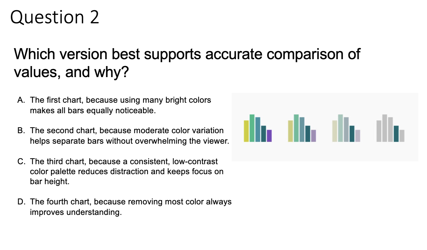
Which model would you trust more? Why?
We pick simple model
Based on CLT, our working memory is limited
Too many elements at once:
Too many colours → Higher cognitive load
Too many charts → Split attention
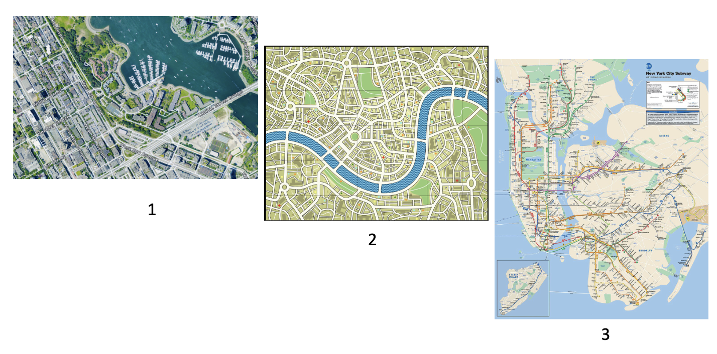
Which map would you use to drive?
Map 1
Abstraction removes details based on the task
Good visualizations are driven by ______
good questions
Turning Topics into Questions (Ask ASSERT)
Questions that offer more complex answers than a simple yes or no tend to be more interesting pursuits
ex: “Was slavery the cause of the Civil War?” → “What degree of economic advantage did slavery offer the South to maintain it?”
Strategies for methodically generating and assessing the quality of questions (Ask ASSERT)
The three-part query
KWL
Three-part query (Ask ASSERT)
identifying topic, questions, and reason to care
We are looking at [topic] because we want to find [who/where/when/why/what/how] in order for my audience to understand [signifigance/reason]
KWL (Ask ASSERT)
What we already KNOW
What we WANT to learn
What we have LEARNED
CPS (Creative Problem-Solving) (Ask ASSERT)
Generate ideas (options) then systematically evaluate the options
CPS tools
Brainstorming, Group discussion, Concept map
Types of Raw Data
Numbers (populations, rainfall amounts)
Documents (court records, birth and death records)
Multimedia (photos, drawings, audio)
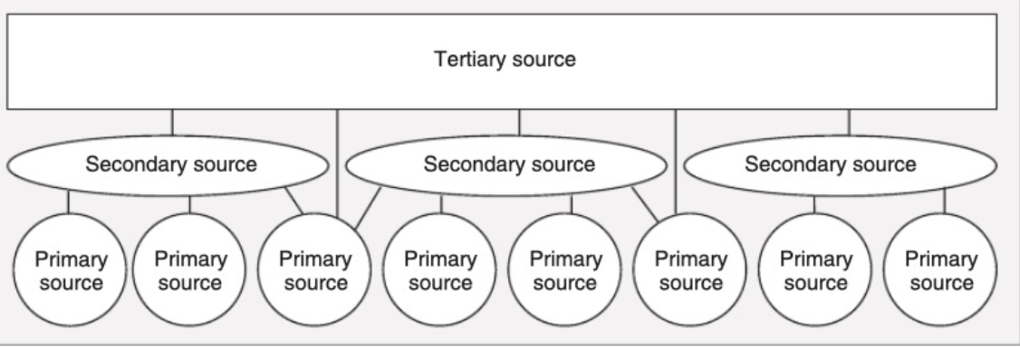
Types of Data Sources
Primary Sources: Taken directly from event, such as first-hand witness
Secondary sources: books and resources that aggregate info from primary sources
Tertiary resources: encyclopedias pull primary and secondary sources to provide broad but shallow overview
Effective Data
Types of Data
Quantitative Continuous → Continous Scale (1.3, 5.7, 83)
Quantitative Discrete → Discrete Scale (1,2,3,4) (Fixed Units)
Qualitative Unordered → Discrete Scale (dog, cat, fish)
Qualitative Unordered → Discrete Scale (Good, Fair, Poor)
Date or time → Continous or Discrete
Text → None or Discrete
Quantitative vs Discrete
Continuous = can take infinitely many values within a range
Discrete = countable, whole numbers only
(0.5, 1.0, 1.5 could be discrete if no intermediate values can exist)
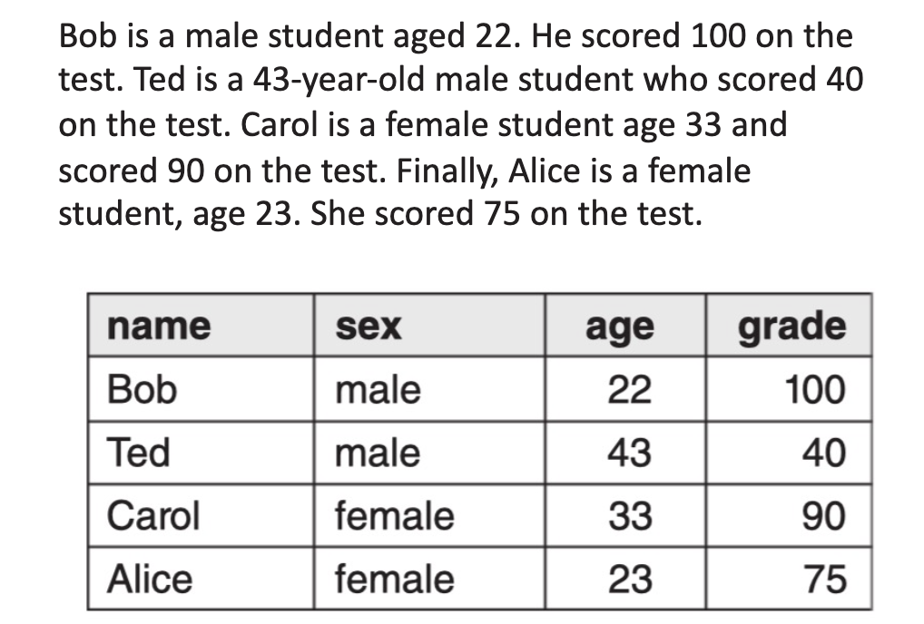
Which of the following variables is quantitative and continuous?
A. Number of students in a class
B. Temperature measured in Celsius
C. Types of animals (dog, cat, fish)
D. Satisfaction level (good, fair, poor)
B. Temperature measured in Celsius
A is Quantitative but discrete (you can’t have 25.5 students)
Which variable is quantitative but discrete?
A. Height of a person
B. Time of day
C. Number of emails received per day
D. Color of a car
C. Number of emails received per day
Which example represents qualitative categorical unordered data?
A. Rankings (1st, 2nd, 3rd)
B. Exam scores
C. Weather type (sunny, rainy, snowy)
D. Dates on a calendar
C. Weather type (sunny, rainy, snowy)
Which option correctly classifies the variables below?
• Number of website visits per day
• Satisfaction level (poor, fair, good)
• Exact time of a transaction
A. Discrete – Unordered – Discrete
B. Discrete – Ordered – Continuous
C. Continuous – Ordered – Discrete
D. Discrete – Continuous – Ordered
B. Discrete – Ordered – Continuous
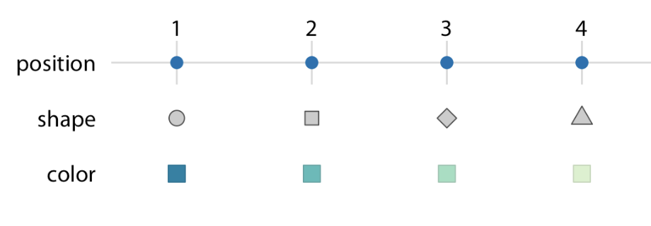
A Scale must be one-to-one
Each data value → one unique visual
No overlaps or confusion
1 → circle
2 → square
3 → diamond
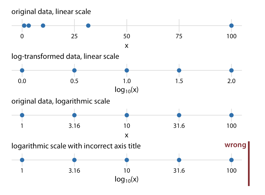
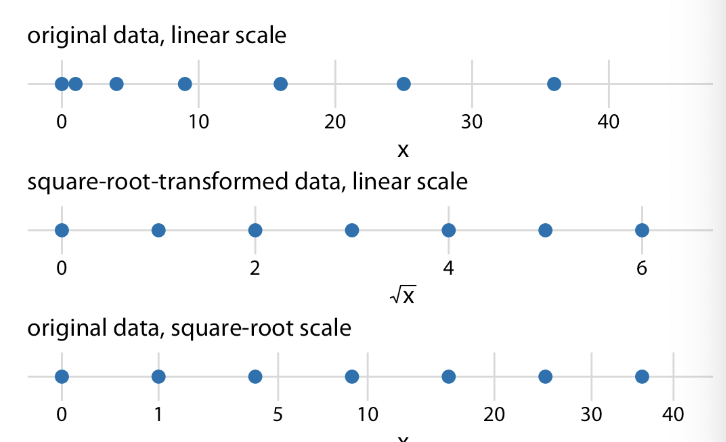
What if we want to visualize highly skewed data?
Nonlinear axes: even spacing in data units corresponds to uneven spacing in visualization
We use different scales/graphs
log-scale
Issue: Doesn’t allow 0
square-root scale
Also compresses larger numbers into smaller range
Allows presence of 0
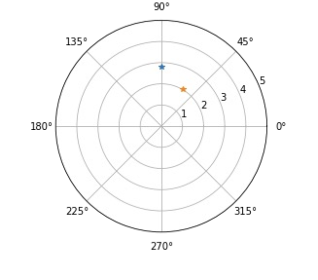
Polar Coordinate System
Pole (Center Point, usually 0,0)
Radius (Distance from pole)
Polar Angle (angle, in deg or rad)
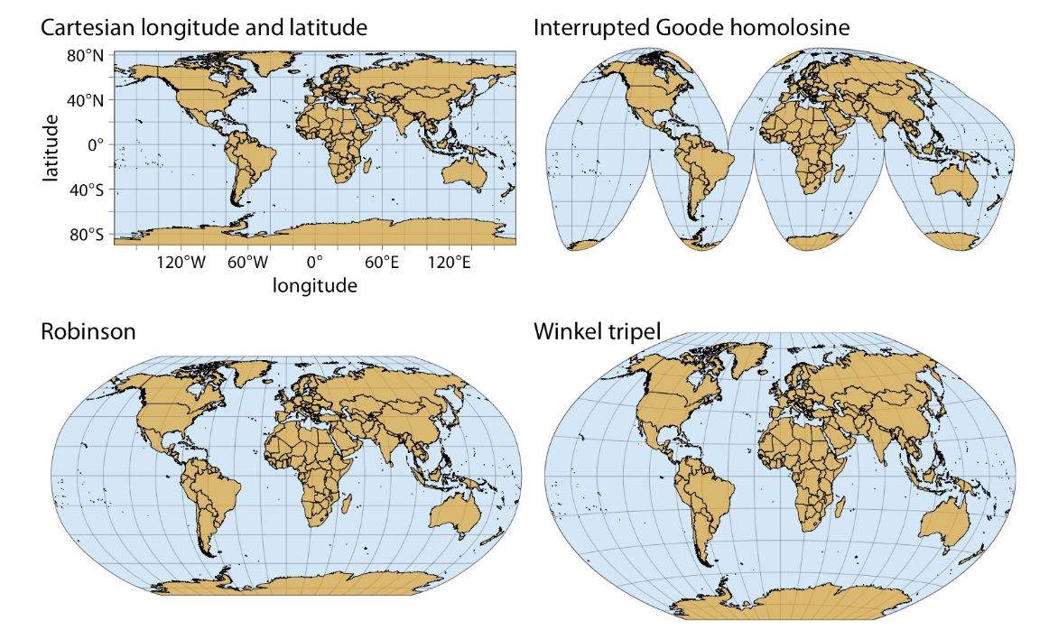
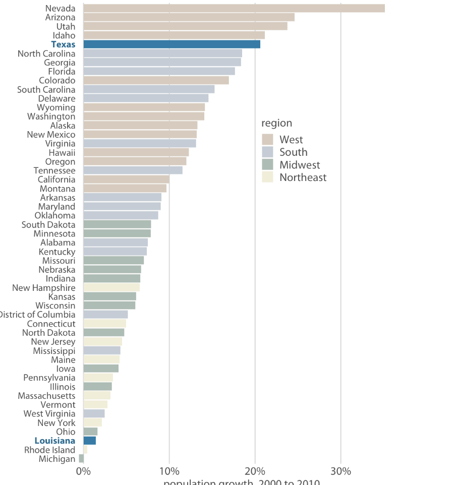
Geospatial Data
Maybe a good question: show a map, which map type is this?
Most accurate way to represent numerical data?
Position (Coordinate Systems)
Shape and line type are limited to ___ data, while color and size can represent both ______
Shape and line type are limited to discrete data, while color and size can represent both discrete and continuous data
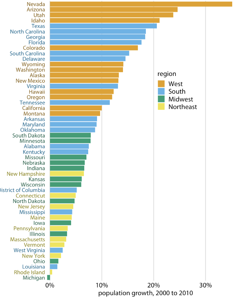
Three Fundamental Use Cases for Colour in Data Visualizations
Distinguish groups of data from eachother
Represent data values
Highlight
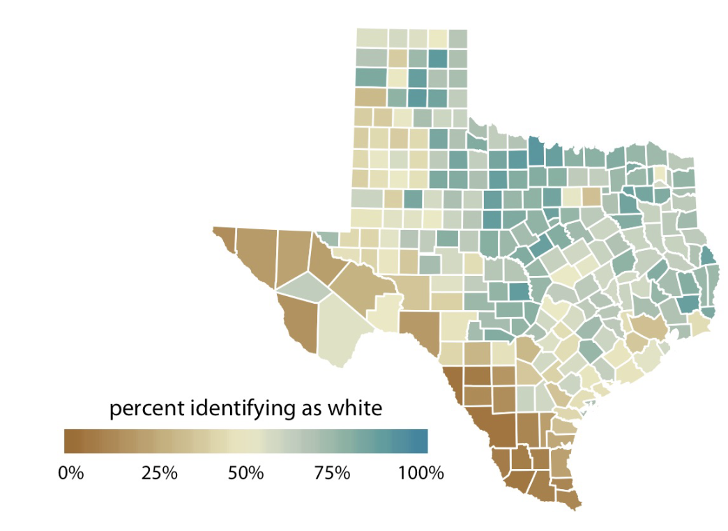
3 Types of Color Scales
Qualitative (countries on map)
Sequential (data, heat on map)
Diverging (data, percent identifying as white) (brown → blue)
Accent (Highlight specific data)
Colour as a tool to distinguish
Use color to distinguish discrete items or groups that don’t have order (countries on map)
- Qualitative Color Scale, finite set, should look clearly distinct
- No color should stand out relative to others
Color to represent data values
Use color to represent data values, such as income, temp, or speed
Sequential Color Scale should indicate:
- Which values are larger or smaller than others
- How distant two specific values are from each other
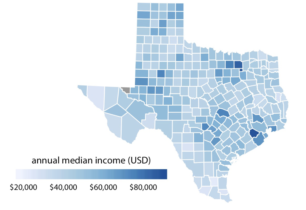
Diverging Colour Scale
Same category as Sequential
Color as a tool to highlight
Accent Color Scales
Highlight specific values or categories in dataset
Contain set of subdued colors and a matching set of stronger darker, more saturated colors
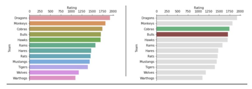
Which chart better highlights one or two teams while still allowing easy comparison across all teams?
A. The left chart, because assigning a unique color to each bar helps viewers remember all teams equally.
B. The left chart, because more colors always improve clarity and engagement.
C. The right chart, because using mostly neutral colors with selective highlighting creates a clear visual hierarchy.
D. The right chart, because color should never be used in bar charts.
C. The right chart, because using mostly neutral colors with selective highlighting creates a clear visual hierarchy.
????
Color Scale Mapping
Categories → Qualitative
Values → Sequential or Diverging
Emphasis → Accent Colours
Unstructured Text → Structured Data
Domain Space Abstraction
Data needs to be abstracted from the domain space to quantitative and qualitative info
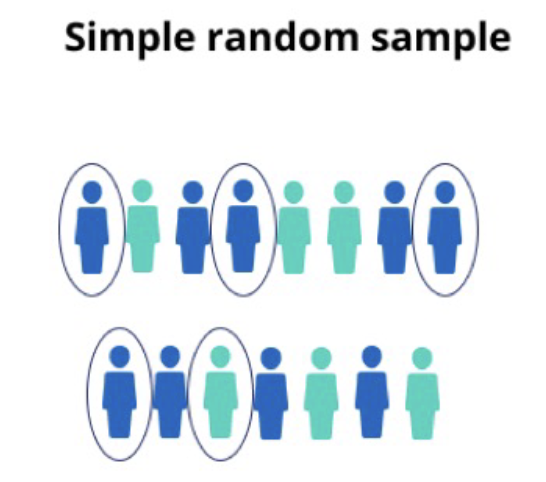
Simple Random Sampling
every member of the population has an equal chance of being selected.
Systemic/Interval Sampling
Every member has an index, pick every x persons, has to be same interval

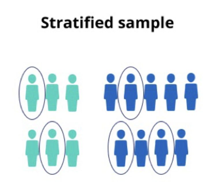
Stratified Sample
divide the population into strata (subgroups), calculate how many people should be sampled from each subgroup
Use random or systematic to pick sample from each subgroup
Cluster Sampling
Cluster into subgroups, randomly select entire clusters
Data Profiling
summary statistics on data before cleaning, to get a good idea of quality of data (part of data cleaning process)
Data Cleaning actions (TSTMO)
Type conversion
Standarize
Transformation
Missing values: (1) drop (2) Flag
Outliers: innocent until proven guilty
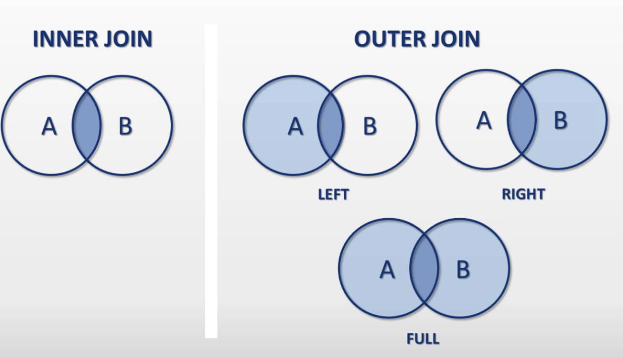
Join Types
Inner Join
Left Join
Right Join
Full Join
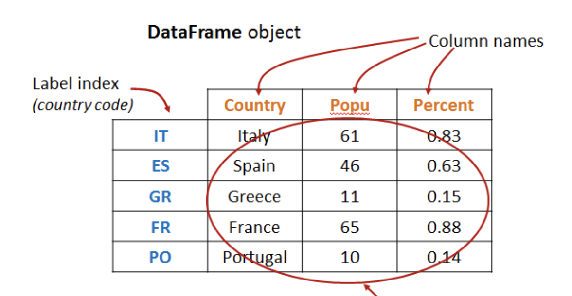
Dataframe
A python object in Pandas, essentially a table
Dataframe basic functions
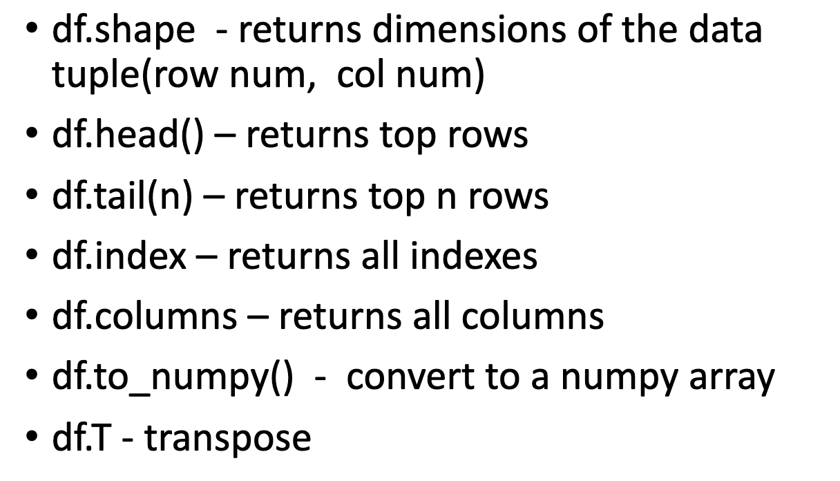
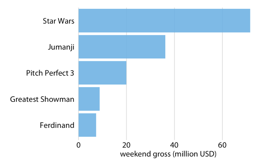
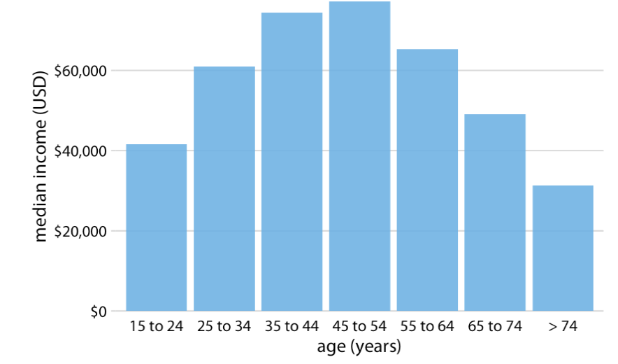
Bar Chart/Plot
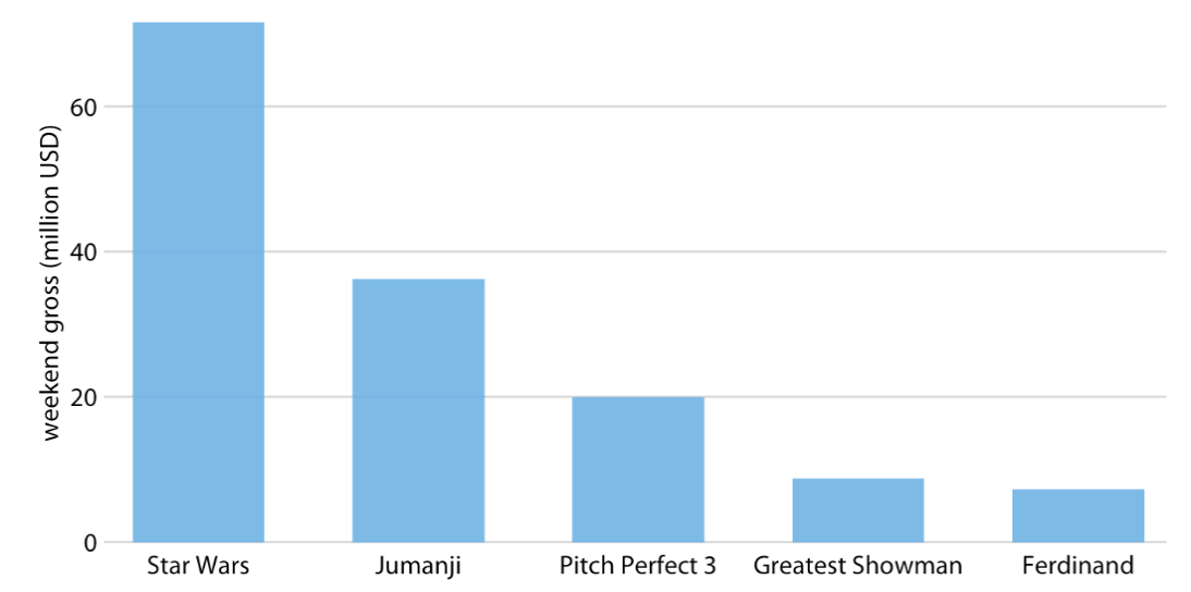
Problem comonly encountered with vertical bar charts
Labels for each bar take up a lot of horizontal space
We want the bars to run horizontally
Natural Ordering
Grouped Bar Plot
For two categorical variables at the same time
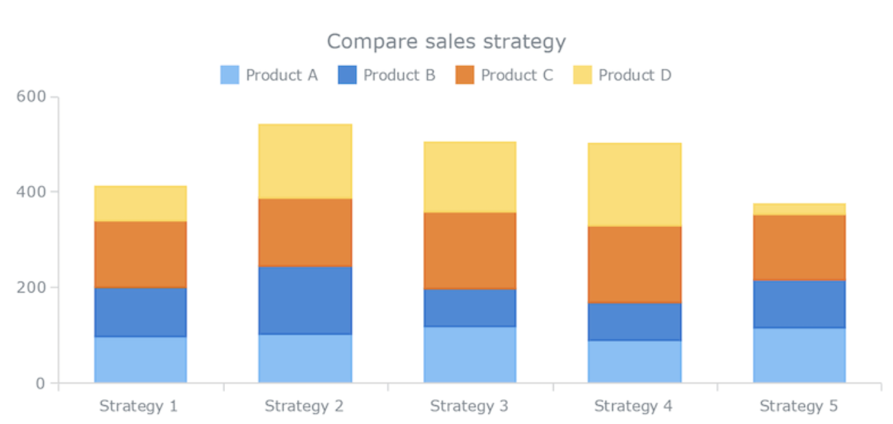
Stacked Bar Plot
For when we’re interested in sum of stacked bars in meaningful
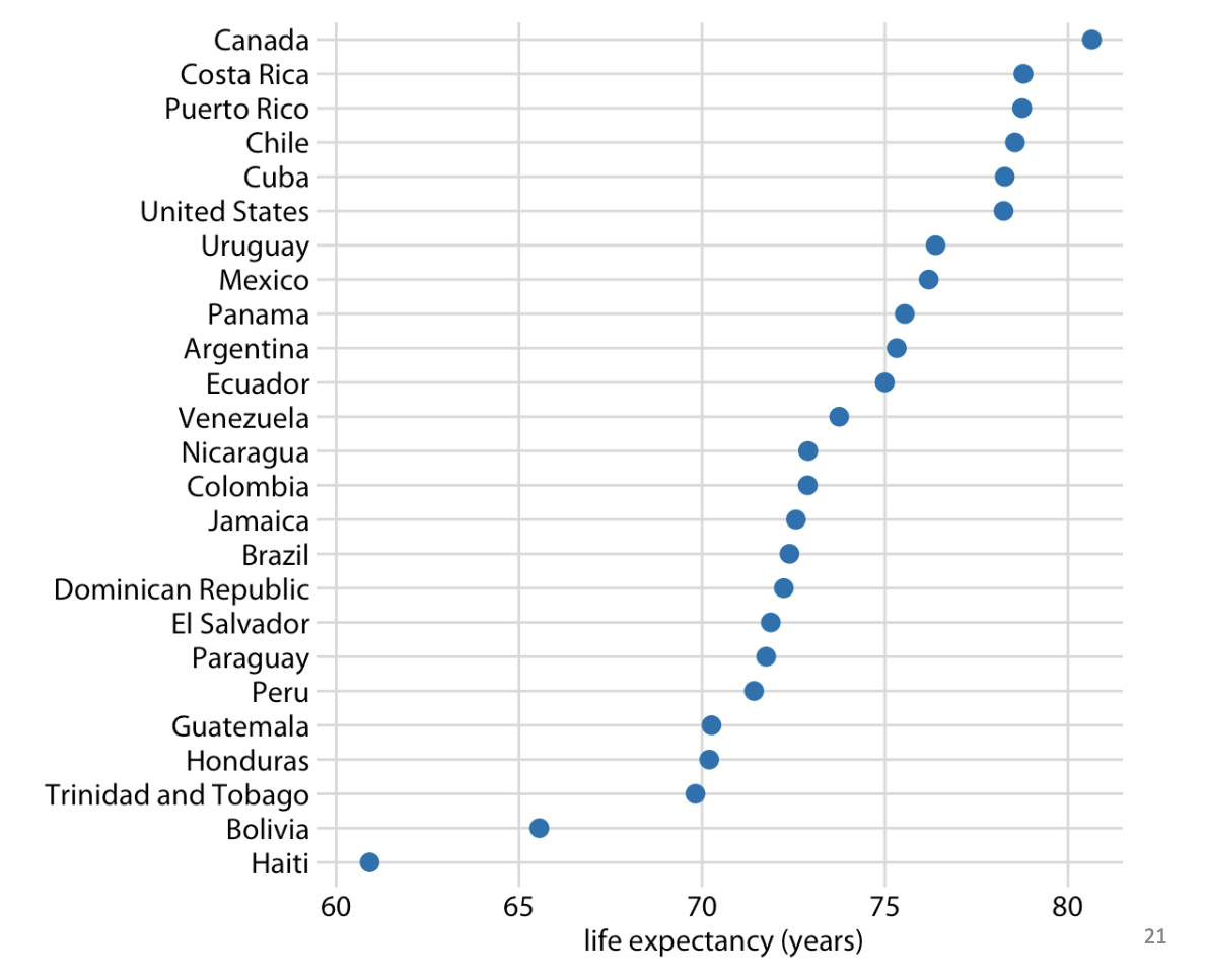
Dot Plot
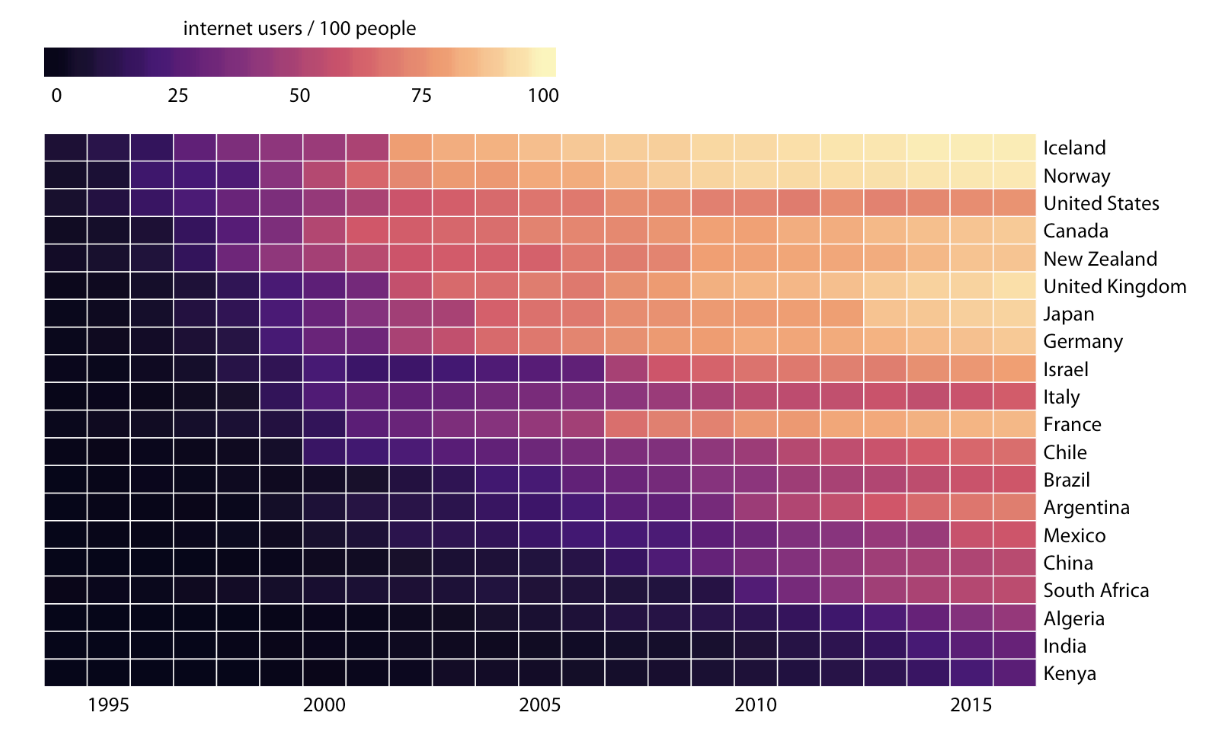
Heatmap
Title, Captions, Annotations
Title → Only one title per graph
Caption → Brief desc that appears next to image and credits the source
Annotations → Axis lables, legend titles
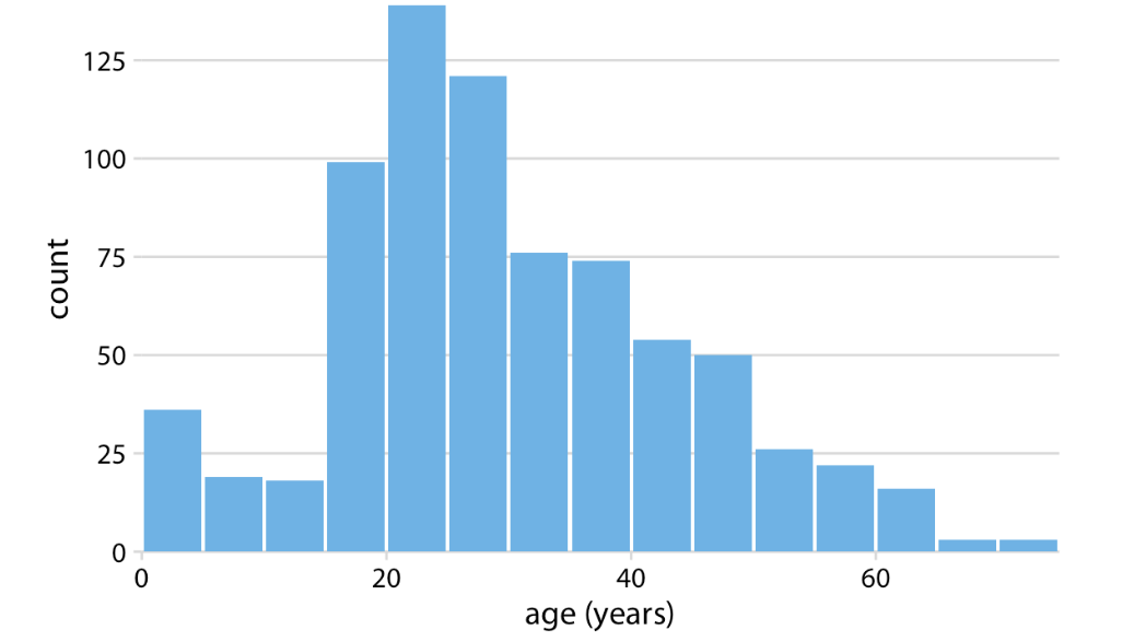
Histogram
Displays shape and spread of continous sample data, depend on bin width
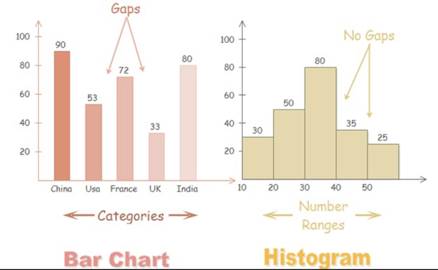
Histogram vs BarChart
BarChart: bars are positioned over a label that represents a categorical variable, has gaps, categories
Histogram: Height of bars represent observed frequencies, no gaps, number range
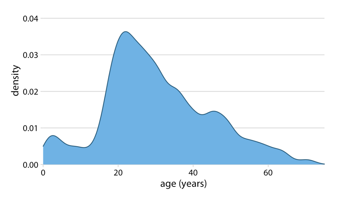
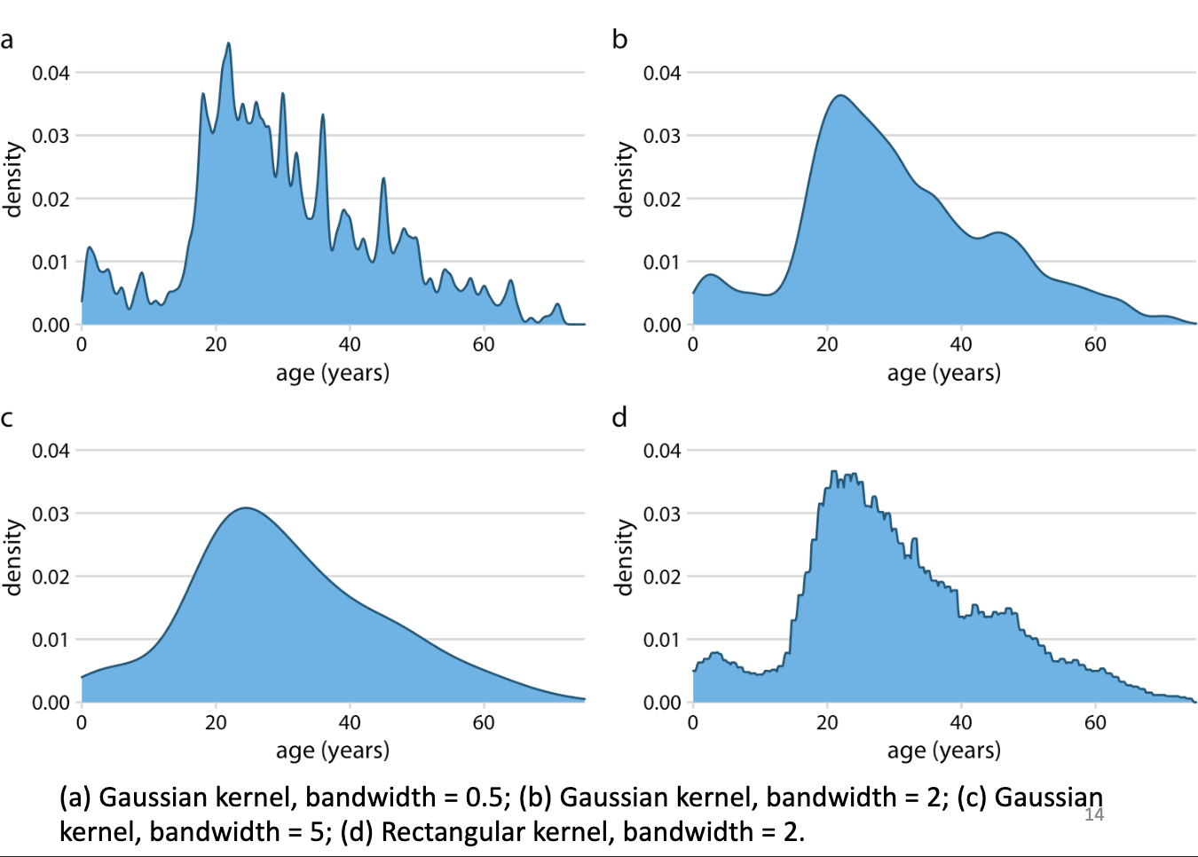
Kernel Density Estimation
Estimates a smooth distribuition, bandwidth matters more than kernel type
Density Plot
depends on bandwidth
Gaussian Kernel Bandwith Meaning
Higher bandwidth = smoother curve
ECDF Empirical cumulative distribution function
??
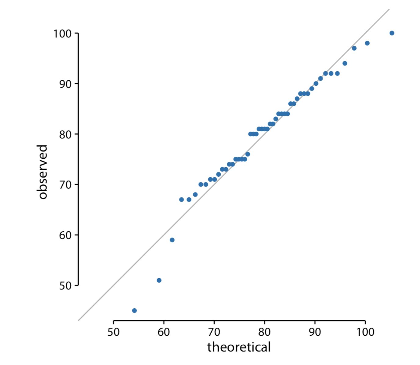
Q-Q Plots (Quantile-Quantile)
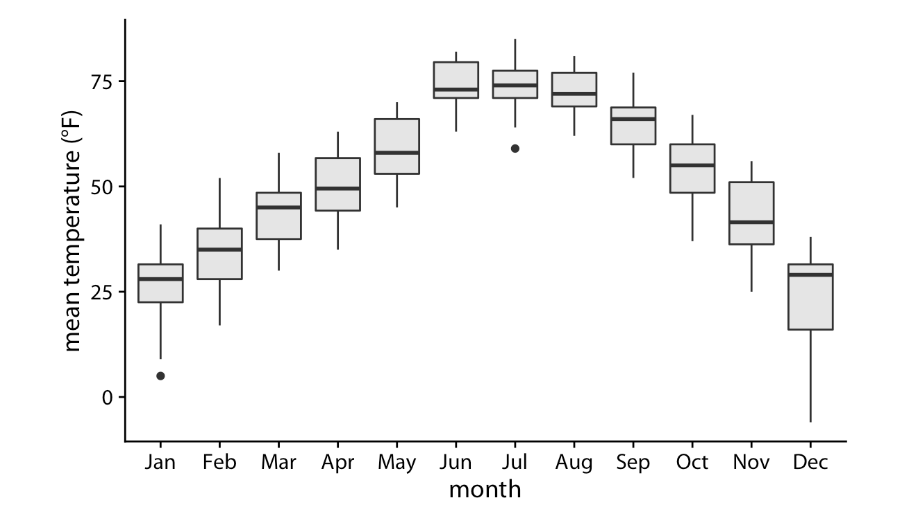
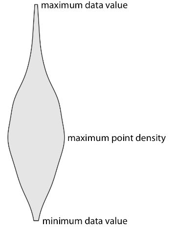
Boxplot
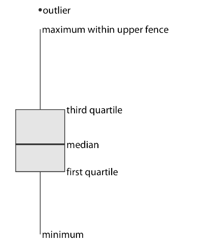
Boxplot Key
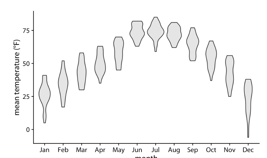
Violin Plots
Violin Plot Key
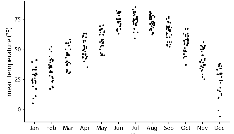
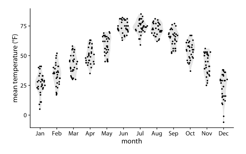
Strip Chart
Plot all individual data points of the variable directly
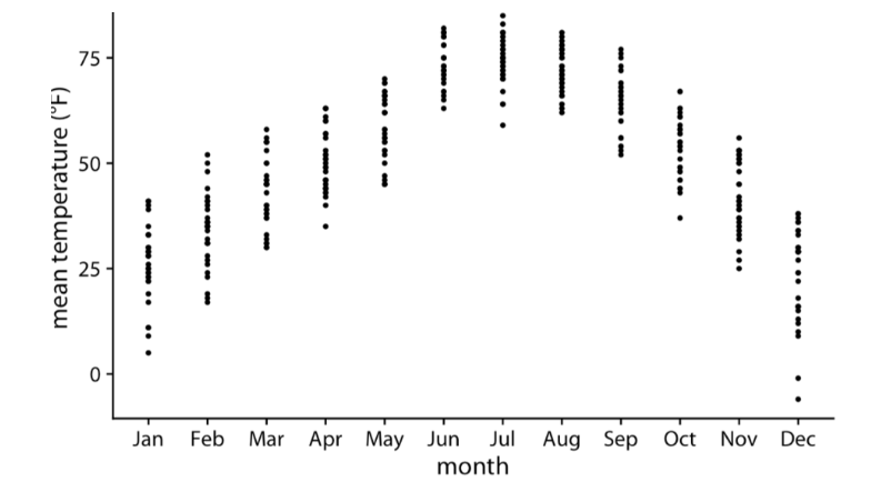
Jittering
Something you can do with Stripcharts to ensure you don’t overplot (plot points on top of eachother)
Sina plot
Hybrid between violin plot and jittered points
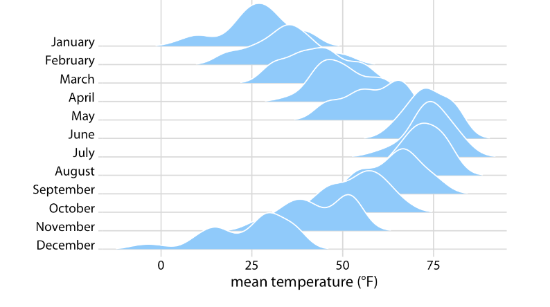
Ridgeline Plot
Visualizing multiple distributions along the horizontal axis
Reproducible vs Repeatable
Reproducible: if the overarching finding of the work will remain the same if a different group does it
Repeatable: if very similar or identical measurements can be obtained by the same person repeating the same procedure on same equipment
A visualization is reproducible if…
if the plotted data are available and any data transformations that may have been applied are exactly specified.
A visualization is repeatable…
if it is possible to recreate the exact same visual appearance, down to the last pixel, from the raw data.
Two distinct phases of data visualization
Data exploration → how we want to visualize, transformations, type of plot
Data presentation → prepare actual figure, use software, reproducing and repeating
Seperation of content and design
Content → specific dataset, data transformations, mappings, scales, ranges
Design → foreground background colours, fonts, shapes, placements
What is the main advantage of visualizing full distributions instead of only means with error bars?
A. It reduces visual clutter
B. It eliminates the need for grouping variables
C. It reveals shape, spread, and potential multimodality
D. It guarantees statistical significance
C. It reveals shape, spread, and potential multimodality
Why can jittering improve a strip chart but also introduce risk if overused?
A. It modifies the underlying data values
B. It can distort perceived density patterns
C. It hides the grouping variable
D. It removes outliers
B. It can distort perceived density patterns
if you overdo it, points get pushed too far apart and can make areas look more or less dense than they really are
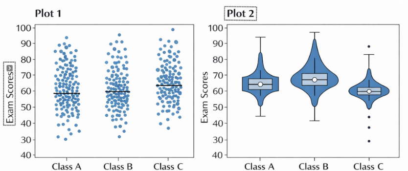
The two plots below show exam score distributions for three classes (A, B, and C). Which plot is more helpful for identifying which class has the highest median exam score, and why?
A) Plot 1, because it shows every individual data point very clearly.
B) Plot 2, because it clearly summarizes the center and spread of the distributions.
B) Plot 2, because it clearly summarizes the center and spread of the distributions.
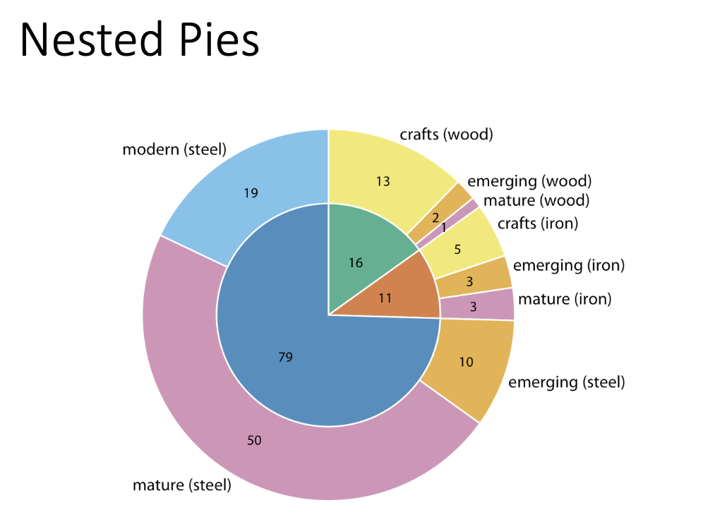
Nested Pi Chart
From broader categories on the inside, to more specific on outside
Mosaic Plot
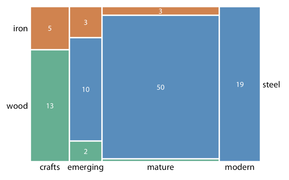
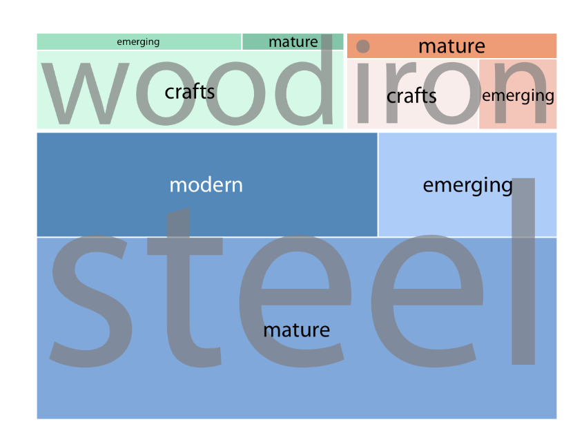
Treemap
Type of mosaic chart
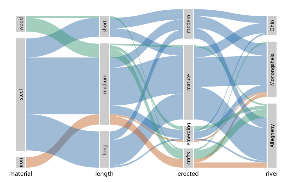
Parallel Sets
Proportional ink
Visual size MUST match the data
Nested Data can be shown using (4)
Mosiac Plots
Treemaps
Nested Pies
Parallel sets
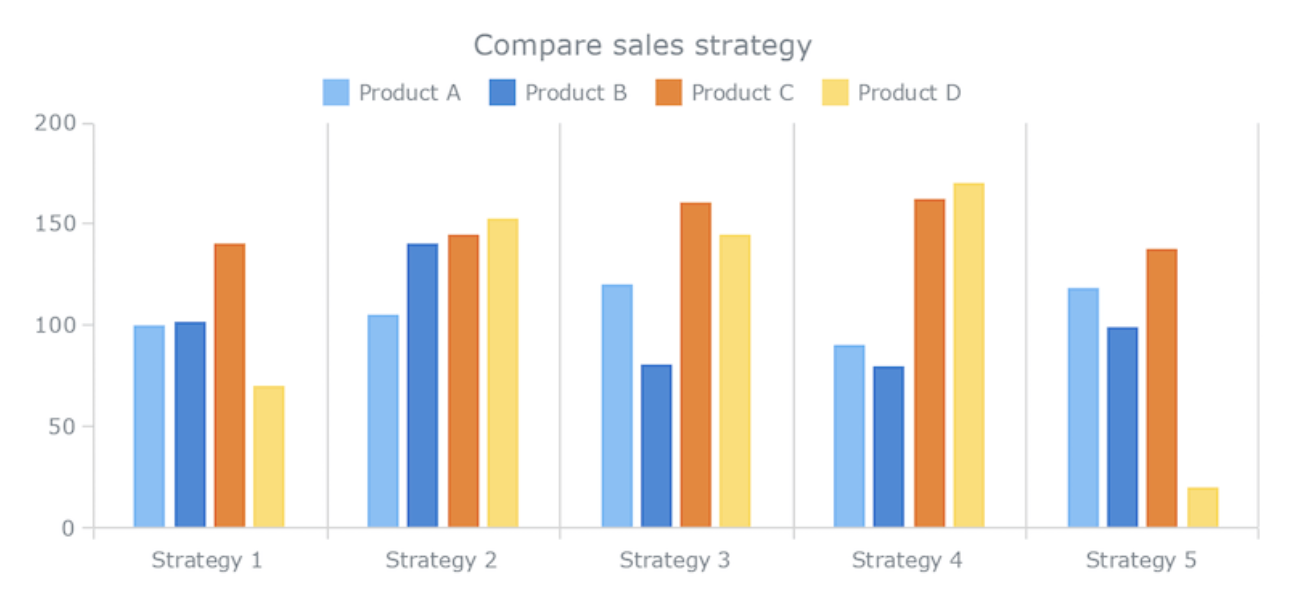
Side-by-side bar charts are best for
accurate comparison of proportions
Pie charts and stacked bars show composition but are weak for _____
precise comparisons
Visualizing Associations
How quantitative Variables relate to each other
2 Variables (ex: hieght and weight) → scatter plot
>2 Variables → bubble chart, scatter plot matrix, correlogram