IS117 Ch 6 - How to use flexbox for page layout
 Call Kai
 Learn
Learn Practice Test
 Spaced Repetition
 Match
Match Flashcards
 Knowt Play
1/21
There's no tags or description
Looks like no tags are added yet.
Name | Mastery | Learn | Test | Matching | Spaced | Call with Kai |
|---|
No analytics yet
Send a link to your students to track their progress
22 Terms
how to use the <meta> element to control the viewport for a web page.
<meta name="viewport" content="width=device-width, initial-scale=1.0">
In general terms, describe how a fluid web page works.
a fluid webpage is a layout that uses proportional units (like percentages) instead of fixed units (like pixels) so that it can stretch and shrink like a rubber band to fit any screen size.
Instead of a "one-size-fits-all" design, a fluid page adapts to the "viewport" (the browser window).
the units of measurement that are relative to the size of the viewport.
viewport is visible area of the browser window
vw(Viewport Width): Represents 1% of the total width of the viewport.vh(Viewport Height): Represents 1% of the total height of the viewport.vmin(Viewport Minimum): Represents 1% of the smaller dimension (width or height).vmax(Viewport Maximum): Represents 1% of the larger dimension (width or height).
how to use the calc() function to set font size relative to the size of the viewport
It allows your text to grow or shrink smoothly as the screen size changes, while preventing it from becoming microscopic on phones or massive on TVs.
The most common way to use this is to combine a fixed unit (like px or rem) with a relative unit (like vw). (the text will never be smaller than the fixed unit)
h1 {
font-size: calc(1.5rem + 2vw);
}
describe how to create a scalable image
most generally used:
ensures the image fills its container but never grows larger than its original size.
img {
  max-width: 100%;
  height: auto;
}
ex. from slides:
The CSS for the image
img { max-width: 100%; }
CSS that limits the width of the image
img {
width: 100%;
max-width: 600px;
}
flexbox diagram —> add to cheatsheet
main acts in x direction, cross acts in y axis
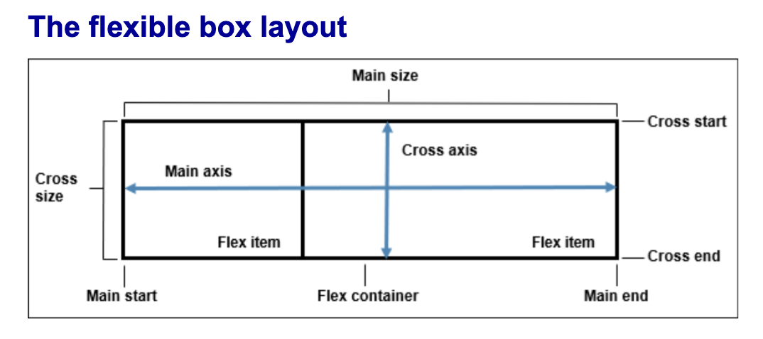
basic concept of how flexbox works
set
display: flex;its default direction is set to row!this will make all the elements in a box line up in a row across the width of the parent container
you can then edit its direction, order, justify/centering, spacing etc. of the elements inside the parent container that has flex display applied to it
how to set flexbox display and its default direction
display: flex;
flex-direction is row by default
3 main properties for working with flexbox
display
flex-direction
flex-basis
what is flex-basis: ##% and how its diff from just setting width
flex-basis is the starting size of an element before any extra space in the container is distributed
If you set an item to
65%, you are telling the browser: "Try to make this item take up 65% of the Main Axis (usually the width) of the container."
DIFFERENCE to WIDTH:
Priority:
flex-basisoverrideswidthwhen an item is inside a flex container.Directional Awareness: If you change your container to
flex-direction: column,flex-basisstops controlling the width and starts controlling the height instead.
what are flex-grow and flex-shrink
flex-grow: <number>;(Default is0)Determines how much of the remaining space an item should take up.
flex-shrink: <number>;(Default is1)Determines the rate at which an item shrinks when the container is too small.
0 is off, 1 is on
Quick Rules of Thumb:
flex-grow: 0: "Stay my size, don't get any bigger."flex-grow: 1: "Fill up whatever empty space is left."flex-shrink: 0: "Do not squish me; I'd rather overflow the container than shrink."flex-shrink: 1;allows a flex item to shrink proportionally if its container is too small to fit all elements at their original size.
ex. if flex-basis: 65%
If there is extra space: The item starts at 65%. If
flex-growis turned on, it might get even wider.If there isn't enough space: The item starts at 65%. If
flex-shrinkis turned on, it will squash down to fit without overflowing.
flex shorthand syntax
flex: flexGrow# flexShrink# flexBasis%
flex: 1 1 65%;
1 (
flex-grow): Can it get bigger? (Yes)1 (
flex-shrink): Can it get smaller? (Yes)65% (
flex-basis): What is the starting size? (65%)
how to make elements align into a column
display: flex;
flex-direction: column;
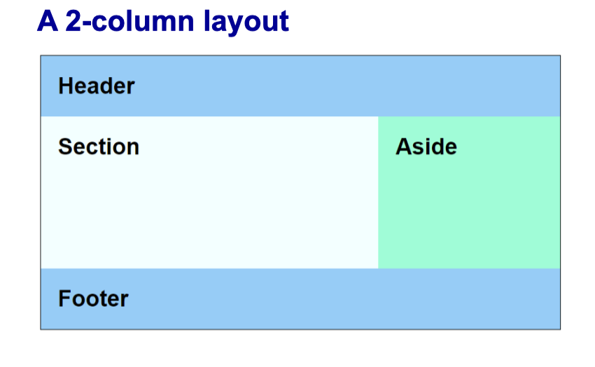
how to set a 2 column layout with flex
same strategy for 3 or more cols as well!
these look like 2 cols bc the 65% and 35% add up to 100! and since they are automatically in a row, they sit next to each other!
main { // the parent box
display: flex;
}
section { // child
flex-basis: 65%;
min-height: 10em; /* just to add some height */
background-color: azure;
}
aside { //child
flex-basis: 35%;
background-color: aquamarine;
}
how to reverse flex items
flex-direction: row-reverse; will set row in backwards order!
how to manually order items in a flexbox with an example
apply to children:
item-selector {
order: <number>;
}
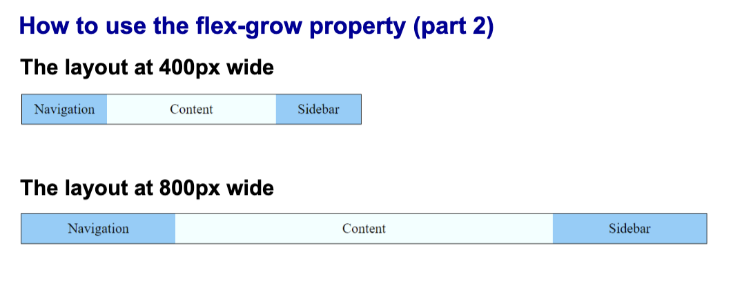
example of flex grow to make page scale up
ex:
nav, aside {
flex-basis: 100px;
flex-grow: 1;
}
section {
flex-basis: 200px;
flex-grow: 3;
}
how to make items scale to page size? - review
flex-grow
flex-shrink
example of how to use flex-shrink to make page scale down
nav, section, aside { flex-basis: 250px; }
nav { flex-shrink: 0; }
section, aside { flex-shrink: 1; }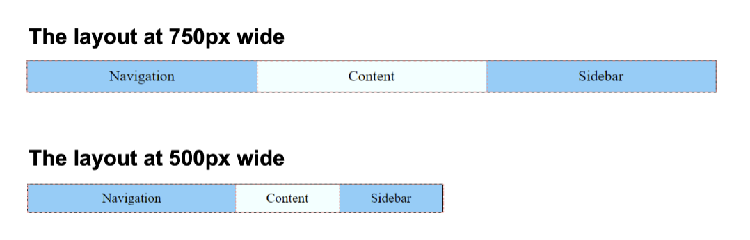
content properties for viewport metadata with example
width
height
initial-scale
minimum-scale
maximum-scale
user-scaleable
width: Sets the width of the virtual viewport, usually set todevice-widthto match the screen's physical size.height: Sets the height of the virtual viewport, though it is rarely used as most layouts scroll vertically.initial-scale: Controls the default zoom level when the page is first loaded by the browser (e.g.,1.0for no zoom).minimum-scale: Defines the smallest amount the user is allowed to zoom out from the page content.maximum-scale: Defines the largest amount the user is allowed to zoom in on the page content.user-scalable: Determines whether or not the user is permitted to pinch-to-zoom (set toyesorno).
ex:
A <meta> element that sets viewport metadata:
<meta name="viewport" content="width=device-width, initial-scale=1.0">
css to set min and max sizes - review
min(list-of-values)
max(list-of-values)
clamp(min, val, max)
val refers to the width of the image's parent container.
ex.
CSS that limits the maximum width of the image
img { width: min(100%, 600px); }
CSS that limits the minimum and maximum widths of the image
img { width: clamp(300px, 100%, 600px);
fluid vs responsive webpages
Fluid Layouts: Use percentages to "flow" into the available space. It's a smooth, continuous resizing.
Responsive Layouts: Use Media Queries to "snap" into different arrangements at specific "breakpoints" (e.g., changing from 3 columns on desktop to 1 column on mobile).