Nat 5 Expressive Flashcards
 Call Kai
 Learn
Learn Practice Test
 Spaced Repetition
 Match
Match Flashcards
 Knowt Play
1/43

There's no tags or description
Looks like no tags are added yet.
Name | Mastery | Learn | Test | Matching | Spaced | Call with Kai |
|---|
No analytics yet
Send a link to your students to track their progress
44 Terms
KEY TERM: Composition
How things are arranged in an artwork.
For example, in a Still Life painting, how the different objects are placed.
You can talk about:
Leading lines, viewpoint, focal point, symmetry, balance, pose, negative space, busy composition, simple composition (see separate flashcards for more on these)
A composition may form shapes that lead your eye around eg a circle or triangle
How does composition affect the mood/atmosphere and visual impact?
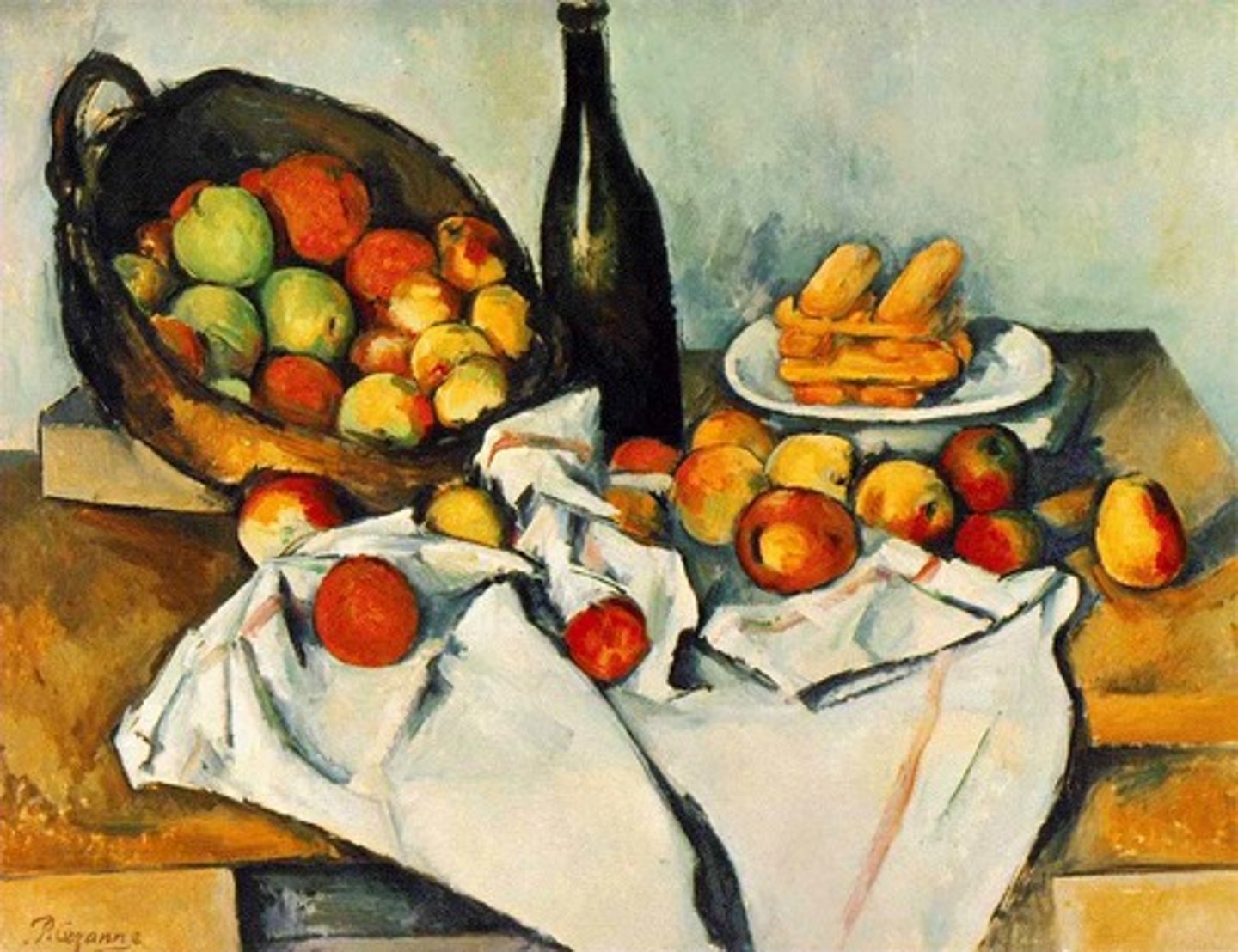
Focal point
The main focus in an artwork.
Focal points are created by the artist using different techniques, such as tone, colour, and line.
Important: not all work has a focal point. Some paintings may be more busy or more minimalist and not feature a single main focus.
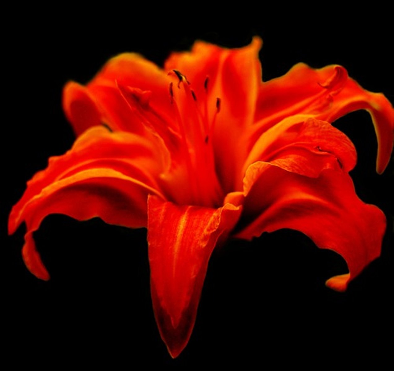
Negative Space
The space around something in an artwork.
For example, the black space around the flower.
This can be used to frame something to make it seem more important.
It could also create a feeling of calm or loneliness.
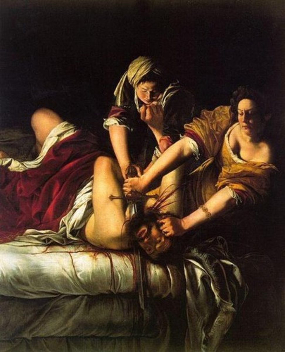
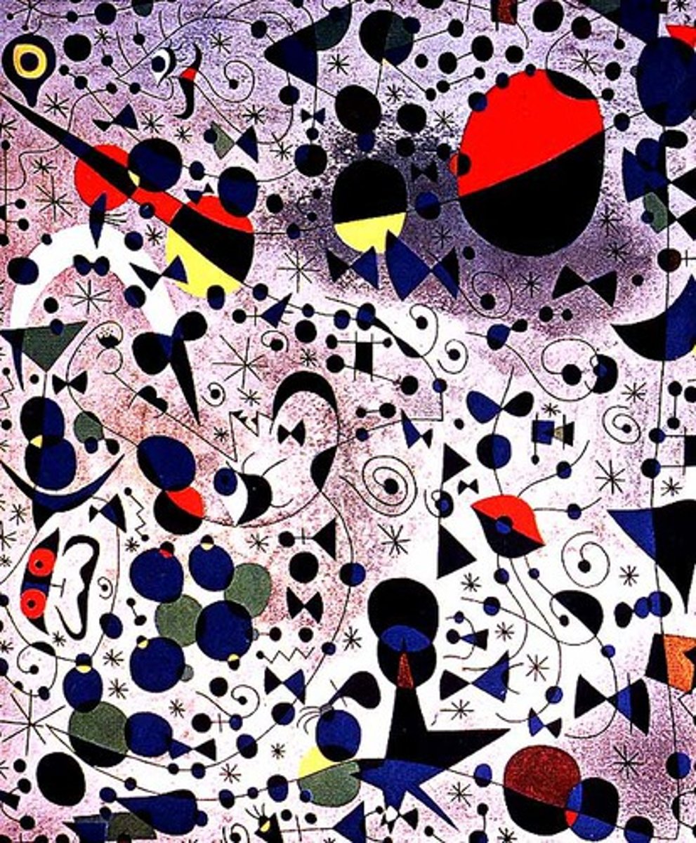
Busy composition
A composition that has lots of things in it.
This could make the painting feel:
busy
stressful
energetic
Claustrophobic (a scary lack of space)
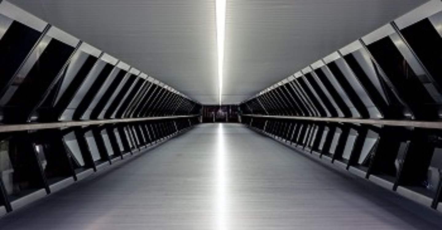
Symmetry
As if there was a mirror in the artwork and the facing parts match each other.
Symmetry can make a painting feel:
Organised
Harmonious
Balanced
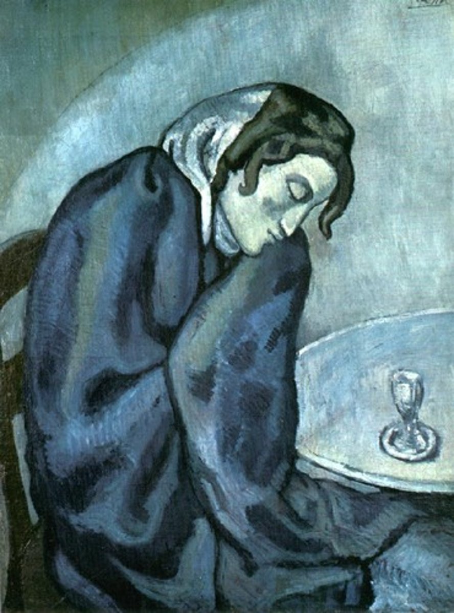
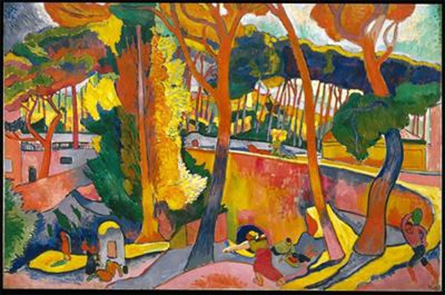
Saturated colours
Strong, bold colours
These can be used to make parts of the painting stand out.
They might also make the painting feel:
Happy
Energetic
Bright
Intense
Unreal/dreamlike
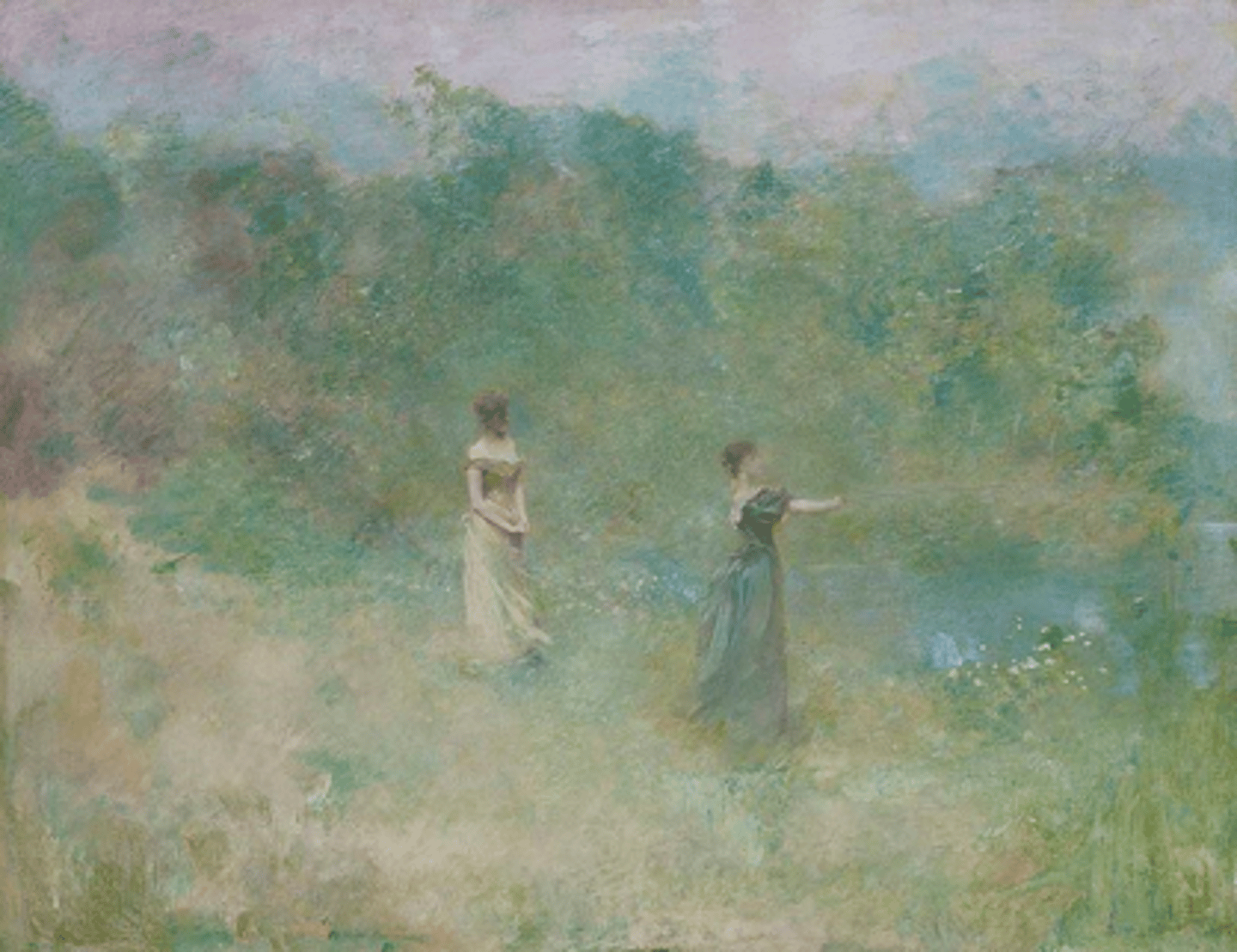
Muted colours
Colours that are not very strong.
This might make the painting feel:
Calm
Sad
Depressed
Sleepy
Unreal/dreamlike
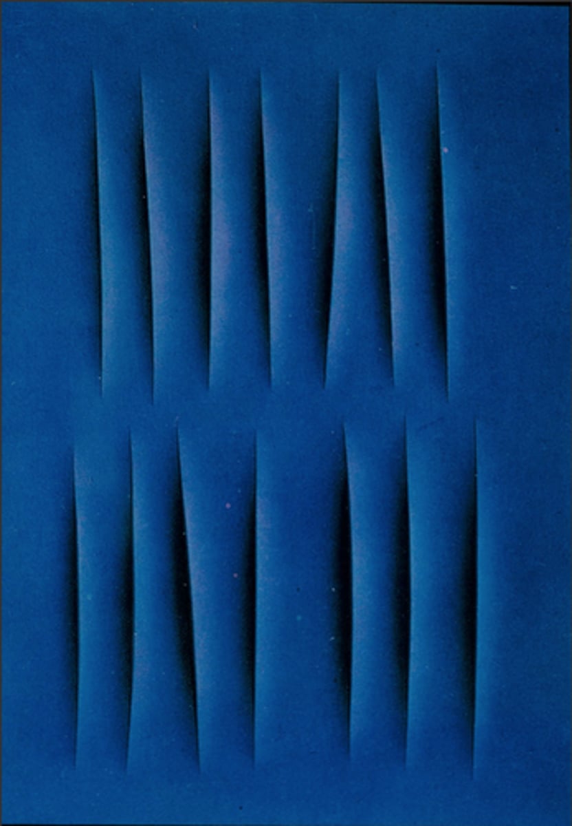
Monochrome
Where only one colour has been used. Different shades of the same colour might also be present.
This might make the painting feel:
Calm
Sad
Intense
It depends on what is in the painting and what colour has been used.
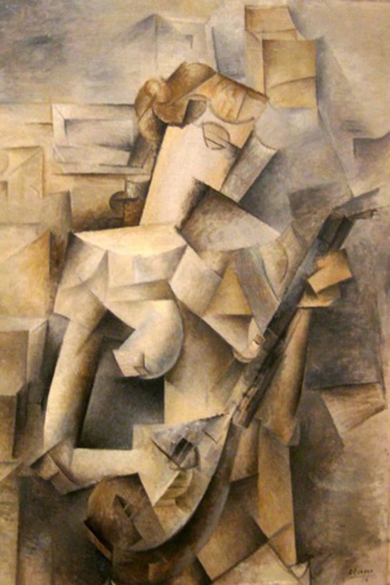
Restricted palette
Only a few colours have been used.
This might make the painting feel:
Calm
Sad
Unreal/dreamlike
It depends on what is in the painting and which colours have been used.
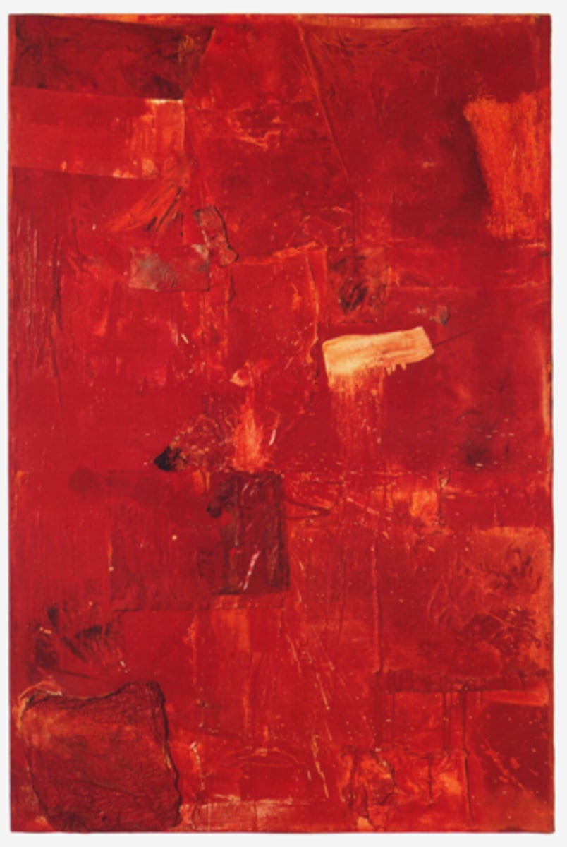
Warm colours
Red, pink, orange, yellow, purple.
These can make a painting feel:
Warm
Happy
Intense
They can also be used to highlight part of a painting. Are their contrasting or cold colours anywhere?
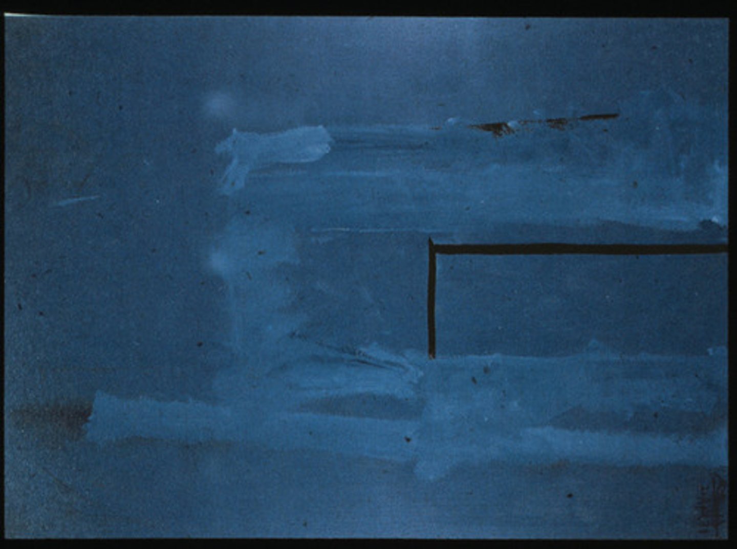
Cold colours
Blue, green
These can make a painting feel:
Calm
Sad
They can also be used to highlight part of a painting.
Are their contrasting or warm colours anywhere?
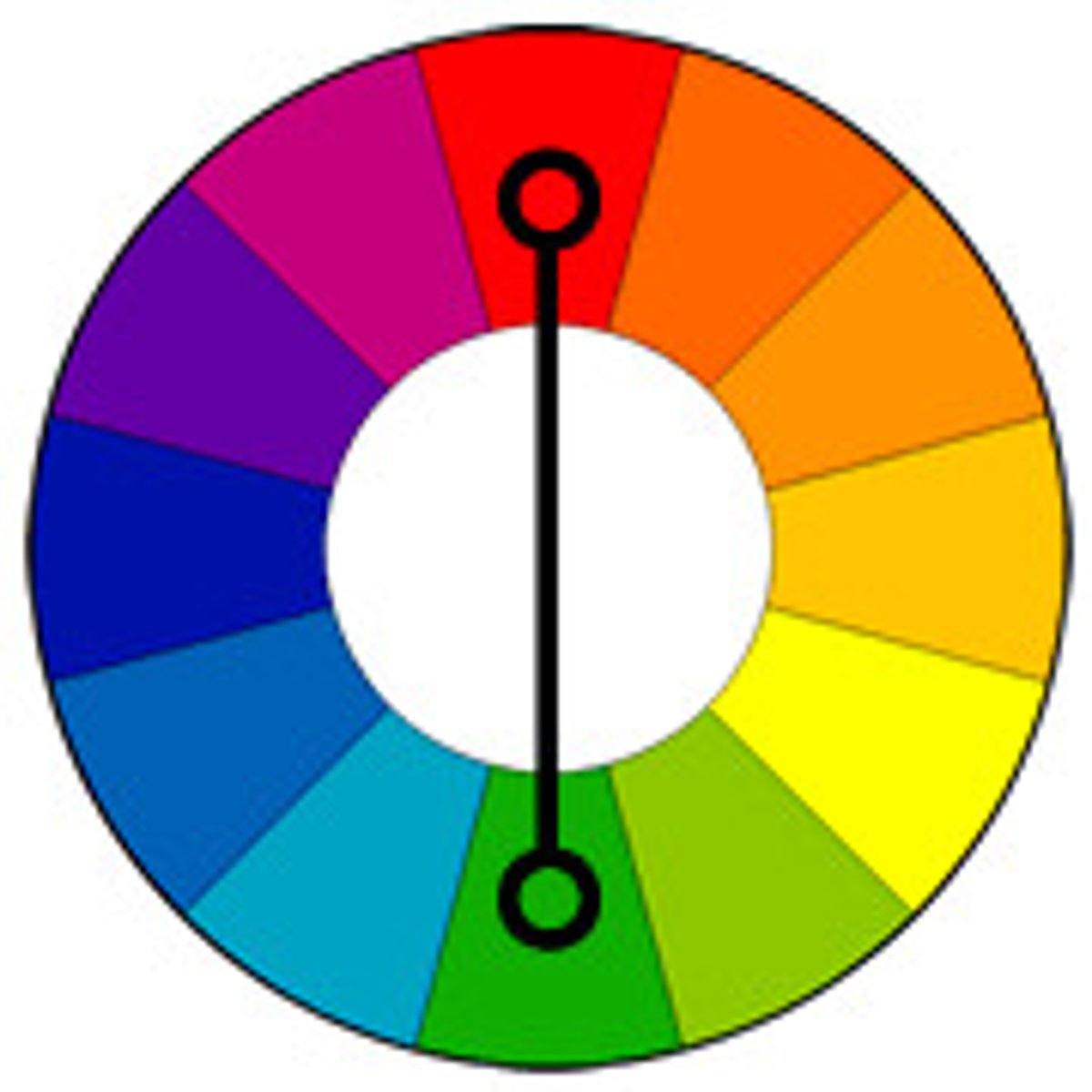
Complementary or contrasting colours
Colours that are opposite each other on the colour wheel.
These can make different parts of the painting stand out from each other.
Cold and warm colours contrast each other.
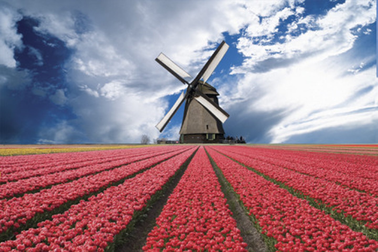
Leading lines
Lines in the artwork which lead our eye to something.
They might lead our eye to the focal point.
They could be exact lines, or the edges of objects could be placed to act as leading lines.
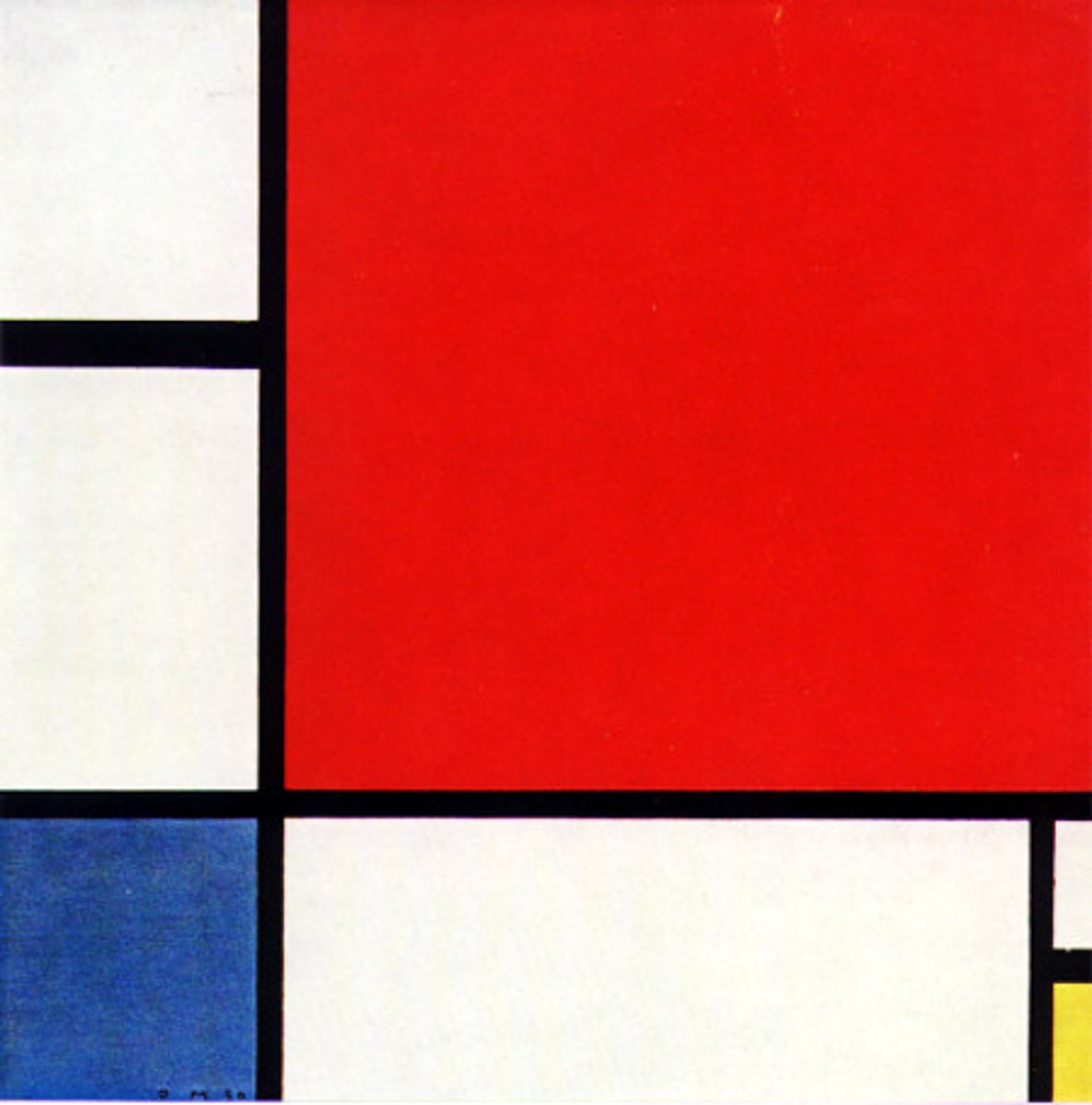
KEY TERM: Shape
Shapes are 2D.
They can be geometric or organic, regular or irregular.
Jagged shapes could suggest a scary mood.
Round shapes could suggest a calm mood.
Bold shapes could draw our eye and make us look at them.
Shapes can be used to create a pattern.
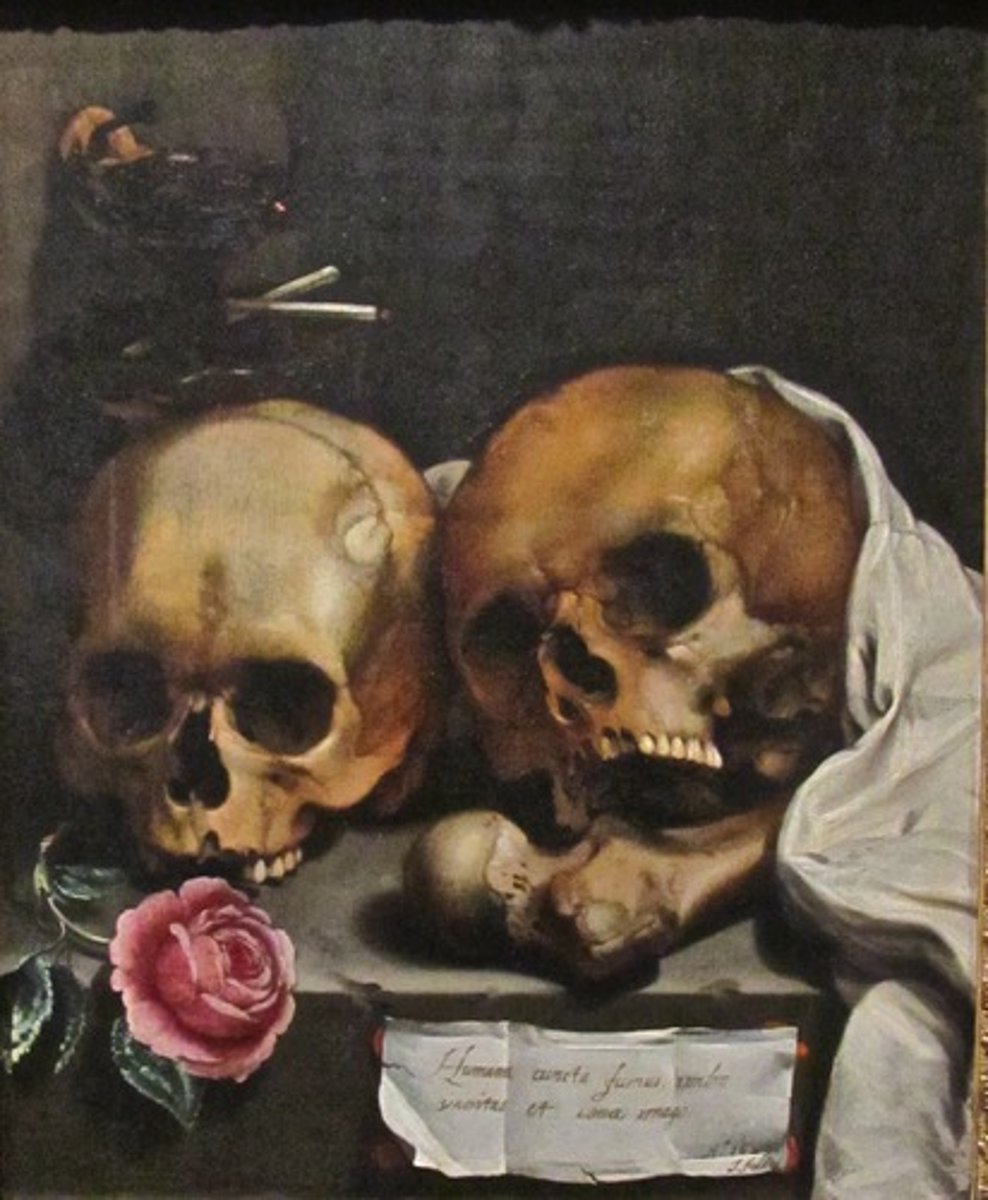
KEY TERM: Form
Forms are 3D.
Paintings can have forms in them: they are flat but have the illusion of form.
For example, the skulls here are flat but they look 3D because the artist has added tone.
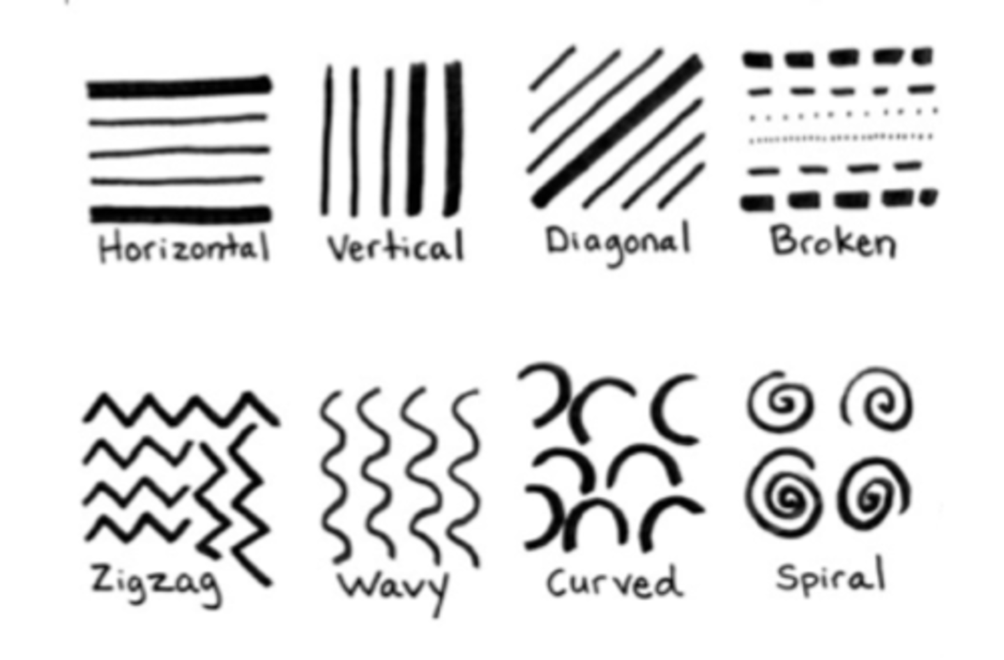
KEY TERM: Line
Lines might be the outline of something or they could be leading lines
They can lead your eye around a painting
They can be bold and make things stand out
They can be light and faint to create a calm mood
They can create patterns
They can be used to add tone (e.g. through cross-hatching)
Heavy lines could make a painting feel:
Angry
Intense
KEY TERM: Materials
What is the artwork made from? What are the properties of that material?
Common materials include:
Oil paint
Acrylic paint
Charcoal
Pencil
Watercolour
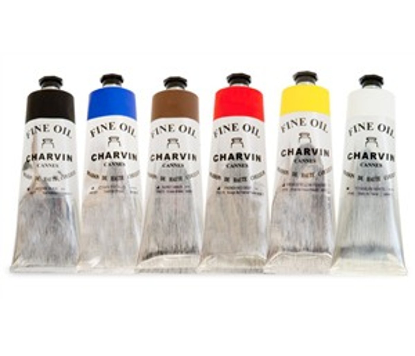
Oil paint
Oil paint takes longer to dry: artists can work on their pieces for a long time
You can blend more realistic colours from it
It is a lot more expensive than acrylic paint so some artists cannot afford it
It was invented much earlier than acrylic paint
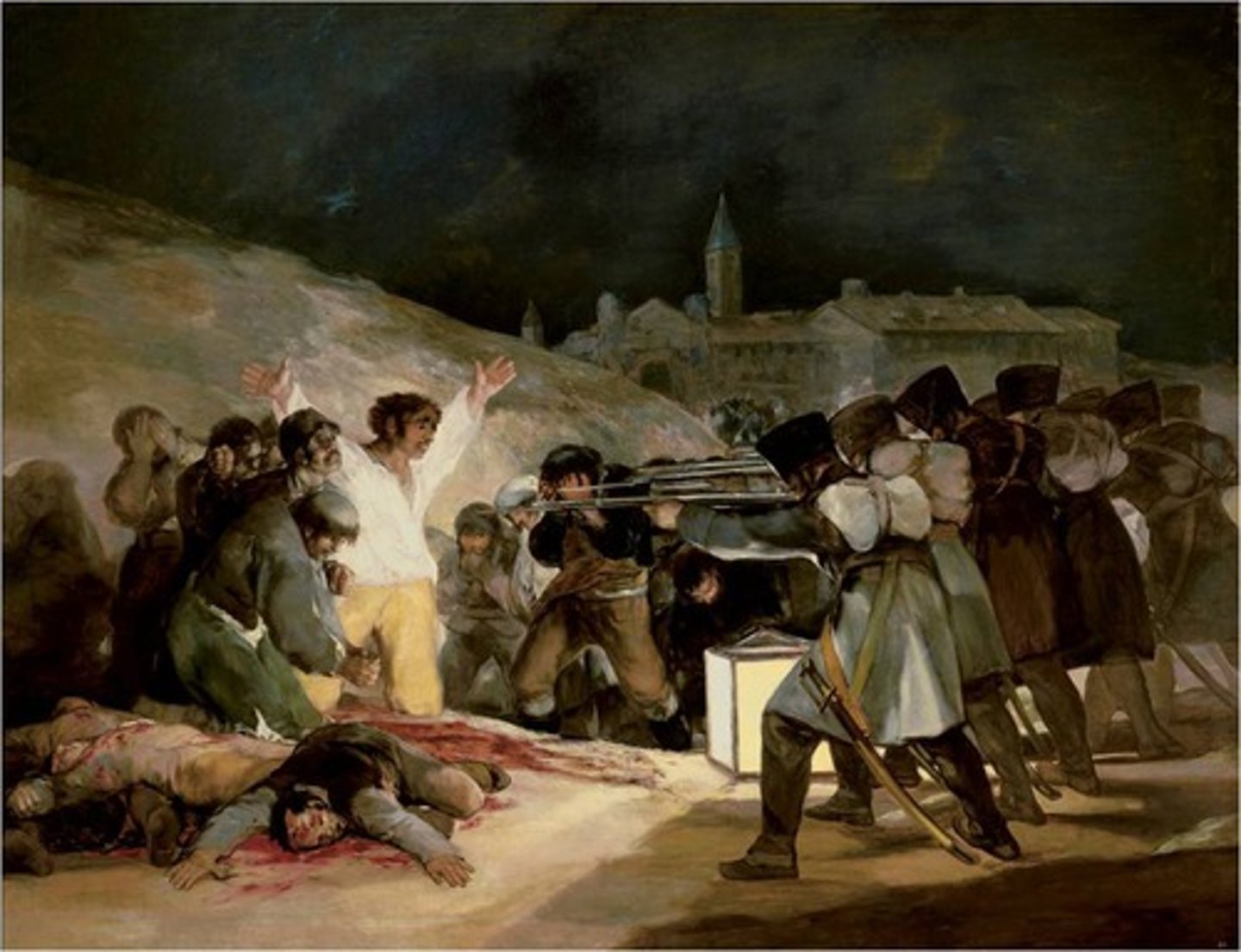
Acrylic paint
Acrylic paint dries quickly so it's not as easy to make changes
Acrylic paint produces more bright, artificial colours than oil paint
It is cheaper than oil paint so it is more accessible for artists
It is a more modern invention so painters before the 1930s couldn't have used it
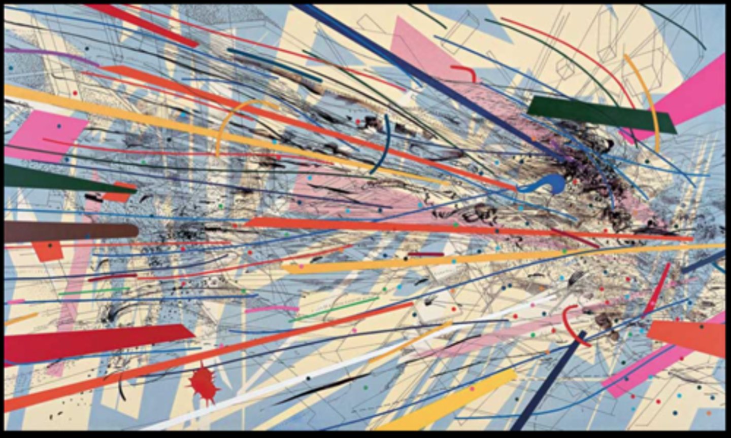
Watercolour
Watercolour is quite transparent: you can see through it. It needs to be built up in layers.
The white of the paper usually shows through, so watercolour paintings tend to be very light and bright.
Watercolour paints must be used on paper, not on canvas as they are not bold enough to show up on canvas
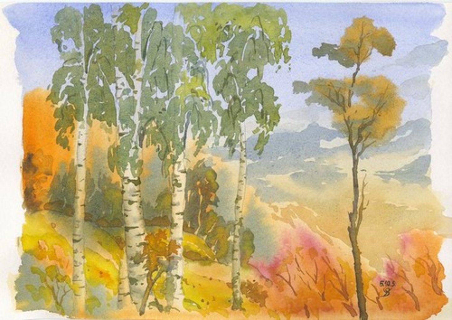
KEY TERM: Mood
Think about human emotions
Words to describe mood:
Happy, sad, excited, bored, cheerful, optimistic, scared, calm, angry, tense, nostalgic, etc...
Mood can be created using subject matter, colour, line, tone, etc.
In the question paper, mood always appears with atmosphere. I have split them up here to make it easier to understand.
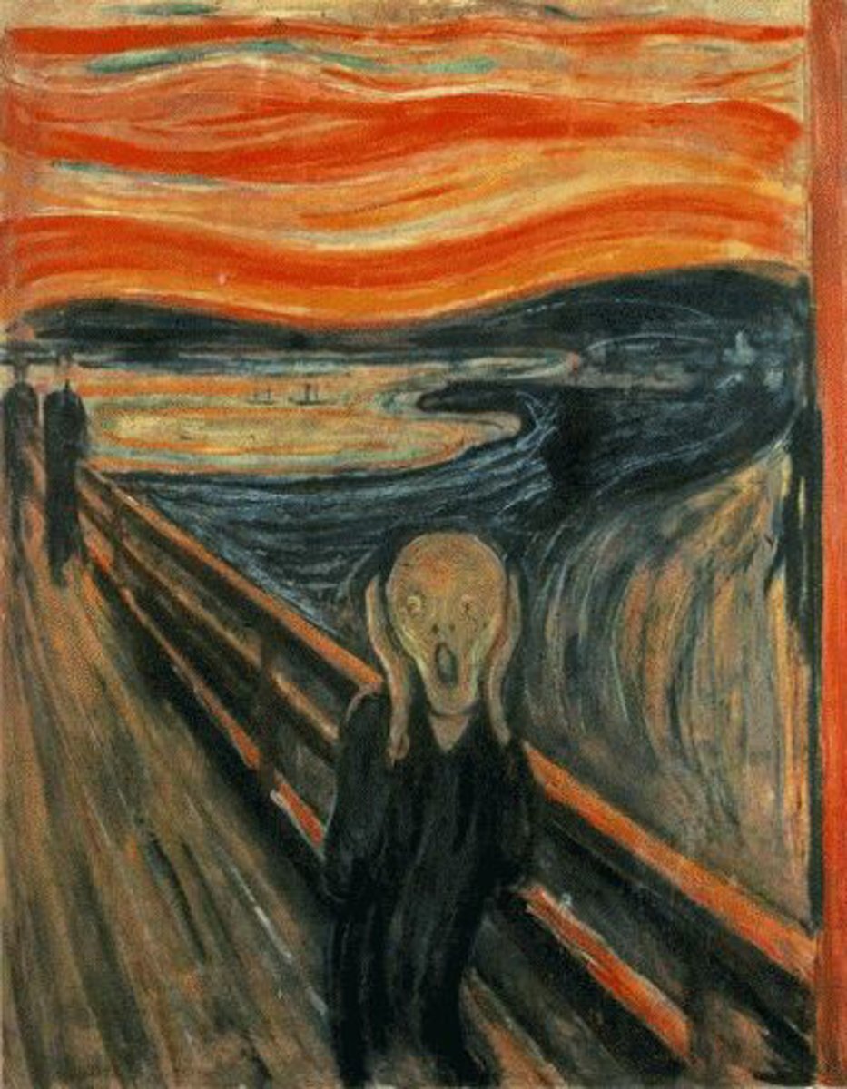
KEY TERM: Atmosphere
Think about vibes
Words to describe atmosphere:
Uncomfortable, calm, tense, disturbing, mysterious
Atmosphere can be created using subject matter, colour, line, tone, etc.
In the question paper, atmosphere always appears with mood. I have split them up here to make it easier to understand.
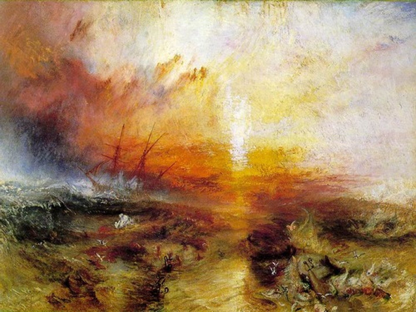
KEY TERM: Pattern
Repeated elements
You can describe the pattern:
Decorative, striped, checked, spotted, floral, irregular, geometric, organic, linear etc.
Patterns can affect the mood and atmosphere. They could make it more energetic or more calm/harmonious.
Patterns could increase the visual impact (the power of the painting)
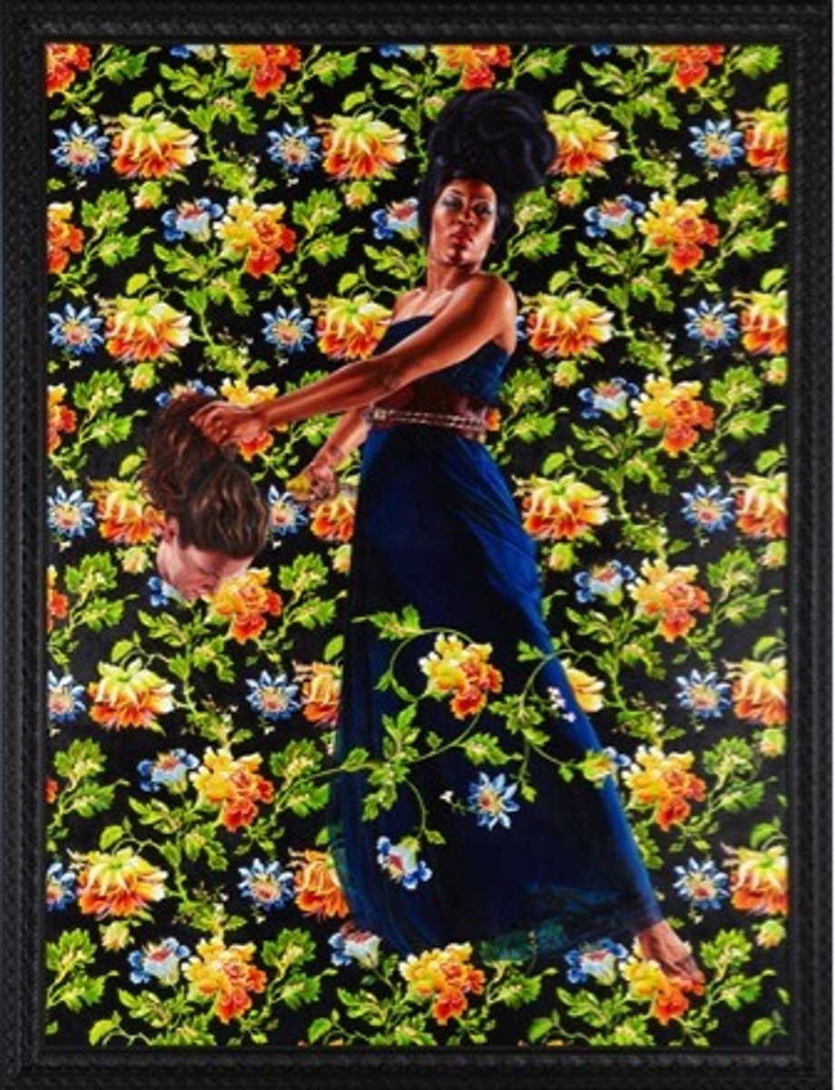
KEY TERM: Perspective
How 3D objects/places are shown in 2D space.
In the exam, you can answer this very similarly to viewpoint
You can talk about aerial perspectives (seen from above) or multiple perspectives (multiple viewpoints)
You can talk about the illusion of space or depth created
How is perspective created in the piece? How does it affect the visual impact (power of the painting)?
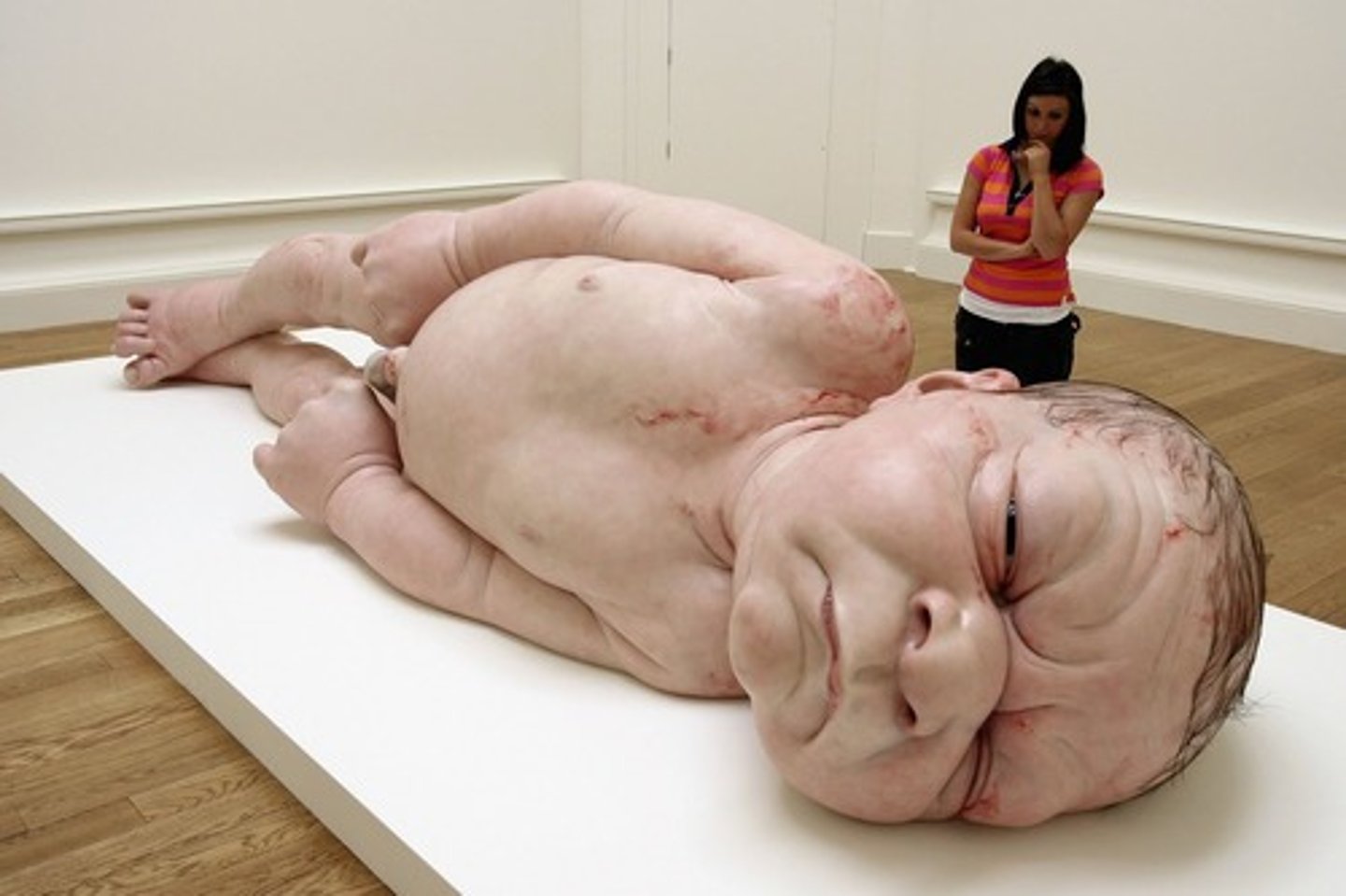
KEY TERM: Scale
The dimensions of the work OR the proportion of elements within the work
Look at the description of the work for clues!
A huge painting/artwork will have a very different impact to a tiny one.
Within the painting, are any elements much larger/smaller than others? How does this change the visual impact? What details are made to seem important?
Words to describe scale:
in proportion, out of proportion, realistic, distorted, large, small, larger-than-life, miniature, life-size
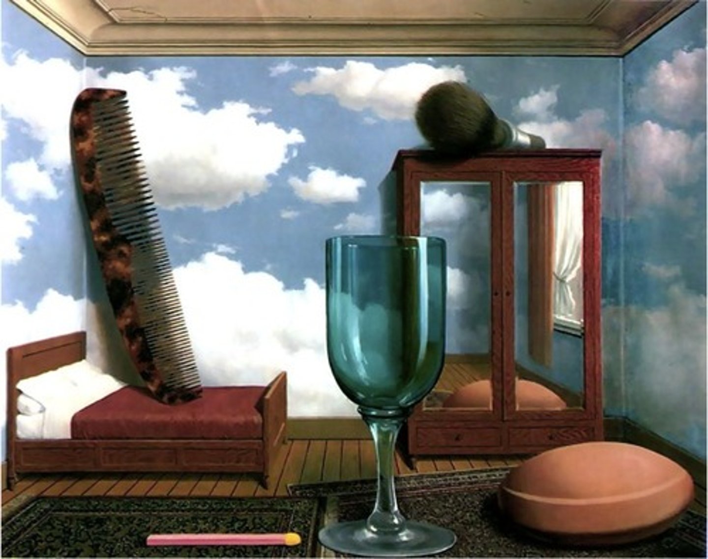
Proportion
The size of elements of the work in relation to other elements.
E.g. in this example, the comb is out of proportion with the bed as it is a lot larger. This creates a dreamlike feeling in the work.
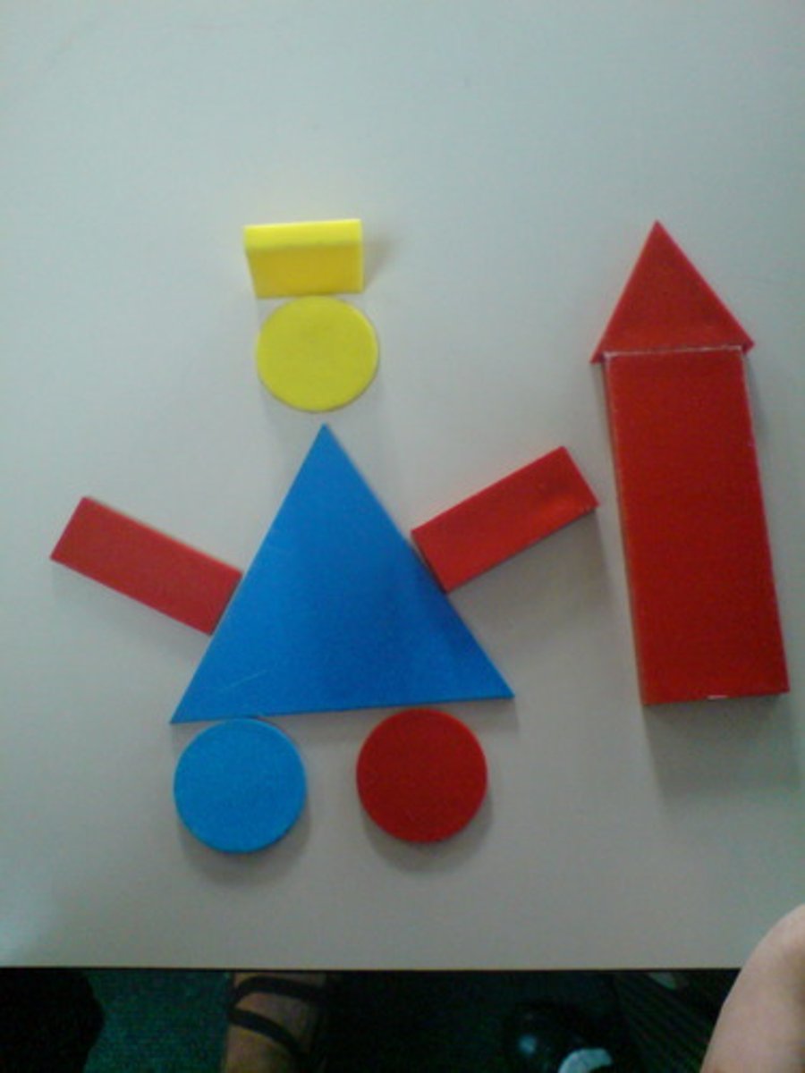
Geometric shape
Precise shapes that you find in maths
E.g. square, rectangle, triangle, circle, hexagon, etc
Their use in an artwork could make it feel:
Precise, harmonious, balanced, busy, etc.
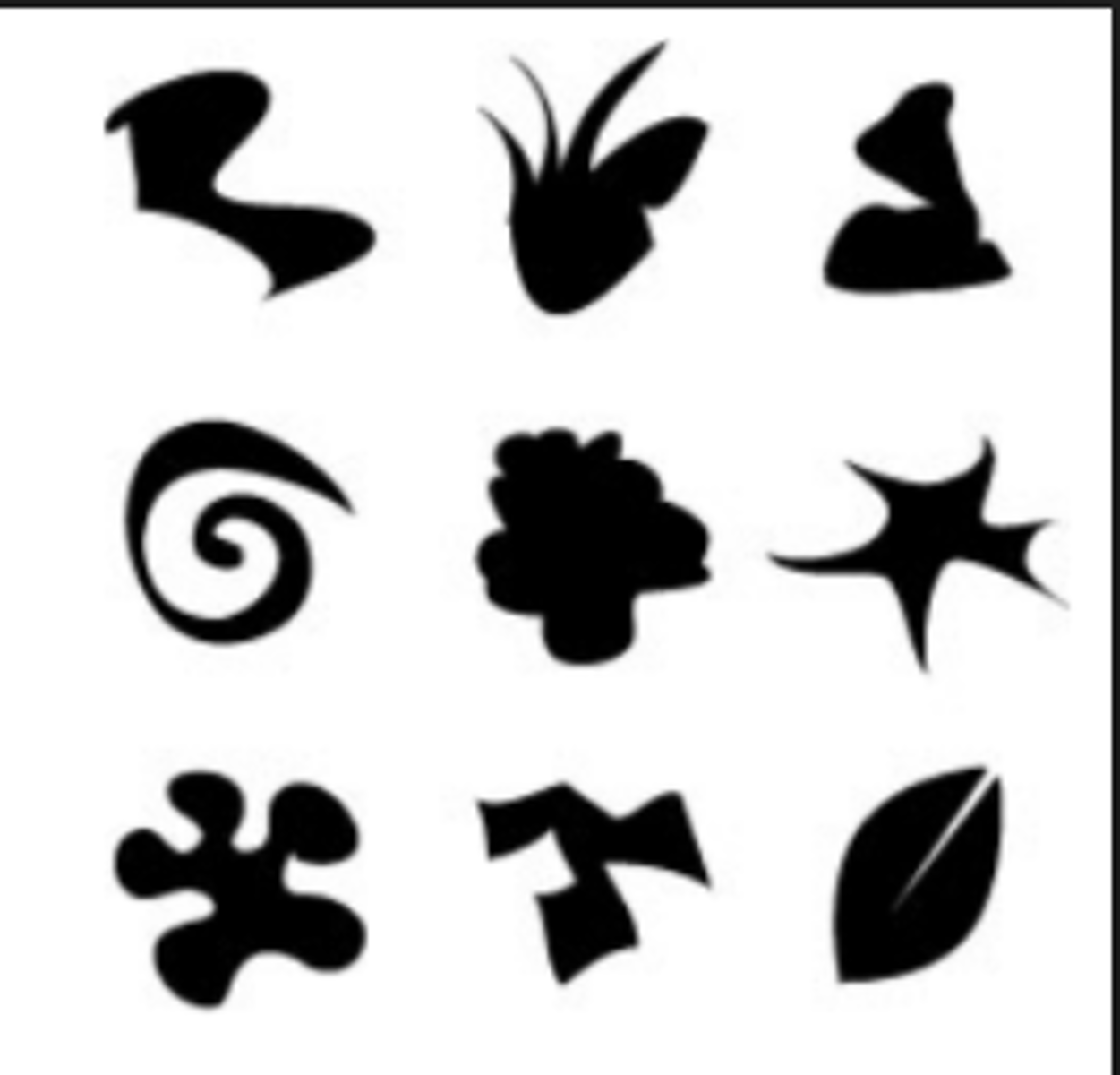
Organic shape
Imperfect shapes that are found in nature.
Words to describe organic shapes:
round, fluid, bumpy, irregular, jagged
Use of organic shapes could make a painting feel:
Natural, dreamlike, calm, etc.
KEY TERM: Style
Like the personality of an artwork/artist
Words to describe style:
Realist, expressive, graphic, experimental, geometric, abstract, playful, childlike, precise, messy, etc.
How does the style affect the mood/atmosphere? Clue: imagine the opposite style, and think how the mood would be different. This should help you work out the effect on mood/atmosphere.
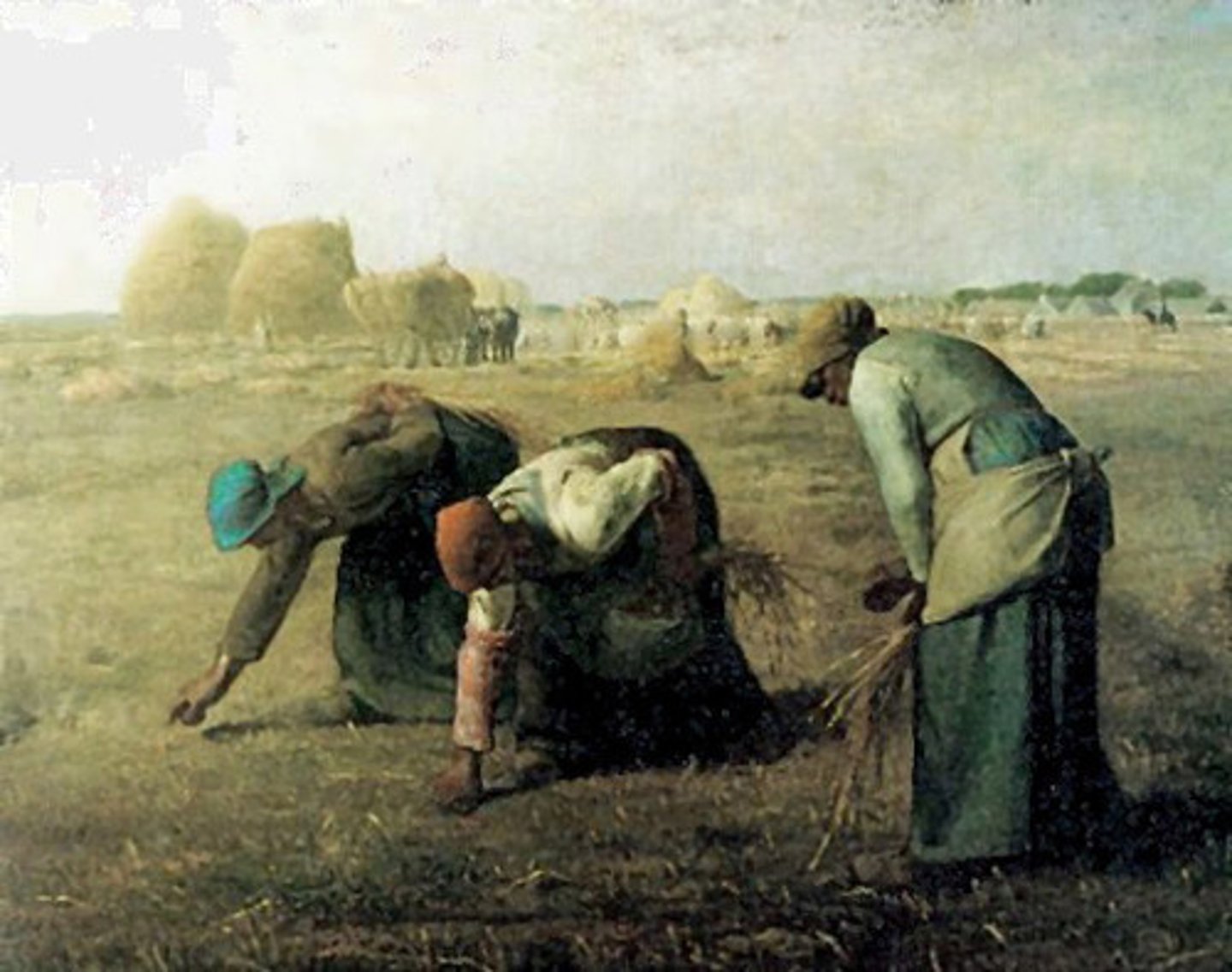
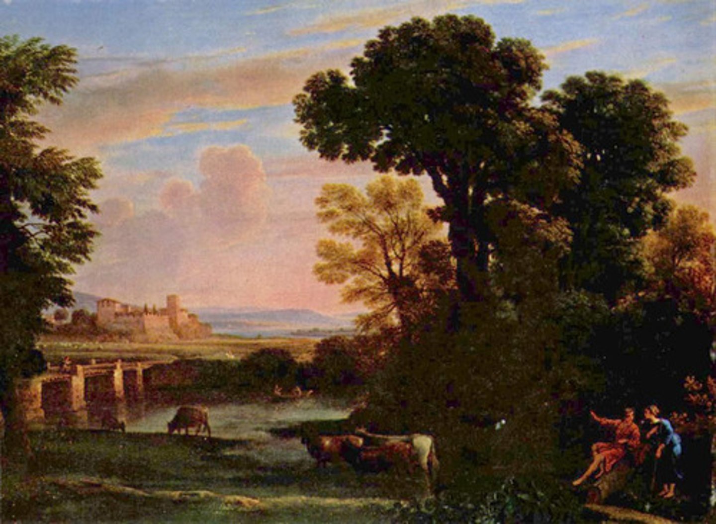
Realist style/realism
Artwork that looks like real life
Shows the artist's skill
More traditional
May not show the artist's individual style
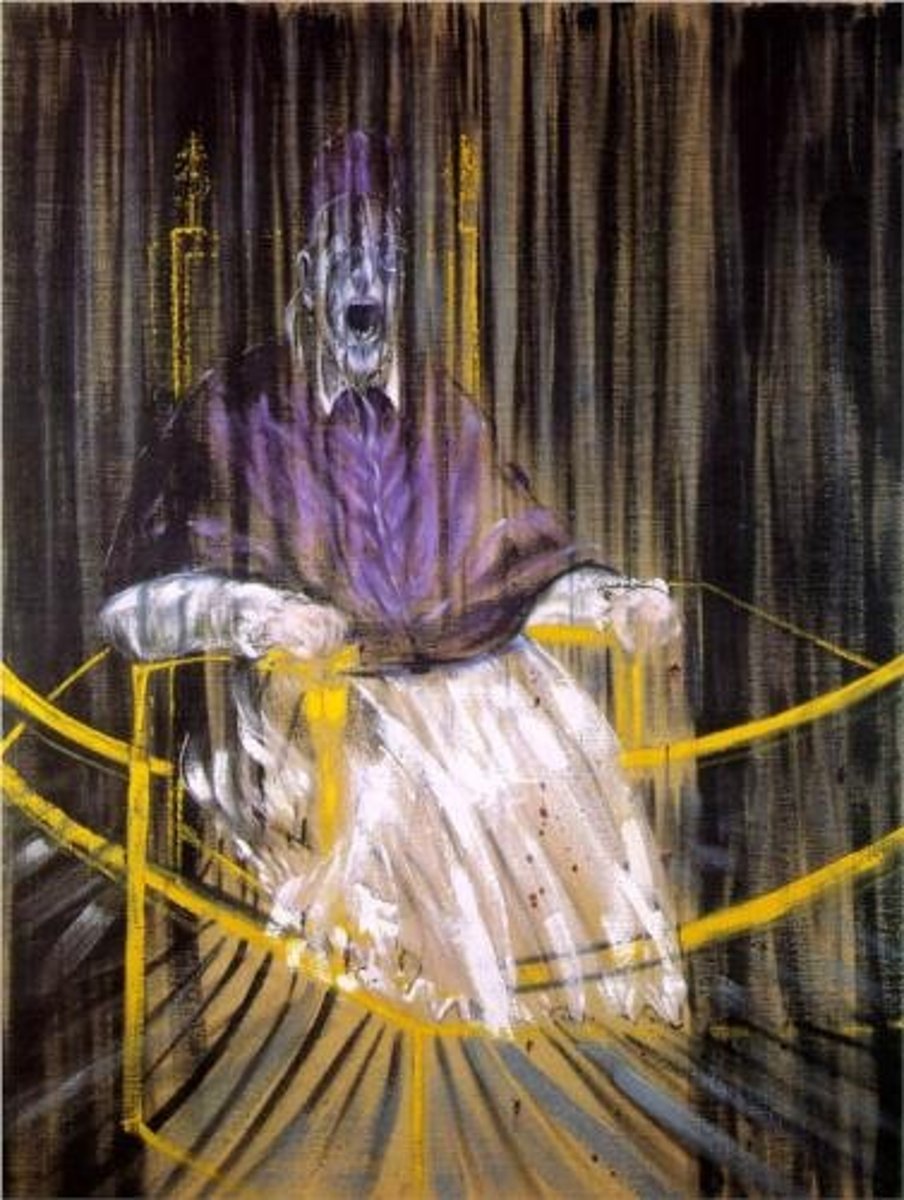
Expressive style
Artwork that expresses a mood, emotion, or the artist's personality rather than looking like reality
More contemporary than realist art
May not show the artist's traditional skills
May be more visually powerful to look at
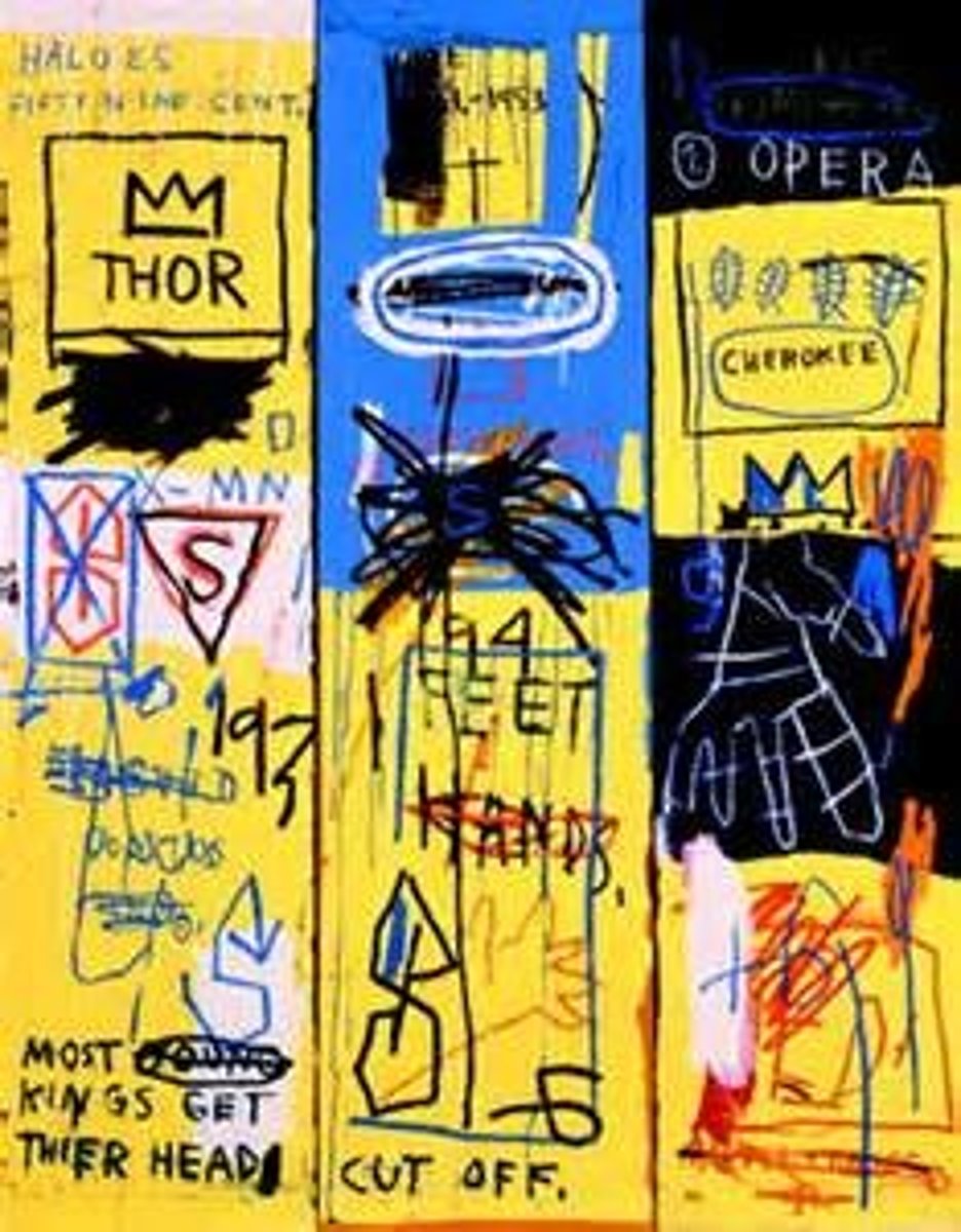
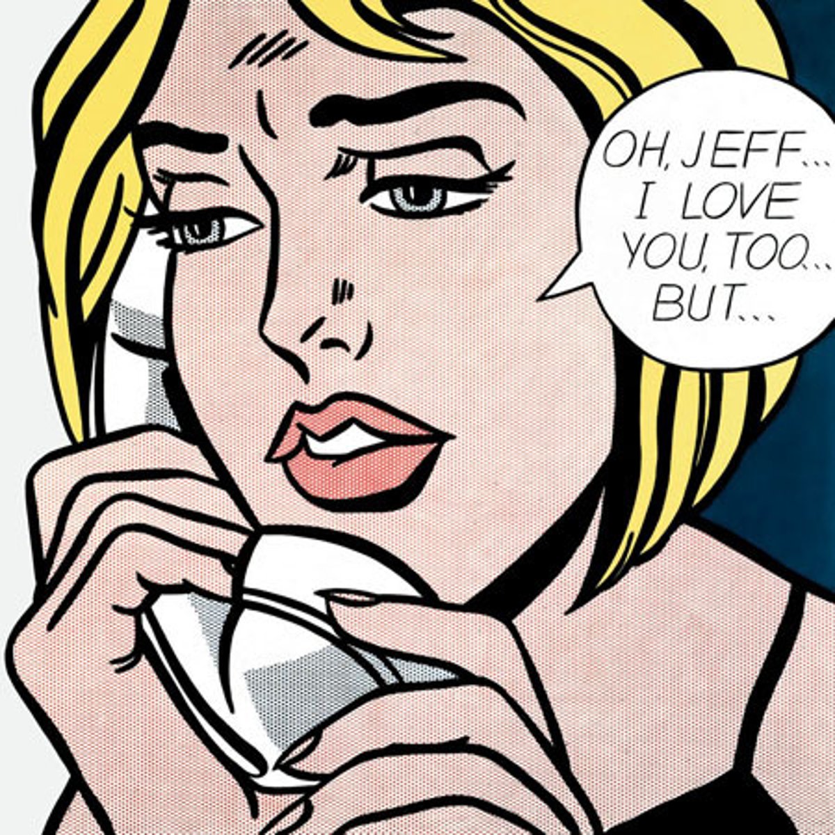
Graphic style
Artwork that looks like a comic or illustration
It usually has bold lines and flat colours
It can make a painting feel:
childlike, playful, bold
It can make it more eye-catching or powerful to look at
It can remind us of graphic novels or adverts
KEY TERM: Subject matter/imagery
What is in the painting/artwork?
People, places, objects
How is it arranged?
Can you work out what might be happening in the scene?
What effect does it have on the mood/atmosphere or visual impact?
For example, a painting of a person holding a gun would be very different if they were holding a flower.
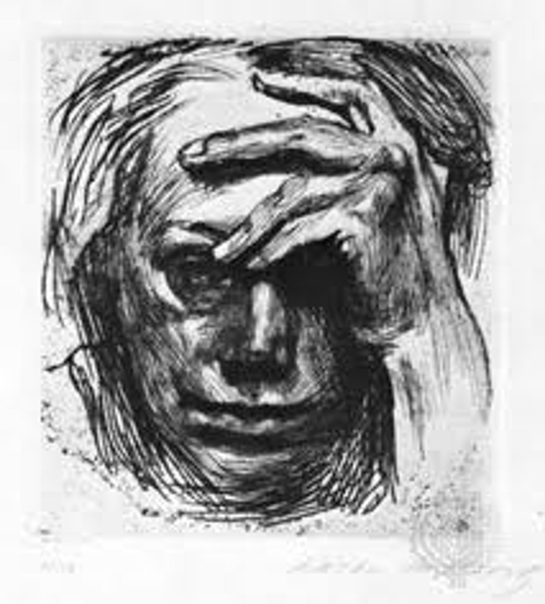
Charcoal
This material can be used to make quick, expressive drawings
You can add a lot of tone with charcoal
It smudges easily so may be less practical to use outside the studio
KEY TERM: Techniques
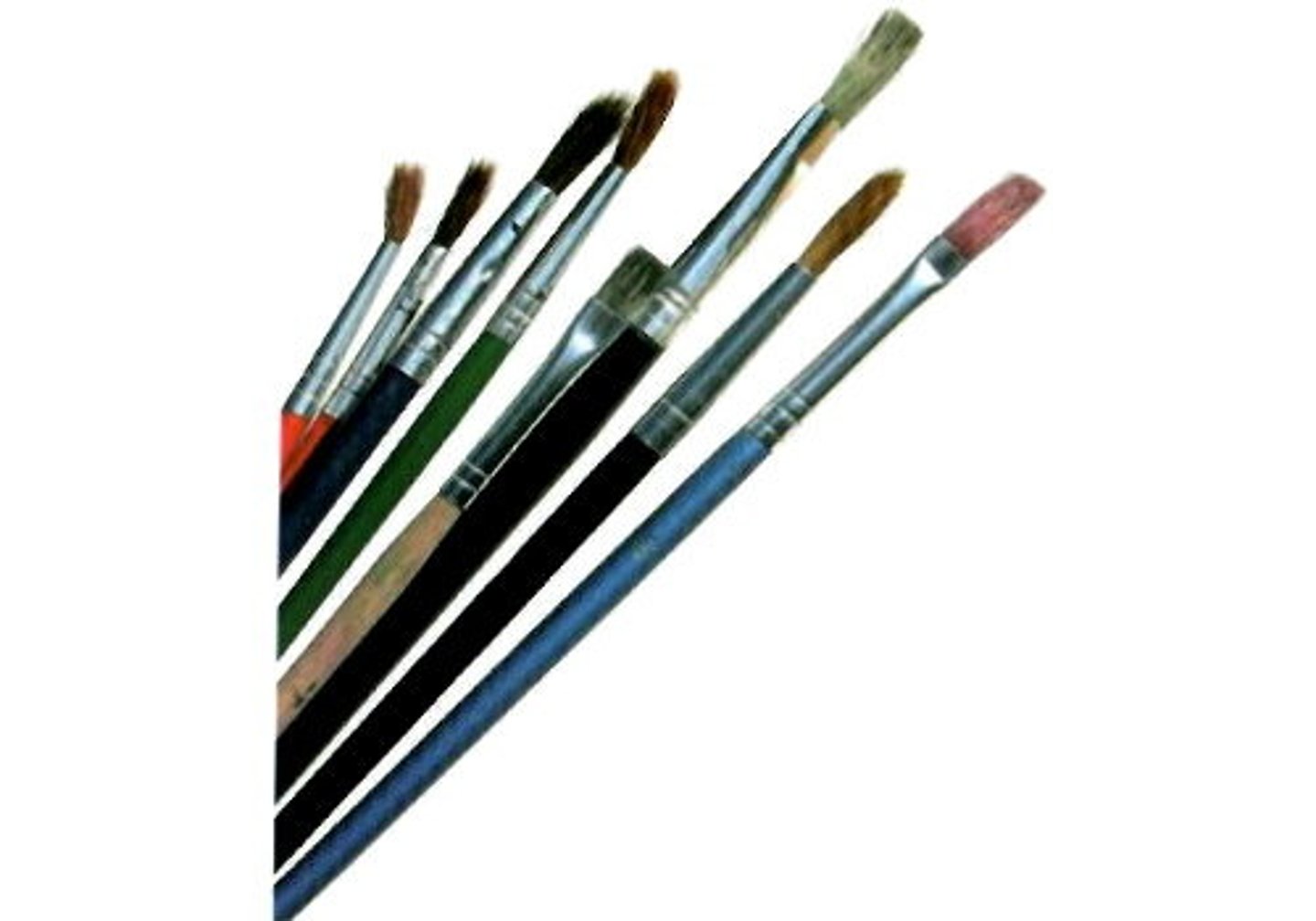
Think about what tools the artist has used:
Paintbrush
Palette knife
How has the artist applied the paint?
Some words to describe techniques:
Impasto, blending, expressive, directional brushstrokes, visible brushstrokes, chiaroscuro, sgraffito, pointillism
How do the techniques used affect the mood/atmosphere and visual impact?
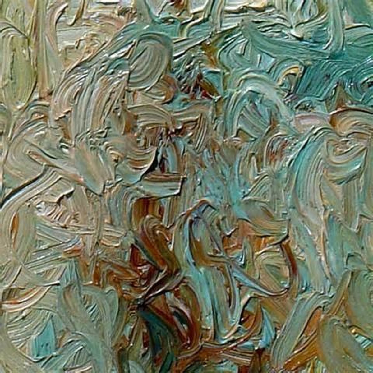
Impasto
Paint that has been thickly applied
Impasto paintings are usually expressive rather than realist.
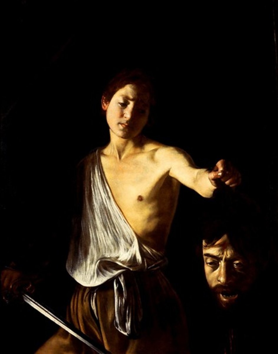
Chiaroscuro
Strong contrast between light and shade in a painting
This can make a painting feel:
Spooky, scary, dramatic
It can also be used to create the illusion of form (make things seem more 3D)
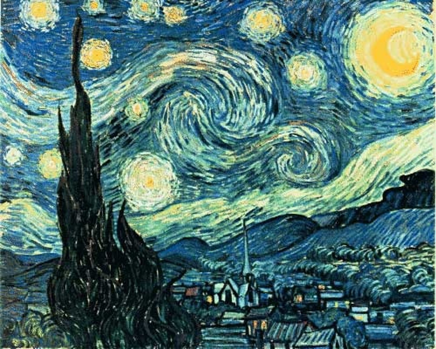
Visible brushstrokes
You can see the brushstrokes made by the artist. They are not blended together.
Paintings with visible brushstrokes are usually expressive rather than realist.
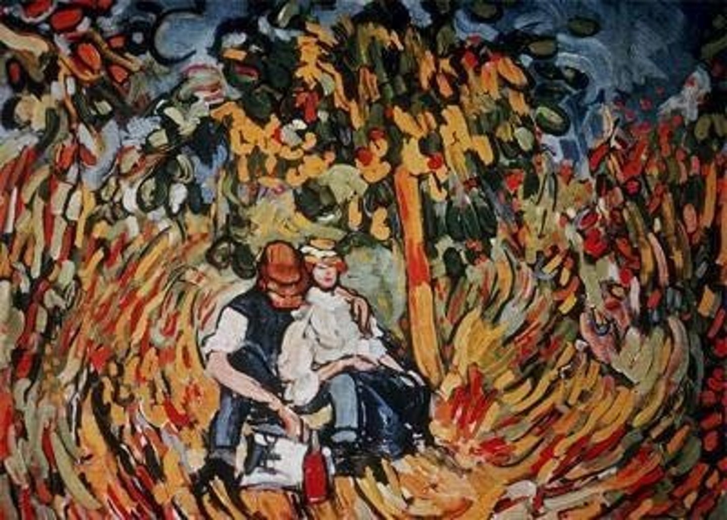
Directional brushstrokes
Do all the brushstrokes point in the same direction? Do they lead your eye somewhere?
Paintings with directional brushstrokes are usually expressive rather than realist.
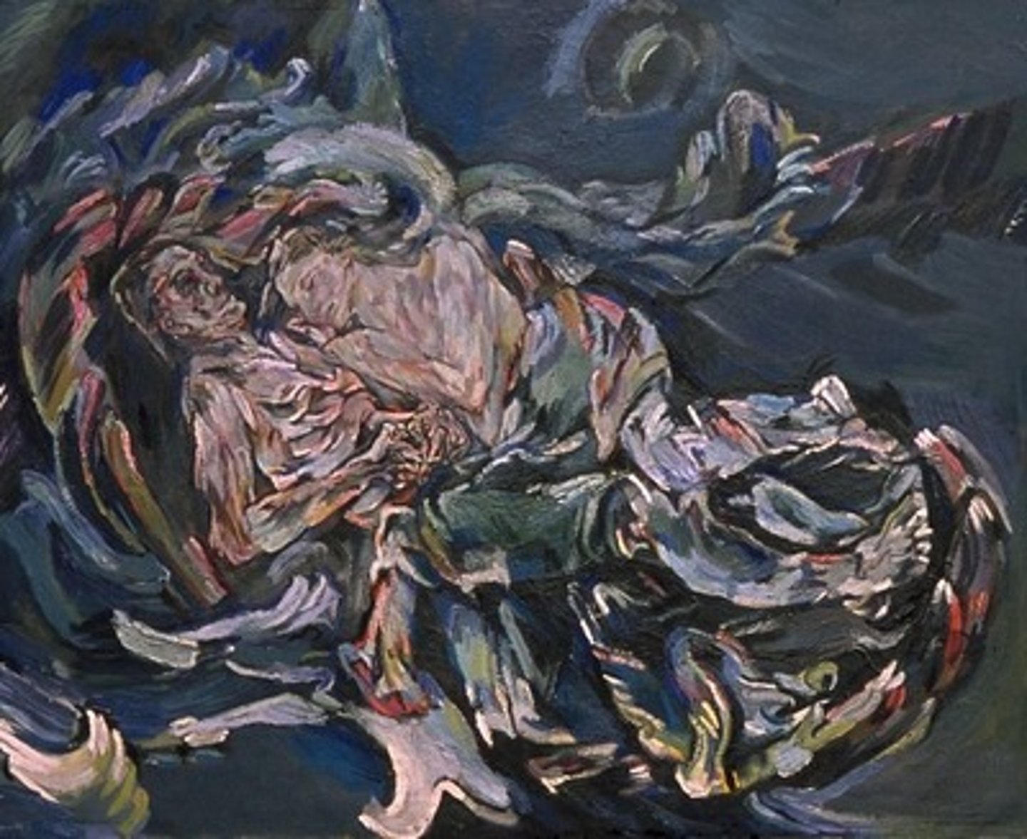
Sgraffito
Scratching through the top layer of paint to reveal the colour/canvas that is underneath
It is done using a palette knife
Sgraffito can give a painting a scratchy feel
It can be used to add smaller details or texture
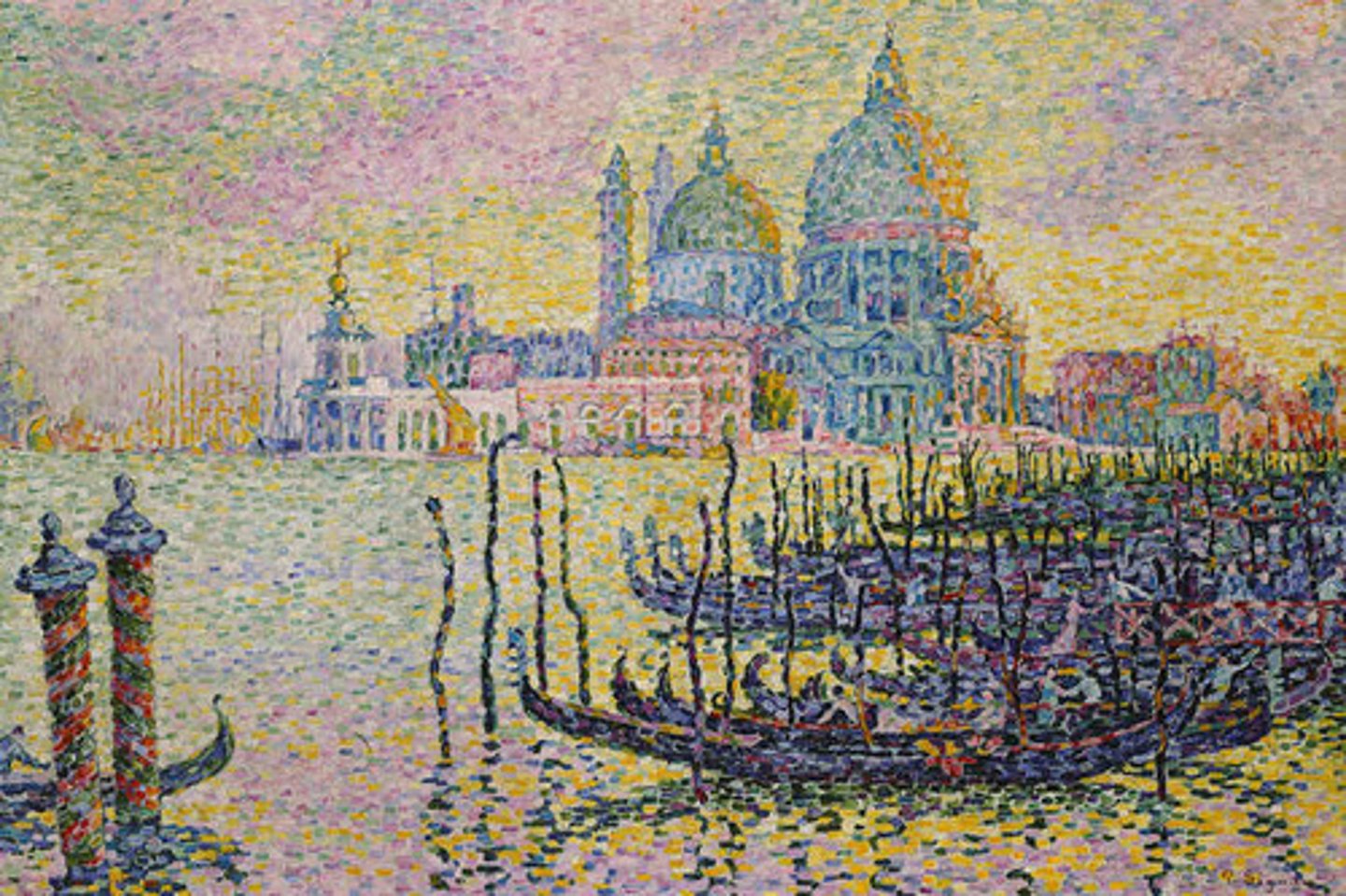
Pointillism
Painting using loads of tiny dots to build up the colour
This technique is very time-consuming
It is usually expressive rather than realist
It can increase a painting's visual impact, making it more bold or dreamlike, and can express a strong mood/atmosphere
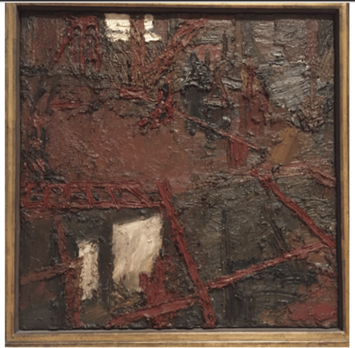
KEY TERM: Texture
How something would feel to touch
2D surfaces can have the illusion of texture
Words to describe texture:
Bumpy, smooth, jagged, rough, soft, furry, coarse, fine
Techniques that create texture:
Impasto, sgraffito, collage, visible brushstrokes
How does the texture affect the mood/atmosphere or visual impact?
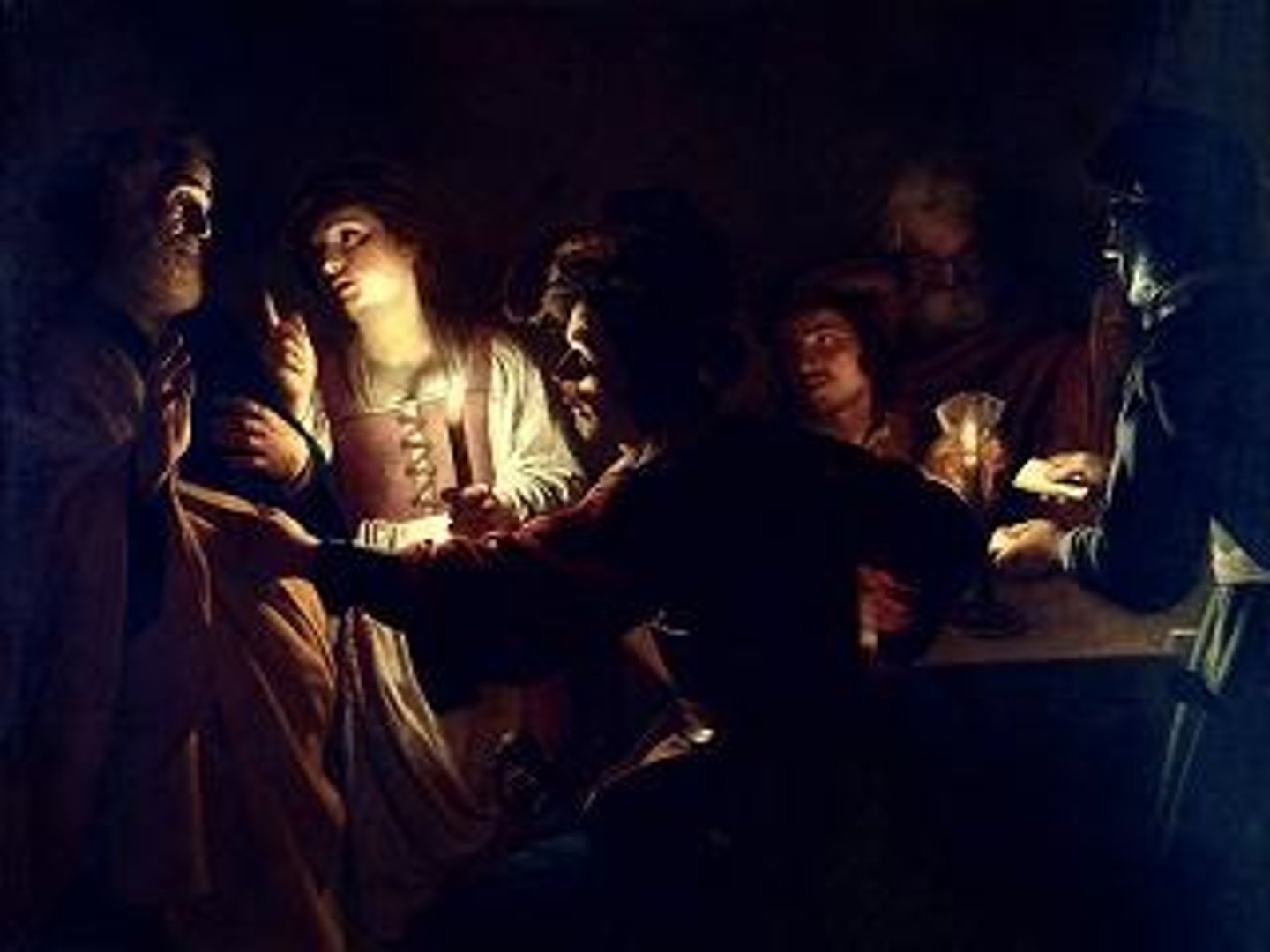
KEY TERM: Tone
Light and shadow in the artwork
Key words:
Highlight
Midtone
Shadow
Tone can be flat, graduated, or contrasting.
Chiaroscuro could be used.
How does tone affect the mood/atmosphere?
Visual impact
The power of the artwork. What will you remember about it once you look away?
An artwork could be:
Powerful, depressing, upsetting, calming, mysterious, frightening
This can be created using scale, tone, subject matter, colour, focal point, viewpoint, etc.