ITSS 4355 final
1/54
There's no tags or description
Looks like no tags are added yet.
Name | Mastery | Learn | Test | Matching | Spaced | Call with Kai |
|---|
No analytics yet
Send a link to your students to track their progress
55 Terms
For good storytelling, what type of title should be used to involve the reader, make insights memorable, and persuade the audience to take action?
A predictive title
A simple bar chart is effective in giving a straightforward overview of the results of patient satisfaction scores and is best suited for
An audience w low comfort w analytics
Which of the following would be an appropriate time to use a dynamic dashboard?
When the info needs continuously updated
A slicer allows the spreadsheet user to filter the data to be displayed in which of these?
Both pivottables and charts
Color
the property of an object that results from how the object reflects or emits light.
•Color is a ubiquitous characteristic, sometimes natural and sometimes by human design, of virtually every object around us.
•Color can catch and hold someone’s attention, communicate, and evoke memories and emotional reactions.
Hue
base of color. The primary hues (red, green, and blue) form the color model. The primary hues cannot be mixed or formed by any combination of other hues.
Combinations of primary hues create secondary and tertiary colors, as displayed in the color wheel.
Saturation
is the attribute of a color representing the amount of gray present. It determines the hue’s intensity or purity. A pure hue has no grayness and is 100% saturated.
Luminance
-measures the relative degree of black or white within a color – the brightness of a color.
Adding white to a hue creates a brighter color and adding black to a hue creates a darker color.
Color pyschology
•: the study of the innate relationships between color and human behavior.
•We perceive Cool hues (purple, blue, and green) as soothing, calming, and reassuring.
•Warm hues orange, yellow, and red) evoke energy, passion, and danger.
Color symbolism
•refers to the cultural meanings and significance associated with color.
•Color symbolism differs much more across cultures than color psychology does and can change over time.
Cognitive load
•Overuse of complementary and analogous colors increases cognitive load and may distract the audience.
Color scheme
the set of colors in data visualization
scheme depends on the type of data used in the data visualization and the message we want to convey to the audience.
•Color can be used differently to represent a categorical variable depending on whether its values represent unordered or ordered groups.
•When considering a quantitative variable, how we use color depends on whether we want to express the magnitudes of the values or convey how far the values are below or above a predefined reference value.
Categorical color scheme
distinct and unordered color groups represent a categorical variable’s outcomes.
Sequential color scheme
the gradient of saturation or luminance of a hue represents the outcomes of an ordered variable
Diverging color scheme
a gradient formed by two sequential color schemes sharing a common endpoint represents a quantitative variable.
Improve the use of color by:
Applying a different color for each state and using gray for all others.
Removing the legend and adding a label for each of the five western-most states in the continental U.S. to the end of their respective lines.
Insufficient contrast
lack of contrast makes it more challenging to differentiate between a graph. ex:
Neglecting colorblindness
Colorblindness, or a reduced ability to accurately perceive some colors, occurs when at least one of the three types of cones in a retina is insensitive to the wavelength of light responsible for sensing.
The most common form of colorblindness is red-green colorblindness.
Projected presentations should:
•Use thick lines, sharp outlines, color contrast, and relatively high saturation and luminance.
•Colors vary across projectors. When possible, review entire presentation in advance with the projection equipment to give the actual presentation.
Printed presentations should
•Use softer outlines with less saturated colors, lower luminance, and less contrast.
•Colors vary across printers. Consider printing a test page that includes each of the colors used in the report on the same printer you will use to print the report.
When the groups of the categorical variable have no inherent ascending or descending order, the variable is well suited for representation by
distinct color for each of its unique groups
Which of these is not a common color usage mistake in data visualization?
reusing the same color scheme for multiple charts
Random variable
a quantity with values not known with certainty.
Frequency distribution
describes the values of a variable and how often they appear in the data.
Variation
the difference in a variable measured over observations
Sample
A subset of the population that makes data collection feasible
Probability distribution
Characterizes the variability of a random variable.
-A percent frequency distribution estimates a probability distribution.
Benford’s law
states that in many data sets, the proportion of observations in which the first digit is from 1 to 9, respectively, follows the distribution shown to the right.
Histogram
column chart w no spaces between the columns
Kernel Density chart
a continuous alternative to a histogram. Employs a smoothing technique kniwn as kernel density estimation
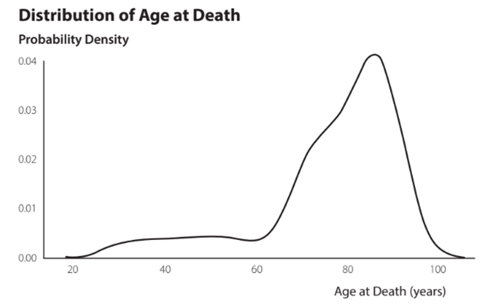
Skewness in a quantitative distribution
represents the lack of symmetry in a quantitative distribution.
a. In a skewed left histogram, the left tail extends farther than the right one (example: exam scores)
b. In a symmetric histogram, the two tails mirror each other (example: SAT scores)
c. In a skewed right histogram, the right tail extends farther than the left one (example: housing prices)
d. In a highly skewed histogram, one of the tails extends much farther than the other one (example: data on wealth and salaries are usually highly skewed right)
Frequency polygon
a visualization tool useful for comparing distributions.
-Like a histogram, a frequency polygon plots the count of observations in a set of bins. Butm uses lines instead of columns.
Trellis display
is a vertical or horizontal arrangement of individual charts of the same type, size, scale, and formatting that differ only by the data they display.
A trellis display can be useful when comparing three or more distributions that would otherwise appear cluttered if plotted using several frequency polygons on the same chart
Bell-shaped distribution
Using the standard deviation to describe variability:
≈ 68% of data values lie within one standard deviation of the mean
≈ 95% of data values lie within two standard deviations of the mean
≈ 99.7% of data values lie within three standard deviations of the mean
Violin chart
An advanced visualization that combines the statistical descriptors of a box and whisker chart with a rotated and mirrored kernel destiny chart.
Statistical inference
The process of collecting collecting sample data to make estimates of or draw conclusions about one or more characteristics of a population.
Confidence interval
A parameter estimate such as the mean or the proportion of a populaton of interest
Margin of error
represents the uncertainty on the parameter estimate at a given confidence level, such as 95% or 99%.
Depends on the confidence level, variability of sample values, and sample size
Incumbent data
Time series data
is a sequence of observations on a variable measured at successive points in time.
Time series chart
a line chart with the time unit displayed on the horizontal axis and the values of the variable on the vertical axis.
When points in a scatter chart are clustered along a line with a downward slope, what type of relationship is shown?
negative linear relationship
A chart that display a small set of values in a manner that shows the individual values, is called a
strip chart
Exploratory data analysis
the process of understanding the data through the heavy use of descriptive statistics and visualization
Structutal dimensions of the data must be considered in EDA:
•Tall data occurs when the number of records (rows) is large à affects mainly 1
•Wide data occurs when the number of variables (columns) is large à affects all three