graphic novel terms
 Call Kai
 Learn
Learn Practice Test
 Spaced Repetition
 Match
Match Flashcards
 Knowt Play
1/7

Earn XP
Description and Tags
page 1: layout
Name | Mastery | Learn | Test | Matching | Spaced | Call with Kai |
|---|
No analytics yet
Send a link to your students to track their progress
8 Terms
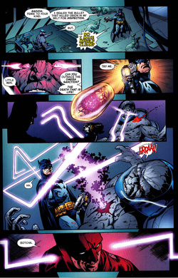
panel
distinct segment of the comic, containing a combo of image & text in endless varieties
spatial arrangement = immediate juxtaposition of present & past
transitions = instant & direct; exact timing of reader’s experience determined by focus & reading speed
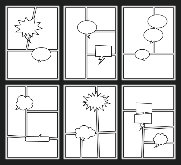
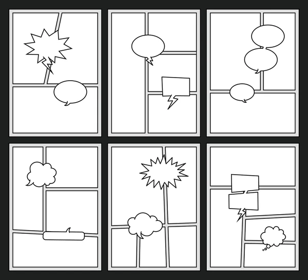
frame
lines & borders that contain the panels (black)
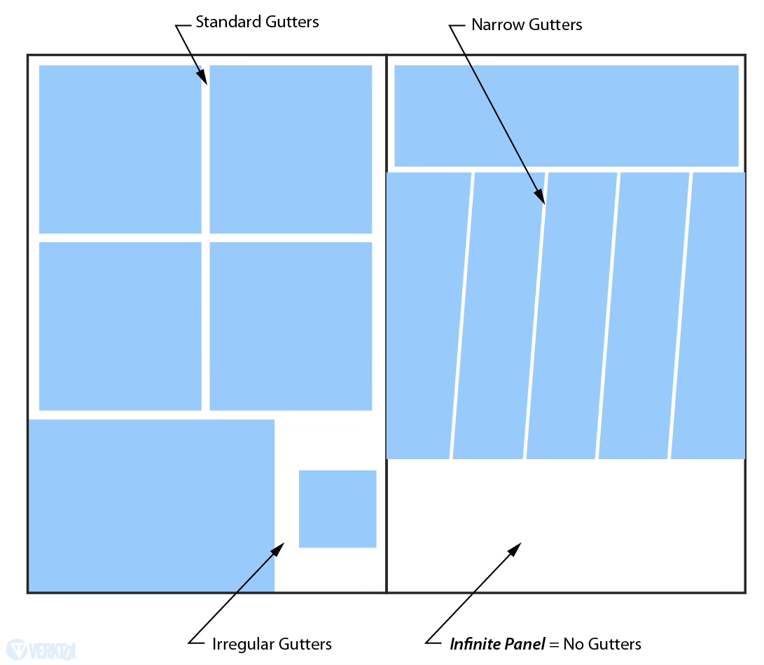
gutter
space between framed panels
bleed
an image that extends to and/or beyond the edge of the page
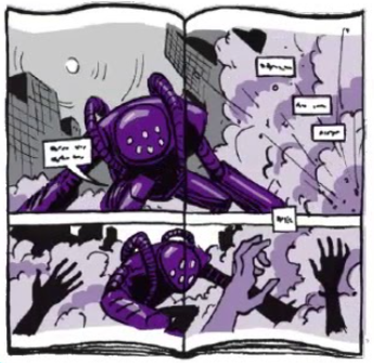
foreground
the panel closest to the viewer
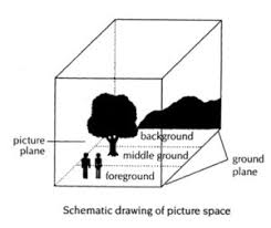
midground
centers image by using natural resting place for vision;
artist deliberately decides to place the image where a viewer would be most likely to look first;
placing an image off-center or near the top/bottom = create visual tension
midground = more readily accepted image
background
provides additional, subtextual info for the reader
graphic weight
describes the way some images draw the eye more than others; creates a definite focus using color + shading:
light/dark shades = dark-toned or high-contrast draw the eye more
pattern or repeated series of marks
colors that are more brilliant/deeper than others (contrast)