Short questions
1/29
There's no tags or description
Looks like no tags are added yet.
Name | Mastery | Learn | Test | Matching | Spaced | Call with Kai |
|---|
No analytics yet
Send a link to your students to track their progress
30 Terms
#1Q—>What is the difference between a population and a sample?
A population is the full group of individuals or objects we want to study.
A sample is a smaller part of that population used to collect data and estimate conclusions about the whole population.
Example: All customers = population. 300 surveyed customers = sample.
#1Q—>What is the difference between a parameter and a statistic?
A parameter describes the whole population.
A statistic is calculated from a sample. We often use a sample statistic to estimate an unknown population parameter.
Explanation
This is basically the “numbers version” of population vs sample.
Population → parameter
Sample → statistic
Usually, the true population parameter is unknown. That is why we use the sample statistic to estimate it.
#1Q—>What is statistical inference?
Statistical inference is using sample data and sample statistics to estimate or test conclusions about the population.
Explanation
You collect data from a sample, but your real interest is usually the population.
Example:
You survey 500 customers and find that 60% like a new product.
You use that result to estimate what all customers may think.
So inference = moving from sample result to population conclusion.
#1Q—>Why does sampling error happen?
Sampling error happens because a sample is only a part of the population. Different samples may produce different statistics, so sample results are not perfectly equal to the true population values.
Explanation
Imagine you take 100 customers from a population. Then you take another 100 customers. The results will probably not be exactly the same.
That does not mean the research is useless. It means we need tools like confidence intervals and hypothesis tests to understand how reliable the sample result is.
#1Q—>What is a census?
A census is when data is collected from every member of the population. It gives a value for the whole population, but it is often expensive or difficult to do.
Imagine a company wants to know the opinion of all its customers.
If it asks 300 customers, that is a sample.
If it asks every single customer, that is a census.
A census is more complete, but usually it is expensive, slow, or impossible. That is why companies usually use samples.
Simple logic:
Census → gives population parameter
Sample → gives sample statistic
#1Q—>What is the difference between a representative sample and a biased sample?
A representative sample accurately reflects the target population.
A biased sample does not, because some groups are missing or overrepresented. If the sample is biased, the results cannot be safely generalized to the population.
Explain it
A sample is useful only if it is close to the population you want to study.
Example:
A company wants to study all young consumers under 30.
If it surveys only university students, the sample may be biased because not all young people are students. The slides give this exact type of example: only surveying university students may not represent all young adults and can lead to incorrect conclusions.
So the key idea:
Representative sample = we can generalize better.
Biased sample = conclusions may be wrong.
#2Q—>How can you reduce the width of a confidence interval?
1. Increasing the sample size.
Bigger sample → smaller standard error → narrower confidence interval.
2. Using a lower confidence level.
90% confidence interval is narrower than 95%, and 95% is narrower than 99%.
3. Reducing variability in the data.
Less variation in the sample → smaller standard error → narrower interval.
The best exam answer is:
Increase the sample size, because the standard error decreases when n increases.
#2Q—>What is a confidence interval?
A confidence interval is a range calculated from sample data that estimates where the true population parameter is likely to be.
A confidence interval is a range calculated from sample data that estimates where the true population parameter is likely to be.
Sample average = 170 cm
Confidence interval = 168 cm to 172 cm
168 ---------------- 170 ---------------- 172
| |
Lower limit Upper limit
We are saying:
"Based on our sample, the true average height is likely somewhere in this range."
#2Q—>How do you interpret a 95% confidence interval?
We are 95% confident that the true population parameter, such as the population mean, lies between the lower and upper limits of the interval.
Explanation
Important: it does not mean “95% of individual observations are inside the interval.”
It is about the population mean, not each individual value.
Example:
If the interval is [1.23, 1.50], the answer is:
“We are 95% confident that the true average cost of a bag of chips in the population is between €1.23 and €1.50.”
#2Q—>What happens to the width of a confidence interval when confidence level increases?
The interval becomes wider. A 99% confidence interval is wider than a 95% interval because we need a larger range to be more confident.
Explanation
Higher confidence means we want to be more sure that the interval contains the true population parameter.
To be more sure, we need a wider range.
Simple logic:
Higher confidence = wider interval
Lower confidence = narrower interval, but less confidence
#2Q—>What is the standard error, and why is it important for confidence intervals?
Standard error measures how much a sample statistic varies from sample to sample. A smaller standard error means a more precise estimate and a narrower confidence interval. For the sample mean,
SE=ns ,
so increasing sample size reduces the standard error.
#3Q—>When would you use a boxplot to describe your data?
Use a boxplot for a numerical variable when you want to see the median, quartiles, and outliers. It is also useful for comparing the distribution of a numerical variable across different groups.
A boxplot gives a quick visual summary of the data.
It is especially useful when the data may not be perfectly normal or when there are extreme values.
Simple logic:
Histogram = good to see the full shape of one continuous variable.
Boxplot = good to see median, spread, and outliers quickly.
Boxplot by groups = good to compare groups.
Example from the exam style:
You have medical cost and region.
You can use boxplots to compare the cost distribution in:
North
East
South
West
Top 4 cities
Then you can see which region has higher median cost, more variability, or more outliers.
The slides also say that graphics help understand data, with histograms for continuous variables and bar charts for discrete variables. Boxplots belong to this same descriptive statistics area
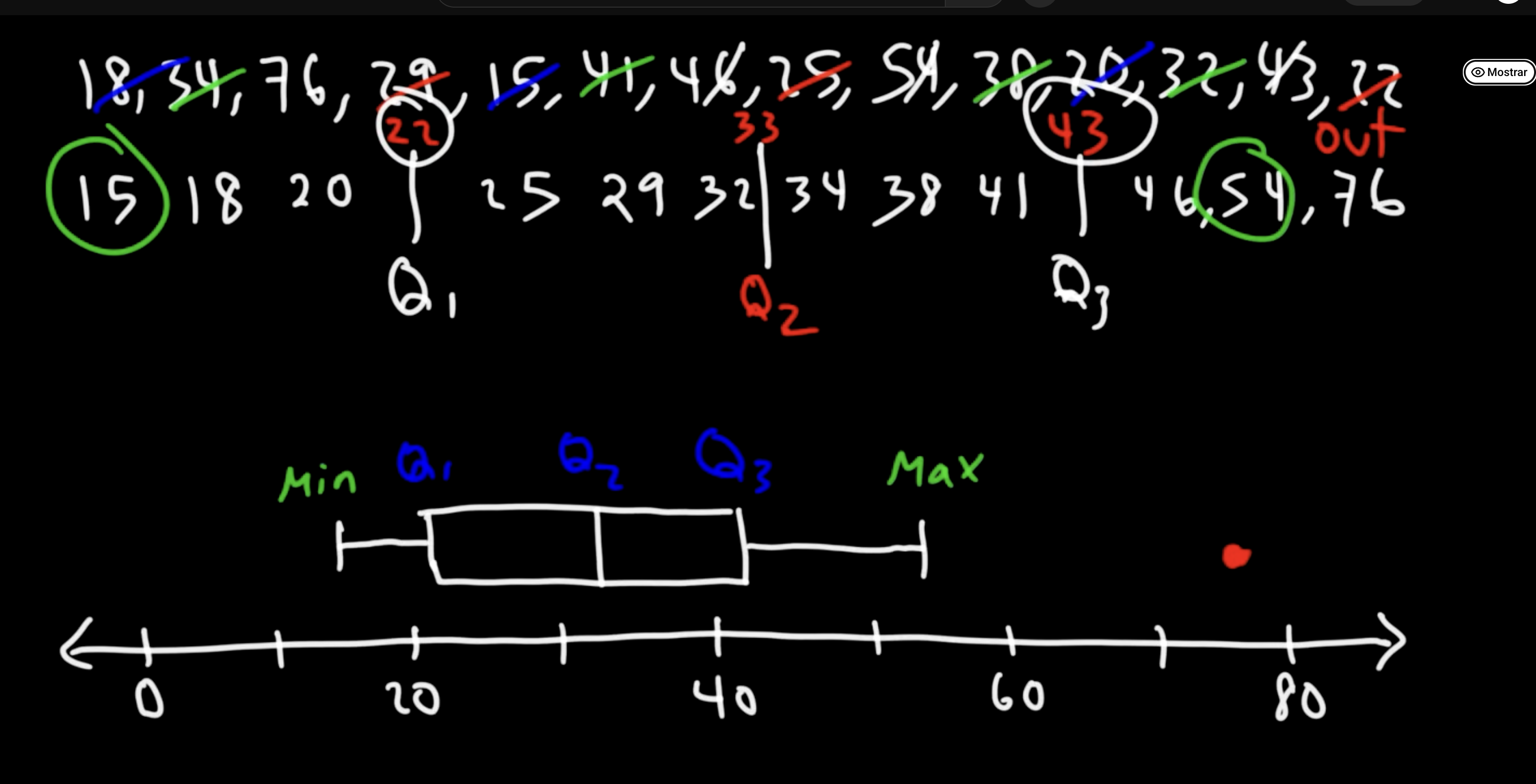
#3Q—>What is the interquartile range?
The interquartile range is Q3-Q1. It measures the spread of the middle 50% of the data and is useful because it is less affected by outliers.
Imagine these two datasets:
Dataset A: 20, 25, 30, 35, 40
Dataset B: 20, 25, 30, 35, 1000
The value 1000 is an outlier (an unusually large value).
The overall range changes a lot because of 1000.
But the IQR mostly ignores extreme values and focuses on the middle 50% of the data.
That's why the IQR is useful—it is less affected by outliers.
Easy Exam Answer
The interquartile range (IQR) is the difference between the upper quartile (Q3) and the lower quartile (Q1). It measures the spread of the middle 50% of the data.
#3Q—>What is the difference between a histogram and a boxplot?
A histogram shows the full shape and frequency distribution of a continuous variable. A boxplot gives a compact summary of median, quartiles, variability, and outliers, and is useful for comparing groups.
Use a histogram when you want to see the full shape:
normal distribution
skewed distribution
peaks
frequency
Use a boxplot when you want a compact summary:
median
spread
outliers
group comparison
Example:
To see the general shape of customer spending → histogram.
To compare customer spending by region → boxplot.
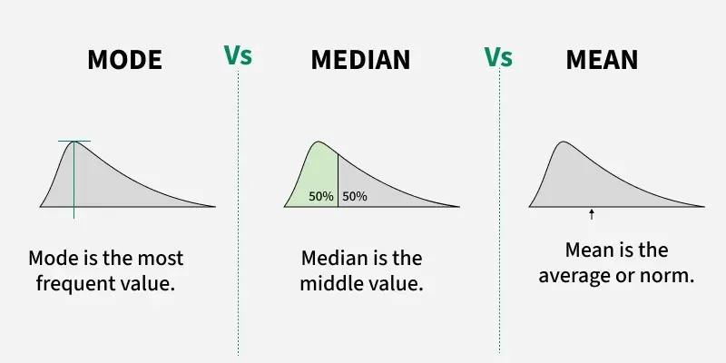
#3Q—>What are mode, median, and mean?
Mode is the most frequent value. Median is the middle value after ordering the data. Mean is the arithmetic average. They are measures of central tendency used to describe the typical value in a dataset.
Use them to describe what is “typical” in your data.
Example data:
2, 3, 3, 4, 100
Mode = 3 because it appears most often.
Median = 3 because it is the middle value.
Mean = 22.4 because you add all values and divide by 5.
Here, the mean is distorted by the outlier 100, so the median better represents the typical value.
#3Q—>When is the median better than the mean?
The median is better when the data is skewed or has outliers. The mean can be pulled by extreme values, while the median shows the middle value and better represents the typical observation.
The mean uses all values, so one extreme value can change it a lot.
The median is the middle value, so it is more stable when there are extreme values.
Example:
Customer spending:
€10, €12, €13, €15, €500
Mean = much higher because of €500.
Median = €13, which better represents the typical customer.
Good examples of ratio variables better described by the median:
income
customer spending
insurance cost
house price
These variables often have extreme high values.
The slides define the median as the value in the middle of ordered values: half of the values are above it and half are below it.
#4Q—>What is the difference between paired and independent samples?
Paired samples are connected observations, usually the same people measured twice or matched cases. Independent samples are separate groups with no direct connection between observations. Example paired: same customers before and after a campaign. Example independent: male customers vs female customers.
Explain it
The key word is connection.
If the data points are connected → paired samples.
If the data points are not connected → independent samples.
Paired sample example
A company measures the same customers:
Before a discount campaign
After a discount campaign
Because it is the same customers, the observations are paired.
Independent sample example
A company compares:
Male customers
Female customers
These are two different groups of people, so the samples are independent.
Simple rule:
Same people twice = paired
Different people/groups = independent
#4Q—>What are the hypotheses when comparing two independent groups?
Usually,
H0:μ1=μ2
meaning there is no difference between group means.
Or ≠, meaning the group means are different.
Explanation
When comparing two groups, the null hypothesis usually says:
no difference
The alternative hypothesis says:
there is a difference
Example:
A brand wants to know if male and female customers spend differently online.
H0: mean spending of males = mean spending of females.
H1: mean spending of males ≠ mean spending of females.
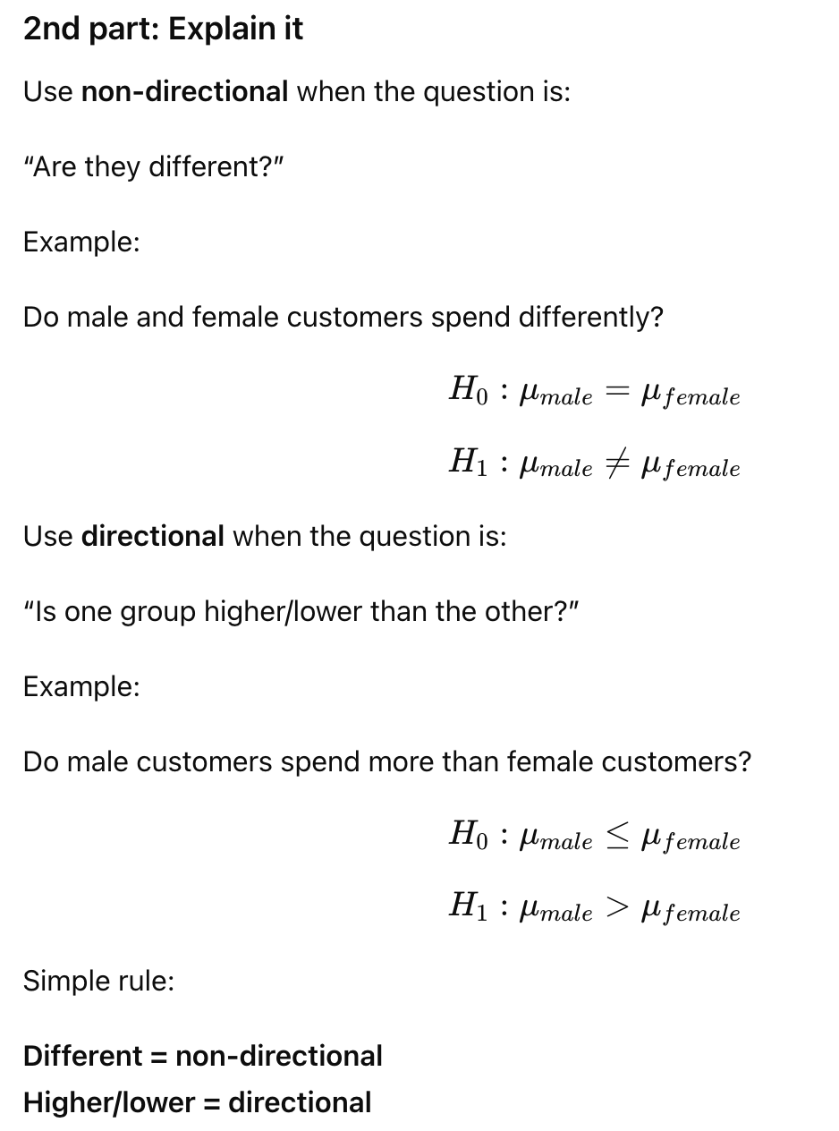
#4Q—>What is the difference between directional and non-directional hypotheses?
A non-directional hypothesis tests whether two values are different, without saying which one is higher. A directional hypothesis tests whether one value is specifically higher or lower than the other.
#5Q—>Define mean and median. What are the main differences among them? Give an example of a ratio variable which is better described by the median.
The mean is the arithmetic average. The median is the middle value after ordering the data. The mean is affected by outliers, while the median is more resistant. A ratio variable better described by the median is income, customer spending, or medical cost, because extreme high values can distort the mean.
magine this data:
10, 12, 13, 15, 100
Mean:
510+12+13+15+100=30
Median:
The middle value is 13.
Here, the mean is 30, but most values are around 10–15. The value 100 pulls the mean upward.
So:
Mean is good when data is balanced and has no strong outliers.
Median is better when data is skewed or has extreme values.
For a ratio variable, use something with a true zero and meaningful ratios. The slides say ratio variables include counts and measures of length/time, and ratio scales have a true zero.
Good exam examples:
income
customer spending
medical costs
insurance charges
Example sentence:
Income is better described by the median because a few very rich people can make the mean too high, while the median better represents the typical person.
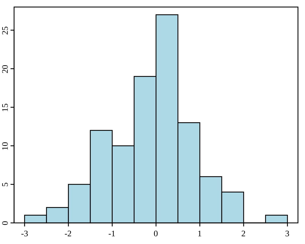
#5Q—>What is a skewed distribution, and why does it matter for mean and median?
A skewed distribution is not symmetrical; values are pulled to one side by extreme values. It matters because the mean can be distorted by outliers, while the median is more resistant and often better represents the typical value.
Explain it
There are two common types:
Right-skewed distribution
Most values are low or medium, but a few very high values pull the distribution to the right.
Example:
Income
Customer spending
Medical costs
Most people spend a normal amount, but a few people spend a very high amount.
Left-skewed distribution
Most values are high, but a few very low values pull the distribution to the left.
Simple exam logic:
Skewed data → outliers/extreme values may exist
Outliers affect the mean
Median is often safer
Example:
10, 12, 13, 15, 100
The value 100 makes the distribution right-skewed.
The mean becomes too high.
The median better describes the typical value.
#6Q—>I have computed the 95% confidence interval for the mean cost in euros of a bag of chips, obtaining [1.23, 1.50]. What is the interpretation for that interval? Is it possible to find a sample for which the mean cost is of 1.51 euros?
We are 95% confident that the true population mean cost is between €1.23 and €1.50. Yes, another sample could have a sample mean of €1.51 because confidence intervals estimate the population mean, not every possible sample mean.
Explain it
The key mistake to avoid:
The confidence interval is about the population mean, not about all sample means or all individual chip prices.
So the interval [1.23, 1.50] does not mean:
“Every sample mean must be between 1.23 and 1.50.”
It means:
“Our best estimate is that the true average cost in the population is between €1.23 and €1.50.”
Why can another sample have a mean of €1.51?
Because of sampling error. Different samples can give slightly different sample means. The slides say every sample provides information about the population, but there is always sampling error that must be considered.
Careful detail:
For the same sample used to calculate this interval, the sample mean is already fixed.
But for a different sample, yes, the sample mean could be €1.51.
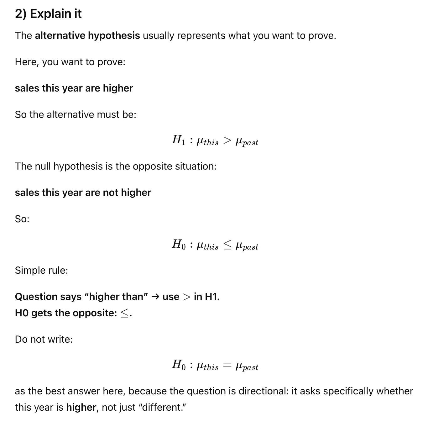
#7Q—>If I want to test that the mean sales of my company during this year have been higher than the sales during the past year, what are the null and the alternative hypotheses?
H0: mean sales this year are not higher than last year.
H1: mean sales this year are higher than last year.
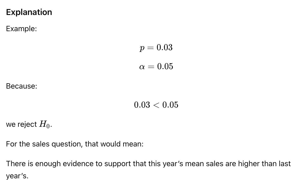
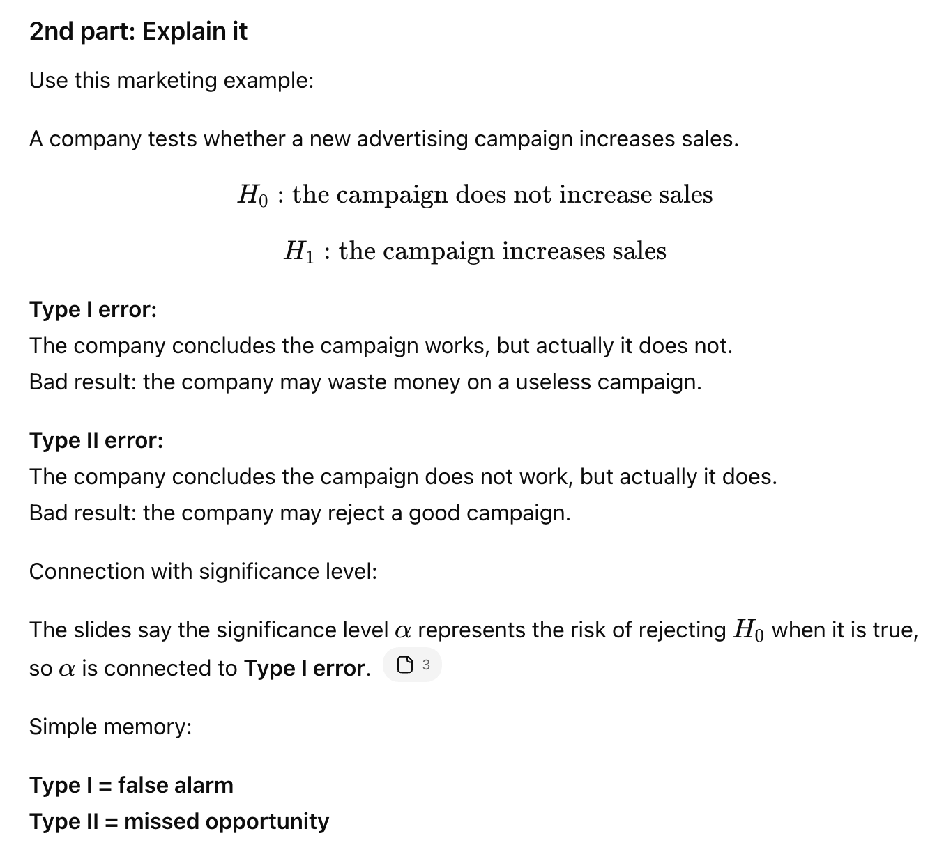
#7Q—>What is the significance level in hypothesis testing?
The significance level α is the criterion used to decide whether to reject H0. It is usually 0.05 and represents the risk of rejecting H0 when it is true.
The most common level is:
α=0.05
This means the researcher accepts a 5% risk of rejecting the null hypothesis when it is actually true.
Simple rule:
p-value < α → reject H0
p-value ≥ α → do not reject H0
#7Q—>What is a test statistic?
A test statistic is a numerical summary calculated from sample data. It shows how far the observed result is from what H0 predicts and helps decide whether to reject H0.
Memory Trick
Think:
Test statistic = "How surprising is my sample if H₀ were true?"
Small test statistic → not very surprising
Large test statistic → very surprising → evidence against H₀
What are Type I and Type II errors?
Type I error means rejecting H0 when H0 is true, a false positive. Type II error means failing to reject H0 when H0 is false, a false negative. Example: Type I = thinking a campaign works when it does not; Type II = missing that a campaign actually works.
#8Q—>What is a dummy variable? Give examples.
A dummy variable is a 0/1 variable used to represent a category in statistical analysis. 1 means the observation belongs to the category; 0 means it does not. Examples: student = 1, not student = 0; single = 1, otherwise = 0; male = 1, female = 0. Dummy variables help include categorical variables in regression.
Student = 1
Not student = 0
Then regression can test whether students behave differently from non-students.
In the mock exam example, the dependent variable is SMS sent in a typical week, and dummy variables like single and student are used as predictors. This helps see whether being single or being a student explains differences in SMS usage.
Simple rule:
Dummy variable = yes/no category turned into 1/0
Why it helps:
It lets us include categorical variables in regression or other statistical analysis.
#8Q—>How do you interpret a dummy variable coefficient?
It shows the difference between the category coded 1 and the reference category coded 0. If the coefficient is positive, group 1 has a higher predicted value. If it is negative, group 1 has a lower predicted value.
Example:
Dependent variable: SMS sent per week
Dummy variable: Student
Student = 1
Not student = 0
If the coefficient for Student is +5, it means:
students are predicted to send 5 more SMS per week than non-students, holding other variables constant.
If the coefficient is -3, it means:
students are predicted to send 3 fewer SMS per week than non-students.
Simple rule:
Positive coefficient = group 1 has higher predicted value than group 0
Negative coefficient = group 1 has lower predicted value than group 0
#8Q—>What is the difference between dependent and independent variables?
The dependent variable is the outcome we want to explain or predict. The independent variables are the variables used to explain or predict that outcome. In regression, Y is dependent and X variables are independent.
Example from the mock exam:
Dependent variable:
How many SMS sent in a typical week
Independent variables:
student
single
gender
monthly bill
technology fascination
The dependent variable is what we want to explain.
The independent variables are the possible causes or predictors.
Simple rule:
Dependent variable = result
Independent variable = predictor
#8Q—>What is multiple regression?
Multiple regression is a model used to predict or explain one dependent variable using more than one independent variable. Example: predicting SMS usage using age, gender, student status, single status, and monthly bill.