RC7 - Visual risk communication (keyterms, mp + scenario questions)
0.0(0)
Studied by 1 personCard Sorting
1/32
There's no tags or description
Looks like no tags are added yet.
Last updated 3:12 PM on 5/29/26
Name | Mastery | Learn | Test | Matching | Spaced | Call with Kai |
|---|
No analytics yet
Send a link to your students to track their progress
33 Terms
1
New cards
What is information evaluability (Hsee & Zhang, 2010)?
The degree to which a person can intuitively and accurately assess whether a data value is good or bad — a value is evaluable when a reference system is available, the user has prior knowledge, or the attribute is inherently easy to interpret
2
New cards
What is the difference between separate evaluation and joint evaluation?
Separate evaluation = a value is assessed in isolation; joint evaluation = a value is assessed alongside something else (e.g., a comparison standard) — joint evaluation increases evaluability
3
New cards
What are three promising solutions for increasing information evaluability?
1. Providing comparative data 2. Providing (personalized) narratives 3. Visualizing reference standards (e.g., action thresholds, standard ranges)
4
New cards
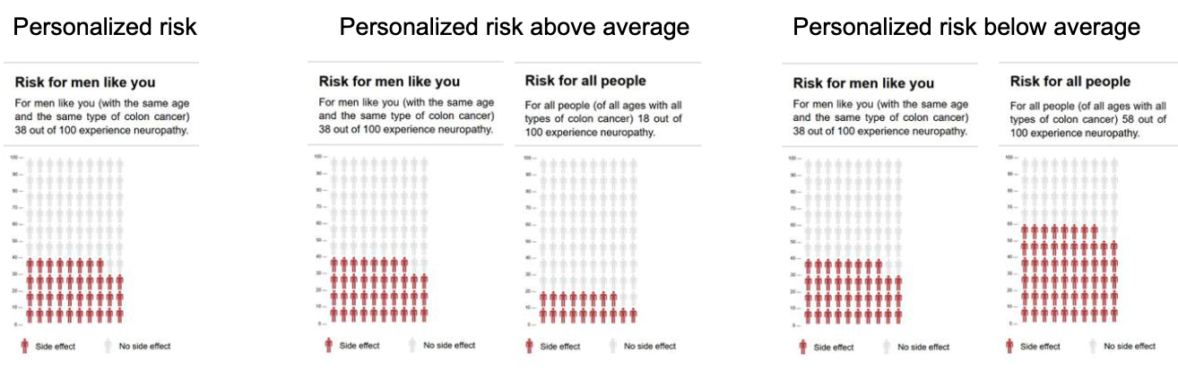
How does generic (average) risk influence personalized risk estimates?
People anchor their personalized risk to the population average — they adjust their own estimate upward when shown higher population risks, even when given personalized information
5
New cards
What is the risk of showing someone their risk is below average?
It may discourage them from taking preventive action — knowing you are at lower risk than others reduces perceived urgency
6
New cards
What are three reasons to always provide comparative risk data (Schwartz, 2016)?
1. People form comparative opinions anyway, even without data 2. People misinterpret personal risk due to optimism bias, availability heuristic, or social norm bias 3. It is impossible to know which heuristics are active in any given situation
7
New cards
What did Boomstra et al. find about numbers vs. personalized narratives in PROMs feedback?
Numbers facilitate action ("do I need to do something?"); narratives provide emotional support and recognition ("how does this look, and how do others cope?") — they serve different purposes
8
New cards
What are five reasons to use graphs in risk communication?
1. Attract and maintain attention 2. Foster automatic/intuitive processing 3. Convey data patterns and gist 4. Communicate uncertainty 5. Overcome low numeracy
9
New cards
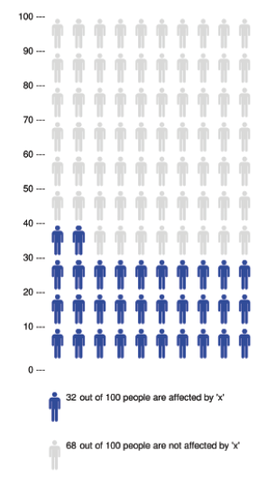
What is an icon array?
A grid of icons/pictographs where "affected" cases are visually separated (e.g., colored in); used for binary yes/no data; requires a legend; typically uses 100 icons for easy proportion reading
10
New cards
What are two key benefits of icon arrays?
1. Clarify risk magnitudes and part-whole relationships 2. Reduce biases like denominator neglect and framing effects
11
New cards
What is denominator neglect?
A cognitive bias where people focus excessively on the numerator (number of affected cases) while ignoring the denominator (total group size) — distorting perceived risk magnitude
12
New cards
Why must icon arrays display both numerators and denominators?
To prevent patients from misjudging proportions and to actively counteract denominator neglect — showing both makes the full risk picture transparent
13
New cards
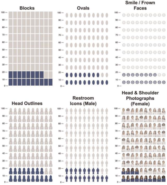
What did Zikmund-Fisher et al. (2014) find about icon types?
Restroom icons are most preferred; anthropomorphic icons (head outline, restroom icon, photos) improve memory for risk; for high numeracy, restroom icons achieve best match between perceived and actual risk; for low numeracy, icon type makes no difference
14
New cards
What distinguishes icon arrays that work from those that don't?
Systematically grouped/block-arranged icons outperform randomly scattered ones — especially important for low-literacy populations who cannot make sense of random layouts
15
New cards
When do dynamic or interactive graph features help — and when do they hurt?
They hurt when they distract from the core data; they only help when they stimulate active elaborative processing (e.g., explanatory text or reflective questions that force engagement)
16
New cards
What is the "less is more" principle in graph design?
Graphs must focus on the bare essentials to avoid overloading working memory — adding more information or design features typically reduces comprehension and decision quality
17
New cards
What is the psychological mechanism behind why graphs improve understanding?
Graphs trigger deliberation (extra reflection time), improve judgment calibration (metacognitive accuracy), and promote strategic allocation of attention to the most relevant data
18
New cards
What is the key paradox in visual risk communication about subjective preferences?
People's subjective preferences for specific graph formats often contradict the formats that objectively produce the highest accuracy — patients do not reliably choose what works best for them
19
New cards
What is the optimal graph type for comparing data points vs. trends vs. proportions?
Comparing data points → bar graphs; trends over time → line graphs; proportions → pie graphs; very large numbers → grids; very small risks → magnifier risk scales
20
New cards
What is low numeracy a strong predictor of?
Worse health outcomes: higher comorbidity prevalence, more ER visits, higher BMI, and poor medication adherence
21
New cards
Under what condition do visual aids help low-numeracy individuals most?
When they also have moderate to high graph literacy — visual aids can fully close the comprehension gap with high-numeracy individuals in that case
22
New cards
When do visual aids fail for low-numeracy individuals?
When they also have low graph literacy — they get confused by visuals and perform better with plain written text
23
New cards
What is the curse of knowledge in risk communication?
Experts — because they see data daily and know the context — forget that the public lacks this knowledge, causing them to systematically overestimate how easily laypeople interpret isolated numbers
24
New cards
What are preference reversals?
A systematic decision error where people make different choices when evaluating options separately (relying on easy-to-evaluate data) versus side by side (where hard-to-evaluate data suddenly influences the decision)
25
New cards
What are action thresholds and why do they help?
Specific numerical cutoff values (e.g., on a lab result display) that signal when action is required — they help patients understand whether a result demands concern without needing background knowledge
26
New cards
What is the curse of knowledge's practical implication for risk communicators?
You must design for the audience's lack of context, not your own expertise — stop blaming low numeracy and start improving the message's evaluability
27
New cards
What is the data evaluability characteristics worksheet?
A practical tool that forces communicators to systematically identify missing implicit context (units, direction of improvement, normal observed values, population norms) needed to make a number meaningful for the public
28
New cards
Why does showing all possible reference frames at once backfire?
It creates confusion about which standard deserves attention — communicators must strategically choose the single reference frame that best fits the user's decision goal
29
New cards
What did the systematic review (Designing Visual Aids) conclude about who benefits most from visual aids?
Low-numeracy individuals with moderate-to-high graph literacy benefit the most — visual aids can fully eliminate their comprehension gap compared to high-numeracy individuals
30
New cards
What is risk literacy?
The overarching capacity to accurately evaluate and understand statistics about medical risks and benefits — essential for informed decision-making
31
New cards
What is graph literacy?
The specific skill of accurately reading, extracting, and interpreting data and meaning from a wide range of visual displays and diagrams
32
New cards
What is the core argument of Schwartz (2016) about comparative risk data?
Even if showing comparative data influences risk perception, not showing it is worse — people will compare anyway using unreliable heuristics, so providing accurate comparisons is always preferable
33
New cards
Explain why increasing evaluability benefits all users, not just low-literacy ones
Even experts make better decisions with contextual anchors — the problem of isolated numbers without reference is universal, not a low-literacy problem