Chapters 16,17, 18,19+Key Commands+Americana to Korinna
1/218
There's no tags or description
Looks like no tags are added yet.
Name | Mastery | Learn | Test | Matching | Spaced | Call with Kai |
|---|

219 Terms
Color
Pure Hue of pigment
Tertiary Colors
A primary mind with a Secondary Color; Red violet, etc
Complementary Colors
Colors directly across from each other on the color wheel.
Vibrating Colors
Using complements in complex designs right next to each other.
Projecting / Receding Colors
Warm colors project forward in a design; cool colors recede.
Monochromatic
A Hue plus all its tints and shades.
Using White Space
Allow white space to take up a significant part of the layout.
What Color should you avoid for type on a white page?
Yellow, light pink or light blue.
Runovers after Bullets
Should be flush with type above.
Ideal amount of leading
At least three points larger than the text size.
The standard point size for type is
Either 8.5 to 9.5 point type depending on the x-height.
State abbreviations
All caps with no periods.
Hyphens (off keyboard)
Show breaking of syllables over two lines.
Bullets
Always a space after the bullet before starting text.
Key command to wrap type after bullet
Command backslash
A Hard Return
is a regular return and it causes a paragraph indent on the next line.
A Soft Return
is a shift return and it returns the cursor to the left margin on the next line.
Bad Breaks
When there is period at the end of a line followed by a one or two letter word such as It or If or As.
Hyphenation Bad Breaks
When a long word is hyphenated, and hyphen falls after the first syllable as in es-tablishment.
The longer your line of text,
the wider the leading should be.
Justified copy
is the second easiest to read.
The quality of the rag
can be adjusted by changing the tracking, adjusting the column width a bit, or replacing a short word with a long word.
Rivers
are vertically aligned enlarged word spaces in justified copy.
Rivers can be alleviated by adjusting
the tracking, adjust the column width a bit or by replacing a short word with a longer one.
When using centered type
address the phrasing of each line, so the breaks occur at natural places.
Never allow two hyphens in a row
at the end of subsequent lines of type.
Never track your body copy out too wide,
because you lose the word units and it is harder to read.
Set Solid
The point size and the leading are the same. 9/9.
You can shape your text boxes
to add interest to your layout.
Tracking your text type at -2 up to +10
usually about the best, but it depends on the particular font.
Widow
when the last line of a paragraph is less than half the column width.
Orphans
when either the first or the last line of a paragraph
is in a different column from all the other lines.
Orphans are undesirable,
it makes sense to try to keep all the lines of a paragraph together.
Widows are undesirable
They interrupt the even tome of gray.
Bullet
is Option 8 •
Degree Symbol
is Option Shift 8 °
Cents Symbol
is ¢ Option Shift 4
Ellipsis is
Option ;
Aligning Type under a bullet
Command \
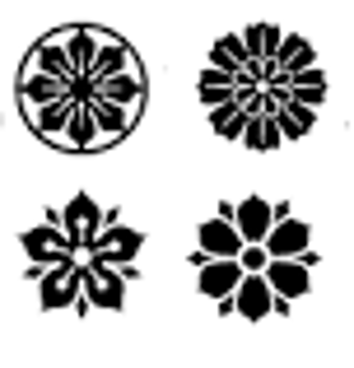
ParagraphDividers

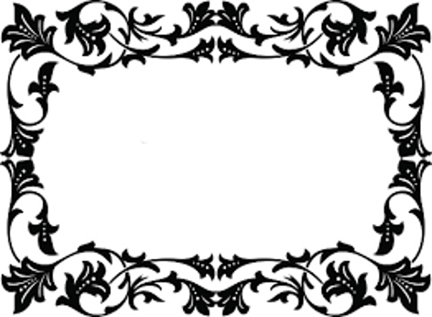
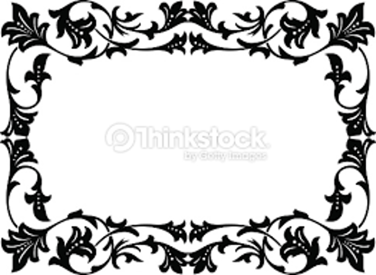
Cartouche frames
Jarring Effect
Complementary colors cause the eye to vibrate back and forth.
Bellevue
Belwe
Benguiat
Berkeley
Bernhard
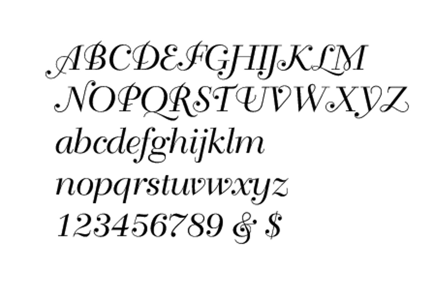
Berthold Script
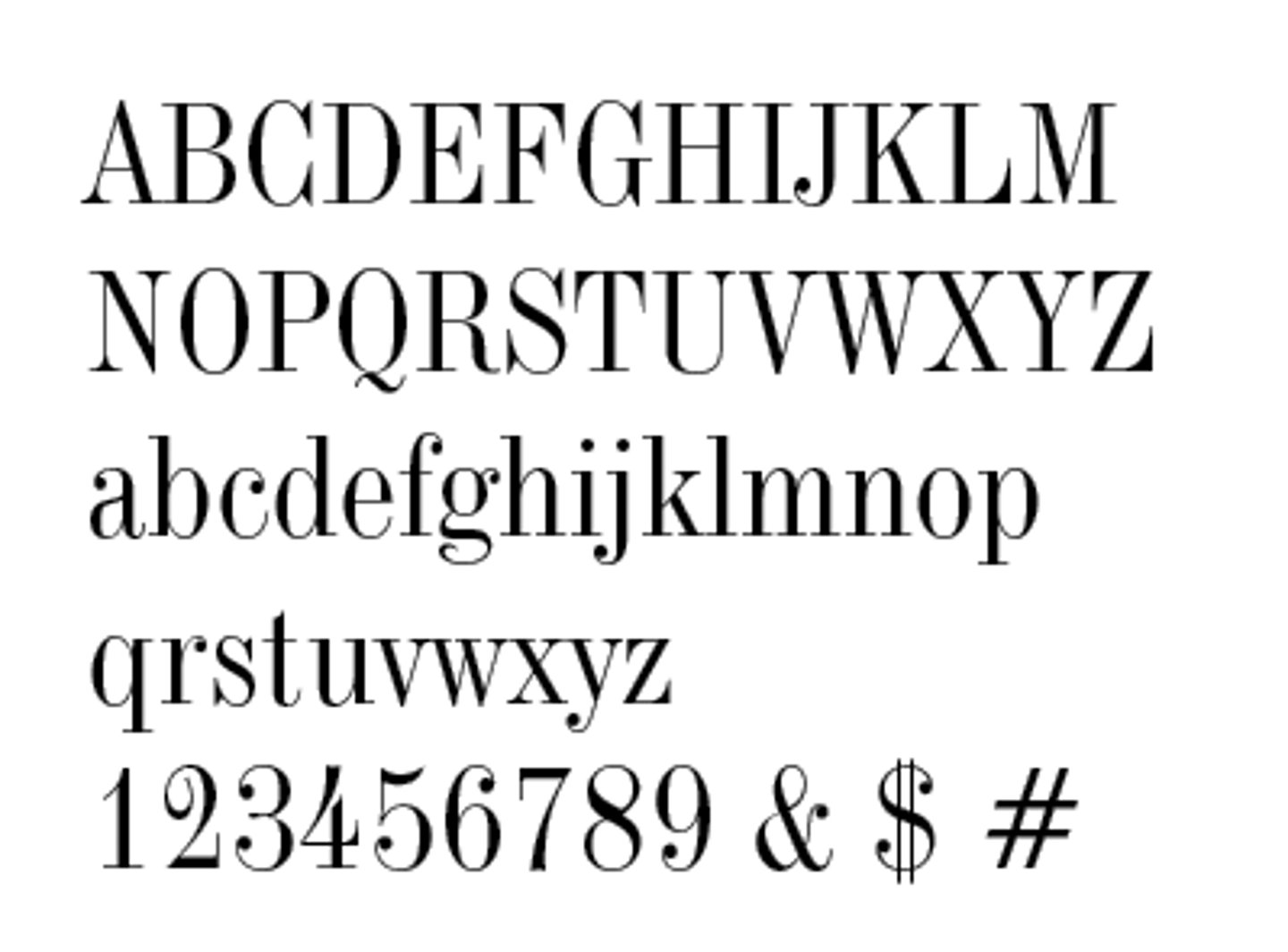
Bodoni
Bookman
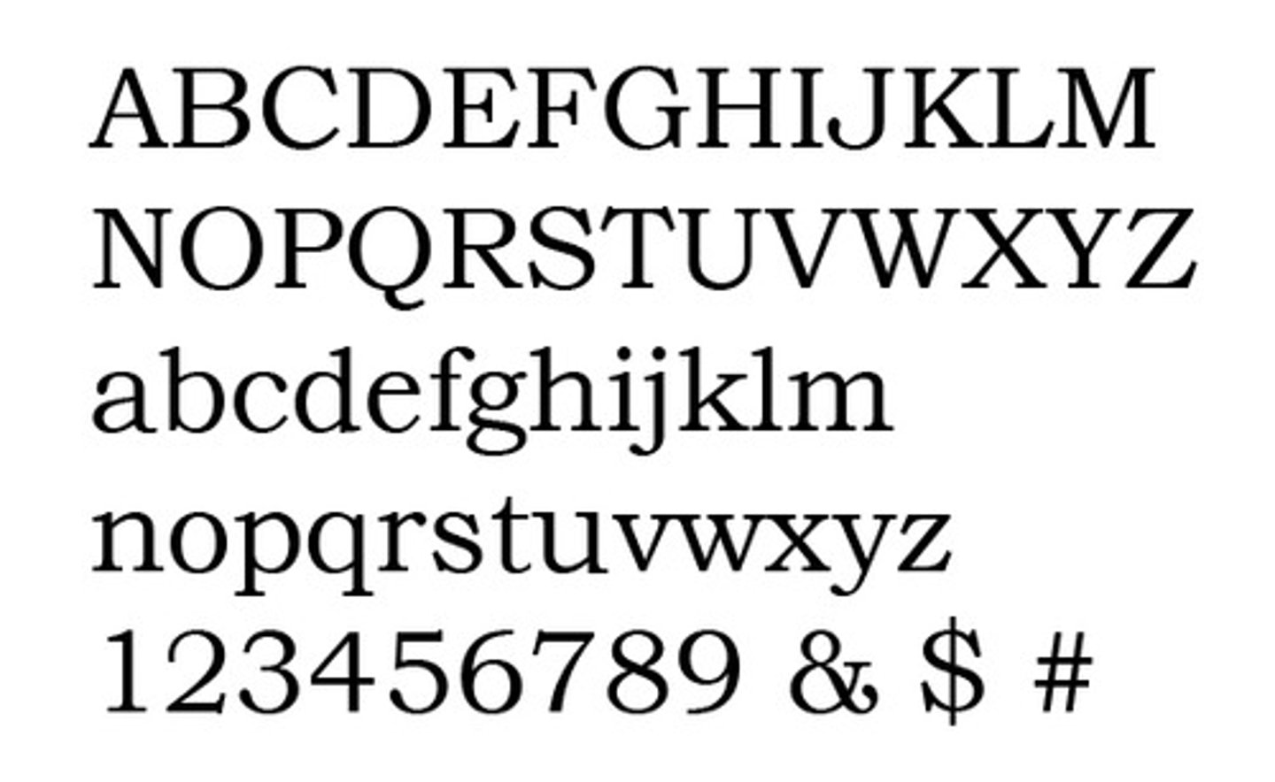
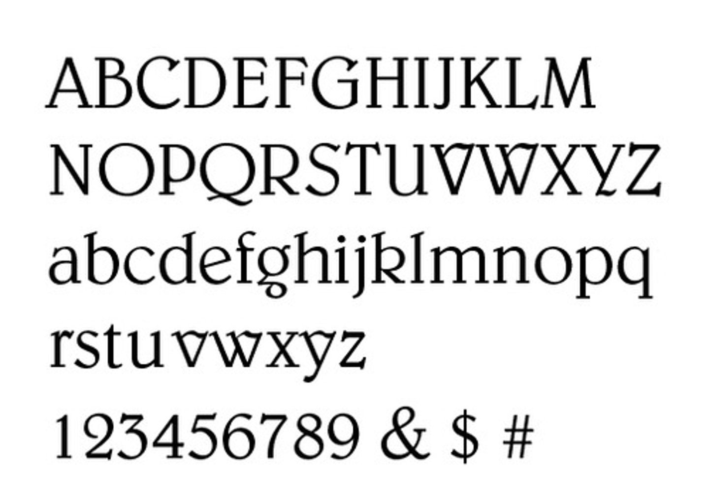
Caslon 540
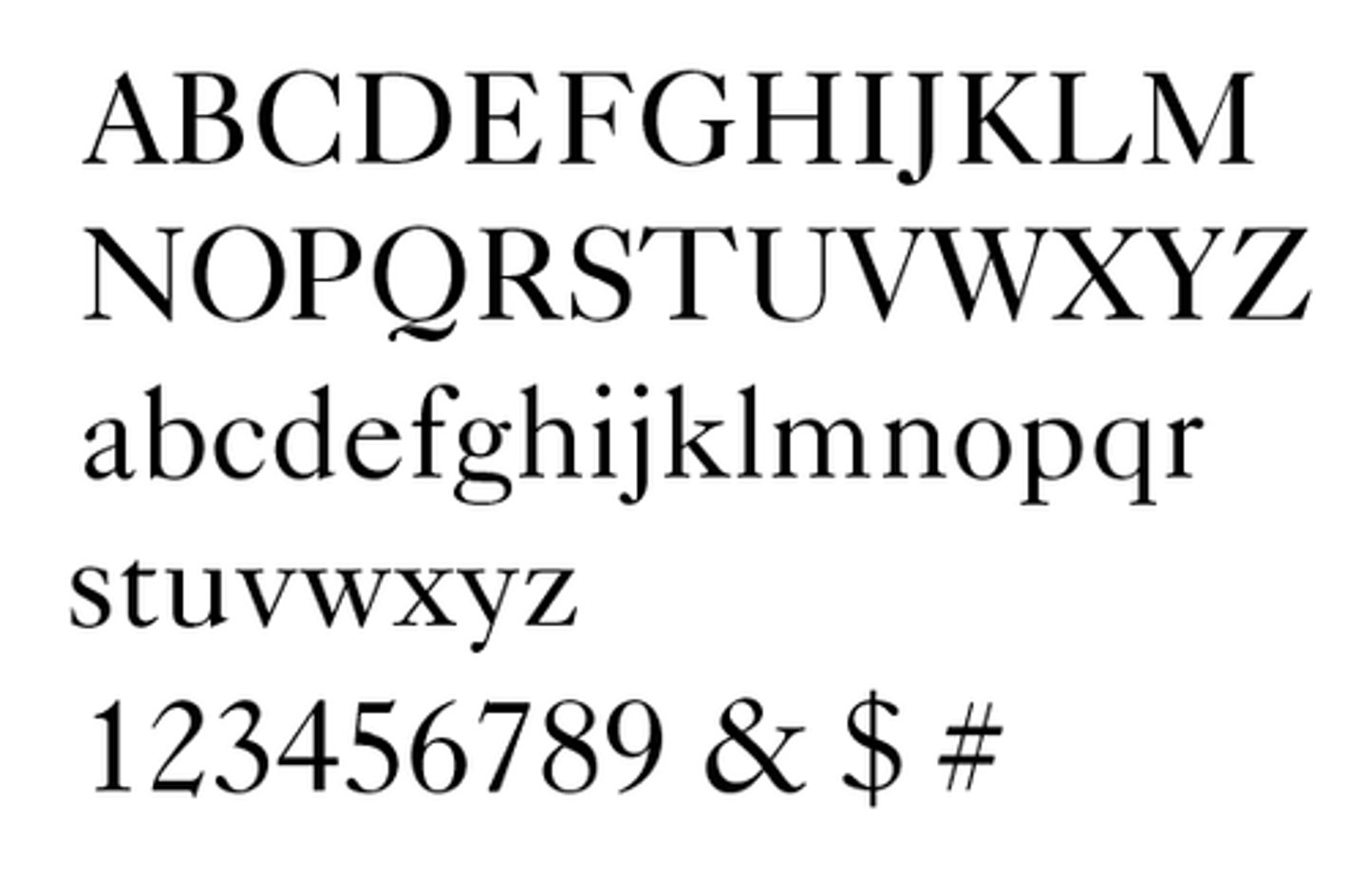
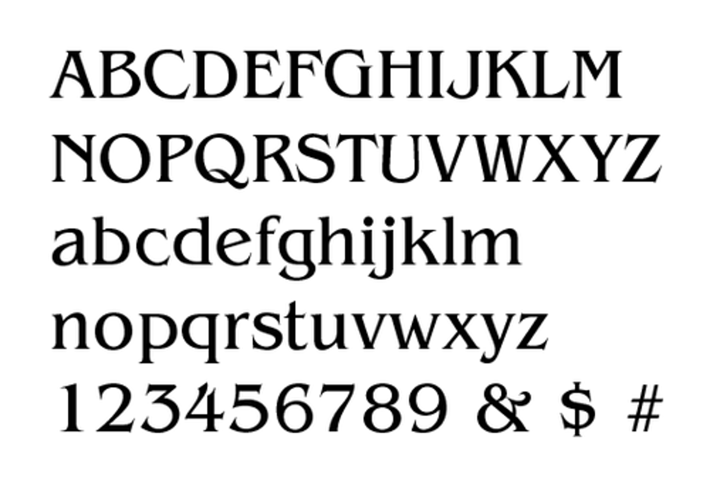
Centennial
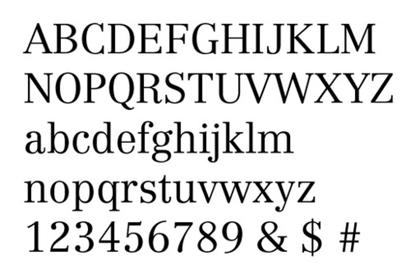
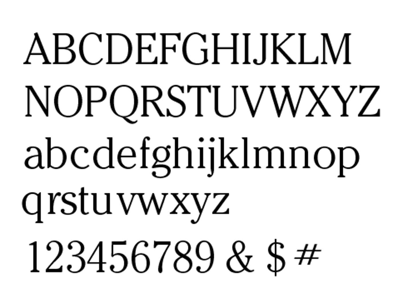
Century Schoolbook

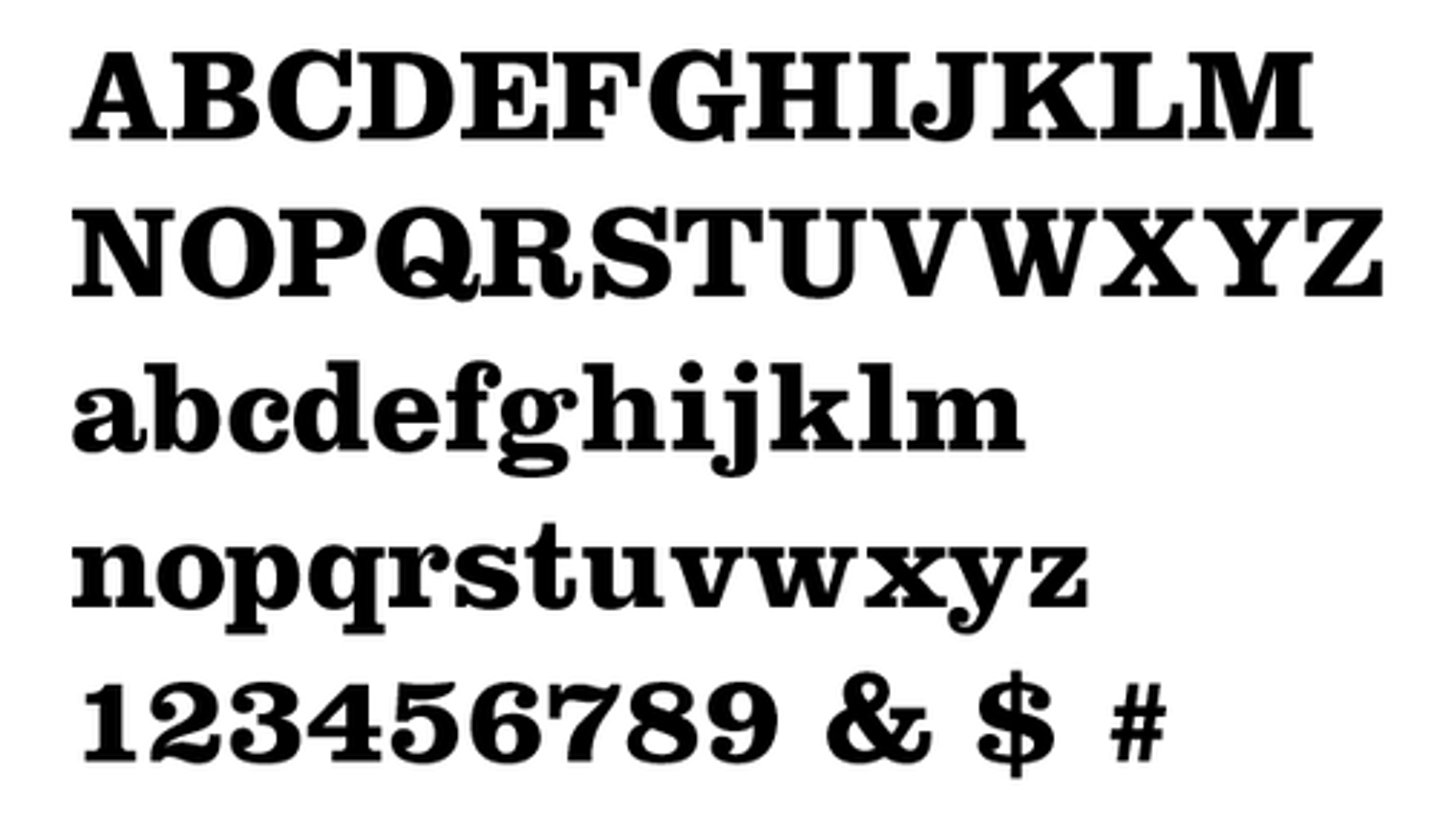
Clarendon Bold
Prime Marks
Straight and designate inches and feet.
Quote Marks
Curly and designate something someone said.
Bullets, Parentheses and Dashes
Baseline shift up in All caps text -- they're designed to centered on the x-height
The goal of a designer is to make text
To create a smooth tone of gray on the page, using leading, tracking, column width and point size.
The ideal number of characters per line
needs to be more than thirty.
The ideal amount of leading
is at least three points larger than the text size.
Monospaced fonts were created for
for the typewriter and rely on squishing wide letters and stretching thin ones to make every letter the same one width.
Variable spaced fonts
those where each character is allotted the required width of the character.
In text it is correct to make titles
ITALIC
In text copy it is correct to use
only one space after a period.
Use Find/Change in text
to change two spaces after periods to one space.
En Dashes or Nut Dashes (short dashes)
Option dashes are longer than hyphens. Show lapse in time as in: 4-6pm or 1945-47.
Em Dashes or Mutt Dashes (long dashes)
Option shift dashes are longer than en dashes and used to show the author who wrote a quote — Ben Franklin
AM and PM
Set in small caps with no periods
An ellipsis
is spaced closer than period space period.
Ellipses
Used to show where text has been edited out.
When the text after a bullet runs over onto the next line
the second line of type has to be flush with the text above.
The key command to wrap type after a bullet
is Command backslash.
Bad Break
Period near end of line followed by short, one or two letter word starting next sentence: It, To, By, If or As. Soft return before the short word to bounce it to next line.
Flush left copy has a rag
On the right.
Rivers are vertically aligned
Enlarged word spaces in justified copy line up vertically.
Flush left type
Easiest setting to read, then justified copy.
Set Solid means
Point size of type and leading are the same. 9/9.
Tracking your text type at -2 or-3 is
Works well, but it depends on the particular font.
A Widow is when the last line of a paragraph
is less than half the column width.
Orphans are when either the first or the last line of a paragraph
is in a different column from all the other lines.
Pointer Ornaments
Arrows or hands that are used as directionals.
Bullet •
Option 8
Degree Symbol °
Option Shift 8
Cents Symbol ¢
Option Shift 4
Aligning Type
Command \
Grid
Lines are for reference in layout.
The more columns there are on the grid,
The more flexible the grid can be.
A six column grid allows the designer
Place type or images in one, two or three columns across.
Widows
should be avoided in text.
Paragraph Ornaments
Cartouche frame
Century Shoolbook
Clarendon

Harting
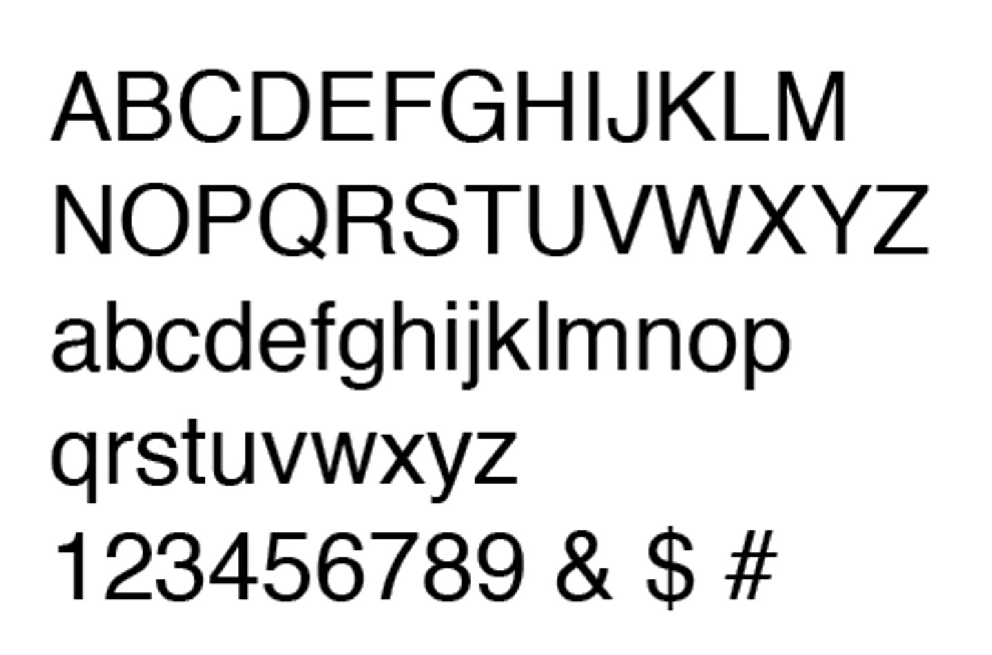
Helvetica
Industrial 756
Cheltenham
Head Space
Margin at top of page.
Foot Space
Margin at bottom of page.
Thumb Space
Left and right outer margins where we hold a book.