Presentation & Display of Quantitative Data (2)
1/3
There's no tags or description
Looks like no tags are added yet.
Name | Mastery | Learn | Test | Matching | Spaced | Call with Kai |
|---|
No analytics yet
Send a link to your students to track their progress
4 Terms
Tables
Researchers use tables to present the summary findings of their research
Raw Scores are not shown in the table as they must be converted to descriptive statistics to present an overview of the results
The mean and standard deviation are commonly used as the measures of central tendency and dispersion
A table provides a clear and straightforward summing up of the results per condition
Bar Charts
A type of graphical display can be achieved using a bar chart
The data shown on the x-axis of a bar chart is discrete (not continuous) e.g.
scores on a memory test
number of 'yes' answers ticked on a questionnaire
A bar chart deals with categorical data which does not necessarily fall into any particular order
If a researcher had conducted an experiment with three conditions they could use a bar graph to display the means of each condition
Bar charts do have gaps between each category on the x-axis (unlike histograms)
The x-axis shows the categories/conditions
The y-axis shows the score/percentage per category/condition
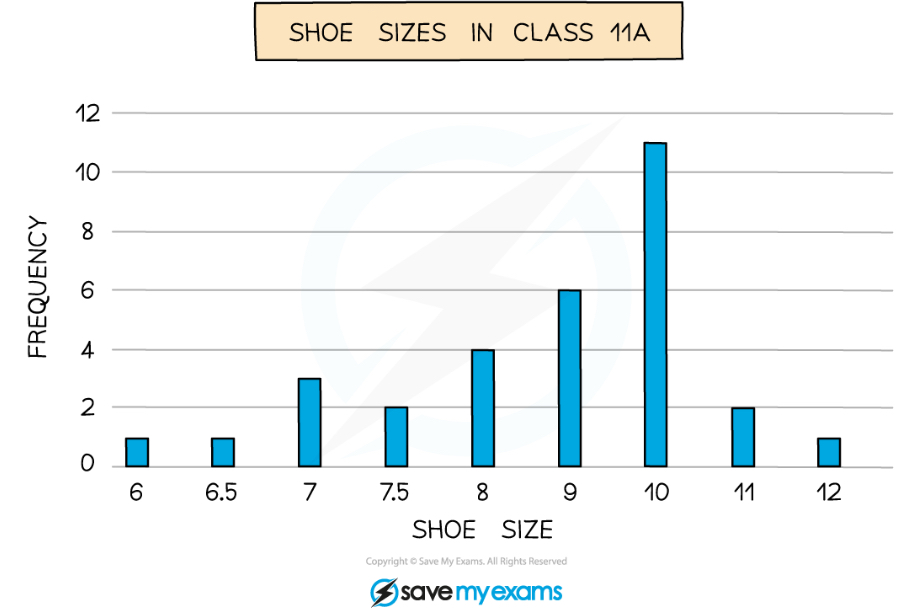
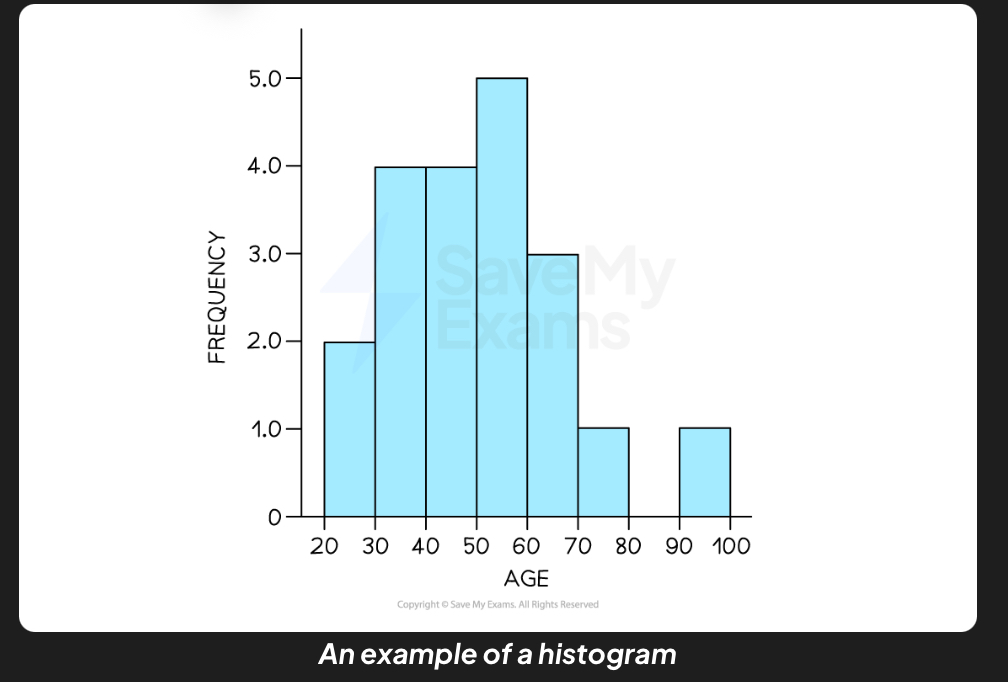
Histograms
On a histogram, the x-axis represents the categories that have been measured e.g.
the number of goals scored across one football season
the number of marks in a psychology mock exam across one year group
On a histogram, the y-axis represents the frequencies of each category occurring e.g.
the frequency of the number of two goals scored in one match
the frequency of question 5 on the mock exam being awarded full marks
A histogram thus, shows continuous data
Any category with zero frequency is represented by a space (a gap) in the chart
Histograms do not have gaps between the bars; the bars touch each other
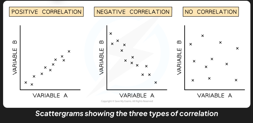
Scattergrams
Scattergrams are used to display the results of correlations
A scattergram shows the point at which two separate pieces of data meet
Each co - variable can be presented along the x-axis or the y-axise.g.
a strong positive correlation will be shown regardless of which axis is chosen per co-variable
The arrangement of points on the scattergram will indicate whether there is a positive correlation, a negative correlation or no correlation