AP Stats
1/67
There's no tags or description
Looks like no tags are added yet.
Name | Mastery | Learn | Test | Matching | Spaced | Call with Kai |
|---|
No analytics yet
Send a link to your students to track their progress
68 Terms
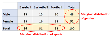
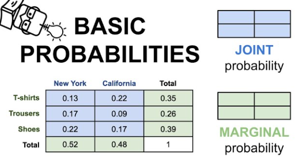
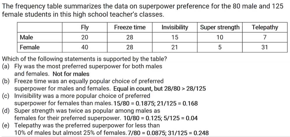
marginal distribution
the probability of an event occurring (p(A)), it may be thought of as an unconditional probability. It is not conditioned on another event.
ex: the probability that a card drawn is red (p(four)=1/13
focuses on the margins (the total row/column)
can be counts or percentages
marginal relative frequency: type of marginal distribution expressed as a ratio or percentage
row/column total divided by table total
conditional distribution
p(A|B) is the probability of event A occurring, given that event B occurs.
ex: given that you drew a red card, what’s the probability that it’s a four (p(four|red))=2/26=1/13
usually only as a percentage
conditional relative frequency: expressed as a ratio or percentage
cell divided by row/column total
interpretation: “Because the distribution of conditional relative frequencies is different for each age group, these two variables are associated.”
joint distribution
p(A and B). The probability of event A and event B occurring
ex: the probability that a card is a four and red p(four and red) = 2/52=1/26
joint relative frequency: expressed as a ratio or percentage
cell divided by table total
individuals
things described by the data set
skew right/left
its the side the tail is pointing to
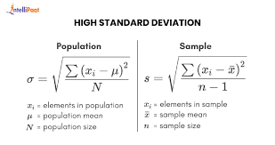
standard deviation formula
(variance is sd squared)
adding a constant to data
mean and median increase (measures of center);
standard deviation, IQR, and range stay the same (measures of spread)
multiplying data by a constant
mean, median, standard deviation, IQR, and range are all multiplied by that constant (both measures of center and spread increase by the multiple)
if data is transformed by addition and multiplication…
measures of spread (standard deviation, etc) will only be affected by multiplication while measures of center (mean, median) will be affected by both
effect of adding/removing a data point or just changing it
adding/removing will affect both mean and median, but affect mean more
changing data point will affect mean but not median
formula for judging outliers in a data set
lower bound = Q1 - 1.5 * IQR
upper bound = Q3 + 1.5 * IQR
unimodal
distribution has a single peak
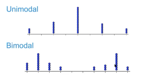
bimodal
distribution has 2 peaks

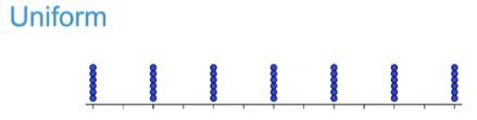
uniform distribution
same number of values for each value on the x-axis
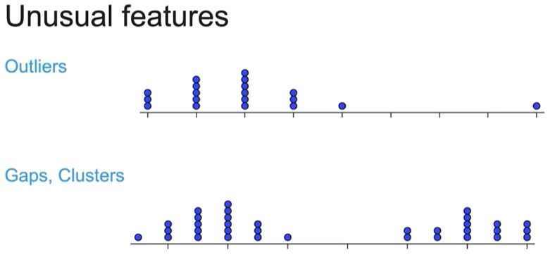
unusual features include…
outliers, gaps, and clusters
typical value:
summarizes a dataset with a single number representing the center or "usual" data point. Can be mean, median, or mode
when describing distribution…
always include context
important characteristics when describing distribution of quantitative data:
shape, center, variability (spread), and unusual features
terms for describing shape:
skewed left/right, symmetric, unimodal, bimodal, uniform
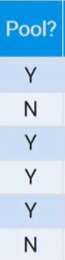
be specific when identifying variables
you can’t just say the variable is “pool?” you have to say it is “whether or not it has a pool”
categorical variables
takes on values that are category names or group labels
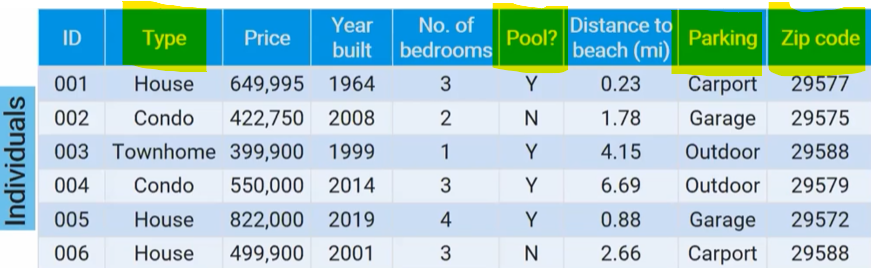
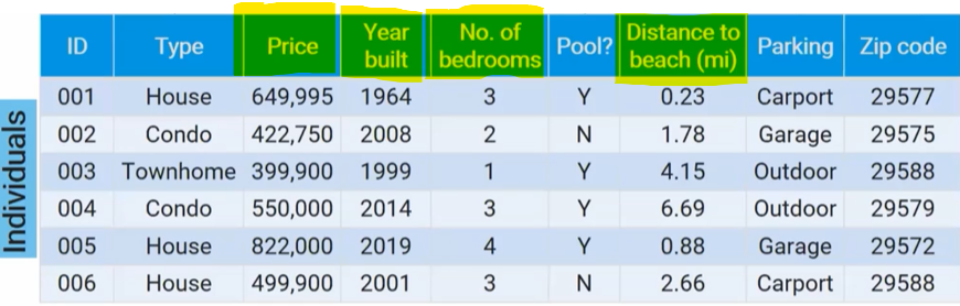
quantitative variable
takes on numerical values for a measured or counted quantity
you can find an average of those values
not all numerical values are quantitative
ex: zipcode
can make quantitative variables categorical by grouping values
ex: distance to beach → close = <1 mi, nearby = 1-3 mi, far = 3+ mi
categorical data
values of a categorical variable in a data set
ex: types of property → house, condo, or townhome
individuals:
people, animals, or things described by the data
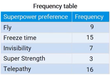
frequency table:
number of individuals (cases) in each category
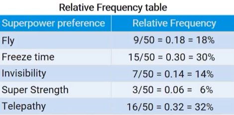
relative frequency table:
gives the proportion or percent of individuals (cases) in each category
should you leave gaps between bars in a bar graph?
yes
how do you display categorical data graphically?
bar chart that displays frequencies or relative frequencies or a pie chart
remember they will try to trick you with questions about proportions given data in counts
comparisons are easier when using relative frequencies for different size groups
discrete variable
can take on a countable number of values (with gaps)
ex: # siblings
counting rather than measuring
continuous variable
can take on infinitely many values, but those values cannot be counted (no gaps)
ex: height
measuring rather than counting
intervals on histograms do or don’t include the end point
dont
histogram pros and cons
pros: easier to make for large data sets, easy to see shape of distribution
cons: doesn’t show every individual value in data set
dot plot and stem and leaf plot pros and cons
pros: shows every individual value in data set, easy to see shape of distribution
cons: difficult for large data sets
IQR interpretation
“the middle 50% of the values for ____ has a range of _ (units)”
range interpretation
“the range of the distribution for ___ is _ (units)”
range is a single value (range = 9 rather than 3-12)
standard deviation interpretation
“The ___ from each sample typically varies by about __ (units) from the mean of __ (units)”
what’s used to describe the position of a distribution of quantitative data?
position: Q1 and Q3
what summary statistics can be used to describe the variability of a distribution of quantitative data?
variability: range, IQR, standard deviation
what summary statistics can be used to describe the center of a distribution?
center: mean, median
standard deviation method for checking outliers:
an outlier is 2 or more standard deviations above or below the mean
nonresistant
heavily affected by the outlier (mean, range, standard deviation)
resistant
not substantially affected by outliers (median, IQR)
for a skewed distribution the best measures of center and variability are…
median and IQR
for a symmetric distribution, the best measures of center and variability are…
mean, standard deviation
boxplot pros and cons
pros: shows 5-num summary and outliers, splits data into quartiles
cons: doesn’t show every individual value, can hide certain features of the shape of a distribution (ex: clusters and gaps are invisible)
skewed right: mean __ median
>
skewed left: mean __ median
<
five-number summary includes:
min, Q1, median, Q3, max
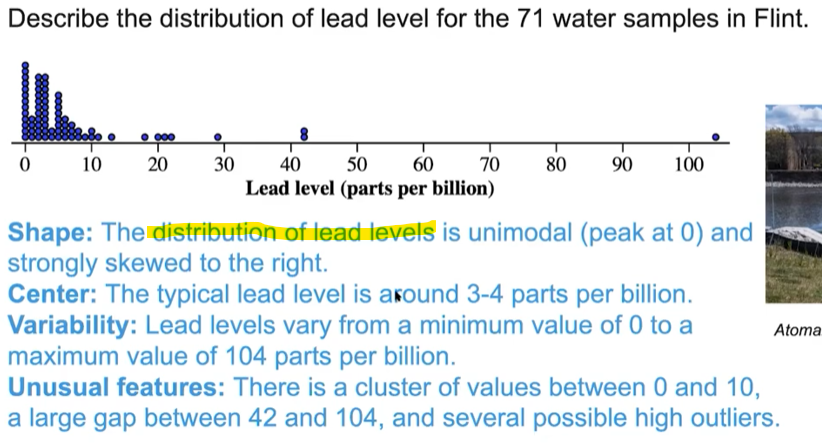
how to describe shape of a distribution
“The distribution of ___ is uni/bimodal (peak at _) and (strongly) skewed towards the left/right (or symmetric)”
how to describe center
“The typical ___ is around ___ (units)”
how to describe variability:
“___ vary from a minimum value of _ to a maximum value of _ (units)
how to describe unusual features:
“There is a cluster of values between _ and _, a large gap between _ and _, and (several) possible high outliers.”
when describing shape from a boxplot…
use the word “appears” because we are not sure
when comparing distributions…
compare all 4 characteristics (shape, center, variability, unusual features), use comparative words (similar, the same, greater), and include context from the problem
check 1.9 daily vid 1
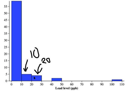
percentile:
percent of data less than or equal to a given value
number of data points at or equal to value/total number of values *100
percentile interpretation:
“The value of ___ is at the pth percentile. About (p) percent of the values are less than or equal to ___.”
standardized score:
most often a standardized z-score
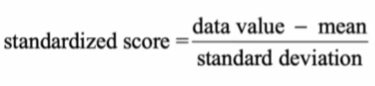
z-score interpretation:
“The value of __ is (z-score) standard deviations above/below the mean.”
(The value of 20 ppb is 0.88 standard deviations above the mean)
z-score
number standard deviations above/below the mean
percentiles and z-scores can be calculated for what distributions?
any, not just normal distribution
normal distributions are determined by…
mean and standard deviation
empirical rule:
68, 95, 99.7
interpretation of area under a normal curve:
“The proportion of ___ is (area)”
(The proportion of adults that are hypertension stage 1 is about 0.13)
if working backwards: “About 10% of adults are high risk, with a blood pressure of more than 122.8 mmHg”
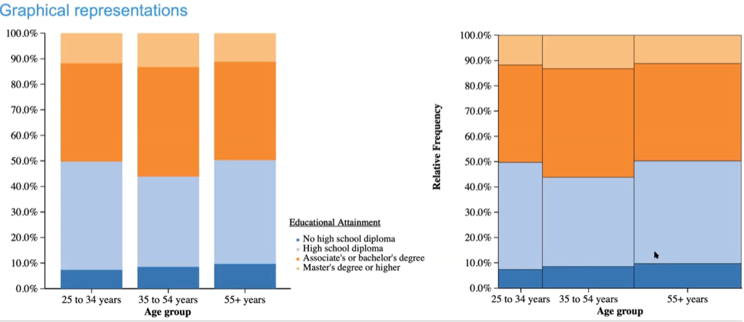
mosaic graph vs segmented
the widths of the bars in a mosaic graph correspond to how many values there are in that bar
what do you use to compare 2 categorical variables?
graphical: bar graphs
numerical: 2-way tables, conditional relative frequencies
what do you use to compare 2 quantitative variables?
graphical: scatterplot
numerical: correlation, linear regression, coefficient of determination
process for graphic 2 categorical variables
turn a table in counts into percentages → side-by-side bar graph → segmented bar graph → mosaic graph