GRAPHS AND MAPS
0.0(0)
Studied by 0 peopleCard Sorting
1/14
There's no tags or description
Looks like no tags are added yet.
Last updated 9:52 AM on 6/7/26
Name | Mastery | Learn | Test | Matching | Spaced | Call with Kai |
|---|
No analytics yet
Send a link to your students to track their progress
15 Terms
1
New cards
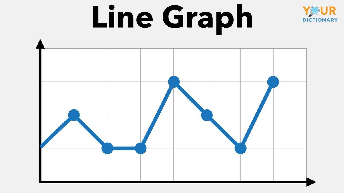
line graph
change over time, good for trends
2
New cards
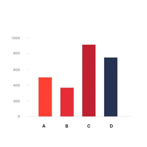
bar chart
compares categories
3
New cards
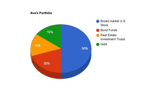
pie chart
shows proportion
4
New cards
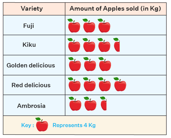
pictogram
icons instead of bars
5
New cards
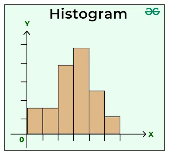
histogram
shows distribution
6
New cards
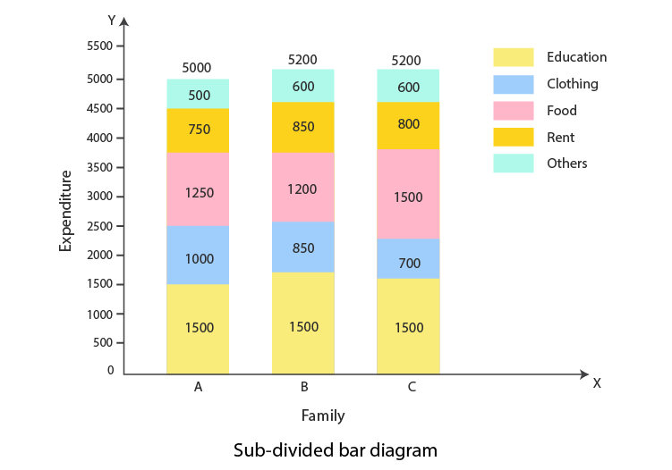
divided bar chart
shows composition within totals
7
New cards
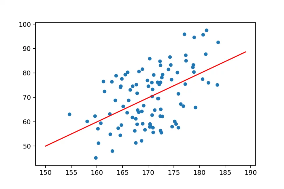
scattergraph
relationship between 2 variables, correlation
8
New cards
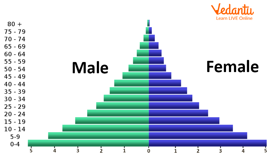
population pyramid
age and gender structure
9
New cards
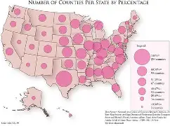
choropleth map
areas shaded by value
10
New cards
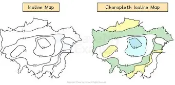
isoline map
line join equal values
11
New cards
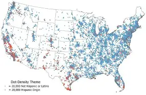
dot map
distribution patterns
12
New cards
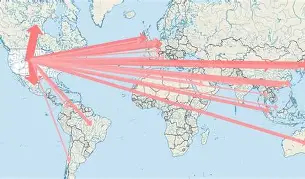
desire line map
movement paths
13
New cards
proportional symbol map
size of shape = value
14
New cards
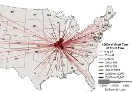
flow line map
line thickness = flow amount
15
New cards
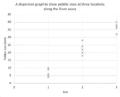
dispersion graph
spatial patterns