Test 1 - Statistics
 Call Kai
 Learn
Learn Practice Test
 Spaced Repetition
 Match
Match Flashcards
 Knowt Play
1/24

There's no tags or description
Looks like no tags are added yet.
Name | Mastery | Learn | Test | Matching | Spaced | Call with Kai | Chat |
|---|
No analytics yet
Send a link to your students to track their progress
25 Terms
Statistics
Statistics is the science of gathering, organizing, analyzing and drawing conclusions from numerical data
Units of Statistical Analysis
Any entities that our data describe (aka units of observation, or cases)
– Individual people
– Schools, universities, organizations
– Geographical areas
– Countries
– Entire world at different points in time
Variables
We characterize each unit of analysis by a number of traits and attributes = variables
• Variable is any characteristic that can have different values (at least 2)
• Examples: race, income, education — for individuals; Gross Domestic Product (GDP), literacy rate, infant mortality rate — for countries
Note: If everyone has the same value on a characteristic, it’s a constant. For example, in a dataset where units of statistical analysis are college students, being a college student is a not a variable but a constant.
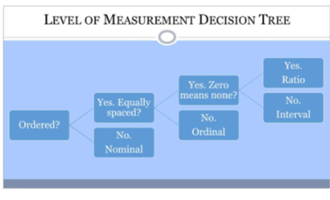
Nominal
Values vary in quality but not the amount
• Examples: nationality, religion, occupation
• Can be represented by numbers, but still not
quantitative (e.g., student ID values)
• Categories should be exhaustive (nothing left
out) and exclusive (no overlap)
• Dichotomies (yes/no variables) are always
nominal
Ordinal
Numbers denote order, ascending or
descending
• Distances between numbers not defined
• Examples: agreement scales, approval scales, pain scales (when these are based on one single question)
Interval (Continuous)
Distances between numbers are meaningful
• Difference between 1 and 2 is the same as
between 10 and 11
• Example: Fahrenheit temperature scale
Ration
Ratio: has a natural zero point (= total lack of)
• Examples: age, weight, income
• That 0 value may never occur in the data (e.g., one can’t weigh 0 lbs
Interval + Ratio
Interval and ratio variables are analyzed and treated the same in statistics
Jointly, they are called continuous or scale
Level of Measurement Decision Tree
Frequency Distributions
- Frequency distribution → always a first step for
nominal and ordinal variables; can be used for
interval/ratio if not too many distinct values
• Frequency distribution = the only way to show
variability/spread for nominal variables
• Cumulative frequency distribution → only for
ordinal and interval/ratio, mostly useful for
technical reasons: to find median and IQR,
identify outliers (e.g., top/bottom 1% or 5%)
Central Tendency: When to use?
Nominal → mode only, NEVER mean or
median
• Ordinal → median or mode; mean is
sometimes used but that’s not technically
correct
• Interval/ratio → mean (if no outliers) or
median (if outliers or skew); mode can be
used but often not as useful, especially if
there are many values, unless distribution is
bimodal or multimodal

Variablity/Spread: When to Use?
Nominal → entire frequency distribution
• Ordinal → entire frequency distribution, range
& IQR (and even though technically incorrect,
some use mean + SD/variance)
• Interval/ratio → can use all of them, most
commonly = SD and IQR (variance is used for
more technical reasons, to be demonstrated
later)
• Media rarely present measures of variability
What to Use to Describe a Single Variable?

Box-and-Whisker Plot (Boxplot)

Normal Curve (Bell Curve)
The most well known “shape” is the normal
curve
• Random processes (chance) often result in a
normal curve

Measures of Distribution’s Shape: Kurtosis

Measures of Distribution’s Shape: Skewness
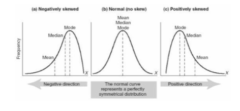
Interpretation of Skewness and Kurtosis Statistics
Skewness:
– Near zero (-0.5 to 0.5) = symmetric (close to normal)
– Positive = right skew (.5 to 1 = moderate, >1 high)
– Negative = left skew (-.5 to -1 = moderate, <-1 high)
Kurtosis:
– In Stata: subtract 3 before interpreting!
– Near zero (-0.5 to 0.5) = close to normal
– Positive = leptokurtic (.5 to 1 = moderate, >1 high)
– Negative = platykurtic (-.5 to -1 = moderate, <-1 high)
Univariate vs Bivariate Bar Graph
Univariate Bar Graph = percentages for
categories of one nominal/ordinal variable →
add up to 100%
• Bivariate Bar Graph = represents the mean or
percentage of something calculated separately
for each group (2 variables – one main
variable and one group variable) → does not
add up to 100%
Histogram or Univariate Bar Graph?
Bar graph (nominal/ordinal variable or 2 vars):
– Spaces between bars
– Bars separately labeled
• Histogram (one interval/ratio variable):
– No spaces between bars
– No individual labels for bars

Bar Graphs Should:
Follow the proportional ink principle
• Always include 0 on vertical axis
• Include proper labels on both axes (vertical
axis label can be skipped if in the title)
• Include values for each bar
• Space the bars equally
• Do not leave any relevant data out
Line Instead of Bars = Line Plot
(Always Bivariate)
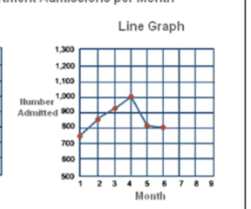
Line Graphs Should:
Include proper labels on both axes
• Have equal spacing on both axes (no skipping)
• Not leave any relevant data out
• Have appropriate vertical scale (not too big or
too small)
• Do not need 0 on vertical axis (unless the area
is shaded)
Pie Charts Should
Have slices add up to 100% (one variable only)
• Display mutually exclusive and exhaustive
categories
• Follow proportional ink principle (no 3D)
• Label categories and list percentages
Proportional Ink Principle Violations:
3D Charts
