Unit 1 AP Statistics
 Call Kai
 Learn
Learn Practice Test
 Spaced Repetition
 Match
Match Flashcards
 Knowt Play
1/62

There's no tags or description
Looks like no tags are added yet.
Name | Mastery | Learn | Test | Matching | Spaced | Call with Kai | Chat |
|---|
No analytics yet
Send a link to your students to track their progress
63 Terms
individual
an object described in a set of data. People, animals, or things. (e.g. households)
variable
a characteristic that can take different values for different individuals. (e.g. region, number of ppl, etc)
categorical v. quantitative
Categorical variables takes values that are labels which place each individual into a particular group called a category (numbers CAN be categorical e.g. zipcode, intervals of time, year).
Quantitative variables take values that are quantities, counts, or measurements. (ranges of numbers like 1-5 are still quantitative!)
Distribution of a variable
This tells us what values the variable takes and how often it takes each value. (Be careful with this term, does NOT mean shape; it means all possible values and the frequency they occur)
How can you summarize a categorical variables distribution?
frequency or relative frequency table
frequency v. relative frequency table
A frequency table shows the number of individuals having each value.
A relative frequency table shows the proportion or percentage of individuals having each value.
These tables are useful for qualitative data (data that isn't discrete like height is hard to make a table for). Keep in mind this SUMMARIZES data it isN'T actual data.
What does it mean to be a majority?
MORE than 50% not equal
bar graph
This graph shows each category (x-axis) as a bar. The heights of the bar show the category frequencies/relative frequencies (y-axis). Leave spaces between categories.
An other category may be required, but necessary because a bar grapjs , must include all individuals in the data set.

pie chart
This graph shows each category as a slice of the "pie." The areas of the slices are proportional to the category frequencies or relative frequencies. Use this when you want to emphasize each categories relationship to the WHOLE.
An "other" category may be required, but necessary because a pie chart , must include all individuals in the data set.

side-by-side bar graph
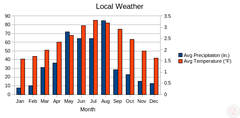
This graph displays the distribution of one categorical variable in each of two or more groups.
Include a color key! Its good to use RELATIVE frequencies when comparing data for multiple grps (e.g. teens vs. tweens), especially if the groups have dif sizes.
You can either make x-axis by the categorical variables or the individuals. If you arrange by the individuals (say teens and tweens) its easier to compare the category between the two
When is there an association between qualitative variables?
When the distribution of outcomes for one variable significantly differs across the categories of the other variable. The only time there is not an association is if they have the exact same percentage because then that would mean one variable has no change on the other (think back to unit 3).
Why do statisticians prefer bar graphs?
Can compare any set of quantities that are measured in the same units along with displaying distributions of a categorical variable.
(e.g. the tweens v. teens example, you could compare the distribution of the categorical variable: screen time for different groups because they were measured in the same unit)
Misleading graphs
Graphs can be misleading if they are pictures or 3D because as you increase the height of the picture, the area increases as well distorting the perceptions of the quantities being compared. In reality, the areas should be proportional to the percentage of the individuals they represent.
They can also be deceptive if they dont start at 0 on the y-axis because it makes comparing the distribution of the categorical variable difficult. (E.g. a bar may seam less than half of another bar when in realiity its more than half)
(Always make sure to give examples of how its seen in the graph!)

What are the types of quantitative variables? Explain them.
Discrete variables are countable sets of possible values with gaps between them on the number line. The number of possible values can be finite or infinite. (E.g. age)
Continuous variables can take any value in an interval on the number line. (E..g. height)
Dot plot
Shows each data value as a dot above its location on a number line.
Recall that bar graphs, side-by-side graphs, pie charts are useful for QUALITATIVE data. Dot plots on the other hand are useful for QUANTITATIVE data.
How do you describe a distribution of a quantitative variable?
Explain shape, center, variability, and outliers. Remember to include the variable name and units!
How do you describe shape?
Roughly symmetric, skewed to the left/negative values (if the tail goes to the left, indicating there are low outliers), skewed to the right/positive values (if the tail goes to the right, indicating there are high outliers).
We can also describe shape as approximately uniform if the frequency of each possible value is about the same. Then, describe numbers of peaks unimodal, bimodal, multimodal.
How do you describe variability?
The distance between the minimum and maximum values; it is referred too as the spread. Standard deviation (if it is roughly sym and has no outliers), IQR (if it is clearly skewed or has outliers), and range (as a last resort) are all used to describe it. This is NOT an interval
How do you describe center?
The median (if skewed/has outliers) or mean (if roughly sym/no outliers) value of the graph.
How do you describe outliers?
By the IQR rule you can define which values are outliers. Too low < Q1 - 1.5IQR. Too high > Q3 + 1.5IQR. It is important to find outliers because it calls attention to inaccurate data values, it indicates remarkable occurrences, and it influences the value of the summary statistics (mean, range, and SD).
How do you compare quantitative distributions?
You must explicitly say greater than, less than, approximately equal and include context when describing the shape, center, variability, and existence of potential outliers,
stemplot
shows each value separated into two parts: a stem, which consists of the leftmost digits, and a leaf consisting of the final digit. The stems are ordered from least to greatest and arranged in a vertical column, the leaves are arranged in increasing order out from the appropriate stems.
Dont forget to add a key 3|2 means 32 people... 5 stems are a good min
What is the benefit of splitting stems?
Separate stems by a certain range (0-4 one one stem and 5-9 on another stem) Allows us to more clearly see distribution (SHAPE). Must have equal number of possible leaf digits. Too many digits then ROUND.
What is the benefit of a back-to-back stem plot?
You can use a back-to-back stemplot with common stems to compare the distribution of a quantitative variable in two groups. The leaves on each side are placed in order leading out from the common stem.
Histogram
shows each interval as a bar. The heights of the bar show frequencies of each value in each interval. Bars are touching. X-axis variables are QUANTITATIVE not categorical (like bar graphs) and grouped in ranges.
How can you compare distributions with histograms?
You can only give ESTIMATES of the center and variability. Use the same interval when comparing histograms so the graphs can be drawn using a common horizontal axis. If sample sizes are different use relative frequencies because it ensures a valid comparison of the categorical variable between the two groups.
Explain the advantages and disadvantages of each type of graph.
Stem plot
Bad for large amounts of data and non-integers (i.e. continuous data). You can see shape, center, variability, and outliers (although may require splitting stems). Can see individual data points.
Dot plot
Bad for large amounts of data. Not great for continuous data. Good for shape, center, variability, and outliers (although it requires calculation). Can see individual data points.
Boxplot
Good for large amounts of data. Bad for individual data points and understanding the complete shape (peaks, clusters, & gaps). You can see 5-number summary (min, Q1, median, Q2, max), outliers, variability (IQR) and which way it skews/symmetry.
Histogram
Good for large amounts of data. Bad for individual data points and understanding the complete shape (peaks, clusters, & gaps). You can ESTIMATE the median, outliers, variability, and which way it skews/symmetry.
median
Midpoint. The value such that about half the observations are smaller and half are larger. It IS resistant to extreme value.
mean
Average of all values. NOT resistant to extreme values. It is equal to the sum of all data values divided by the number of data values. Denoted by x-bar (sample) and mu (population).

What is the difference between x-bar and the greek letter mu?
X-bar refers to the mean of a SAMPLE and a STATISTIC, while the greek letter mu refers to a POPULATION mean and a PARAMETER.
Statistic v. parameter
a number that describes some characteristic of a sample v. a population
resistance
a statistical measure is resistant if it is not affected much by extreme data values (outliers)
How do we decide whether to use the mean or the median as a center?
Use the mean if it is roughly symetric and has no outliers because mean will be pulled in the direction of the long tail in a skewed distribution and it is not resistant to outliers. Use the median for the latter.
(Exp. if graph is skewed to the left (as in negatively skewed) then the median will be GREATER than the mean because the mean will go to the left)
What are the three ways to measure variability? When should you use them?
Range (last resort because not resistant to outliers), SD for roughly symmetric graphs with no outliers (bc not resistant), and IQR for skewed graphs with outliers (bc RESISTANT)
Range
The distance between the minimum and maximum value. It is a single number. It is a last resort because it isNOT resistant to outliers considering minimum and maximum values may be outliers.
Standard deviation
The typical distance of the values in a distribution from the mean.
1. Find sum of (value-mean)^2. You square it to get rid of positive and negative deviations considering its the distance from the 0 or else SD would = 0
2. Divide by (n-1) for a SAMPLE or (N) for a POPULATION where n is the total number of values .This gets you the sample /population variance: Sx^2 or sigma^2.
3. To find the standard deviation, calculate the square root of the _ variance to get Sx or sigma.

Properties of SD
Sx is ALWAYS greater than or equal to 0 (its getting squared after all).
Greater variation from the mean results in larger values of Sx (and remember from unit 3 greater variation means less reliable data)
Sx is NOT a resistant measure of variability because extreme values in the distribution can affect it.
Sx measures variation about the MEAN (NOT the median, which is why its always paired with mean)
IQR
Measures variability about the MEDIAN. The interquartile range Q3-Q1. The range of the middle half of the of the data. Resistant to outliers!

What are Quartiles? What is Q1? Q3?
Quartiles of a distribution divide an ordered data set into FOUR groups having roughly the same number of values. The first quartile is the median of the data values that are LEFT of the mean. While the third quartile is the median of the data values that are RIGHT of the mean.
5 number summary
a distribution of quantitative data consists of the minimum, Q1, median, Q3, and the maximum.
Boxplot
Visual representation of the 5 number summary. Outliers are represented as dots. Ends of square are Q1 and Q3 with the median as a line inside the box. "Whiskers" go out to the minimum and maximum before outliers.

percentile
Describes an individuals position in a distribution of quantitative data. The pth percentile of a distribution is the value with p% of observations less than or equal to it.
Its more helpful for larger number sets. Keep in mind an observation is AT the _ percentile NOT in. Always round percentile. The median is roughly 50th percentile, Q1 is roughly 25th percentile. Q3 is roughly 75th percentile. A HIGH percentile isn't always good.

FRQ format: percentile. Does the 90th percentile of lead level exceed 15 ppb
The 90th percentile is greater than or equal to 64 of the 71 lead levels (Calculate this by finding where x/total = .9). Because 64 of the values are less than or equal to (definition of percentile) 18, the 90th percentile is 18 ppb (Found by finding the 64th data point). 18ppb exceeds 15ppb.
standardized score
for an individual value in a distribution tells us how many standard deviations from the mean the value falls and in what direction.
(value - mean)/SD = _ "SD above/below the mean"
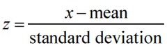
When can we use the z-score to find its corresponding percentile and vise versa
In normal distributions i.e. roughly symmetric, single-peaked, mound-shaped distributions
How do we compare the relative positions of individual data values in distributions of quantitative data?
By comparing the percentile and the z-scores, you CAN state which data point's position relative to their sample of data is higher or lower.
You cannot conclude one data point is higher than the other data point from the other sample if the sample does not provide the mean and SD.
cumulative (relative) frequency (% or proportion) graphs
Plots a point corresponding to the PERCENTILE of a given value in a distribution of quantitative data. Consecutive points are then connected with a line segment to form the graph

What effects do adding or subtracting a constant do to te shape, center, and variability of a distribution of quantitative data?
ADDING: Measures of center (mean and median), min, Q1, Q3, max increase (+ value), but shape, variability (range, SD, IQR) all stay the same. And, vice versa for subtraction.
(Think about it if all the data points shift together there is no difference in subtracting them from one another to find our summary statistics)
What effects do multiplying or dividing a constant do to te shape, center, and variability of a distribution of quantitative data?
Measures of center (mean and median), min, Q1, Q3, max, variability increase (*value), but shape stays the same (Graph is simply shifted upwards or downwards wrt summary stats). And vice versa.
How does turning data values into z-scores affect shape, center, and variability (how we get normal curves!)
Shape remains the same (subtracting and dividing have no affect on shape). Center becomes 0 (You subtract the mean from the mean!). Variability becomes 1 (You divide SD by SD!).
normal distribution
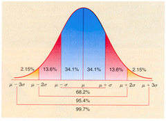
A normal curves' distribution which is described as symmetric, single-peaked, mound-shaped curve. Any normal distribution is completely specified by two parameters: its mean u and standard deviation o (= to distance pt at mean to inflection point). The max/min should be about 2 SD from the mean.
We use parameters bc its for a population! Mean and standard deviation dont NORMALLY determine the appearance of most distributions JUST in this case. NOT every symmetric, bell-shaped distribution is approximately normal!!

normal curve
an idealized model for the population distribution of a quantitative label.
What are common normal distributions and what are the benefits of normal distributions?
Scores on standardized tests, repeated careful measurements of the same quantity (stopping distances of a car, heights of 3 yr olds, weights of 9 oz bags of potato chips), characteristics of biological pop (yields of corn)
model reality!
Empirical rule
ONLY APPLIES TO NORMAL DISTRIBUTIONS. It states that 68% of the values fall within 1 SD of the mean, 95% of the values fall within 2 SD of the mean, 99.7% of the values fall within 3 SD of the mean. (68-95-99.7 rule)
Commonly right skewed quantitative variables + FRQ format
single-family home prices, number of siblings, income, pennys distance from a target, ect. (when situations have a minimum constraint)
_ is likely positively skewed because it is likely too have several high outliers.
Commonly left skewed quantitative variables
Test scores, age of death from natural causes, distribution of dates on pennies (when situations have a maximum constraint)
Commonly approx uniform quantitative variables
dice, coin toss, quantitative variables involving equal chance
Commonly roughly symmetric quantitative variables (could be normal, depends if they follow empirical rule)
stopping stopwatch times, IQ, weather data over a long period, length of body parts, heights, weights
Can real world data be normal?
No! always say approximately normal!
standard normal distribution
is the normal distributions with mean 0 and standard deviation 1. number line is z-scores. percentiles are = area.
FRQ format: finding area under a normal curve (looking for percent of whatever the question is asking)
1. convert to z-scores
2. draw standard normal distribution
3. normcdf(lower=, upper=, mean=0, SD=1)
what upper and lower =s depends if its area to the left, right, or between two values (-infinity, infinity, the values)
Finding percentile in a normal distribution
Percentile corresponds to _ % of the area under the cruve less than or equal to it. We essentially have to work backwards, using invNorm(area: .90, mean:0, SD:1). Dont forget to show conversion to z-scores
Calculating the mean or standard deviation of a normal distribution (using the value of one+ percentiles)
1. find z-score with information given
2. plug it into z-score equation and solve for missing variable
If you don't know the mean OR the standard deviations make a system of equations with the two different percentiles