Quality Tools in Six Sigma
 Call Kai
 Learn
Learn Practice Test
 Spaced Repetition
 Match
Match Flashcards
 Knowt Play
1/26

There's no tags or description
Looks like no tags are added yet.
Name | Mastery | Learn | Test | Matching | Spaced | Call with Kai | Chat |
|---|
No analytics yet
Send a link to your students to track their progress
27 Terms
pareto principle
Limited number of causes often lead to majority of problems; 80/20 rule

Pareto chart steps
Tally number of defects for each category 2. Sort from highest to lowest frequency 3. Calculate the percentage each category contributes to total number of defects 4. Calculate cumulative percentage by adding each category’s percentage to the sum of the previous ones 5. Plot data on chart: left Y axis=number of defects; x axis=types of defects; right Y axis=cumulative percentages

cause and effect diagrams
fish bone diagram to gain a clear overview of potential causes to spot patterns and connections
man
people involved
machine
equipment and tools
method
procedures and work flows
material
raw materials and components
measurement
data collection and accuracy
mother nature
environmental factors

flow charts
highlight delays and breakdowns, reveal inefficiencies, & turn complex workflows into clear diagrams
Oval/circles
start or end of a process
Rectangles
task that moves process forward
Diamonds
decision points that usually asks a question
Parallelagrams
input or output
Flow chart steps
Define process starts and ends 2. Collect info on steps, decisions, and handoffs 3. Collaborate to gather team insights 4. Sequence steps with flowchart symbols 5. Review for accuracy
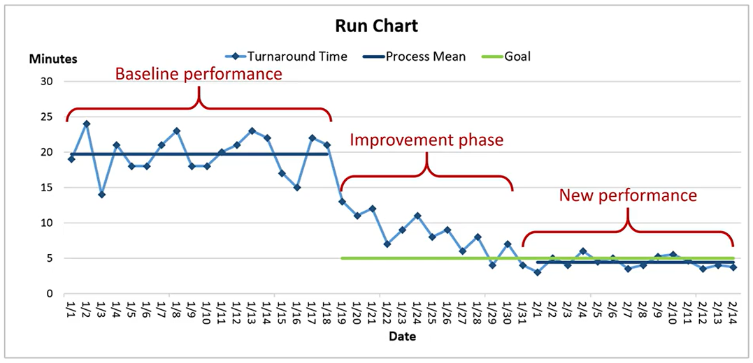
run charts
Understand how a process behaves overtime, Monitor process without complex tools, Use to validate improvements
run chart Y axis
measured values
run chart x axis
time intervals
Shift
seven or more consecutive points fall above or below median
Trend
steady increase or decrease over five or more points
Oscillation
rapid alternation around the median
Mixture
data points avoid the median
Clustering
data grouped in time
check sheets
organize data such as defects and locations using columns or sections to represent data categories and use tallies during data collection
designing check sheets steps
Define specific data categories related to the process 2. Guide collectors with clear, accurate category labels 3. Design simple user friendly check sheet layout 4. Include date and time to track 5. Enhance clarity with symbols and color coding
scatter diagrams
explores correlations between variables not visible in raw data
creating scatter diagram steps
Select correct variables
Define independent and dependent variables with clear examples
Collect accurate data for both defined variables
Use paired measurements under consistent data conditions
Y axis = independent variable
X axis = dependent variable