Common Types of Graphs
 Call Kai
 Learn
Learn Practice Test
 Spaced Repetition
 Match
Match Flashcards
 Knowt Play
1/11

There's no tags or description
Looks like no tags are added yet.
Name | Mastery | Learn | Test | Matching | Spaced | Call with Kai | Chat |
|---|
No analytics yet
Send a link to your students to track their progress
12 Terms
For example, if you wanted to
display relationships between
data in categories, you could
make a bar graph. Microsoft
Excel calls a bar graph with
vertical bars a column graph
and a bar graph with
horizontal bars a bar graph.

A line graph shows a line;
usually with an equation.
Lines can be either straight or
curved.

A pie chart would show you how categories
in your data relate to the whole set.

Scatter plots are a good way to display
data points.
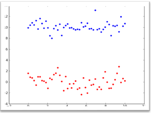
A bubble chart is another good way to display data points.

A histogram is a way to
display data counts with data
organized into bins.

A Pareto chart plots the
distribution of the data in
descending order of
frequency, with a cumulative
line on a secondary axis as a
percentage of the total.

A waterfall chart shows the
cumulative effect of a series
of positive and negative
values. Use it to show the
cumulative effect of
sequential values.

A box and whiskers graph (also
called a box plot) is useful for
showing the five number summary.

Pictographs, also called
pictograms, are diagrams that show
and compare data by using picture
symbols. Each of these symbols
corresponds to a specific quantity
and is repeated a number of times.
The media often uses pictographs to
compare trends.

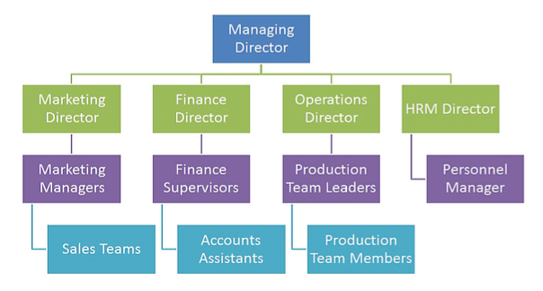
Organizational charts, also called
organization charts or org charts,
are diagrams that reveal the overall
structure of the workforce of a
company.
Flowcharts are types of graphs that display
a schematic process. Contemporary flow
charts are modelled after the logic behind
early computer games. Businesses often use
them to visually depict all the stages of a
project.
