content
 Call Kai
 Learn
 Practice Test
 Spaced Repetition
 Match
 Flashcards
 Knowt Play
 Podcast
1/76

There's no tags or description
Looks like no tags are added yet.
77 Terms
wood marsh profesional design practise
Designers
Founded by Roger Wood and Randal Marsh in 1983.
They work as part of the Wood Marsh architecture firm, not as solo designers.
Type of Practice
The firm includes architects, interior designers, directors and graduates.
They work across residential, commercial, public and urban architecture.
Residential Work
Wood Marsh designs houses and apartments for people to live in.
However, residential design is only one part of their wider architectural practice.
Design Style
Their work often uses sculptural forms, strong materials and simple material palettes.
Their designs aim to feel contemporary, unique and long-lasting.
MCR professional design practice
Designers
Founded by Debbie Ryan and Robert McBride in 1988.
They continue to play an active role in the studio, along with a larger team of architects and associates.
Type of Practice
MCR is a studio-based design practice.
They specialise in architecture, urban design and interior design.
Their projects include homes, education, health, commercial and public buildings.
Residential Work
Yes, MCR designs residential architecture, including houses, apartments and townhouses.
Residential design is only one part of their wider practice.
Design Style
Their designs are often bold, engaging and unique to the client and community.
They focus on turning ideas into architectural forms while still creating practical and functional spaces.
similarities and differences
Similarities
Both are Melbourne-based architecture firms with larger design teams.
Both work across residential, commercial and public projects.
Both are known for unique, award-winning architecture.
Differences
Wood Marsh has a more sculptural, bold and timeless style.
MCR is often more playful and expressive, focusing strongly on the client and community.
Wood Marsh also has a strong focus on infrastructure and urban projects, while MCR works heavily in architecture, interiors and urban design.
awards each have got
Wood Marsh: Victorian Architecture Medal (1998) for the Eastern Freeway Extension.
MCR: Victorian Architecture Medal (2017) for the Victorian Comprehensive Cancer Centre (VCCC).
visual language and conventions wood marsh
Elements
Line: curved, flowing lines create an organic appearance.
Shape/Form: rounded floorplates and fluted columns create sculptural forms.
Texture: timber, marble, stone and textured columns add natural detail.
Tone/Colour: a mostly neutral, monochromatic palette creates a refined appearance.
Principles
Movement: flowing curves guide the eye around the building.
Contrast: solid forms contrast with large areas of glazing and open spaces.
Balance: asymmetrical forms are balanced through the repeated floors, columns and landscaping.
Gestalt Principles
Similarity: repeated curved balconies and columns visually connect each level.
Continuity: continuous curved lines lead the eye around the façade.
Figure–ground: solid building forms contrast with the voids, glazing and planted spaces, making the sculptural form stand out.
visual language and conventions wood marsh- MMMS
Method, Media, Materials & Processes
Methods: concept drawings, architectural models, digital renderings, elevations and construction documentation.
Media: digital drawing/rendering, photography and physical model making.
Materials: concrete/plaster forms, glass, timber, bronze, marble, stone and travertine.
Process: ideas were developed from organic natural forms, then refined through models and drawings before construction.
visual language and conventions MCR
Elements
Line: curved lines create the cloud-like form.
Shape/Form: the rounded cloud shape contrasts with the more rectangular original house.
Colour: strong red in the kitchen creates a focal point, while white spaces keep the rest simple.
Texture: timber, carpet and smooth curved surfaces add variety.
Principles
Contrast: old and new forms strongly contrast with each other.
Movement: the sequence of spaces guides people through the house.
Hierarchy: the cloud-shaped living area becomes the main feature of the design.
Gestalt Principles
Continuity: curved walls, floor and ceiling flow together as one continuous form.
Figure–ground: the bold red kitchen and cloud form stand out against the simpler surrounding spaces.
Proximity: connected spaces create a clear progression from the original house to the kitchen and then to the cloud addition.
visual language and conventions MCR- MMM
Method, Media, Materials & Processes
Methods: architectural drawings, plans, modelling, renovation and construction.
Media: digital drawings, photography and architectural plans.
Materials: timber lining, glass, carpet, painted surfaces and existing Edwardian building materials.
Process: MCR kept much of the original house, then added the red kitchen box and the new cloud-shaped living space.
similarities and differences
Similarities
Both use curved, sculptural forms inspired by organic shapes.
Both create movement and continuity through flowing lines and connected spaces.
Both combine strong visual design with practical residential use.
Differences
No. 6 Sydney Street is a multi-residential apartment building, while Cloud House is a renovation and extension of one family home.
Wood Marsh uses a more monochromatic, refined material palette, while MCR uses bold colour, especially the red kitchen.
No. 6 Sydney Street focuses on repetition, balconies and façade form, while Cloud House focuses more on the sequence of interior spaces and contrast between old and new.
specialists wood mash
Builder / Contractor: interprets the architectural drawings and physically constructs the design.
Landscape Designer: develops the gardens and planting so they connect with the building’s organic architecture.Specialist – Structural Engineer
The structural engineer is important because the building has unusual curved forms, balconies and fluted columns.
They work with Wood Marsh to make sure these design ideas are safe, stable and structurally possible without losing the intended appearance.
stakeholders wood marsh
Residents are important because they live in and use the apartments every day.
Their needs influence comfort, privacy, natural light, views and functionality.
Builder / Contractor: interprets the architectural drawings and physically constructs the design.
Landscape Designer: develops the gardens and planting so they connect with the building’s organic architecture.
MCR stake holders
Homeowners / Clients: need the house to suit their family, lifestyle and daily needs.
Local Council: ensures the extension meets planning, setback and building requirements.
Neighbours are stakeholders because changes to the house can affect the streetscape, privacy and surrounding properties.
MCR therefore needed to make sure the new extension respected the existing area while still creating a bold new design.
MCR specialists
The structural engineer makes sure the curved cloud-shaped extension can be safely built.
They work with MCR to keep the unusual form while making sure it is stable, practical and meets building requirements.Builder / Contractor: constructs the renovation from MCR’s drawings and specifications.
Building Services / Sustainability Specialist: helps with ventilation, glazing, cooling and rainwater systems.
diferences
Differences
No. 6 Sydney Street is a larger apartment development, so it involves multiple residents and a developer.
Cloud House is a single-family home, so the homeowners have a more direct influence on the design.
Wood Marsh’s project requires more coordination for a large multi-residential building, while MCR’s project focuses more on a smaller renovation and extension.
..
similarities
Similarities
Both projects involve clients/residents, local councils and surrounding communities as key stakeholders.
Both rely on specialists such as structural engineers and builders to make the designs safe and buildable.
Both practices need to communicate closely with stakeholders and specialists throughout the design and construction process.
evaluation techniques wood marsh
Client / Developer Approval: The design can be evaluated by whether V-Leader is satisfied that it meets the brief, budget, functional needs and overall design vision.
Apartment Sales / Buyer Interest: Strong buyer interest and successful apartment sales can show that the design is desirable, functional and appealing to its target market.
Feedback & Recognition: Architectural reviews, publications and awards can provide professional feedback on the project’s quality, originality and success.
good design wood marsh
Understanding of Good Design – Wood Marsh
Useful: No. 6 Sydney Street provides functional, comfortable spaces for residents.
Aesthetic: the curved forms, natural materials and landscaping create a strong visual identity.
Long-lasting: the design uses durable materials and a timeless architectural style.
Thorough: details such as light, views, terraces and material finishes are carefully considered.
MCR evaluation techniques
Client Approval: The design can be evaluated by whether the homeowners are satisfied that the renovation meets their family needs, lifestyle and design expectations.
Function in Everyday Use: MCR can judge success by how well the spaces work for living, entertaining, natural light, ventilation and movement through the house.
Awards & Recognition: Awards and architectural recognition can show that the project is seen as innovative, functional and visually successful.
good design MCR
Good Design – Dieter Rams
Useful: The renovation improves how the family can live, move and gather within the home.
Aesthetic: The cloud form, red kitchen and curved interior create a distinctive and memorable appearance.
Innovative: The cloud-shaped extension turns a practical living space into a unique architectural feature while still meeting functional needs.
similarities
Similarities
Both use client satisfaction and feedback to judge whether the final design successfully meets the brief, user needs and expectations.
Both can use awards, publications and professional recognition to show that the design has been positively received by the architecture industry.
Both reflect Dieter Rams’ ideas of useful, aesthetic and long-lasting design, combining strong visual appeal with practical everyday function.
differences
Differences
Wood Marsh can also use apartment sales and buyer interest to judge market success, while Cloud House is a private family home.
MCR Cloud House places more emphasis on innovation, especially through its unusual cloud-shaped extension.
No. 6 Sydney Street focuses more on multi-residential functionality and market appeal, while Cloud House focuses more on family lifestyle and everyday use
context of No 6 sydney st
Context – No. 6 Sydney Street
Located in Prahran, Melbourne, beside Orrong Romanis Reserve.
It is a multi-residential building with 15 residences.
The surrounding area includes more rectilinear residential buildings, so Wood Marsh wanted the design to connect more strongly with nature and the nearby park.
design decisions of No.6 sydney street
Design Decisions
Used curved, organic forms inspired by nature to contrast with the surrounding straight-edged buildings.
Added fluted columns, layered balconies and deep curves to create movement and a sculptural appearance.
Included large glazing, terraces and planting to improve natural light, views and connection to the landscape.
Used a neutral, natural material palette to create a refined and timeless look.
MCR context
Context – Cloud House
Located in Fitzroy North, Melbourne, as an addition to an existing Edwardian family home.
The original street façade was kept to respect the character and history of the neighbourhood.
The project needed to create more modern family living spaces while still working with the existing house.
MCR design decisions
Design Decisions
MCR divided the house into three distinct parts, creating a sequence from the original home to the red kitchen and then the cloud extension.
The cloud-shaped living area was designed as a playful family space for eating, relaxing and entertaining.
The bold red kitchen creates contrast and acts as a visual link between the old and new areas.
Large glazing, cross ventilation and controlled northern sunlight were included to improve light, comfort and sustainability.
similarities
Similarities
Both respond strongly to their site and surrounding environment rather than designing the building in isolation.
Both use curved forms, natural light and connections to outdoor areas to improve the experience of the people using the space.
Both balance visual impact with practical residential needs, including comfort, movement and functionality.
differences
Differences
No. 6 Sydney Street responds to a larger urban site and nearby park, while Cloud House responds to an existing Edwardian home and neighbourhood character.
Wood Marsh focuses more on sculptural multi-residential design and landscaping, while MCR focuses more on contrasting old and new through playful interior spaces.
description of Wood marsh design
Wood Marsh – No. 6 Sydney Street
No. 6 Sydney Street is a 15-residence apartment building in Prahran designed as an organic, sculptural form. It uses curved balconies, fluted columns, large glazing and integrated landscaping to connect the building with the nearby park and create a refined residential environment.
description of MCR design
MCR – Cloud House
Cloud House is a renovation and extension of an Edwardian family home in Fitzroy North. The design keeps the original front of the house, then introduces a bold red kitchen and a playful cloud-shaped living area, creating a strong contrast between old and n
Factors that influence design MCR
Environmental
MCR designed the house to use controlled northern sunlight, cross ventilation and double glazing, improving comfort and reducing reliance on heating and cooling.
They also retained much of the existing house and added a rainwater tank, reducing waste and water use.
Social
The design was influenced by how the family would live, gather and entertain.
The cloud-shaped living space creates a playful shared area where family and friends can eat, relax and interact.
Factors that influence design- Wood marsh
Factors Influencing Design – Wood Marsh, No. 6 Sydney Street
Environmental
The design responds to the nearby Orrong Romanis Reserve through curved forms, landscaping, glazing and terraces that connect residents with nature.
The large windows and open terraces also increase access to natural light and outdoor views, improving the living environment.
Economic
As a high-end multi-residential development, the design needed to appeal to buyers and support the value of the apartments.
Premium materials, refined finishes, views and private terraces help make the residences feel desirable and luxurious.
similarities an ddifferences
Similarities
Both designs are influenced by their environment and surrounding context.
Both use natural light, outdoor connections and considered layouts to improve the experience of the people living there.
Differences
Cloud House is influenced more by social factors, especially how one family lives, gathers and entertains.
No. 6 Sydney Street is influenced more by economic factors, as a high-end apartment development designed to attract buyers through premium materials, views and terraces.
ethical obligations- MCR
Ethical Obligations
Respect existing character: avoid unnecessarily removing significant parts of the original home.
Sustainability: reduce demolition, improve natural ventilation and sunlight, and collect rainwater.
User wellbeing: create a home that is safe, comfortable and functional for the family.
legal obligations- MCR
Building Codes
The renovation and extension needed to meet relevant Australian building requirements for areas such as structural safety, ventilation, glazing and safe construction.
Council / Planning Codes
MCR had to respond to local planning requirements, including setbacks. The cloud form was specifically shaped so it could meet setback regulations while maintaining its unique appearance.
Heritage
As an Edwardian-era home, its existing character was an important consideration. MCR retained the original street façade and placed the dramatic new design further into the property, helping preserve the character of the streetscape.
Heritage controls in the City of Yarra can require new work to respond appropriately to existing heritage character and significance.
legal obligations- wood marsh
Legal Obligations – Wood Marsh, No. 6 Sydney Street
Building codes: The design must meet requirements for structural safety, fire safety, accessibility, ventilation and safe construction.
Council regulations: Wood Marsh must follow local planning controls such as building height, setbacks, site use and development approval.
Planning requirements: As a multi-residential development, the building needs to respond appropriately to the surrounding neighbourhood, nearby park and residential context.
ethical obligations wood marsh
Ethical Obligations
Resident wellbeing: The apartments should provide privacy, natural light, ventilation, comfort and safe access for the people living there.
Sustainability: The design should make responsible use of natural light, landscaping, durable materials and connections to outdoor spaces.
Respect for context: The building should contribute positively to the area by responding to Orrong Romanis Reserve and the surrounding streetscape, rather than ignoring its environment.
similarities and differences
Similarities
Both projects must meet building codes, council regulations and planning requirements.
Both designers have an ethical responsibility to create spaces that are safe, functional and comfortable for the people using them.
Both designs also consider sustainability and their surrounding context.
Differences
MCR Cloud House has a stronger focus on heritage, because it renovates an existing Edwardian home and keeps the original street façade.
No. 6 Sydney Street has a stronger focus on multi-residential requirements, including privacy, accessibility and the needs of multiple residents.
purposes of MCR
Main Purposes – MCR Cloud House
Depicting: Architectural drawings, plans and renderings show what the Cloud House will look like, including its form, spaces and materials.
Guiding: Plans and construction drawings guide builders and specialists by showing dimensions, structure, layout and how the design should be built.
Informing: Drawings and visualisations communicate design information to the client and other stakeholders, such as the layout, materials, lighting and ventilation.
constraints of MCR
Main Constraints – MCR Cloud House
Existing Building: MCR had to work with the original Edwardian house, keeping much of the existing structure and street façade.
Planning / Setbacks: The cloud-shaped extension had to fit within local setback regulations, which influenced its final curved form.
Site & Orientation: The design had to manage sunlight, ventilation and the position of the new living area, while still creating a comfortable family space.
constraints of wood marsh
Main Constraints – Wood Marsh, No. 6 Sydney Street
Site & Surroundings: The building had to respond to the urban Prahran site and nearby Orrong Romanis Reserve, influencing its curved form and landscaping.
Multi-Residential Use: The design needed to fit 15 residences while still providing privacy, natural light, views and terraces.
Planning / Urban Context: The building had to work within its existing urban block and surrounding residential streetscape, while still creating a distinctive sculptural form.
purposes of wood marsh
Main Purposes – Wood Marsh, No. 6 Sydney Street
Depicting: Concept drawings, models and renderings show the form, materials and overall appearance of the building.
Guiding: Elevations and construction drawings guide builders and specialists in how the design should be constructed.
Informing: Plans and visualisations communicate the layout, structure, materials and design ideas to the client, developer and other stakeholders.
similarities an ddifferences
Similarities
Both use depicting, guiding and informing to communicate their designs through plans, drawings, models and renderings.
Both are affected by site conditions, planning requirements and user needs.
Both use visual communication to help clients, builders and specialists understand the final design.
Differences
Cloud House is constrained more by the existing Edwardian house and setback rules because it is a renovation and extension.
No. 6 Sydney Street is constrained more by multi-residential requirements, including fitting 15 residences while maintaining privacy, light and views.
messgaes
survey
interview
focus groups
competitor analysis
visual analysis
empashy mao
messages- briefly explain
Surveys – collect feedback and opinions from the target audience.
Interviews – ask the client or users detailed questions about their needs.
Focus groups – discuss design ideas with a small group to gain feedback.
Competitor analysis – examine similar brands to identify common styles and opportunities.
Visual analysis – analyse existing logos, advertisements or designs for inspiration.
Empathy map – helps understand the target audience by considering what they think, feel, say and do, so the design better meets their needs.
surveys explain
Surveys – Surveys are an effective research method because they allow designers to collect information directly from the target audience. Questions can focus on preferences for colour, typography, imagery, layout, style and overall appearance. The responses can then be compared to identify common trends and preferences. This helps the designer make more informed design decisions and ensures the final message is visually appealing, appropriate and relevant to the intended audience.
explain empathy maps
Empathy maps – Empathy maps are used to develop a deeper understanding of the target audience by considering what they think, feel, say and do. They can also explore the audience’s needs, motivations, frustrations and expectations. This information helps the designer understand how the audience may respond to a visual message and what design choices may connect with them. As a result, the final design can communicate more effectively and better suit the audience’s interests and needs.
explain competitor analysis
Competitor analysis – Competitor analysis involves researching similar brands, businesses or existing designs within the same field. The designer can compare features such as logos, colour schemes, typography, imagery, layouts and overall visual style to identify common trends and successful approaches. This research can also reveal gaps or opportunities to make the new design more distinctive. It helps ensure the final message is appropriate for the market while still having its own unique identity.
environments methods
survey
case studies
site visits
site analysis
interviews
environments briefly explain
For VCD – Environments, five useful research methods are:
Surveys – collect feedback from users about their needs, preferences and experiences within a space.
Case studies – research existing buildings or environments to analyse successful design features and solutions.
Site visits – physically visit the location to observe the space, surrounding area, access, lighting and existing conditions.
Site analysis – examine factors such as orientation, climate, traffic flow, surrounding buildings and environmental conditions.
Interviews – speak with the client, users or stakeholders to understand their needs, expectations and requirements.
site visits explain
Site visits – Site visits allow the designer to physically explore and observe the location where the environment will be created. This helps them understand important factors such as the size of the site, surrounding buildings, access points, pedestrian and vehicle movement, natural lighting, existing vegetation and overall atmosphere. Visiting the site can reveal opportunities and constraints that may not be obvious from photos or maps, helping the designer create a more practical and suitable design.
case studies explain
Case studies – Case studies involve researching existing buildings or environments that are similar to the proposed design. The designer can analyse features such as layout, materials, sustainability, accessibility, circulation, lighting and overall appearance to understand what has worked successfully in other designs. This research can provide inspiration and help the designer make informed decisions while also avoiding problems found in existing environments.
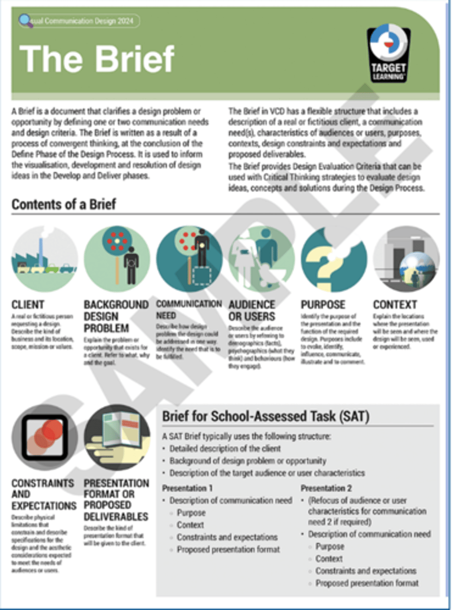
how to write a brief
Your Brief should include the following subheadings (500-600 words):
Client - Who are you designing for?
Design Problem - What/Why and desired result?
Communication Needs - What will you be designing?
Target Audience - Who will be viewing or benefiting from the design (age, gender, demographic, socio-economic status)?
Purpose - What is the reason for creating the design?
Context - Where will the design be viewed?
Constraints & expectations - What must be considered & included in the design
Proposed Final Presentation Format - How will the design be presented to the client and audience?
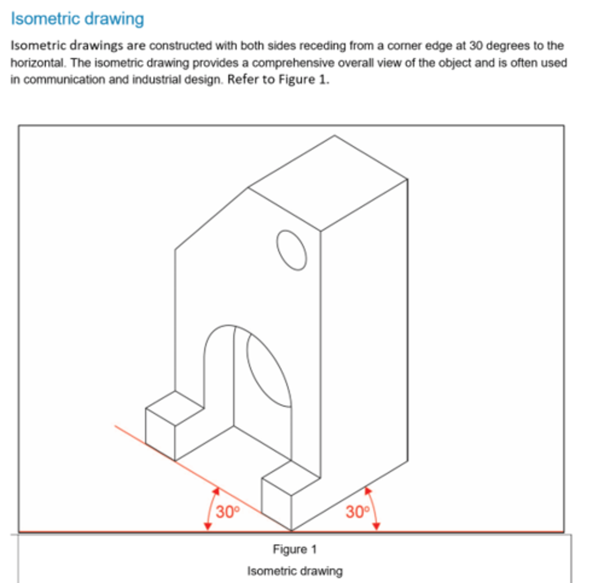
what is isometric drawing
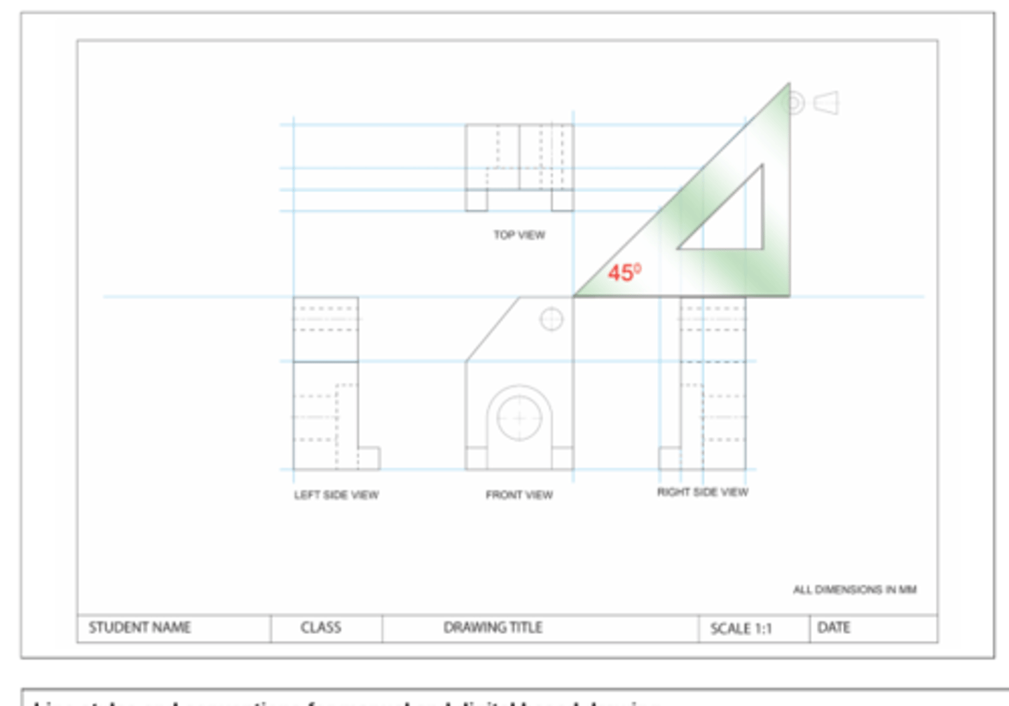
what is orthogonal drawing
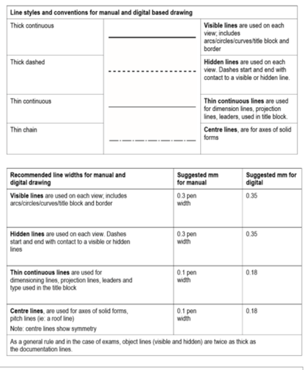
what are the meaning of different lines
design elements
Line
Shape
Form
Colour
Value
Texture
Space
line and shape
Line
A continuous mark used to guide the eye, divide space, create texture, or add movement.
Things you can talk about:
Thick or thin lines
Curved or straight lines
Horizontal, vertical, or diagonal direction
Flow and movement created
Emotional feeling (soft, energetic, harsh)
Words to use:
bold, delicate, dynamic, flowing, rigid, structured, organic, directional, energetic, sharp
Shape
A flat, two-dimensional enclosed area. Shapes can be geometric or organic.
Things you can talk about:
Geometric vs organic shapes
Repeated shapes creating pattern
Symbolic meanings
Rounded vs angular appearance
Words to use:
geometric, organic, rounded, angular, simplified, abstract, natural, playful, structured
form and colour
Form
The three-dimensional quality of an object or the illusion of depth.
Things you can talk about:
Realistic depth and shadows
3D appearance
Perspective
Layering
Words to use:
dimensional, realistic, sculptural, solid, volumetric, layered, immersive
Colour
Used to create mood, meaning, emphasis, and brand identity.
Things you can talk about:
Warm vs cool colours
Bright vs muted tones
Symbolism and emotions
Colour harmony
Contrast between colours
Words to use:
vibrant, muted, warm, cool, energetic, calming, bold, harmonious, contrasting, saturated
tone and texture
tone
The lightness or darkness of colours and objects.
Things you can talk about:
Shadows and highlights
Contrast
Depth and realism
Mood creation
Words to use:
high contrast, subtle, dramatic, tonal, shaded, highlighted, darkened, soft
Texture
The way a surface looks or feels.
Things you can talk about:
Smooth vs rough surfaces
Visual texture in print or digital design
Natural or artificial textures
Emotional response
Words to use:
tactile, rough, smooth, grainy, polished, layered, textured, soft, glossy, matte
type and point
Type / Typography
The style, arrangement, and appearance of text used to communicate information and create personality in a design.
Things you can talk about:
Font style (serif, sans serif, script)
Size and hierarchy
Readability and spacing
Bold or thin text
Mood and tone created
Words to use:
modern, elegant, bold, minimal, clean, readable, decorative, professional, playful, sophisticated, structured
Point
The smallest visual element in a design, often used to attract attention, create texture, or form patterns and images.
Things you can talk about:
Dots or repeated points
Focus and attention
Patterns and texture
Direction and movement created by points
Words to use:
precise, concentrated, detailed, patterned, subtle, focal, repetitive, textured, minimal, scattered

design principles
Balance
Emphasis
Contrast
Movement
Repetition / Pattern
Unity / Harmony
Proportion
Scale
contrast
Contrast
Contrast is the difference between visual elements such as colour, size, shape, texture, or tone. Designers use contrast to make objects stand out, improve readability, and create focal points.
Things you can talk about:
Light vs dark colours
Large vs small objects
Rough vs smooth texture
Bold typography
Creating emphasis
Words to use:
striking, dramatic, bold, eye-catching, varied, vibrant, opposing, noticeable, high-contrast
balance
Balance
Balance is the visual distribution of weight within a composition. It helps a design feel stable and organised. Designers use balance to control how comfortable or dynamic a layout appears to viewers.
Symmetry
Symmetrical balance occurs when both sides of a composition are mirrored or evenly distributed. This creates a formal, professional, and calm appearance. It is commonly used in logos, architecture, posters, and editorial layouts because it feels reliable and visually pleasing.
Things you can talk about:
Mirrored layouts
Equal spacing and placement
Formal or traditional appearance
Stability and structure
Sense of order
Words to use:
balanced, symmetrical, stable, organised, formal, structured, calm, even, professional, controlled
Asymmetry
Asymmetrical balance uses different elements that still feel visually balanced through colour, size, spacing, or placement. It creates movement and interest and is often used in modern and contemporary design.
Things you can talk about:
Uneven layouts
Visual weight
Dynamic compositions
Eye movement
Modern appearance
Words to use:
dynamic, energetic, modern, engaging, unbalanced, creative, visually weighted, interesting
cropping
Cropping
Cropping is when part of an image, object, or text is cut off by the frame or layout. It can make designs feel more dramatic, focused, or modern and helps direct attention to important details.
Things you can talk about:
Close-up imagery
Objects extending beyond the frame
Focus on details
Creating scale and impact
Modern layout techniques
Words to use:
cropped, enlarged, close-up, dramatic, focused, zoomed-in, partial, extended
scale
Scale
Scale refers to the relative size of elements within a design. Designers use scale to create hierarchy, depth, and emphasis.
Things you can talk about:
Oversized images or typography
Small supporting details
Size relationships
Importance through size
Visual impact
Words to use:
large-scale, oversized, dominant, exaggerated, impactful, monumental, small-scale, proportionate
proportion
Proportion
Proportion is the relationship between the sizes and dimensions of different elements. Good proportion helps designs feel balanced and realistic.
Things you can talk about:
Tall vs short objects
Wide vs narrow forms
Human proportions
Realistic or exaggerated sizing
Balance between elements
Words to use:
proportionate, elongated, stretched, condensed, balanced, realistic, distorted, oversized
hierarchy
Hierarchy
Hierarchy organises information in order of importance so viewers know what to look at first, second, and third. It improves readability and communication.
Things you can talk about:
Large headings
Bold typography
Placement of information
Reading order
Visual importance
Words to use:
dominant, prioritised, organised, structured, readable, sequential, clear, important, layered
pattern
Pattern
Pattern is created through the repetition of visual elements such as shapes, colours, lines, or images. Patterns can create rhythm, decoration, and texture.
Repetition
Repetition occurs when the same visual elements repeat consistently throughout a design to create unity and consistency.
Words to use:
consistent, repetitive, rhythmic, cohesive, predictable, uniform, connected
Alternation
Alternation occurs when different elements repeat in a sequence or rhythm, creating movement and variation.
Words to use:
alternating, varied, rhythmic, decorative, dynamic, changing, playful
figure- ground
Figure-Ground
Figure-ground refers to the relationship between the main object (figure) and the background (ground). Designers use this principle to create clarity, contrast, and visual interest.
Things you can talk about:
Separation between subject and background
Use of negative space
Optical illusions
Readability and visibility
Layering
Words to use:
contrasting, layered, separated, visible, defined, clear, bold, distinctive
Gestalt Principles — Words to Use Proximity
Gestalt Principles — Words to Use Proximity
grouped, connected, organised, clustered, associated, aligned, structured, unified, arranged
Continuity
flowing, guiding, directional, connected, smooth, continuous, progressive, leading, linked
Similarity
matching, consistent, harmonious, repetitive, related, unified, cohesive, balanced, corresponding
Closure
implied, simplified, abstract, symbolic, incomplete, minimal, interpreted, finished, completed
Common Fate
directional, moving, coordinated, aligned, connected, grouped, flowing, collective, dynamic
Focal Point
dominant, eye-catching, emphasised, highlighted, striking, prominent, noticeable, attention-grabbing, bold
gestalt principles
1. Figure–Ground
Definition: We perceive images as having a figure (the main focus) and a ground (the background).
In Design: Helps guide the viewer’s attention to the focal point.
Example: A logo where text stands out clearly from its background.
🔗 2. Proximity
Definition: Elements that are close together are seen as belonging together.
In Design: Used to group related information (like in layouts or menus).
Example: Grouping captions near images to show connection.
➿ 3. Similarity
Definition: We see things that look similar (in shape, color, size, or texture) as part of a group.
In Design: Creates unity and organization.
Example: Using the same color for related icons across an app.
gestalt part 2
➡️ 4. Continuity
Definition: The eye naturally follows lines and curves to see continuous patterns.
In Design: Helps lead the viewer’s gaze smoothly through a composition.
Example: Flowing text or aligned images that guide the eye.
🔒 5. Closure
Definition: Our brains fill in missing parts of a shape or image to perceive it as whole.
In Design: Allows creative, simplified forms that are still recognizable.
Example: The WWF panda logo — parts are missing, but we still see the full panda.
🎯 6. Common Fate
Definition: Elements moving or pointing in the same direction are seen as related.
In Design: Suggests connection or movement.
Example: Arrows pointing toward a product draw attention to it.
🌟 7. Focal Point
Definition: The most visually dominant element that first attracts attention.
In Design: Used to establish hierarchy and guide where the viewer looks first.
Example: A bold title or a brightly colored object in a muted background.
divergent strategy
S – Substitute: Replace one element with something different.
C – Combine: Join two or more ideas or features together.
A – Adapt: Adjust an existing design to suit a new purpose.
M – Modify: Change the size, shape, colour or appearance of a design.
P – Put to another use: Use an existing design for a different purpose.
E – Eliminate: Remove unnecessary features to simplify a design.
R – Reverse/Rearrange: Change the order, position or layout of elements to create a new design.
example
Example: Redesigning a reusable water bottle
S – Substitute: Replace plastic with stainless steel.
C – Combine: Add a built-in water filter to the bottle.
A – Adapt: Add a handle to make it easier to carry.
M – Modify: Change the bottle's shape to make it easier to grip.
P – Put to another use: Design the bottle to also function as a phone stand.
E – Eliminate: Remove unnecessary decorations for a simpler design.
R – Reverse/Rearrange: Move the drinking spout from the top to the side of the bottle.
tech
Technological Factors Influencing DesignWood Marsh – No. 6 Sydney Street
Advanced construction technology: Modern construction techniques allowed the creation of complex curved façades and sculptural forms.
Material innovation: Modern building methods enabled the use of fluted columns, large glass panels and detailed finishes to create a luxurious, contemporary design.
ArchDaily+1
MCR – Cloud House
Advanced construction technology: Steel framing and corrugated materials allowed the creation of the unusual cloud-shaped extension.
Digital design technology: MCR uses 3D modelling and rendering technology to develop and communicate complex architectural forms, helping achieve innovative designs.
Domain+1
tech- sim and diff
Similarity
Both designs demonstrate how modern technology enables architects to create complex, curved structures that would be difficult to achieve using traditional construction methods.
Difference
Wood Marsh uses technology to achieve a refined, sculptural apartment building, while MCR uses it to create a playful, unconventional residential extension.
linear vs non linear in design messages and environments
Linear Design Process
Follows a step-by-step sequence, with each stage completed before moving to the next.
Has a clear beginning and end, with limited revisiting of previous stages.
Messages example: Research → Generate logo ideas → Develop → Present final logo.
Environments example: Research site → Sketch floor plans → Develop elevations → Final building design.
Non-Linear Design Process
A flexible process where designers revisit and repeat stages to improve their designs.
Involves ongoing feedback, experimentation and refinement.
Messages example: Develop a logo, receive feedback, return to generating ideas and refine the design.
Environments example: Develop a floor plan, identify accessibility issues, return to earlier sketches and modify the layout.