DotNet Add visual controls to a .NET MAUI app
 Note
Note Call Kai
 Learn
Learn Practice Test
 Spaced Repetition
 Match
Match Flashcards
 Knowt Play
1/11

There's no tags or description
Looks like no tags are added yet.
Name | Mastery | Learn | Test | Matching | Spaced | Call with Kai | Chat |
|---|
No analytics yet
Send a link to your students to track their progress
12 Terms
What's in a .NET MAUI project?
The MauiProgram.cs file that contains the code for creating and configuring the Application object.
The App.xaml and App.xaml.cs files that provide UI resources and create the initial window for the application.
The AppShell.xaml and AppShell.xaml.cs files that specify the initial page for the application and handle the registration of pages for navigation routing.
The MainPage.xaml and MainPage.xaml.cs files that define the layout and UI logic for the page displayed by default in the initial window.
You can add further pages to the app as necessary, and you can create more classes to implement the business logic the app requires.
A .NET MAUI project also contains a default set of application resources such as images, icons, and fonts, and default bootstrap code for each platform.
Application Class
The App class represents the .NET MAUI application as a whole. It inherits a default set of behaviors from Microsoft.Maui.Controls.Application. Recall from the previous unit that it's the App class that the bootstrap code instantiates and loads for each platform. The App class constructor will, in turn, usually create an instance of the AppShell class and assign it to the MainPage property. It's this code that controls the first screen the user sees through what's defined in the AppShell.
The App class also contains:
Methods for handling lifecycle events, including when the app is sent to the background (that is, when it ceases to be the foreground app).
Methods for creating new
Windowsfor the application. The .NET MAUI application has a single window by default, but you can create and launch additional windows, which is helpful in desktop and tablet applications.
Shell
Reduces app development complexity by providing features like visual hierarchy description, common navigation experience, URI-based navigation, and integrated search handling.
Pages
Root of the UI hierarchy in .NET MAUI, including types like ContentPage, TabbedPage, and FlyoutPage for different navigation patterns.
Views
NET Multi-platform App UI (.NET MAUI) Shell reduces the complexity of app development by providing the fundamental features that most apps require, including:
A single place to describe the visual hierarchy of an app.
A common navigation user experience.
A URI-based navigation scheme that permits navigation to any page in the app.
An integrated search handler.
In a .NET MAUI Shell app, the app's visual hierarchy is described in a class that subclasses the Shell class. This class can consist of three main hierarchical objects:
FlyoutItemorTabBar. AFlyoutItemrepresents one or more items in the flyout, and should be used when the navigation pattern for the app requires a flyout. ATabBarrepresents the bottom tab bar, and should be used when the navigation pattern for the app begins with bottom tabs and doesn't require a flyout.Tab, which represents grouped content, navigable by bottom tabs.ShellContent, which represents the ContentPage objects for each tab.
These objects don't represent any user interface, but rather the organization of the app's visual hierarchy. Shell takes these objects and produces the navigation user interface for the content.
Controls and Layouts
A view can contain a single control such as a button, label, or text boxes. (Strictly speaking, a view is itself a control, so a view can contain another view.) However, a user interface restricted to a single control wouldn't be very useful, so controls are positioned in a layout. A layout defines the rules by which the controls are displayed relative to each other. A layout is also a control, so you can add it to a view. If you look at the default MainPage.xaml file, you'll see this page/view/layout/control hierarchy in action. In this XAML code, the VerticalStackLayout element is just another control that allows you to fine-tune the layout of other controls.
<ContentPage ...> <ScrollView ...> <VerticalStackLayout> <Image ... /> <Label ... /> <Label ... /> <Button ... /> </VerticalStackLayout> </ScrollView> </ContentPage>What is VerticalStackLayout and HorizontalStackLayout
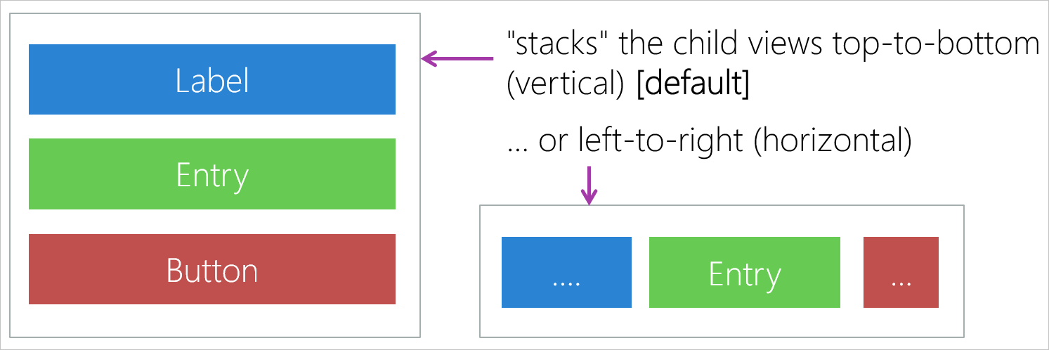
are optimized stack layouts that lay out controls in a top-to-bottom or left-to-right stack. A StackLayout is also available, which has a property named StackOrientation that you can set to Horizontal or Vertical. On a tablet or phone, modifying this property in your application code enables you to adjust the display if the user rotates the device:
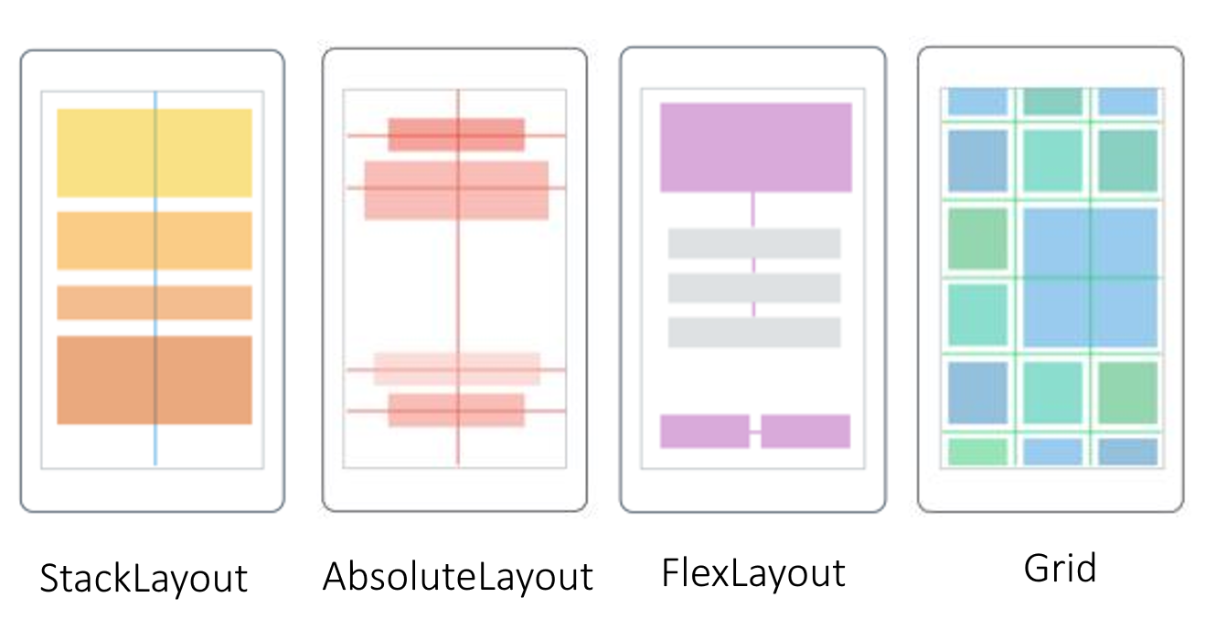
AbsoluteLayout,
which lets you set exact coordinates for controls.
FlexLayout
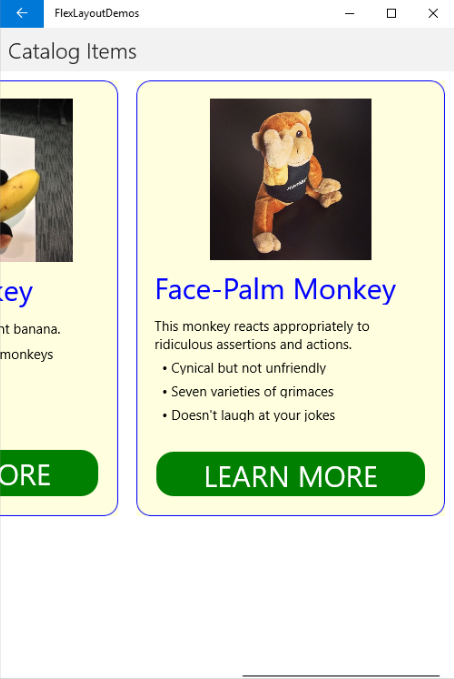
which is similar to StackLayout except that it enables you to wrap the child controls it contains if they don't fit in a single row or column. This layout also provides options for alignment and adapting to different screen sizes. For example, a FlexLayout control can align its child control to the left, right, or center when arranged vertically. When aligned horizontally, you can justify controls to ensure even spacing. You could use a horizontal FlexLayout inside a ScrollView to display a horizontally scrollable series of frames (each frame could itself be a vertically arranged FlexLayout):
grid
, which lays out its controls according to a column and row location we set. You can define the column and row sizes as well as spans, so grid layouts don't necessarily have a "checkerboard look" to them.
controll and view ?
NET MAUI, all controls (or views) have properties that define their appearance and behavior. These properties can be set initially in XAML, which is a markup language used to define the user interface.
In addition to setting properties in XAML, you can also modify these properties in your C# code. This is often done in response to user interactions or other events. For example, in the OnCounterClicked method you posted, the Text property of the CounterBtn control is updated each time the button is clicked.
what does this code do ?
All controls have properties. You can set initial values for these properties using XAML. In many cases, you can modify these properties in the C# code of your application. For example, the code that handles the Clicked event for the Click me button in the default .NET MAUI app looks like this:
C#Copy
int count = 0;
private void OnCounterClicked(object sender, EventArgs e)
{
    count+=5;

    if (count == 1)
        CounterBtn.Text = $"Clicked {count} time";
    else
        CounterBtn.Text = $"Clicked {count} times";

    SemanticScreenReader.Announce(CounterBtn.Text);
}
This code modifies the Text property of the CounterBtn control in the page. You can even create entire pages, views, and layouts in your code; you don't have to use XAML. For example, consider the following XAML definition of a page:
XMLCopy
<ContentPage xmlns="http://schemas.microsoft.com/dotnet/2021/maui"
             xmlns:x="http://schemas.microsoft.com/winfx/2009/xaml"
             x:Class="Phoneword.MainPage">

    <ScrollView>
        <VerticalStackLayout>
            <Label Text="Current count: 0"
                Grid.Row="0"
                FontSize="18"
                FontAttributes="Bold"
                x:Name="CounterLabel"
                HorizontalOptions="Center" />

            <Button Text="Click me"
                Grid.Row="1"
                Clicked="OnCounterClicked"
                HorizontalOptions="Center" />
        </VerticalStackLayout>
    </ScrollView>
</ContentPage>