Chapter 2: Descriptive Statisitcs - Tabular and Graphical Displays
 Call Kai
 Learn
Learn Practice Test
 Spaced Repetition
 Match
Match Flashcards
 Knowt Play
1/20

There's no tags or description
Looks like no tags are added yet.
Name | Mastery | Learn | Test | Matching | Spaced | Call with Kai | Chat |
|---|
No analytics yet
Send a link to your students to track their progress
21 Terms
Frequency Distribution
Tabular summary of data showing the number (frequency) of observations in each of several non-overlapping categories or classes.
Relative Frequency
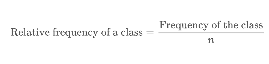
Relative Frequency Distribution
Tabular summary of data showing the fraction or proportion of observations in each of several non-overlapping categories or classes.
Percent Frequency Distribution
Tabular summary of data showing the percentage of observations in each of several non-overlapping classes
Bar Chart
Graphical display for depicting categorical data summarized in a frequency, relative frequency, or precent frequency distribution.

Pie Chart
Graphical Device for presenting data summaries based on subdivision of a circle into sectors that correspond to the relative frequency for each class.

Class Midpoint
The value halfway between the lower and upper class limits.
Dot Plot
Graphical device that summarizes data by the number of dots above each data value on the horizontal axis.

Histogram
Graphical display of a frequency distribution, relative frequency distribution, or percent frequency distribution of quantitative data constructed by placing the class intervals on the horizontal axis and the frequencies, relative frequencies, or percent frequencies on the vertical axis.

Class Width

Cumulative Frequency Distribution
Tabular summary of quantitative data showing the number of data values that are less than or equal to the upper class limit of each class.
Cumulative Relative Frequency Distribution
Tabular summary of quantitative data showing the fraction or proportion of data values that are less than or equal to the upper class limit of each class
Cumulative Percent Frequency Distribution
Tabular summary of quantitative data showing the percentage of data values that are less than or equal to the upper class limit of each class.
Stem-and-Leaf Display
Graphical display used to show simultaneously the rank order and shape of a distribution of data.

Cross-tabulation
Tabular summary of data for two variables. The classes for one variable are represented by the rows; the classes for the other variable are represented by the columns
Simpson’s Paradox
Conclusions drawn from two or more separate cross-tabulations that can be reversed when the data are aggregated into a single cross-tabulation.
Scatter Diagram
Graphical display of the relationship between two quantitative variables. One variable is shown on the horizontal axis and the other variable is shown on the vertical axis.
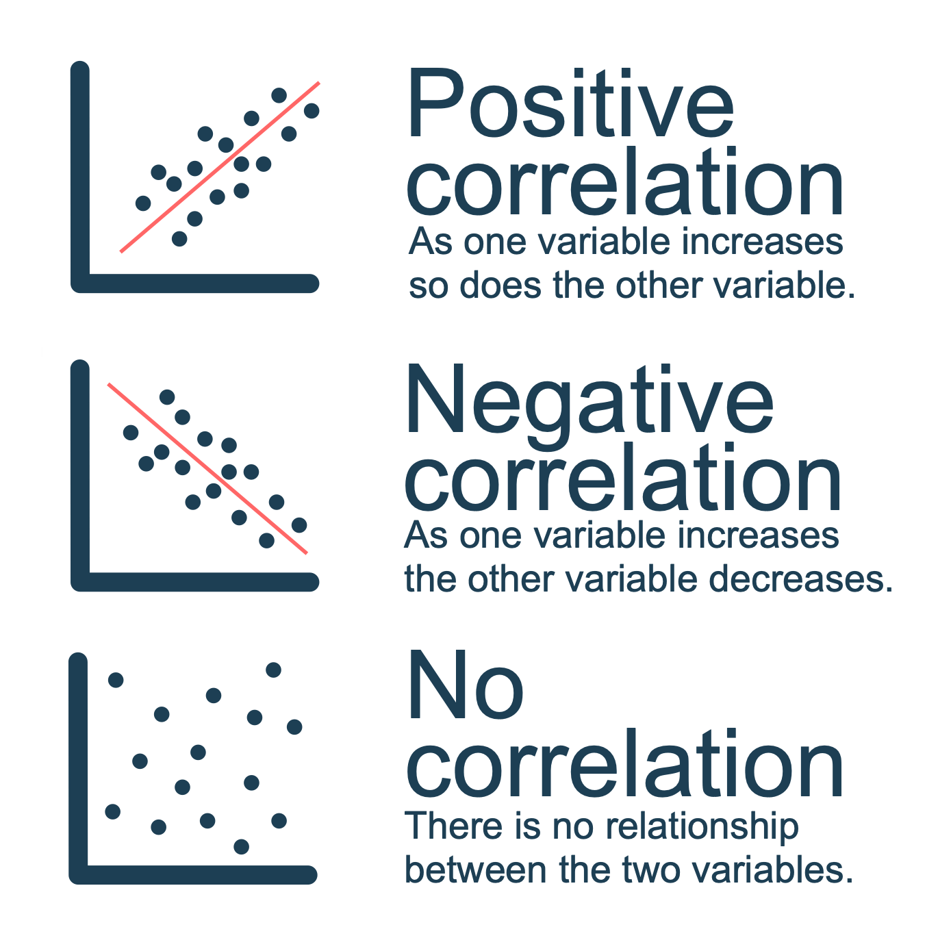
Trendline
A line that provides an approximation of the relationship between two variables/
Side-by-Side Bar Chart
A graphical display for depicting multiple bar charts on the same display.

Stacked Bar Chart
A bar chart in which each bar is broken into rectangular segments of a different color showing the relative frequency of each class in a manner similar to a pie chart.

Data Dashboard
A set of visual displays that organizes and presents information that is used to monitor the performance of a company or organization in a manner that is easy to read, understand, and interpret.