Unit 1 - Intro and Types of Variables
 Call Kai
 Learn
Learn Practice Test
 Spaced Repetition
 Match
Match Flashcards
 Knowt Play
 Podcast
1/67

There's no tags or description
Looks like no tags are added yet.
Name | Mastery | Learn | Test | Matching | Spaced | Call with Kai | Chat |
|---|
No analytics yet
Send a link to your students to track their progress
68 Terms
Categorical Variable
A categorical variable places things into groups or categories. The values are usually names or labels, not numbers that you would add or average.
They can be either nominal or ordinal.
This involves describing distributions with graphs (e.g. bar charts, pie charts).
For example marital status, eye colour, favourite pet, province.
Numerical Variable (Quantitative)
A numerical variable contains numbers that represent a quantity or amount. You can do math with these values. Can be count or obtained by measurement, and it makes sense to perform arithmetic calculations, such as taking the average, on those values.
This includes continuous variables, and discrete variables.
This involves describing distributions through using numbers. The variable will take a certain numerical value, and can be described in measurements (or number of units). This can be shown through histograms and time plots.
Make sure does it make sense to perform arithmetic calculations on the average. Even if you are using number based things (e.g. birth month - categorical variable), it may not be relevant to do so (if the data is recorded in numbers).
If it is not numerical, then for sure you know that it is not quantitative.
Examples include income level, age, height, test score, number of siblings.
Ordinal Data (One Type of Categorical Variable)
Data follows a natural order and the order makes sense. Categories that can be put in order and ranked. Is there a logical ordering that you should put one value in front of the other.
Examples:
Education level: High school, college, university
Satisfaction survey: Very Dissatisfied, Dissatisfied, Neutral, Satisfied, Very Satisfied
T-shirt size: Small, Medium, Large
Birth month: Jan, Feb, Mar, April, etc.
Nominal Data (One Type of Categorical Variable)
Data is recorded as labels. Categories that have no particular order or ranking. There is no category that is "higher" or "better" than another.
Examples:
Eye , Brown, Green
Province: Manitoba, Ontario, Alberta
Type of pet: Dog, Cat, Fish
Gender: Female, Male, Non-Binary
Marital status: Single, Married, Widowed, Divorced
Population
The total amount of individuals or units about which we want information. The population is the entire group that you want information about. The whole group being studied.
Example:
All students at your university.
All residents of Manitoba.
All children involved with a particular program.
Individuals (or Units)
Individuals are the people, animals, objects, or things being studied.
Example: If you are studying students in a classroom:
Each student is an individual.
If you are studying cars in a parking lot:
Each car is an individual
Variables
A variable is a characteristic or piece of information collected about each individual or unit. Variables can vary from individual to individual, and you can get different values.
Example: Suppose the individuals are students.
Variables could include:
Age
Height
Eye color
Grade level
Location
What information are we collecting about each individual?
Sample
A sample is a smaller group taken from a population.
Example:
Population: All 10,000 students at a university.
Sample: 200 students selected from that university to complete a survey.
Researchers often use a sample because it is easier and less expensive than studying everyone in the population.
One Value of a Variable
A value is the specific information recorded for an individual.
For example, if the variable is Age:
Student | Age |
|---|---|
Sarah | 20 |
James | 22 |
Emma | 19 |
Age is the variable.
20 is one value of the variable.
22 is another value.
19 is another value.
Another example:
Variable: Eye Color
Values: Brown, Blue, Green
Descriptive Statistics
Methods used to summarize and describe data so it is easier to understand. Instead of looking at every single piece of data, descriptive statistics give you a quick summary.
Example
Suppose five students received these test scores:
70, 75, 80, 85, 90
Descriptive statistics can tell us:
Mean (average): 80
Minimum score: 70
Maximum score: 90
Range: 20 (90 − 70)
These numbers help describe the data in an easy, and consumable way. Takes less time then sifting through mountains of data.

Questions to Ask (Categorical and Numerical Data)
If you were to have a numerical value, it does not tell you it is quantitative. But if is not numerical, then for sure you know it is not quantitative.
Is there a logical ordering between variables?
Example: Where someone is studying

Distribution
How frequently different values occur.
The way data values are spread out or distributed. The distribution of a v variable tells us what values it takes and how often it takes on these values.
It shows:
What values occur
How often they occur
Whether values are clustered together or spread apart
This can be useful on histograms for using 5 - 10 intervals for datapoints.
Pie Chart
Visual representation of the relative frequency or proportion of the observed values. Proportions are values between 0 and 1. They can convert to percentages when multiple by 100.
A proportion of the whole.
Divide the specific number by the total number.
Proportions (a number between 0 - 1) and can also be called relative frequency.
Bar Graph
A graph that uses bars to show and compare the frequencies (counts) of different categories.
This will include only data that is categorical data.
Histogram
A histogram is a graph that shows how numerical data are grouped together. Asking how many values fall into certain ranges. The goal is to look at the overall distribution of the data (overall pattern).
Displays the distribution of values of a quantitative value. They display the counts of the number of data values that fall into specific “classes” or “intervals.”
For example, if you have students' ages:
18, 19, 19, 20, 20, 21, 22, 22, 23, 24
A histogram helps you see where most of the ages are concentrated.
What are intervals
Intervals (also called classes or bins) are groups of values. Instead of showing every age separately, we group ages into ranges. Every interval needs to be of equal length (e.g. using 10 every time).
To decide on intervals you want to look at the smallest amount of data, and the largest amount of data, and pick break points in between the smallest and largest. You want to end up with 5 - 10 intervals.
For example:
Age Interval | Number of Students |
|---|---|
18-19 | 3 |
20-21 | 3 |
22-23 | 3 |
24-25 | 1 |
Here:
18-19 is an interval.
20-21 is an interval.
22-23 is an interval.
The histogram would have a bar for each interval, and the height of the bar shows how many students are in that range.
Where to Place Exact Intervals (e.g. range is 10, and you have data that ranges from 30 - 40, but a number listed as 40)
If intervals fall range from 10, and you have data that falls into 30 - 40, it actually means that the interval is from 30 - 39.999. This means that 40 would fall into the next range of 40 - 49.99.
Includes the left endpoint, but not the left endpoint.
Continuous Variable (Quantitative Variables)
**Most of the course will focus on this type.
Can take any value within a given range. Can take a percentage out of 100.
Histogram is only used for this type of variable.
This can include weight, height, test scores, distance.
Discrete Variable (Quantitative Variables)
Can only take a countable whole number of values.
Examples include: Number of children in a family, number of days of rain in the month.
Proportions (Relative Frequency)
A relative frequency tells you what fraction of the sample is in each category.
Relative frequencies always add up to 1.00, or 100% if written as percentages.
Age | Relative Frequency |
|---|---|
20-30 | 0.26 |
30-40 | 0.30 |
40-50 | 0.44 |
Add them: 0.26 + 0.30 + 0.44 = 1.000.26 + 0.30 + 0.44 = 1.00
What is the Difference Between Frequency and Relative Frequency?
Frequency is the actual count of how many times something occurs. The number of times a value appears. The total n = the total amount of observations.
Favorite Pet Survey
Pet | Frequency |
|---|---|
Dog | 5 |
Cat | 3 |
Fish | 2 |
Frequency = Relative Frequency x n [0.22 × 200 = 44]
Relative Frequency = 0.22
Sample Size n= 200
Relative frequency is the proportion or percentage of the total. The fraction or percentage of the total. The total amount will always all up to 1 or 100%.
Relative Frequency = Frequency / n
Frequency = 44
Sample Size = 200
44/200 =0.22
Relative Frequency = 0.22 or 22%
Pet | Frequency | Relative Frequency |
|---|---|---|
Dog | 5 | 5/10 = 0.50 = 50% |
Cat | 3 | 3/10 = 0.30 = 30% |
Fish | 2 | 2/10 = 0.20 = 20% |
Type | Adds Up To |
|---|---|
Frequency | Total sample size nn |
Relative Frequency | 1.00 (or 100%) |
To Make a Histogram
Look at the intervals and frequency
Show the data values between the decided interval (e.g. 2 between 30 - 40).
General format of histogram:
Variables: On the x-axis (side).
Count (Frequency): On the y-axis (bottom).
Three Elements that We Look at When Analyzing a Distribution
There are three main things we look at in analyzing a distribution:
Centre: Mean and Median
Shape: Approximately Symmetric, Skewed to the Left, Skewed to the Right
Spread: Measures of spread
Range: Including all of the data
Maximum - minimum =
Effected by outliers
Interquartile Range (IQR): 50% of the (most relevant) data
Q1 - Q3 =
Not impacted by outliers
Position of Percentile
P/100(n)
Effected by outliers
Proportion Formula (Histogram)
What percentage of test scores were less than 60?
Proportion = # of scores that are less than 60 / total # of test scores
Scores less than 60 = 10 test scores
Total test scores = 40 test scores
Divide 10/40 = 0.25 × 100 = 25%
Purpose of a Histogram (and Parts)
The goal is to not look at individual scores, but look at the overall pattern of the data. This includes looking at overall distribution of the data. We are looking at the centre of the distribution (can be looked at in several ways), and any deviation from this pattern.
This includes looking at the:
Shape: This can include approximately symmetric, skewed to the left (highest on the right), skewed to the right (highest on the left)
Any gaps: Intervals that does not have any values (no bar)
Peaks: The highest point of the data
Spread (of the data): From which value to which value does the data include. From the smallest value to the largest value of the dataset (e.g. the spread of data is from 30 - 100 because this includes the total amount of data that there is).
Outliers: Observations that fall away from the overall pattern.
3 Different Distribution Shapes (Histogram)
A histogram can take a different shape depending on the data. This can include:
Approximately Symmetric: This happens when there is an approximate mirror image on either side of the highest peak.
Mean and the median are equal.
Skewed to the Left: When the distribution extends much farther out toward smaller data values. Lower values on the left, and higher values on the right. Peak on the right side (opposite).
Mean is less than the median. Observations on the tail are outliers. Outliers are pulling the mean in the certain direction.
Skewed to the Right: When the distribution extends much farther out toward larger data values. Larger values on the left side, as you go to the right the lower values appear. Peak on the left side (opposite).
Outliers are pulling the mean to the left. The mean ends up being larger than the median.
Timeplots
Gathering data in a sequence over a period of time, then you have a timeplot. This is looking at a trend, or an overall pattern. We look for trends, or any cyclical behaviours.
Trends: Upward or downward between time periods (overall pattern).
Cyclical Behaviours: Same pattern occurring over 12 months time point (every year the pattern is the same).
Seasonal variation is another term used for this (every 12 months seeing the patterns repeating themselves).
Features:
X-axis = time (days, months, years, etc.)
Y-axis = the variable being measured
Points are connected with lines over time
How are Timeplots Different from Histograms?
Histogram: Shows how data are distributed. It answers the question How often do values occur?
X-axis = numerical values or intervals
Y-axis = frequency (count)
Shows the distribution of the data
Timeplots: Shows how something changes over time. It answers the question How does a variable change as time passes?
X-axis = time (days, months, years, etc.)
Y-axis = the variable being measured
Points are connected with lines
Central Tendency (Two Types)
The location of the centre of our data. This includes:
Mean: The average value. Adding up all the data values, and dividing the sum by the data points. x-bar (x with bar on top). This can be considered as a balance point. xˉ("x-bar")
Not resistant to outliers, impacted when data values change.
Median: The middle value. This is the value that has ½ the ordered data values as large or larger than it. And ½ the data the values as small or smaller than it.
Median is resistant to outliers. Not impacted when data values change.
notation = M
Remembering Where the Axis Is
"Y to the Sky"
The Y-axis goes up and down.
"Y" and "Sky" rhyme.
Y-axis = Sky-axis ☁
When you're looking at a graph, the line going up toward the sky is the Y-axis.
Deviations
Deviations are simply the distances between a data value and the average (mean).
Deviation = Data Value - Mean
Deviations all have to add up to 0 by definition. The deviations always add up to 0 because the mean (average) is the balancing point of the data.
The values below the average create negative deviations.
The values above the average create positive deviations.
The mean is located exactly where these positives and negatives balance each other out.
When we say that the seesaw would balance at 6, when we add up all of the deviations we get 0.
Example: Data = 10, 15, 20
Mean:
10 + 15 + 20 / 3 = 15
Now find the deviations:
Value | Deviation |
|---|---|
10 | 10 − 15 = −5 |
15 | 15 − 15 = 0 |
20 | 20 − 15 = +5 |
Add the deviations: -5 + 0 + +5 = 0
Weighted Mean
A weighted mean is an average that accounts for the fact that some values represent more observations than others.
How frequently we are observing a particular value. Treating values differently when groups of people differ.
In some cases when calculating the mean, some data values are given more weight than others.
This can be because some values are observed more frequently, or because some values are is some sense more important than others (e.g. GPA).
The notation is the wi. The weight is given to the i(th) of the value.
Median (& Steps)
The middle value in a set of ordered data. In ordered data the media is the value that splits the data into two equal parts. This is one of the other types of central tendency. M.
Order the date from smallest to largest.
Mark off each side of the number until you get to the middle number.
If you get to the middle and it is on number, this is a whole number.
1,5, 7, 9,10,12,15, 20, 21Median = 10 (exactly)
When finding Q1 and Q3, you would not include the 10, as it is stand alone data.
Q1 would include 1, 5, 7, 9,
Q2 would include 12,15, 20, 21
If you get the the middle number and it is two, then you have to find the median.
1,5, 7,9, 10,12, 15,209 + 10 / 2 = 9.5 (as this will be the found number, although it does not directly appear in our data set).
If you are find the quarter, you include in the calculation 1, 5, 7, 9, for Q1. For Q2 you would include 10, 12, 15, 20
Frequency Quartiles Position
Which interval contains the first quartile (Q1)?
In grouped frequency tables you are dealing with larger datasets, and they will appear in frequencies. This may not make it possible to find an exact median (unless the data only contains 1 value and not a range). Each frequency counts as one observation (or value). So you will instead find the interval that contains that.
Interval | Frequency | Cumulative Frequency |
|---|---|---|
0-9 | 4 | 4 (starts at 1 - 4) |
10-19 | 6 | 10 (4 + 6 = 10) |
20-29 | 8 | 18 (4 + 6 + 8 =324 18) |
30-39 | 2 | 20 (4 + 6 + 8 + 2 = 20) |
Find total observations. n = 14.
Find Q1 position.
n + 1 / 4 = 3.75th position.
Find the cumulative frequencies.
Do this by adding up all the numbers from the previous frequencies.
The interval that contains the Q1 would be 10 - 19, as it contains the interval that holds 5.
3 Types of Spread
Range: Full maximum - minimum = range. Covers the entire interval covering all 100% of data.
Effected by outliers
Interquartile Range (IQR): Measure of spread or variability. It covers the middle 50% of the ordered data, so it is not affected by outliers.
Not effected by outliers
Percentiles:
Affected by outliers
Spread Ideas
Idea 1: Look at the lowest, highest values (range - R).
This is the easiest method.
Idea 2: Highest / lowest may be outliers, so instead describe most of the data, and then also mention any outliers.
Range (Spread)
The range (R) is a measure of spread and is calculated from
maximum - minimum = final answer
This is a measure of variability.
The larger the value of R, the more variable the data are.
R measures the length of the interval containing all (100%) of the data.
Range IS AFFECTED by outliers.
Finding the Median of a Quarters
Find Q3: Find the median = n + 1 / 2.
Look at all of the data values above 50% (half way) |, and find the median of that data.
For example: 3, 7, 9, 12 | 13, 14, 18, 26
12 + 13 = 25 / 2 = 12.5
The median is 12.5 with a range (R) of 26 - 3 = 23.
We can see that there are 4 numbers less than 12. 5, and 4 numbers greater than 12.5. Now what if we want to find the median of each of those groups of numbers?
Interquartile Range (IQR)
Measure of Variability
Measure of spread or variability. It covers the middle 50% of the ordered data, so it is not affected by outliers.
Not affected by outliers because outliers tend to be a value very high or low, which would not impact the IQR.
IQR Formula = Q1 - Q3 (Use the actual quartile values, not the positions)
Q1: 25th percentile. 25% of all data values lie below it, and 75% of data lie above it.
Q3: 75th percentile. 75% of the data values lie below it, and 25% of data values lie about it.
Can just used the median formula to find Q3 and Q1 n + 1 / 2.
Count to the 24th observation and this is the median.
With IQR make sure that you are using the median number and not the position number.
You can use the formulas to get to the position, but make sure you actually count to that specific number in the data (subtract the median number for Q3 – median number for Q1).
Percentile (p th)
The percentile is the value such that the p% of data values lie below it and (100 - p)% of data values lie above it.
Formula = P/100(n)
Example 90th, means that 90% of values lie below it, and 10% of values lie above it (because it should equate to 100% in total).
Example: Asking for the 60th percentile when n = 1,000.
(0.6)(1000) = 600
This method can only be used for the percentile, and NOT for the median.
How Do you Distinguish Between the Percentile, and the Score?
Score = the actual value a person got. For example: A mark.
Percentile = How that score compares to everyone else's scores. Your ranking compared to others.
Example: Suppose 100 students write a statistics test.
You score 80/100.
Score = 80
If your score is higher than 90 of the students, then you are in the 90th percentile.
Your score = 80
Your percentile = 90th percentile
The percentile does not mean you got 90%.
It means you scored better than about 90% of the students.
Five Number Summary
(M | FQ | M | TQ | M)
When describing distributions with numbers we can use the five number summary:
Minimum
First Quartile
Median
Third Quartile
Maximum
These numbers deserve the location (median), and the spread (range and IQR range).
THIS DOES NOT INCLUDE MEAN
Steps to Find the Five Number Summary
Minimum = smallest value
Q1 (First Quartile) = 25% of the data is below this value
Median (Q2) = middle value
Q3 (Third Quartile) = 75% of the data is below this value
Maximum = largest value
This will look different depending on if it an odd, or even number observation.
Five Number Summary Example
Suppose the test scores are:
50, 60, 70, 80, 90, 100, 110
Step 1: Find the Minimum and Maximum
Minimum = 50
Maximum = 110
Step 2: Find the Median | n = 7 observations
n + 1 / 2
7 + 1 / 2 = 4 (count to the fourth number of the dataset to get the median within the data. This would be 80). This tells us that the median is located in the 4th position of the ordered dataset. The value in the 4th position is 80, so the median is 80. The middle value is not always 50. In this dataset, the middle value happens to be 80.
The median is the middle number.
50, 60, 70, 80, 90, 100, 110
The middle value is 80.
Median = 80
Step 3: Find Q1
Look at the lower half of the data (do not include the median).
50, 60, 70
The middle of these values is 60.
Q1 = 60
Step 4: Find Q3
Look at the upper half of the data.
90, 100, 110
The middle value is 100.
Q3 = 100
Boxplot (Quantile Boxplot / Whisker Plot)
A boxplot is a graph that summarizes a dataset using the five-number summary.
Center of the data (median)
Spread of the data (range and IQR)
Shape of the distribution (symmetric, left-skewed, right-skewed)
Outliers
Key Ideas to Remember
A boxplot divides the data into 4 quartiles.
Each quartile contains 25% of the data, regardless of how long or short that section appears on the graph.
A longer section does NOT mean more data.
A longer section means the data in that quartile is more spread out (more variability).
A shorter section means the data in that quartile is more concentrated together.
Quartile Percentages
Minimum → Q1 = 25% of data
Q1 → Median = 25% of data
Median → Q3 = 25% of data
Q3 → Maximum = 25% of data
Outlier Boxplot
Lower Fence and Upper Fence Method
Construct a box using the Q1, median and Q3.
Calculate the whiskers that extend to the upper and lower fence.
Lower Fence (LF): Q1 - (1.5 x IQR)
Upper Fence (UF): Q3 + (1.5 x IQR)
Any value below Q1 - (1.5 X IQR), or above Q3 + (1.5 x IQR) is considered an outlier.
Standard Deviation
SD = Typical distance from the mean
Can check if SD adds up to 0 to ensure that it is correct.
2, 4, 6
1: Find the Mean x(bar): 2 + 4 + 6/ 3 = 4 [Mean = 4]
Mean = 4
2: Find Each Distance from the Mean
2 - 4 = -2
4 - 4 = 0
6 - 4 = 2
3: Square the Distances
(-2)^2 = 4
0^2 = 0
2^2 = 4
4: Find the Average of the Squared Distances
4 + 0 + 4/ n - 1 = 8/2 =2.667 (2.67)
This value is called the variance. If you are trying to find variance you can stop here.
5: Take the Square Root
SD=2.67 (squared) = 1.63
Standard Deviation ≈ 1.63
Sample Variance
This is written as s2, and it is the square of the standard deviation. Standard deviation tells you the typical distance from the mean. Variance tells you that same spread, but in squared units.
Variance measures how spread out the data is from the mean (average).
Small variance = data values are close to the mean.
Large variance = data values are far from the mean.
Steps to Find the Median Position
Find the number of sample observations (n =).
8, 13, 14, 17, 18, 19
n = 6
Compute the observation into the formula. Formula is n + 1 / 2
6 + 1 / 2 = 3.5
This means that the median value will be at the 3.5th position.
That would be in between 8, 13, 14, | 17, 18, 19
Can determine if it matches the median number.
Median:
8, 13,14, 17,18,1914 + 17 / 2 = 15.5
How to Find the Quartile Median (Q1 & Q2)
Determine the n (sample observations).
5, 7, 9, 12, 15, 18, 20
n = 7 observations
Find the median
5, 7, 9,12,15, 18, 2012 value
8 / 2 = 4th position
Find the Q1 before the median (there are three numbers, before the whole number 12).
5,7,9Q1 = 7 median value
n + 1 / 4 (for Q1)
8 / 4 = 2nd position (which is 18)
Find the Q3 after the median value.
Q3 =
15,18,20Value = 18
3(n + 1) / 4 = 6th position (which is 18)
Formula for Solving a Missing x Mean Value
Missing value = (xbar x n) - (sum of known values)
Include the total number of observations. If there are 8 observations and is unknown, include n as all 8 numbers. n = 8
Add up the total sum of the known values.
Subtract the known values from the provided mean x the amount of observations.
A sample of 8 people weighed (kg): 71, 65, 80, 74, 69, 72, 78, ?
The mean weight is 73 kg. Find the missing weight.
n = 8
xbar = 73
x = unknown value
Add 71, 65, 80, 74, 69, 72, and 78 = 509 (sum of known values)
73 × 8 - 509 = 75 (x value = 75)

How to Solve for Mean Questions Where People are Added or Subtracted
There are 6 employees in a small consulting firm with an average salary of $49,905. One employee making $38, 920 was fired and two more making $25,000 and $27,000 were hired. What is the new average salary?
For questions where people are added or removed:
Find the original total: Average x n
Average=$49,905 | n =6 | 49,905 × 6 = 299,430
Subtract any values that leave.
Fired employee made $38, 920 | New Total 299,430 − 38,920 = 260,510 | Now there are 6 − 1 = 5 employees
Add any values that join.
New employees salary added 25,000 + 27,000 = 52,000 | New total salary 260,510 + 52,000 = 312,510 | New # of employees 5 + 2 = 7
Update the sample size.
New # of employees 5 + 2 = 7
Find the new Average
312, 510 / 7 = $44, 644.29
Divide:
New Average = New Total / New n

Weighted Mean Steps
The mean age of 6 males is 23.3 years. The mean age of 4 females in the class is 21.7 years. What is the mean age for the whole class?
Find the total of both of the different groups (Male: 23.3 × 6 =139.8 | Female: 21.7 × 4 = 86.8)
Add the totals together (139.8 + 86.8 = 226.6)
Add the number of people together (6 + 4 = 10)
Find the overall mean with new numbers (226.6 / 10 = 22.66)
Final answer is 22.66 mean age.

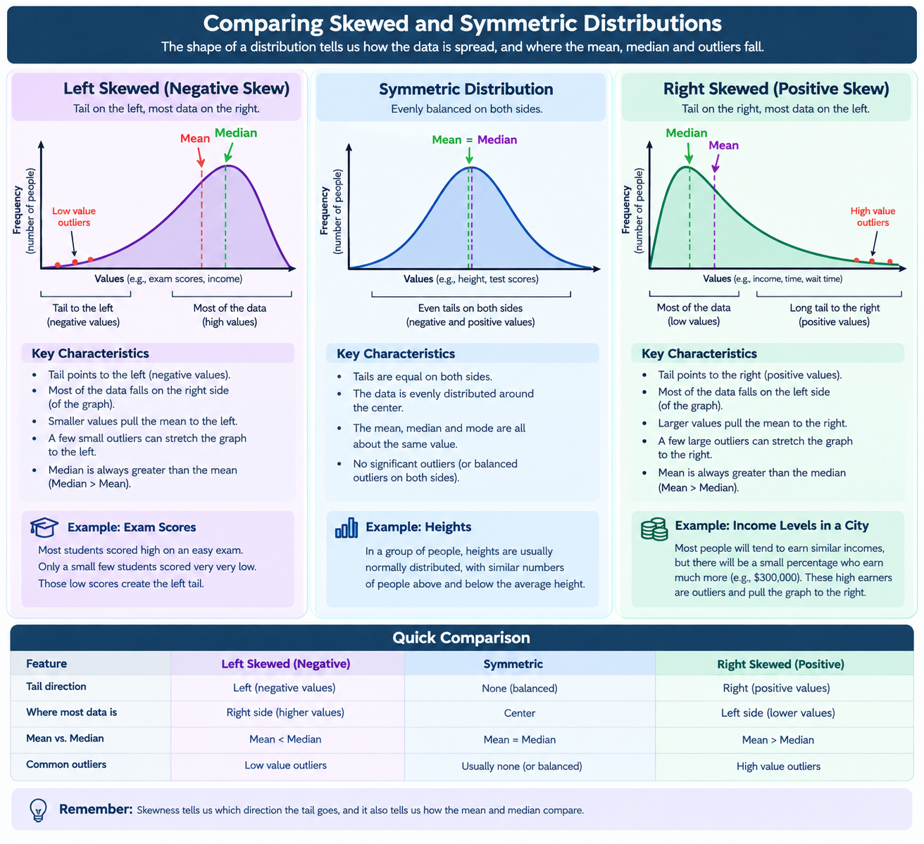
Right Skewed (Positive Skew)
The tail will point to the right, while most of the data will fall on the left side. Larger values pull the mean to the right.
A few large outliers will make the values stretch to the graph on the right.
The mean will always be greater than the median (Mean > Median), because most of the data lies at the beginning of the chart.
Example : Incomes levels in a city. Most people will tend to earn similar incomes, however, there will be an outlier with that certain percentage that makes $300,000. This is the data that pulls the graph to the right (skewed because of this).
The tail stretches to the higher (positive) values, so it is called a positive skew.

Left Skewed (Negative Skewed)
Most of the data will be on the right, and the tail will point to the left (y axis) side.
The median will always be greater than the mean (Median < Mean).
This is because the middle number will fall in the higher data over the overall mean.
The tail stretches to the more negative values, so it is called a negative skew.
Example: Most students scored high on an easy exam. Only a small few students scored very very low. Those low scores create the left tail.
What is the Median and Mean?
Mean = the average
Add all the numbers together.
Divide by the number of values.
Example:2, 4, 6, 8, 10
Mean = 2 + 4 + 6 + 8 + 10/5 = 30/5 = 6 mean
Uses all the values.
Impacted by outliers.
Median = the middle number
Put the numbers in order from smallest → largest.
Find the number in the exact middle.
Does not use all the values.
Not as impacted by outliers.
Symmetric Distribution
Looks approximately balanced, however it will never be a perfect shape because it is rare that the data reflects this.
Left and right appear similar.
Mean = Median.
There are no long tails, and the data is more balanced.
Example: Heights of adults. Most people tend to fall around a similar average. Taller and shorter outliers are few.
Do histograms, time plots, frequency distribution, box plot, show all the same data?
No. They are related, but they do not provide the same amount of information.
Frequency Distribution Table (Counts): A frequency distribution lists values (or classes) and their frequencies. Exact frequencies are shown.
Total number of observations
Numerical detai
Most precise numerical information
Histogram (Shape): A graph made from a frequency distribution. It is easier to see patterns than a table, but exact frequencies maybe harder to read.
Shape of the distribution
Center of the data
Spread of the data
Skewness (left or right skew)
Timeplot (Trends): Displays data in the order it occurred over time. This can reveal how data changes over time. It does not show the shape of distribution shape as well as a histogram.
Trends over time
Seasonal patterns
Increases or decreases
Boxplot: Summarizes a data set using the five-number summary: Minimum, First Quartile (Q1), Median (Q2), Third Quartile (Q3), Maximum
Center (median)
Spread (range and IQR)
Skewness
Outliers
Why can different data sets produce the same boxplot?
A boxplot only shows the five-number summary. It shows a brief description, and not all of the data. Boxplots will not show every individual value.
Minimum
Q1
Median
Q3
Maximum
Data Set A
1, 2, 3, 3, 3, 3, 5, 7, 8, 8, 8
Data Set B
1, 1, 3, 3, 3, 3, 3, 6, 8, 8, 8
Both can produce the same boxplot because they have the same:
Min = 1
Q1 = 3
Median = 3
Q3 = 8
Max = 8
What is the difference between fences and whiskers?
Fences are the upper and lower calculations, whiskers actually touch the data
Fences (Boundary)
Calculated values
Used to identify outliers
Includes Upper Fence: Q3 + 1.5(IQR) and Lower Fence Q1 - 1.5(IQR)
Q1±1.5(IQR)Q1±1.5(IQR)
Whiskers (Actual Data Values)
Actual data values
Extend to the smallest and largest non-outliers
Example:
Fence = 0.208
Data:
0.178, 0.202, 0.210, 0.219...
Since 0.178 and 0.202 are outside the fence, the whisker starts at: 0.210
How do I solve boxplot questions on a test (outliers and whiskers)
If asked for Outliers:
Find IQR
Find fences
Count values outside fences
If asked for Whiskers:
Find fences
Ignore values outside fences
Find the closest actual data values inside the fences
If asked whether a data set matches a boxplot:
Check Min
Check Q1
Check Median
Check Q3
Check Max
Same five-number summary = Same boxplot
How do I solve weighted average questions?
Find the total using Average x Number = Total (find the totals first, the averages second)
Find the known group's total.
Subtract to get the missing group's total.
Divide by the missing group's size.
How do I find a new mean when people/items are added or removed from a group?
1: Find the original total
Total = Mean × Number
Mean = 3.12
Students = 14
3.12(14) = 43.683. Original total GPA points = 43.68
2: Remove any values that leave
One student with GPA 2.41 drops
43.68 − 2.41 = 41.27. New total = 41.27
3: Add any values that join
New students: 3.97 + 4.26 = 8.233
Add to the total: 41.27 + 8.23 = 49.50 (new total)
4: Update the sample size
Started with 14 students
1 left
2 joined
14 + 1 - 2 = 15. New sample size n= 15
5: Calculate the new mean
Mean = Total / Number
49.50/15 =3.3 3.30. New mean = 3.30
How to Read a Boxplot
Ask is this a question about:
Percentages: Q1 = 25%, Median = 50%, Q3 = 75%
Spread: IQR = Q3 - Q1
Outliers: Q1 - 1.5(IQR) | Q3 + 1.5(IQR)
Whiskers: Left Whisker: Q1 - min | Right Whisker: Max - Q3
Think of all the data as 25% regardless of how long the data is in the boxplot. The 4 quartiles = 25%. The entire boxplot than =100% which is the total amount of data there is.
What does a long section actually mean?
It means those observations are more spread out.
Short section
50 51 52 53 54
Those 25 students are packed close together.
Long section
50 60 70 80 90
Those same 25 students are spread across a much larger range.
Still 25 students. Just more spread out.
Suppose these are test scores:
40 50 60 70 80 90 100
and there are 100 students total.
A boxplot might split them like:
Min ---- Q1 ---- Median ---- Q3 ---- Max

25%       25%       25%       25%
The distance between Q3 and Max might look huge, but that section still represents only the last 25 students.
Shortcut for Median Positions
Ask "Where is the 25th, 50th, or 75th percent mark?"
Example: n = 94 observations.
Q1 = 0.25(94) = 23.5 position. Around the 24th observation.
Median = 0.50(94) = 47. Around the 47th observation.
Q3 = 0.75(94) = 70.5. Around the 71st observation.

SD that Shifts for All Numbers
Shifting the SD: Variability around 60, and 56 is the same. So it just shifts everything down the number line. However this question would be different if they were asking for the new mean. You would add 4 to all of the numbers and find the new average (add up all the numbers and divide them by the total numbers).
Culmative Frequency
Timeplot Considerations
Don't assume bigger is better. If the graph is showing time taken (like race times):
Higher time = slower runner
Lower time = faster runner
Pay attention to what the graph is measuring
Ask yourself: "Is a larger value good or bad?"
For race times:
Large value = slower
Small value = faster
For something like test scores:
Large value = better
Small value = worse
Don't just estimate based on where a point appears visually.
The exact point on the graph
Then read the value from the axis
Graphs are not always evenly spaced, so you should read the real value rather than guessing.
Can find the median on the timeplot. For finding a median on a timeplot.
Count how many data points there are.
Find the middle position.
Use the actual values from the graph.