DSCI 320
 Call Kai
 Learn
Learn Practice Test
 Spaced Repetition
 Match
Match Flashcards
 Knowt Play
1/136

Earn XP
Description and Tags
up to week 5 - python & pandas (programming, data wrangling), data viz grammar, intro to altair, data abstraction, channel effectiveness
Name | Mastery | Learn | Test | Matching | Spaced | Call with Kai | Chat |
|---|
No analytics yet
Send a link to your students to track their progress
137 Terms
Why are visualizations so effective for data interpretation?
Vision is the only sense that can take in huge amounts of information at once, process it in parallel, and give you an instant overview, which is why it’s the best channel for data visualization.
extra:
vision supports parallel pre-attentive processing (can process many things at once before you even consciously think about them; can instantly notice color differences, patterns, detect movement, etc in parallel)
vision allows simultaneous subjective experience (lets you perceive multiple elements at the same time; sound by contrast is sequential)
vision provides high capacity background processing (brain is constantly analyzing visual input in the background)
other senses have much lower bandwidth, are sequential or lack record/replay capability
describe the limitations of sound, touch, taste and smell for data interpretation
sound: low bandwidth, sequential
touch: limited detail, no replay
taste/smell: no record/replay devices, extremely low bandwidt
what is the problem with raw data? what needs to be done to it?
Raw data is a problem because it is invisible and meaningless on its own — it has no physical form and no context. To make it understandable, it must be represented visually so patterns, relationships, and meaning become visible
why visualize data?
provides context (raw numbers do not mean anything)
aids in pattern recognition (to translate significant insights)
memory and communication (visual info sticks longer and can be shared easier)
scale (to condense information as modern datasets are too big for spreadsheets so visualization handles millions of points at once)
Why not just use summary statistics (eg. tables)
When you only look at summary statistics — like the mean, variance, or correlation — you’re seeing just a tiny numerical summary of the dataset. But many different datasets can produce the same summary numbers, even if their shapes, patterns, or anomalies are completely different.
So the numbers look identical, but the underlying data distribution (the actual shape of the data) can be wildly different.
eg. A mean of 7.5 tells you nothing about whether the data is:
tightly clustered
spread out
skewed
bimodal
containing extreme outliers
In what scenarios do computers perform better than humans and vice versa
Computers are best at fast, precise, large‑scale mechanical tasks, while humans are best at contextual, creative, ethical, and insight‑driven thinking.
why should we have a human in the loop especially in terms of presenting data?
computers do not perform as well when there is ambiguity and visualizations should support human thinking and not fully be responsible for decision making
(Computers are powerful but rigid; humans are flexible but interpretive — visualization keeps humans in the loop so ambiguous, exploratory, and context‑dependent problems can be solved effectively.)
what are the key reasons for using computerized external representations in data visualization?
Computerized external representations make data tasks easier by replacing cognition with perception, enabling interaction with data, allowing integration with algorithms, supporting efficient reuse of charts and methods, ensuring precise data‑driven rendering, and enhancing storytelling over time.
describe the concept of task vs design and theory
The Task is the WHAT
what are you actually trying to find out? - the goal driving the whole exercise
The Design and Theory is the HOW
how you build the chart is informed by evidence about how people actually see and understand visuals
what are marks?
basic shapes used to represent data (what we see, the basic geometric objects)
eg. points, lines, interlocking areas
what are channels?
the visual properties of those marks that encode information
eg. position, length, color, size and shape
what are channel properties?
type and amount of information that can be conveyed to human perceptual system
what are encodings?
An encoding is the assignment of a data variable to a visual channel.
what are interlocking areas vs normal areas
both are marks a mark
interlocking areas are regions that overlap or share boundaries showing that multiple categories, groups or concepts intersect or have something in common
normal areas shows one category and does not say anything about the combination of two categories

marks: points (representing countries)
channels: x-position, y-position, size
encodings: x-position = children_per_woman, y-position = life_expectancy, size = population
(code) create a chart object with data called “pickles” and specify the mark type to be point and use the channels x, y and colour in Altair
alt.Chart(pickles).mark_point().encode(
x = ‘column1’,
y = ‘column2’,
color = ‘column3’ )
in what scenarios do visualizations play a key role?
data processing; turning raw collected data to clean data (helps spot errors, missing values, outliers)
exploratory data analysis (reveals patterns, trends and relationships in the dataset)
ML Algorithms and Statistical Models (guides model improvement by showing performance and error behavior)
reporting/communication (tells a clear story that makes finding understandable to others
what are semantics?
Semantics are the real‑world meanings, units, and context behind data values that make the numbers understandable. they include the following:
real-world meaning of each variable
units
categories and labels
relationships
context
how will we refer to columns and rows in this cours?
attribute = column
item = row
what is a cell and key?
cell: the value for one item-attribute pair
key: what makes a row unique
data types vs dataset types
data types: they describe the nature of a single column (nominal, ordinal, quanitative, temporal)
determines which channels are appropriate
dataset types: the structure or shape of the entire dataset (describes how the data is organized)
eg. tables, networks and trees, geometry, fields
determines which visualization forms are appropriate (scatterplot, tree map, network graph, etc)
describe the data attribute types that are used in data visualization and good channels to use
nominal: pure categories with no order or ranking
eg. country, gender, species, product type
if values are names or labels with no inherent order
channels: color hue, shape, position (categorical axis)
ordinal: ordered categories, order matters but differences are not numeric
eg. small, medium, large
if values have meaningful order but do not have numeric spacing they are ordinal
channels: colour saturation, size, position
quantitative: numeric values where math makes sense (add, subtract, average) - can be continuous or discrete
eg. population, income, temperature, life expectancy
if values are numbers with real numeric meaning they are quantitative
channels: position (best), length, size, color luminance
temporal: time-based data, has natural order and often continuous
eg. year, date, month, timestamp
if values represent time they are temporal
channels: position (x-axis), line marks, animation
what are attributes encoded to?
channels
and channels are encoded to marks
can a visualization have more than one mark?
A chart may include more than one mark when you need to show different kinds of information at the same time.
Examples:
Points + Lines
(scatterplot with a trend line)Bars + Points
(bar chart with individual data points overlaid)Areas + Lines
(area chart with a line showing the boundary)Interlocking areas + Points
(Venn diagram with data points inside regions)
data
symbols representing properties of objects and events
what does every attribute have?
every attribute has a type: nominal, ordinal, quantitative, temporal
visualization
a combination of marks, where data values are encoded using the marks’ visual channels to make patterns and relationships perceptible
cardinality
the number of distinct values an attribute takes; impotant becasue it affects which visual channels
data model
a formal, mathematical description: what the values are and which operational are defined on them - mathematical descriptions
discriminability
how many useable steps; how easily can differences between attribute levels be percieved - channel must be sufficient for number of distinct values for the given attribute
0D
point - no constraint on size (size and shape are both free; you can encode extra attributes on them)
1D
line - one constraint on size; length is spoken for - you can still size code the other way on width
2D
interlocking area - two constraints on size; length an width are both spoken for by the geometry. You cannot size-code or shape-code at all
two principles for choosing a channel
expressiveness and effectiveness
expressiveness and when it is an issue?
match the channel type to data characteristics: the visual
encoding should express all of, and only, the information in the dataset attributes.
an issue when ordered attributes are visualized using identity channels or when categorical attributes are visualized using magnitude channels

effectiveness
for a given task, some channels are better (i.e., more
accurately perceived) than others, so it is important to
select the most effective (available) channel for the
important attributes available.
describe the channel of position when position is sorted
postion carries identity and rank; two attributes for one channel
what is the order to determine effectiveness

spatial position ranks at the top for both principles, whic is why so many good charts look boring
postion, length, size, color, volume/shape
what does ranking tell and not tell you
ranking tells you which channel is read most accurately
ranking does not tell you which attributes deserves the most accurate channel
when is cardinality and discriminability an issue
channel property problem; too many levels for the channel or too little accuracy
when is effectiveness for accuracy an issue?
encoding weakness; a valid choice but a low-ranked one for the job
what is the problem of task fitness?
the encoding does not serve what the reader came to do
does this refer to data cleaning, EDA, ML or communication: bar charts or heatmaps to show where data is absent
data cleaning
does this refer to data cleaning, EDA, ML or communication: counts and plots to reveal irregular repetitions
data cleaning
does this refer to data cleaning, EDA, ML or communication: histograms and density plots to show the patterns/trends of one variables
EDA
does this refer to data cleaning, EDA, ML or communication: scatterplots, boxplots to show relationships between two variables
EDA
does this refer to data cleaning, EDA, ML or communication: pair plots, heatmaps, dimensionality reduction to show relationships between 2+ variables
EDA
does this refer to data cleaning, EDA, ML or communication: line charts to show trends over time
EDA
does this refer to data cleaning, EDA, ML or communication: learning curves to compare training vs validation error
ML
does this refer to data cleaning, EDA, ML or communication: heatmaps/line plots across parameter ranges to show hyperparameter effects
ML
does this refer to data cleaning, EDA, ML or communication: bar charts or SHAP plots to show feature importance
ML
does this refer to data cleaning, EDA, ML or communication: residual plots to check model assumptions and errors
ML
does this refer to data cleaning, EDA, ML or communication: dashboards, charts and infographics, annotated visuals, tailored visuals
communication
what is the purpose of using visualization in Data Cleaning, EDA, ML and Communication
Data Cleaning: help see problems that are not obvious from raw tables
EDA: generates hypotheses and insights that guide modelling
ML: makes the tuning process more interpretable (guides model improvement)
communication: persuasion and explanation (less exploration)
what is the difference between data abstraction and task abstraction?
data abstraction: what data is shown
task abstraction: why is the user analyzing/viewing it?
what are the three steps for data abstraction
identify attributes
identify cardinality (how many items, number of levels for nominal/ordinal, range for quantitative, range and step for temporal)
consider whether to transform data (based on what the task is)
data model vs conceptual model
A data model defines the technical format and mathematical structure of values (such as floats, strings, or integers), whereas a conceptual model defines the human-assigned meaning and real-world context behind those values (such as treating a float as a temperature or a spatial coordinate).
what is the difference between interval and ratio?
An interval scale has an arbitrary, human-assigned zero point (like Celsius temperature or calendar years), meaning subtraction works but ratios do not. In contrast, a ratio scale has a true, absolute zero representing the complete absence of a quantity (like weight or count), which supports all arithmetic operations including division.
are dates interval or ratio data?
interval data
A date is considered interval data because you can subtract one date from another to get a meaningful duration (e.g., subtracting January 1, 2020, from January 1, 2021, results in a duration of 366 days), but you cannot add two dates together.
Explain why bar length needs a meaningful zero and position does not
✅ Bar length encodes value as distance from zero.
The length of a bar is measured from the baseline (zero) to the data value. If zero is arbitrary, the bar's length creates misleading ratio comparisons. For example, temperatures in °C and °F produce different bar-length relationships even though the underlying data are identical.
✅ Position encodes differences, not distance from zero.
Position compares where values lie along a scale. Interval data (like temperature and dates) supports meaningful differences even when zero is arbitrary.
what are appropriate ways to visualize interval and ratio data?
Ratio data: Can be effectively visualized using bar length (such as standard bar charts) because bar length encodes values as a distance measured from a meaningful zero baseline.
Interval data: Should be visualized using position along a scale rather than bar length, since interval data has an arbitrary zero point where bar lengths would create misleading ratio comparisons.

A and D (as they are the only interval data)
cardinality, how to label it based on the data type and its importance
the number of distinct values an attribute takes
important because it affects which visual channels are appropriate (color, shape, position, etc) - every visual channel has a limited number of steps a person can actually tell apart. If an attribute has more levels than the channel has steps, the encodings fails (values become unreadable)
nominal/ordinal: the number of distinct categories
quantitative: the range (min to max) plus whether it is discrete or continuous
temporal: the range and the step, which together give you a count (eg. [1800, 2018], step 1 year (219 values))
what is an example of channels with limited steps and unlimited steps (can match with an attribute with any cardinality
limited: line width, color saturation, color hue, shape
unlimited: vertical position, horizontal position
out of the following channels describe the approximate steps it can accommodate: line width, shape, color saturation, position

describe how the physical dimensions of marks affects encoding of extra data attributes - mention the three categories of marks in this regard
Points (0D): Have zero geometric size constraints, meaning both size and shape are completely free for you to use to encode additional data values.
Lines (1D): Have one constraint because length is already dedicated to the geometry, though you can still use width to size-code another attribute.
(one spatial/structural property is reserved to give the mark its identity or category)
Interlocking Area (2D): Have two constraints because both length and width are used up by the shape's area, leaving no room to encode additional attributes via size or shape.
(two spatial bounds are locked)
*quick check: can you size-code another attribute here or is size already in use?
list the point (0D) marks in altair
mark_point, mark_circle, mark_square, mark_text
list the line (1D) marks in altair
mark_line, mark_bar, mark_rule, mark_area, mark_arc
list the interlocking area (2D) marks in altair
mark_rect, mark_geoshape
what are is the mark being used here and how do we know? what evidence?

mark: point
because the size channel (2D area) is encoded to hectares burned and the horizontal position is encoded to year; the point itself (square) represents a specific year where data exists
list the magnitude (10) and identity channels (4)


which mapping violates expressiveness
D: size
because size is a magnitude channel while region is a categorical attribute that should be represented by a identity channel
in terms of magnitude and identity channels which type of channel ranksat the top in terms of effectiveness?
spatial position (position, common scale and spatial region)

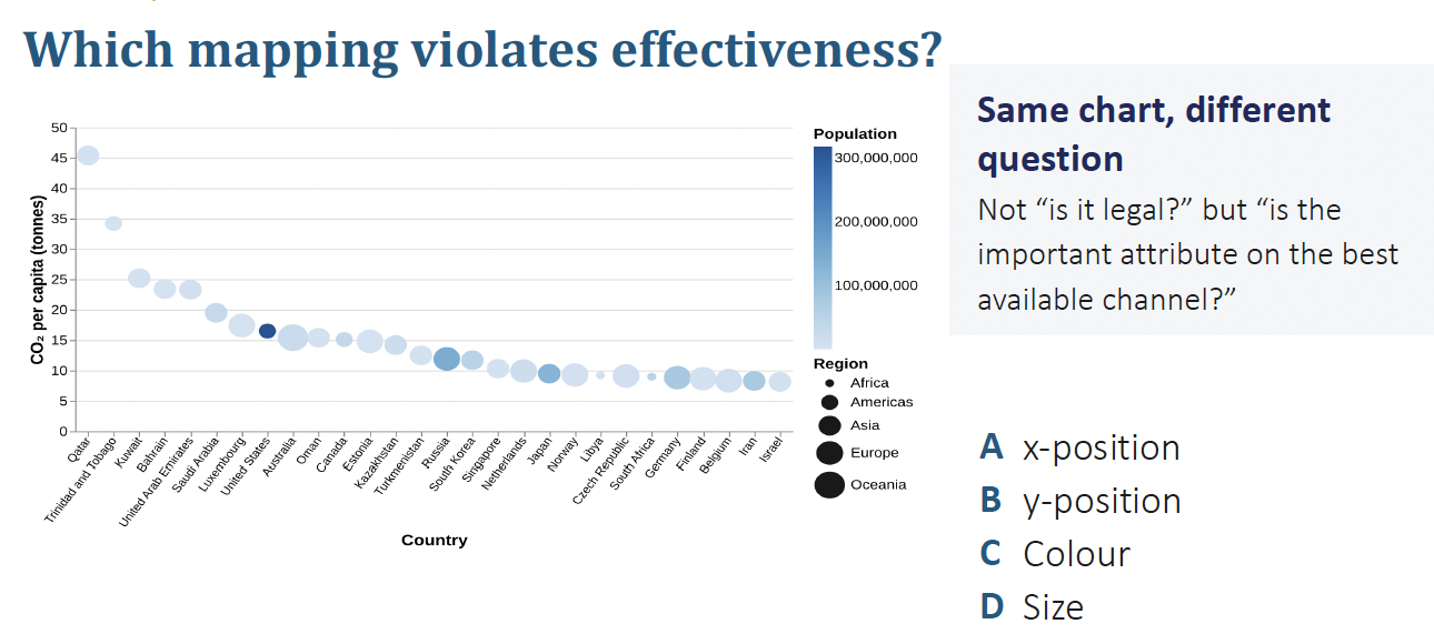
which mapping violates effectiveness?
C: color saturation (to map population) a more effective channel would be 2D area
based on this chart which principle was violated and what would have been a better channel to encode to?
expressiveness was violated
The chart uses Area (2D squares) to encode quantitative data (burned area size). Humans are notoriously poor at accurately perceiving and comparing 2D area sizes compared to 1D lengths.
OBSERVATIONS:
mark: point (data from a particular year)
channel:
2D size; magnitude (hectars burned, ordered)
position, common scale; magnitude (years, ordered)
IMPROVEMENTS:
instead of 2D size should have used length or position
what is the weakness of this visualization but why is it the only option?

When primary channels (like position) are fully consumed by core variables, time-dependent or sequential properties (path order) can fail to be communicated visually, forcing reliance on explicit text labels to decode the data sequence.
what does channel ranking tell us and what does it not (have to be left to our discretion
tells us which channel us read the most accurately (based on data) - does not change based on data or the reader
does not tells us which attribute deserves the highest ranked (most readable) channel - depends on what your reader is trying to do (task abstraction; what message you want to convey)
encode the most important attribute (to the reader) with the highestranked channel
what are the 4 ways to reject a design
expressiveness (channel type (magnitude or identity) does not match attribute type (ordered or categorical)
effectiveness (it is a legal choice but an attibute is encoded to a low-ranked attribute)
discriminability: too many levels for the channel, or can not distinguish values (eg. what is bigger)
task fitness: the encoding does not serve what the reader came to do (how well a specific visual representation, encoding, or interactive mechanism supports the user in successfully performing a given analytical task.)

which principle does this color choice violate?
expressiveness
because income group is ordered but color is an identity attribute
what are physical examples of points (0D)
point, square, circle etc.
what are physical examples of lines (1D)
bar, pie arc, line segment, tick
what is a physical example of interlocking areas (2D)
geoshape polygons
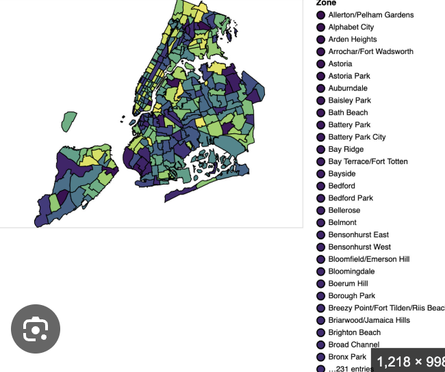
is a pie chart 1D or 2D? explain.
1D
while the angle/radius is locked the angular span (arc length)
what are factors that affect the accuracy (of interpretation) of channels
alignment, distractors (eg. colors), distance, common scale

top left: length
top right: length
bottom: position unaligned scale
when to use a regular bar chart, what is good for and what channel does it rely on
single variable across categories
good for: comparing magnitudes between categories
judgement/channel: position along aligned scale
when to use a grouped bar chart, what is good for and what channel does it rely on
multiple variables shown side by side for each category
good for: comparing within and between groups
judgement/channel: position along unaligned scale
when to use a stacked bar chart, what is good for and what channel does it rely on
segments stacked to show total and contribution of parts
good for: seeing overall total and approximate part contributions
judgement/channel: length but harder for internal segments (unequal judgement)
when to use a normalized stacked bar chart, what is it good for and what channel does it rely on
segments scaled to a common total of 100%
good for: comparing proportions across categories
judgement: position/length, but only relative proportions are visible and not totals
what is the 4 step critique to check after a visualization design?
inferred attribute and type
discriminability
expressiveness
effectiveness
what is the specific difference between accuracy and discriminability
accuracy: how precise can a quantitative value be read? (position > length > area > saturation)
discriminability: how many categories can a reader tell apart (what is the cardinality of the data attribute and how does it relate to the number of discriminable steps for the channel)
what are the two modes of analysis? describe them
confirmatory
evaluate specific hypothesis/claims using data
you have a hypothesis before you look
the data tests it
the question is fixed in advance
exploratory
discover patterns, relationships, and possible explanations in data
you have a dataset and a rough interest
looking changes what you ask
the question is an output not only an input
what are the main things to look into for EDA
structure
rows, columns, what type
quality
what is missing, duplicated, impossible
distribution
where does each variable sit, how spread out is it and what shape is it?
EDA workflow in pandas
df.shape
df.dtypes (what pandas thinks each column is)
df.isna().sum() # missing per column
df.isna().mean().sort_values() # proportion missing, ascending order
df[‘col’].describe() # look into specific columns
what are the three main things to do when for EDA of datasets

explain the nested model of a task

idiom
visual encoding based on task and data abstraction
data abstraction consists of:
determining attribute type, cardinality, and items/attributes
explain: task = action on target

what are the two halves of the effectiveness principle
The ranking of channels (comes from perception experiments and does not change because of your data)
The most important attributes are the ones the task’s target names
(encode the most important attribute with the highest-ranked channel)