OMIS 473
 Call Kai
 Learn
Learn Practice Test
 Spaced Repetition
 Match
Match Flashcards
 Knowt Play
1/78

There's no tags or description
Looks like no tags are added yet.
Name | Mastery | Learn | Test | Matching | Spaced | Call with Kai | Chat |
|---|
No analytics yet
Send a link to your students to track their progress
79 Terms
delete
delete
Tableau data types
text/ string/ character values
numeric/ integer values
Date values
Date and time values
Boolean (true/ false) values
Geographic values that are to be used with Maps
4 properties of every field
Data type - how values are stored, string, number, date, boolean or geographic
Role - how the field behaves - dimension or measure
Display - how it appears in the view - discrete or continuous
Aggregation - how multiple measure values are summarized, SUM, AVG, COUNT, and more
Difference between dimensions vs measures
Dimensions group or segment (ex: category, region, customer, order date)
Measures are aggregated. Examples, sales, profit, quantity, discount
Dimensions change the level of detail by creating groups of marks
Decision rule: do i want to group by this field or calculate with it
Dimensions features
Usually categorical labels, dates, or identifiers
They organize data into groups and change the level of detail
Ex: product, customer, region, order date
Measures features
Numeric values that tableau aggregates
Common aggregations: SUM, AVG, MIN, MAX, COUNT, COUNTD
Ex: sales, profit, quantity, discount
Discrete vs. continuous
Discrete (blue): separate values that create headers
Continuous (green): a range that creates an axis
Field role and display mode are independent decisions
delete
delete
Different variable types
Nominal - categories have no natural order
Ordinal - categories follow a meaningful order
Discrete -counted values, typically separate whole numbers
Continuous - measured values, any value within a range is possible
Different bar charts (use to compare categories)
Frequency bar chart
1 categorical variable
Shows frequency (count) of each category
Aggregated bar chart
1 categorical + 1 numerical
Shows aggregated value (sum, mean, median) of numerical variable
Clustered bar chart
2 categorical + 1 numerical
2 categorical + 2 numerical
Compare values across groups of categories
Stacked bar chart
2 categorical variables + 1 numerical variable
Shows the composition of categories within each bar
Horizontal bar charts
Useful when category names are long/ there are many categories or bars
1 dimension + 1 measure.
Clustered bar charts
Aka Side by side bar chart, or group bar chart
Displays multiple bar charts side by side within each category
How do subgroups compare within each main category?
REQUIRED: 2 categorical + 1 numerical
Stacked bar chart
When you want to show both the overall total and its composition
Each complete bar represents the total for one category
Each colored section shows how a subgroup contributes to that total
Shows part to whole relationship
REQUIRED: 2 categorical + 1 numerical (not good for exact subgroup comparison)
When to use a stacked vs. clustered bar chart
Use clustered when the main goal is to compare the exact values of individual subgroups across categories
When to use 100% stacked bar chart
when relative percentages are more important than total values
100% stacked bar chart -
displays every bar with the same total height of 100%
Each color represents the percentage contributed by one subgroup
Emphasizes relative composition
Good when main goal is to compare how subgroup proportions differ across categories
REQUIRED: 2 categorical + 1 numerical converted to %
Does not show absolute totals
Calculated field
creates a new measure from existing variables
text table

Highlight table

Horizontal Bar chart frequency
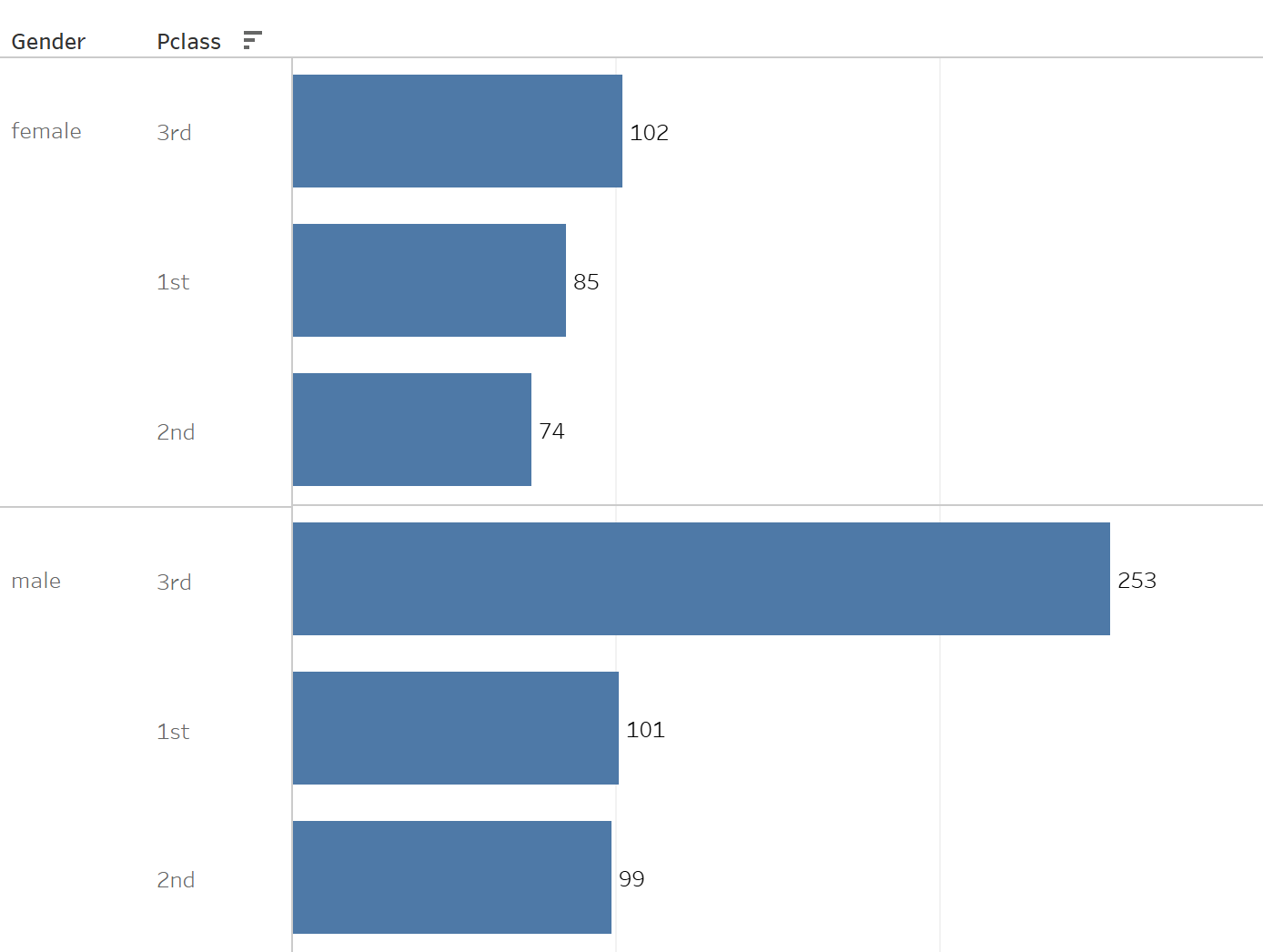
Horizontal Bar chart aggregation

clustered bar

stacked bar

100% stacked bar

delete
delete
3 levels of memory
Iconic memory
Starts from the sensory input
Pre-attentive attributes
Unattended information is lost
Short term memory
Maintenance rehearsal
Starts with attention and ends with encoding
Unrehearsed information is lost
Long term memory
Only develops after encoding
Pie chart needs
one categorical dimension and one quantitative measure
Law of enclosure
individuals perceive objects that are physically enclosed together as belonging to the same group
Law of proximity
Objects that are close to one another are perceived as a group
Law of Similarity
Elements within an assortment of objects are perceptually grouped together if they are similar to each other.
Law of continuity
when looking at objects, our eyes seek the smoothest path and naturally create continuity in what we see. Even if it might not actually exist
Law of connection
people perceive objects that are physically connected as part of a group
Scatter plot
shows relationship between 2 numerical variables
Each observation must contain a pair of numerical variables, an x value and y value. Each pair is represented by 1 point
Can suggest a correlation between two variables
X (independent) explanatory variable
Y (dependent) response variable
Correlation does not establish causation
Law of Closure (Law of Past Experience)
People mentally complete incomplete shapes and perceive them as whole object.
Decluttering data
Remove chart border
Remove gridline
Remove data markers
Clean up axis labels
Label data directly
Leverage consistent color
Line charts
commonly used to plot continuous data
Quantitative data on y axis and time on x axis
Great for show trends over time
Data must be plotted in consistent intervals
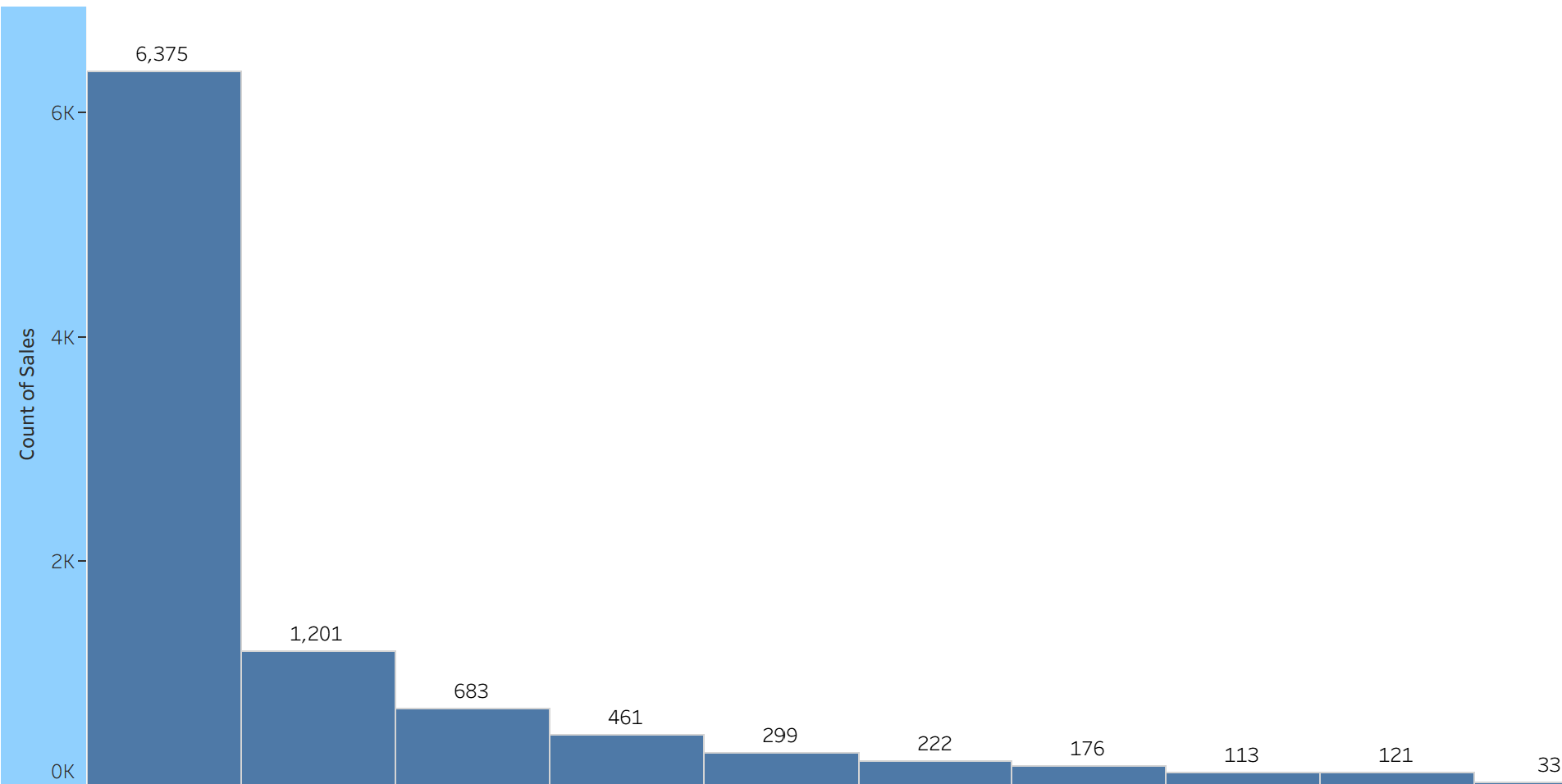
Histogram
distribution of one quantitative variable
Bins group observations into numerical intervals
Xaxis shows intervals in numeric order
Y axis shows frequency percentage or density
1 Quantitative measure; multiple observations
Reads center, spread, shape, skew, frequency, bins
Box and whisker plot
Useful for detecting potential outliers and seeing spread and skewness of a data set
REQUIRED: 1 measure + optional grouping dimension
Median, Q1, Q3, IQR, whiskers, outliers
IQR
Q3 - Q1
Lower fence
Q1 - 1.5 x IQR
Upper fence
Q3 + 1.5 x IQR
Whisker end points
most extreme observations inside the fences (within the box plot)
Strip plot
each dot represents an individual observation and clusters of a quantitative variable
Separate strips compare distributions across categories
Look for clusters, spread, gaps, and unusual values.
REQUIRED: 1 measure + 1 observation ID; optional dimension
How to know which distribution chart to choose
Histogram - look at shape of distribution
Boxplot - compare medians and spreads
Strip plot - look at individual observations
How fields change a scatter plot
two measures define position, a dimension determines the number and meaning of the marks
Bubble scatter plot
keeps two position measures and adds a third measure through bubble area
x measure + y measure + size measure
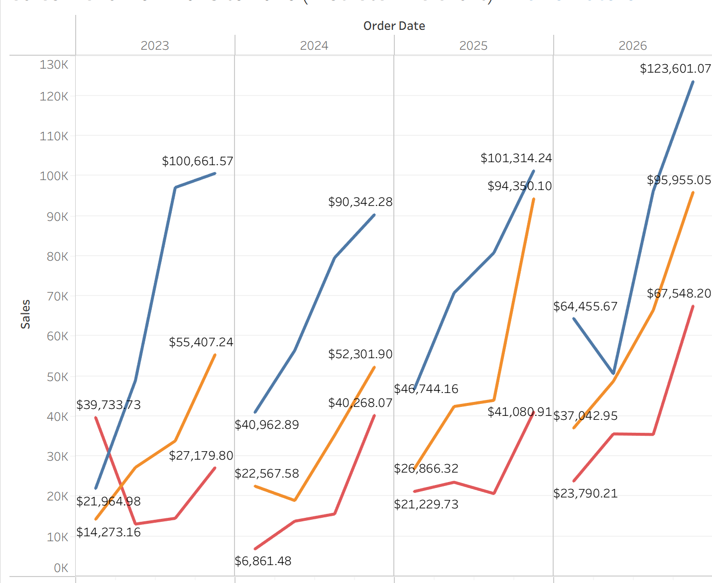
Slopegraph
pack in a lot of information, only showing two time periods or points of comparison
Q: which groups increased or decreased between two points
group dimension + measure at two time points
Area charts
used to compare the overall trend + contribution of multiple data sets
Plot continuous data over time with the area below the line filled in with color or shading to visually represent the magnitude of the data.
Continuous data on the Y axis and the units of time on the X axis
Great for showing the proportion of each data set relative to the whole
Time + measure + subgroup + dimension
Works for part to whole overtime
Box and Whisker plot components

Main limitations of the charts
Histogram - bin choices affect visible pattern
Boxplot - clusters and exact values can be hidden
Strip plot - dots can overlap
side by side circle chart
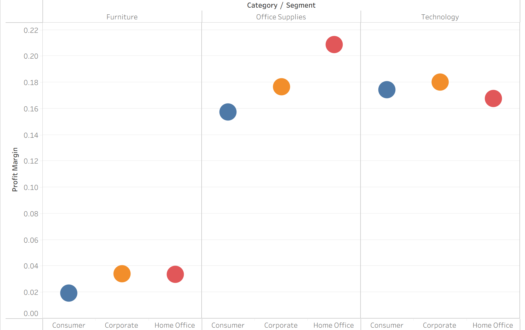
discrete line chart
slopegraph

area chart

Who/what/where/when prompt
usually a dimension or category
how much/ how many/ how long prompt
usually a quantitative measure
why/ how prompt
needs comparison, trend, relationship, or distribution
data source
Connect Tableau to Excel or another structured data file
data source page; check field types
Rows / Columns
Place fields to define the chart structure
Dimension → header; measure → axis
Marks card
Controls mark type, color, size, label, detail, tooltip
change bar, pie, circle, line, area; add labels
Text table
Look up exact values by row/column.
REQUIRED: Dimensions + measure(s).
Highlight table
Scan for high/low values quickly
REQUIRED: Dimensions + measure encoded by color saturation.
Bar chart
Compare values across categories
REQUIRED: 1 categorical dimension + 1 measure.
zero baseline needed
Basic bar
Which category has the highest value?
REQUIRED: 1 categorical + 1 numerical
Not for trends over time unless time is
categorical.
calculated field bar
How does a derived metric compare?
calculated measure + dimension
Formula must match business meaning.
one meaningful whole (in pie chart) =
1 categorical dimension + 1 quantitative measure
Use a pie chart when
goal is overall composition not exact ranking
categories are mutually exclusive and collectively exhaustive
few slices tell a simple story
labels show percentages or absolute values clearly
use bar chart when
there are many categories or small differences
need precise comparison or ranking
values include negatives or do not form a whole
legend is long or hard to read
Filtered scatter
focus on relevant records or threshold cases
2 measures + filter condition
reference lines or labels for threshold
Discrete line view
how do patterns compare across years/ quarters
time parts as discrete headers + measure
use when comparing period patterns
Distribution charts short summary
Histogram - (group values) changing bin width changes visual pattern
Box plot - (summarize) hide individual values and exact sample size
strip plot - (reveal individual records) use small/ transparent dots when many overlap
Composition charts
pie, stacked bar, 100% stacked bar, area
REQUIRED: Dimension + 1 measure
relationship charts
scatter/ bubble
REQUIRED: 2+ measures/ optional dimension
trend over time charts
line, slopegraph, area
REQUIRED: time + measure; optional dimension
distribution charts
histogram, box plot, strip plot
1 measure + many observations
nominal/ unordered variables
need distinct hues
ex: product category, region, class, purpose
ordered/ quantitative variables
need sequential light to dark ordering
ex: low to high sales, count, rate
deviation around a meaningful midpoint
means diverging a palette centered at 0 or target
ex: profit/ loss, above/ below benchmark
Strip plot visual
