Data Vis Exam 1
 Call Kai
 Learn
Learn Practice Test
 Spaced Repetition
 Match
Match Flashcards
 Knowt Play
1/155

There's no tags or description
Looks like no tags are added yet.
Name | Mastery | Learn | Test | Matching | Spaced | Call with Kai | Chat |
|---|
No analytics yet
Send a link to your students to track their progress
156 Terms
Data visualization
computer based visualization systems provide visual representations of datasets designed to help people carry out tasks more effectively.
The use of computer supported, interactive visual representations of data to amplify cognition.
the graphical representation of information and data
The Three Types of Visualization
Information Vis (Data Vis)
Scientific Vis (SciVis)
Visual Analytics
Info (Data) Vis
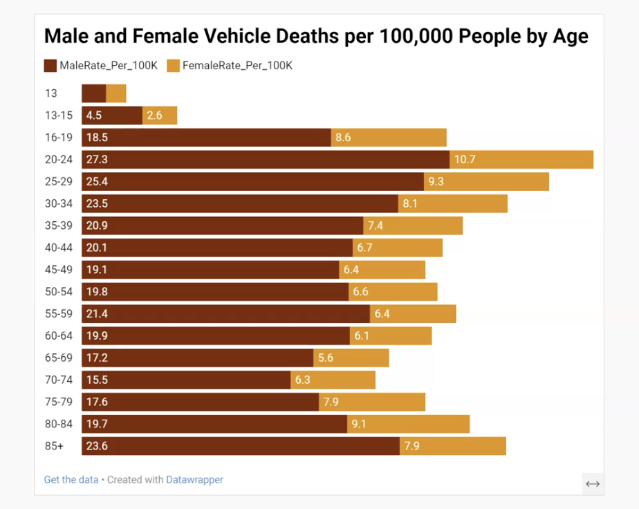
Scientific Visualization
the representation of physical processes or physical entities graphically as a means of gaining understanding and insight into the data.


Visual Analytics
combines automated analysis techniques with interactive visualizations for an effective understanding, reasoning, and decision making using very large and complex data sets (ex: self-organizing map, geovisual analytics)
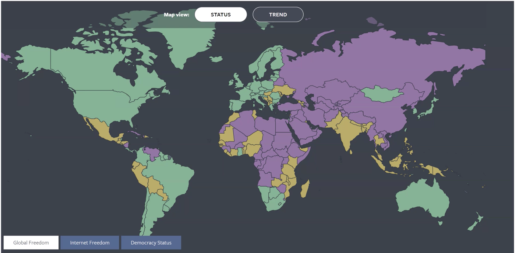

self-organizing map is an example of this

Anscombe’s Quartet
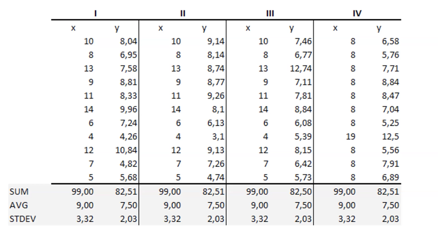
______ _______ and the Datasaurus Dozen shows us that when we visualize, we notice the difference between things.
In the datasaurus dozen example, we see that each dataset has the same summary statisitics, but they produce different graphs (thus, summary statistics are not enough to understand data shapes)


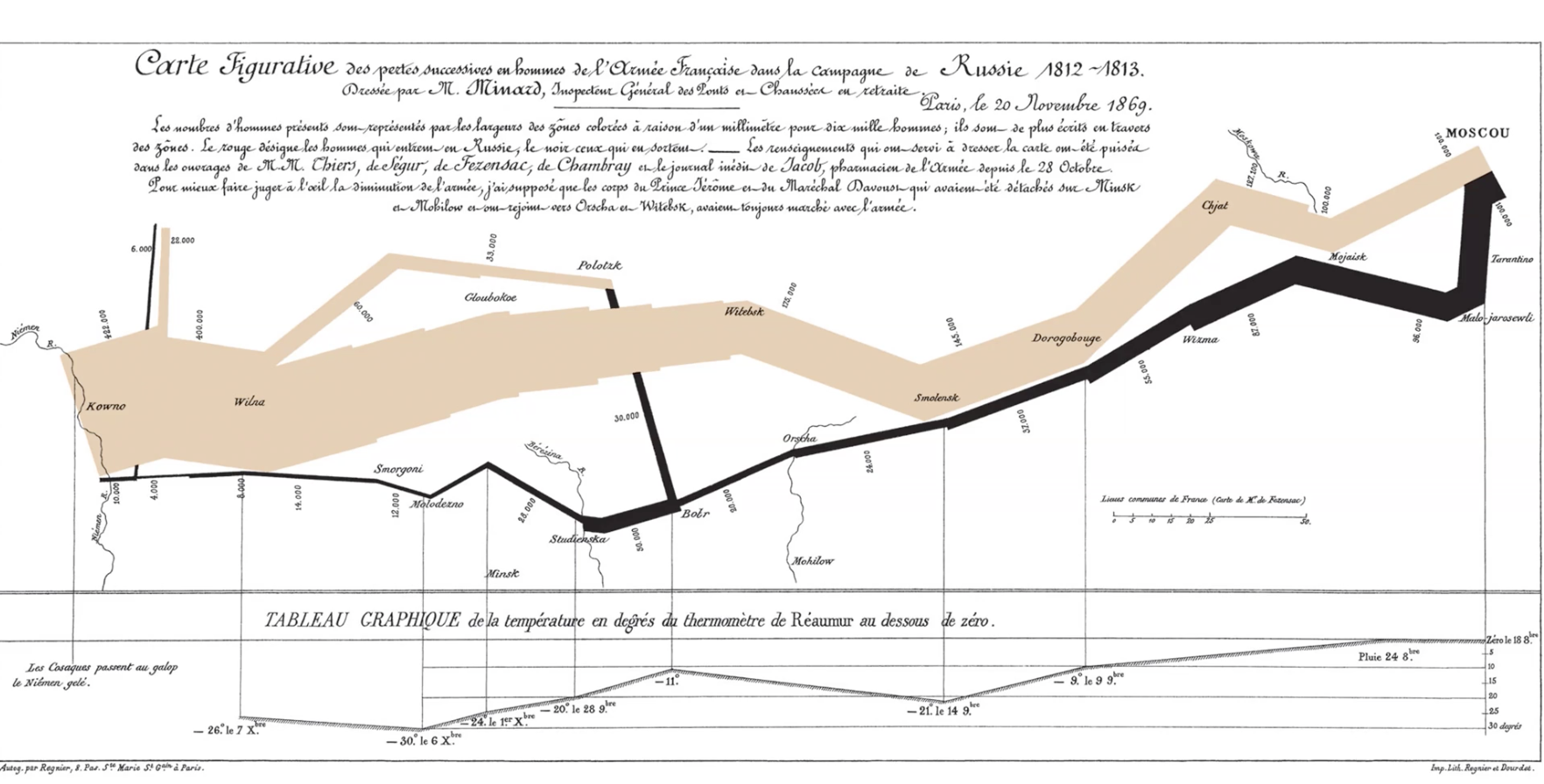
Visualization Example: Napolean’s Campaign
troops encoded by line thickness
Communication, Representation, Design
C.R.D.:
1) Audience, purpose and goals (____: We do stuff for reason! Not everything needs vis!)
2) Let the data speak for themselves (____: The information needs a stage and a microphone, let it shine—in the right way.)
3) The devil is in the details (____: Changes make a big difference, attention to detail communicates trust and validity)

Audience: general public
Purpose: spreading awareness about coronavirus risks
Goal: informing and changing people’s behavior
Data speaking for itself: encoding the data with size, color, and position
Devil in the details: grouping risks into three categories, add details to certain categories to show why the places are risky (like a story behind some of them)
launch date; temperature
Data describing o-ring failures on the Challenger was originally shown
ordered by [variable]__. When it was subsequently ordered by
____[variable]______, it was easier to see a clear pattern.
A
We used the word “encoding” a few times. Which of the following is the
most correct usage of the word, given our discussion?
(a) More COVID-19 danger was ‘encoded’ as more vivid red, larger circles, and
farther on an X axis.
(b) More COVID-19 danger was ‘encoded’ with a different font.
(c) We use ‘encoding’ to send secret messages in graphics.
(d) COVID-19 risk cannot be ‘encoded’ because there are no numbers.
Data visualization; Visual Analytics
Describe a key difference between _____ ______ and _____
_____.
______ ____ - more complex analytical techniques and larger data sets (combines interactive visual interfaces with computational reasoning and algorithms to explore complex data and uncover hidden root causes)
______ _____ - displays data in graphical formats like charts and graphs to communicate known findings,
cleaning
Downloading data:
-It’s gonna be ugly (we do a
lot of _______...)
-It may be annoying
-Many times, you won’t use
most of it
Case Study: The Jeanne Clery Campus Safety Act Example
Example of Data Cleaning
Original data
was given in
different files…
…And it
required a lot of
decisions

How many years? (Why not just do all of them? Pros/Cons)
• Which indicators? (Why not just do all of them? Pros/Cons)
• Which indicators to combine?
Then…
• How to choose universities?
• How to deal with outliers?
The “Cleaned” dataset took a long time to make…and
then we iterate with visualization decisions.
Plus: design choices, usability tests, ethical discussions, dissemination…but the data
was the biggest hurdle. So let’s look at some data stuff.
Data Levels
Nominal
Ordinal
Interval
Ratio

Others:
Circular: clock time (some other maybes here…) Kinda color?
Fuzzy: belongingness
Nominal
Named data
Example: eye color
id numbers, names, street names, etc.
Ordinal
named, natural order data
example: level of satisfaction
number of stars on Yelp, soil type by moisture, low-
medium-high
Interval
Named, natural order, equal interval between variable data
Example: Temperature
continuous data where zero doesn’t mean ‘nothing
Ratio
Named, natural order, equal interval between variable, has a true zero value thus ratio between values can be calculated
You are often going to see this type of data in data vis
continuous data where zero means ‘nothing’
Data could be stored as a…
• Boolean
• Int
• Long
• Short
• Float
• Double
• String
• Char
• Date
(numeric data aligns to the right in excel)
Data Wrangling & Cleaning
Parsing: What’s a delimiter? What are some common delimiters? Why don’t
they all “work”?
examples: slash, new line character, tab, white space, comma, semicolon
•Your ID numbers may be saved as numbers, may be saved as text…you may
have dates saved as strings, etc…
•Significant digits and rounding (3.243543% - 6.34323%) (NO PLEASE)
•Column names: best practices (?? -> Pct_FgBrn_15_17_F).
•Abbreviations & standards (GATech, GT, Ga Tech, GaTech, Tech, Georgia
Tech, GIT (?), Georgia Institute of Technology) (Huge problem).
•Tools for this? Regular expressions, data dictionary, and automated scripts.

Regular Expressions
The goal is to find certain character
sequences.
We know what a wildcard is, this is more
intense…
• Great for find and replace
• Great for cleaning / filtering
• Great for limiting user input


wide; form
Let’s Reshape Data
we resahped this data from _____ form to _____ form

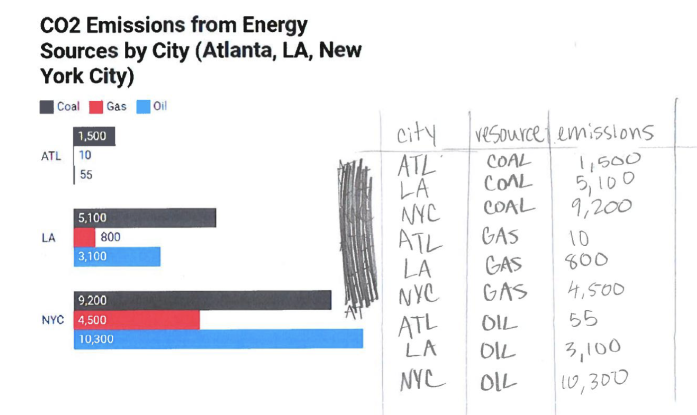
Reshaping Data

Select Muppet, Avg(Apples), Avg(Oranges), First(Bananas)
From Fruit
Where Muppet = Ernie or Muppet = Bert
Group by Muppet
Let’s name some summary statistics:
For numbers: sum, median, mean, st_dev, mode, max, min, variance, range (max-min)
For text: (length), first, last, count, count(unique) aka count(distinct)
For both: count, count(unique)
What SQL query would give us the green table
below?

PRIMARY KEYS
uniquely identifies the entry, doesn’t repeat, nominal data
Composite Keys
collectively comprised of multiple attributes, to produce a “unique key”

(have to put multiple things together)
Table Joins
A common field is needed between the two for them to be joined
(Most programs have a default)


Left


The image above is showcasing results of a ___ join on the data
inner


The image is showcasing results of a ___ join
Outer
The image is showcasing results of a ___ join


Right
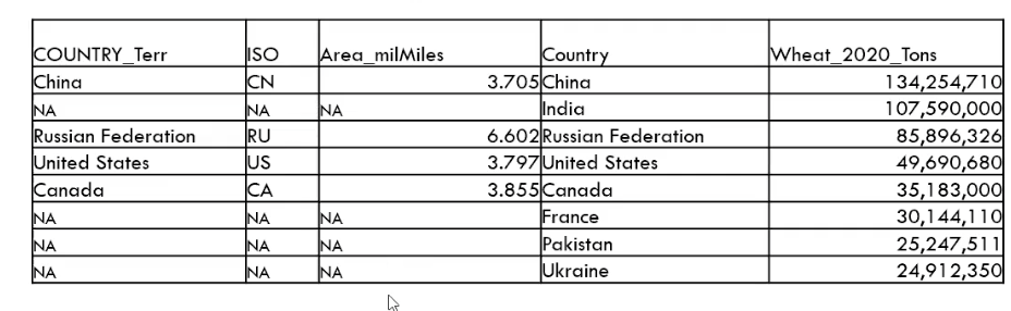

The image is showcasing results of a ___ join
wheat field

If you did a left join to the ___ ____

Our Old result of a left join in the image above
Data Classification
equal interval
quantile
natural breaks
manual (anything you would like)
pretty breaks (ending in zeros or fives)


Color Patches, Classed

how would you describe the legion of this data?
Color Ramp, Unclassed

how would you describe the legion of this data?
Binning
What is Data ______ / Classification?
Grouping quantitative data values into categorical groups.

Data Classification Method: Equal Interval
ex. 5 bins of equal LENGTH
same-sized number ranges

Data Classification Method: Defined interval
ex. by 10s [start at even numbers!]
Data Classification Method: Standard deviation
(mean and then two tails)
• Note: when there is a 0 and negative / positive values, the zero
can act like a mean.

Data Classification Method: Quantiles
the same number of observations in each category
forcing the data to have differences in it, because we are forcing the same number of things in each bins
for this map specifically, it is making it look like there are “two AMericas” (we are so different these two parts)

Data Classification Method: Maximum breaks
biggest chops in the data

in the map: showing that the life expectancy of the US is so low all over the place

Data Classification Method: Natural breaks
a little more complicated--chops in the data that
minimize deviation within a bin
we find gaps in the data and we section things off
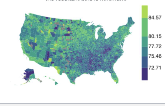
Data Classification Method: Log Scale
1-10, 10-100, 100-1000, etc.
growing organism examples in science
Data Classification Method: Unclassed

extent; breaks
Bin refers to the single range of continuous values used to group values, also
known as class', scheme', category', bucket', break', range’.
• Bin count is the number of specified bins for or created after binning.
• Bin ____ refers to a bin's minimum and maximum values.
• Bin interval refers to the difference between a bin's maximum and minimum
values. It is also referred to as `bin range’.
• Bin size refers to the number of data values that lie within a bin extent.
• Bin ____ refers to the set union of all bin extents.
• Bin color is the map color assigned to administrative units in that bin.
True
True or False: Binning can (mis)influence policy making.
Mapmakers can falsely project a county as doing good or bad when that may not be the case

Psychophysics; Cognitive
Human Perception: Related fields
_________
• Applying methods of physics to measuring human perceptual systems
• How fast must light flicker until we perceive it as constant?
• What change in brightness can we perceive?
•_____ psychology
• Understanding how people think, here, how it relates to perception
Perceptual Processing
• Seek to better understand visual perception and visual information
processing
• Multiple theories or models exist
• One simple model is a 2 stage process with 1) parallel extraction of
low-level properties of a scene and 2) sequential goal-directed
processing
One-simple Model
a 2 stage process with 1) parallel extraction of
low-level properties of a scene and 2) sequential goal-directed processing

Stage 1 - Low-level, Parallel
Otherwise known as: Pre-attentive Processing
Neurons in eye & brain responsible for different kinds of information
• Orientation, color, texture, movement, etc.
• Arrays of neurons work in parallel
• Occurs “automatically”
• Rapid (Quick)
• Information is transitory, briefly held in iconic store
• Bottom-up data-driven model of processing
• Often called “pre-attentive” processing
Preattentive Processing
How does human visual system analyze images?
• Some things seem to be done preattentively, without the need for focused
attention
• Generally less than 200-250 mil secs (eye movements take 200 mil secs)
• Seems to be done in parallel by low-level vision system
Think of this as a “mental shortcut” that your mind can (and does) use
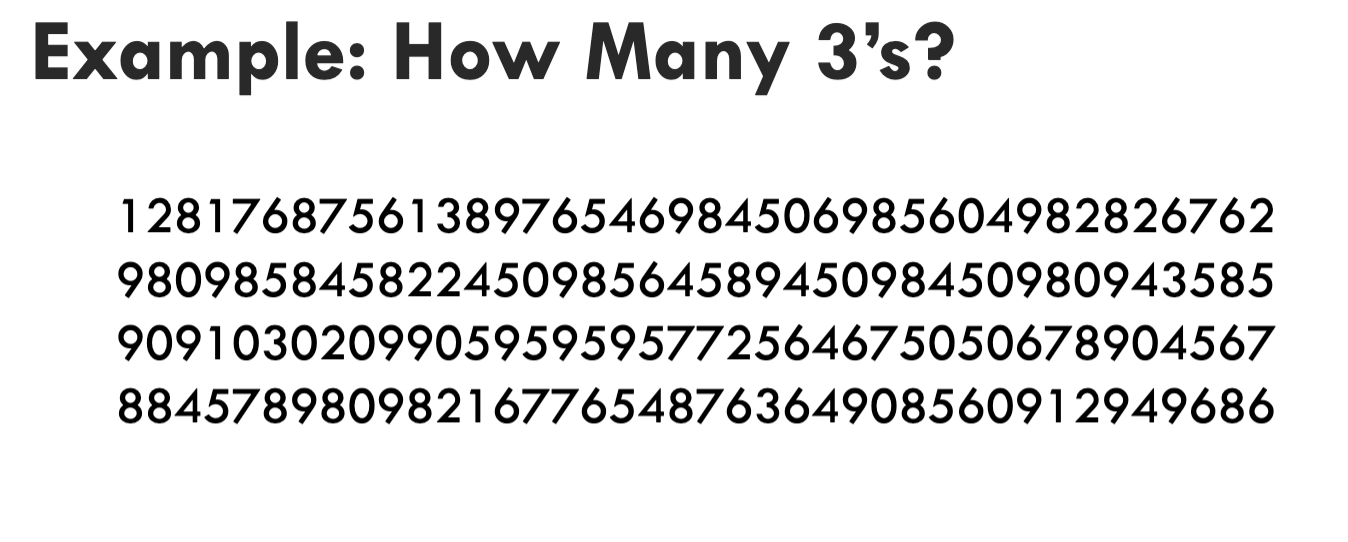
Why does this take a long time?
• No features that leverage preattentive processing.
• Have to scan sequentially
target; boundary; counting
Which tasks pre-attentive processing work well
for?
______ detection
• Is something there?
• _____ detection
• Can the elements be grouped?
• ______
• How many elements of a certain type are present?
Example Illustrating Pre-Attentive Processing

Who can find the circle?
Can be done rapidly (preattentively) by people
Surrounding objects called “distractors”

Was this faster?

Hue and shape variation…cannot be done pre-attentively.
Must perform a sequential search, conjunction of features causes it.
Stage 2 - Sequential, Goal-Directed
Splits into subsystems for object recognition and for interacting
with environment
• Increasing evidence supports independence of systems for
symbolic object manipulation and for locomotion & action
• First subsystem then interfaces to verbal linguistic portion of
brain, second interfaces to motor systems that control muscle
movements
• ~slower
• Involves working and long-term memory
• More emphasis on arbitrary aspects of symbols
• Top-down processing
Gestalt Laws of Pattern Perception
Gestalt – German: "essence or shape of an entity's complete
form"
• German psychologists, early 1900’s
• Attempt to understand pattern perception
• Founded Gestalt School of Psychology
• Provided clear descriptions of many basic perceptual
phenomena
Gestalt Principles
• Proximity
• Similarity
• Continuity
• Common Fate
• Symmetry
• Figure/Background
• Connectedness
• Width, Length
• Size curvature
• Number
• Intersection
• Closure
• Hue
• Intensity
• Flicker
• Direction of motion
• Stereoscopic depth
• (3d)
• Overlap
• Lighting direction
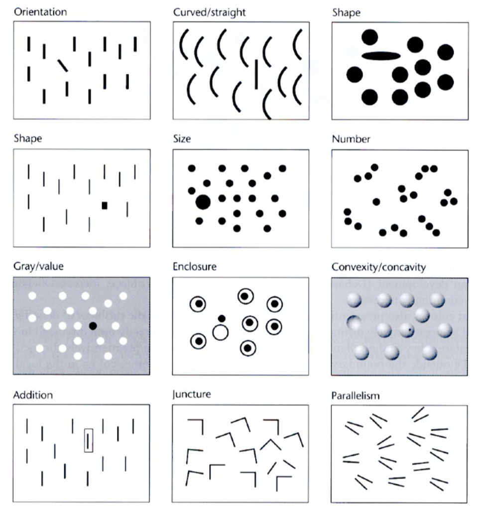
several principles can be utilized in one design
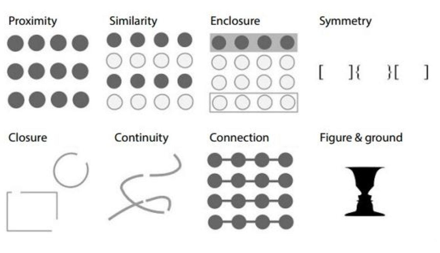
Gestalt Principles in Images
Emergent Features
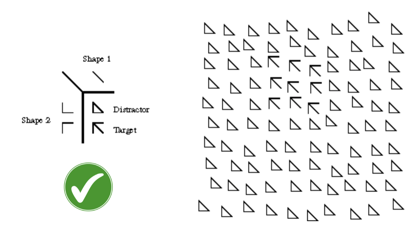

harder to process the second picture
True
True or False: Preattentive processing may be why it’s easier
to find mistakes then to see the big picture
Prägnanz
German word for good figure. The mind tends to perceive ‘ambiguous’ thing as simply as possible.
Gestalt Principle: Proximity
We group together ‘proximate’ objects

Gestalt Principle: Closure
We try to see collections of objects as creating a larger, more complete object

so in our minds, even though we aren’t seeing the whole thing, are brains are seeing different
Closure

Which Gestalt principle is this?
i.e., our brains using context clues to create an image
Gestalt Principle: Similarity
We group similar objects together|

Gestalt’s Principle: Symmetry
We group together objects that are symmetrical to one another
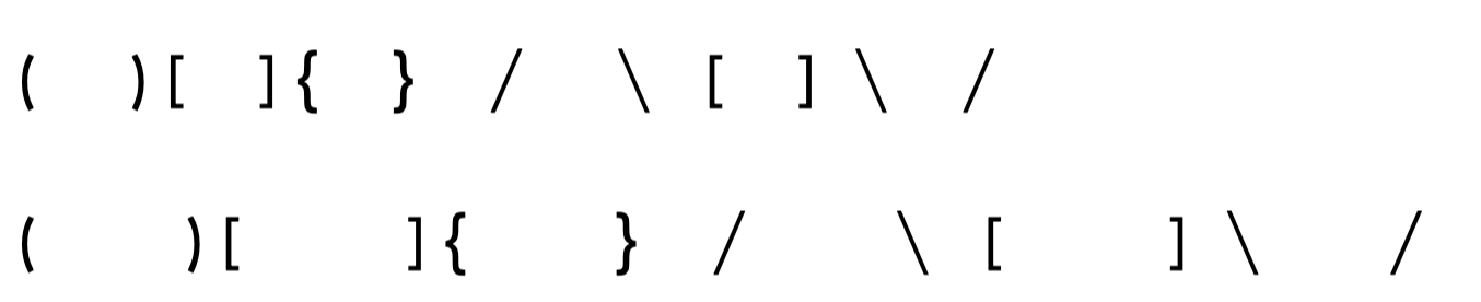
*don’t confuse this with Proximity
Gestalt’s Principle: Continuity (Good Continuation)
We separate (parse) overlapping objects to give them a ‘smooth’ interpretation

How do we interpret the left figure (a)? Is it (b) or is it (c)?
• Most of use will interpret (a) as having the two elements shown in (b)
Continuity
“Fill in the Blanks”


(Might be Wrong)
Continuity, Similarity

Which gestalt principle is this?
Gestalt Principle: Common Fate
We group together objects seen to be moving in the same direction
(having a ‘common fate’)
• Also applies to movement toward perspective vanishing point
Imagine groups of planes
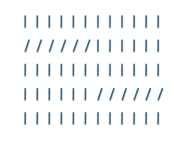
Gestalt Principle: Figure and Ground





the X’s are the same color
Combine Similarity and Connectedness

note use of proximity
come back to this
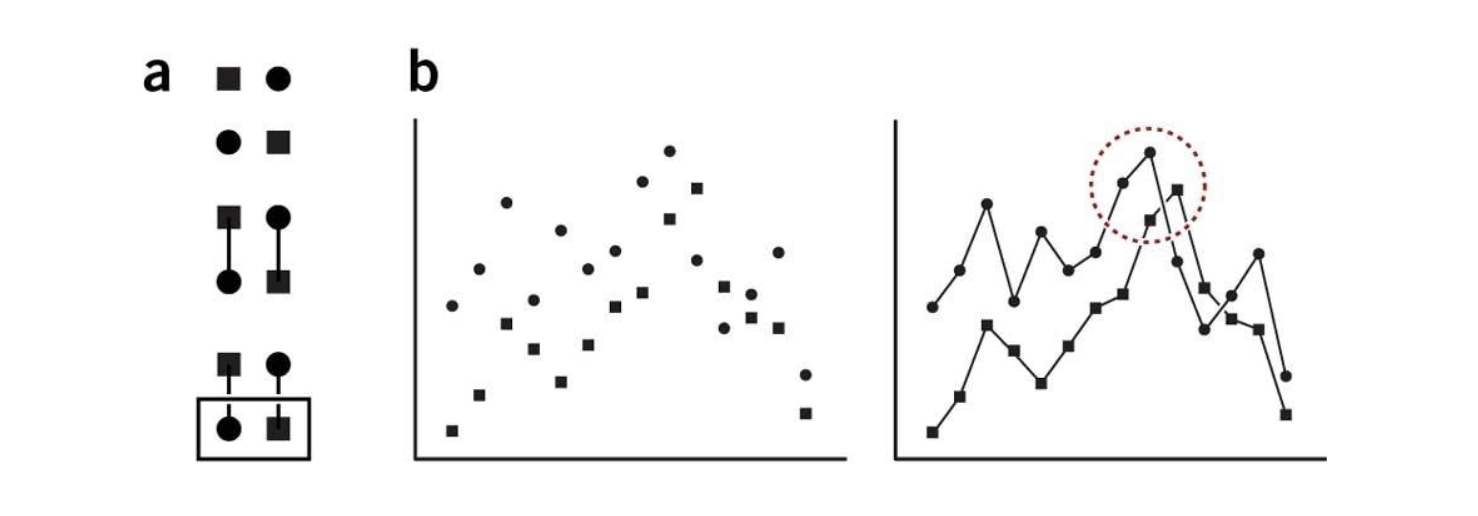
Proximity; Similarity

______ + ____ reinforce one another
• Similar to redundant (double) coding idea
Similarity
Which Gestalt principle:

Proximity
Which gestalt principle:

Enclosure

Which gestalt principle
Closure

Which gestalt principle?
Principles
______ are used to guide people in HCI (Human Computer Interaction)
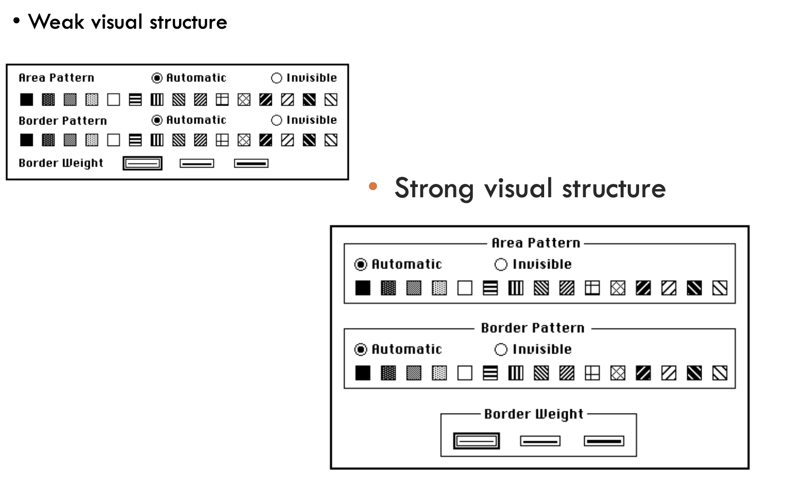
Items close together appear to have a relationship
• Greater distance implies no relationship


Grouping: Poor Dialogue Box
effective; information; perceived

What is effectiveness
A visualization is more ______ than another visualization if the ______ conveyed by
one visualization is more readily ______ than the information in the other visualization.
“Address the eye without fatiguing the mind.” ------ Alexander von Humboldt
cognition
Quote by Hanspeter pfister: Effective visualizations reveal patterns and communicate ideas using the power of perception to offload ______.
Not effective

This is an example of a (effective/not effective) chart
Hint: Clutter and confusion are not attributes of
information, they are failures of design. — Edward Tufte

Effective
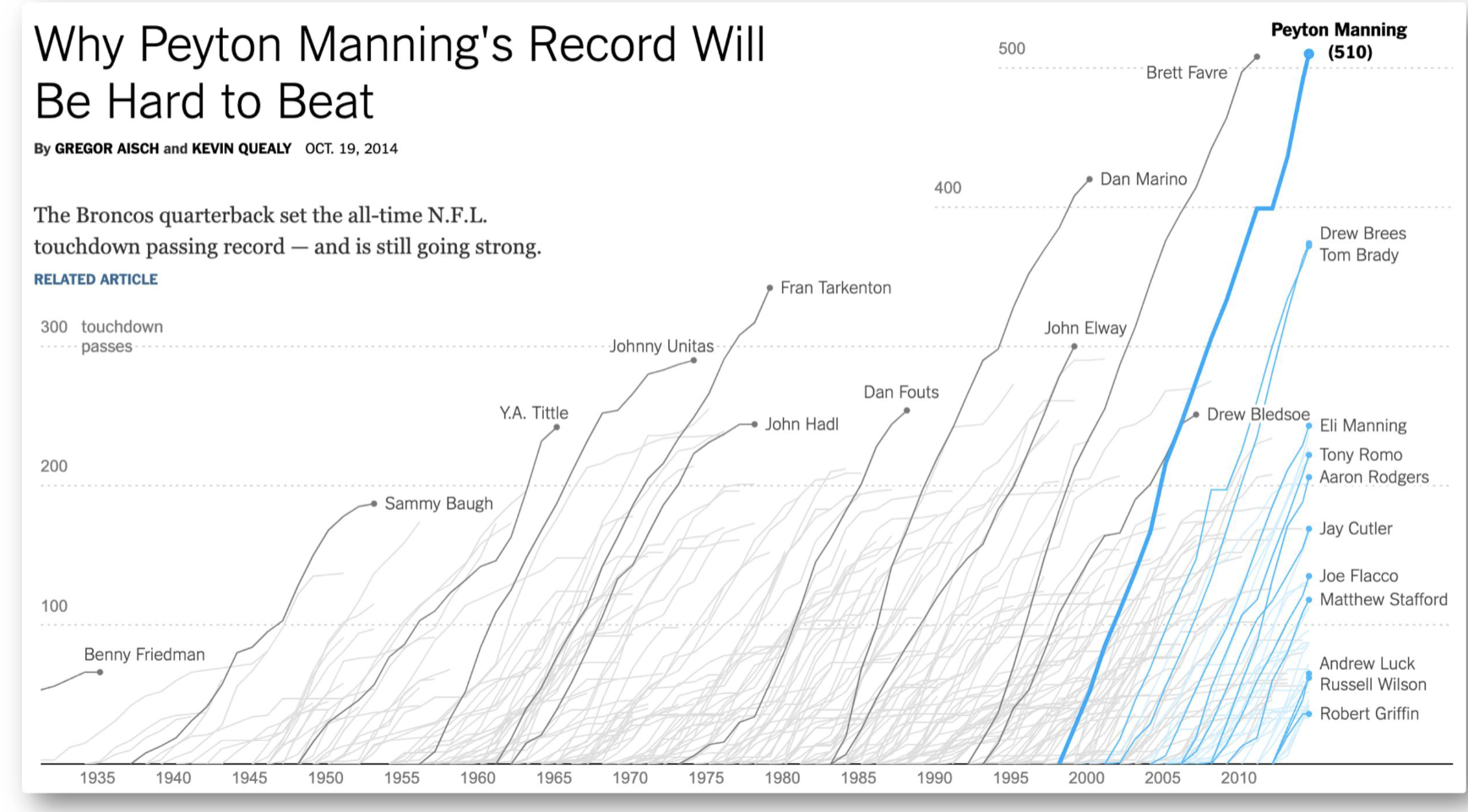
This is an example of a (effective/not effective) chart
Graphical Integrity
Principle proposed by Edward Tufte
making a graph represent the data truthfully and accurately.

example: these two bars are really different from each other, however, it is highly exaggerated because of the non zero axis. The difference between the two bars below are not as big as the bottom (which makes the fox news example misleading)
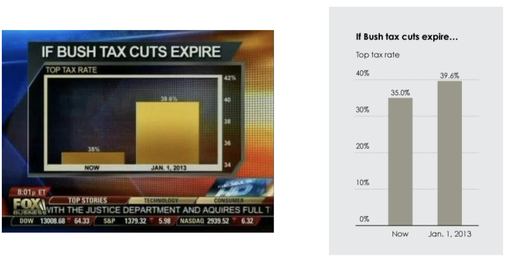
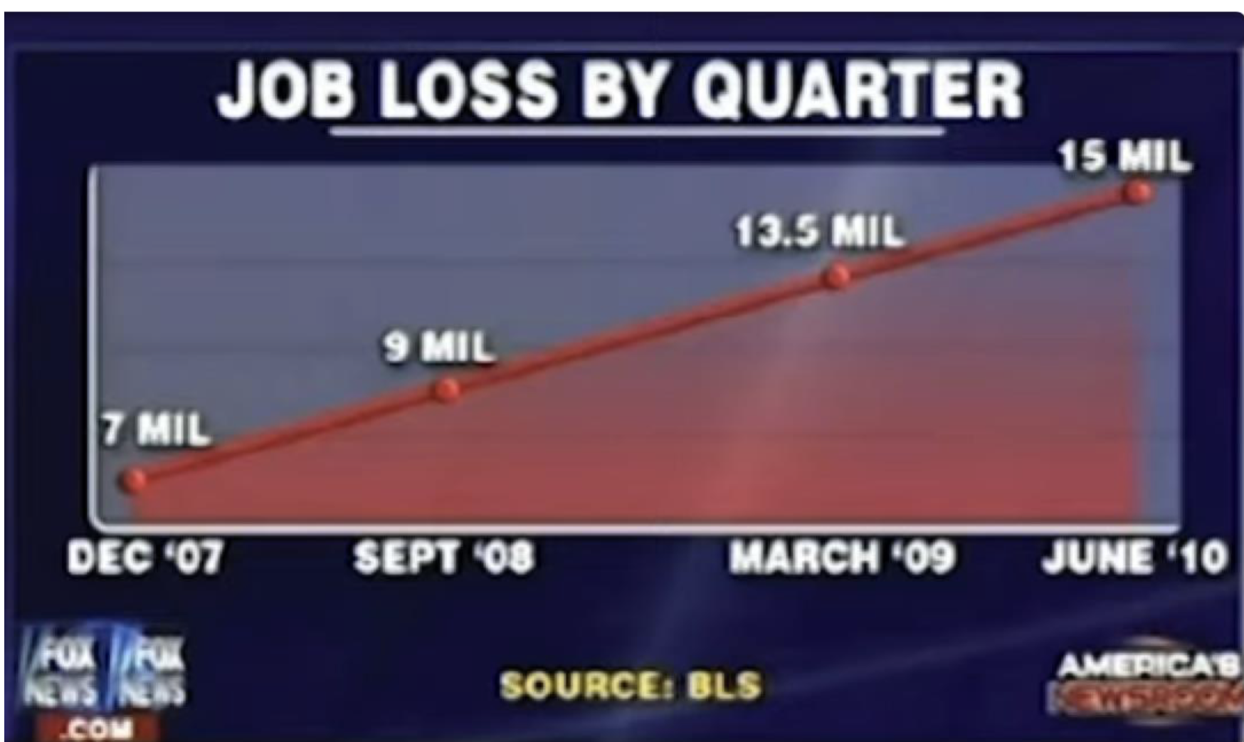
not proportionally scaled, vague x and y axis labeling and information (hard to understand)
Non-zero axis
This is an example (related to Graphical Integrity) of why you should avoid (or NEVER try) drawing bar charts with a _____ ______ _____


it is relatively okay to do with line charts

Scale Distortions

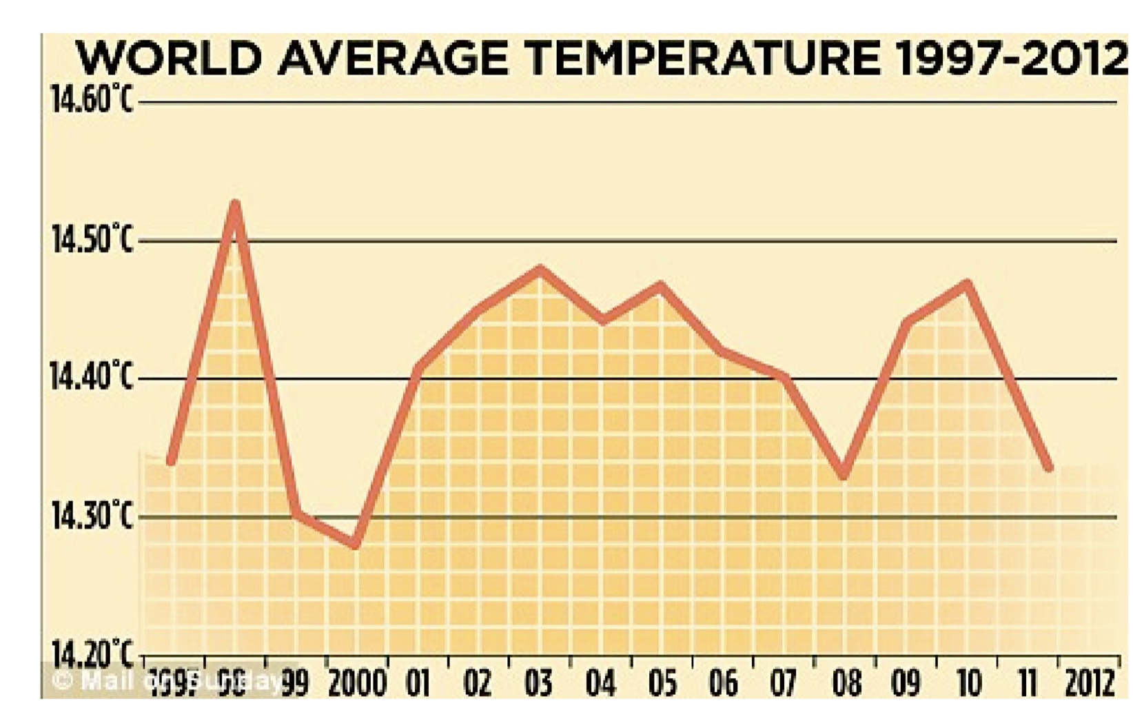
manipulating or choosing a scale that makes the data look different or more dramatic than it really is.


The Lie Factor

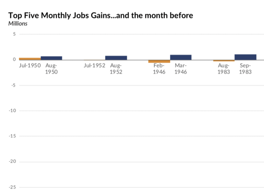
What is being showcased here?
The Lie Factor
Coined by Edward Tufte; ____ ____ = Size of effect shown in graphic (change in area, length, or volume) / Size of effect in data (difference between those two numbers)
people are good at estimating length but bad at estimating volume
The effects you show in a visualization should be proportional to the effects you have in the real data
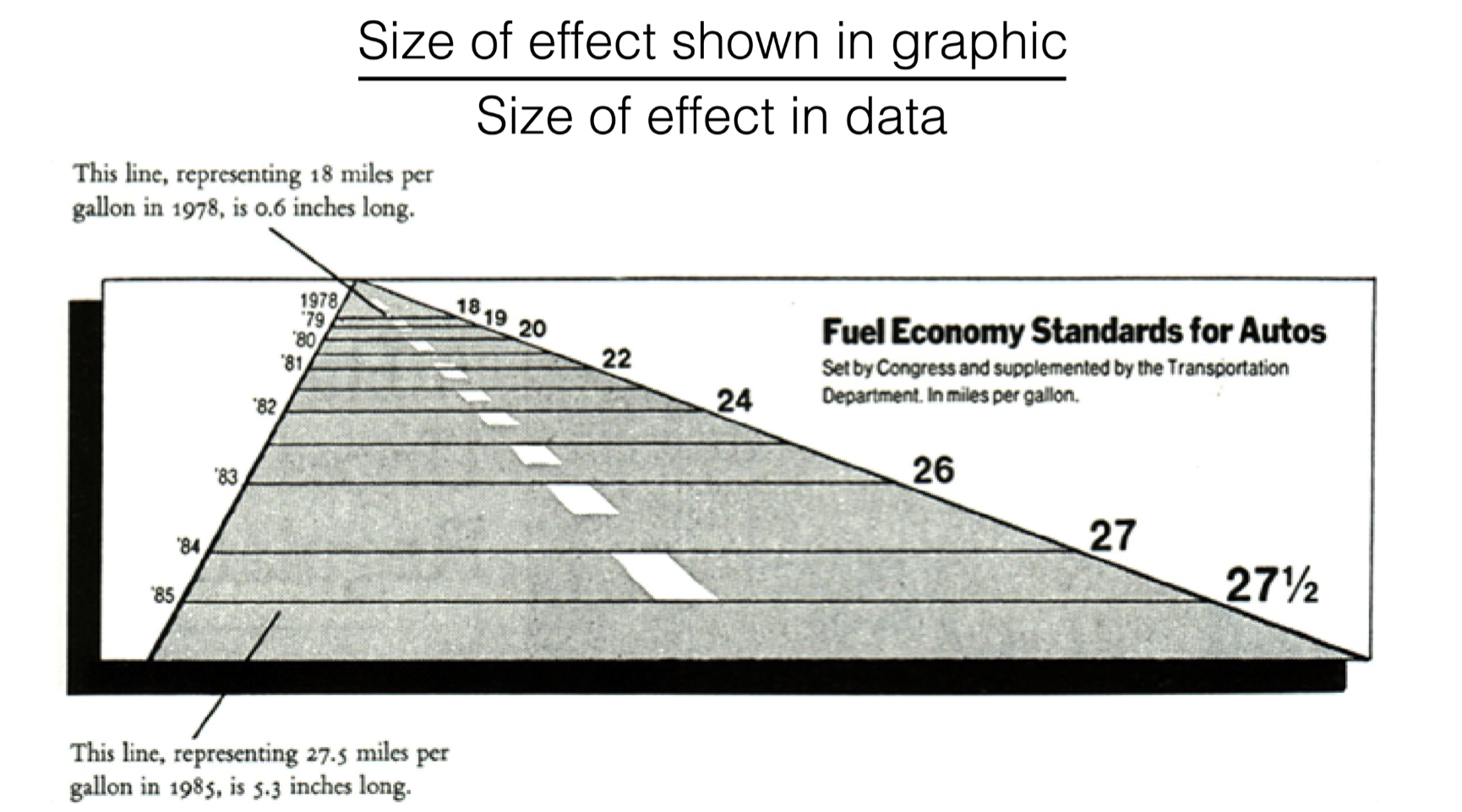
The representation of numbers, as physically measured on the surface of the graph itself,
should be directly proportional to the numerical quantities represented. — Tufte


Why 3D Pie Charts are Bad

never use 3D pie charts
The Cone of Uncertainty


Keep it simple Principle: Maximize Data-Ink Ratio
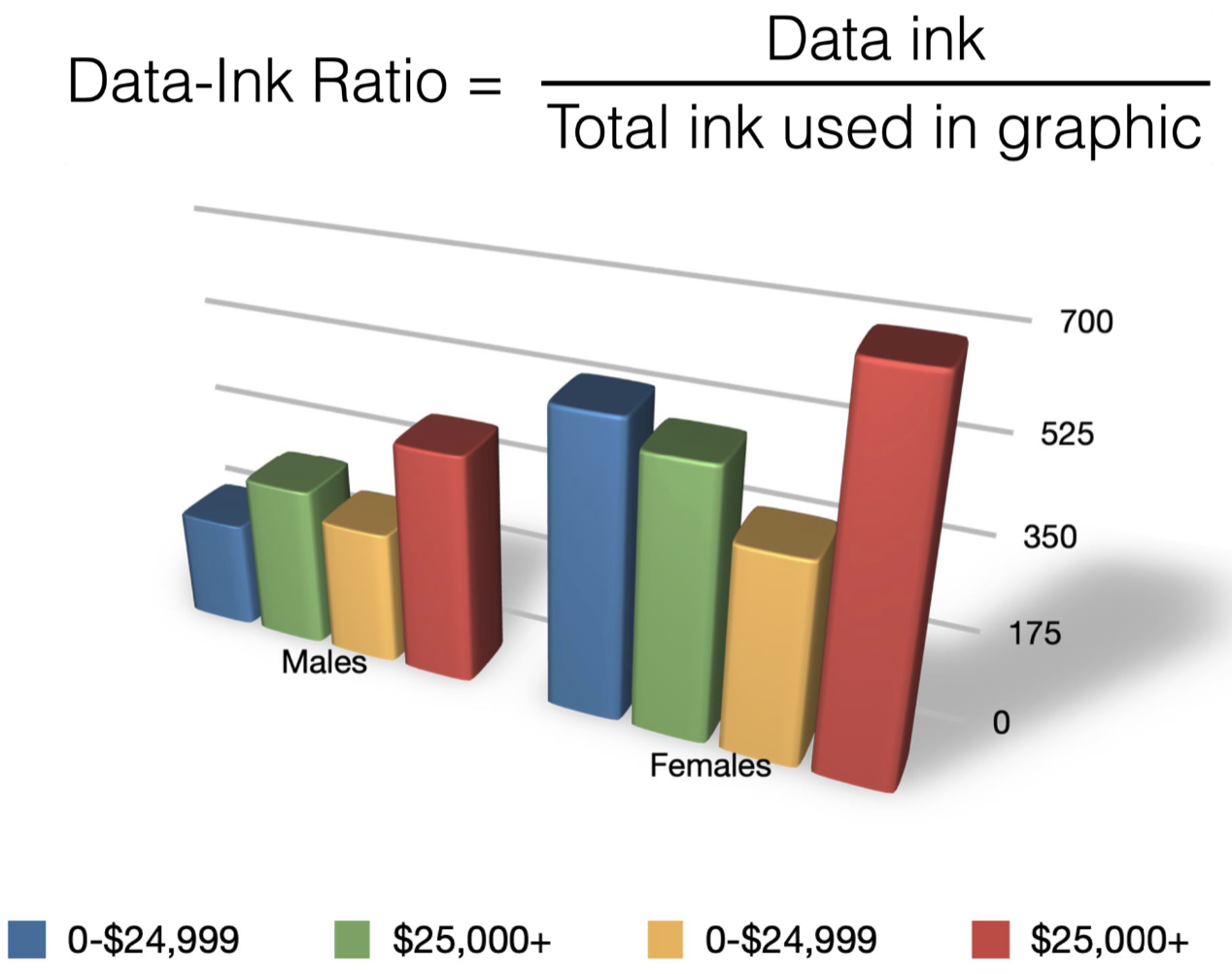

The simple bar chart is much more effective than the top (3D) version
(less ink is more)
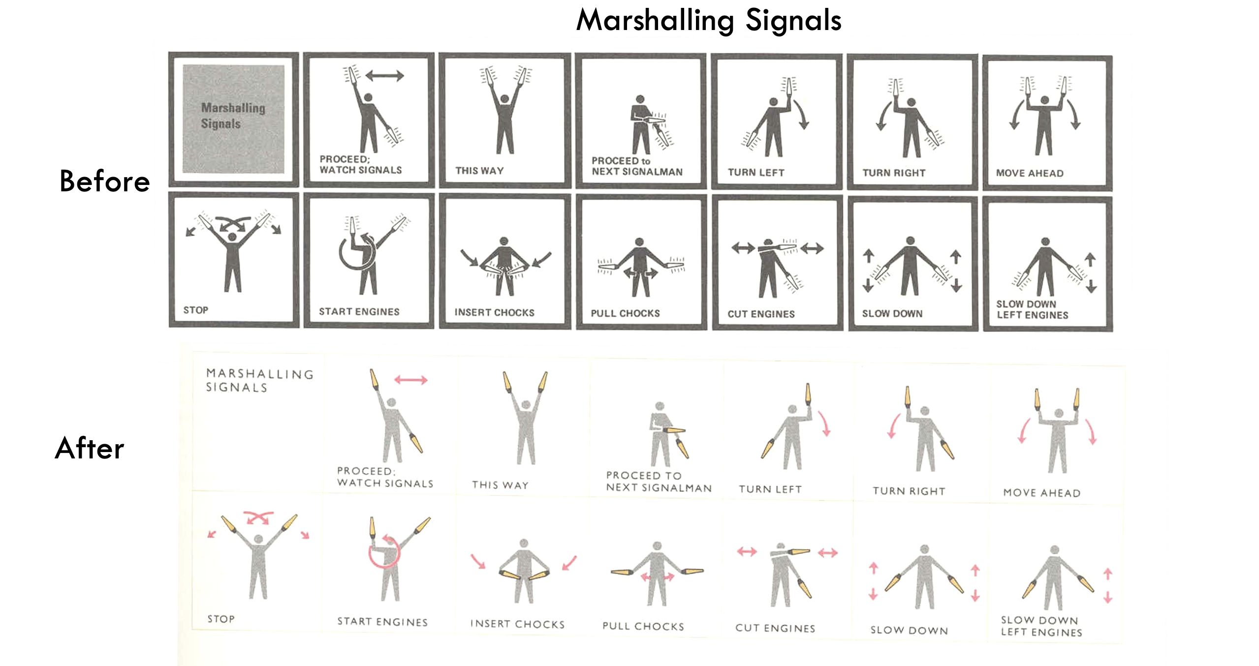

Keep it simple Principle: Avoid Chartjunk
Extraneous visual elements that distract from the message

Cleaning it
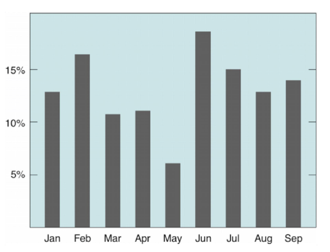


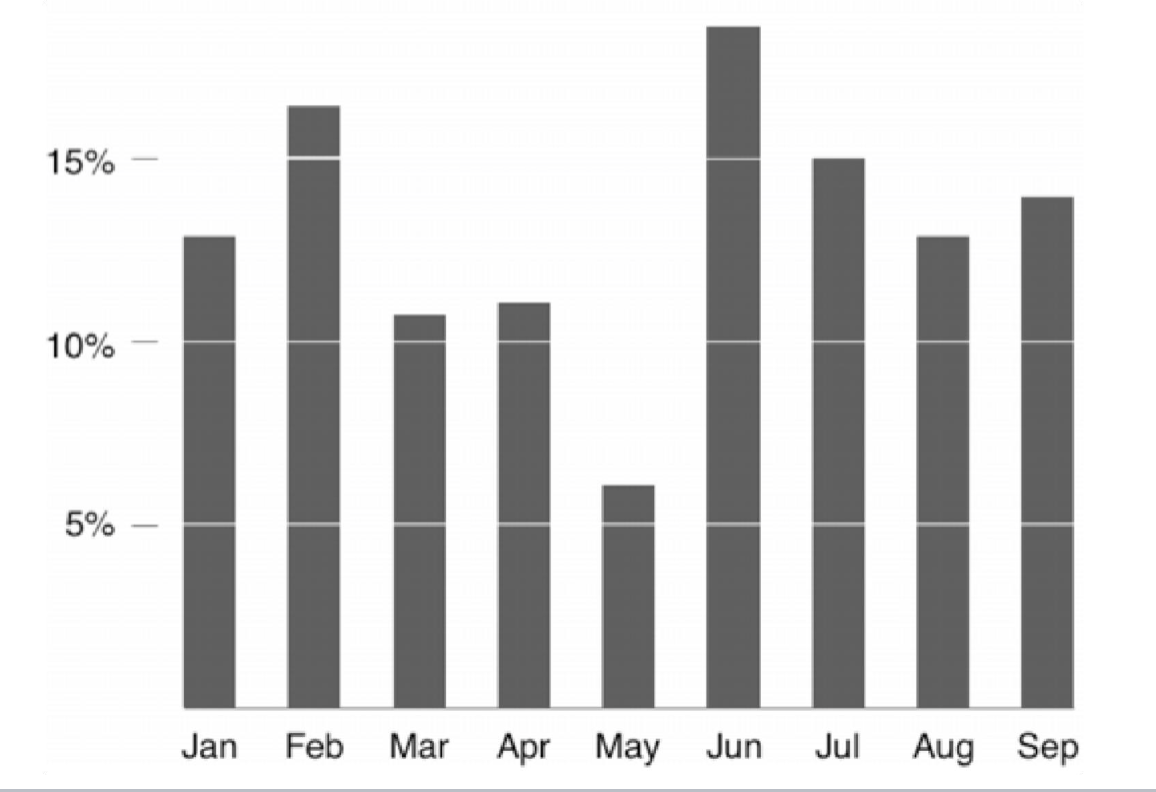

do not have to go this far, but this is showcasing how far you can go to remove factors to allow people to read your chart better
Edward Tufte
Who said this: Clutter and confusion are not attributes of
information, they are failures of design.
Tufte’s Principles
Have graphical integrity
Mind the lie factor
Maximize data-ink ratio
Avoid chart junk
In other words:
Show comparisons (help the eye compare…)
Show causality (draw the eye towards…)
Use multivariate data
Integrate text, image & numbers
Establish credibility (author & data sources)
Focus on content
Alexander von Humboldt
Who said this:
Address the eye without fatiguing the mind.
Subjective Dimensions of Data Visualization
Aesthetics: Attractive things are perceived as more useful
than unattractive ones
Style: Communicates brand (through colors for example), process, who the designer is
Playfulness: Encourages experimentation and exploration
Vividness: Can make a visualization more memorable
Audience: Your visualization should be adapted to your
audience
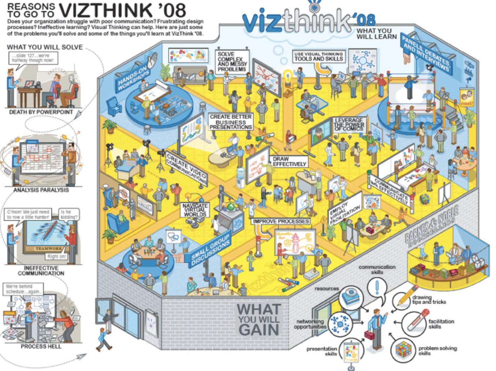
Data Exploration

Data Journalism

Infographics

Data Art

more creative
usually doesnt abide by tufte’s principles