Graphs
 Call Kai
 Learn
Learn Practice Test
 Spaced Repetition
 Match
Match Flashcards
 Knowt Play
1/17

There's no tags or description
Looks like no tags are added yet.
Name | Mastery | Learn | Test | Matching | Spaced | Call with Kai | Chat |
|---|
No analytics yet
Send a link to your students to track their progress
18 Terms
Segmented bar graph
Displays the distribution of a categorical variable across different groups

How to draw a segmented bar graph
Draw a single bar for each group with all bars reaching a total height of 100%
Divide each bar into stacked segments
The height of each segment represents the relative frequency of that category
How to interpret a segmented bar graph
Look for an association between variables
If the segments look identical across all bars, there is no association
If the segment heights change noticeably from bar to bar, an association exists
Histogram
Displays the distribution of a single quantitive variable

How to draw a histogram
Divide data into equal-width intervals (bins) on the x-axis
Draw adjacent bars where the height represents the frequency or relative frequency of data points in that bin
The bars must touch
How to interpret a histogram
Shape (skewed, symmetric, bimodal)
Outliers (gaps)
Center (estimate median/mean)
Spread (range)
Stem-and-leaf plot
Displays quantitative data while preserving the individual raw data values

How to draw a stem-and-leaf plot
Split each data point into a “stem” (leading digits) and a “leaf” (final digit)
List stems vertically and leaves horizontally in vertical order
You must include a key (e.g. 4|2 = 42 years old)
How to interpret a stem-and-leaf plot
Shape (skewed, symmetric, bimodal)
Outliers (gaps)
Center (mean/median)
Spread (range)
Boxplot
Visually displays the five number summary (Min, Q1, median, Q3, Max)
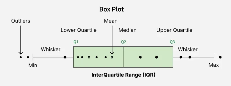
How to draw a boxplot
Draw a central box from Q1 to Q3 with a vertical line at the median
Calculate outliers using the 1.5 x IQR rule
Mark outliers as isolated dots
Extend “whiskers” from the box to smallest and largest non-outlier data points
Cumulative relative frequency graph
Displays the running total percentage of a quantitative variable as you move left to right

How to draw a cumulative relative frequency graph
Plot the upper boundary of each data interval on the x-axis and the cumulative percentage on the y-axis
Connect the points with line segments
The graph always starts at 0% and ends at 100%
How to interpret a cumulative relative frequency graph
Locate a percentage on the y-axis, move horizontally to the line, and look straight down to find the raw score
Steep sections mean lots of data points are concentrated there
Flat sections mean very few data points
Dotplot
Displays the distribution of a small quantitative dataset

How to draw a dotplot
Draw a single, labeled horizontal axis
Place one dot directly above the axis for every individual data value in the set
Stack duplicate values vertically
How to interpret a dotplot
Shape (skewed, symmetric, unimodal)
Outliers (gaps)
Center (mean/median)
Spread (range)
Bar graph
Used for a single categorical variable
