Graphing Vocabulary and Graph Types
 Call Kai
 Learn
Learn Practice Test
 Spaced Repetition
 Match
Match Flashcards
1/10

Earn XP
Description and Tags
Vocabulary terms and visual definitions covering core graphing concepts and graph types.
Name | Mastery | Learn | Test | Matching | Spaced | Call with Kai | Chat |
|---|

11 Terms
correlation
Sets of data that seem to increase or decrease together.
x-axis
The horizontal axis in a graph, typically representing the independent variable (thing being changed) and control group.
y-axis
The vertical axis in a graph, usually representing the dependent variable (thing being measured).
causation
Sets of data that cause each other to increase or decrease.
units
Quantities used to specify measurements (meters, grams, seconds, etc.).
outlier
A piece of data that is much larger or smaller than the other points of data

Scatter plot
A graph that displays plotted data points showing the relationship or correlation between two variables, such as average daily temperature and number of beach visitors.

Bar graph
A chart using rectangular bars to compare frequencies across categories, such as eye colour distributions for Year 7 and Year 8 students.

Histogram
A graph with adjacent vertical bars showing frequency distribution across continuous numerical intervals, such as age groups of people choosing M&M as favorite candy.
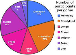
Pie chart
A circular graph divided into sectors representing numerical percentages or proportions of a total, such as the number of participants per game.

Line graph
A graph showing continuous trends over time by connecting individual data points with line segments, such as Class CQA Averages over quarters.