DS 2003
 Call Kai
 Learn
Learn Practice Test
 Spaced Repetition
 Match
Match Flashcards
 Knowt Play
1/43

There's no tags or description
Looks like no tags are added yet.
Name | Mastery | Learn | Test | Matching | Spaced | Call with Kai | Chat |
|---|
No analytics yet
Send a link to your students to track their progress
44 Terms
Two kinds of visualizations
exploratory data
plotting data and looking at it, preprocessing
Explanatory
interpreting data, integrating data, has an argument, post processing data
Underlying model perhaps
Why use computers
Better than drawing bc can update easily
interactivity : can inspect different aspects of plot
Integration: with algorithms
Efficiency : can re use charts and methods for different datasets
Quality: precise data rendering
Storytelling: can use time
What is data
An elementary assertion of a fact.
Bob has a height of six feet ✅
6 feet ❌
Needs to be a sentence
Thing (row/column), category (row/column), value (cell).
Subject , predicate, object
Row = item, cell = value, attribute = column
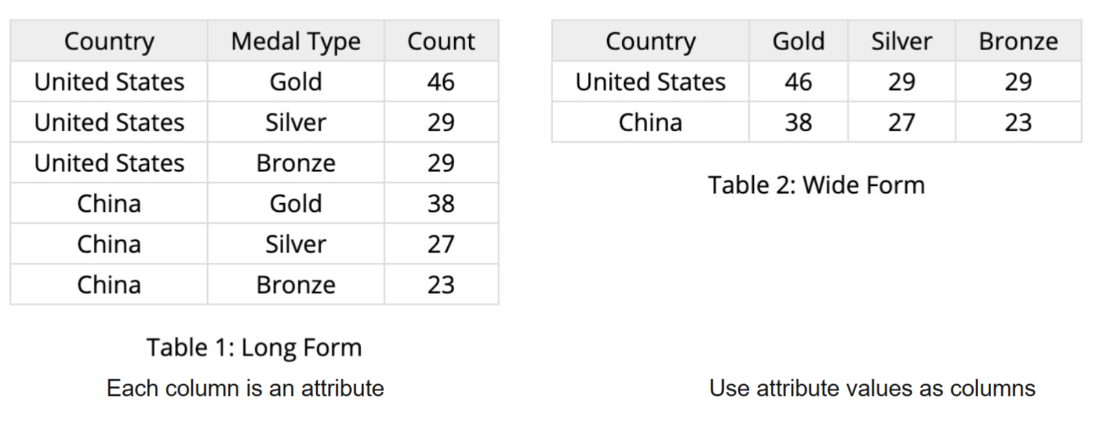
Standard data table / “tidy data” types
Wide
Each column is attribute
long
Attribute values are columns
Attribute types
Nominal example: list of fruits
Ordinal: quality of meat (grades), A, AA, AAA
Q interval: dates, locations ,only differences can be calculated but they will be things like distances or spans
Q ratio: length, mass . fixed zero. 0 means the absence of something. Can measure ratios or proportions
ratio data
Zero is absolute and means a complete absence
No negative numbers
Weight height length time duration
Can say that one variable is twice as much as the other
interval data
can go below zero
Cannot say that one value is twice as much as the other
Temp in C or F
marks
Aka visual object, graphical objects
Basic graphical element in an image
Different dimensions
0D: point
1D: line/oath
2D: an area
3D: volume
Visual channel
Aka visual variable
A way to control the appearance of marks
Position, color, texture, shape, tilt, angle, rotation, curvature, size (length area volume)
Color
Hue (what color is it), saturation (how pure is the color, how much of the hue is in the color), value (brightness of the color)
Types of channels
Magnitude channels: how much of something . position, length, saturation (numbers) / ordinal and quantitative data
Identity channels: what and where. shape, color . nominal data

The points are marks
And they represent the values in the table
x position is quantitative, something else that is encoded

The bars are marks and the encode the values
The x axis is a mark with nominal data and it encodes the x position
The y axis is a mark with ratio data and it encodes the y position

The points are a mark and they encode the items
The process input is an attribute and it is the x axis location
The quality characteristic xxx encodes quantitative data and the y axis position

X position: encodes quantitative attribute
Y position: encodes quantitative attribute
Sizes: encodes quantitative attribute
Circles to encode the item: nominal attribute

area:
Color hue
Color value
Rectangle mark
Rectangle position
Chart jargon
items are mapped as MARKS (dots, etc)
relationships can be mapped as MARKS (lines, etc)
attributes (things about item) are encoded to visual channels
Examples
Month (ordinal) mapped as horizontal position
Items being mapped as point mark (on line graph)
Lines mark/ connections between dots connect consecutive months , ordering of time
Dimensions of a scale
Domain: the data values to be mapped (actual attributes not the labels on the axis)
example all the months, example 0 to 20 degrees C
Range: example x pixels horizontal position
Type: sequential, diverging, linear, log, power, square root
Aggregator: how are the values being aggregated if a mark represents multiple items
domain
he data values to be mapped (actual attributes, example all the months, example 0 to 20 degrees C)
range
: the visual channel values derived from domain (example x pixels horizontal position)
aspect ratio
approximate proportion of the chart to match the depicted trend
If domain doesn't start at zero, should center y axis on data’s mean
different scales
Linear (look at absolute changes)
log scale (emphasizes small fluctuations, smoosh together high values and separate lower values) . use when data is very skewed , or when looking at percent changes
Need positive non zero values
how to handle outliers
Could remove the outlier
Could do a scale break but becomes another cognitive load
Color scales
Use the flow chart . Q and ordinal data is ordered, nominal is unordered
scales use hues and value / lightness
can be sequential for diverging color scale
diverging color scale if have meaningful midpoint (like elevation)
Design criteria
Lots of possible encodings with n data attributes and k visual channels
Design criteria
Expressiveness
Visualizations express all the facts of the data and only the facts of the data
Tell the truth and nothing but the truth
Effectiveness
One visualization may be more effective than another if one is more readily perceived
position is the most effective way to encode Q, O, and N data
Use encodings that people decode better (fast or more accurate)
Principle of consistency
properties of image should match properties of the data
Principle of Importance Ordering
Encode the most important information in the most effective way.
Tufte’s Integrity Principles
change in data should be proportional to visual change in graph
Show data variation, not design variation
Size of the graphic effect should be directly proportional to the numerical quantities (“lie factor”)

color choice
We got them cones. One for each color, RGB
Usually want to go from light to dark or dark to light so that color blind people dont crash out .
Dimensions of color can see different luminance in black and white, but cant differentiate saturation
change value instead of hue
perception
dentification and interpretation of sensory information
From the physical stimulus to recognizing information
Shaped by learning, memory, expectation
What you notice first
Example hear someone speak . what we hear immediately
For visual system: comes from eye optical nerve, visual cortex, basic perception, first processings, not conscious, reflexive
Importance: explains why certain designs succeed or fail
cognition
The processing of information, applying knowledge
Thinking more deeply
Example understanding the language
Recognizing objects
Relations between objects
Conclusion drawing
Problem solving
Learning
Vision and cognition
Vision is constructed top down from the input
Want to make the most important things easy to perceive automatically / pre attentive processing . most important things is the goal of the visualization
discriminability/accuracy/popout/separability in channel effectiveness
accuracy: how precisely can we tell the difference between encoded items?
discriminability: how many unique steps can we perceive? How easily can we see different bins
How many different bins can be represent clearly
Line width is hard
separability: is our ability to use this channel affected by another one?
Example position and hue are completely separable visual channels. Can use position and color differences at the same time . interpreting one does not limit interpretation of the other
Some interference happens with size and hue . really small = harder to interpret
Some significant interference: width and height . area also complicates things
Major interference: red and green and mixing them together to see which one shave high green and high red
Size/area and shape would be hard af
popout: can things jump out using this channel?
Ways to make things easier detectable
Happens before focused attrition, what do you see immediately
Difference in hue is good , so is shape
accuracy
part of channel effectiveness
how precisely can we tell the difference between encoded items?
discriminability: how many unique steps can we perceive? How easily can we see different bins
How many different bins can be represent clearly
Line width is hard
seperability
part of channel effectiveness
is our ability to use this channel affected by another one?
Example position and hue are completely separable visual channels. Can use position and color differences at the same time . interpreting one does not limit interpretation of the other
Some interference happens with size and hue . really small = harder to interpret
Some significant interference: width and height . area also complicates things
Major interference: red and green and mixing them together to see which one shave high greenland high red
Size/area and shape would be hard af
popout
aspect of channel effectiveness
can things jump out using this channel?
Ways to make things easier detectable
Happens before focused attrition, what do you see immediately
Difference in hue is good , so is shape
Not valid for combinations. Cant find that one shape that is not hte same color. no conjunction targets

grouping
part of channel effectiveness
Another type of preattentive process
Easy to see groups, look for pattern
Marks for grouping are containment marks and connection marks
Containment = shapes around points. Can be nested
Connection marks = lines between points
Grouping can also be through proximity and similarity . proximity = they are next to each other. Similarity = same identify channels ie have the same color
pre attentive processing
very first thing noticed, at very first view
Can be used to draw attention to areas of interest
Can be used to express similarity/group memberships
Conjunctions must be avoided
in channel effectivity
Gestalt principles
Expanding on grouping
How do we make it obvious that things fall into groups
How to guide people to quickly see patterns
Gestalt laws
Proximity
Objects that are close to each other are perceived as a group
Similarity
Objects are grouped together if they are similar to each other
Good for 1-2 groups or else it doesn’t stand out anymore
Or can modulate everything else but use sparingly
Symmetry
When two symmetrical elements are unconnected the mind perceptually connects them to form a coherent shape see 3 groups, not four
can easily see symmetry
Connectedness
Elements are visually connected are perceived as more related than elements with no connection . overrides proximity
marks can be physically lines, containment mark, outline
Continuity
Human eye will follow the smoothest path when viewing lines, regardless of how the lines were actually drawn
Closure
Humans tend to perceive objects as complete rather than focusing on the gaps that the object might contain
triangle and box
Mind fills stuff in for us. We should remove chartjunk bc we don’t need it ie we can fill it in ourselves
Common fate
Humans tend to perceive elements moving in the same direction as being more similar
This wind plot but imagine its moving
Webers law
we judges based on relative, not absolute differences. I can see difference of .2 in in shorter lines, but not difference of .2 in lines when the lines are longer
In order for a difference to be noticeable, the amount something must be changed (JND) is a fixed proportion of the reference sensory level
Stevens powers law
We perceive different visual channels with difference levels of accuracy
We are good at length and not good at area
Interested in shape/distribution/skew:
Histogram, density, box plot
Interested in trend / relationship / two different variables:
Scatterplot and fitted line
curvy lines of best fit are also possible
interested in Comparing averages/medians/most estimates
Estimate and uncertainty, mean + 95 % CI or show distributions
What makes a plot statistical
Start with raw data, create summary (marks show aggregates, histogram, box plot, mean +- CI (confidence internal)), and then add a model (a mark that shows a fitted estimate like a regression line)
Each step adds assumptions and hides raw data
Confidence interval
More data shrinks the CI, but not the SD. Say which one your error bars show in a label or caption.
If we repeated the sample many times, about of the intervals would contain the true value.