Mistakes, Errors, and Slips + Design Principles: Visibility, Feedback, Mapping, Constraints
 Call Kai
 Learn
Learn Practice Test
 Spaced Repetition
 Match
Match Flashcards
 Knowt Play
1/20

There's no tags or description
Looks like no tags are added yet.
Name | Mastery | Learn | Test | Matching | Spaced | Call with Kai | Chat |
|---|
No analytics yet
Send a link to your students to track their progress
21 Terms
2 types of human errors
-unconscious slips
-conscious mistakes
slips
occur when users intend to perform one action, but end up doing another (often similar) action; unconscious
-example: accidentally putting liquid hand soap on one’s toothbrush instead of toothpaste
mistakes
made when users have goals that are inappropriate for the current problem or task (wrong method for achieving your goal/objective); conscious
-example: if someone misunderstood the meaning of the oil-pressure warning light in his car, and thought it was the tire-pressure monitor, no matter how carefully he added air to his tires, it would not fix the issue with his oil pressure
general guidelines for preventing slips
-include helpful constraints
-offer suggestions
-choose good defaults
-use forgiving formatting
general guidelines for preventing mistakes
-gather user data (to understand users’ mental models)
-follow design conventions
-communicate affordances
-preview results
design principles
-visibility
-feedback
-mappings
-constraints
(from Donald Norman’s book, “The Design of Everyday Things”)
visibility
make the state and operations of a system visible and clear to users
-don’t hide controls; craft well-designed displays (like progress bars) and using other senses like sound output, giving users a good indication of the state and operations of the system
bad visibility example
pumping gas shown in picture
-hard to know how to turn pump on, push to start button hard to see among other buttons

good visibility example
starting email message
-easy to see compose button to start email
Microsoft Office Toolbar is also another good example, showing most common options and devoting more screen real estate to more common buttons (like paste)

mappings
used to determine relationships, typically between something you want to control and the thing you use to control it OR between an action and result of that action
-physical analogies/relationships + cultural standards
bad mapping example
cup lids: difficult to tell right size for cups, shown in image

good mapping example
cup lids: easy to tell right size for cups since cups and lids are next to each other for each size, shown in image

bad mapping example
stove burners: how do I know how to map the different burners to different switches?
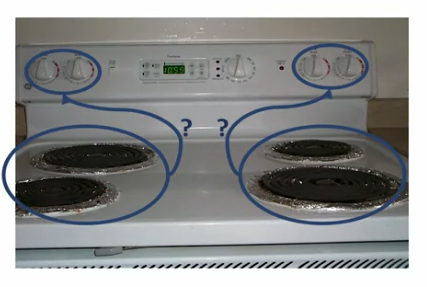
good mapping example
stove burners: clear which switches are for each burner

bad mapping example
ceiling fans: which string turns on the fan, which turns on the light?

feedback
an action that the system takes in response to a user action
-leads to CAUSAL models (if y happens after x, then x caused y)
-prime mechanism for helping people understand how the system works and build an appropriate model of the system
good feedback example
-hovering over laptop configurations highlights them
-typing numbers in phone and showing the digits entered so far (image)
-Google Now: when tapping the microphone or saying okay google, visual feedback is given with red circle having circles around it, showing Google is interpreting input and that it is listening

constraints
design features that limit the range of possible actions a user can take
-narrow down options a user has to consider, making their task easier
-physical constraints: chargers and VCR tapes can go in only one way
-there are also logical and simple constraints that you can design into a system
good constraints example
grey out or deactivate unavailable menu items (image shows Cut and Copy are unavailable since nothing is selected)

good constraints example
constraining user input (image shows Amazon dropdown menu for how much you want to buy a product, only giving sensible options)

good constraints example
Duolingo: trying to learn Spanish and translating a sentence (image), only a set of words are given at the bottom to choose for translation
-user is not yet ready to type in free text, so clues are given instead to constrain choice and having higher probability for picking right response
