Unit 2 - Question Recognition
 Call Kai
 Learn
Learn Practice Test
 Spaced Repetition
 Match
Match Flashcards
 Knowt Play
1/32

There's no tags or description
Looks like no tags are added yet.
Name | Mastery | Learn | Test | Matching | Spaced | Call with Kai | Chat |
|---|
No analytics yet
Send a link to your students to track their progress
33 Terms
What is Regression Line Answering?
Predicted value of y (response variable). There must be an x and y variable for the regression line, as actual calculations are taking place (unlike in correlation).
If I know X, what do I predict Y will be? This is done using the regression line formula. This also involves drawing a line of best fit.
Features of the Regression Line include:
Slope Formula: For every 1-unit increase in X, how much does Y change?
Correlation: The slope of the least squares regression line always has the same sign as the correlation.
Y-intercept: The y-intercept is the predicted value of Y when X = 0.
Residuals: Looking at how far off the prediction was.
Residual = Actual value − Predicted value
r2 (the coefficient of determination) measures how much of the variation in yy is explained by the linear relationship.
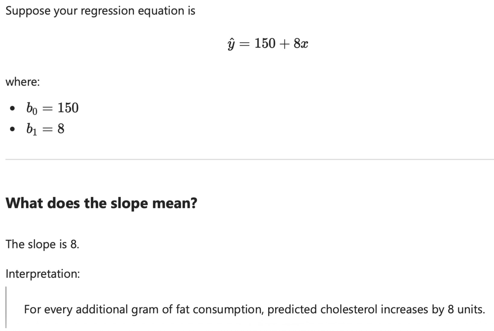
Interpret the slope of the least squares regression line
This is asking for “What does the slope mean in words.” When you see this type of question think, what happens to y when x increases by 1?
Trying to understand what the line is telling us, and what is the rate of change.
Suppose the regression equation is: y^ = 150 + 2.4x. The slop of this point is 2.4.
For every 1-unit increase in x, the predicted value of y increases by the slope amount.
For every additional gram of daily fat consumption, the predicted cholesterol level increase by 2.4 units.

What proportion of the variation is accounted for?
Proportion of variation, explained variation, accounted for are all language that will be used in this type of question.
Not every point will follow the line perfectly. Some people will fall above and below the line.
This focuses on R2. Squaring the correlation variable that is provided.

Calculate the predicted cholesterol level
Predicted, estimate and expected value are all key words for this. Immediately think about plugging in the x (points on scatterplot) to the regression line equation for the different points.
Trying to understand what the prediction the line makes.
Use the regression equation found.
Plug in the different x values for the different points on the scatterplot.

Calculate the residual
Residual, prediction error. Thinking about how far off the prediction points were. Looking at if the prediction that was made was accurate.
The line predicts, however the reality (residual maybe something different). Measuring how wrong the prediction was.
Residual = Actual - Predicted or yi − y^i
yi − y^i
yi = the actual value for person i
y^i = the predicted value for person i
The predicted value from the regression line
The value will change (e.g. y2, y3, y4), and correspond with each of the different points for the different observations. The i tells you which observations (person) you are talking about. The values will change for each point.
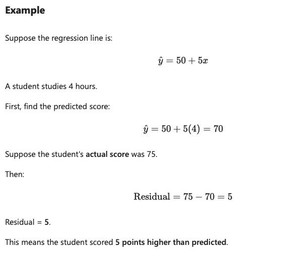
Find the Regression Line
After seeing the points on a scatterplot, ask if you Can draw one line that summarizes the trend. This is the regression line.
Can be called the Least Squares Regression Line, LSRL, and Line of Best Fit.
Think of is as Prediction = Starting Point + Rate of Change.
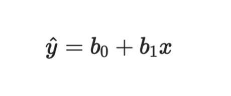
y^ = b0 + b1x
Start by finding the slope (b1 formula), then the intercept (b0 formula). Then use this y formula to find the other points.
You plug in the x-value of the explanatory (predictor) variable.
Notations for Regression Line
y^ = b0 + b1x
y^: This is the predicted value (e.g. predicted cholesterol level).
b0 (b-zero): This is the intercept. Looking at where the regression line begins.
b1 (b-one): This is the slope. How much does the predicted value change when x increases by 1. This is the number to interpret in slope questions.
x: This is the explanatory variable. x = fat consumption.
What should you consider when being asked correlation questions?
Correlation Questions
1. Is it positive or negative direction?
Positive → both variables move together.
Negative → one goes up while the other goes down.
2. How close is it to 1 or -1?
Close to ±1 → strong.
Close to -1 = strong.
Close to 0 → weak.
Positive values
r | Interpretation |
|---|---|
0.00 | No linear relationship |
0.20 | Weak positive |
0.50 | Moderate positive |
0.70 | Strong positive |
0.90 | Very strong positive |
Negative values
r | Interpretation |
|---|---|
-0.20 | Weak negative |
-0.50 | Moderate negative |
-0.70 | Strong negative |
-0.90 | Very strong negative |
Purpose of Correlation
Tells us the direction (positive or negative) and strength (anything above or below 0) of a linear relationship. Correlation measures linear relationships.
Answering if variables are related and move together. When one thing changes, does another thing tend to change too? Looking for relations and patterns.
Features include:
Correlation is unitless.
Must be quantitative data.
Negatives and positives tell us direction.
Positive pattern moving upward.
Negative pattern moving downward.
Number value tells us the strength of the values (e.g. closer to 1 or -1), indicates a strong correlation.
0 would mean no correlation.
x or y variables can go on either side and it should produce the same information.
Positive Correlation
A positive correlation means as one variable goes up, the other tends to go up too. Anything above 0 would be considered a positive (e.g. 0.20, 0.50, 0.90).
Examples:
More hours studied → higher test grades
More exercise each week → better cardiovascular fitness
More Indigenous language learning → stronger cultural connection
More time spent practicing a sport → better performance
More years of education → generally higher income
Negative Correlation
As one variable goes up, the other tends to go down. The correlation moves in opposite directions, making them negative. It does not matter which variable that you start with, as long as they move in different directions.
Any correlation coefficient less than 0 indicates a negative correlation.
Examples:
Speed and travel time: As speed increases travel time decreases.
Access to clean drinking water: As access increases water borne illnesses decrease.
More exercise: Lower resting heart rate
More sleep: Less daytime fatigue
Higher price of a product: Lower demand (often)

Strong Positive Correlation
This means there is a strong correlation, and the points stay close to a line. Anything above 0 would be considered positive (e.g. 0.20, 0.90, 0.50). The closer the value is to 1 the stronger the relationship.
Imagine a scatterplot where almost every point lines up perfectly. This would be considered very strong.
Correlation could be a strong positive (0.90) or a strong negative (-0.90).
Examples
Hours studied and exam grades
Height and arm span
Scores from two judges who agree a lot (e.g., r=0.90r=0.90)

Weak Positive Correlation
There is still a pattern, but it is messy. Scatterplot would look more distributed with dots. You can see bit of a trend by points are more spread out.
The farther a point is away from 1, the weaker the relationship is considered (e.g. 0.20, 0.30, 0.40). 0.50 would be considered moderate.
Upwards trend but many exceptions.
Correlation could be r = 0.20, or r = -0.20.
Examples:
Hours worked and happiness
Number of books owned and grades
Distance from campus and stress
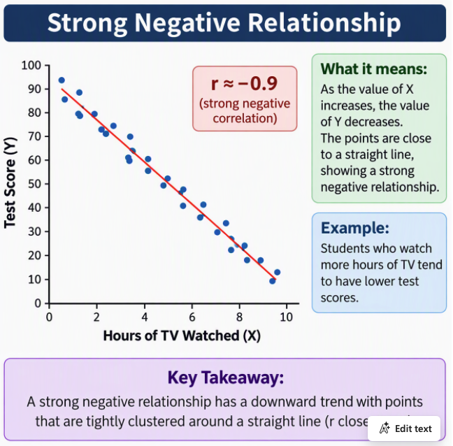
Strong Negative Correlation
The closer the correlation is to −1, the stronger the negative relationship. For example, r = −0.90 indicates a stronger negative relationship than r=−0.80.Points are close to a straight downward line.
Note: The correlation value (like r=−0.9) does not appear as a point on the graph. Instead, it describes the overall pattern of all the points together.
The points slope downward from left to right.
The points stay close to a straight line.
The correlation is close to −1 (for example, r ≈ −0.9)
Examples:
Speed and travel time for a fixed distance
Outdoor temperature and home heating use
Number of missed classes and final grade

Weak Negative Correlation
Anything under 0 is considered a negative. The farther away something is from -1, the weaker the relationship (e.g. -0.20, -0.30, -0.40). -0.50 would be considered moderate negative.
Age and number of social media accounts
Distance from a cultural centre and event attendance
Daily screen time and sleep quality
Think: Slight downward trend, but very scattered.

Calculating the slope
Take the correlation r and (multiply) it by the sy (SD) and then divide the sy by the sx.
Get you answer (e.g. b1 = −0.473061224).
Positives and negatives are important.
Negative sign means that “as something increases, something else decreases.”
For every additional hour (1 unit increase) of screen time, the predicted amount of (y) sleep decreases by about 0.473 hours (slope).
For every 1-unit increase in x, predicted y changes by the slope.

Calculator Rules
Rule #1: Don't round during your work. Early rounding creates extra error.
Rule #2: Round only the FINAL answer.
Rule #3: Round using the next digit.
Rounding decimal places:
Correlation: Use 3 decimal places.
Predictions: 2 decimal
Residuals: 2 decimal
Percentages: 2 decimal places
Mean: 2 decimal places
SD: 2 decimal places
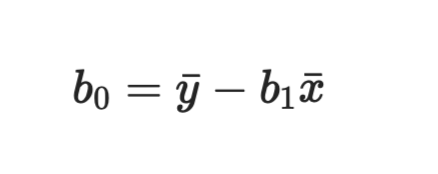
Intercept
Find the b1 first so it can be used in this formula.
Multiply the b1 by the average x bar.
Regression equation

Variation explanation

Residual: Distance between two y values.
Never a point, the distance between two y values.
Anything that falls below the LSRL will be considered a negative. Anything that falls about the LSRL would be considered a positive.


Interpretation of the slope b1

Interpreting a Scatterplot
Students
Student 1 (S1) is at (1, 82).
Student 2 (S2) is at (2, 80).
Student 3 (S3) is at (3, 77).
And so on.
The labels S1, S2, S3, ... are not normally required on a scatterplot, but I added them so you can see where each student's data point is located.
Creating the Y Axis (Effected Axis)
Look at the smallest and largest y-values in the data.
For our heart rate example:
Smallest y-value = 65
Largest y-value = 82
So your y-axis must include both 65 and 82.
Graph Meaning
The points move downward from left to right. This shows a negative relationship, because most points almost form a straight line. This means it is a very strong relationship (strong negative correlation).
3 Considerations When Viewing a Scatterplot
Direction?
Up = Positive direction
Down = Negative direction
Strength?
Tight = Strong
Spread out = Weak
Form?
Does it look like a straight line?
This is a very strong correlation (0.90, -0.90).
If yes, correlation/regression makes sense.
Interpret the slope of the least squares regression line. What does this question mean / ask for?
Explain the meaning of the slope.
What does the slope tell us in the context of the problem?
Give a practical interpretation of the slope.
Think: For every 1-unit increase in X, the predicted value of Y changes by the slope amount.
Identify X (the explanatory variable).
Identify Y (the response variable).
Find the slope b1.
Check if the slope is positive or negative.
Use the interpretation template.
Positive Slope (b1>0)
For every 1-unit increase in X, the predicted value of Y increases by b1 units.
Negative Slope (b1<0)
For every 1-unit increase in X, the predicted value of Y decreases by b1 units.
Example 1
X = Study Hours
Y = Grade
b1 = 5
Interpretation: For every additional hour studied, the predicted grade increases by 5 percentage points.
Example 2
X = Screen Time
Y = Sleep
b1=−0.473
Interpretation: For every additional hour of screen time, the predicted amount of sleep decreases by 0.473 hours.

As X goes up, does Y always go up perfectly?
As X goes up, does Y always go up perfectly?
Every pizza is on sale for 30% off.
Regular Price | Sale Price |
|---|---|
$10 | $7 |
$20 | $14 |
$30 | $21 |
$40 | $28 |
When the regular price goes up, the sale price goes up.
The sale price is always exactly 70% of the regular price.
There is no randomness.
If I know the regular price exactly, I can tell you the sale price exactly. That means the relationship is perfect. r = 1 (perfect relationship).
Retail price = X
Sale price = Y
Formula: y = 0.70x
All points fall exactly on a straight line.
Higher retail price → higher sale price.
Perfect positive relationship.
Correlation = +1
0.70 is the slope, NOT the correlation.
Correlation of 0
How closely do the dots follow a straight line?
When r = 0
There is no linear relationship.
Knowing X does not help predict Y.
The dots look scattered around with no upward or downward trend.
Simple Example
Hours of TV Watched | Shoe Size |
|---|---|
1 | 8 |
5 | 10 |
2 | 7 |
8 | 9 |
As TV hours change, shoe size doesn't consistently go up or down.
➡ Correlation is close to 0.
Visual Memory Trick
r = +1 → Perfect uphill line 📈
r = −1 → Perfect downhill line 📉
r = 0 → Random cloud of dots ☁
The correlation between the two variables is calculated to be 0.88 and the equation of the least squares regression line is calculated to be ˆy = 0.003 + 0.012x. Which of the following statements is true?
What does this mean
About 77% of the variation in blood alcohol level can be explained by its linear relationship with the number of alcoholic beverages consumed.People's blood alcohol levels are not all the same. They vary from person to person.
The regression line uses number of alcoholic beverages consumed (x) to predict blood alcohol level (y).
77% of the differences in blood alcohol levels can be explained by differences in the number of drinks consumed.
The remaining 23% is due to other factors or random variation.
Least Squared Regression Line
2 Elements
The slope of the least square regression line always has the same sign (+ or -) as the correlation.
Sign means positive or negative.
Positive association between the variables, or the negative association between the variables.
Line that minimizes that minimizes the sum of the squared deviation residuals.
What proportion of variation is explained?
r2 variation
Interpret the slope
For every 1-unit increase in x, y changes by slope units.
Interpret the correlation
Direction + strength of relationship.
Residual.
Actual minus predicted.
y − y^
For residuals, always:
Point above the regression line → Positive residual
Point below the regression line → Negative residual