History of Graphic Design Quiz 3
 Call Kai
 Learn
 Practice Test
 Spaced Repetition
 Match
 Flashcards
 Knowt Play
1/35

There's no tags or description
Looks like no tags are added yet.
36 Terms
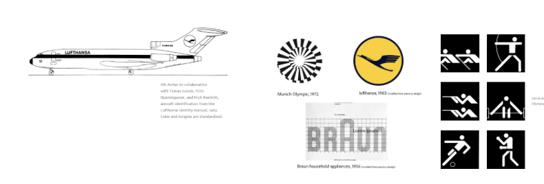
Whose work is this?
Otl Aicher
Otl Aicher
(1922-1991)
One of the founder members of the Ulm School of Design
International Typographic Style
Lufthansa Airlines
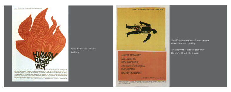
Whose work is this?
Saul Bass

Saul Bass
1936-1996
Bauhaus movement, Mid-Century Modernism, and the European avant-garde (including Cubism, Dadaism, and experimental abstract animation)
movie poster magazine covers, often a single dominant image centered in the composition, use of chunky forms which were created by cut paper with scissors, freely drawn shapes, decorative letterforms, handwriting
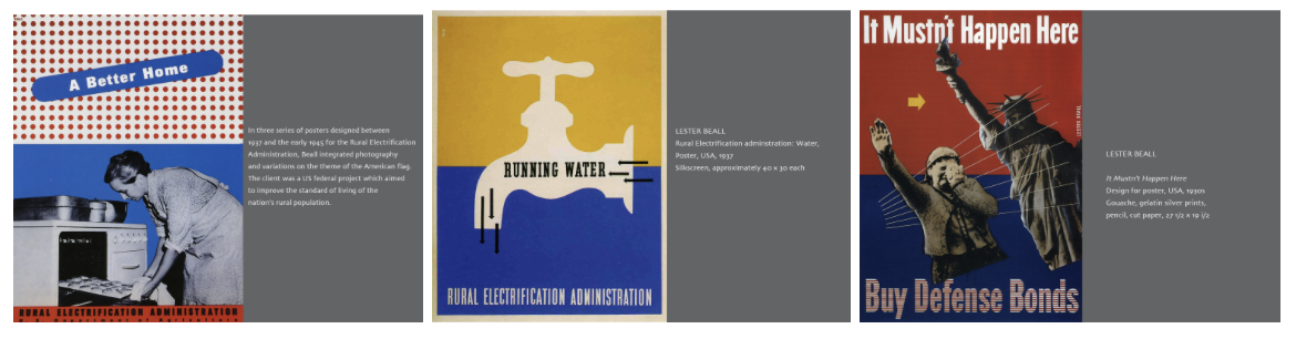
Whose work is this?
Lester Beall
Lester Beall
1927-1969
American Modernism
Primary colors, black and white photography photomontage, arrows and lines
International Paper Company

Whose work is this?
Josef Müller-Brockmann
Josef Müller-Brockmann
1914-1996
Swiss Style
Photomontage, road safety series, Germany/Switzerland, Akzidenz Grotesk font, minimal color

Whose work is this?
Paul Rand
Paul Rand
Mid 1930s-1996
European avant-garde movements such as Cubism & Constructivism
playful & childlike qualities, hidden meanings, children’s books, straight to the point, trademark design, A. Eye G.A., IBM, ABC

Whose work is this?
Anton Stankowski

Anton Stankowski
1906-1998
Zurich Concrete Artists
German graphic designer
Berlin layout
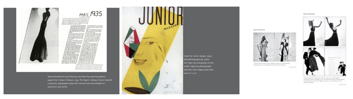
Whose work is this?
Alexey Brodovitch
Alexey Brodovitch
1920 - 1970
Editorial design, modernist photography, modernism, constructivism & suprematism, surrealism
Art deco influenced
Passion for negative space, contrast, unusual cropping, enlarging, and juxtaposition of images,

Whose work is this?
William Golden
William Golden
CBS Logo
Husband of Cipe Pineles

Whose work is this?
Cipe Pineles
Cipe Pineles
1910-1991
Vogue, Seventeen, Charm, Glamour
text as backdrop, photography with a lot of positive space

Whose work is this?
Max Bill
Max Bill
Zurich, Swiss, Ulm School of Design, Bauhaus
embraced the concepts of concrete art
Lines, planes, colors, space, mathematical, single-case type, paragraphs

Whose work is this?
Adrian Frutiger

Adrian Frutiger
Type designer
Univers font

Whose work is this?
Herb Lubalin
Herb Lubalin
alphabets as visual forms, combining text and image, use of old, heavy serif, wood looking type, elements used as not only type, but considered an image as well, traditional typefaces

Whose work is this?
Milton Glaser

Milton Glaser
very colorful, fun, more cartoon/playful, flat shapes with black lines with adhesive color films
I ❤ NY logo

Whose work is this?
Seymour Chwast
Seymour Chwast
similar to Glaser, technique of line drawings, children-like, primitive, folk, comic book quality, flat work

Whose work is this?
Paula Scher

Paula Scher
STACKED TYPE, inspired by Bauhaus, known for public theater work, Swatch Swiss ad, record design covers

Whose work is this?
Louise Fili

Louise Fili
typographic driven, book covers, historical typefaces, handwritten writing, feminine restaurant identity design, lots of SIMPLE shapes and forms
Visual Semiotics
Advancing the Bauhaus ideas of universal shapes and color, Max Bill included a study of semiotics (theory of signs and symbols) in the 50s. Semiotics has three branches:
Semantics, the study of the meaning behind signs
Syntactic, the study of the visual structures behind sign
Pragmatics, the study of the relation of signs and symbols to their users, where the action triggers
Other notes:
visual information (how we interpret it)
what’s the meaning, study of the meaning
STUDY OF FORM
Swiss Design (origin & styles)
During the 1950s, the design style emerged from Switzerland and Germany that has been called Swiss design or, the International Typographic Style. Everyone interpreted type the same way in international style. No meaning behind it. There was only feeling through punctuation. Very straightforward. Other characteristics were asymmetrical organization, "mathematically" constructed grid, objective photography, clear and factual information, sans serif typography, flush-left and ragged-right, geometric shapes.
The decline of the magazine culture and its historical significances
Late 60s, 20 years of golden period of magazine declined due to inflation, increasing postal rates, and printing costs.
Television was replacing magazines as entertainment.
News media also shifted from magazine to TV
Advertising shifted from magazine ads to TV commercials
Due to Vietnam War, environmental problems, women and minority rights, the public demanded a higher information content.
Magazine sizes were shrunk. Many magazine sizes shrunk from 10x13" or 11x14" to 8.5x11".
Current development: magazines continue to shrink because they don't make profit. Digital publishing replaced a part of the market; there's a lot other online sources for free entertainment.
Historical significance: magazines provide pictures of a culture at a given time, a printed record of the present, and a forecast of the future
Long Question: Explain the definition of successful graphic design given by Paul Rand. How were his design principles different from the European Modernist designers?
Paul Rand’s definition of successful graphic design is the synthesis of form and content. Design isn’t so much of creating something visually appealing, but more of communication. Also, the manipulation and management of form and content and its relationship. It’s all about effectiveness. In his video, he states, “don’t try to be original, just try to be good”. That doesn’t mean that designs shouldn’t be good or creative, but everything should have a purpose and do the job. He also stated, “creativity is a plus, not a must”. These are different from the European Modernist designers because with the modernist houses for example, they were over emphasized on functionality. The houses couldn’t be used as houses should be because people couldn’t touch anything and that caused self consciousness. Part of living is being comfortable, not dysfunctional. This is a perfect representation of something not doing the job. The houses weren’t effective because they couldn’t be used. This can also tie in with the part of the video where Paul gives his example on the gray trousers with the red thread and also aesthetics. While the red thread serves a purpose and did the job, one has a real reason and ones for decoration, the red being for decoration. Without aesthetics, no one cares how it looks. To Paul, aesthetics are finding perfect forms to fuse with the content. In this case, the gray thread would be the perfect form because it matches the gray trousers. Going back to the European Modernist designers, the things inside the houses may have fulfilled their idea of aesthetics. However in reality, they don’t work together within the house because they don’t serve a purpose other than for looks and decoration. Again, just because something looks good, that doesn't mean it is good.