Flashcards Types of graphs
 Call Kai
 Learn
Learn Practice Test
 Spaced Repetition
 Match
Match Flashcards
 Knowt Play
1/15

There's no tags or description
Looks like no tags are added yet.
Name | Mastery | Learn | Test | Matching | Spaced | Call with Kai | Chat |
|---|
No analytics yet
Send a link to your students to track their progress
16 Terms
Line graph
A graph that uses line segments to show changes that occur over time
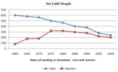
line graph example
A student heats a cup of water to 90°C and places it on a lab table. They measure and record the water temperature every 2 minutes for 20 minutes.
Bar graph
a graph that uses vertical or horizontal bars to show comparisons among two or more items

Bar graph example
How does the type of liquid (water, juice, or vinegar) affect plant growth over a two-week period?"
Scatterplot
a graphed cluster of dots, each of which represents the values of two variables

Scatterplot example
Daily RELATIONSHIP between outdoor and relative humidity and local pollen count over a 30 day period
histogram
A graph of vertical bars representing the frequency distribution of a set of data.
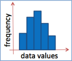
histogram example
A science class investigates how different amounts of daily sunlight affect the growth rate of bean plants. Students measure the final growth height (in centimeters) of 50 individual bean plants after 4 weeks of controlled care under varying light exposure. to create a histogram where the touching bars display the frequency distribution of plant heights.
Dual Y graph
investigates how one independent variable (on the x-axis) simultaneously affects two different dependent variables with different units or scales
dual y example
"How does light intensity (in lux) affect both the rate of photosynthesis (measured as oxygen bubbles produced per minute) and the transpiration rate (measured as water loss in mg/min) in a Elodea or bean plant over a 10-minute period?"
box and whisker plot
A graph that displays the highest and lowest quarters of data as whiskers, the middle two quarters of the data as a box, and the median
box and whisker example
A comparison of the spread and the median of dissolved oxygen levels between urban and rural river ecosystems
Standard error of means
measures how far your sample mean is likely to be from the true population mean
Error bars
on bar or line graphs, they indicate the amount of variability around a mean; often reflect standard deviations or confidence intervals, overlapping bars not significant, not overlapping, significant

How to calculate SEM
SEM=stdv/sqrtn
how to use error bars
Add sem and subtract sem to the mean