knowt ap exam guide logo

APAH - Later Europe Study Guide

Joseph Wright of Derby A Philosopher Giving a Lecture at the Orrery
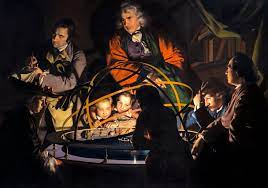
A Philosopher Giving a Lecture at the Orrery - Joseph Wright of Derby

Joseph Wright of Derby’s A Philosopher Giving a Lecture at the Orrery is a genre scene oil painting that depicts Issac Newton mentoring a group of people around an Orrery. Not only that but the painting itself exercises the idea and the movement of the Enlightenment in Colonial Americas**.** In fact, the artist Joseph Wright, used artistic techniques, chiaroscuro and tenebrism (which were mastered by Renaissance artist Caravaggio), to make the lighting dynamic around the characters in the painting. Furthermore, the light that is reflected on the character’s faces symbolizes the different phases of the moon, which exercises the Enlightenment aspect of this painting. An orrery is a device that showcases the solar system, and the light source in the middle acts as the main light source**.** Moreover, the group in this painting are called the Lunar Society, a group of intellectuals interested in science that Joseph Derby and his other friends are a part of during the Enlightenment**.**

Details (Philosopher Giving a Lecture at the Orrery):

  • (Philosopher Giving a Lecture at the Orrery)

    Group seen at the Orrery is known as the Lunar society as they discussed new scientific discoveries

  • (Philosopher Giving a Lecture at the Orrery)

    An Orrery is an early form of a planetarium (shows the progression of the earth around the sun)

  • (Philosopher Giving a Lecture at the Orrery) The lamp is blocked by character; meant to function as a sun

  • (Philosopher Giving a Lecture at the Orrery) Joseph Wright gave every character their own unique facial expression (some are fascinated, interested)

  • (Philosopher Giving a Lecture at the Orrery) The philosopher depicted could be Issac Newton (teaching how the Earth revolves around the sun and how lunar eclipses work)

  • (Philosopher Giving a Lecture at the Orrery)Each of the faces is a phase of the room

  • Orrery: a mechanical model of the solar system, or of just the sun, earth, and moon, used to represent their relative position and motions.


Jacques-Louis David The Oath of the Horatii
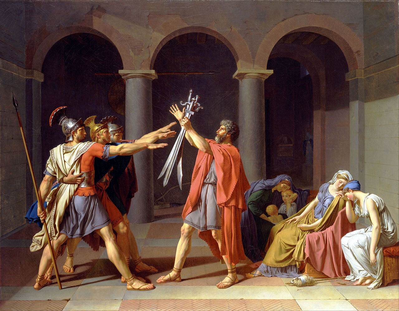
Jacques-Louis David The Oath of the Horatii

According to the Roman legend of two disputed cities of Rome and Alba Longa during the seventh-century, three brothers of the Horatii must sacrifice themselves for the good of the city of Rome. In Jacques-Louis David’s Neoclassical oil on canvas painting, Oath of the Horatii, depicts this legend in a highly intricate way by means of using an organized composure**.** In this painting, three of the brothers from the Horatii family of Rome, are picking out their swords from the head of the Horatii family, while three of the brothers’ sorrowful wives are sitting and weeping. However, one of the wives from the Curatti household, where the Horatii are against, would eventually kill her husband**.** In fact, Louis David used the artistic technique of tenebrism and chiaroscuro, and a linear-perspective background, as the head of the Horatii family grasping the swords acts as the vanishing point of the painting**.**

Details (The Oath of the Horatii):

  • (The Oath of the Horatii) exemplum virtutis; a painting that tells a moral tale for the viewer

  • (The Oath of the Horatii) The sons are part of the Horatii family (the Horatii brothers are going to attack the Curatti family

  • (The Oath of the Horatii) 2 of the woman are sisters to the brothers while the other woman is a sister-in-law, one of the women is married to a Curatti (this women will have to kill her brother)

  • (The Oath of the Horatii) Part of the Paris Salon-David submitted this work of art and he was selected making this work of art fairly popular


Jean-Antoine Houdon George Washington
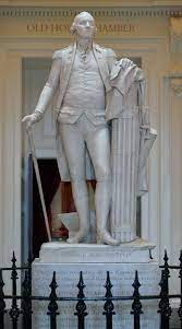
Jean-Antoine Houdon George Washington

Ignoring everything traditionally idealized like how Romans depict their leaders, George Washington, the first president of the United States, requested that his sculpture should be as relatable and natural as possible. In Jean-Antoine Houdon’s George Washington, Houdon demonstrates his Neoclassical sculpting skills**.** In fact, this artwork is a marble sculpture that utilizes Polykleitos’ canon of proportions, contrapposto, negative space, subtraction, and emphasized realism by the means of depicting George Washington with a tight vest with a missing button. Furthermore, in order to highlight Washington’s character, he is dressed as a gentleman, leaning against a barrel of thirteen fasces, resembling the original thirteen colonies**.** Another statue of George Washington was made by Horatio Greenough, who depicted him to be more god-like, while Houdon’s sculpture depicted George Washington as a relatable character as the honorable soldier and general Washington is**.**

Details (George Washington):

  • (George Washington) Washington is dressed as a 18th century gentleman

  • (George Washington) All of the military associations have been minimized

  • (George Washington) George Washington has an epaulet in his shoulder (makes his shoulder less sharp; less influences of military)

  • (George Washington) George Washington is missing a button on his vest (conveys naturalism)

  • (George Washington) Symbolism of the Fasces being made out of 13 rodes(13 colonies)

  • (George Washington) the badge of Cincinnati is on George’s shirt

  • (George Washington) Behind Washington is his plow, symbolizing his farm life

  • (George Washington) Washington leans on his fasces to show that he’s receiving support from the 13 colonies


Jean-Auguste Dominique Ingres La Grande Odalisque
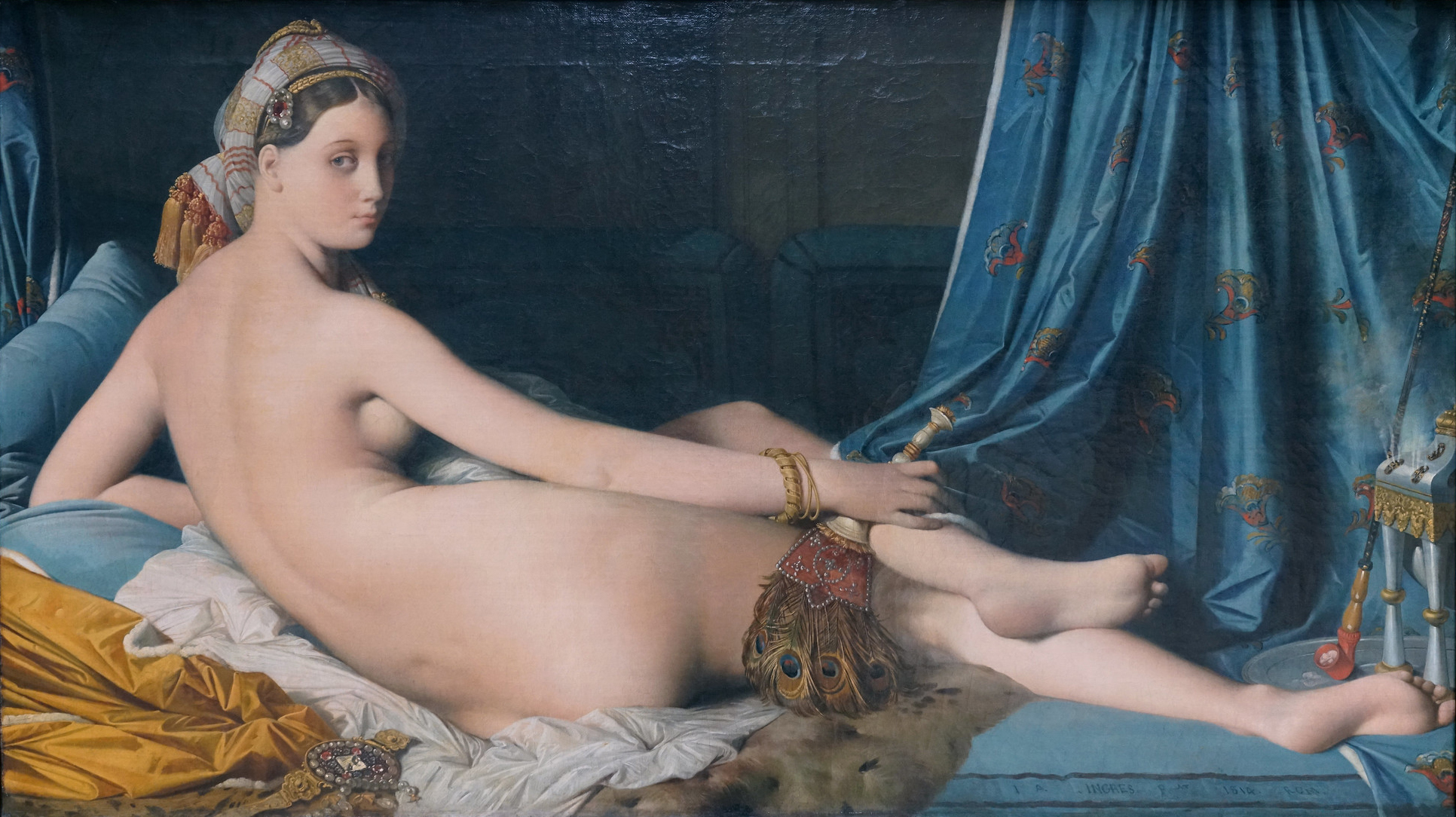
Jean-Auguste Dominique Ingres La Grande Odalisque

In order to avoid public backlash at the Paris Salon, Jean-Auguste Dominique Ingres’ La Grande Odalisque depicts a nude woman with heavy Turkish elements. La Grand Odalisque is a commissioned work for the King of Sicily, the monarch of Naples**.** Furthermore, Ingre included in his painting a nude woman with her gaze towards us wearing a turban holding an ostrich feather fan, a devan silk in the middle ground, leopard skin, and a hashish pipe, on the right corner, which were all considered to be Turkish elements. In fact, when this painting was about to be exhibited at the Paris Salon, Ingres knew that the people of France would be more accepting of having erotic paintings outside French culture**.** Moreover, Ingres demonstrated his mastery in his Mannerist style by incorporating his major influence from other masters of art like of the Italian-Mannerist artist, Jacopo Pontormo and his defining elongated anatomy, Jacques-Louis David’s composition and historical narrative style, and Raphael Sanzio’s emphasis on smaller facial features**.**

Details (La Grande Odalisque):

  • (La Grande Odalisque) the woman’s face is inspired by Raphael (facial features are more smaller, lower - Raphael style face)

  • (La Grande Odalisque) a lot of Turkish elements (ostrich fan, leopard skin, silk, opium/hashish pipe, the woman’s turban)

  • (La Grande Odalisque) perspective is not true-elongated torso due to Italian Mannerist


Eugene Delacroix Liberty Leading the People
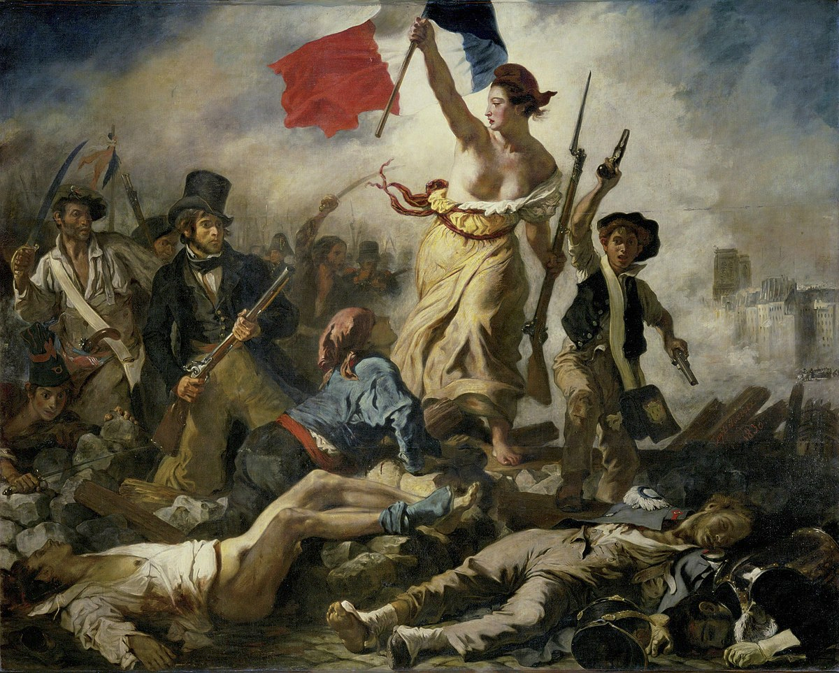
Eugene Delacroix Liberty Leading the People

During the 19th century in France, the artist Eugene Delacroix, sought to motivate the people of France to revolt against the aristocratic French monarchy through his romantic, oil on canvas painting, Liberty Leading the People in 1830**.** In the painting, the goddess of liberty, holding the tricolor flag while leading a crowd of all classes (as indicated by the middle class gentlemen with the shotgun, contrasted by the lower class man with a sword and pistol) behind her to move forward. In the foreground, the viewer is exposed more to the carcases of the aristocratic and soldiers of their kind, to demonstrate the consequences of a revolution**.** Delacroix’s quick brushstrokes, in contrast to the classical pyramidal-composition, highlights and creates the order within a scene of pure chaos. From its Hellenistic influences, like Liberty exposing her breast similarly to the Antiquity of the Greeks and Romans, the painting has been bought by the French monarchy, and then returned back to Delacroix, in fear of provoking another revolution**.**

Details (Liberty Leading the People):

  • (Liberty Leading the People) central character is Liberty with a French flag

  • (Liberty Leading the People) Liberty is stepping on a barricade and dead corpses

  • (Liberty Leading the People) pyramid-shaped composition

  • (Liberty Leading the People) (Liberty Leading the People) Delacroix uses red,white,and blue to unify the canvas(small aspects of the characters have these colors)

  • (Liberty Leading the People) (Liberty Leading the People) Liberty is wearing a phrygian cap to indicate liberation from slavery

  • (Liberty Leading the People) Liberty is leading people to freedom

  • (Liberty Leading the People) icon of France is the French flag (can be seen on top of the Notre Dame in the background)

  • (Liberty Leading the People) Allegorical artwork


Thomas Cole The Oxbow
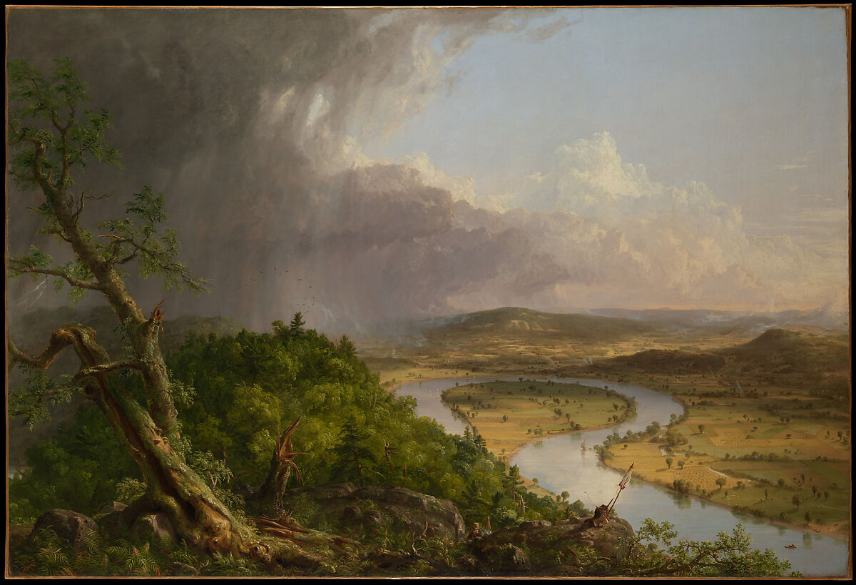
Thomas Cole The Oxbow

Although heavily looked-down upon by the British after America just gained independence, the rising of the Manifest Destiny, especially American landscape painters, expressed their strong beliefs that God has blessed them with new lands for them to inhabit and transform**.** The group of artists who showed a great interest in romanticism and landscape paintings, which included Thomas Cole, Frederick Edwin Church, Asher B. Durand, and Albert Bierstadt, formed the Hudson River  school to create romantic landscapes in the 19th century. Furthermore, especially in Thomas Cole’s The Oxbow, it depicts the Hudson River Valley, located in New York in the aftermath of a raging thunderstorm. Cole contrasted the sublime, dark, primal, and untouched forest on the left, while the romantic, bright, and classical pastoral and cultivated landscape is on the right**.** In fact, Cole can be seen within the brushes of the primal forest, painting in plein air, as he adds Christian elements, like the Hebrew writings on the cultivated hills, to demonstrate the romantic aspect of the Manifest Destiny**.**

Details (The Oxbow):

  • (The Oxbow) Thomas Cole is the founder of the Hudson River School

  • (The Oxbow) Thomas Cole referred the cultivated lands as classical (more structures); forest landscape is romantic (sublime and primal)

  • (The Oxbow) thick forest on the left, but still can see a hint of Thomas Cole painting within the brushes

  • (The Oxbow) The British published a book criticizing the Americans and the Manifest Destiny. (The British think that the Americans are ruining the lands they fought for).

  • (The Oxbow) painted for an exhibition (National Academy of the Zine)


Joseph Mallord William Turner The Slave Ship
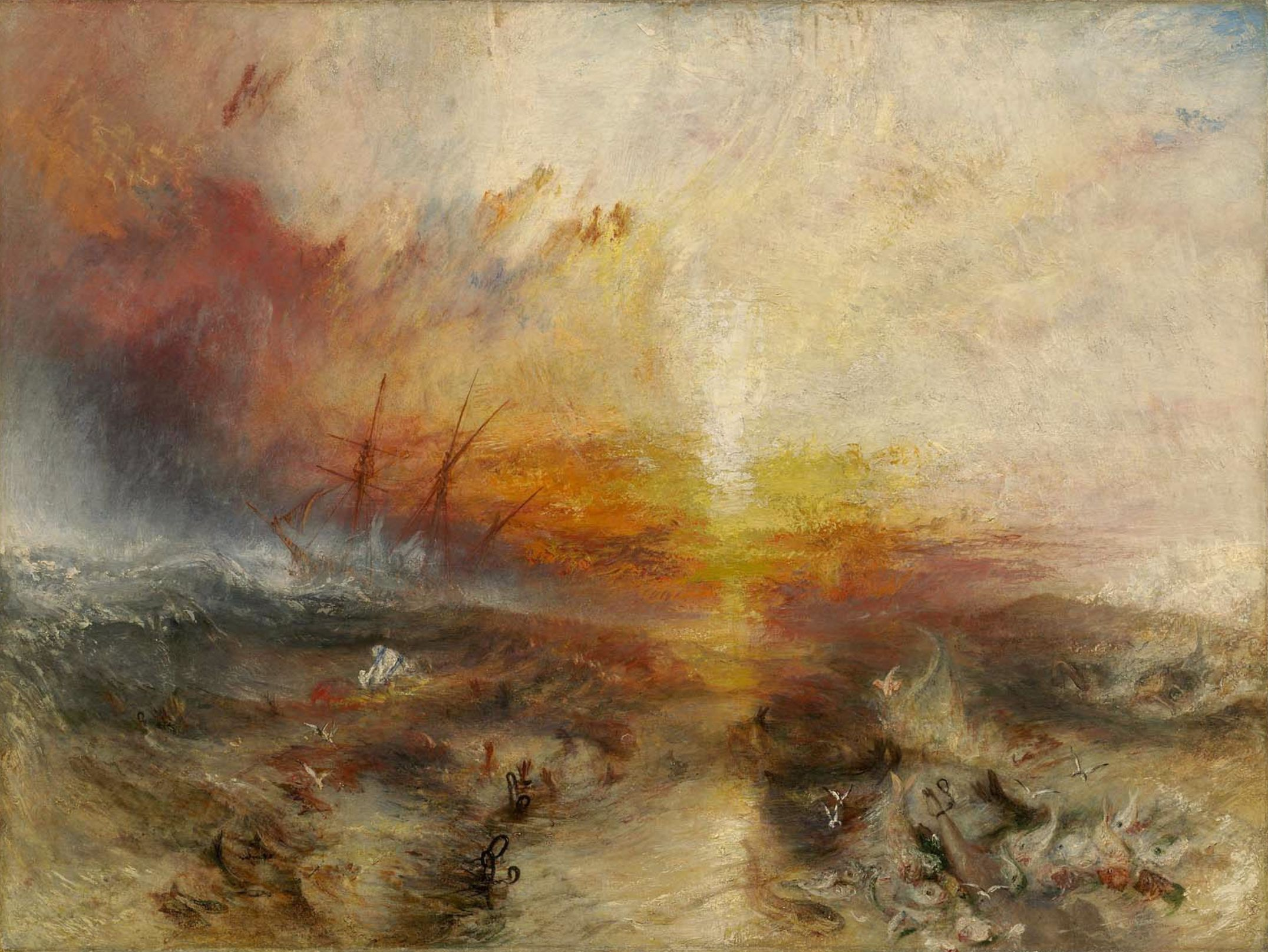
Joseph Mallord William Turner The Slave Ship

Joseph Mallord William Turner’s The Slave Ship, is a realism painting that depicts the events of the sinking of a slave ship called the Zong. Turner used artistic techniques such as quick brushstrokes, impasto, a mix of orange and red to make the iconic sunset, to make this oil on canvas painting**.** Furthermore, the story of the Zong ship follows a Slave ship captain throwing off the slaves during a typhoon, since the captain cannot get the insurance money if at least a slave dies on seas. Turner’s artwork was also featured in the Royal Academy exhibition in 1840 along with a complementary poem made by the artist**.** The violent waves of the typhoon, contrasts with the bloody sunset, tells a lot about the indifference of nature, where the same typhoon wave would also benefit the slave captain for the insurance money, while also killing the slaves lost in the sea, with shackles still stuck to them**.**

Details (The Slave Ship):

  • (The Slave Ship) Exhibited in the Royal Academy during 1840.

  • (The Slave Ship) Turner published a poem related to the book and painting (Fallacy of Hope).

  • (The Slave Ship) The story of the Zong took place in 1731; slaves were ensured that they wouldn't get any sickness.

  • (The Slave Ship) In 1833, England no longer had slaves.

  • (The Slave Ship) impasto was used as the painting technique

  • (The Slave Ship) orange and red symbolizes blood and death

  • (The Slave Ship) atmospheric perspective


Edouard Manet Olympia
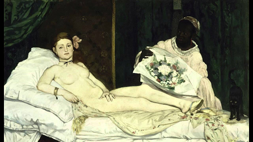
Edouard Manet Olympia

With the rising modernity of Paris, France, the gap of difference among all classes is coming to a close, as impressionist artists, especially like Edouard Monet and his sentient oil on canvas painting Olympia, would start to paint more of everyday people, rather than royalty. Furthermore, in Olympia, Monet depicted a wealthy nude woman who is a courtesan named Olympia, and heavily took inspiration from the Italian Renaissance artist, Titian and his painting Venus of Urbino, especially when it comes to the pose of Olympia as if like a goddess. Unlike mythological figures who do not have their gaze directly at the viewer, Olympia is aware and is focusing her gaze at the viewer, in contrast to her servant, appearing to look momentary while holding a bouquet of flowers from Olympia’s customer**.** Furthermore, like many other impressionist painters during this time, this painting was also highly criticized for his quick brushstrokes, which only gave an impression on what the artist was trying to visualize. However, despite Manet’s choice of subject which was heavily looked down upon, Manet’s defining characteristic in his art are his thick outlines and his love for the color black**.**

Details (Olympia):

  • (Olympia) exhibited in Paris salon 1865

  • (Olympia) caused a scandal that drew many in

  • (Olympia) received poorly by critics (especially with Manet’s quick brushstrokes and pale skin tone of Olympia)

  • (Olympia) Olympia is a cold, uninviting person, despite her occupation as a courtier

  • (Olympia) Olympia’s uninviting gaze to the viewers made the audience upset

  • (Olympia) Manet used quick and simple brush strokes (especially in the backdrop; not blended)

  • (Olympia) Manet emphasized more on creating the image, rather than focusing on smaller details


Vincent Van Gogh Starry Night
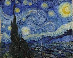
Vincent Van Gogh Starry Night

Just like the great masters of the Impressionist era, especially like how Claude Monet would study light and time through his many series of paintings like The Saint Lazare Station and the Rouen Cathedral, Vincent Van Gogh utilize his observation in Impressionist art by painting how views would look like at a certain point of day and weather, especially through his composite oil on canvas painting, the Starry Night. Like many other impressionist artists and despite getting heavily criticized by his impasto-style of painting, Van Gogh was able to finally gain his own sense of catharsis while battling bi-polar depression**.** Furthermore, Starry Night is a composite painting that Van Gogh saw from his room at a mental hospital by relying on his memory, where you can see an undulating cypress tree in the front, a small dutch village in the middle ground and the hills of the Alpilles Mountains in the background. The sky is painted with quick and small brush strokes, enabling the viewer to see the tiny strokes of the wind and stars like tiny atoms**.** Moreover, Van Gogh emphasized on using complimentary colors like shades of blues contrasting with the bright colors of orange, white and yellow of the starry sky**.**

Details (The Starry Night):

  • (The Starry Night) lots of plain visible strokes, crescent moon, mediterranean cypress tree

  • (The Starry Night) not all canvases were fully covered with paint (there are no paint on the sides)

  • (The Starry Night) strong left to right impulse across the canvas

  • (The Starry Night) Cypress tree is a tradition symbol of death

  • (The Starry Night) thick impasto style of drawing


Mary Cassatt The Coiffure
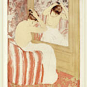
Mary Cassatt The Coiffure

Known for her use of different contrasting patterns, pastel colors, and genre scene paintings that mostly consists of a mother and child, impressionist artist Mary Cassatt is no different to Japanese woodblock prints**.** Especially in her painting, The Coiffure, which is different from her usual artworks of a mother and a child, The Coiffure depicts a woman with a towel who just came out of a bath fixing her while sitting on a holstered hair. This painting used the technique of drypoint and aquatint on laid paper**.** Cassatt’s artworks strays away from the highly stricter and grander artworks of the Neoclassical period, in which the natural genre scenes of Cassatt’s creates a more calming and relatable contrast. Not only that but, Cassat and other few well known impressionist artists like Claude Monet, Edgar Degas, and Vincent Van Gogh, are all inspired by Ukiyo-e Japanese block prints that were exhibited at the École des Beaux-Arts (School of Fine Arts) in Paris, in which these block prints depict genre scenes of geishas, sumo wrestlers, kabuki actors, and nature like cherry blossoms, rain showers, and waves of Edo, Japan**.**

Details (The Coiffure):

  • (The Coiffure) Cassatt’s world is filled with women (all of her paintings’ subjects are women; women are seen to be independent)

  • (The Coiffure) Cassatt’s women are often seen with other women or children(genre scenes)

  • (The Coiffure) Contrasts the Neoclassical period; Impressionist paintings are all natural genre scenes, unlike Neoclassical artworks that are highly historical

  • (The Coiffure) Strong Japanese influences ; woodblock print with Japanese POV (characters back)

  • (The Coiffure) part of a series of 10 other woodprints (meant to be displayed together)

  • (The Coiffure) Contrast in shapes

  • (The Coiffure) Cassatt emphasizes pastel colors more than harsher colors


Louis Sullivan, The Carson, Pirie, Scott and Company Building
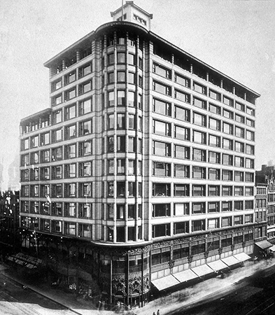
Louis Sullivan, The Carson, Pirie, Scott and Co. Building

“Form follows function,” Chicago architect Louis Sullivan, believed that buildings must also stay aesthetically pleasing, as well as still serving its purpose effectively. This is highly demonstrated in one of his most well-known works that created the basis for many modern skyscrapers today, the Carson, Pirie, Scott and Company Building**.** Furthermore, this eleven-story building is known for its steel outer-frame, and hypostyle hall, and it’s made out of concrete, terracotta, iron, and glass, in which the terracotta is a callback to how the ancient Romans built their home, like the House of Vetti. Sullivan believed that buildings should be built up instead of building out, as this building was originally commissioned since the former building burnt down**.** Sullivan also utilized the use of the hypostyle hall in the interior by implementing an expansive open space to create room for displaying retail products, while also balancing the amount of office space above. In fact, in order to attract more customers at the retail floor, Sullivan emphasized on a more classical facade by installing a complex and highly decorative three-sectioned window frame above the entrance**.**

Details (The Carson, Pirie, Scott and Co. Building):

  • (The Carson, Pirie, Scott and Co. Building) emphasis on horizontality than vertical

  • (The Carson, Pirie, Scott and Co. Building) Natural light by windows

  • (The Carson, Pirie, Scott and Co. Building) Exterior has a no supporting role; structure supported by the hypostyle hall

  • (The Carson, Pirie, Scott and Co. Building) All sorts of decoratives all over the

  • (The Carson, Pirie, Scott and Co. Building) Form follows function

  • (The Carson, Pirie, Scott and Co. Building) Incorporation of decorative elements of terracotta and iron

  • (The Carson, Pirie, Scott and Co. Building) Elevators introduced to the building


Pablo Picasso Les Demoiselles d’Avignon
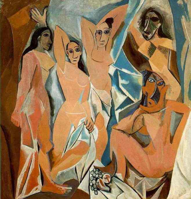
Pablo Picasso Les Demoiselles d'Avignon

Known to be the father of Cubism, Pablo Picasso challenges artistic norms by creating the artistic style of abstraction. “I paint forms as I think them, not as I see them” Picasso demonstrates his defining characteristics in art in his painting, as well as his cultural knowledge on African art influences, Les Demoiselles D'Avignon. This artwork is a supersized oil on canvas painting, which emphasized cubism and geometric elements, especially abstraction. Furthermore, it depicts three women on the left are nude while one of them has her leg abstracted, while on the right are two prostitutes wearing African masks**.** Picasso painted this artwork to relieve his desires of intercourse, battling his fears against dying from sexually transmitted diseases**.**

Details (Les Demoiselles d’Avignon):

  • (Les Demoiselles d’Avignon) Pablo is trying to relieve his sexual desires by painting this artwork (Pablo had a fear of getting STDs since these were untreatable this time)

  • (Les Demoiselles d’Avignon) first of Pablo’s cubist works

  • (Les Demoiselles d’Avignon) African Art exhibit influence

  • (Les Demoiselles d’Avignon) one of the legs of the prostitutes on the left has her leg abstracted to cubism

  • (Les Demoiselles d’Avignon) unalluring appearances, opposite of what a prostitute does

  • (Les Demoiselles d’Avignon) figures look awkward, expressionless

  • (Les Demoiselles d’Avignon) the women are grouped into twos, left side are nude, the right has African masks


Henri Matisse Goldfish
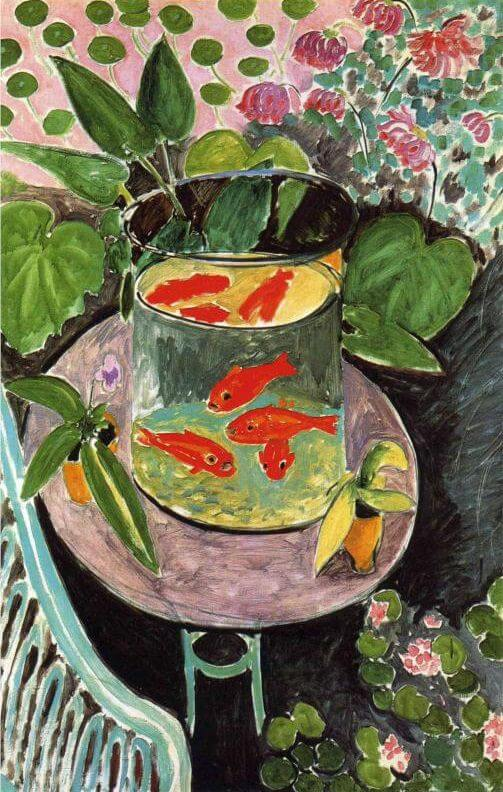
Henri Matisse Goldfish

With the rising popularity of the invention of prepared paint, Fauvist artist Henri Matisse was inspired to paint about a bowl of bright orange goldfish, when he saw an orange prepared paint. Thus, Matisse painted The Goldfish, a Fauvist oil on canvas masterpiece known for its use of unusual perspective, vibrant colors, bold brushstrokes, simplistic shapes and bits of exposed canvas. In The Goldfish, it depicts vibrant orange goldfishes in a bowl that can be viewed by the artist’s unusual perspective, in contrast to the soft pastel background of blues and greens. Furthermore, a bit of canvas can be seen, similar to Vincent Van Gogh’s Starry Night. Not only that but, The Goldfish is part of Matisse’s series of other artworks that mainly focused on his studies on interior space and perspective, as well as breaking art tradition and expressing his emotions.

Details (Goldfish):

  • (Goldfish) Violent contrasts of color

  • (Goldfish) Thinly applied colors; white of canvas shows through

  • (Goldfish) Energetic painterly brushwork

  • (Goldfish) May have been influenced by the decorative quality of Asian art

  • (Goldfish) Broad patches of color anticipate Color-Field painting later in century


Vasily Kandinsky Improvisation 28 (second version)
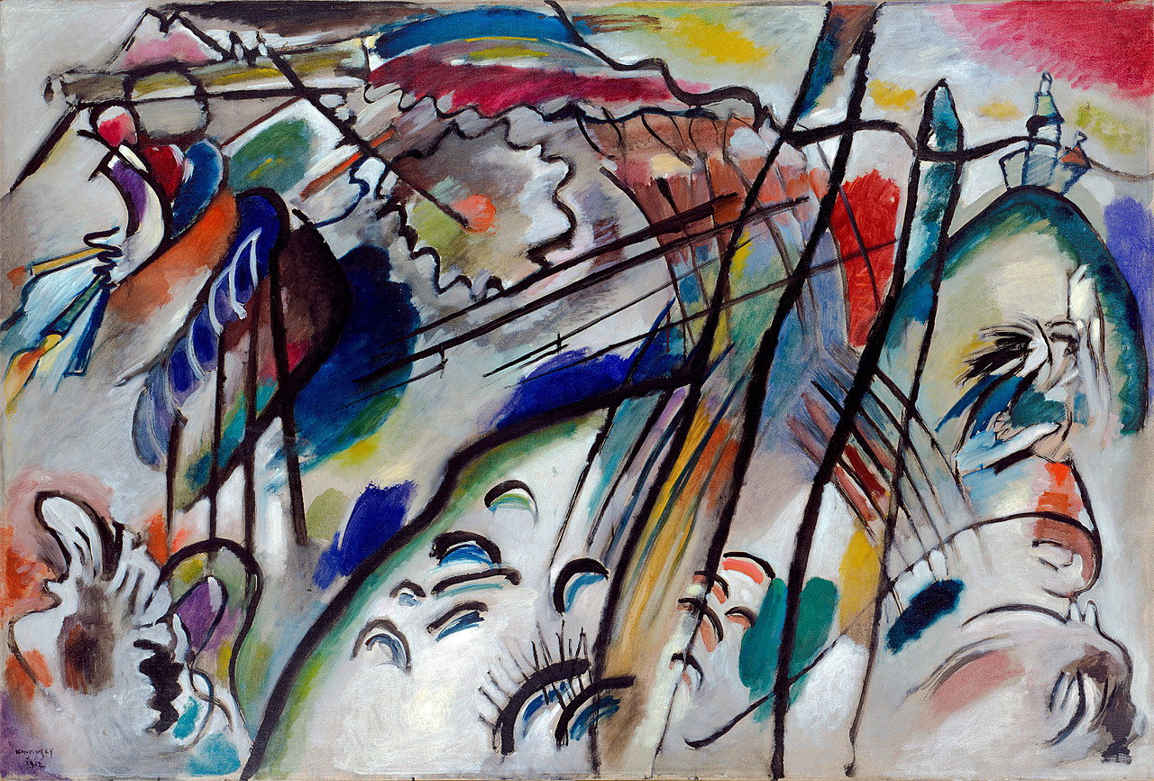
Vasily Kandinsky Improvisation 28 (second version)

Improvisation is the act of creating and performing music spontaneously without prior planning or preparation. Russian abstract painter, Wassily Kandinsky, wanted to capture a visual representation of music, and believed that you could not just hear music but perceive them. Enter Improvisation 28 (second version), an abstract oil on canvas artwork that showcases spontaneous and articulated black lines, geometry, and explosions of bold reds, blues, yellows, greens, and whites dynamically moving within the canvas, like as of an actual musical improvisation taking place. Furthermore, Kandinsky lived in a period of time when Europe was becoming increasingly experimental by creating new artistic innovations. Improvisations 28 demonstrates Kandinsky’s friendship with Arnold Schoenberg, who is famously known for being a painter, theorist, and music composer while also being inspired by one another.

Details (Improvisation 28):

  • (Improvisation 28) In land of abstract expressionism

  • (Improvisation 28) title is from improvisation music genre

  • (Improvisation 28) moves from suggested rather than depicted

  • (Improvisation 28) articulated black lines

  • (Improvisation 28) colors form around black lines

  • (Improvisation 28) felt that sound and color were linked

  • (Improvisation 28) Vasily wanted the viewer to respond in the same way a listener responds to music


Ernst Kirchner Self Portrait as a Soldier
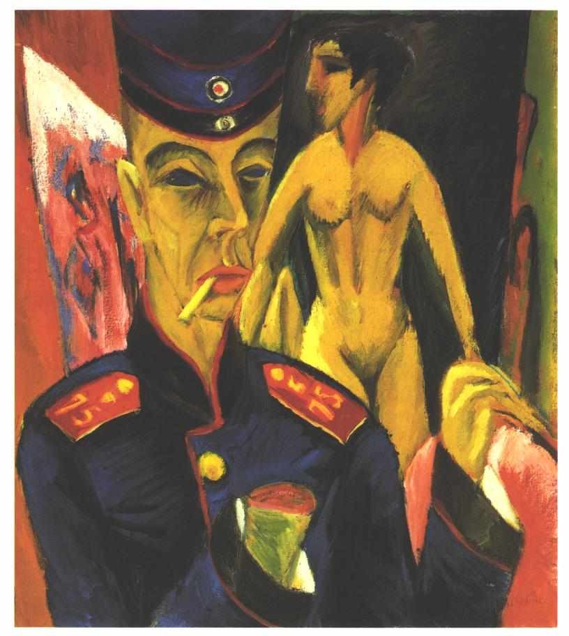
Ernst Kirchner Self Portrait as a Soldier

Ernst Kirchner was drafted as a soldier during World War I. However, as Kirschner was avoidant of battling at the frontlines, Kirschner still faced devastating psychological and physiological effects after the war, despite successfully securing a position as a driver for artillery. As a result, Self Portrait as a Soldier, an Expressionist oil on canvas painting, was created by Kirschner, in reflection and expression of grief towards his loss of creativity due to his traumatizing experience during World War I. In this artwork, it depicts Kirschner himself as a soldier with a distorted face with a blank expression, and a missing hand, symbolic of the carcasses of soldiers and his loss of creativity; a nude woman is depicted on the right, representing what Kirschner enjoyed painting before being drafted**.** Furthermore, Kirschner struggled with alcoholism and drug abuse, thus committing suicide as a result of World War I.

Details (Self Portrait as a Soldier):

  • (Self Portrait as a Soldier) Kirchner was an “unwilling volunteer’ driver in the artillery in World War I, rather than be drafted into the infantry

  • (Self Portrait as a Soldier) Declared unfit for service; lung problems and weakness; mental breakdown-scholarly debate as to whether or not he faked those to avoid service

  • (Self Portrait as a Soldier) Painted this work during a recuperation period

  • (Self Portrait as a Soldier) Drawn face; loss of right hand indicates his feelings that he has an inability to paint

  • (Self Portrait as a Soldier) Nude model represents what he used to paint, but no longer can

  • (Self Portrait as a Soldier) Nightmarish quality

  • (Self Portrait as a Soldier) Colors are non-representational, but symbolic, and chosen to provide a jarring impact

  • (Self Portrait as a Soldier) Expressive quality of horrified facial features and grim surroundings

  • (Self Portrait as a Soldier) Tilted perspective moves things closer to the picture plane

  • (Self Portrait as a Soldier) His life was plagued by drug abuse, alcoholism, and then paralysis


Kathe Kollwitz Memorial Sheet for Karl Liebknecht
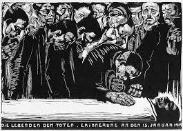
Kathe Kollwitz Memorial Sheet for Karl Liebknecht

After the assassination of communist activist Karl Liebknecht, German artist Käthe Kollwitz sought to grieve his death by the means of mass-producing prints of Memorial for Karl Liebknecht on a woodblock, making it easy to spread political statements that Kollwitz also stood for. Furthermore, this woodblock print is unique amongst Kollwitz’s other works, as this woodblock print memorializes Liebknecht without advocating for his ideology. Not only that but, Kollwitz was also influenced by Ukiyo Japanese block prints, and approached for a more darker tone of her artwork by only using black ink, making the scene dynamic and stark. The image depicts the dead body of Libenecht peacefully resting, surrounded by mourners placed on one of the three horizontal areas. As a pacifist herself, Kollwitz’ Memorial for Karl Liebknecht still remains relevant today, as this art piece demonstrates a powerful anti-war message and the consequences of political conflict.

Details (Memorial Sheet for Karl Liebknecht):

  • (Memorial Sheet for Karl Liebknecht) Themes of woman grieving and poverty

  • (Memorial Sheet for Karl Liebknecht) Karl was part of a communist group called Burnin Spartacus league; the assassination of Karl becomes a Spartacus revolt

  • (Memorial Sheet for Karl Liebknecht) No political references in this woodblock print

  • (Memorial Sheet for Karl Liebknecht) grief is the underlying theme of the woodblock print

  • (Memorial Sheet for Karl Liebknecht) Kollwitz uses black to magnify and memphis the funeral;grief


Piet Mondrian Composition with Red, Blue and Yellow
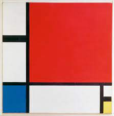
Piet Mondrian Composition with Red, Blue, and Yellow

With the rising of World War I and world events such as the Great Depression, Piet Mondrian, a De Stijl and Neoplasticism artist, created the oil on canvas painting, Composition with Red, Blue, and Yellow to bring hope during the harsh times of the early twentieth century. Furthermore, Mondrian approached a simpler asymmetrical style of painting, while also emphasizing chaos in a composition of order by utilizing horizontal and vertical black lines, in contrast to the primary colors of white, yellow, red, and blue. This painting strays away from other paintings that depict everyday genre scenes, as there isn’t really a clear subject in Composition with Red, Blue, and Yellow, as this painting mainly focuses on severe geometry. Every element in this painting is meant to be seen as separate elements, as everything in this painting is perceived as a whole**.** In fact, many art historians theorize that art also evolves along with humanity, as it is evident according to a series of journals made by Mondrian and Van Doesburg on their efforts to promote the belief that simple colors, lines, and shapes symbolized the unity of spiritual and natural forces**.**

Details (Composition with Red, Blue, and Yellow):

  • (Composition with Red, Blue, and Yellow) solid primary colors are used (red, yellow blue), black lines segregate colors

  • (Composition with Red, Blue, and Yellow) severe geometry (all right angles)

  • (Composition with Red, Blue, and Yellow) asymmetrical composition (smaller boxes in contrast to big boxes)


Varvara Stepanova Illustration from The Results of the First Five-Year Plan
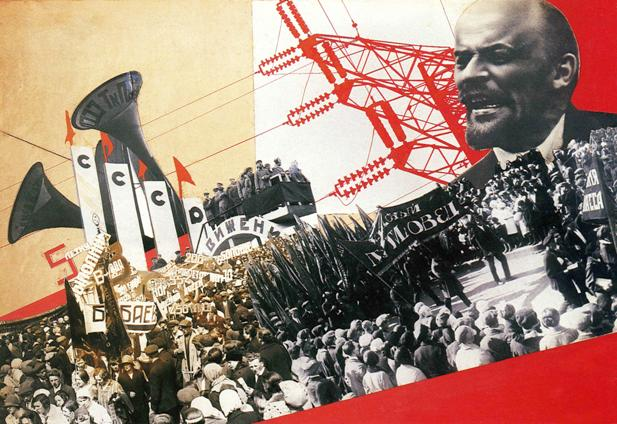
Varvara Stepanova Illustration from the Results of the Five-Year Plan

During the 1930’s Soviet Russia was undergoing a rapid increase in industrialization and modernization, as a series of government initiatives implemented by the Soviet government called the ‘Five-Year Plan’ finally took effect. Results of the First Five-Year Plan is a Soviet propaganda photomontage art piece that perfectly captures this era of history. In other words, artists in Germany and the Soviet Union started becoming more experimental with photomontage, an art medium that consists of making a collage of photos by juxtaposing or layering photographs to give the illusion of a single image. Not only that but, the First Five-Year Plan was created to celebrate the success of the Five-Year plan which was started by Joseph Stalin in 1928. Moreover, photomontages were exclusively used for promoting political propaganda and advocating for social change, as the main subjects for these photomontages would be of industrial buildings like factories and  groups of workers engaging in various activities.

Details (Illustration from the Results of the Five-Year Plan):

  • (Illustration from the Results of the Five-Year Plan) Avant Garde artwork

  • (Illustration from the Results of the Five-Year Plan) political propaganda artwork

  • (Illustration from the Results of the Five-Year Plan) effect of cubism, pieces of art cobbled together

  • (Illustration from the Results of the Five-Year Plan) Futurism

  • (Illustration from the Results of the Five-Year Plan) Lenin accomplish what he wanted to achieve

  • (Illustration from the Results of the Five-Year Plan) Double panel; a book


Frank Lloyd Wright Fallingwater

Frank Lloyd Wright Fallingwater

Famously known to be built on top of a waterfall in Bear Run, Pennsylvania, Fallingwater by Frank Lloyd Wright is a Prairie style home built during the Modernist architectural era. Fallingwater was commissioned and also built along with Kaufmann Jr. who is a student of Lloyd Wright**.** Furthermore, the home mostly consisted of rectilinear shapes with a great emphasis on horizontal lines. The cantilever hangs over the waterfalls, as the floors within the interiors of Fallingwater have an intricate and complex water pattern that reflects like a pool**.** In fact, Wright intended to build Fallingwater to be a part of the forest and waterfall, as Wright seems to be a Transcendentalist himself, and decided that Fallingwater should have windows facing the waterfall to show the changing of seasons**.**

Details (Fallingwater):

  • (Fallingwater) cantilevered porches extend over waterfall, accent on horizontal lines, architecture in harmony with site

  • (Fallingwater) living room contains glass curtain wall

  • (Fallingwater) floor of living room is made from stone

  • (Fallingwater) hearth is the center of the house

  • (Fallingwater) suppression of space devoted to hanging a painting

  • (Fallingwater) irregularity and complexity of ground plan and design

  • Prairie Style: a style of building that believes a structure should reflect and pay homage to the surrounding environment. (Huge emphasis on horizontal designs).

  • Cantilever: a long projecting beam or girder fixed at only one end, used in bridge construction.


Frida Kahlo The Two Fridas
Frida Kahlo The Two Fridas

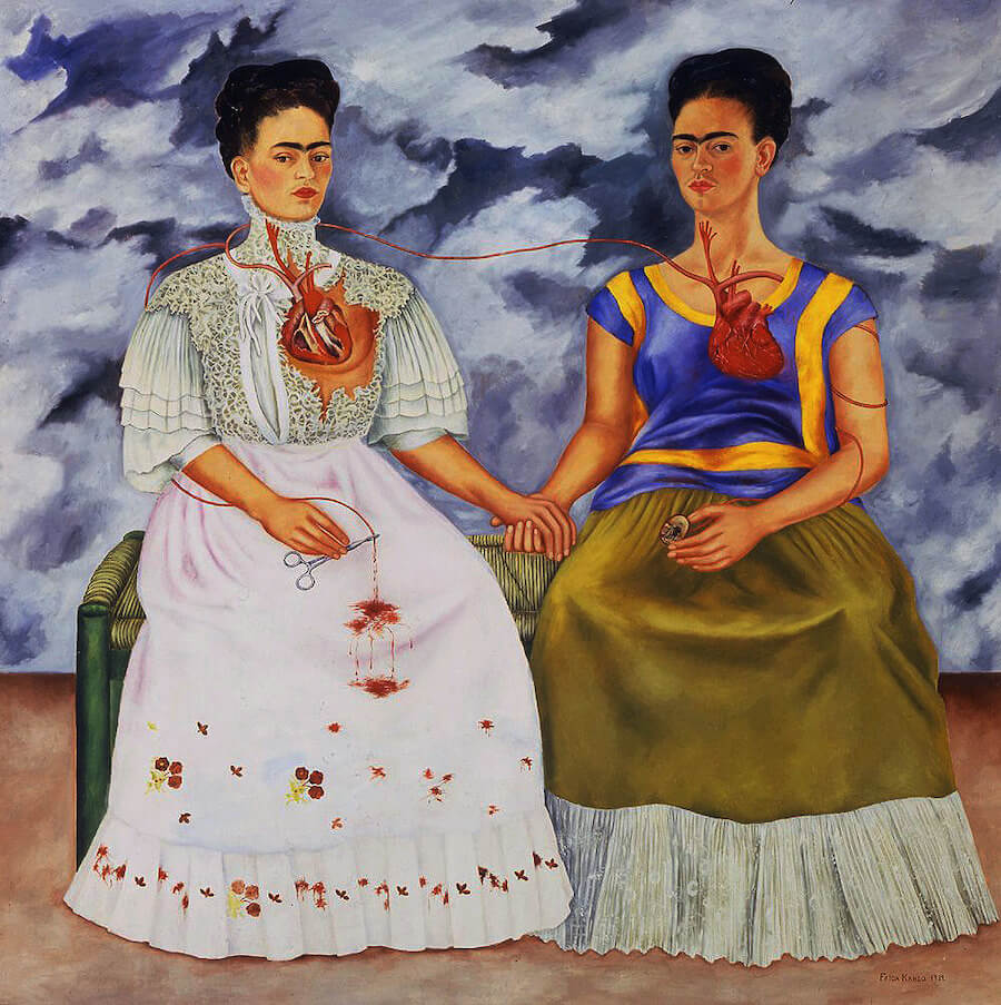
The Two Fridas by the rebellious Mexican artist Frida Kahlo, is an oil on canvas painting that reflected her contained emotions of the artist herself towards her break up with another Mexican artist, Diego Rivera. Kahlo is known for breaking social and beauty expectations during her time, as demonstrated by her wearing indigenous clothing and her iconic facial hair. In The Two Fridas, it depicts twin Kahlo, where on the left shows her in a Victorian Wedding dress, exposing her broken heart as the bloodied veins that entwine around her arm gradually connects to the Kahlo on the right. On the right side, it depicts Kahlo wearing indigenous clothing called a tuana, as her heart seems to be complete. Furthermore, Kahlo likes using blood in symbolic of union, as shown in one of her family tree portraits, and The Two Fridas**.**

Details (The Two Fridas):

  • (The Two Fridas) Right Frida represents indigenous Mexico

  • (The Two Fridas) Left Frida represents colonized europe (europe traditions)

  • (The Two Fridas) Her 2 hearts are connected by a vein; the vein on the right is terminated by the image of Diego Rivera in the locket

  • (The Two Fridas) The left vein is terminated by forceps ; representing the miscarriages shes had

  • (The Two Fridas) Art historians theorized that the veins also symbolizes umbilical cords (pregnancy, Frida had miscarriages)

  • (The Two Fridas) Barren landscape (stormy clouds, dark)


Jacob Lawrence The Migration of the Negro panel No. 49.
Jacob Lawrence The Migration of the Negro panel No. 49.

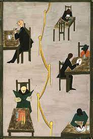
Jacob Lawrence’s Migration of the Negro is the No.49th casein on hardboard panel out of a series of a total of sixty panels that depicts the life of African Americans, and their population migrating from the rural South to the industrial North after World War I. Furthermore, despite moving away from Jim Crow laws in the South, African Americans still faced discrimination when working in the North**.** Not only that but, this panel in particular depicts a segregated diner divided by a yellow rope line, where two white men are sitting straight in tables on the left side, completely oblivious to the African Americans sitting wearily. The white men seem to have faces, while the African Americans seem to be faceless, but have a defining silhouette that expresses their personality and characteristic**.** In fact, the way Lawrence depicts this scene as if it’s theatrical, as the African Americans are depicted to be more distanced away by the use of darker, flat colors, as the whole setting seems to lose the linear perspective and gives us more of a bird’s eye view, and the whole series has a narrative style attached to it.

Details (Migration of the Negro Panel No. 49.):

  • (Migration of the Negro Panel No. 49.) painted after WWI before WWII started

  • (Migration of the Negro Panel No. 49.) Several details unify the series; flat simple shapes, the color

  • (Migration of the Negro Panel No. 49.) no individuality within every figure (all look the same)

  • (Migration of the Negro Panel No. 49.) No blending of colors


Wifredo Lam The Jungle
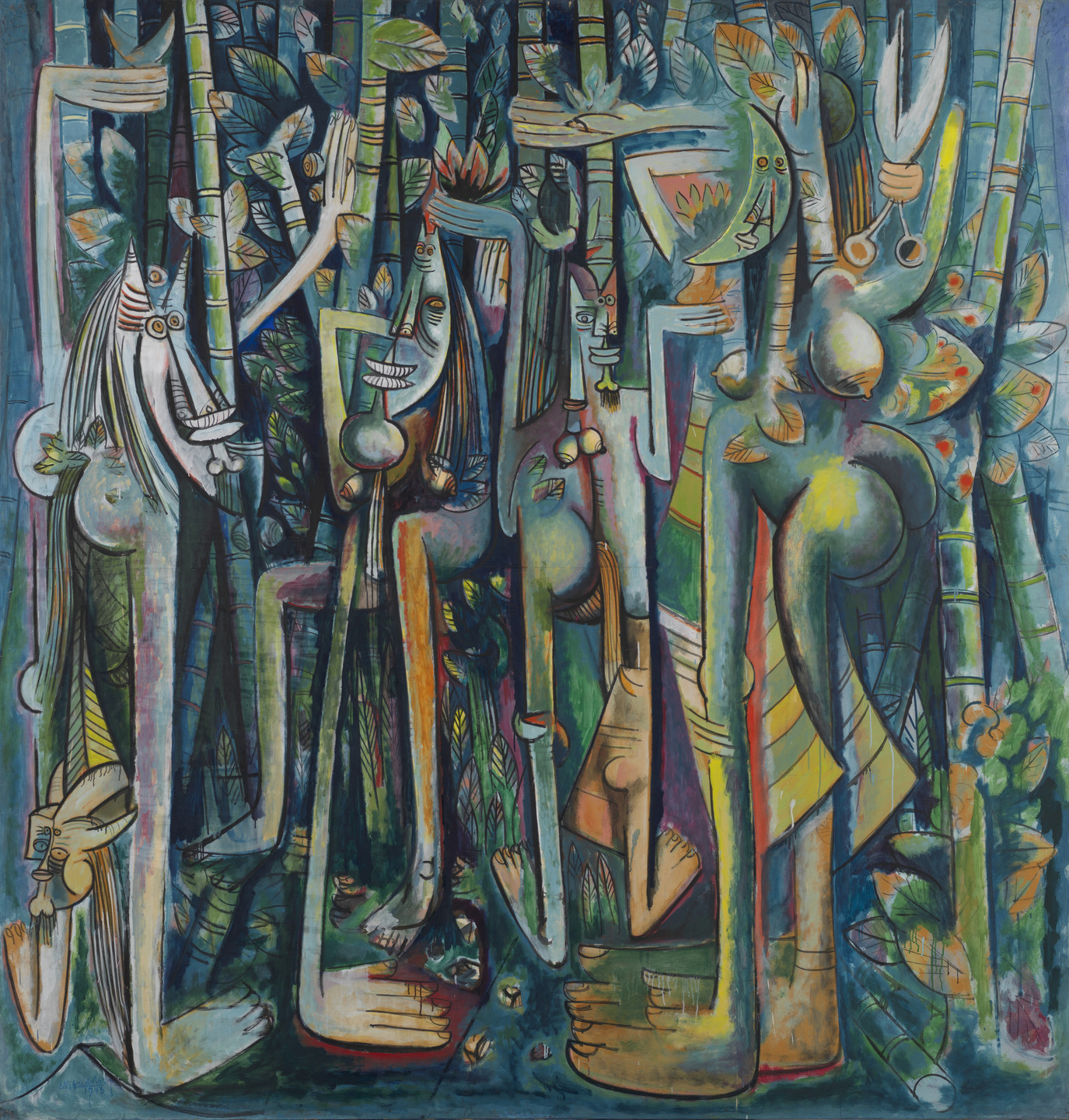
Wilfredo Lam The Jungle

Inspired by the Cubist works of Pablo Picasso, The Jungle by Wilfredo Lam, is an gouache paper on a mounted oil on canvas painting that grasps elements of Cubism, African and Hispanic culture and masks, and Surrealism. The Jungle is a reflection of Lam’s concern towards slavery and corrupt government in Cuba, as Europe was under war during the 1940s**.** Furthermore, this painting’s rounded figures seem to almost be disproportionate and indistinguishable on their placement but the setting is almost dreamlike, as the composite animal-like wearing African masks figures reside in a vibrant sugarcane jungle. In fact, this painting is actually depicting slaves in a sugarcane plantation**.** Moreover,  The Jungle is a great example of a Surrealist style painting, as Lam stated, “[...] I knew I was running the risk of not being understood either by the man in the street or by the others. But a true picture has the power to set the imagination to work, even if it takes time.” In other words, Surrealist artworks intended to create another reality that reflects the suppressed unconscious mind of what an artist is feeling, when words alone cannot fully express his or her emotions**.**

Details (The Jungle):

  • (The Jungle) Lam is interested in the combination of Hispanic and African representation in Cuba (Hispanic and African cultures)

  • (The Jungle) Strange rounded backs, butts; larger feet and arms

  • (The Jungle) Represents the slavery in Cuba

  • (The Jungle) Gives Lam’s opinion of the sugar cane field


Diego Rivera, Dream of a Sunday Afternoon in the Alameda Park
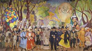
Diego Rivera, Dream of a Sunday Afternoon in the Alameda Park

The fresco, Dream of a Sunday Afternoon in the Alameda Park, was commissioned by Hotel del Prado in Mexico City. It was created by Diego Rivera, who was deeply affected by the murder of an indigenous Mexican in the park. Despite the fresco's appearance of a cheerful and lively atmosphere, there is a darker meaning beneath the surface, as the use of vibrant colors and elements like balloons creates a false sense of security that masks the underlying darkness. Within this fresco, it depicts many historical figures throughout the rich history of Mexico like Sor Juana, Emperor Maximilian and President Benito Juárez**.** One of the most overlooked aspects of this horror vacui fresco is a man being shot in the face while getting trampled over a horse**.**

Details (Dream of a Sunday Afternoon in the Alameda Park):

  • (Dream of a Sunday Afternoon in the Alameda Park) this fresco has now been moved to a museum (originally placed in a hotel)

  • (Dream of a Sunday Afternoon in the Alameda Park) 50 ft long, 13 feet high Earthquake in 1985 destroys the hotel causing them to move the painting toa museum

  • (Dream of a Sunday Afternoon in the Alameda Park) 3 distinct eras in the fresco; 1st era is the conquest of Mexico, 2nd era is the dictatorship of Porfirio , 3rd era is the revolution of 1910

  • (Dream of a Sunday Afternoon in the Alameda Park) Originally located in the lobby of the Hotel de Prado


Andy Warhol Marilyn Diptych
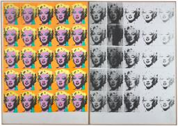
Andy Warhol Marilyn Diptych

Andy Warhol is a Pop artist known for creating one of his most iconic works, the Marilyn Diptych as dedication for Marilyn Monroe, a famous actress who would eventually commit suicide. Not only that but, Warhol is known for his vibrant, color field art utilized by using photography as well**.** Furthermore, the Marilyn Diptych uses layers of color silkscreens to create the coloring, as this artwork has two panels. On the left side, shows a vibrant, colorized photo of Monroe, derived from Warhol’s Green Marilyn photo as the basis for the artwork, while on the right side, it uses the same twenty-five colorized photo panel silkscreens, and runs it through black paint. Warhol approached for a more religious symbolism in the Marilyn Diptych, as diptychs were mostly religious panels of artwork meant for worship**.** Not only that but, like many other Abstract Expressionist artist like Jackson Pollock and his own unique style of action painting, Warhol has his own techniques and styles of his own, in which he emphasizes more on repetition and even distribution of form and color, making the eyes of the viewers restless**.**

Details (Marilyn Diptych):

  • (Marilyn Diptych) silkscreens requires working with a photo, different individual colors of silk screens are meant to be layered to color the photo

  • (Marilyn Diptych) Warhol takes the completed first 16 colored silk screen panels, then runs it under black paint to create the second panel

  • (Marilyn Diptych) left panel represents Marilyn’s life; the right represents her death/suicide (and her private life)

  • (Marilyn Diptych) faces on the left panel is more bold; more artificial colors (represents public face/life)

  • (Marilyn Diptych) Warhol decided to give Marilyn a more stronger, vibrant color (pink face, yellowish hair, heavy green eyeshadow).


Claes Oldenburg Lipstick (Ascending) on Caterpillar Tracks

Claes Oldenburg Lipstick (Ascending on Caterpillar Tracks

Created in the midst of the Vietnam War in 1969, Lipstick Ascending on Caterpillar Tracks, a large POP Art installation by the artist Claes Oldenburg, was implemented at night within Beinecke Plaza of Yale University. Students were easily amazed and quickly took a liking to the colossal art piece, as professors found it out of place and repulsive**.** In fact, this art piece is one of the first installations Oldenburg made himself, as this ginormous artprice compiles a rubber balloon within a giant gold-colored cylinder to create the lipstick part, as its mounted on a rusted metal tractor. To add on to that, all together it looks like a giant lipstick mounted on a military tank, as this seems to stereotypically resemble men and women**.** The lipstick and tank takes an even more heavy symbolic and masculine meaning relating to the Vietnam War, despite the lipstick being a feminine item, it takes on the shape of a bullet, as consumerism during this time seemed to fuel and distract everyone from the ongoing war in Vietnam**.**

Details (Lipstick (Ascending) on Caterpillar Tracks):

  • (Lipstick (Ascending) on Caterpillar Tracks) Placed in Beinecke plaza place for speeches on topics (vietnam war, and women's rights)

  • (Lipstick (Ascending) on Caterpillar Tracks) the tractor base looks like a tank; masculine and feminine elements combined together to create balance

  • (Lipstick (Ascending) on Caterpillar Tracks) inexpensive and cheap materials

  • (Lipstick (Ascending) on Caterpillar Tracks) recreated in 1974, replaced with much more stronger materials

  • (Lipstick (Ascending) on Caterpillar Tracks) first super-sized structure created by Oldenburg


Helen Frankenthaler The Bay
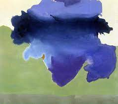
Helen Frankenthaler The Bay

With the rise of the Abstract Expressionism era through the popularity of Jackson Pollock’s techniques of action painting, artist Helen Frankenthaler was inspired to make her own unique painting technique of her own, after seeing works of Pollock’s, as demonstrated by Frankenthaler’s The Bay**.** Furthermore, The Bay is painted using acrylic paint mixed with turpentine using an empty tin coffee can with a hole through it, to create a puddle-like look on the canvas. Then, Frankenthaler would pour the paint freely on an unprimed canvas, rather than making intentional brush strokes with a brush. The Bay is considered to be a landscape painting, as the blue paint represents the ocean, and the green paint represents the land much like a bay**.** In fact, Frankenthaler, developed the technique and style called ‘color field’ through this artwork, in which this style is a subcategory of its own within the concept of Abstract Expressionism, as colors itself started to be viewed as ambiguous to viewers instead of directly representing something**.**

Details (The Bay):

  • (The Bay) Canvas is  not primed; paint directly on top of it as she thins the paint down with turpentine

  • (The Bay) Landscape painting; land mass(the bay)


Gustav Klimt The Kiss
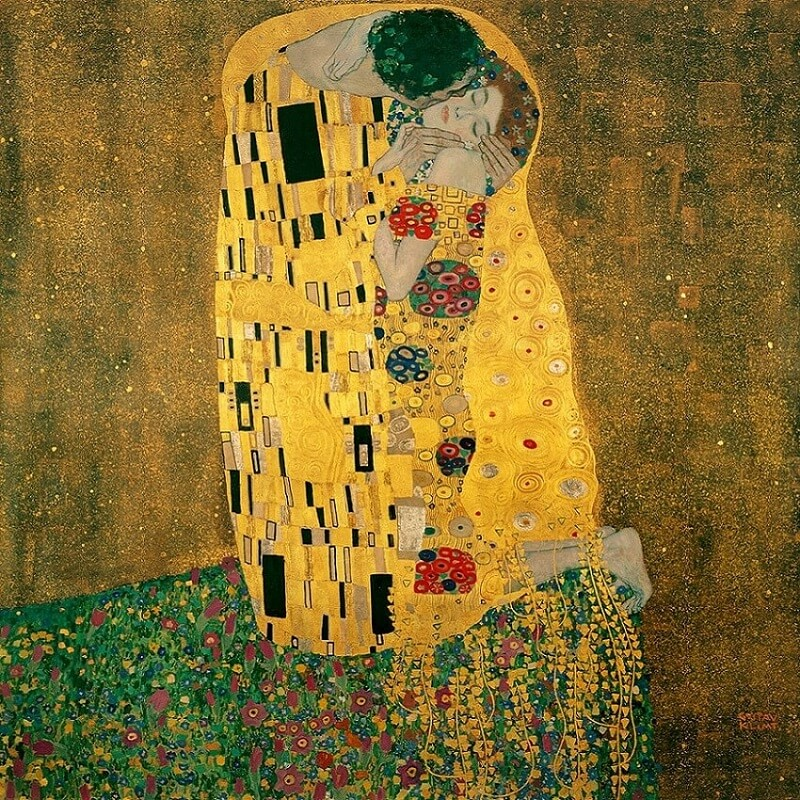
Gustav Klimt The Kiss

Gustav Kiimt’s The Kiss is an oil on canvas painting that is considered as one of the most defining artwork of the Arts Nouveau & Arts and Crafts era, especially by the use of gold leaf and the use of classical elements of Byzantium artworks by making the figures look frontal, flat and floating. As controversial as the Austrian artist himself, The Kiss was highly criticized for its erotic symbolism by the means of conveying it through geometric shapes. Furthermore, in The Kiss, it depicts a man embracing and kissing a woman, as his hands are wrapped around the lady, as they both stand on a flower bed with a gold leaf background. The man wears a cloak that consists of squares, while the woman wears a cloak of circular shapes in contrast. One of Klimt’s defining characteristics of his art would be of showing little to no human physiognomy in his human figures, as it is also strongly present in The Kiss**.** In fact, in other artworks of Klimt, he befriended a socialite named Adele Bloch-Bauer, who would later become the main subject of two of Klimt’s iconic paintings called Adele Bloch-Bauer I and Adele Bloch-Bauer II, which were eventually confiscated by the Nazis during World War II**.**

Details (The Kiss):

  • (The Kiss) Hardly any physiognomy just clock

  • (The Kiss) we can only see the garments of the figures

  • (The Kiss) the man has a rectangular motif; woman has circular motif (link to sexuality)

  • (The Kiss) flat, frontal, no sense of background, heavy use of gold (link to Byzantine mosaics and icons like Justinian and Theodora).


Paul Cezanne Mont Saint-Victoire
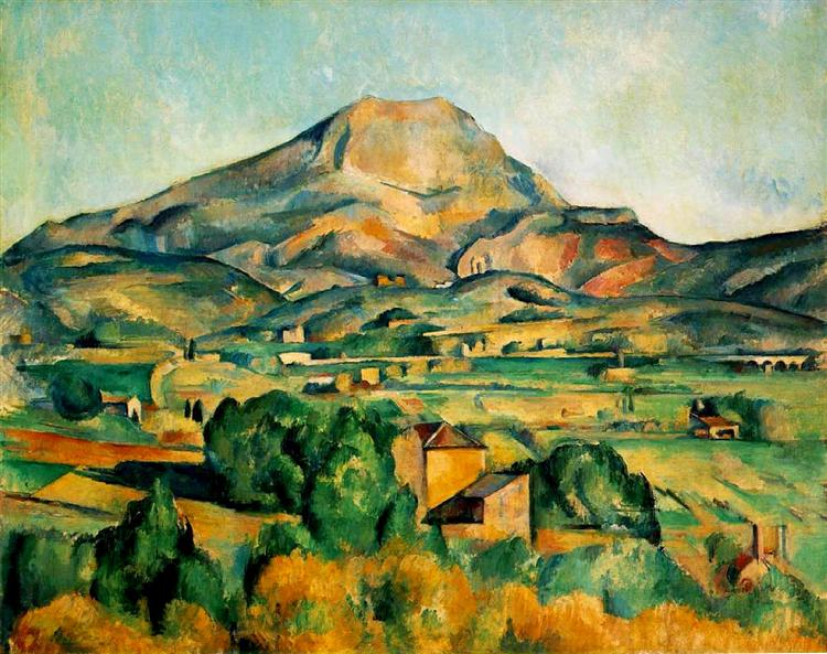
Paul Cezanne Mont Saint-Victoire

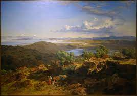
Paul Cezanne’s Mont Sainte-Victoire is a post-impressionist oil on canvas artwork that depicts a mountain, in an aerial-panoramic perspective, similar to that of José María Velasco’s The Valley of Mexico. However, Cezanne emphasized using more geometric shapes and abstraction to give us an impression of Mont Sainte-Victoire**.** Furthermore, Cezanne utilizes warm and cool colors and divides the composition into three equal horizontal sections to create  the illusion of perspective. In this painting, a tiny village and a forest can be seen in the foreground, the valley is in the middle ground, as the mountains and hills are in the background**.** In fact, Cezanne had step foot on the summits of Mont Sainte-Victoire multiple times with his friends even before he began painting in plein air, in which this mountain would be the major subject of his series of eleven paintings dedicated to Mont Sainte-Victoire**.**

Details (Mont Sainte-Victoire):

  • (Mont Sainte-Victoire) 1 of 11 canvases dedicated to mountain sainte Victoire

  • (Mont Sainte-Victoire) made in Cezanne's later years

  • (Mont Sainte-Victoire) Cezanne uses geometric contrasts using different colors on each sections

  • (Mont Sainte-Victoire) Cezanne’s POV of his view painting the mountain

  • (Mont Sainte-Victoire) usage of color to create perspective(warm colors receive into the cool colors)

  • (Mont Sainte-Victoire) scene being painted from an elevation

  • (Mont Sainte-Victoire) Cezzane invites the viewer to look at it but we are not apart of it(separation from viewer and art)


Francisco Goya Y no hai remedio (And There’s Nothing to Be Done), from The Disasters of War
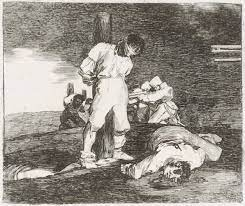
Francisco Goya Y no hai remedio

Dissatisfied with the Napoleonic occupation and invasion of the French in Spain, the exiled Royal Spanish court painter of King Charles IV, Francisco Goya showed his discontent with the politics during his time through a series of graphic and dark etchings called the Disasters of War, in which it depicts the harsh reality of war and Goya’s bitter pessimism**.** Especially in Goya’s Y no Hai Remedio etching, it depicts a blindfolded soldier on the foreground, tied up to the post ready to be executed as indicated by the barrels of shotguns by the French regiment, similarly to Jesus Christ being crucified (Alter Christus). In front of the tied up soldier, is a mangled carcass of another dead soldier, in contrast to the other soldiers in the background, also tied and blind like the soldier in the foreground**.** These series of etchings of Goya were deemed too political, and were kept away and were published not until 35 years after its creation. In fact, Goya was able to create a wide variety of dark and light shades through his own effective technique of drypoint etching**.**

Details (Y No Hai Remedio):

  • (Y No Hai Remedio) There are 80 etchings made by Goya

  • (Y No Hai Remedio) Goya has also made aquatints (colorized etchings)

  • (Y No Hai Remedio) these etchings weren’t published until 35 years after (it was deemed too political during the time the French invaded Spain)

  • (Y No Hai Remedio) theme of this series of 80 etchings are about war and politics; famine was created to weaken soldiers

  • (Y No Hai Remedio) the author Ernest Hemingway, was influenced by Goya’s work


Gustave Courbet The Stone Breakers
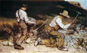
Gustave Courbet The Stone Breakers

Large and grander canvases are usually reserved for mythological, historical or important figures. However, in Gustave Courbet’s Stone Breakers, Courbet utilized painting on a supersized canvas by means of conveying his message about the reality of poverty and hardship in the world, especially in France**.** In Courbet’s Stone Breakers, it depicts an older man in tattered clothes, kneeling on a cushion of straws to support his ill knee, while mining stone for road building materials. On the other hand, his son, also in threadbare clothes, seems to be helping pick up stones with his father**.** With its isolating colossal hills and harsh lighting that resembles the permanent poverty-stricken status of the father and son in the painting, this painting was also published to the Paris Salon in 1850, which was positively-received by the empathetic audience**.**

Details (The Stone Breakers):

  • (The Stone Breakers) exhibited in the Paris Salon in 1850.

  • (The Stone Breakers) the men are breaking large stones into smaller pieces (these materials are used for making roads)

  • (The Stone Breakers) the characters are born poor, will be poor forever

  • (The Stone Breakers) large canvases are usually reserved for mythological, legendary, historical, grander or narrative paintings; the big size emphasizes it’s message

  • (The Stone Breakers) it caught the attention of Paris Salon viewers, which was received positively.


Willem de Kooning,
Woman I
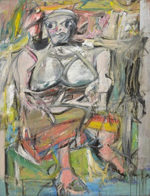
Willem de Kooning Woman I

During an era of pin-up girls and the upbringing of the artificial world of film and advertisement in the 1950’s, abstract expressionist artist Willem de Kooning, sought to uplift more women empowerment and decrease objectification through his action oil on canvas painting, Woman I. Despite it’s unusual appearance, Kooning’s iconic quick and spontaneous brushstrokes of all sizes, was able to depict a woman figure that strays away from the everyday-stereotypical pin-up girl of the 1950’s, as the woman figure seems to have a more asymmetric balance and ferocious, disproportionate eyes and breasts. Furthermore, Kooning put a lot of effort into tweaking and making changes over a timespan of eighteen months. In fact, Kooning was inspired by the Venus of Willendorf, in which the figure in Woman I seems to share some physical characteristics. Moreover, many people had debated that the Woman series by Kooning, is considered as misogynistic, while some people also argue that Kooning intended to criticize the advertisement of pin-up girls**.**

Details (Woman I):

  • (Woman I) woman figure is ferocious looking (big eyes, big disproportionate breasts); not easy to miss

  • (Woman I) Lots of gaited lines, smile cut out of a magazine

  • (Woman I) blank stare like Olympia

  • (Woman I) combination of stereotypes; artificial world of film and advertisement

  • (Woman I) 1 of six(series)

  • (Woman I) influenced from the Venus of Willendorf and 1950 pin up girls


Marcel Duchamp Fountain
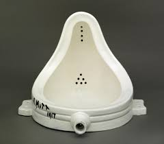
Marcel Duchamp Fountain

Marcel Duchamp is a Dadaist artist, who challenged the choice of choosing what is art, and what isn’t through his Dadaism artwork, Fountain. Fountain is a readymade work, a term coined by the artist himself. Fountain is a porcelain urinal flipped upside down. Initials of “R. Mott 1917” derive from the plumbing company called Mott, in which Duchamp himself bought the urinal from. Not only that but, Duchamp being one of the founding fathers of the American Society for Independent Artists, submitted Fountain into one of their exhibitions under the notion of this artwork being a sculpture, but was rejected from exhibition.

Details (Fountain):

  • (Fountain) The style is called readymade

  • (Fountain) Didn’t get selected for art exhibits;not accepted publically

  • (Fountain) Avant Garde art

  • (Fountain) Fighting against the isms by using a different perspective

  • (Fountain)  Uses the cartoon character Mutt from the 1920’s to sign his art

  • (Fountain) The title is a pun


George Braque The Portuguese
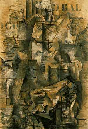
George Braque The Portuguese

The Portuguese is an Analytical Cubist oil on canvas work painted by George Braque, who was influenced by the father of Cubism, Pablo Picasso. Braque and Picasso worked together to create the style of Analytic Cubism . Furthermore, Barque intended to depict a café guitarist, while also trying to take in every aspect of the figures by fragmenting and breaking the figure into small shapes. The colors are monochromatic browns and grays, as shapes constantly shift and change forms. Not only that but, Braque further developed his Cubist medium by inventing the papier collé technique, which involves pasting imitation wood-grain paper onto his compositions. Moreover, Braque’s artstyle before developing the Cubist style with Picasso were Impressionism and Fauvism.

Details (The Portuguese):

  • (The Portuguese) Picasso and Braque work on cubism style

  • (The Portuguese) monochromatic and fragmentism

  • (The Portuguese) objects broken down into smaller pieces

  • (The Portuguese) letters in the posters in the back is the only realism in the art.

  • (The Portuguese) Idea of monochromatism; shapes constantly shifting


Constantin Brancusi The Kiss
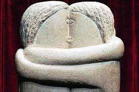
Constantin Brancusi The Kiss

Similar to of a Prehistoric artwork like the Anthropomorphic Stele of the Arabian Peninsula, Proto-Cubism artist of the 20th Century, Constantin Brancusi, returned to practicing sculpting a more simpler and a more traditional stone artwork, to relieve his exhaustion of mastering metal sculptures. This is demonstrated by his artwork, The Kiss. Furthermore, The Kiss is a series of limestone block-like sculptures that depicts 2 figures kissing with stylized hair, but merged together as indicated by the cyclops-like eye. This sculpture emphasizes the use of geometric shapes, abstraction, and low-relief, as it creates a simple balance between sculpture and natural material. In fact, as art is becoming more modernized and popular in Paris, France, the center of the art world, Brancusi is known to be quite the rulebreaker, as he sought to reintroduce more primitive and traditional art back to modern day art.

Details (Brancusi - The Kiss):

  • (Brancusi - The Kiss) demonstration of abstraction (similar to prehistoric art)

  • (Brancusi - The Kiss) highly stylized

  • (Brancusi - The Kiss) the eyes of the figures merge into one; makes it look like it’s one eye like a cyclops

  • (Brancusi - The Kiss) Brancusi moved on to metal sculptures later on but changed his style (he started off with stone).

  • (Brancusi - The Kiss) Mont Parnas is the cemetery that one of The Kiss sculptures were placed as a grave marker for a suicide victim.

  • (Brancusi - The Kiss) possibly more than 6 sculptures in The Kiss series


Mies Van Der Rohe
Seagram Building
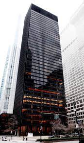
Mies Van Der Rohe Seagram Building

Commissioned as the Seagram company’s main headquarters, Modernist architect Mies Van Der Rohe, was able to create the standards for all skyscrapers that followed during the post World War II era. Furthermore, Van Der Rohe believed in his philosophy of “less is more,” as the Seagram building of Manhattan, New York, takes the form and style of a minimalist business building. In fact, the Seagram building is made out of steel, steel columns on the first floor, and an outer frame solely for decoration purposes. The Seagram building has thirty-eight floors, and has a courtyard to appear inviting to employees and visitors alike. Moreover, Van Der Rohe was heavily inspired by Greek architecture, where in this case, Van Der Rohe made the entire building stand on a platform similar to a stylobate, the use of a courtyard and a fountain, and steel columns that has decorative vertical lines, similar to of a greek column.

Details (Seagram Building):

  • (Seagram Building) international as well as minimalist style influenced by kate Mondrian “minimalist style”

  • (Seagram Building) set around office streets

  • (Seagram Building) plaza in front of building, has fountains

  • (Seagram Building) sets the standard for all skyscrapers that follows (post WWII era)

  • (Seagram Building) “less is more” - Mies Van Der Rohe


Le Corbusier Villa Savoye
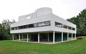
Le Corbusier Villa Savoye

Built during the midst of World War II, Villa Savoye is a commissioned house built by the architect Charles Edouard Jeanneret, who is also known as Le Corbusier. Originally a vacation home outside of Paris, France for the Savoye family, this style of architecture of this era is unique, as homes are starting to take on a more minimalist and modernist approach. Furthermore, Villa Savoye is a modernist steel and concrete building that utilizes rectilinear shapes and a plain exterior. The building also includes a second floor that is elevated, supported by the pillars below, a patio garden above on the roof, and ribbon glass windows wrap around the house. In fact,  Villa Savoye is an important work of architecture for Le Corbusier, as in his studies and essays on his beliefs on science in architecture, modern architecture should still incorporate common elements that were also found in ancient architecture, and based on newest technology such as race cars, airplanes, and factories**.**

Details (Villa Savoye):

  • (Villa Savoye) open floor plan, no interior walls

  • (Villa Savoye) vno decoration on the exterior (very plain); demonstrates cleanliness

  • (Villa Savoye) furniture is built into the wall (like one of the tables)

  • (Villa Savoye) house seems to float because of the pillars supporting the elevated floor

  • (Villa Savoye) ribbon glass technique (windows wraps around the building)

  • (Villa Savoye) commissioned by Pierre Savoye, acts as a vacation home for his family


Claude Monet The Saint-Lazare Station
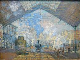
Claude Monet The Saint-Lazare Station

As Paris is modernizing its buildings and overall environment that welcomes all different classes of people, art is becoming modernized too, as artists sought to paint more of modern life than classical antiquity through impressionist paintings**.** Not only that but, a well known impressionist Claude Monet, is known for his quick brush strokes, which were highly criticized, especially on his take on painting the The Gare Saint-Lazare, a modernized train station in Paris, France. In this oil on canvas painting, thick blue smoke that is burned from the charcoal in the trains took up most of the atmosphere in the painting, as the figures and the train are reduced to nothing but simple geometric shapes, only giving the impression of what is being presented. Only little of the train station’s structure is hidden through the thick blue clouds around the train station. Furthermore, Monet would paint in plein air as his form of his main subjects: light and atmosphere, as The Gare Saint-Lazare is part of these series of study paintings.

Details (Saint-Lazare Station):

  • (Saint-Lazare Station) rejected from the Paris Salon

  • (Saint-Lazare Station) Monet had his friends host their own impressionist exhibit in Paris (impressionist exhibit of 1877)

  • (Saint-Lazare Station) One of serval images of The Saint Lazare Station

  • (Saint-Lazare Station) Monet studies the contrast of lights by repainting the same locations in different lighting time

  • (Saint-Lazare Station) One of the series of paintings that was meant to be displayed together

  • (Saint-Lazare Station) Claude studies the effect of light


Eadweard Muybridge The Horse in Motion
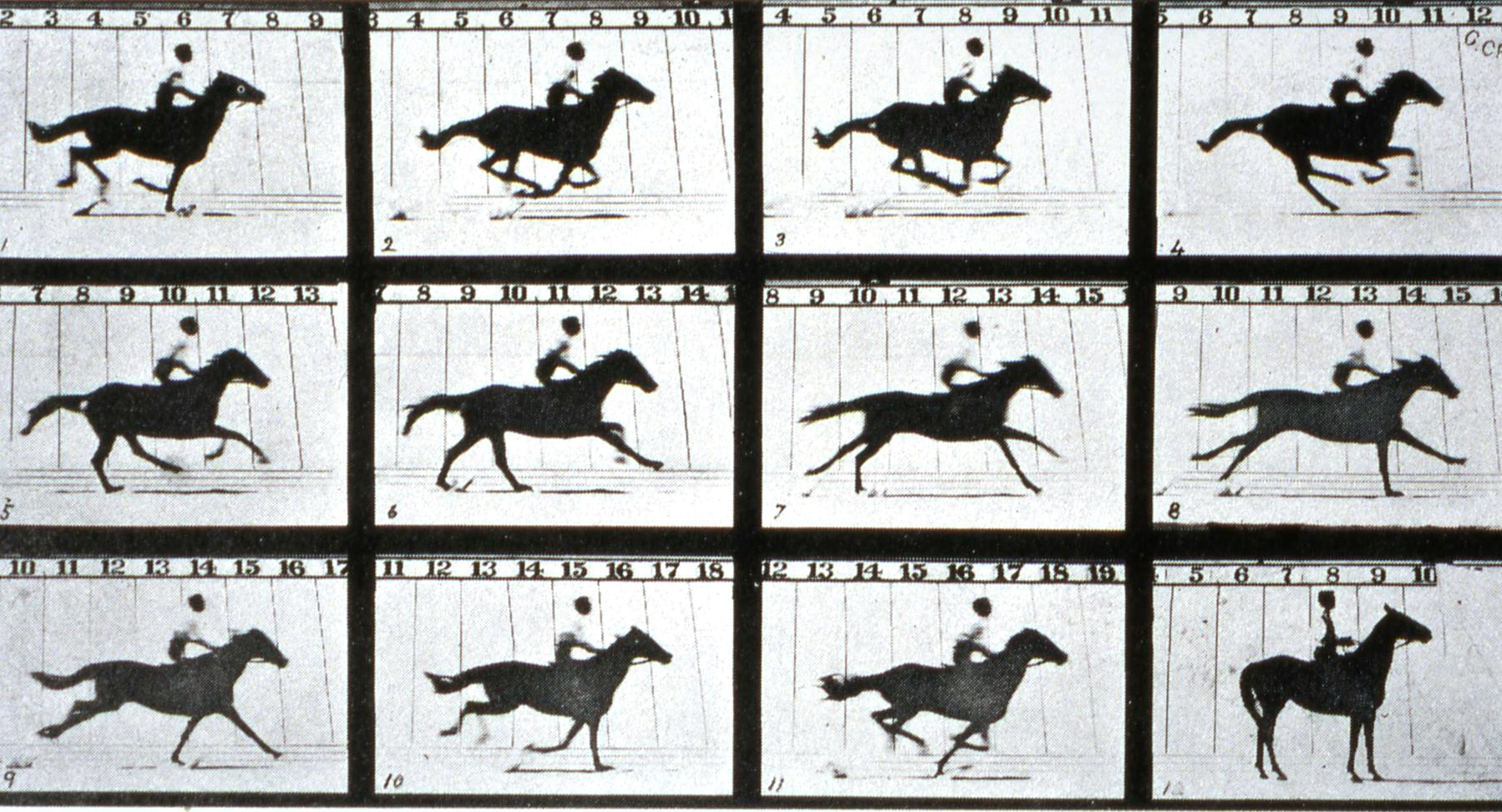
Eadweard Muybridge The Horse in Motion

Started off originally by a bet by Leland Stanford, the founder of Stanford University, believed that a horse will have all four of its hooves off the ground at the same time when running. He hired his friend, Eadweard Muybridge, to take photographs of a racehorse running. Furthermore, in order to capture at least every motion and movement of the racehorse, Muybridge evenly-placed sixteen cameras with a tripwire. As a result, this would create the invention of a zoopraxiscope, a set of moving images that creates the illusion of movement. Muybridge would then produce more similar experiments with Stanford in Stanford’s farm in Palo Alto, which took more than one attempt and years of development to perfect the invention of the zoopraxiscope.

Details (The Horse in Motion):

  • (The Horse in Motion) advancement in photography; produces a new artistic medium of motion pictures

  • (The Horse in Motion) Muybridge set up 16 evenly spaced cameras in a track in order to capture the race horse’s movements

  • (The Horse in Motion) the invention of the zoopraxiscope enabled motion pictures to be made

  • (The Horse in Motion) more people would start to take on the motion picture medium to create the movie industry

  • (The Horse in Motion) zoopraxiscope: an early device for displaying moving images and is considered an important predecessor of the movie projector.


Élisabeth Louise Vigée-Lebrun
Self Portrait
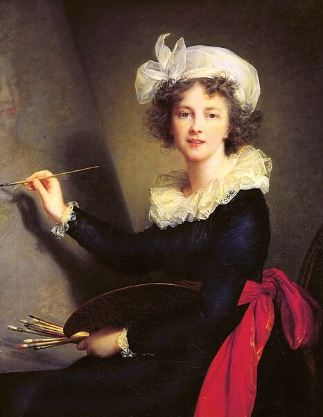
Elisabeth Louise Vigee Le-Brun Self Portrait

Elisabeth Louise Vigée Le-Brun, is one of the first few female artists of the French court during Marie Antoinette’s reign. However, it was not until the French Revolution when Marie Antoinette was executed, consequently forcing Le-Brun to flee from France and seek safety in England. Furthermore, her escape from France is evident in her self-portrait, where she seems to be directing her gaze fully at the viewer, as she is painting a self-portrait of Marie Antoinette within this portrait in her studio. In fact, Le-Brun now has to paint Marie Antonette from memory, since Antonette has been executed. Moreover, this self-portrait seems to be reflecting the mood of Le-Brun, as she is seen to be more vibrant, relaxed, and free from care.

Details (Self Portrait):

  • (Self Portrait) self portraits of Vigée Lebrun are rare

  • (Self Portrait) Slightly idealized herself

  • (Self Portrait) Vigée fully has her gaze at the viewer

  • (Self Portrait) Vigée is painting Marie Antoinette from memory, since Marie has been executed and beheaded during the time of making this painting

  • Self Portrait) the artistic style are similar Peter Paul Ruben


Thomas Jefferson Monticello

Thomas Jefferson Monticello

Famously known as one of the the authors of the Declaration of Independence and the American ambassador for the French court, during one of Thomas Jefferson’s travels overseas in Europe would spark inspiration for his Neoclassical plantation home, Monticello. In fact, Jefferson was heavily inspired by ancient classical architecture, where in Monticello, Jefferson included pediments, columns, frieze, entablature, a dome, capitals, and great sense of symmetry, which were all elements reminiscent of Palladio’s architecture. Jefferson studied the ancient architecture recorded by Vitruvius that were also studied by Palladio himself. Furthermore, Jefferson wanted to enforce a more democratic appeal to Americans, in call back to ancient Greece, contrasting the English from their more French counterparts.

Details (Monticello):

  • (Monticello) Translation of Monticello from French to English is little mountain

  • (Monticello) Monticello is Jefferson’s primary plantation home (mainly where he lived)

  • (Monticello) The floor plan is very symmetrical; mirror image

  • (Monticello) Monticello is made out of bricks, stucco, and wood

  • (Monticello) An innovation designed by Jefferson is the size of the windows;bottom and up(cold air comes from the bottom and top lets warm air in)

  • (Monticello) Monticello is actually a 2-story building (the 2nd story is hidden)

  • (Monticello) Palladio studied Vitruvian who recorded the Temple of Minerva

  • (Monticello) Link to the temple of Minerva

  • (Monticello) Jefferson built his beds into the walls (to save space)

  • (Monticello) spiral staircases are narrow to save space


Robert Smithson Spiral Jetty
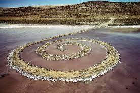
Robert Smithson Spiral Jetty

Located in the Great Salt Lake in Utah, Environmental artist Robert Smithson, created one of the first examples of earthworks art by creating the Spiral Jetty in 1970. Furthermore, this spiral is meant to be a walkable and interactive art piece, where visitors are meant to walk around the spiral to view the environment from different angles. In fact, Smithson used tractors and dump trucks to shape out the spiral shape, and used mud, precipitated salt, rocks, and basalt crystals for this art piece, as it demonstrates Smithson’s knowledge about the science behind the salt water’s reaction to the basalt crystals, as the red algae that forms around the lake; Smithson even has cultural knowledge about the fact that spirals are one of the major iconographies in Native American culture as well. Moreover, the lake reacts to its season and environment it’s in, as the water levels can vary among the seasons. Not only that but, the Spiral Jetty is a terminal basin, meaning that water would sometimes fill up the lake, but would evaporate eventually; this demonstrates an entropy motif behind this earthwork.

Details (Spiral Jetty):

  • (Spiral Jetty) coil of rock that goes into the salt lake

  • (Spiral Jetty) area is remote 2 and a half hours away from salt lake city

  • (Spiral Jetty) twists and curves change views of walkers on the jetty

  • (Spiral Jetty) uses a tractor and dump truck to create piece

  • (Spiral Jetty) a Jetty has a rectilinear space; Smithson changes it into a spiral (spirals are a part of Native American iconography)

  • (Spiral Jetty) Smithson chose this location because he liked the color of the red sea water formed by the algae


Yayoi Kusama Narcissus Garden
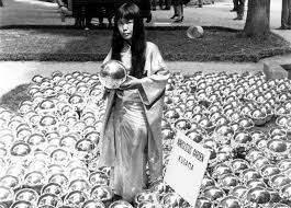
Yayoi Kusama Narcissus Garden

Narcissus Garden by Yayoi Kusama is a minimalist style installation art of 1,500 metallic spheres that were presented originally in the lawns of the Venice Biennial. Not only that but, Narcissus Garden is an example of a great commentary on commercializing art, as Kusama argued and challenged the fact that any art, no matter how simple or unique it is, can be worth more than it’s supposed to be. In fact, these spherical metal balls were sold to visitors of the Venice Biennial for two dollars, and were installed again in numerous locations around the world. Furthermore, the reflective nature of the reflective spheres is a reference to the tale of Narcissus, a Greek mythology character who fell in love with his reflection he saw in a pool of water and died there, thus growing the Narcissus flower in place; these flowers are also commonly called daffodils. This is also another form of commentary on vanity, as visitors can admire their reflection on them, or let the spheres reflect the skies of New York City alone. Furthermore, narcissism and infinity is one of the key elements that defines Kusama’s art, where similarly in one of her first installations, the Infinity Mirror Room also emphasizes on using mirrors to reflect thousands of spotted phallus-like objects on the floor, as well as yourself.

Details (Narcissus Garden):

  • (Narcissus Garden) Kusama wanted to be apart of the Venice Biennial which she was denied access in response she assembled her art outside of the convention

  • (Narcissus Garden) most of Kusama’s works are super-sized, a lot of polka dot patterns

  • (Narcissus Garden) happening art (event)

  • (Narcissus Garden) The date of the Venice Biennial is 1966; the price was 1200 liera ($2)

  • (Narcissus Garden) The narcissus Garden reflects the idea of the Narcissus myth of the man

  • (Narcissus Garden) Art is portable on land and water (in water the balls move with current reflecting land in water mass

  • (Narcissus Garden) The exhibition has been displayed on both water and dry places on the world


Edvard Munch The Scream
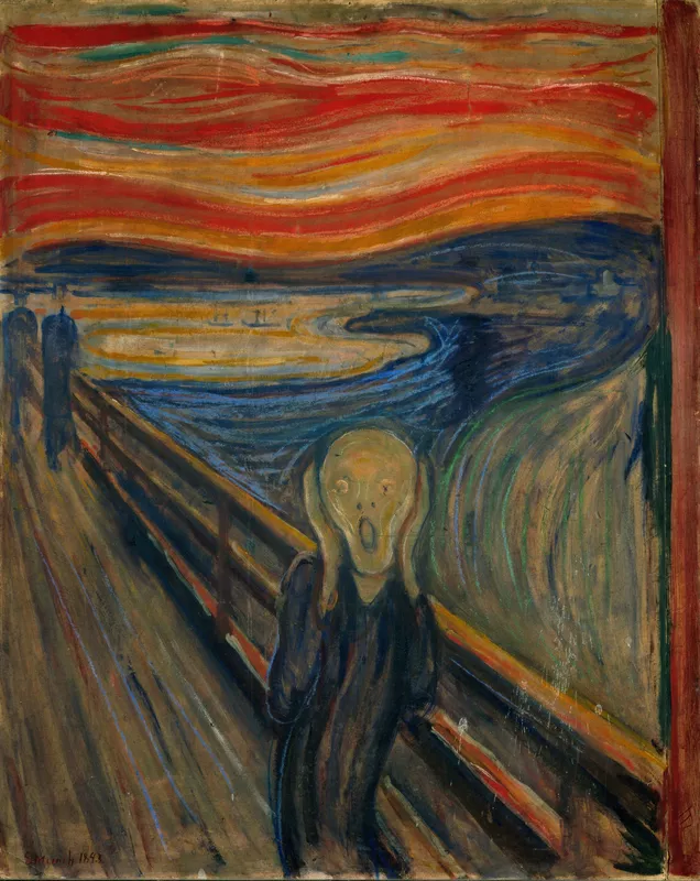
Edvard Munch The Scream

Edvard Munch’s The Scream is a tempera and chalk on cardboard painting of the Symbolism era that depicts Munch’s feelings of anxiety during his walk on a fjord at Norway, where Munch said, “...the sun was setting, and the clouds turning blood red. I sensed a scream passing through nature; it seemed to me that I heard the scream.” according to his diary entry. Not only that but, The Scream depicts an androgynous screaming figure walking on a bridge in the foreground, in which Munch modeled the figure off of a Peruvian mummy. In the background there are two faceless figures also walking on the bridge, as the bloodshot-red sky, influenced by the red skies created by the Krakatoa eruption, can be seen amongst the fjord. Although not directly meant to be perceived as an actual depiction of reality, Symbolist artists intend their work to be observed more as an account of emotions of the artist. The Scream is part of the series named The Frieze of Life created by Munch**.**

Details (The Scream):

  • (The Scream) Figure walking on a path

  • (The Scream) Munch’s brushstrokes are heavily thick and long, opposite of the usual impressionist style of painting (usually quick, fast and short)

  • (The Scream) The character screaming on the bridge has the environment around him reflecting his scream

  • (The Scream) choice of color (like the bloodshot red sky and  dark blues) reflects Munch's emotions and anxiety

  • (The Scream) One of a series from the frieze of life


Alfred Stieglitz The Steerage
Alfred Stieglitz The Steerage

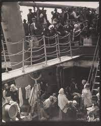
The Steerage is a photograph of immigrants on a ship, taken by modernist American-Jewish photographer Alfred Stieglitz. Stieglitz was able to capture the many lives of different economic classes aboard the ship through a unionizing color of black and white, as Stieglitz found appreciation in the composition of the photograph, just like how an artist would with a canvas. Furthermore, in The Steerage, it documents the upper class on the top level, looking down at the lower class in the bottom, all on their way back to Europe. The reality of hardship and poverty is perfectly captured in this one photograph. Moreover, Stieglitz was proud of this photograph, as he strived for photography to be more accepted as an art form during the 1900s.

Details (The Steerage):

  • (The Steerage) Stieglitz photographs as he saw it  took the shot based on the framing of the vessel (ladders, steels, and posts, and ropes)

  • (The Steerage) shows people in poverty on the lower level being looked down on by the upper class in the upper level

  • (The Steerage) The United States government is sending people back due to lack of visa

  • (The Steerage) published in magazine called camerawork 1911


Nadar Raising Photography to the Height of Art Honoré Daumier
Honore Daumier Nadar Raising Photography to the Height of Art

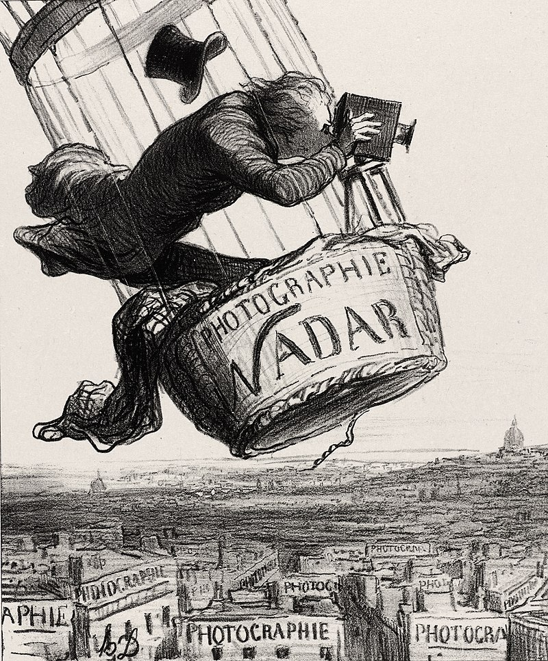
Honore Daumier’s Nadar Raising Photography to the Height of Art is a lithographic satirical cartoon published for the Le Boulevard magazine, in Paris, France. Nadar is a prominent photographer who was known for his aerial photographs of the streets in Paris, France in his hot air balloon. Furthermore, during this time, photography was not considered widely as an art form, but more as someone’s profession. The daguerreotype, a photography technique developed by Louis Daguerre, uses a polished silver plate covered in iodine, mercury vapor, placed in a copper plate holder in a camera. In fact, it was not until 1862 when the Paris court declared that photography is an art form.

Details (Nadar Raising Photography to the Height of Art):

(1858):

  • (Nadar Raising Photography to the Height of Art) Nadar started taking aerial photographs in his hot air balloon

(1862):

  • (Nadar Raising Photography to the Height of Art) The Paris court declared that photography is an art form.

  • (Nadar Raising Photography to the Height of Art) Daumer created this satire cartoon to mock Nadar

  • (Nadar Raising Photography to the Height of Art) irony is similar/associated to satire

  • (Nadar Raising Photography to the Height of Art) the satire cartoon is published to Boulevard Magazine

  • (Nadar Raising Photography to the Height of Art) Nadar’s hot air balloon was really famous (also taken to wars in Paris; earliest form of aerial or spy warfare)

  • (Nadar Raising Photography to the Height of Art) considered as an intrusive photograph (introduces intelligence photography; people unrelated might appear in the photos with no consent)


Louis-Jacques Daguerre
Still Life in Studio
Louis-Jacques Daguerre Still Life in Studio

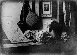
Louis Jacques Daguerre’s Still Life in Studio is a vanitas style photograph using the Daguerreotype process, which was developed by the artist in 1839. Furthermore, photography was still in its infancy, and started rising in popularity in Paris, France. In this still life photograph, Daguerre utilizes using different textures by placing a variety of items of different mediums such as the puttie cupid mold, a big wine holder, a goat / sheep skull, candle sticks, a plaster mold, curtains, and a window that acts as its main light source. The Daguerreotype process uses a mirror. silver-coated copper plate with mixture of chemicals to capture the photo. Daguerre, who is a theatrical scene painter/designer, showman and experimentalist, believes that the new art form of photography is part-art and part-science, and should be encouraged more to be viewed as an art medium.

Details (Still Life in Studio):

  • (Still Life in Studio) inspired by vanitas paintings (symbolic of the transience of life; basically everything will and decay)

  • (Still Life in Studio) Emphasizes different textures

  • (Still Life in Studio) exposes us to the new kind of art form (Still Life in Studio introduces photography)


Palace of Westminster (Houses of Parliament)
Charles Barry & Augustus Pugin

Palace of Westminster Charles Barry & Augustus Pugin

The Palace of Westminster is the government of London, based in England. Furthermore, the architectural style takes the form of an Elizabethan-gothic limestone and glass building, designed by Pugin and Barry in a competition for the palace’s new design. In fact, many of its gothic elements are heavily fanciful, and has spires, hallways and corridors 2 miles in length, a bell tower (Big Ben), the central lobby, and the Westminster Hall. The palace is made from limestone masonry and glass, and is commissioned by the Royals of England as the main body of government for the country of England. Having the Palace of Westminster take a more Gothic-Elizabethan style during the Industrial Revolution, people were able to reminisce and appreciate the past compared today.

Details (Palace of Westminster):

  • a competition for the architect design was held in 1835, after the Palace burnt down.

  • 97 architectural teams submitted plans,91 plans were gothic style while Elizabethan

  • The architectural style was inspired by the Elizabethan era. there are 1000,100 rooms in the Palace of Westminster and 100 staircases.

  • 2 miles of corridors.

  • 2 Architects working on the plan, Barry was a Classical that created that plan

  • Pugin was a gothic arithmetical that was incharge of decorations Plain exterior , but Pugin has added more permutation (uber gothic)

  • Pugin added Big Ben for the town clock tower. (Big Ben is the country block for England).

Central Lobby:

  • main entrance for the house of parliament (in the middle between the house of commons and the house of lords; reached by the central lobby)

  • 4 doors (represents a principality of England; St. George, Scotland, St. Andrew, Wales, St. David, (4th door - Ireland) St. Patrick).

  • members of parliament are from these principalities (principalities are what made up England)

Westminster Hall:

  • oldest building in Westminster

  • Pugin and Barry modeled their plan for House Parliament

  • the monarchy has to state the Union Address with the House of Commons and Parliament.


Jose Maria Velasco, The Valley of Mexico from the Hillside of the Santa Isabel**.**
Jose Maria Velasco, The Valley of Mexico from the Hillside of the Santa Isabel

Jose Mario Velasco’s The Valley of Mexico is an oil on canvas painting that depicts the Valley of Mexico, where it first exposes us to the idea of a panoramic view. In fact, The first art school in the Americas was established in Mexico city during the 18th century. In this oil painting, it demonstrates the history and beauty of Mexico, while showing interest in geology and meteorology. During this time, Mexico was still first developing their national identity as a country. In fact, Velasco has a great sense of broader view in landscapes and went for a more idealized and romanticized approach**.**  Not only that but, the location of the same name depicted in this painting, is also the famous site where Juan Diego meets the Virgin of Guadalupe (La Virgen) in 1531.

Details (The Valley of Mexico):

  • (The Valley of Mexico) Jose Maria Velasco is a landscape painter (fond of painting landscapes)

  • (The Valley of Mexico) (The Valley of Mexico) One of the first artist the introduces the viewers an idea of panorama

  • (The Valley of Mexico) Very romantic painting (not realism / idealized)

  • (The Valley of Mexico) location is at the Valley of Mexico (Tepache from the La Virgin story)

  • (The Valley of Mexico) strong sense of nationalism


Auguste Rodin,
Burghers of Calais
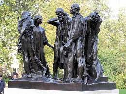
Burghers of Calais

During the Hundred Years War with the invasion of King Edward II of England in Calais, France, a deal was sent out to the people of Calais, where six of any of the city’s top leaders must surrender themselves in place for the entirety of Calais, and must wear a sack cloth, a noose and carry the keys to the city and castle. It was not until one wealthy burgher by the name of Eustache de Saint-Pierre, who was the first to volunteer amongst the upcoming five more sacrificers. However, 500 years after the Hundred Years War, the commission work of Auguste Rodin’s Burghers of Calais, was heavily criticized for its almost unheroic appearance. Burghers of Calais is a lost wax bronze sculpture, reminiscent of bronze Hellenistic Greek sculptures, as it depicts the six burghers with different kinds of emotions like defeat or anguish. Although the burghers were fortunately spared, Rodin was able to capture the devastating effects and the famine of the Hundred Years War by depicting the figures to be malnourished, as Rodin paid close attention to detail by making joints and bones almost visible.

Details (Burghers of Calais):

  • (Burghers of Calais) The six Burghers sacrificed their lives in place for the people of Calais.

  • (Burghers of Calais) The English king wanted to humiliate these Burghers by requiring them to dress in sack cloths with nooses around their necks and carry the key to the city.

  • (Burghers of Calais) sack cloth indicates that someone has done a sin.

  • (Burghers of Calais) figures are all sculpted individually and in parts (limbs are all separate parts, then welded together, similar to the Terracotta Warriors)

  • (Burghers of Calais) Eustache De Saint Pierre is the figure that is stepping towards

  • (Burghers of Calais) not originally placed on a platform, usually eye level ground. Was later placed on a platform due to how life-sized the artwork is

  • (Burghers of Calais) The people of Calais were expecting something more heroic, disappointed by this artwork.


Paul Gauguin Where Do We Come From? What Are We? Where Are We Going?
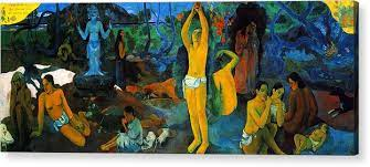
Paul Gauguin Where Do We Come From? What Are We? Where Are We Going?

Known to be arrogant but an emotional-trainwreck and a well known associate to Vincent Van Gogh, like many other post-impressionist artists, Paul Gauguin is an expert in having diverse and multicultural awareness during his travels around the world, as it is strongly demonstrated in one of his final paintings, Where Do We Come From? What Are We? Where Are We Going? Furthermore, this oil on burlap painting of vibrant colors of yellow and shades of blue is considered as a masterpiece by the artist and his friends himself**.** In fact, Gauguin created this painting as a way to ponder his philosophical contemplations about death by depicting people that resemble the phases of life in rule of thirds. To add on to that, the painting is read from right to left, as the infant who resembles youth is on the right side of the canvas, as the more elderly figures are on the left. Gauguin is very intricate when it comes to symbolism in his artworks that reflects his philosophies, as it’s only meant to be esoteric, or only understood by a small number of people; which is one of the common characteristics of the artist’s artworks.

Details (Where Do We Come From?):

  • (Where Do We Come From?) Painted during his second trip of Tahiti; learns about his daughters death causing him to try to take his own life

  • (Where Do We Come From?) Gauguin was obsessed with death and he had very poor health

  • (Where Do We Come From?) During this time he was believed  to have suicidal thoughts; this work of art was believed to be his

  • (Where Do We Come From?) the canvas is read from right to left

  • (Where Do We Come From?) a blue idol is seen in the background

  • (Where Do We Come From?) symbolic of the phases of life (on the right resembles youth, middle is middle life, life side resembles death)

  • (Where Do We Come From?) Gauguin considered this his masterpiece


Meret Oppenheim, Object (Le Déjeuner en fourrure)

Meret Oppenheim Object

“Almost anything can be covered in fur!” Pablo Picasso claimed as he commented on Dora Maar’s brass bracelet, when Maar made a joke on her cold tea by asking the waiter for “a little more fur.” Swiss Surrealist artist Meret Oppenheim, was sitting in a table in a café at Paris, France with her friends Picasso and Maar, in which in this seemingly fun conversation sparked inspiration into Oppenheim to create the most groundbreaking Surrealist work yet called Object (Le Déjeuner en Fourrure) in 1936. Object is a cup, saucer, and spoon covered with gazelle fur, almost like a callback to what Picasso has claimed about fur looking great on anything. Furthermore, Oppenheim has combined two things that are forbidden from merging together, completely disrupting the initial, functional use of a regular ceramic cup, saucer, and spoon. Furthermore, despite its unusual appearance, Object is a perfect example of Surrealist works, as Surrealism delves into the unconscious minds of artists, and objects are starting to take on a more symbolic meaning, rather than looking at its functional use**.**

Details (Object):

  • (Object) Done in response of Picasso's comment of anything being able to be covered in fur

  • (Object) 2 objects that don’t belong together

  • (Object) erotic overtones (usually cup saucers are soft objects; Oppenheim takes a hard object and covers it in fur to make it soft)

  • (Object) Meret Oppenheim became popular through Object

  • (Object) Oppenheim become famous at a young age


F<

APAH - Later Europe Study Guide

Joseph Wright of Derby A Philosopher Giving a Lecture at the Orrery

A Philosopher Giving a Lecture at the Orrery - Joseph Wright of Derby

Joseph Wright of Derby’s A Philosopher Giving a Lecture at the Orrery is a genre scene oil painting that depicts Issac Newton mentoring a group of people around an Orrery. Not only that but the painting itself exercises the idea and the movement of the Enlightenment in Colonial Americas**.** In fact, the artist Joseph Wright, used artistic techniques, chiaroscuro and tenebrism (which were mastered by Renaissance artist Caravaggio), to make the lighting dynamic around the characters in the painting. Furthermore, the light that is reflected on the character’s faces symbolizes the different phases of the moon, which exercises the Enlightenment aspect of this painting. An orrery is a device that showcases the solar system, and the light source in the middle acts as the main light source**.** Moreover, the group in this painting are called the Lunar Society, a group of intellectuals interested in science that Joseph Derby and his other friends are a part of during the Enlightenment**.**

Details (Philosopher Giving a Lecture at the Orrery):

  • (Philosopher Giving a Lecture at the Orrery)

    Group seen at the Orrery is known as the Lunar society as they discussed new scientific discoveries

  • (Philosopher Giving a Lecture at the Orrery)

    An Orrery is an early form of a planetarium (shows the progression of the earth around the sun)

  • (Philosopher Giving a Lecture at the Orrery) The lamp is blocked by character; meant to function as a sun

  • (Philosopher Giving a Lecture at the Orrery) Joseph Wright gave every character their own unique facial expression (some are fascinated, interested)

  • (Philosopher Giving a Lecture at the Orrery) The philosopher depicted could be Issac Newton (teaching how the Earth revolves around the sun and how lunar eclipses work)

  • (Philosopher Giving a Lecture at the Orrery)Each of the faces is a phase of the room

  • Orrery: a mechanical model of the solar system, or of just the sun, earth, and moon, used to represent their relative position and motions.


Jacques-Louis David The Oath of the Horatii

Jacques-Louis David The Oath of the Horatii

According to the Roman legend of two disputed cities of Rome and Alba Longa during the seventh-century, three brothers of the Horatii must sacrifice themselves for the good of the city of Rome. In Jacques-Louis David’s Neoclassical oil on canvas painting, Oath of the Horatii, depicts this legend in a highly intricate way by means of using an organized composure**.** In this painting, three of the brothers from the Horatii family of Rome, are picking out their swords from the head of the Horatii family, while three of the brothers’ sorrowful wives are sitting and weeping. However, one of the wives from the Curatti household, where the Horatii are against, would eventually kill her husband**.** In fact, Louis David used the artistic technique of tenebrism and chiaroscuro, and a linear-perspective background, as the head of the Horatii family grasping the swords acts as the vanishing point of the painting**.**

Details (The Oath of the Horatii):

  • (The Oath of the Horatii) exemplum virtutis; a painting that tells a moral tale for the viewer

  • (The Oath of the Horatii) The sons are part of the Horatii family (the Horatii brothers are going to attack the Curatti family

  • (The Oath of the Horatii) 2 of the woman are sisters to the brothers while the other woman is a sister-in-law, one of the women is married to a Curatti (this women will have to kill her brother)

  • (The Oath of the Horatii) Part of the Paris Salon-David submitted this work of art and he was selected making this work of art fairly popular


Jean-Antoine Houdon George Washington

Jean-Antoine Houdon George Washington

Ignoring everything traditionally idealized like how Romans depict their leaders, George Washington, the first president of the United States, requested that his sculpture should be as relatable and natural as possible. In Jean-Antoine Houdon’s George Washington, Houdon demonstrates his Neoclassical sculpting skills**.** In fact, this artwork is a marble sculpture that utilizes Polykleitos’ canon of proportions, contrapposto, negative space, subtraction, and emphasized realism by the means of depicting George Washington with a tight vest with a missing button. Furthermore, in order to highlight Washington’s character, he is dressed as a gentleman, leaning against a barrel of thirteen fasces, resembling the original thirteen colonies**.** Another statue of George Washington was made by Horatio Greenough, who depicted him to be more god-like, while Houdon’s sculpture depicted George Washington as a relatable character as the honorable soldier and general Washington is**.**

Details (George Washington):

  • (George Washington) Washington is dressed as a 18th century gentleman

  • (George Washington) All of the military associations have been minimized

  • (George Washington) George Washington has an epaulet in his shoulder (makes his shoulder less sharp; less influences of military)

  • (George Washington) George Washington is missing a button on his vest (conveys naturalism)

  • (George Washington) Symbolism of the Fasces being made out of 13 rodes(13 colonies)

  • (George Washington) the badge of Cincinnati is on George’s shirt

  • (George Washington) Behind Washington is his plow, symbolizing his farm life

  • (George Washington) Washington leans on his fasces to show that he’s receiving support from the 13 colonies


Jean-Auguste Dominique Ingres La Grande Odalisque

Jean-Auguste Dominique Ingres La Grande Odalisque

In order to avoid public backlash at the Paris Salon, Jean-Auguste Dominique Ingres’ La Grande Odalisque depicts a nude woman with heavy Turkish elements. La Grand Odalisque is a commissioned work for the King of Sicily, the monarch of Naples**.** Furthermore, Ingre included in his painting a nude woman with her gaze towards us wearing a turban holding an ostrich feather fan, a devan silk in the middle ground, leopard skin, and a hashish pipe, on the right corner, which were all considered to be Turkish elements. In fact, when this painting was about to be exhibited at the Paris Salon, Ingres knew that the people of France would be more accepting of having erotic paintings outside French culture**.** Moreover, Ingres demonstrated his mastery in his Mannerist style by incorporating his major influence from other masters of art like of the Italian-Mannerist artist, Jacopo Pontormo and his defining elongated anatomy, Jacques-Louis David’s composition and historical narrative style, and Raphael Sanzio’s emphasis on smaller facial features**.**

Details (La Grande Odalisque):

  • (La Grande Odalisque) the woman’s face is inspired by Raphael (facial features are more smaller, lower - Raphael style face)

  • (La Grande Odalisque) a lot of Turkish elements (ostrich fan, leopard skin, silk, opium/hashish pipe, the woman’s turban)

  • (La Grande Odalisque) perspective is not true-elongated torso due to Italian Mannerist


Eugene Delacroix Liberty Leading the People

Eugene Delacroix Liberty Leading the People

During the 19th century in France, the artist Eugene Delacroix, sought to motivate the people of France to revolt against the aristocratic French monarchy through his romantic, oil on canvas painting, Liberty Leading the People in 1830**.** In the painting, the goddess of liberty, holding the tricolor flag while leading a crowd of all classes (as indicated by the middle class gentlemen with the shotgun, contrasted by the lower class man with a sword and pistol) behind her to move forward. In the foreground, the viewer is exposed more to the carcases of the aristocratic and soldiers of their kind, to demonstrate the consequences of a revolution**.** Delacroix’s quick brushstrokes, in contrast to the classical pyramidal-composition, highlights and creates the order within a scene of pure chaos. From its Hellenistic influences, like Liberty exposing her breast similarly to the Antiquity of the Greeks and Romans, the painting has been bought by the French monarchy, and then returned back to Delacroix, in fear of provoking another revolution**.**

Details (Liberty Leading the People):

  • (Liberty Leading the People) central character is Liberty with a French flag

  • (Liberty Leading the People) Liberty is stepping on a barricade and dead corpses

  • (Liberty Leading the People) pyramid-shaped composition

  • (Liberty Leading the People) (Liberty Leading the People) Delacroix uses red,white,and blue to unify the canvas(small aspects of the characters have these colors)

  • (Liberty Leading the People) (Liberty Leading the People) Liberty is wearing a phrygian cap to indicate liberation from slavery

  • (Liberty Leading the People) Liberty is leading people to freedom

  • (Liberty Leading the People) icon of France is the French flag (can be seen on top of the Notre Dame in the background)

  • (Liberty Leading the People) Allegorical artwork


Thomas Cole The Oxbow

Thomas Cole The Oxbow

Although heavily looked-down upon by the British after America just gained independence, the rising of the Manifest Destiny, especially American landscape painters, expressed their strong beliefs that God has blessed them with new lands for them to inhabit and transform**.** The group of artists who showed a great interest in romanticism and landscape paintings, which included Thomas Cole, Frederick Edwin Church, Asher B. Durand, and Albert Bierstadt, formed the Hudson River  school to create romantic landscapes in the 19th century. Furthermore, especially in Thomas Cole’s The Oxbow, it depicts the Hudson River Valley, located in New York in the aftermath of a raging thunderstorm. Cole contrasted the sublime, dark, primal, and untouched forest on the left, while the romantic, bright, and classical pastoral and cultivated landscape is on the right**.** In fact, Cole can be seen within the brushes of the primal forest, painting in plein air, as he adds Christian elements, like the Hebrew writings on the cultivated hills, to demonstrate the romantic aspect of the Manifest Destiny**.**

Details (The Oxbow):

  • (The Oxbow) Thomas Cole is the founder of the Hudson River School

  • (The Oxbow) Thomas Cole referred the cultivated lands as classical (more structures); forest landscape is romantic (sublime and primal)

  • (The Oxbow) thick forest on the left, but still can see a hint of Thomas Cole painting within the brushes

  • (The Oxbow) The British published a book criticizing the Americans and the Manifest Destiny. (The British think that the Americans are ruining the lands they fought for).

  • (The Oxbow) painted for an exhibition (National Academy of the Zine)


Joseph Mallord William Turner The Slave Ship

Joseph Mallord William Turner The Slave Ship

Joseph Mallord William Turner’s The Slave Ship, is a realism painting that depicts the events of the sinking of a slave ship called the Zong. Turner used artistic techniques such as quick brushstrokes, impasto, a mix of orange and red to make the iconic sunset, to make this oil on canvas painting**.** Furthermore, the story of the Zong ship follows a Slave ship captain throwing off the slaves during a typhoon, since the captain cannot get the insurance money if at least a slave dies on seas. Turner’s artwork was also featured in the Royal Academy exhibition in 1840 along with a complementary poem made by the artist**.** The violent waves of the typhoon, contrasts with the bloody sunset, tells a lot about the indifference of nature, where the same typhoon wave would also benefit the slave captain for the insurance money, while also killing the slaves lost in the sea, with shackles still stuck to them**.**

Details (The Slave Ship):

  • (The Slave Ship) Exhibited in the Royal Academy during 1840.

  • (The Slave Ship) Turner published a poem related to the book and painting (Fallacy of Hope).

  • (The Slave Ship) The story of the Zong took place in 1731; slaves were ensured that they wouldn't get any sickness.

  • (The Slave Ship) In 1833, England no longer had slaves.

  • (The Slave Ship) impasto was used as the painting technique

  • (The Slave Ship) orange and red symbolizes blood and death

  • (The Slave Ship) atmospheric perspective


Edouard Manet Olympia

Edouard Manet Olympia

With the rising modernity of Paris, France, the gap of difference among all classes is coming to a close, as impressionist artists, especially like Edouard Monet and his sentient oil on canvas painting Olympia, would start to paint more of everyday people, rather than royalty. Furthermore, in Olympia, Monet depicted a wealthy nude woman who is a courtesan named Olympia, and heavily took inspiration from the Italian Renaissance artist, Titian and his painting Venus of Urbino, especially when it comes to the pose of Olympia as if like a goddess. Unlike mythological figures who do not have their gaze directly at the viewer, Olympia is aware and is focusing her gaze at the viewer, in contrast to her servant, appearing to look momentary while holding a bouquet of flowers from Olympia’s customer**.** Furthermore, like many other impressionist painters during this time, this painting was also highly criticized for his quick brushstrokes, which only gave an impression on what the artist was trying to visualize. However, despite Manet’s choice of subject which was heavily looked down upon, Manet’s defining characteristic in his art are his thick outlines and his love for the color black**.**

Details (Olympia):

  • (Olympia) exhibited in Paris salon 1865

  • (Olympia) caused a scandal that drew many in

  • (Olympia) received poorly by critics (especially with Manet’s quick brushstrokes and pale skin tone of Olympia)

  • (Olympia) Olympia is a cold, uninviting person, despite her occupation as a courtier

  • (Olympia) Olympia’s uninviting gaze to the viewers made the audience upset

  • (Olympia) Manet used quick and simple brush strokes (especially in the backdrop; not blended)

  • (Olympia) Manet emphasized more on creating the image, rather than focusing on smaller details


Vincent Van Gogh Starry Night

Vincent Van Gogh Starry Night

Just like the great masters of the Impressionist era, especially like how Claude Monet would study light and time through his many series of paintings like The Saint Lazare Station and the Rouen Cathedral, Vincent Van Gogh utilize his observation in Impressionist art by painting how views would look like at a certain point of day and weather, especially through his composite oil on canvas painting, the Starry Night. Like many other impressionist artists and despite getting heavily criticized by his impasto-style of painting, Van Gogh was able to finally gain his own sense of catharsis while battling bi-polar depression**.** Furthermore, Starry Night is a composite painting that Van Gogh saw from his room at a mental hospital by relying on his memory, where you can see an undulating cypress tree in the front, a small dutch village in the middle ground and the hills of the Alpilles Mountains in the background. The sky is painted with quick and small brush strokes, enabling the viewer to see the tiny strokes of the wind and stars like tiny atoms**.** Moreover, Van Gogh emphasized on using complimentary colors like shades of blues contrasting with the bright colors of orange, white and yellow of the starry sky**.**

Details (The Starry Night):

  • (The Starry Night) lots of plain visible strokes, crescent moon, mediterranean cypress tree

  • (The Starry Night) not all canvases were fully covered with paint (there are no paint on the sides)

  • (The Starry Night) strong left to right impulse across the canvas

  • (The Starry Night) Cypress tree is a tradition symbol of death

  • (The Starry Night) thick impasto style of drawing


Mary Cassatt The Coiffure

Mary Cassatt The Coiffure

Known for her use of different contrasting patterns, pastel colors, and genre scene paintings that mostly consists of a mother and child, impressionist artist Mary Cassatt is no different to Japanese woodblock prints**.** Especially in her painting, The Coiffure, which is different from her usual artworks of a mother and a child, The Coiffure depicts a woman with a towel who just came out of a bath fixing her while sitting on a holstered hair. This painting used the technique of drypoint and aquatint on laid paper**.** Cassatt’s artworks strays away from the highly stricter and grander artworks of the Neoclassical period, in which the natural genre scenes of Cassatt’s creates a more calming and relatable contrast. Not only that but, Cassat and other few well known impressionist artists like Claude Monet, Edgar Degas, and Vincent Van Gogh, are all inspired by Ukiyo-e Japanese block prints that were exhibited at the École des Beaux-Arts (School of Fine Arts) in Paris, in which these block prints depict genre scenes of geishas, sumo wrestlers, kabuki actors, and nature like cherry blossoms, rain showers, and waves of Edo, Japan**.**

Details (The Coiffure):

  • (The Coiffure) Cassatt’s world is filled with women (all of her paintings’ subjects are women; women are seen to be independent)

  • (The Coiffure) Cassatt’s women are often seen with other women or children(genre scenes)

  • (The Coiffure) Contrasts the Neoclassical period; Impressionist paintings are all natural genre scenes, unlike Neoclassical artworks that are highly historical

  • (The Coiffure) Strong Japanese influences ; woodblock print with Japanese POV (characters back)

  • (The Coiffure) part of a series of 10 other woodprints (meant to be displayed together)

  • (The Coiffure) Contrast in shapes

  • (The Coiffure) Cassatt emphasizes pastel colors more than harsher colors


Louis Sullivan, The Carson, Pirie, Scott and Company Building

Louis Sullivan, The Carson, Pirie, Scott and Co. Building

“Form follows function,” Chicago architect Louis Sullivan, believed that buildings must also stay aesthetically pleasing, as well as still serving its purpose effectively. This is highly demonstrated in one of his most well-known works that created the basis for many modern skyscrapers today, the Carson, Pirie, Scott and Company Building**.** Furthermore, this eleven-story building is known for its steel outer-frame, and hypostyle hall, and it’s made out of concrete, terracotta, iron, and glass, in which the terracotta is a callback to how the ancient Romans built their home, like the House of Vetti. Sullivan believed that buildings should be built up instead of building out, as this building was originally commissioned since the former building burnt down**.** Sullivan also utilized the use of the hypostyle hall in the interior by implementing an expansive open space to create room for displaying retail products, while also balancing the amount of office space above. In fact, in order to attract more customers at the retail floor, Sullivan emphasized on a more classical facade by installing a complex and highly decorative three-sectioned window frame above the entrance**.**

Details (The Carson, Pirie, Scott and Co. Building):

  • (The Carson, Pirie, Scott and Co. Building) emphasis on horizontality than vertical

  • (The Carson, Pirie, Scott and Co. Building) Natural light by windows

  • (The Carson, Pirie, Scott and Co. Building) Exterior has a no supporting role; structure supported by the hypostyle hall

  • (The Carson, Pirie, Scott and Co. Building) All sorts of decoratives all over the

  • (The Carson, Pirie, Scott and Co. Building) Form follows function

  • (The Carson, Pirie, Scott and Co. Building) Incorporation of decorative elements of terracotta and iron

  • (The Carson, Pirie, Scott and Co. Building) Elevators introduced to the building


Pablo Picasso Les Demoiselles d’Avignon

Pablo Picasso Les Demoiselles d'Avignon

Known to be the father of Cubism, Pablo Picasso challenges artistic norms by creating the artistic style of abstraction. “I paint forms as I think them, not as I see them” Picasso demonstrates his defining characteristics in art in his painting, as well as his cultural knowledge on African art influences, Les Demoiselles D'Avignon. This artwork is a supersized oil on canvas painting, which emphasized cubism and geometric elements, especially abstraction. Furthermore, it depicts three women on the left are nude while one of them has her leg abstracted, while on the right are two prostitutes wearing African masks**.** Picasso painted this artwork to relieve his desires of intercourse, battling his fears against dying from sexually transmitted diseases**.**

Details (Les Demoiselles d’Avignon):

  • (Les Demoiselles d’Avignon) Pablo is trying to relieve his sexual desires by painting this artwork (Pablo had a fear of getting STDs since these were untreatable this time)

  • (Les Demoiselles d’Avignon) first of Pablo’s cubist works

  • (Les Demoiselles d’Avignon) African Art exhibit influence

  • (Les Demoiselles d’Avignon) one of the legs of the prostitutes on the left has her leg abstracted to cubism

  • (Les Demoiselles d’Avignon) unalluring appearances, opposite of what a prostitute does

  • (Les Demoiselles d’Avignon) figures look awkward, expressionless

  • (Les Demoiselles d’Avignon) the women are grouped into twos, left side are nude, the right has African masks


Henri Matisse Goldfish

Henri Matisse Goldfish

With the rising popularity of the invention of prepared paint, Fauvist artist Henri Matisse was inspired to paint about a bowl of bright orange goldfish, when he saw an orange prepared paint. Thus, Matisse painted The Goldfish, a Fauvist oil on canvas masterpiece known for its use of unusual perspective, vibrant colors, bold brushstrokes, simplistic shapes and bits of exposed canvas. In The Goldfish, it depicts vibrant orange goldfishes in a bowl that can be viewed by the artist’s unusual perspective, in contrast to the soft pastel background of blues and greens. Furthermore, a bit of canvas can be seen, similar to Vincent Van Gogh’s Starry Night. Not only that but, The Goldfish is part of Matisse’s series of other artworks that mainly focused on his studies on interior space and perspective, as well as breaking art tradition and expressing his emotions.

Details (Goldfish):

  • (Goldfish) Violent contrasts of color

  • (Goldfish) Thinly applied colors; white of canvas shows through

  • (Goldfish) Energetic painterly brushwork

  • (Goldfish) May have been influenced by the decorative quality of Asian art

  • (Goldfish) Broad patches of color anticipate Color-Field painting later in century


Vasily Kandinsky Improvisation 28 (second version)

Vasily Kandinsky Improvisation 28 (second version)

Improvisation is the act of creating and performing music spontaneously without prior planning or preparation. Russian abstract painter, Wassily Kandinsky, wanted to capture a visual representation of music, and believed that you could not just hear music but perceive them. Enter Improvisation 28 (second version), an abstract oil on canvas artwork that showcases spontaneous and articulated black lines, geometry, and explosions of bold reds, blues, yellows, greens, and whites dynamically moving within the canvas, like as of an actual musical improvisation taking place. Furthermore, Kandinsky lived in a period of time when Europe was becoming increasingly experimental by creating new artistic innovations. Improvisations 28 demonstrates Kandinsky’s friendship with Arnold Schoenberg, who is famously known for being a painter, theorist, and music composer while also being inspired by one another.

Details (Improvisation 28):

  • (Improvisation 28) In land of abstract expressionism

  • (Improvisation 28) title is from improvisation music genre

  • (Improvisation 28) moves from suggested rather than depicted

  • (Improvisation 28) articulated black lines

  • (Improvisation 28) colors form around black lines

  • (Improvisation 28) felt that sound and color were linked

  • (Improvisation 28) Vasily wanted the viewer to respond in the same way a listener responds to music


Ernst Kirchner Self Portrait as a Soldier

Ernst Kirchner Self Portrait as a Soldier

Ernst Kirchner was drafted as a soldier during World War I. However, as Kirschner was avoidant of battling at the frontlines, Kirschner still faced devastating psychological and physiological effects after the war, despite successfully securing a position as a driver for artillery. As a result, Self Portrait as a Soldier, an Expressionist oil on canvas painting, was created by Kirschner, in reflection and expression of grief towards his loss of creativity due to his traumatizing experience during World War I. In this artwork, it depicts Kirschner himself as a soldier with a distorted face with a blank expression, and a missing hand, symbolic of the carcasses of soldiers and his loss of creativity; a nude woman is depicted on the right, representing what Kirschner enjoyed painting before being drafted**.** Furthermore, Kirschner struggled with alcoholism and drug abuse, thus committing suicide as a result of World War I.

Details (Self Portrait as a Soldier):

  • (Self Portrait as a Soldier) Kirchner was an “unwilling volunteer’ driver in the artillery in World War I, rather than be drafted into the infantry

  • (Self Portrait as a Soldier) Declared unfit for service; lung problems and weakness; mental breakdown-scholarly debate as to whether or not he faked those to avoid service

  • (Self Portrait as a Soldier) Painted this work during a recuperation period

  • (Self Portrait as a Soldier) Drawn face; loss of right hand indicates his feelings that he has an inability to paint

  • (Self Portrait as a Soldier) Nude model represents what he used to paint, but no longer can

  • (Self Portrait as a Soldier) Nightmarish quality

  • (Self Portrait as a Soldier) Colors are non-representational, but symbolic, and chosen to provide a jarring impact

  • (Self Portrait as a Soldier) Expressive quality of horrified facial features and grim surroundings

  • (Self Portrait as a Soldier) Tilted perspective moves things closer to the picture plane

  • (Self Portrait as a Soldier) His life was plagued by drug abuse, alcoholism, and then paralysis


Kathe Kollwitz Memorial Sheet for Karl Liebknecht

Kathe Kollwitz Memorial Sheet for Karl Liebknecht

After the assassination of communist activist Karl Liebknecht, German artist Käthe Kollwitz sought to grieve his death by the means of mass-producing prints of Memorial for Karl Liebknecht on a woodblock, making it easy to spread political statements that Kollwitz also stood for. Furthermore, this woodblock print is unique amongst Kollwitz’s other works, as this woodblock print memorializes Liebknecht without advocating for his ideology. Not only that but, Kollwitz was also influenced by Ukiyo Japanese block prints, and approached for a more darker tone of her artwork by only using black ink, making the scene dynamic and stark. The image depicts the dead body of Libenecht peacefully resting, surrounded by mourners placed on one of the three horizontal areas. As a pacifist herself, Kollwitz’ Memorial for Karl Liebknecht still remains relevant today, as this art piece demonstrates a powerful anti-war message and the consequences of political conflict.

Details (Memorial Sheet for Karl Liebknecht):

  • (Memorial Sheet for Karl Liebknecht) Themes of woman grieving and poverty

  • (Memorial Sheet for Karl Liebknecht) Karl was part of a communist group called Burnin Spartacus league; the assassination of Karl becomes a Spartacus revolt

  • (Memorial Sheet for Karl Liebknecht) No political references in this woodblock print

  • (Memorial Sheet for Karl Liebknecht) grief is the underlying theme of the woodblock print

  • (Memorial Sheet for Karl Liebknecht) Kollwitz uses black to magnify and memphis the funeral;grief


Piet Mondrian Composition with Red, Blue and Yellow

Piet Mondrian Composition with Red, Blue, and Yellow

With the rising of World War I and world events such as the Great Depression, Piet Mondrian, a De Stijl and Neoplasticism artist, created the oil on canvas painting, Composition with Red, Blue, and Yellow to bring hope during the harsh times of the early twentieth century. Furthermore, Mondrian approached a simpler asymmetrical style of painting, while also emphasizing chaos in a composition of order by utilizing horizontal and vertical black lines, in contrast to the primary colors of white, yellow, red, and blue. This painting strays away from other paintings that depict everyday genre scenes, as there isn’t really a clear subject in Composition with Red, Blue, and Yellow, as this painting mainly focuses on severe geometry. Every element in this painting is meant to be seen as separate elements, as everything in this painting is perceived as a whole**.** In fact, many art historians theorize that art also evolves along with humanity, as it is evident according to a series of journals made by Mondrian and Van Doesburg on their efforts to promote the belief that simple colors, lines, and shapes symbolized the unity of spiritual and natural forces**.**

Details (Composition with Red, Blue, and Yellow):

  • (Composition with Red, Blue, and Yellow) solid primary colors are used (red, yellow blue), black lines segregate colors

  • (Composition with Red, Blue, and Yellow) severe geometry (all right angles)

  • (Composition with Red, Blue, and Yellow) asymmetrical composition (smaller boxes in contrast to big boxes)


Varvara Stepanova Illustration from The Results of the First Five-Year Plan

Varvara Stepanova Illustration from the Results of the Five-Year Plan

During the 1930’s Soviet Russia was undergoing a rapid increase in industrialization and modernization, as a series of government initiatives implemented by the Soviet government called the ‘Five-Year Plan’ finally took effect. Results of the First Five-Year Plan is a Soviet propaganda photomontage art piece that perfectly captures this era of history. In other words, artists in Germany and the Soviet Union started becoming more experimental with photomontage, an art medium that consists of making a collage of photos by juxtaposing or layering photographs to give the illusion of a single image. Not only that but, the First Five-Year Plan was created to celebrate the success of the Five-Year plan which was started by Joseph Stalin in 1928. Moreover, photomontages were exclusively used for promoting political propaganda and advocating for social change, as the main subjects for these photomontages would be of industrial buildings like factories and  groups of workers engaging in various activities.

Details (Illustration from the Results of the Five-Year Plan):

  • (Illustration from the Results of the Five-Year Plan) Avant Garde artwork

  • (Illustration from the Results of the Five-Year Plan) political propaganda artwork

  • (Illustration from the Results of the Five-Year Plan) effect of cubism, pieces of art cobbled together

  • (Illustration from the Results of the Five-Year Plan) Futurism

  • (Illustration from the Results of the Five-Year Plan) Lenin accomplish what he wanted to achieve

  • (Illustration from the Results of the Five-Year Plan) Double panel; a book


Frank Lloyd Wright Fallingwater

Frank Lloyd Wright Fallingwater

Famously known to be built on top of a waterfall in Bear Run, Pennsylvania, Fallingwater by Frank Lloyd Wright is a Prairie style home built during the Modernist architectural era. Fallingwater was commissioned and also built along with Kaufmann Jr. who is a student of Lloyd Wright**.** Furthermore, the home mostly consisted of rectilinear shapes with a great emphasis on horizontal lines. The cantilever hangs over the waterfalls, as the floors within the interiors of Fallingwater have an intricate and complex water pattern that reflects like a pool**.** In fact, Wright intended to build Fallingwater to be a part of the forest and waterfall, as Wright seems to be a Transcendentalist himself, and decided that Fallingwater should have windows facing the waterfall to show the changing of seasons**.**

Details (Fallingwater):

  • (Fallingwater) cantilevered porches extend over waterfall, accent on horizontal lines, architecture in harmony with site

  • (Fallingwater) living room contains glass curtain wall

  • (Fallingwater) floor of living room is made from stone

  • (Fallingwater) hearth is the center of the house

  • (Fallingwater) suppression of space devoted to hanging a painting

  • (Fallingwater) irregularity and complexity of ground plan and design

  • Prairie Style: a style of building that believes a structure should reflect and pay homage to the surrounding environment. (Huge emphasis on horizontal designs).

  • Cantilever: a long projecting beam or girder fixed at only one end, used in bridge construction.


Frida Kahlo The Two Fridas

Frida Kahlo The Two Fridas

The Two Fridas by the rebellious Mexican artist Frida Kahlo, is an oil on canvas painting that reflected her contained emotions of the artist herself towards her break up with another Mexican artist, Diego Rivera. Kahlo is known for breaking social and beauty expectations during her time, as demonstrated by her wearing indigenous clothing and her iconic facial hair. In The Two Fridas, it depicts twin Kahlo, where on the left shows her in a Victorian Wedding dress, exposing her broken heart as the bloodied veins that entwine around her arm gradually connects to the Kahlo on the right. On the right side, it depicts Kahlo wearing indigenous clothing called a tuana, as her heart seems to be complete. Furthermore, Kahlo likes using blood in symbolic of union, as shown in one of her family tree portraits, and The Two Fridas**.**

Details (The Two Fridas):

  • (The Two Fridas) Right Frida represents indigenous Mexico

  • (The Two Fridas) Left Frida represents colonized europe (europe traditions)

  • (The Two Fridas) Her 2 hearts are connected by a vein; the vein on the right is terminated by the image of Diego Rivera in the locket

  • (The Two Fridas) The left vein is terminated by forceps ; representing the miscarriages shes had

  • (The Two Fridas) Art historians theorized that the veins also symbolizes umbilical cords (pregnancy, Frida had miscarriages)

  • (The Two Fridas) Barren landscape (stormy clouds, dark)


Jacob Lawrence The Migration of the Negro panel No. 49.

Jacob Lawrence The Migration of the Negro panel No. 49.

Jacob Lawrence’s Migration of the Negro is the No.49th casein on hardboard panel out of a series of a total of sixty panels that depicts the life of African Americans, and their population migrating from the rural South to the industrial North after World War I. Furthermore, despite moving away from Jim Crow laws in the South, African Americans still faced discrimination when working in the North**.** Not only that but, this panel in particular depicts a segregated diner divided by a yellow rope line, where two white men are sitting straight in tables on the left side, completely oblivious to the African Americans sitting wearily. The white men seem to have faces, while the African Americans seem to be faceless, but have a defining silhouette that expresses their personality and characteristic**.** In fact, the way Lawrence depicts this scene as if it’s theatrical, as the African Americans are depicted to be more distanced away by the use of darker, flat colors, as the whole setting seems to lose the linear perspective and gives us more of a bird’s eye view, and the whole series has a narrative style attached to it.

Details (Migration of the Negro Panel No. 49.):

  • (Migration of the Negro Panel No. 49.) painted after WWI before WWII started

  • (Migration of the Negro Panel No. 49.) Several details unify the series; flat simple shapes, the color

  • (Migration of the Negro Panel No. 49.) no individuality within every figure (all look the same)

  • (Migration of the Negro Panel No. 49.) No blending of colors


Wifredo Lam The Jungle

Wilfredo Lam The Jungle

Inspired by the Cubist works of Pablo Picasso, The Jungle by Wilfredo Lam, is an gouache paper on a mounted oil on canvas painting that grasps elements of Cubism, African and Hispanic culture and masks, and Surrealism. The Jungle is a reflection of Lam’s concern towards slavery and corrupt government in Cuba, as Europe was under war during the 1940s**.** Furthermore, this painting’s rounded figures seem to almost be disproportionate and indistinguishable on their placement but the setting is almost dreamlike, as the composite animal-like wearing African masks figures reside in a vibrant sugarcane jungle. In fact, this painting is actually depicting slaves in a sugarcane plantation**.** Moreover,  The Jungle is a great example of a Surrealist style painting, as Lam stated, “[...] I knew I was running the risk of not being understood either by the man in the street or by the others. But a true picture has the power to set the imagination to work, even if it takes time.” In other words, Surrealist artworks intended to create another reality that reflects the suppressed unconscious mind of what an artist is feeling, when words alone cannot fully express his or her emotions**.**

Details (The Jungle):

  • (The Jungle) Lam is interested in the combination of Hispanic and African representation in Cuba (Hispanic and African cultures)

  • (The Jungle) Strange rounded backs, butts; larger feet and arms

  • (The Jungle) Represents the slavery in Cuba

  • (The Jungle) Gives Lam’s opinion of the sugar cane field


Diego Rivera, Dream of a Sunday Afternoon in the Alameda Park

Diego Rivera, Dream of a Sunday Afternoon in the Alameda Park

The fresco, Dream of a Sunday Afternoon in the Alameda Park, was commissioned by Hotel del Prado in Mexico City. It was created by Diego Rivera, who was deeply affected by the murder of an indigenous Mexican in the park. Despite the fresco's appearance of a cheerful and lively atmosphere, there is a darker meaning beneath the surface, as the use of vibrant colors and elements like balloons creates a false sense of security that masks the underlying darkness. Within this fresco, it depicts many historical figures throughout the rich history of Mexico like Sor Juana, Emperor Maximilian and President Benito Juárez**.** One of the most overlooked aspects of this horror vacui fresco is a man being shot in the face while getting trampled over a horse**.**

Details (Dream of a Sunday Afternoon in the Alameda Park):

  • (Dream of a Sunday Afternoon in the Alameda Park) this fresco has now been moved to a museum (originally placed in a hotel)

  • (Dream of a Sunday Afternoon in the Alameda Park) 50 ft long, 13 feet high Earthquake in 1985 destroys the hotel causing them to move the painting toa museum

  • (Dream of a Sunday Afternoon in the Alameda Park) 3 distinct eras in the fresco; 1st era is the conquest of Mexico, 2nd era is the dictatorship of Porfirio , 3rd era is the revolution of 1910

  • (Dream of a Sunday Afternoon in the Alameda Park) Originally located in the lobby of the Hotel de Prado


Andy Warhol Marilyn Diptych

Andy Warhol Marilyn Diptych

Andy Warhol is a Pop artist known for creating one of his most iconic works, the Marilyn Diptych as dedication for Marilyn Monroe, a famous actress who would eventually commit suicide. Not only that but, Warhol is known for his vibrant, color field art utilized by using photography as well**.** Furthermore, the Marilyn Diptych uses layers of color silkscreens to create the coloring, as this artwork has two panels. On the left side, shows a vibrant, colorized photo of Monroe, derived from Warhol’s Green Marilyn photo as the basis for the artwork, while on the right side, it uses the same twenty-five colorized photo panel silkscreens, and runs it through black paint. Warhol approached for a more religious symbolism in the Marilyn Diptych, as diptychs were mostly religious panels of artwork meant for worship**.** Not only that but, like many other Abstract Expressionist artist like Jackson Pollock and his own unique style of action painting, Warhol has his own techniques and styles of his own, in which he emphasizes more on repetition and even distribution of form and color, making the eyes of the viewers restless**.**

Details (Marilyn Diptych):

  • (Marilyn Diptych) silkscreens requires working with a photo, different individual colors of silk screens are meant to be layered to color the photo

  • (Marilyn Diptych) Warhol takes the completed first 16 colored silk screen panels, then runs it under black paint to create the second panel

  • (Marilyn Diptych) left panel represents Marilyn’s life; the right represents her death/suicide (and her private life)

  • (Marilyn Diptych) faces on the left panel is more bold; more artificial colors (represents public face/life)

  • (Marilyn Diptych) Warhol decided to give Marilyn a more stronger, vibrant color (pink face, yellowish hair, heavy green eyeshadow).


Claes Oldenburg Lipstick (Ascending) on Caterpillar Tracks

Claes Oldenburg Lipstick (Ascending on Caterpillar Tracks

Created in the midst of the Vietnam War in 1969, Lipstick Ascending on Caterpillar Tracks, a large POP Art installation by the artist Claes Oldenburg, was implemented at night within Beinecke Plaza of Yale University. Students were easily amazed and quickly took a liking to the colossal art piece, as professors found it out of place and repulsive**.** In fact, this art piece is one of the first installations Oldenburg made himself, as this ginormous artprice compiles a rubber balloon within a giant gold-colored cylinder to create the lipstick part, as its mounted on a rusted metal tractor. To add on to that, all together it looks like a giant lipstick mounted on a military tank, as this seems to stereotypically resemble men and women**.** The lipstick and tank takes an even more heavy symbolic and masculine meaning relating to the Vietnam War, despite the lipstick being a feminine item, it takes on the shape of a bullet, as consumerism during this time seemed to fuel and distract everyone from the ongoing war in Vietnam**.**

Details (Lipstick (Ascending) on Caterpillar Tracks):

  • (Lipstick (Ascending) on Caterpillar Tracks) Placed in Beinecke plaza place for speeches on topics (vietnam war, and women's rights)

  • (Lipstick (Ascending) on Caterpillar Tracks) the tractor base looks like a tank; masculine and feminine elements combined together to create balance

  • (Lipstick (Ascending) on Caterpillar Tracks) inexpensive and cheap materials

  • (Lipstick (Ascending) on Caterpillar Tracks) recreated in 1974, replaced with much more stronger materials

  • (Lipstick (Ascending) on Caterpillar Tracks) first super-sized structure created by Oldenburg


Helen Frankenthaler The Bay

Helen Frankenthaler The Bay

With the rise of the Abstract Expressionism era through the popularity of Jackson Pollock’s techniques of action painting, artist Helen Frankenthaler was inspired to make her own unique painting technique of her own, after seeing works of Pollock’s, as demonstrated by Frankenthaler’s The Bay**.** Furthermore, The Bay is painted using acrylic paint mixed with turpentine using an empty tin coffee can with a hole through it, to create a puddle-like look on the canvas. Then, Frankenthaler would pour the paint freely on an unprimed canvas, rather than making intentional brush strokes with a brush. The Bay is considered to be a landscape painting, as the blue paint represents the ocean, and the green paint represents the land much like a bay**.** In fact, Frankenthaler, developed the technique and style called ‘color field’ through this artwork, in which this style is a subcategory of its own within the concept of Abstract Expressionism, as colors itself started to be viewed as ambiguous to viewers instead of directly representing something**.**

Details (The Bay):

  • (The Bay) Canvas is  not primed; paint directly on top of it as she thins the paint down with turpentine

  • (The Bay) Landscape painting; land mass(the bay)


Gustav Klimt The Kiss

Gustav Klimt The Kiss

Gustav Kiimt’s The Kiss is an oil on canvas painting that is considered as one of the most defining artwork of the Arts Nouveau & Arts and Crafts era, especially by the use of gold leaf and the use of classical elements of Byzantium artworks by making the figures look frontal, flat and floating. As controversial as the Austrian artist himself, The Kiss was highly criticized for its erotic symbolism by the means of conveying it through geometric shapes. Furthermore, in The Kiss, it depicts a man embracing and kissing a woman, as his hands are wrapped around the lady, as they both stand on a flower bed with a gold leaf background. The man wears a cloak that consists of squares, while the woman wears a cloak of circular shapes in contrast. One of Klimt’s defining characteristics of his art would be of showing little to no human physiognomy in his human figures, as it is also strongly present in The Kiss**.** In fact, in other artworks of Klimt, he befriended a socialite named Adele Bloch-Bauer, who would later become the main subject of two of Klimt’s iconic paintings called Adele Bloch-Bauer I and Adele Bloch-Bauer II, which were eventually confiscated by the Nazis during World War II**.**

Details (The Kiss):

  • (The Kiss) Hardly any physiognomy just clock

  • (The Kiss) we can only see the garments of the figures

  • (The Kiss) the man has a rectangular motif; woman has circular motif (link to sexuality)

  • (The Kiss) flat, frontal, no sense of background, heavy use of gold (link to Byzantine mosaics and icons like Justinian and Theodora).


Paul Cezanne Mont Saint-Victoire

Paul Cezanne Mont Saint-Victoire

Paul Cezanne’s Mont Sainte-Victoire is a post-impressionist oil on canvas artwork that depicts a mountain, in an aerial-panoramic perspective, similar to that of José María Velasco’s The Valley of Mexico. However, Cezanne emphasized using more geometric shapes and abstraction to give us an impression of Mont Sainte-Victoire**.** Furthermore, Cezanne utilizes warm and cool colors and divides the composition into three equal horizontal sections to create  the illusion of perspective. In this painting, a tiny village and a forest can be seen in the foreground, the valley is in the middle ground, as the mountains and hills are in the background**.** In fact, Cezanne had step foot on the summits of Mont Sainte-Victoire multiple times with his friends even before he began painting in plein air, in which this mountain would be the major subject of his series of eleven paintings dedicated to Mont Sainte-Victoire**.**

Details (Mont Sainte-Victoire):

  • (Mont Sainte-Victoire) 1 of 11 canvases dedicated to mountain sainte Victoire

  • (Mont Sainte-Victoire) made in Cezanne's later years

  • (Mont Sainte-Victoire) Cezanne uses geometric contrasts using different colors on each sections

  • (Mont Sainte-Victoire) Cezanne’s POV of his view painting the mountain

  • (Mont Sainte-Victoire) usage of color to create perspective(warm colors receive into the cool colors)

  • (Mont Sainte-Victoire) scene being painted from an elevation

  • (Mont Sainte-Victoire) Cezzane invites the viewer to look at it but we are not apart of it(separation from viewer and art)


Francisco Goya Y no hai remedio (And There’s Nothing to Be Done), from The Disasters of War

Francisco Goya Y no hai remedio

Dissatisfied with the Napoleonic occupation and invasion of the French in Spain, the exiled Royal Spanish court painter of King Charles IV, Francisco Goya showed his discontent with the politics during his time through a series of graphic and dark etchings called the Disasters of War, in which it depicts the harsh reality of war and Goya’s bitter pessimism**.** Especially in Goya’s Y no Hai Remedio etching, it depicts a blindfolded soldier on the foreground, tied up to the post ready to be executed as indicated by the barrels of shotguns by the French regiment, similarly to Jesus Christ being crucified (Alter Christus). In front of the tied up soldier, is a mangled carcass of another dead soldier, in contrast to the other soldiers in the background, also tied and blind like the soldier in the foreground**.** These series of etchings of Goya were deemed too political, and were kept away and were published not until 35 years after its creation. In fact, Goya was able to create a wide variety of dark and light shades through his own effective technique of drypoint etching**.**

Details (Y No Hai Remedio):

  • (Y No Hai Remedio) There are 80 etchings made by Goya

  • (Y No Hai Remedio) Goya has also made aquatints (colorized etchings)

  • (Y No Hai Remedio) these etchings weren’t published until 35 years after (it was deemed too political during the time the French invaded Spain)

  • (Y No Hai Remedio) theme of this series of 80 etchings are about war and politics; famine was created to weaken soldiers

  • (Y No Hai Remedio) the author Ernest Hemingway, was influenced by Goya’s work


Gustave Courbet The Stone Breakers

Gustave Courbet The Stone Breakers

Large and grander canvases are usually reserved for mythological, historical or important figures. However, in Gustave Courbet’s Stone Breakers, Courbet utilized painting on a supersized canvas by means of conveying his message about the reality of poverty and hardship in the world, especially in France**.** In Courbet’s Stone Breakers, it depicts an older man in tattered clothes, kneeling on a cushion of straws to support his ill knee, while mining stone for road building materials. On the other hand, his son, also in threadbare clothes, seems to be helping pick up stones with his father**.** With its isolating colossal hills and harsh lighting that resembles the permanent poverty-stricken status of the father and son in the painting, this painting was also published to the Paris Salon in 1850, which was positively-received by the empathetic audience**.**

Details (The Stone Breakers):

  • (The Stone Breakers) exhibited in the Paris Salon in 1850.

  • (The Stone Breakers) the men are breaking large stones into smaller pieces (these materials are used for making roads)

  • (The Stone Breakers) the characters are born poor, will be poor forever

  • (The Stone Breakers) large canvases are usually reserved for mythological, legendary, historical, grander or narrative paintings; the big size emphasizes it’s message

  • (The Stone Breakers) it caught the attention of Paris Salon viewers, which was received positively.


Willem de Kooning,
Woman I

Willem de Kooning Woman I

During an era of pin-up girls and the upbringing of the artificial world of film and advertisement in the 1950’s, abstract expressionist artist Willem de Kooning, sought to uplift more women empowerment and decrease objectification through his action oil on canvas painting, Woman I. Despite it’s unusual appearance, Kooning’s iconic quick and spontaneous brushstrokes of all sizes, was able to depict a woman figure that strays away from the everyday-stereotypical pin-up girl of the 1950’s, as the woman figure seems to have a more asymmetric balance and ferocious, disproportionate eyes and breasts. Furthermore, Kooning put a lot of effort into tweaking and making changes over a timespan of eighteen months. In fact, Kooning was inspired by the Venus of Willendorf, in which the figure in Woman I seems to share some physical characteristics. Moreover, many people had debated that the Woman series by Kooning, is considered as misogynistic, while some people also argue that Kooning intended to criticize the advertisement of pin-up girls**.**

Details (Woman I):

  • (Woman I) woman figure is ferocious looking (big eyes, big disproportionate breasts); not easy to miss

  • (Woman I) Lots of gaited lines, smile cut out of a magazine

  • (Woman I) blank stare like Olympia

  • (Woman I) combination of stereotypes; artificial world of film and advertisement

  • (Woman I) 1 of six(series)

  • (Woman I) influenced from the Venus of Willendorf and 1950 pin up girls


Marcel Duchamp Fountain

Marcel Duchamp Fountain

Marcel Duchamp is a Dadaist artist, who challenged the choice of choosing what is art, and what isn’t through his Dadaism artwork, Fountain. Fountain is a readymade work, a term coined by the artist himself. Fountain is a porcelain urinal flipped upside down. Initials of “R. Mott 1917” derive from the plumbing company called Mott, in which Duchamp himself bought the urinal from. Not only that but, Duchamp being one of the founding fathers of the American Society for Independent Artists, submitted Fountain into one of their exhibitions under the notion of this artwork being a sculpture, but was rejected from exhibition.

Details (Fountain):

  • (Fountain) The style is called readymade

  • (Fountain) Didn’t get selected for art exhibits;not accepted publically

  • (Fountain) Avant Garde art

  • (Fountain) Fighting against the isms by using a different perspective

  • (Fountain)  Uses the cartoon character Mutt from the 1920’s to sign his art

  • (Fountain) The title is a pun


George Braque The Portuguese

George Braque The Portuguese

The Portuguese is an Analytical Cubist oil on canvas work painted by George Braque, who was influenced by the father of Cubism, Pablo Picasso. Braque and Picasso worked together to create the style of Analytic Cubism . Furthermore, Barque intended to depict a café guitarist, while also trying to take in every aspect of the figures by fragmenting and breaking the figure into small shapes. The colors are monochromatic browns and grays, as shapes constantly shift and change forms. Not only that but, Braque further developed his Cubist medium by inventing the papier collé technique, which involves pasting imitation wood-grain paper onto his compositions. Moreover, Braque’s artstyle before developing the Cubist style with Picasso were Impressionism and Fauvism.

Details (The Portuguese):

  • (The Portuguese) Picasso and Braque work on cubism style

  • (The Portuguese) monochromatic and fragmentism

  • (The Portuguese) objects broken down into smaller pieces

  • (The Portuguese) letters in the posters in the back is the only realism in the art.

  • (The Portuguese) Idea of monochromatism; shapes constantly shifting


Constantin Brancusi The Kiss

Constantin Brancusi The Kiss

Similar to of a Prehistoric artwork like the Anthropomorphic Stele of the Arabian Peninsula, Proto-Cubism artist of the 20th Century, Constantin Brancusi, returned to practicing sculpting a more simpler and a more traditional stone artwork, to relieve his exhaustion of mastering metal sculptures. This is demonstrated by his artwork, The Kiss. Furthermore, The Kiss is a series of limestone block-like sculptures that depicts 2 figures kissing with stylized hair, but merged together as indicated by the cyclops-like eye. This sculpture emphasizes the use of geometric shapes, abstraction, and low-relief, as it creates a simple balance between sculpture and natural material. In fact, as art is becoming more modernized and popular in Paris, France, the center of the art world, Brancusi is known to be quite the rulebreaker, as he sought to reintroduce more primitive and traditional art back to modern day art.

Details (Brancusi - The Kiss):

  • (Brancusi - The Kiss) demonstration of abstraction (similar to prehistoric art)

  • (Brancusi - The Kiss) highly stylized

  • (Brancusi - The Kiss) the eyes of the figures merge into one; makes it look like it’s one eye like a cyclops

  • (Brancusi - The Kiss) Brancusi moved on to metal sculptures later on but changed his style (he started off with stone).

  • (Brancusi - The Kiss) Mont Parnas is the cemetery that one of The Kiss sculptures were placed as a grave marker for a suicide victim.

  • (Brancusi - The Kiss) possibly more than 6 sculptures in The Kiss series


Mies Van Der Rohe
Seagram Building

Mies Van Der Rohe Seagram Building

Commissioned as the Seagram company’s main headquarters, Modernist architect Mies Van Der Rohe, was able to create the standards for all skyscrapers that followed during the post World War II era. Furthermore, Van Der Rohe believed in his philosophy of “less is more,” as the Seagram building of Manhattan, New York, takes the form and style of a minimalist business building. In fact, the Seagram building is made out of steel, steel columns on the first floor, and an outer frame solely for decoration purposes. The Seagram building has thirty-eight floors, and has a courtyard to appear inviting to employees and visitors alike. Moreover, Van Der Rohe was heavily inspired by Greek architecture, where in this case, Van Der Rohe made the entire building stand on a platform similar to a stylobate, the use of a courtyard and a fountain, and steel columns that has decorative vertical lines, similar to of a greek column.

Details (Seagram Building):

  • (Seagram Building) international as well as minimalist style influenced by kate Mondrian “minimalist style”

  • (Seagram Building) set around office streets

  • (Seagram Building) plaza in front of building, has fountains

  • (Seagram Building) sets the standard for all skyscrapers that follows (post WWII era)

  • (Seagram Building) “less is more” - Mies Van Der Rohe


Le Corbusier Villa Savoye

Le Corbusier Villa Savoye

Built during the midst of World War II, Villa Savoye is a commissioned house built by the architect Charles Edouard Jeanneret, who is also known as Le Corbusier. Originally a vacation home outside of Paris, France for the Savoye family, this style of architecture of this era is unique, as homes are starting to take on a more minimalist and modernist approach. Furthermore, Villa Savoye is a modernist steel and concrete building that utilizes rectilinear shapes and a plain exterior. The building also includes a second floor that is elevated, supported by the pillars below, a patio garden above on the roof, and ribbon glass windows wrap around the house. In fact,  Villa Savoye is an important work of architecture for Le Corbusier, as in his studies and essays on his beliefs on science in architecture, modern architecture should still incorporate common elements that were also found in ancient architecture, and based on newest technology such as race cars, airplanes, and factories**.**

Details (Villa Savoye):

  • (Villa Savoye) open floor plan, no interior walls

  • (Villa Savoye) vno decoration on the exterior (very plain); demonstrates cleanliness

  • (Villa Savoye) furniture is built into the wall (like one of the tables)

  • (Villa Savoye) house seems to float because of the pillars supporting the elevated floor

  • (Villa Savoye) ribbon glass technique (windows wraps around the building)

  • (Villa Savoye) commissioned by Pierre Savoye, acts as a vacation home for his family


Claude Monet The Saint-Lazare Station

Claude Monet The Saint-Lazare Station

As Paris is modernizing its buildings and overall environment that welcomes all different classes of people, art is becoming modernized too, as artists sought to paint more of modern life than classical antiquity through impressionist paintings**.** Not only that but, a well known impressionist Claude Monet, is known for his quick brush strokes, which were highly criticized, especially on his take on painting the The Gare Saint-Lazare, a modernized train station in Paris, France. In this oil on canvas painting, thick blue smoke that is burned from the charcoal in the trains took up most of the atmosphere in the painting, as the figures and the train are reduced to nothing but simple geometric shapes, only giving the impression of what is being presented. Only little of the train station’s structure is hidden through the thick blue clouds around the train station. Furthermore, Monet would paint in plein air as his form of his main subjects: light and atmosphere, as The Gare Saint-Lazare is part of these series of study paintings.

Details (Saint-Lazare Station):

  • (Saint-Lazare Station) rejected from the Paris Salon

  • (Saint-Lazare Station) Monet had his friends host their own impressionist exhibit in Paris (impressionist exhibit of 1877)

  • (Saint-Lazare Station) One of serval images of The Saint Lazare Station

  • (Saint-Lazare Station) Monet studies the contrast of lights by repainting the same locations in different lighting time

  • (Saint-Lazare Station) One of the series of paintings that was meant to be displayed together

  • (Saint-Lazare Station) Claude studies the effect of light


Eadweard Muybridge The Horse in Motion

Eadweard Muybridge The Horse in Motion

Started off originally by a bet by Leland Stanford, the founder of Stanford University, believed that a horse will have all four of its hooves off the ground at the same time when running. He hired his friend, Eadweard Muybridge, to take photographs of a racehorse running. Furthermore, in order to capture at least every motion and movement of the racehorse, Muybridge evenly-placed sixteen cameras with a tripwire. As a result, this would create the invention of a zoopraxiscope, a set of moving images that creates the illusion of movement. Muybridge would then produce more similar experiments with Stanford in Stanford’s farm in Palo Alto, which took more than one attempt and years of development to perfect the invention of the zoopraxiscope.

Details (The Horse in Motion):

  • (The Horse in Motion) advancement in photography; produces a new artistic medium of motion pictures

  • (The Horse in Motion) Muybridge set up 16 evenly spaced cameras in a track in order to capture the race horse’s movements

  • (The Horse in Motion) the invention of the zoopraxiscope enabled motion pictures to be made

  • (The Horse in Motion) more people would start to take on the motion picture medium to create the movie industry

  • (The Horse in Motion) zoopraxiscope: an early device for displaying moving images and is considered an important predecessor of the movie projector.


Élisabeth Louise Vigée-Lebrun
Self Portrait

Elisabeth Louise Vigee Le-Brun Self Portrait

Elisabeth Louise Vigée Le-Brun, is one of the first few female artists of the French court during Marie Antoinette’s reign. However, it was not until the French Revolution when Marie Antoinette was executed, consequently forcing Le-Brun to flee from France and seek safety in England. Furthermore, her escape from France is evident in her self-portrait, where she seems to be directing her gaze fully at the viewer, as she is painting a self-portrait of Marie Antoinette within this portrait in her studio. In fact, Le-Brun now has to paint Marie Antonette from memory, since Antonette has been executed. Moreover, this self-portrait seems to be reflecting the mood of Le-Brun, as she is seen to be more vibrant, relaxed, and free from care.

Details (Self Portrait):

  • (Self Portrait) self portraits of Vigée Lebrun are rare

  • (Self Portrait) Slightly idealized herself

  • (Self Portrait) Vigée fully has her gaze at the viewer

  • (Self Portrait) Vigée is painting Marie Antoinette from memory, since Marie has been executed and beheaded during the time of making this painting

  • Self Portrait) the artistic style are similar Peter Paul Ruben


Thomas Jefferson Monticello

Thomas Jefferson Monticello

Famously known as one of the the authors of the Declaration of Independence and the American ambassador for the French court, during one of Thomas Jefferson’s travels overseas in Europe would spark inspiration for his Neoclassical plantation home, Monticello. In fact, Jefferson was heavily inspired by ancient classical architecture, where in Monticello, Jefferson included pediments, columns, frieze, entablature, a dome, capitals, and great sense of symmetry, which were all elements reminiscent of Palladio’s architecture. Jefferson studied the ancient architecture recorded by Vitruvius that were also studied by Palladio himself. Furthermore, Jefferson wanted to enforce a more democratic appeal to Americans, in call back to ancient Greece, contrasting the English from their more French counterparts.

Details (Monticello):

  • (Monticello) Translation of Monticello from French to English is little mountain

  • (Monticello) Monticello is Jefferson’s primary plantation home (mainly where he lived)

  • (Monticello) The floor plan is very symmetrical; mirror image

  • (Monticello) Monticello is made out of bricks, stucco, and wood

  • (Monticello) An innovation designed by Jefferson is the size of the windows;bottom and up(cold air comes from the bottom and top lets warm air in)

  • (Monticello) Monticello is actually a 2-story building (the 2nd story is hidden)

  • (Monticello) Palladio studied Vitruvian who recorded the Temple of Minerva

  • (Monticello) Link to the temple of Minerva

  • (Monticello) Jefferson built his beds into the walls (to save space)

  • (Monticello) spiral staircases are narrow to save space


Robert Smithson Spiral Jetty

Robert Smithson Spiral Jetty

Located in the Great Salt Lake in Utah, Environmental artist Robert Smithson, created one of the first examples of earthworks art by creating the Spiral Jetty in 1970. Furthermore, this spiral is meant to be a walkable and interactive art piece, where visitors are meant to walk around the spiral to view the environment from different angles. In fact, Smithson used tractors and dump trucks to shape out the spiral shape, and used mud, precipitated salt, rocks, and basalt crystals for this art piece, as it demonstrates Smithson’s knowledge about the science behind the salt water’s reaction to the basalt crystals, as the red algae that forms around the lake; Smithson even has cultural knowledge about the fact that spirals are one of the major iconographies in Native American culture as well. Moreover, the lake reacts to its season and environment it’s in, as the water levels can vary among the seasons. Not only that but, the Spiral Jetty is a terminal basin, meaning that water would sometimes fill up the lake, but would evaporate eventually; this demonstrates an entropy motif behind this earthwork.

Details (Spiral Jetty):

  • (Spiral Jetty) coil of rock that goes into the salt lake

  • (Spiral Jetty) area is remote 2 and a half hours away from salt lake city

  • (Spiral Jetty) twists and curves change views of walkers on the jetty

  • (Spiral Jetty) uses a tractor and dump truck to create piece

  • (Spiral Jetty) a Jetty has a rectilinear space; Smithson changes it into a spiral (spirals are a part of Native American iconography)

  • (Spiral Jetty) Smithson chose this location because he liked the color of the red sea water formed by the algae


Yayoi Kusama Narcissus Garden

Yayoi Kusama Narcissus Garden

Narcissus Garden by Yayoi Kusama is a minimalist style installation art of 1,500 metallic spheres that were presented originally in the lawns of the Venice Biennial. Not only that but, Narcissus Garden is an example of a great commentary on commercializing art, as Kusama argued and challenged the fact that any art, no matter how simple or unique it is, can be worth more than it’s supposed to be. In fact, these spherical metal balls were sold to visitors of the Venice Biennial for two dollars, and were installed again in numerous locations around the world. Furthermore, the reflective nature of the reflective spheres is a reference to the tale of Narcissus, a Greek mythology character who fell in love with his reflection he saw in a pool of water and died there, thus growing the Narcissus flower in place; these flowers are also commonly called daffodils. This is also another form of commentary on vanity, as visitors can admire their reflection on them, or let the spheres reflect the skies of New York City alone. Furthermore, narcissism and infinity is one of the key elements that defines Kusama’s art, where similarly in one of her first installations, the Infinity Mirror Room also emphasizes on using mirrors to reflect thousands of spotted phallus-like objects on the floor, as well as yourself.

Details (Narcissus Garden):

  • (Narcissus Garden) Kusama wanted to be apart of the Venice Biennial which she was denied access in response she assembled her art outside of the convention

  • (Narcissus Garden) most of Kusama’s works are super-sized, a lot of polka dot patterns

  • (Narcissus Garden) happening art (event)

  • (Narcissus Garden) The date of the Venice Biennial is 1966; the price was 1200 liera ($2)

  • (Narcissus Garden) The narcissus Garden reflects the idea of the Narcissus myth of the man

  • (Narcissus Garden) Art is portable on land and water (in water the balls move with current reflecting land in water mass

  • (Narcissus Garden) The exhibition has been displayed on both water and dry places on the world


Edvard Munch The Scream

Edvard Munch The Scream

Edvard Munch’s The Scream is a tempera and chalk on cardboard painting of the Symbolism era that depicts Munch’s feelings of anxiety during his walk on a fjord at Norway, where Munch said, “...the sun was setting, and the clouds turning blood red. I sensed a scream passing through nature; it seemed to me that I heard the scream.” according to his diary entry. Not only that but, The Scream depicts an androgynous screaming figure walking on a bridge in the foreground, in which Munch modeled the figure off of a Peruvian mummy. In the background there are two faceless figures also walking on the bridge, as the bloodshot-red sky, influenced by the red skies created by the Krakatoa eruption, can be seen amongst the fjord. Although not directly meant to be perceived as an actual depiction of reality, Symbolist artists intend their work to be observed more as an account of emotions of the artist. The Scream is part of the series named The Frieze of Life created by Munch**.**

Details (The Scream):

  • (The Scream) Figure walking on a path

  • (The Scream) Munch’s brushstrokes are heavily thick and long, opposite of the usual impressionist style of painting (usually quick, fast and short)

  • (The Scream) The character screaming on the bridge has the environment around him reflecting his scream

  • (The Scream) choice of color (like the bloodshot red sky and  dark blues) reflects Munch's emotions and anxiety

  • (The Scream) One of a series from the frieze of life


Alfred Stieglitz The Steerage

Alfred Stieglitz The Steerage

The Steerage is a photograph of immigrants on a ship, taken by modernist American-Jewish photographer Alfred Stieglitz. Stieglitz was able to capture the many lives of different economic classes aboard the ship through a unionizing color of black and white, as Stieglitz found appreciation in the composition of the photograph, just like how an artist would with a canvas. Furthermore, in The Steerage, it documents the upper class on the top level, looking down at the lower class in the bottom, all on their way back to Europe. The reality of hardship and poverty is perfectly captured in this one photograph. Moreover, Stieglitz was proud of this photograph, as he strived for photography to be more accepted as an art form during the 1900s.

Details (The Steerage):

  • (The Steerage) Stieglitz photographs as he saw it  took the shot based on the framing of the vessel (ladders, steels, and posts, and ropes)

  • (The Steerage) shows people in poverty on the lower level being looked down on by the upper class in the upper level

  • (The Steerage) The United States government is sending people back due to lack of visa

  • (The Steerage) published in magazine called camerawork 1911


Nadar Raising Photography to the Height of Art Honoré Daumier

Honore Daumier Nadar Raising Photography to the Height of Art

Honore Daumier’s Nadar Raising Photography to the Height of Art is a lithographic satirical cartoon published for the Le Boulevard magazine, in Paris, France. Nadar is a prominent photographer who was known for his aerial photographs of the streets in Paris, France in his hot air balloon. Furthermore, during this time, photography was not considered widely as an art form, but more as someone’s profession. The daguerreotype, a photography technique developed by Louis Daguerre, uses a polished silver plate covered in iodine, mercury vapor, placed in a copper plate holder in a camera. In fact, it was not until 1862 when the Paris court declared that photography is an art form.

Details (Nadar Raising Photography to the Height of Art):

(1858):

  • (Nadar Raising Photography to the Height of Art) Nadar started taking aerial photographs in his hot air balloon

(1862):

  • (Nadar Raising Photography to the Height of Art) The Paris court declared that photography is an art form.

  • (Nadar Raising Photography to the Height of Art) Daumer created this satire cartoon to mock Nadar

  • (Nadar Raising Photography to the Height of Art) irony is similar/associated to satire

  • (Nadar Raising Photography to the Height of Art) the satire cartoon is published to Boulevard Magazine

  • (Nadar Raising Photography to the Height of Art) Nadar’s hot air balloon was really famous (also taken to wars in Paris; earliest form of aerial or spy warfare)

  • (Nadar Raising Photography to the Height of Art) considered as an intrusive photograph (introduces intelligence photography; people unrelated might appear in the photos with no consent)


Louis-Jacques Daguerre
Still Life in Studio

Louis-Jacques Daguerre Still Life in Studio

Louis Jacques Daguerre’s Still Life in Studio is a vanitas style photograph using the Daguerreotype process, which was developed by the artist in 1839. Furthermore, photography was still in its infancy, and started rising in popularity in Paris, France. In this still life photograph, Daguerre utilizes using different textures by placing a variety of items of different mediums such as the puttie cupid mold, a big wine holder, a goat / sheep skull, candle sticks, a plaster mold, curtains, and a window that acts as its main light source. The Daguerreotype process uses a mirror. silver-coated copper plate with mixture of chemicals to capture the photo. Daguerre, who is a theatrical scene painter/designer, showman and experimentalist, believes that the new art form of photography is part-art and part-science, and should be encouraged more to be viewed as an art medium.

Details (Still Life in Studio):

  • (Still Life in Studio) inspired by vanitas paintings (symbolic of the transience of life; basically everything will and decay)

  • (Still Life in Studio) Emphasizes different textures

  • (Still Life in Studio) exposes us to the new kind of art form (Still Life in Studio introduces photography)


Palace of Westminster (Houses of Parliament)
Charles Barry & Augustus Pugin

Palace of Westminster Charles Barry & Augustus Pugin

The Palace of Westminster is the government of London, based in England. Furthermore, the architectural style takes the form of an Elizabethan-gothic limestone and glass building, designed by Pugin and Barry in a competition for the palace’s new design. In fact, many of its gothic elements are heavily fanciful, and has spires, hallways and corridors 2 miles in length, a bell tower (Big Ben), the central lobby, and the Westminster Hall. The palace is made from limestone masonry and glass, and is commissioned by the Royals of England as the main body of government for the country of England. Having the Palace of Westminster take a more Gothic-Elizabethan style during the Industrial Revolution, people were able to reminisce and appreciate the past compared today.

Details (Palace of Westminster):

  • a competition for the architect design was held in 1835, after the Palace burnt down.

  • 97 architectural teams submitted plans,91 plans were gothic style while Elizabethan

  • The architectural style was inspired by the Elizabethan era. there are 1000,100 rooms in the Palace of Westminster and 100 staircases.

  • 2 miles of corridors.

  • 2 Architects working on the plan, Barry was a Classical that created that plan

  • Pugin was a gothic arithmetical that was incharge of decorations Plain exterior , but Pugin has added more permutation (uber gothic)

  • Pugin added Big Ben for the town clock tower. (Big Ben is the country block for England).

Central Lobby:

  • main entrance for the house of parliament (in the middle between the house of commons and the house of lords; reached by the central lobby)

  • 4 doors (represents a principality of England; St. George, Scotland, St. Andrew, Wales, St. David, (4th door - Ireland) St. Patrick).

  • members of parliament are from these principalities (principalities are what made up England)

Westminster Hall:

  • oldest building in Westminster

  • Pugin and Barry modeled their plan for House Parliament

  • the monarchy has to state the Union Address with the House of Commons and Parliament.


Jose Maria Velasco, The Valley of Mexico from the Hillside of the Santa Isabel**.**

Jose Maria Velasco, The Valley of Mexico from the Hillside of the Santa Isabel

Jose Mario Velasco’s The Valley of Mexico is an oil on canvas painting that depicts the Valley of Mexico, where it first exposes us to the idea of a panoramic view. In fact, The first art school in the Americas was established in Mexico city during the 18th century. In this oil painting, it demonstrates the history and beauty of Mexico, while showing interest in geology and meteorology. During this time, Mexico was still first developing their national identity as a country. In fact, Velasco has a great sense of broader view in landscapes and went for a more idealized and romanticized approach**.**  Not only that but, the location of the same name depicted in this painting, is also the famous site where Juan Diego meets the Virgin of Guadalupe (La Virgen) in 1531.

Details (The Valley of Mexico):

  • (The Valley of Mexico) Jose Maria Velasco is a landscape painter (fond of painting landscapes)

  • (The Valley of Mexico) (The Valley of Mexico) One of the first artist the introduces the viewers an idea of panorama

  • (The Valley of Mexico) Very romantic painting (not realism / idealized)

  • (The Valley of Mexico) location is at the Valley of Mexico (Tepache from the La Virgin story)

  • (The Valley of Mexico) strong sense of nationalism


Auguste Rodin,
Burghers of Calais

Burghers of Calais

During the Hundred Years War with the invasion of King Edward II of England in Calais, France, a deal was sent out to the people of Calais, where six of any of the city’s top leaders must surrender themselves in place for the entirety of Calais, and must wear a sack cloth, a noose and carry the keys to the city and castle. It was not until one wealthy burgher by the name of Eustache de Saint-Pierre, who was the first to volunteer amongst the upcoming five more sacrificers. However, 500 years after the Hundred Years War, the commission work of Auguste Rodin’s Burghers of Calais, was heavily criticized for its almost unheroic appearance. Burghers of Calais is a lost wax bronze sculpture, reminiscent of bronze Hellenistic Greek sculptures, as it depicts the six burghers with different kinds of emotions like defeat or anguish. Although the burghers were fortunately spared, Rodin was able to capture the devastating effects and the famine of the Hundred Years War by depicting the figures to be malnourished, as Rodin paid close attention to detail by making joints and bones almost visible.

Details (Burghers of Calais):

  • (Burghers of Calais) The six Burghers sacrificed their lives in place for the people of Calais.

  • (Burghers of Calais) The English king wanted to humiliate these Burghers by requiring them to dress in sack cloths with nooses around their necks and carry the key to the city.

  • (Burghers of Calais) sack cloth indicates that someone has done a sin.

  • (Burghers of Calais) figures are all sculpted individually and in parts (limbs are all separate parts, then welded together, similar to the Terracotta Warriors)

  • (Burghers of Calais) Eustache De Saint Pierre is the figure that is stepping towards

  • (Burghers of Calais) not originally placed on a platform, usually eye level ground. Was later placed on a platform due to how life-sized the artwork is

  • (Burghers of Calais) The people of Calais were expecting something more heroic, disappointed by this artwork.


Paul Gauguin Where Do We Come From? What Are We? Where Are We Going?

Paul Gauguin Where Do We Come From? What Are We? Where Are We Going?

Known to be arrogant but an emotional-trainwreck and a well known associate to Vincent Van Gogh, like many other post-impressionist artists, Paul Gauguin is an expert in having diverse and multicultural awareness during his travels around the world, as it is strongly demonstrated in one of his final paintings, Where Do We Come From? What Are We? Where Are We Going? Furthermore, this oil on burlap painting of vibrant colors of yellow and shades of blue is considered as a masterpiece by the artist and his friends himself**.** In fact, Gauguin created this painting as a way to ponder his philosophical contemplations about death by depicting people that resemble the phases of life in rule of thirds. To add on to that, the painting is read from right to left, as the infant who resembles youth is on the right side of the canvas, as the more elderly figures are on the left. Gauguin is very intricate when it comes to symbolism in his artworks that reflects his philosophies, as it’s only meant to be esoteric, or only understood by a small number of people; which is one of the common characteristics of the artist’s artworks.

Details (Where Do We Come From?):

  • (Where Do We Come From?) Painted during his second trip of Tahiti; learns about his daughters death causing him to try to take his own life

  • (Where Do We Come From?) Gauguin was obsessed with death and he had very poor health

  • (Where Do We Come From?) During this time he was believed  to have suicidal thoughts; this work of art was believed to be his

  • (Where Do We Come From?) the canvas is read from right to left

  • (Where Do We Come From?) a blue idol is seen in the background

  • (Where Do We Come From?) symbolic of the phases of life (on the right resembles youth, middle is middle life, life side resembles death)

  • (Where Do We Come From?) Gauguin considered this his masterpiece


Meret Oppenheim, Object (Le Déjeuner en fourrure)

Meret Oppenheim Object

“Almost anything can be covered in fur!” Pablo Picasso claimed as he commented on Dora Maar’s brass bracelet, when Maar made a joke on her cold tea by asking the waiter for “a little more fur.” Swiss Surrealist artist Meret Oppenheim, was sitting in a table in a café at Paris, France with her friends Picasso and Maar, in which in this seemingly fun conversation sparked inspiration into Oppenheim to create the most groundbreaking Surrealist work yet called Object (Le Déjeuner en Fourrure) in 1936. Object is a cup, saucer, and spoon covered with gazelle fur, almost like a callback to what Picasso has claimed about fur looking great on anything. Furthermore, Oppenheim has combined two things that are forbidden from merging together, completely disrupting the initial, functional use of a regular ceramic cup, saucer, and spoon. Furthermore, despite its unusual appearance, Object is a perfect example of Surrealist works, as Surrealism delves into the unconscious minds of artists, and objects are starting to take on a more symbolic meaning, rather than looking at its functional use**.**

Details (Object):

  • (Object) Done in response of Picasso's comment of anything being able to be covered in fur

  • (Object) 2 objects that don’t belong together

  • (Object) erotic overtones (usually cup saucers are soft objects; Oppenheim takes a hard object and covers it in fur to make it soft)

  • (Object) Meret Oppenheim became popular through Object

  • (Object) Oppenheim become famous at a young age


robot