skills section A
graphical
 | → used for discrete and discontinuous data → simple to read/visually strong → can easily compare data → difficult to show precise values |
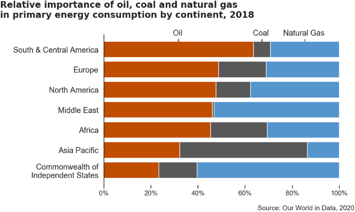
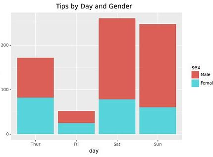 | → easy to see totals as well as break down to individual data → the floating bars can be difficult to read and spot patterns |
 | → easy to compare and see patterns → can see who is most reliant on one thing → can’t display totals or numbers nor compare numbers |
 | → used for continuous data on the x-axis, e.g. height → similar to bar chart (see above) |
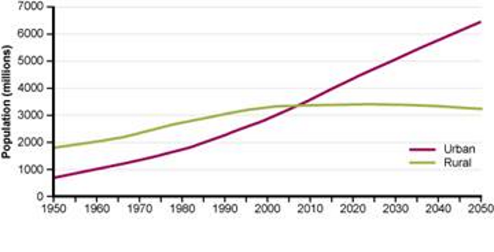 | → used to plot data over time → easy to spot trends → easy to compare two or more data sets → can be hard to read specific data |
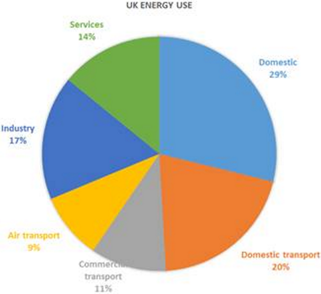 | → used to plot percentages, should all add up to 100% → simple to read and spot patterns → can be colour coded appropriately → are the percentages/data given? → cannot represent too many data points or it may become cluttered → some categories may be overly vague |
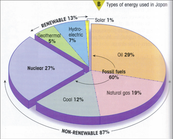 | → similar to pie chart (see above) → additional data given to compare renewable vs. non renewable energy → 3D pie charts overexaggerate the front segments compared to the back segments |
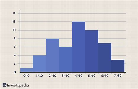
→ easily see range of data and anomalies → data can sometimes be very close together and become confusing → better with lots of data | |
→ used when continuous data on both axes → need BIVARIATE data → easily shows correlation and anomalies → can draw a line of best fit → straight line (trendy is bendy) | |
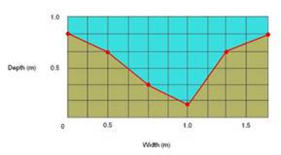 | → shows a ‘slice’ through a river or landscape → the scale on this one is bad/unhelpful |
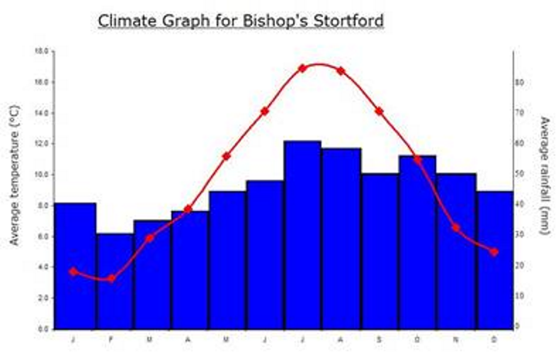
 | → dates aren’t equally spaced → half figures are hard to read off/interpret → easy to spot patterns and the overall trend |
 | → histogram + line graph (see above) → could be asked questions about data on this graph |
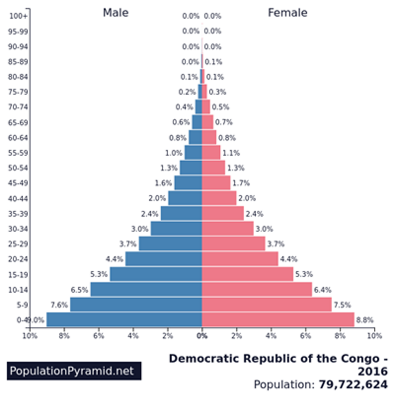 | → this is for an LIDC, classic pyramid → to describe, talk about: three groups, anomalies and specific data |
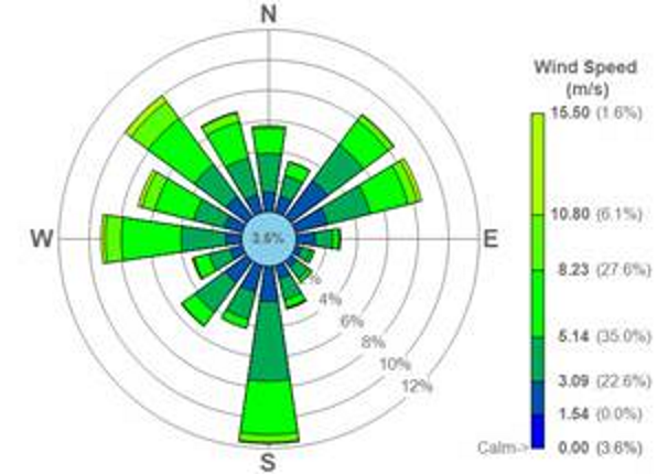 | → good for spatial relationships, e.g. compass points or bearings → colour coded → easy to see patterns → can be very difficult to read exact data |
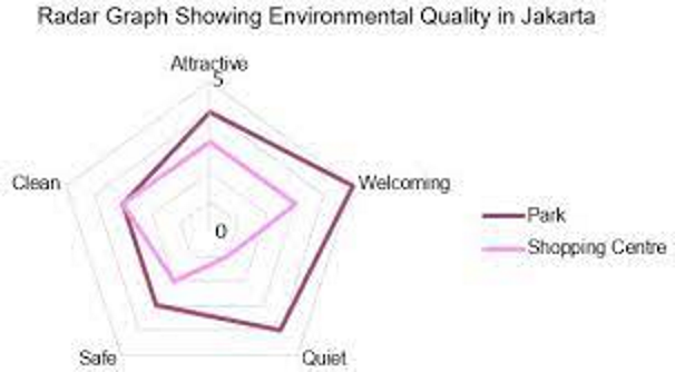 | → similar to radial diagram (see above) → see trends and patterns → can’t be colour coded → no precise data, only a score |
overall, look for: | → type of data being represented → how easy to read specific data → how easy to make comparisons → how easy to spot trends/patterns → is it colour coded → is it vague → look at the scale |
cartographic
compass points | |
map keys | 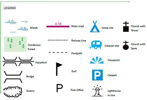 |
interpret an atlas map | |
interpret an OS map | 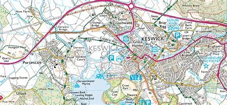 |
read heigh with contour lines, and determine steep or gentle relief | 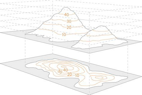 |
interpret base maps | |
interpret scale | 1:10000 means 1 cm on the map represents 10000 cm in real life 1:25000 means 1 cm on the map represents 25000 cm in real life |
six figure and four figure grid references → use the site Geo for CXC for a quiz on grid references | |
distances | using a ruler for a straight line and referring to the scale for a non-straight line: → mark on the map the route you wish to measure. |
Cross Sections I understand what a cross-section and a transect are and can interpret one. |
|
|
Interpretation I can describe, interpret and analyse geo-spatial data presented in a GIS framework. |
|
|
|
|
|
|
|
|
|
|
|
|
|
|
|
|
|
|
|
|
|
|
|
|
|
|