supply demand and equilibrium
Definition 1 Competitive Market: A market in which there are many buyers and sellers so that each has a negligible impact on the price. Buyers and Sellers are price takers.
We use the supply and demand model that follows under the assumption that the good is a competitive market. Think of a situation with many buyers and sellers of something that is very homogenous, i.e. no difference across sellers in terms of quality/location/etc. Perhaps a market for soy beans.
Definition 2 Quantity demanded is the amount of a good that buyers are willing and able to purchase.
What is quantity demanded a function of?
The price of the good
Income
Expectations
Tastes/Preferences
Price of other goods
Price of the good
Definition 3 The law of demand states that, other things equal, the quantity demanded of a good falls when the price of the good rises.
Definition 4 Demand is the relationship between quantity demanded and the price of the good, holding all else constant. The demand curve is the graphical representation of this relationship.
How does demand differ from quantity demanded? Quantity demanded refers to a particular amount at a given price, income, etc. Demand refers to the whole relationship between what quantity demanded will be at every possible price, holding everything else constant. So when the price of a good changes, the demand does NOT change only quantity demanded. Rather this is a movement along the demand curve (see below):
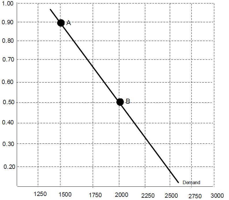
In the demand curve above when price changes from 0.50 to 0.90, quantity demanded decreases from 2000 to 1500. Demand is unchanged. So what changes the whole relationship? When any of those things listed (2-5) change. You might be wondering why the price of the good is on the vertical axis. Normally, you would expect the dependent variable on the vertical axis rather than the independent variable. This is a historical artifact. Originally economists were describing the price people were willing to pay as a function of the number of units. Hence price on the vertical axis. For the most part this does not matter for us. The one exception is that when shifting supply and demand curves we should think of increases as shifts to the right and decreases as shifts to the left, not up and down.
Income
Changes in income or wealth can cause demand to either decrease or increase. Economists classify goods based on whether demand has a positive or negative relationship to income.
Definition 5 Normal Good - An increase in income increases demand.
Definition 6 Inferior Good - An increase in income decreases demand. Examples: Ramen Noodles, Cheap Beer
Expectations
Expectations about the future can have affects on demand today. For example, if people expect that prices will be higher in the future and the good is durable they might wish to purchase more immediately.
Tastes/Preferences
This is the category we use to lump in changes in peoples likes and dislikes. What has become fashionable, new information about health risks, etc.
Price of other goods
The price of other goods can also have an affect on the demand of a particular good. The nature of that can be positive or negative.
Definition 7 Complements - An increase in the price of the complement decreases demand
Definition 8 Substitutes -An increase in the price of a substitute decreases demand.
Graphically, when we change demand we change the entire curve at every price and quantity.
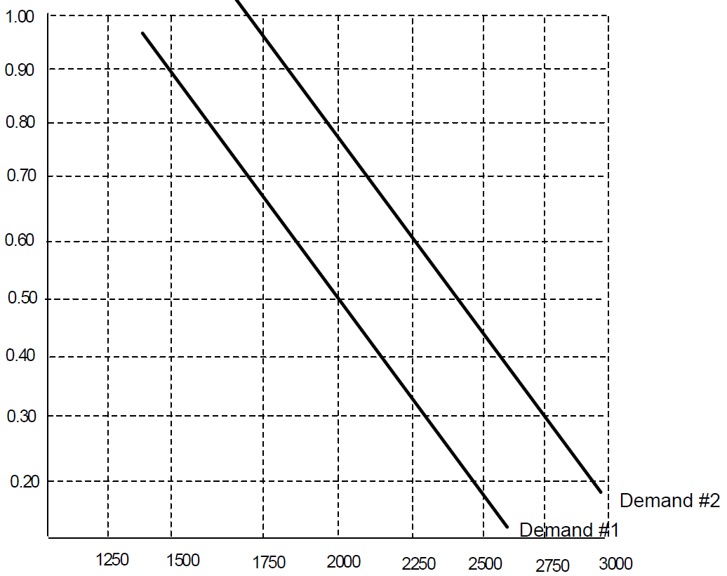
The graph above depicts an increase in demand from #1 to #2. Notice that at each price the quantity demanded has increased.
Definition 9 Quantity supplied is the amount of a good that sellers are willing and able to supply.
What is quantity supplied a function of?
The price of the good
Cost of inputs
Technology and Regulations
Expectations
Number of Producers
Note that quantity supplied is not a function of "how much they think buyers will buy." In a competitive market an individual supplier will be able to sell as much as they want at the market price. How much buyers will want affects the quantity supplied only indirectly through the price in the market.
Definition 10 The law of supply states that, other things equal, the quantity supplied of a good rises when the price of the good rises.
Definition 11 Supply is the relationship between quantity supplied and the price of the good, holding all else constant. The supply curve is the graphical representation of this relationship.
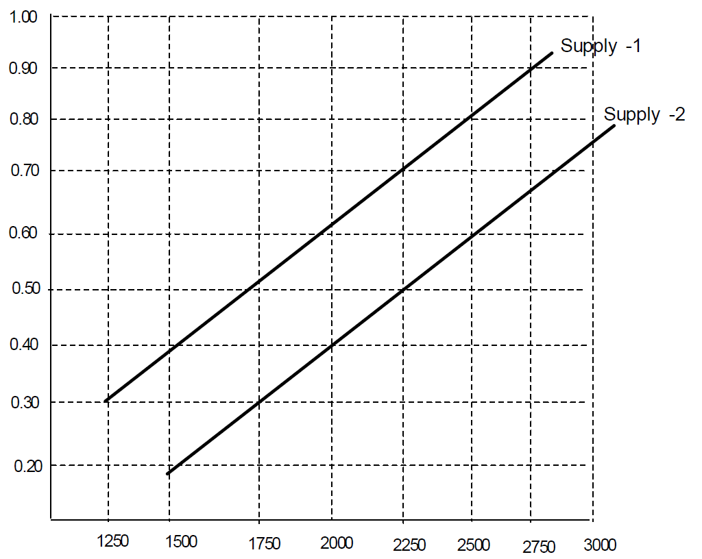
Like with demand, a change in price does not change supply. It is only a movement along a supply curve. Its changes to (2-4) that cause a shift in the whole relationship and thus lead to shifting the supply curve. The picture below shows an increase in supply from supply 1 to supply 2. Notice that it has shifted the curve right, not up.
Now that we have supply and demand, we can put them together to describe the equilibrium in the market.
Definition 12 Equilibrium refers to a situation in which the price has reached the level where quantity supplied equals quantity demanded.
The market achieves equilibrium because the price of the good changes when it is out of equilibrium. When quantity supplied exceeds quantity demanded then there is pressure for the market price to fall. When quantity demanded exceeds quantity supplied then there is pressure for the price to rise. Graphically, equilibrium is where supply intersects the demand curve.
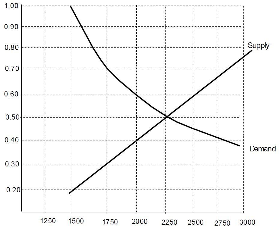
The equilibrium price would be 0.50 and the equilibrium quantity 2250 in the market above.
2 Comparative Statics
This term refers to comparing the equilibrium price and quantity in two different situations. For example, what happens when there is an increase in demand to the price and quantity?
Example 1 Single Demand Shift
Just to see how this works, lets start with a simple change in demand. For example, suppose that income has gone up and the good is normal. That tells us that demand should increase.
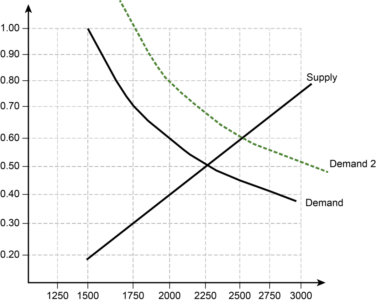
The new equilibrium is where Demand 2 intersects the supply curve. Relative the old equilibrium we see price has increased (0.50 to 0.60) and quantity has also increased (2250 to 2500).
Example 2 Single Supply Shift
Now consider an increase in the wages to workers in the beer industry on the market for beer. This example frequently trips people up. The key point is that if workers in this group are paid more this is a higher input cost in beer production. Assuming that those workers make up a small fraction of consumers (thus their higher income does not affect demand), this only causes supply to decrease.
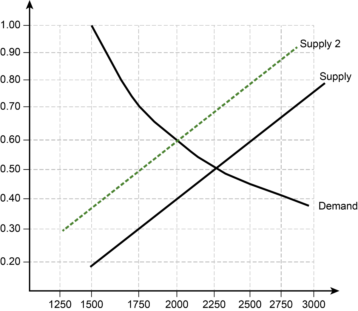
As we can see in the market above, the price has risen from (0.50 to 0.60) and the quantity has decreased (2250 to 2000)

Example 3 Multiple Shifters
Suppose that we have two events simultaneously. For example, the increase in wages and an increase in income for all consumers. What is the effect. We now need to shift both supply and demand. When we do this we will find our answer, in part, depends on how much we shift them.
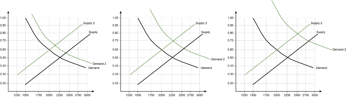
Notice in all three of the above that the price of the good is higher than it was originally. However, in the first panel quantity is lower, the second unchanged and the third higher. We say that the affect on quantity is indeterminate. Whenever we shift both supply and demand there will be at least one indeterminate effect. If you can not see this when drawing the graph, you can also find this result by "adding" the two shifts separately.
Effect on Price | Effect on Quantity | |
|---|---|---|
Supply Decreases | Increase | Decrease |
Demand Increases | Increase | Increase |
Combined Effect | Increase | Indeterminate? |
Since both shifts cause price to rise, price increases. Quantity, however, depends upon which shift is larger.

Example 4 Multiple Part II
Just to practice that, suppose that the price of a substitute good falls and there are new regulations that make production more expensive. The fall in a substitute goods price causes demand to decrease. The new regulations cause supply to also decrease.
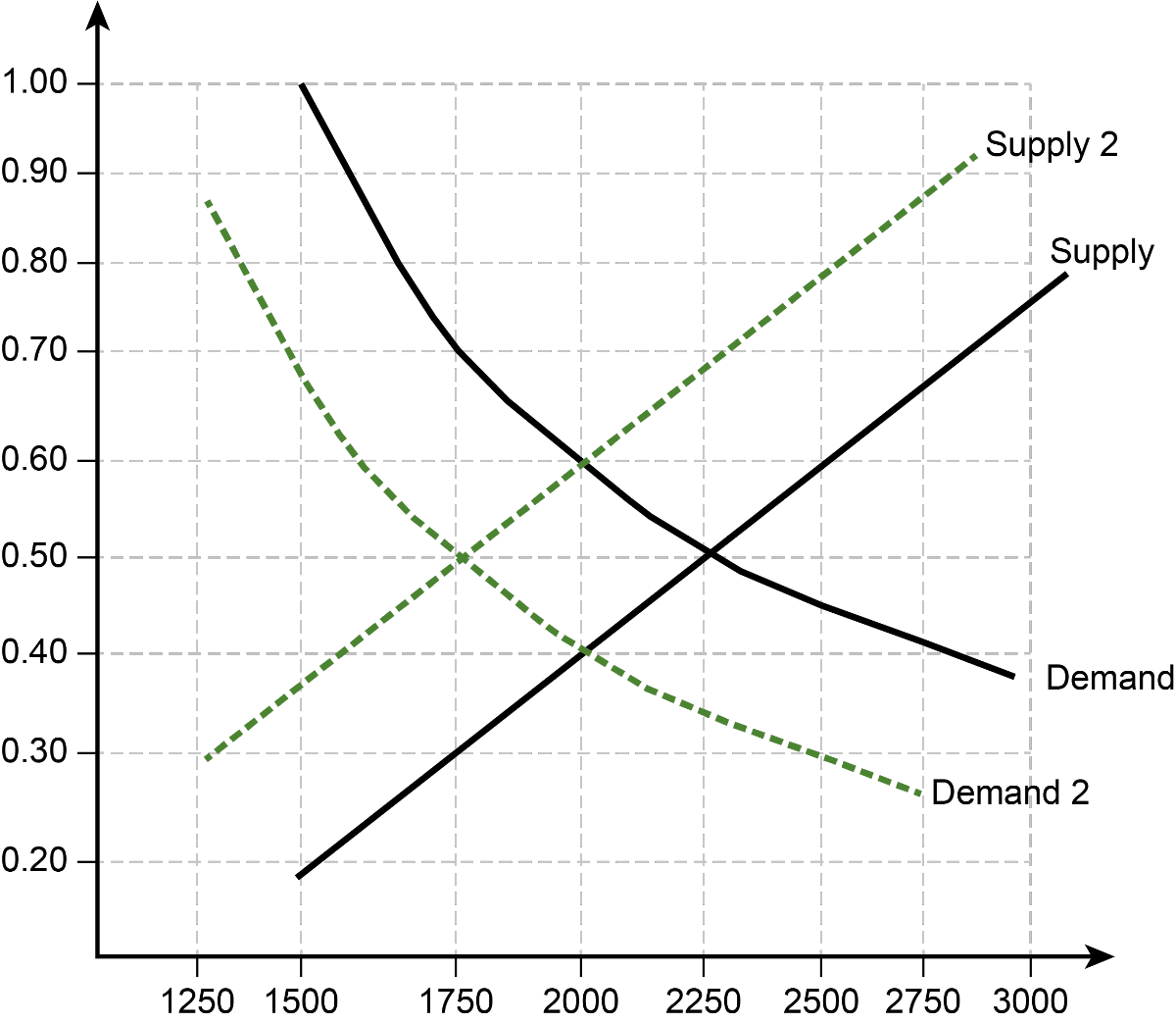
In the graph above quantity has clearly decreased. Price looks like it is unchanged, but this is indeterminate. It depends on how much I shift the two curves. Again, if you don’t see this use the table below.
Effect on Price | Effect on Quantity | |
|---|---|---|
Supply Decreases | Increase | Decrease |
Demand Decreases | Decrease | Decrease |
Combined Effect | Indeterminate? | Decrease |
3 Supply and Demand with Algebra
Sometimes we are given an equation that represents supply and an equation that represents demand. In those cases we can solve for the equilibrium price and quantity and graph them using algebra.
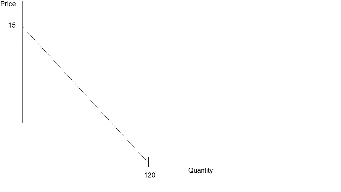
Example 5: Supply and Demand
Suppose that the equation for the supply of a good and the equation for the demand of a good are given by
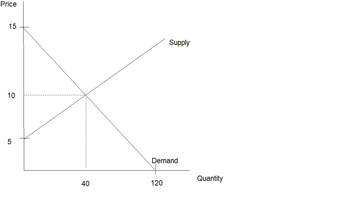
Qs= −40+8PQD=120−8PQs=−40+8PQD=120−8P
First we will graph the demand curve. This is complicated slightly by the fact that the equation is given as quantity in terms of price, but on our graph we are putting price on the vertical axis and quantity on the horizontal axis (in fact we are graphing the inverse demand curve, but that is a distinction we won't concern ourselves with). We could solve for price in terms of quantity and then have it in regular slope-intercept form. Alternatively, we could just solve for the intercepts. For the demand curve the horizontal intercept (the quantity when price is zero) is just 120. The vertical intercept can be found by plugging zero into the quantity demanded and finding the resulting price.
0=120−8P0=120−8P
Now, solving for P we find the vertical intercept.
8P=1208P=120
So, P=1208=15P=8120=15
Next, we do the same for supply. The horizontal intercept is -40, which won't be relevant for us. To find the vertical intercept we put 0 into quantity in the supply equation.
0=−40+8P0=−40+8P
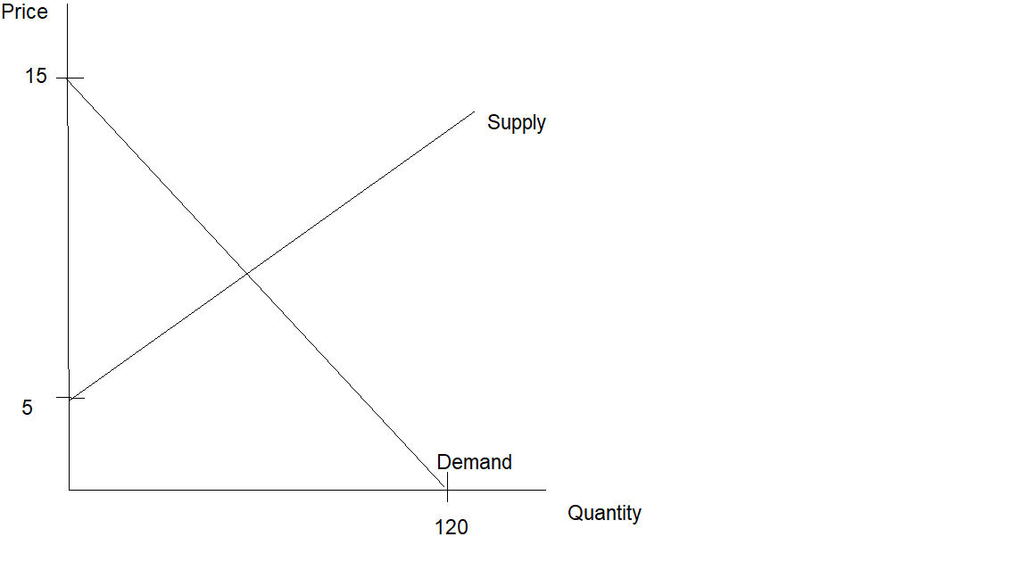
Then we solve for P (note this is not the equilibrium price, this is the price that makes quantity supplied equal to 0.
8P=40, P =408=5 8P=40,P=840=5
Finally, we find the equilibrium price and quantity by setting Qd=QsQd=Qs
120−8P=−40+8P160 = 16PP =10120−8P=−40+8P160=16PP=10
Now that we have the equilibrium price we can plug that into either equation to get the quantity.
QD=120 − 8(10) = 40QS=−40+8(10) = 40QD=120−8(10)=40QS=−40+8(10)=40
Graphically: