GEOM 6 (Feb 3rd)
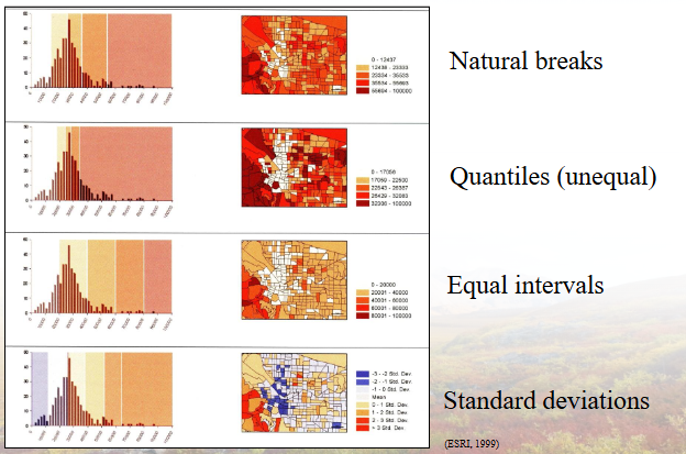
Whenever developing a map, the safest choice is NATURAL BREAKS, 4-6 Cases, Use manual to read and determine the range (Size of classes)
Typed
Map Scale and generalization
Representative fraction
Large –scale maps show a smaller geographic area and have a larger representative fraction (RF)
1:1, 1:500, 1:5000
Measurements of this are consider ‘large’ scale because they provide detailed information about the features within a limited area, allowing for precise navigation and analysis. (Think of it as a large magnification)(The item is larger, map on the left)
Small –scale maps show a larger geographic area and have a smaller representative fraction (RF)
1:250,000, 1:500,000
When representing a larger area we have a ‘smaller’ magnification which results in less detail but a broader overview of the landscape, making them useful for regional planning and understanding broader spatial relationships. (The information is smaller, map on the right)
(Its kinda backwards)
Generalization: what level of detail?
The map is a model of the landscape you are portraying; and as in any model, you need to decide on the appropriate level of simplification
similarly, you need to consider how to display the thematic data on your map, including what level of detail will be used in the visual presentation
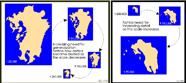
Sometimes the data you want to present are already availablev at “just the right” level of detail for your purposes, but you should always be assessing whether or not this match has been achieved.
For example, just because you have a dataset showing every city, town, village and hamlet across your map’s region doesn’t mean that it’s best to include them all on your map, depending on the purpose of the map.
Depending on the above evaluation, may want to select specific records / classes / values to show up and leave the rest “invisible”
Measurement levels and Classification
Map design:
Users define graphical elements to communicate message
Graphical elements - coordinate systems, map projections, scale & symbolism
Legends explain meanings of graphical symbols
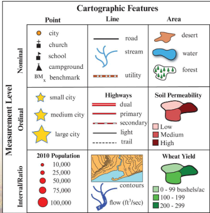
Points
Simple dot maps: Polar Bear sighting represented by a single dot, with each dot indicating a specific sighting location, allowing for visual analysis of population distribution.
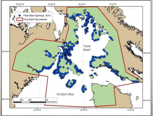
This image represents a Point layer, which is useful for displaying discrete data points on a map, highlighting trends and patterns in geographic information data such as wildlife sightings, urban development, or resource allocation.
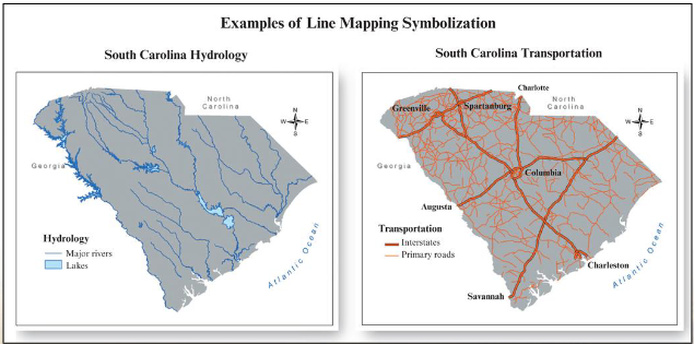
Linear
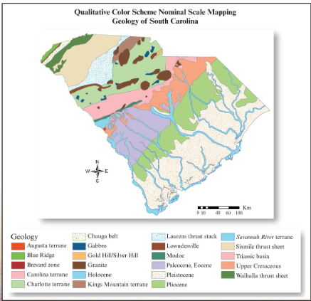
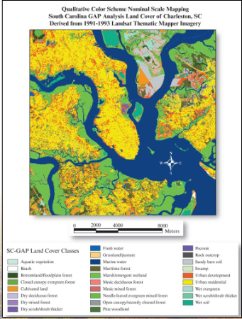
Nominal
Ordinal

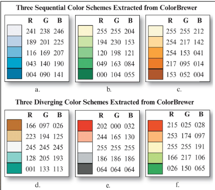
Sequential vs Divergent
Sequential idea for mapping ordered data that progress from low to high. Lightness steps dominate the look of these themes with light colours for low values and dark colours for high values.
Diverging schemes put equal emphasis on mid-range critical values and extremes at both ends of the data range.

Interval Methods
Data Classifications:
Several options to divide your data in to N mutually exclusive, collectively exhaustive classes, e.g.:
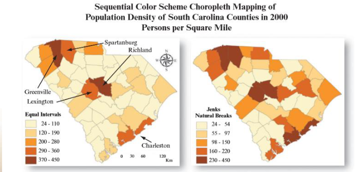
natural breaks
standard deviation (good if normally distributed)
quantiles (equal numbers in each class)
equal distance / range (good for uniform distributions and equally-sized map units)
To accomplish this, need to classify the map - generally, experiments show us that people can (easily/reliably) visually distinguish 3-7 classes
Map Design Fundamentals; Map Elements, Composition (Layout), Figure-Ground Relationship
The figure is the most important thematic content of a map
The ground is the literal background
Proper map design will focus the map reader’s attention on the figure component followed by the next most important component and so on
Strongly influenced by colour, but also placement of elements and their relative sizes
The Legend, The Scale bar, The Compass, The Correct orientation, and the Title are essential elements that should be carefully designed to enhance readability and understanding of the map.
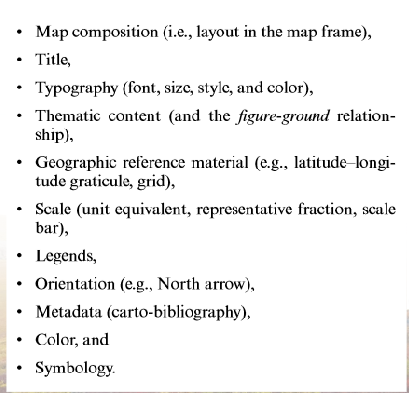
Map balancing elements are as follows
Each map element has own importance, so cartographer must organize them
Important elements in prominent positions within map
Important elements should have appropriate size & area
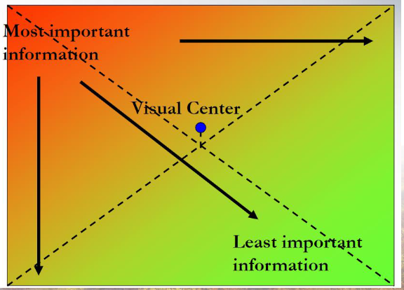
General rule;
Most important elements - top left
Least important elements - bottom right
Map Design Fundamentals: Balancing Elements
KAi
Map Scales
A map scale is a critical component that allows us to understand the relationship between distances on a map and actual distances on the ground.
Common scales include representative fractions (RF) such as 1:500, 1:5,000, and 1:1,000,000.
In the case of RF 1:500, each unit on the map corresponds to 500 units in reality, thus demonstrating a large scale, which typically represents a smaller geographical area with more detail.
Conversely, a small scale map (e.g., 1:5,000,000) represents a larger surface area but with less detail.
Types of Maps
Large Scale Maps: These are detailed maps that represent smaller areas, such as campus maps or city maps. They allow for zooming in on features and displaying intricate details.
Example: A campus map with a scale of 1:1100.
Small Scale Maps: These maps cover larger geographical areas and focus on broad features rather than intricate details. They require generalization.
Detail Levels in Mapping
The level of detail in a map can be influenced by the geographic area being represented and important points of interest.
Boundary characteristics and points of interest must be considered when determining how much detail to include.
Generalization is a technique applied to maintain clarity in smaller scale maps; it simplifies the representation by omitting some details.
Cartographic Features
Maps can represent three main types of cartographic features:
Points: Represented as singular features such as cities or buildings.
Lines: Represent linear features such as rivers, roads, or boundaries.
Areas: Represented by polygons, used for depicting larger features like forests, lakes, or property boundaries.
Each type can convey different levels and styles of data visualization based on cartographic choices.
Data Classification in Cartography
Data classification is essential in map making as it dictates how data is represented and perceived in various forms:
Nominal Representation: The simplest form of data categorization where features are labeled without numerical value.
Ordinal Representation: Represents data with an inherent order, such as ranking, but does not indicate magnitude.
Interval or Ratio Representation: Provides numerical values, indicating measurable quantities, such as population counts.
Classification methods include:
Natural Breaks: Identifies gaps in data to classify it effectively, commonly used as the default method.
Equal Interval: Divides the entire range of data into equal parts for uniform classification.
Quantile: Ensures that each class contains an equal number of observations.
Manual: Allows cartographers to define the class boundaries, enhancing visual readability.
Map Presentation Techniques
The visualization of data on maps can utilize different techniques:
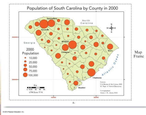
Graduated Symbols: Variable sized symbols represent different data values; larger symbols indicate higher values.
Choropleth Mapping: A technique using different shades or colors to represent differences in a variable across defined areas, facilitating comparison.
It is important to ensure that visual representations communicate the intended message and enhance understanding.
Practical Application in GIS
In GIS, various tools allow for the visualization and representation of data through both symbolic and color gradation methods.
GIS data can help in analyzing spatial patterns, such as earthquake distributions based on magnitude, using graduated colors and proportional symbols to visualize intensity effectively.
When creating maps, a systematic approach to classification and representation is necessary, ensuring appropriate methods and scales are employed for the data at hand.
Summary
Understanding map scales, types, detail levels, and data representations is essential in cartography and GIS. Effective map-making requires careful consideration of objectives, the relationship between map features, and the data classification methods employed. Both large and small scale maps have their distinct purposes and presentation methods which serve various analytic requirements.