Scatter Plots
Scatterplots- a graph that shows the relationship between 2 sets of data.
A scatter plot helps understand the form, direction, and strength of the relationship between two variables. Correlation is the strength and direction of the linear relationship between the two variables.
Trend line (also known as a line of best fit)- a line that averages the points in a scatter plot.
splits the data
Does not have to go through any points
You can use trend lines to predict.
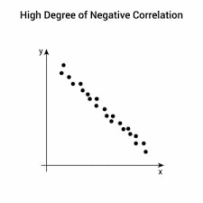
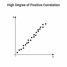
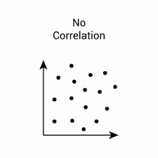
Just like a positive slope, as x increases, so does y. This is known as a positive relationship. A negative relationship is like a negative slope, whereas x increases, y decreases. There can be strong positives just like there are strong negatives, whereas there are also weak positives and negatives. There can also be no correlation, where all the points are scattered. Then that graph would have no relationship. You can sometimes see the word correlation instead of the word relationship.
This is a negative correlation, or a negative relationship/slope.
This is an example of a positive correlation, or a positive relationship/slope.
 This is an example of a no-correlation graph.
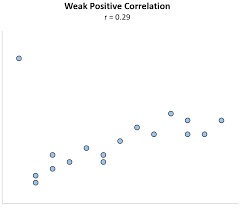
 Weak correlation- Points are not close to the trend line/spaced out.
This is an example of a positive weak correlation.
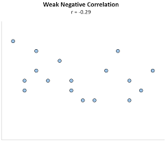
 This is an example of a negative weak correlation.
 No correlation- no relationship with the graph/points
The correlation coefficient r is a measure of how well the data set is fit by a model. In other words, how well it fits the line of best fit. r is a value in the range.