SUMMER WORK
GLOSSARY OF TERMS
Media Language | Definition/Explanation |
DPS (Double Page Spread) | Two pages that cover the same topic/article but are spread out over two pages and are often blended into each other to make the reading more easy. |
Masthead | The title/name of the newspaper/magazine and is important for branding so it often includes a logo or symbol (E.g. The Times Lion & Unicorn logo) |
Headline | The title of the main story and it is usually big and bold to catch the readers attention. Sometimes tabloids use misleading/clickbait headlines to get more people reading their content. |
Byline | The line which states who the article/news feature is by and what their role is in the newspaper. (E.g. Jill James, Senior Journalist at the Daily Mirror.) |
Cover Line | Short phrases or quotes that are put on the front page of a magazine or newspaper to get more engagement and readers. They are used often by Tabloids to entice their readers. |
Cover Image | It is an eye catching or distinctive image often featuring a celebrity or something linked to the main story in order to catch the readers attention and attract new readers. |
Strap Line | A Strap Line is also called a subheading and usually gives context about the headline and may summarise the content of the article or may elaborate further on the heading. |
Stand First | Can be considered a HOOK and essentially summarises the entirety of the article (often in a different /italic/bold font than the rest of the article). This allows readers to get a snippet of the content & gives them an idea of the type of newspaper/magazine they are reading. |
Pull Quote | A quote from the article which adds ‘visual interest’ to the article and is often in a different brightly coloured font or in a way to stand out to the reader and catch their eye. |
Puffs | Promotional content such as vouchers or discount codes that attract the readers as they say things such as ‘exclusive sneak peak!’, etc… |
Supplement | An additional section to the newspaper/magazine that covers a different topic and may cover topics that are different to the whole publication or may be a bonus insert. E.g. An exclusive interview with Pamela Anderson about her Diet (when the newspaper often covers political issues). This gives the newspaper a more synoptic audience and allows it to cater to more than one specific niche or on the other hand may attract readers from a particular niche such as ‘diet enthusiasts’, who wouldn’t otherwise read the publication. |
Mainstream Audience | A majorityaudience with a broad range of demographics, hobbies, interests, ages, psychographics and often most newspapers cater to this audience to ensure a high level of readership. |
Niche Audience | A more specific audience catering to a smaller set of interests and focuses. A magazine may cater to a niche audience but this means it wont be able to appeal to a wider more mainstream audience. |
1960’s force recall notes & context
Womens sexual liberation/revolution
Introduction of contraceptive Pill in 1960
Higher levels of women in paid work
Feminism was on a rise
Equal Pay legislation
Pop Culture flourished
A Time of CHANGE
‘Beatlemania’
Mod & Psychedelic genres
the Mini skirt was invented
Abortion act 1967
Race Relations Acts of 1965 and 1968
Youth subcultures flourished
Civil rights in the USA
Scientific Advances
Modernity
Capitalism was getting rejected
women’s liberation movement
SECOND WAVE FEMINISM
Rise of anti propaganda subcultures
New homes built, picket fences, etc…
POST WAR ECONOMIC PROSPERITY
Televisions were common in middle class households
Household supplies such as ‘TIDE’
the ‘Swinging Sixties’
Legal end to segregation in USA
Increased tolerance of LGBTQ+
Post War sense of community
Increased immigration
The Married Women’s Property Act of 1964
VOGUE TIMELINE
1892- Vogue Magazine’s first publication was by Arthur Turnure in 1892.
It was a weekly publication at the time but is now a monthly one.
The original magazine was for the elite and those with landed wealth.
1895- It was read by men and women but by 1895 it became more ‘female oriented’ and fashion focused.
1900- Vogue’s illustrated covers were created by recognised artists and from 1900, frequently in colour, this is still common to this day, vogue covers catch the eye of the passerby!!!
1909- Conde Montrose Nast (American publisher, entrepreneur and business magnate) purchased the US magazine- it had a weekly circulation of 14,000 copies and an annual revenue of $100,000.
Condé Nast, named after its founder, became a subsidiary of Advance Publications after being bought out.
He created his own Vogue studio in Paris
1911- Nast introduced a Shopping Service and specialised issues to target advertisers, including interior design.
1914-1916- The US version of Vogue was very popular in the UK. Sales Quadrupled.
It was very popular in ‘the trenches’ in the World War, and was read by Men !! (defying gender norms? Still relevant to this day.)
1916- The first ‘international’ edition of Vogue was released, it was ‘British Vogue’.
The British version, was more bohemian (hippy/liberal) than the USA publication.
It was launched because:
German submarine attacks during WWI halted shipping of non-essential goods like magazines.
Rising paper costs in the US made UK production more cost-effective.
1920’s- youth became a marketable commodity and slimness a new ideal
1925- Vogue introduced Vogue’s beauty supplement called Vogue’s Beauty Book, to take advantage of the sudden boom in consumer spending on cosmetic products.
1928- French Vogue dictated the trend: "You must be slim... it’s the definition of modern beauty." The magazine's illustrations featured boyish, elongated, and de-sexualised figures, showing Vogue's influence on women's ideals.
1930 - Nast lost his fortune in the 1930s Wall Street crash.
1933- Blue Ridge Investments took over in 1933, and although ownership changed over the years, the company kept the Condé Nast name.
1939- The magazine was seen as a ‘mentor’ in the fashion world.
1953- British Vogue started ‘A Young Idea’
1960’s- The 1960s brought major shifts in British society.
Economic growth and high employment followed post-war austerity.
Consumer goods became more accessible, and international travel increased.
Popular culture flourished, fostering a rise in individualism.
Social class and gender norms evolved.
Feminist and civil rights movements greatly influenced society.
1961- British Vogue revitalised ‘A Young Idea’.
Boldness/sassiness replaced respect in fashion photography and copy
1964- Beatrix Miller became editor from 1964-1984, brought great change with her!!! (important for set product) :)
1960’s-70’s- Vogue expanded it’s range of topics catering to women- reviews of books - reviews of theatre - reviews of music and art
RISE IN CONSUMERISM
NOW- In the UK, Vogue had a circulation of around 220,000 in 2020, with an estimated readership of 1.2 million. From April 2019 to March 2020, Vogue reached around 2.7 million people in the UK, including almost two million women. This was the magazine's highest monthly reach since 2013.
VOGUE SET PRODUCT ANALYSIS
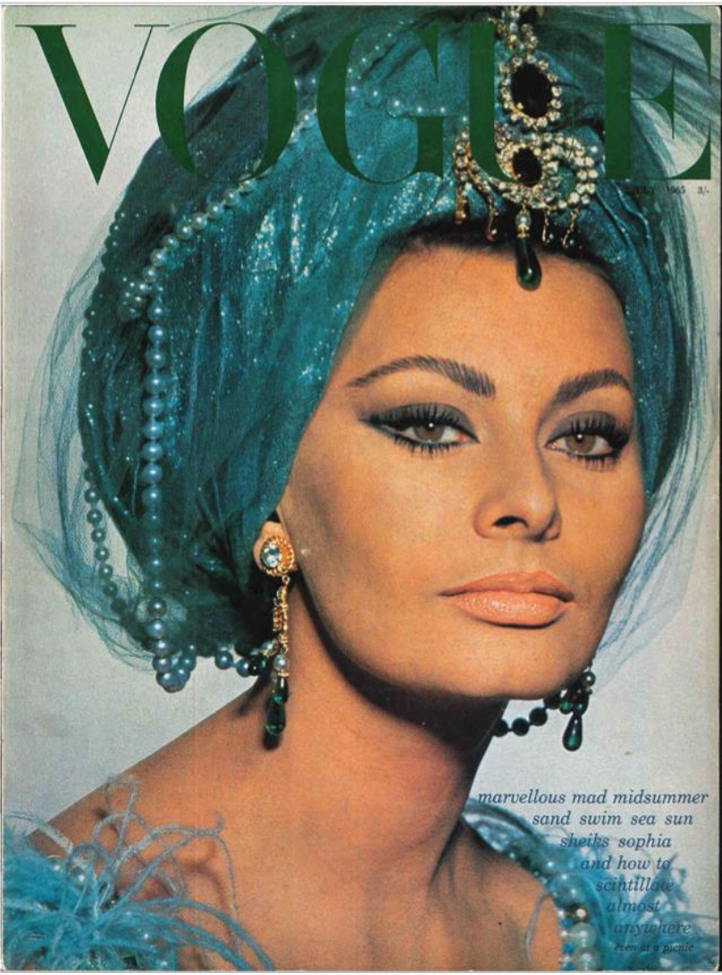
The front cover is vital in communicating a sense of brand identity of Vogue to the target audience, which is in this case middle aged women of middle/upper class. The front cover also is a key part in appealing to potential readers as it must catch their eye and stand out from the rest.
The Vogue Masthead is in a bold typeface font, which remains the same in all issues of the magazine. This establishes brand identity and sets a familiarity with the readers. The colour of the text is green, overlapping the model and almost blending in as it is a similar colour to the rest of the front cover. This highlights the fact that vogue uses colour schemes in each of their issues, perhaps to give a unique & distinguishable quality to the magazine, unlike their competitors. The colour scheme also ties into the words ‘sand, swim, sea, sun;, suggesting an influence of the ocean and summer on the piece that the model is wearing.
The Close Up eye level shot of famous actress Sofia Loren represents her as the main focus, powerful, engaging and exotic. It also draws attention to her eyes, which has a certain ‘ethnic influence’ on the eye makeup. However, it can also be argued that it is stereotypically ‘middle eastern’, tying into the use of the word sheiks in the cover line, this ‘exotic’, ‘other’ representation of her can link to Stuart Hall's ideas about the use of stereotypes in order to represent a certain group, as ‘them’ vs ‘us’.Furthermore, the word ‘mad’ ion the cover line suggest that the outfit is ‘mad’ or ‘eccentric’, which may carry negative connotations and lead to more stereotypes of the middle east as ‘other’, and may not give the intended effect to certain audiences, causing them to develop an oppositional reading.
However, on the other hand, people of middle eastern descent/poc may see sophia loren as a ‘role model’ and this may encourage a preferred reading as there is representation of their ethnic group in the media.
The close up shot suggests that there aren’t sexual connotations to the model, which would not be conforming to the ‘status quo’ of the typical representations of women in magazines. This may be due to external influence surrounding cultural context of the 1960’s, the time of ‘sexual liberation’ and women’s rights. This suggests that Vogue is trying to diversify their market and stay in sync with current events, so as not to appear ‘old fashioned’. This sets them apart from competitors at the time.
Opposes Van Zoonen’s theory in which she states that ‘in media, women’s bodies are used as a commodity’, as she is fully covered. Additionally, the model is dressed in ‘traditional’ clothing, with a head covering as well, which can be seen as an attempt to make something usually stigmatised into a ‘stylish piece’, however, it also implies that the model is upper class and is of aspirational qualities.
The language used in the cover line such as ‘marvellous’ caters to a more ‘elite’ upper class audience, suggesting that this is what they should aspire to be. It also implies what the content of the magazine encompasses, further appealing to the target audience. Moreover, the alliteration used in ‘marvellous, mad, midsummer’ ‘sand, swim, sea, sun’, encourages audience appeal.
Extra
Post colonialism- paul gilroy
At the time, immigration and diversity was increasing due to post war society inciting higher levels of people of colour coming to the west to work, etc…
Additionally, the fact that Sophia Loren isn’t middle eastern but rather Italian, may lead to some negative views on Vogue as a whole, as they were unable to use a middle eastern model for a middle eastern themed shoot. However, she may serve as a role model
David gauntlett - identity!!!
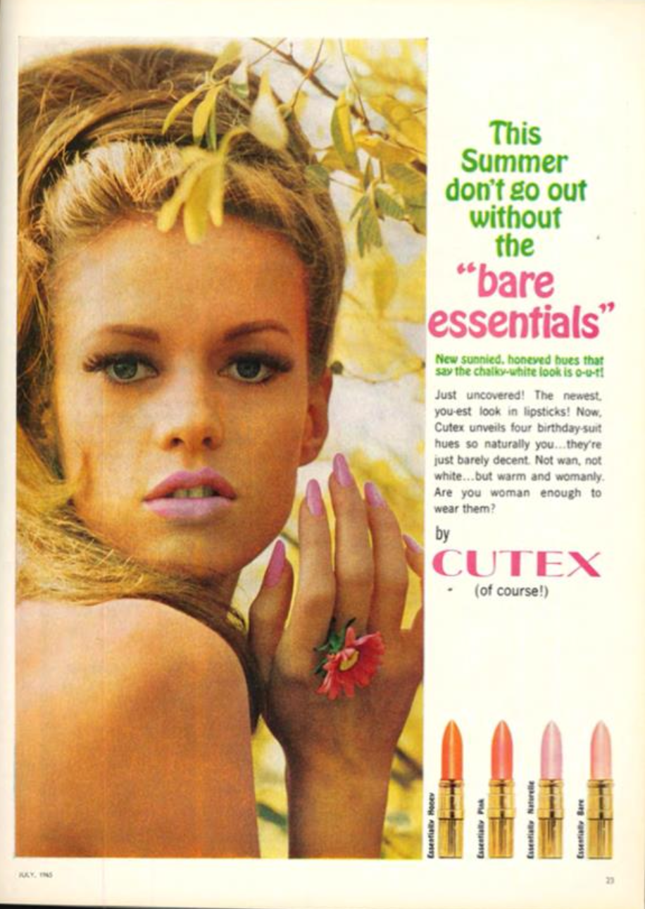
CUTEX ADVERT ANALYSIS
The model is visibly naked and although there is no specific nudity, the content of the advert says otherwise. The link between the phrase ‘bare essentials’, ‘birthday suit’ and the model suggest a hypersexualised representation of the model. This supports Van Zoonens idea that Women’s bodies are often used by the media as a commodity, in this case, Cutex is utilising the woman’s sexual identity as a way to market a product to the female population. This would have been rather controversial at the time of the 1960’s, a time for female liberation.
Furthermore, the use of the phrase ‘naturally you’ imply that women are ‘naturally’ sexual beings, reinforcing harmful gender stereotypes. This is further evidenced by the phrase ‘warm and womanly’, suggesting that to be a woman is to be warm, which ties into the idea of women’s roles being nurturing and motherly, rather than independent.
The colour scheme of pink further reinforces the traditional ideas about femininity and women’s identity, thus creating a hyper-feminine sexual identity for women to aspire to be.
The direct address in the question ‘are you woman enough to wear them?’ is clearly problematic, as it creates unrealistic and toxic standards for women to keep up to, making them believe they should aspire to be like the model and wear Cutex lipsticks, otherwise they are not ‘woman enough’. This would lead to them developing a negative sense of self, One can apply David Gauntletts theory of identity, which suggests that people ‘pick and mix’ aspects of people in media and apply them to their own identity.
Additionally, you can apply Laura Maulvey’s ‘Male Gaze’ theory, suggesting that media is made for the benefit of men and to appeal to the male gaze. The over sexualisation of the model is an attempt to appeal to the male population, potentially husbands as well, to make them want to buy the lipstick for their wife?
On the other hand, the phrase ‘chalky white is o-u-t’ and ‘wan’ suggest that there is a shift from the beauty standard where paleness is the ideal. This is evidenced by the picture of the model, where she appears tanned and is in ‘warm’ light. This may be due to changing attitudes and anxieties at the time, especially towards immigration.
It is evident that it isn’t a model of colour in the advert, but rather a white woman. This supports Gilroys theory of representation where he argues that representations of race in media often reinforce a colonial ideology of white western superiority. Furthermore, the shade range outlined at the bottom of the advert is clearly designed for lighter skin tones.
One can also apply bell hooks theory of western bias to white women in media texts rather than poc (emphasis on black women). The Cutex ad enforces western beauty standards, which then promote harmful ideologies to the audience of the advert, suggesting that you are only ‘beautiful’ and ‘womanly’ if you look like the model in the advert.
NOT SURE
However, one may argue on the other hand that it is encouraging women to be ‘sexual’ as it is their ‘right’???
Additionally, the fact that the model is holding a flower may be to get a certain traditional message across, suggesting an air of ‘innocence’ ???