The Production Possibilities Frontier (trade offs and trade)
Key Points
The Production Possibilities Frontier (PPF) is a graph that shows all the different combinations of output of two goods that can be produced using available resources and technology. The PPF captures the concepts of scarcity, choice, and tradeoffs.
The shape of the PPF depends on whether there are increasing, decreasing, or constant costs.
Points that lie on the PPF illustrate combinations of output that are productively efficient. We cannot determine which points are allocatively efficient without knowing preferences.
The slope of the PPF indicates the opportunity cost of producing one good versus the other good, and the opportunity cost can be compared to the opportunity costs of another producer to determine comparative advantage.
The Production Possibilities Frontier and Social Choices
Just as individuals cannot have everything they want and must instead make choices, society as a whole cannot have everything it might want, either. This section of the chapter will explain the constraints faced by society, using a model called the production possibilities frontier (PPF). There are more similarities than differences between individual choice and social choice. As you read this section, focus on the similarities.
Because society has limited resources (e.g., labor, land, capital, raw materials) at any point in time, there is a limit to the quantities of goods and services it can produce. Suppose a society desires two products, healthcare and education. This situation is illustrated by the production possibilities frontier in this graph.
A Healthcare vs. Education Production Possibilities Frontier
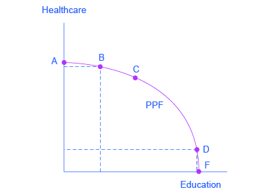
This production possibilities frontier shows a tradeoff between devoting social resources to healthcare and devoting them to education. At A all resources go to healthcare and at B, most go to healthcare. At D most resources go to education, and at F, all go to education.
In the graph, healthcare is shown on the vertical axis and education is shown on the horizontal axis. If the society were to allocate all of its resources to healthcare, it could produce at point A. But it would not have any resources to produce education. If it were to allocate all of its resources to education, it could produce at point F. Alternatively, the society could choose to produce any combination of healthcare and education shown on the production possibilities frontier. In effect, the production possibilities frontier plays the same role for society as the budget constraint plays for Alphonso. Society can choose any combination of the two goods on or inside the PPF. But it does not have enough resources to produce outside the PPF.
Most important, the production possibilities frontier clearly shows the tradeoff between healthcare and education. Suppose society has chosen to operate at point B, and it is considering producing more education. Because the PPF is downward sloping from left to right, the only way society can obtain more education is by giving up some healthcare. That is the tradeoff society faces. Suppose it considers moving from point B to point C. What would the opportunity cost be for the additional education? The opportunity cost would be the healthcare society has to give up. Just as with Alphonso’s budget constraint, the opportunity cost is shown by the slope of the production possibilities frontier. By now you might be saying, “Hey, this PPF is sounding like the budget constraint.” If so, read the following Clear It Up feature.
There are two major differences between a budget constraint and a production possibilities frontier. The first is the fact that the budget constraint is a straight line. This is because its slope is given by the relative prices of the two goods. In contrast, the PPF has a curved shape because of the law of the diminishing returns. The second is the absence of specific numbers on the axes of the PPF. There are no specific numbers because we do not know the exact amount of resources this imaginary economy has, nor do we know how many resources it takes to produce healthcare and how many resources it takes to produce education. If this were a real-world example, that data would be available. An additional reason for the lack of numbers is that there is no single way to measure levels of education and healthcare. However, when you think of improvements in education, you can think of accomplishments like more years of school completed, fewer high-school dropouts, and higher scores on standardized tests. When you think of improvements in healthcare, you can think of longer life expectancies, lower levels of infant mortality, and fewer outbreaks of disease.
Whether or not we have specific numbers, conceptually we can measure the opportunity cost of additional education as society moves from point B to point C on the PPF. The additional education is measured by the horizontal distance between B and C. The foregone healthcare is given by the vertical distance between B and C. The slope of the PPF between B and C is (approximately) the vertical distance (the “rise”) over the horizontal distance (the “run”). This is the opportunity cost of additional education.
The Shape of the PPF and the Law of Diminishing Returns
The budget constraints presented earlier in this chapter, showing individual choices about what quantities of goods to consume, were all straight lines. The reason for these straight lines was that the slope of the budget constraint was determined by the relative prices of the two goods in the consumption budget constraint. However, the production possibilities frontier for healthcare and education was drawn as a curved line. Why does the PPF have a different shape?
To understand why the PPF is curved, start by considering point A at the top left-hand side of the PPF. At point A, all available resources are devoted to healthcare and no resources are left for education. This situation would be extreme and even ridiculous. For example, children are seeing a doctor every day, whether they are sick or not, but not attending school. People are having cosmetic surgery on every part of their bodies, but no high school or college education exists. Now imagine that some of these resources are diverted from healthcare to education, so that the economy is at point B instead of point A. Diverting some resources away from A to B causes relatively little reduction in health because the last few marginal dollars going into healthcare services are not producing much additional gain in health. However, putting those marginal dollars into education, which is completely without resources at point A, can produce relatively large gains. For this reason, the shape of the PPF from A to B is relatively flat, representing a relatively small drop-off in health and a relatively large gain in education.
Now consider the other end, at the lower right, of the production possibilities frontier. Imagine that society starts at choice D, which is devoting nearly all resources to education and very few to healthcare, and moves to point F, which is devoting all spending to education and none to healthcare. For the sake of concreteness, you can imagine that in the movement from D to F, the last few doctors must become high school science teachers, the last few nurses must become school librarians rather than dispensers of vaccinations, and the last few emergency rooms are turned into kindergartens. The gains to education from adding these last few resources to education are very small. However, the opportunity cost lost to health will be fairly large, and thus the slope of the PPF between D and F is steep, showing a large drop in health for only a small gain in education.
The lesson is not that society is likely to make an extreme choice like devoting no resources to education at point A or no resources to health at point F. Instead, the lesson is that the gains from committing additional marginal resources to education depend on how much is already being spent. If on the one hand, very few resources are currently committed to education, then an increase in resources used can bring relatively large gains. On the other hand, if a large number of resources are already committed to education, then committing additional resources will bring relatively smaller gains.
This pattern is common enough that it has been given a name: the law of diminishing returns, which holds that as additional increments of resources are added to a certain purpose, the marginal benefit from those additional increments will decline. When government spends a certain amount more on reducing crime, for example, the original gains in reducing crime could be relatively large. But additional increases typically cause relatively smaller reductions in crime, and paying for enough police and security to reduce crime to nothing at all would be tremendously expensive.
The curvature of the production possibilities frontier shows that as additional resources are added to education, moving from left to right along the horizontal axis, the original gains are fairly large, but gradually diminish. Similarly, as additional resources are added to healthcare, moving from bottom to top on the vertical axis, the original gains are fairly large, but again gradually diminish. In this way, the law of diminishing returns produces the outward-bending shape of the production possibilities frontier.
Productive Efficiency and Allocative Efficiency
The study of economics does not presume to tell a society what choice it should make along its production possibilities frontier. In a market-oriented economy, the choice will involve a mixture of decisions by individuals, firms, and government. However, economics can point out that some choices are unambiguously better than others. This observation is based on the concept of efficiency. In everyday usage, efficiency refers to lack of waste. An inefficient machine operates at high cost, while an efficient machine operates at lower cost, because it is not wasting energy or materials. An inefficient organization operates with long delays and high costs, while an efficient organization meets schedules, is focused, and performs within budget.
The production possibilities frontier can illustrate two kinds of efficiency: productive efficiency and allocative efficiency. The following graph illustrates these ideas using a production possibilities frontier between healthcare and education.
Productive and Allocative Efficiency
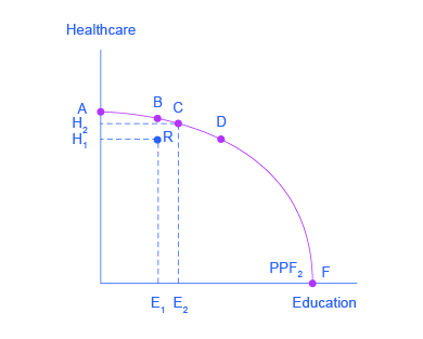
Productive efficiency means it is impossible to produce more of one good without decreasing the quantity that is produced of another good. Thus, all choices along a given PPF like B, C, and D display productive efficiency, but R does not. Allocative efficiency means that the particular mix of goods being produced—that is, the specific choice along the production possibilities frontier—represents the allocation that society most desires.
Productive efficiency means that, given the available inputs and technology, it is impossible to produce more of one good without decreasing the quantity that is produced of another good. All choices on the PPF in this graph, including A, B, C, D, and F, display productive efficiency. As a firm moves from any one of these choices to any other, either healthcare increases and education decreases or vice versa. However, any choice inside the production possibilities frontier is productively inefficient and wasteful because it is possible to produce more of one good, the other good, or some combination of both goods.
For example, point R is productively inefficient because it is possible at choice C to have more of both goods: education on the horizontal axis is higher at point C than point R (E2 is greater than E1), and healthcare on the vertical axis is also higher at point C than point R (H2 is great than H1).
The particular mix of goods and services being produced—that is, the specific combination of healthcare and education chosen along the production possibilities frontier—can be shown as a ray (line) from the origin to a specific point on the PPF. Output mixes that had more healthcare (and less education) would have a steeper ray, while those with more education (and less healthcare) would have a flatter ray.
Allocative efficiency means that the particular mix of goods a society produces represents the combination that society most desires. How to determine what a society desires can be a controversial question, and is usually discussed in political science, sociology, and philosophy classes as well as in economics. At its most basic, allocative efficiency means producers supply the quantity of each product that consumers demand. Only one of the productively efficient choices will be the allocatively efficient choice for society as a whole.
Why Society Must Choose
Every economy faces two situations in which it may be able to expand consumption of all goods. In the first case, a society may discover that it has been using its resources inefficiently, in which case by improving efficiency and producing on the production possibilities frontier, it can have more of all goods (or at least more of some and less of none). In the second case, as resources grow over a period of years (e.g., more labor and more capital), the economy grows. As it does, the production possibilities frontier for a society will shift outward and society will be able to afford more of all goods.
But improvements in productive efficiency take time to discover and implement, and economic growth happens only gradually. So, a society must choose between tradeoffs in the present. For government, this process often involves trying to identify where additional spending could do the most good and where reductions in spending would do the least harm. At the individual and firm level, the market economy coordinates a process in which firms seek to produce goods and services in the quantity, quality, and price that people want. But for both the government and the market economy in the short term, increases in production of one good typically mean offsetting decreases somewhere else in the economy.
The PPF and Comparative Advantage
While every society must choose how much of each good it should produce, it does not need to produce every single good it consumes. Often how much of a good a country decides to produce depends on how expensive it is to produce it versus buying it from a different country. As we saw earlier, the curvature of a country’s PPF gives us information about the tradeoff between devoting resources to producing one good versus another. In particular, its slope gives the opportunity cost of producing one more unit of the good in the x-axis in terms of the other good (in the y-axis). Countries tend to have different opportunity costs of producing a specific good, either because of different climates, geography, technology or skills.
Suppose two countries, the US and Brazil, need to decide how much they will produce of two crops: sugar cane and wheat. Due to its climatic conditions, Brazil can produce a lot of sugar cane per acre but not much wheat. Conversely, the U.S. can produce a lot of wheat per acre, but not much sugar cane. Clearly, Brazil has a lower opportunity cost of producing sugar cane (in terms of wheat) than the U.S. The reverse is also true; the U.S. has a lower opportunity cost of producing wheat than Brazil. This can be illustrated by the PPFs of the two countries in the following graphs.
Production Possibility Frontier for the U.S. and Brazil
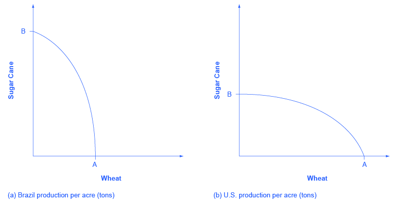
The U.S. PPF is flatter than the Brazil PPF implying that the opportunity cost of wheat in term of sugar cane is lower in the U.S. than in Brazil. Conversely, the opportunity cost of sugar cane is lower in Brazil. The U.S. has comparative advantage in wheat and Brazil has comparative advantage in sugar cane.
When a country can produce a good at a lower opportunity cost than another country, we say that this country has a comparative advantage in that good. In our example, Brazil has a comparative advantage in sugar cane and the U.S. has a comparative advantage in wheat. One can easily see this with a simple observation of the extreme production points in the PPFs of the two countries. If Brazil devoted all of its resources to producing wheat, it would be producing at point A. However, if it had devoted all of its resources to producing sugar cane instead, it would be producing a much larger amount, at point B. By moving from point A to point B Brazil would give up a relatively small quantity in wheat production to obtain a large production in sugar cane. The opposite is true for the U.S. If the U.S. moved from point A to B and produced only sugar cane, this would result in a large opportunity cost in terms of foregone wheat production.
The slope of the PPF gives the opportunity cost of producing an additional unit of wheat. While the slope is not constant throughout the PPFs, it is quite apparent that the PPF in Brazil is much steeper than in the U.S., and therefore the opportunity cost of wheat is generally higher in Brazil. Countries’ differences in comparative advantage determine which goods they will choose to produce and trade. When countries engage in trade, they specialize in the production of the goods that they have a comparative advantage in, and trade part of that production for goods they do not have a comparative advantage in. With trade, goods are produced where the opportunity cost is lowest, so total production increases, benefiting both trading parties.
Key Concepts and Summary
A production possibilities frontier defines the set of choices society faces for the combinations of goods and services it can produce given the resources available. The shape of the PPF is typically curved outward, rather than straight. Choices outside the PPF are unattainable and choices inside the PPF are wasteful. Over time, a growing economy will tend to shift the PPF outwards.
The law of diminishing returns holds that as increments of additional resources are devoted to producing something, the marginal increase in output will become smaller and smaller. All choices along a production possibilities frontier display productive efficiency; that is, it is impossible to use society’s resources to produce more of one good without decreasing production of the other good. The specific choice along a production possibilities frontier that reflects the mix of goods society prefers is the choice with allocative efficiency. The curvature of the PPF is likely to differ by country, which results in different countries having comparative advantage in different goods. Total production can increase if countries specialize in the goods they have comparative advantage in and trade some of their production for the remaining goods.
Self-Check Questions
Refer to this graph:
Productive and Allocative Efficiency
Productive efficiency means it is impossible to produce more of one good without decreasing the quantity that is produced of another good. Thus, all choices along a given PPF like B, C, and D display productive efficiency, but R does not. Allocative efficiency means that the particular mix of goods being produced—that is, the specific choice along the production possibilities frontier—represents the allocation that society most desires.
Suppose there is an improvement in medical technology that enables more healthcare to be provided with the same amount of resources. How would this affect the production possibilities curve and, in particular, how would it affect the opportunity cost of education?
Because of the improvement in technology, the vertical intercept of the PPF would be at a higher level of healthcare. In other words, the PPF would rotate clockwise around the horizontal intercept. This would make the PPF steeper, corresponding to an increase in the opportunity cost of education, since resources devoted to education would now mean forgoing a greater quantity of healthcare.
Could a nation be producing in a way that is allocatively efficient, but productively inefficient?
No. Allocative efficiency requires productive efficiency, because it pertains to choices along the production possibilities frontier.
What are the similarities between a consumer’s budget constraint and society’s production possibilities frontier, not just graphically but analytically?
Both the budget constraint and the PPF show the constraint that each operates under. Both show a tradeoff between having more of one good but less of the other. Both show the opportunity cost graphically as the slope of the constraint (budget or PPF).
Review Questions
What is comparative advantage?
What does a production possibilities frontier illustrate?
Why is a production possibilities frontier typically drawn as a curve, rather than a straight line?
Explain why societies cannot make a choice above their production possibilities frontier and should not make a choice below it.
What are diminishing marginal returns?
What is productive efficiency? What is allocative efficiency?
Critical Thinking Questions
During the Second World War, Germany’s factories were decimated. It also suffered many human casualties, both soldiers and civilians. How did the war affect Germany’s production possibilities curve?
It is clear that productive inefficiency is a waste since resources are being used in a way that produces less goods and services than a nation is capable of. Why is allocative inefficiency also wasteful?
Glossary
allocative efficiency: when the mix of goods being produced represents the mix that society most desires.
comparative advantage: when a country can produce a good at a lower cost in terms of other goods; or, when a country has a lower opportunity cost of production
law of diminishing returns: as additional increments of resources are added to producing a good or service, the marginal benefit from those additional increments will decline
production possibilities frontier (PPF): a diagram that shows the productively efficient combinations of two products that an economy can produce given the resources it has available.
productive efficiency: when it is impossible to produce more of one good (or service) without decreasing the quantity produced of another good (or service)
Lesson summary: the production possibilities frontier
Key takeaways
A production possibilities frontier, or PPF, defines the set of possible combinations of goods and services a society can produce given the resources available. Choices outside the PPF are unattainable (at least in any sustainable way), and choices inside the PPF are inefficient. Sometimes the PPF is called a production possibilities curve.
The law of diminishing returns holds that as additional resources are devoted to producing a good, the marginal increase in output will become smaller and smaller.
All choices along a PPF display productive efficiency—it is impossible to use society’s resources to produce more of one good without decreasing production of the other good.
The specific choice along a PPF that reflects the mix of goods society most desires is the choice with allocative efficiency. We need more information than just the PPF to determine allocative efficiency.
When a country's opportunity cost for a specific good is lower than another country's, we say that the country has comparative advantage for that good.
The Production Possibilities Curve (PPC) is a model used to show the tradeoffs associated with allocating resources between the production of two goods. The PPC can be used to illustrate the concepts of scarcity, opportunity cost, efficiency, inefficiency, economic growth, and contractions.
For example, suppose Carmen splits her time as a carpenter between making tables and building bookshelves. The PPC would show the maximum amount of either tables or bookshelves she could build given her current resources. The shape of the PPC would indicate whether she had increasing or constant opportunity costs.
Key terms
Term | Definition |
|---|---|
production possibilities curve (PPC) | (also called a production possibilities frontier) a graphical model that represents all of the different combinations of two goods that can be produced; the PPC captures scarcity of resources and opportunity costs. |
opportunity cost | the value of the next best alternative to any decision you make; for example, if Abby can spend her time either watching videos or studying, the opportunity cost of an hour watching videos is the hour of studying she gives up to do that. |
efficiency | the full employment of resources in production; efficient combinations of output will always be on the PPC. |
inefficient use (under-utilization) of resources | the underemployment of any of the four economic resources (land, labor, capital, and entrepreneurial ability); inefficient combinations of production are represented using a PPC as points on the interior of the PPC. |
growth | an increase in an economy's ability to produce goods and services over time; economic growth in the PPC model is illustrated by a shift out of the PPC. |
contraction | a decrease in output that occurs due to the under-utilization of resources; in a graphical model of the PPC, a contraction is represented by moving to a point that is further away from, and on the interior of, the PPC. |
constant opportunity costs | when the opportunity cost of a good remains constant as output of the good increases, which is represented as a PPC curve that is a straight line; for example, if Colin always gives up producing 2 fidget spinners every time he produces a Pokemon card, he has constant opportunity costs. |
increasing opportunity costs | when the opportunity cost of a good increases as output of the good increases, which is represented in a graph as a PPC that is bowed out from the origin; for example Julissa gives up \[2\] fidget spinners when she produces the first Pokemon card, and \[4\] fidget spinners for the second Pokemon card, so she has increasing opportunity costs. |
productivity | (also called technology) the ability to combine economic resources; an increase in productivity causes economic growth even if economic resources have not changed, which would be represented by a shift out of the PPC. |
Key model

Figure 1: A production possibilities curve that reflects increasing opportunity costs
The Production Possibilities Curve (PPC) is a model that captures scarcity and the opportunity costs of choices when faced with the possibility of producing two goods or services. Points on the interior of the PPC are inefficient, points on the PPC are efficient, and points beyond the PPC are unattainable. The opportunity cost of moving from one efficient combination of production to another efficient combination of production is how much of one good is given up in order to get more of the other good.
The shape of the PPC also gives us information on the production technology (in other words, how the resources are combined to produce these goods). The bowed out shape of the PPC in Figure \[1\] indicates that there are increasing opportunity costs of production.
We can also use the PPC model to illustrate economic growth, which is represented by a shift of the PPC. Figure \[2\] illustrates an agent that has experienced economic growth. Combinations that were once impossible, such as 6 iPads and 4 watches, are now on the new PPC, thanks to the increase in resources or technology.

Figure \[2\]: PPC showing economic growth
Key Equations and Calculations: Calculating opportunity costs:
To find the opportunity cost of any good X in terms of the units of Y given up, we use the following formula:
\[\text{Opportunity cost of each unit of good X}=(Y_1-Y_2) \div (X_1-X_2) \text{ units of good Y}\]
For example, suppose we knew that the following table represented all of the possible combinations of iPads and Apple Watches that could be produced.
Number of Apple Watches | Number of iPads |
|---|---|
\[0\] | \[5\] |
\[2\] | \[4\] |
\[4\] | \[3\] |
\[6\] | \[2\] |
\[8\] | \[1\] |
\[10\] | \[0\] |
If a producer is producing \[6\] Apple Watches and \[2\] iPads, but wants to make one more iPad, they can instead produce \[4\] Apple Watches and \[3\] iPads:
\[\begin{aligned} \text{Opportunity cost of one iPad} &= (6-4)\div (3-2)\text{ Apple Watches}\\
&=2\div 1 \text{ Apple Watches}\\
&=2 \text{ Apple Watches}\end{aligned}\]
Note that opportunity costs are always expressed in terms of the good that is given up.
We can use the same procedure if given a graph. Figure \[3\] shows a PPC that has been created from our table. The two points used in this formula are the two efficient points indicated in the graph in Figure \[3\].

Figure 3: A PPC created from the table showing different combinations of production
Common Misperceptions
Not all costs are monetary costs. Opportunity costs are expressed in terms of how much of another good, service, or activity must be given up in order to pursue or produce another activity or good. For example, when you head out to see a movie, the cost of that activity is not just the price of a movie ticket, but the value of the next best alternative, such as cleaning your room.
Going from an inefficient amount of production to an efficient amount of production is not economic growth. For example, suppose an economy can make two goods: chocolate donuts and cattle prods. But half of their donut machines aren’t being used, so they aren’t fully using all of their resources. Graphically, that would be represented by a combination of goods in the interior of their PPC. If they then put all of those donut machines to work, they aren’t acquiring more resources (which is what we mean by economic growth). Instead, they are just using their resources more efficiently and moving to a new point on the PPC.
On the other hand, if this economy is making as many donuts and cattle prods as it can, and it acquires more donut machines, it has experienced economic growth because it now has more resources (in this case, capital) available. This would be represented in a PPC graph as a shift outward of the entire PPC curve.
Discussion Questions
How would you show with a PPC that a country has constant opportunity costs of production?
Using a correctly labeled PPC model, show an economy that has increasing opportunity costs that can produce cattle prods and chocolate donuts that is underutilizing its labor.
Using our example earlier of an economy producing chocolate donuts and cattle prods, suppose a lot of the cattle prod workers were laid off. Point \[A\] in Figure \[4\] would represent an inefficient amount of production due to underutilization of this labor.

Figure 4: An inefficient combination of cattle prods and chocolate donuts