Chapter 5: One-Variable Data Analysis
Descriptive versus Inferential Statistics
| Descriptive Statistics | Inferential Statistics |
|---|---|
| also known as exploratory data analysis (EDA). It is concerned with only the data at hand. | involves using our data to make a stronger statement. |
Parameters Vs Statistics
- Values that describe a sample are called statistics.
- Values that describe a population or population model are called parameters.
- Drawing a sample of 35 students from a large university and computing their mean GPA gives us a statistic. Estimating the mean GPA for all students in the university gives us a parameter.
Types of Data
I. Quantitative Data: Also known as Numerical data. It deals with measures or counts. For example: heights, speeds, scores in an exam.
II. Categorical data: Also known as Qualitative data.
- It can be classified into a group based on a non-quantitative characteristic.
- For example eye color, socioeconomic level, zip codes
- However sometimes, the distinction between quantitative and categorical data is not so clear.
- We must consider how a variable is being used to determine its type.
Types of Variables
Quantitative variables are either discrete or continuous.
I. Discrete variables take on values with gaps between. For example: the number of heads we get on flipping a coin 10 times.
II. Continuous variables take on any value in an interval. For example: The time of day.
Graphical Analysis
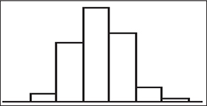
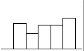
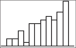
Shape:
The extent to which the graph appears to be symmetric, mound-shaped ( bell-shaped ), skewed, bimodal, or uniform. Here are some examples of differently shaped graphs:
 Types of Graphs:
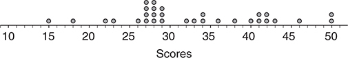
- Dotplot: Involves plotting the data values, with dots, above the corresponding values on a number line.
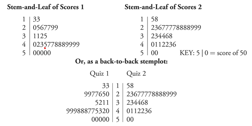
- Stemplot (or Stem-and-Leaf Plot):
- Each data value has a stem and a leaf .
- There are no mathematical rules for what constitutes the stem and what constitutes the leaf.
- The nature of the data will suggest reasonable choices for the stem and leaves.
- In the below stem and leaf plot, we see that the scores on Quiz 1 (on the left) were generally higher than for those on Quiz 2—the center of Quiz 1 scores is higher than the center of Quiz 2 scores. Both distributions are reasonably symmetric.
- The spreads of the two distributions appear to be similar.
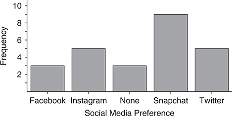
- Bar Charts:
- Bar charts are used to illustrate categorical data.
- The horizontal axis contains the categories.
- The vertical axis contains the frequencies, or relative frequencies, of each category.
- There is a space between the bars.
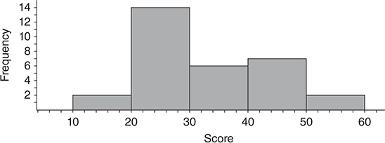
Histograms:
- Histogram is used to illustrate quantitative data.
- The horizontal axis contains numerical values, and the vertical axis contains the frequencies, or relative frequencies, of the values (often intervals of values).
- A histogram divides the number line into intervals (bins) of equal width.
- A bar is constructed on each interval, and the height of the bar is the number of cases in that interval.
- By convention, a value that lies on the boundary between two intervals is included in the interval to the right. So the interval from 25 to 35 contains 25 but not 35.
Measures of Center
Mean:
Let xi represent any value in a set of n values ( i = 1, 2, . . . , n ). The mean of the set is defined as the sum of the x ’s divided by n.

Example problem:
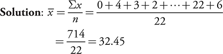
During his major league career, Babe Ruth hit the following number of home runs (1914–1935): 0, 4, 3, 2, 11, 29, 54, 59, 35, 41, 46, 25, 47, 60, 54, 46, 49, 46, 41, 34, 22, 6. What was the mean number of home runs per year for his major league career?
Median:
- The value that cuts the dataset in half.
- When there is an odd number of values in an ordered dataset, the median is the value at the middle position which is given by (n+1)/2.
- Here n is the number of values in the dataset.
- If the dataset has an even number of values, the median is the mean of the two middle numbers.
Example problem:
Consider once again the data in the previous example from Babe Ruth’s career. What was the median number of home runs per year he hit during his major league career?
Solution:
First, put the numbers in order from smallest to largest: 0, 2, 3, 4, 6, 11, 22, 25, 29, 34, 35, 41, 41, 46, 46, 46, 47, 49, 54, 54, 59, 60. There are 22 scores, so the median is found at the 11.5th position, between the 11th and 12th scores (35 and 41). So the median is (35+41)/2=38.
Resistant Values:
- The median is a resistant statistic. That is, its numerical value is not dramatically influenced by outliers.
- The mean is not resistant.
- If the distribution is symmetric and mound-shaped, the mean and the median will be close.
- However, if the distribution has outliers or is strongly skewed, the median is probably the better choice to describe the center.
Grouped Data
- When data is in the form of a histogram or frequency table in which intervals contain more than one value, mean, median and quartiles can be estimated them using reasonable techniques.
Example:
Noor and Jacob were collecting data for a statistics class. They used a precise scale borrowed from the science department and weighed 100 U.S. pennies. They did not provide the raw data, but these are summarized in a frequency table and a histogram. Estimate the median weight of their sample of pennies.
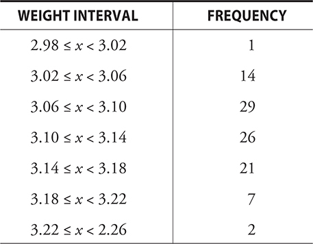
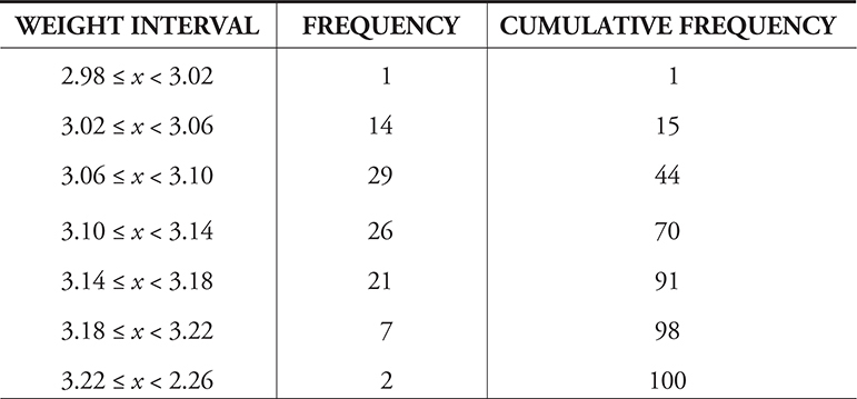
The cumulative frequency of 44 in the third row means that 44 pennies weigh less than 3.10 grams. 29 + 14 + 1 = 44. We know the median is between the 50th and 51st pennies, so the median is between 3.10 and 3.14 grams. Our estimate could be anywhere in this interval.
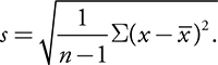
Measures of Spread:
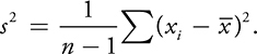
Variance and Standard Deviation:
- Variance is the average squared deviation from the mean.
- The more distant a value is from the mean, the larger will be the square of the difference between it and the mean.
- However, the units for the variance won’t match the units of the original data because each difference is squared.
- For example, the variance of a set of measurements made in inches will be in square inches.
- To correct this, we often take the square root of the variance as our measure of spread.
- The square root of the variance is known as the standard deviation.
- Like the mean, s is not resistant to extreme values.
Useful Qualities of Standard Deviation:
- It is independent of the mean.
- It measures the spread
- It is independent of n (number of values in dataset).
Interquartile Range:
- The medians of the upper and lower halves of the distribution, not including the median itself in either half, are called quartiles.
- The median of the lower half is called the lower/first quartile. It is the 25th percentile or Q1.
- The median of the upper half is called the upper/third quartile , or the third quartile. It is the 75th percentile or Q3.
- The median itself can be thought of as the second quartile or Q2.
- ==The interquartile range (IQR) = Q3 – Q1.==
Outliers:
- A value far removed from the others is an outlier.
- Based on mean of a dataset, considering how many standard deviations away from the mean a term is is one way to find outliers.
- Some texts consider a datapoint that is more than two or three standard deviations from the mean as an outlier.
- Based on median, we use the 1.5IQR rule.
• Find the IQR. • Multiply the IQR by 1.5. • Find Q1 − 1.5(IQR) and Q3 + 1.5(IQR). • Any value below Q1 − 1.5(IQR) or above Q3 + 1.5(IQR) is a potential outlier
Example:
The following data represent the amount of money, in British pounds, spent weekly on tobacco for 11 regions in Britain: 4.03, 3.76, 3.77, 3.34, 3.47, 2.92, 3.20, 2.71, 3.53, 4.51, 4.56. Do any of the regions seem to be spending a lot more or less than the other regions? That is, are there any outliers in the data?
Solution:
Using a calculator, we find the following:
x̄ = 3.62
Sx = s = 0.59
Q1 = 3.2
Q3 = 4.03
Using means:
==Required interval = 3.62 ± 2(0.59) = (2.44, 4.8).== There are no values in the dataset less than 2.44 or greater than 4.8, so there are no outliers by this method.
Using the 1.5(IQR) rule:
Q1 − 1.5(IQR) = 3.2 − 1.5(4.03 − 3.2) = ==1.96==
Q3 + 1.5(IQR) = 4.03 + 1.5(4.03 − 3.2) = ==5.28.==
There are no values in the data less than 1.96 or greater than 5.28, thus there are no outliers by this method either.
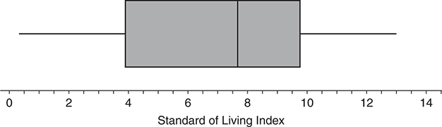
5 Number Summary:
The five-number summary of a dataset is composed of the minimum value, the lower quartile, the median, the upper quartile, and the maximum value.
Box and Whisker Plot
- A box-and-whiskers plot is simply a graphical version of the five-number summary.
- A box is drawn that contains the middle 50% of the data and “whiskers” extend from the lines at the ends of the box to the minimum and maximum values of the data.
- If there are outliers, the “whiskers” extend to the last value before the outlier that is not an outlier.
- The outliers themselves are marked with a special symbol, such as a point, a box, or a plus sign.
Percentile Rank
The proportion of terms in the distribution less than the term. For example, a term that is at the 75th percentile is larger than 75% of the terms in a distribution.
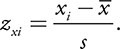
z-Scores
- z-Score is a statistic that shows how many standard deviations the term is above or below the mean.
- The z -score is positive when x is above the mean and negative when it is below the mean.
Example:
For the first test of the year, Harvey got a 68. The class average (mean) was 73, and the standard deviation was 3. What was Harvey’s z -score on this test?
Solution:
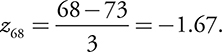
Thus, Harvey was 1.67 standard deviations below the mean.
Normal Distribution
The 68-95-99.7 rule, or the empirical rule, states that approximately:
- 68% of the data values in a normal distribution are within one standard deviation of the mean.
- 95% are within two standard deviations of the mean.
- 99.7% are within three standard deviations of the mean.
Standard Normal Distribution:
We convert the data to a set of z -scores, using the formula.
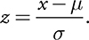
we use Meu and sigma in order to standardize the data in a normal distribution to produce a standard normal distribution.
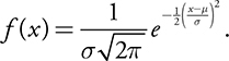
Math Background:
Although you are not required to know it, you might be interested to see that the function that defines the normal curve is:
Click the link to go to the next chapter: