2.1: Density Curves, Normal Distributions, and Segmented Bar Charts
Normal Curves
- Some data can be graphed on a relatively smooth curve
- Detail may be lost about some specific data, but this is outweighed by the simplicity the curve allows us to analyze with
- Mathematical model: an idealized description of a situation
- When a curve is used to approximate a distribution, the scale is adjusted to make it into a density curve
- Density curve: a distribution which is always above the x-axis and always has an area of 1
- The area in any part of the curve is equal to the percent of data present in that part of the curve
- Normal curve: a distribution which is symmetric, bell-shaped, and has a single peak
- Defined by their means (μ) and standard deviations (σ)

- Normal curves may be analyzed further using z-scores, which can be found and interpreted in relation to probabilities using a z-chart
- This chart is provided on the AP exam, along with many relevant formulas
- When solving z-score problems, it is always necessary to:
- Show work for getting the z-score
- Write a probability statement
- Give the final probability
- Data may be represented as N(μ, σ)
- μ: mean
- σ: standard deviation
Case Study: Male vs. Female Height
- Who is taller relative to their gender: a 76.5-inch-tall woman or a 80-inch-tall man?
- Female heights are N(64, 2.5) and male heights are N(69.1, 2.8)
- Female: 76.5 inches

- That means that this value is 5 standard deviations above the mean
- This is where the term “off the charts” comes from → if you reference what 5 standard deviations above the mean would look like on the normal curve above in the notes, 5 standard deviations to either side is virtually unheard of and statistically very rare
- Male: 80 inches
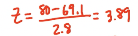
- The height of an 80-inch-tall man is 3.89 standard deviations above the mean
- This means that statistically, the woman is taller proportionate to her gender than the man is proportionate to his.
Segmented Bar Charts
- Segmented bar chart: a display of categorical data showing such data as a percentage of the whole
- Like a pie chart in bar form
- Mosaic plot: segmented bar charts for comparing groups where the widths of the bars are proportional to the size of the groups