Unit 1 Chapter 1
Overview of Maps
Introduction to Mapping
Maps are essential tools for visualizing geographical data and understanding spatial relationships.
Different types of maps serve various purposes, from navigation to thematic analysis.
The choice of map type can significantly influence the interpretation of data.
Importance of Scale in Mapping
Changing the scale of a map alters the representation of data, revealing different insights.
Larger scales show more detail, while smaller scales provide a broader overview.
Understanding scale is crucial for accurate data interpretation and decision-making.
Types of Maps
Reference Maps
Reference maps provide general information about a location, focusing on physical and political features.
They are used for navigation and understanding geographical context.
Physical Maps
Physical maps depict geographical features such as mountains, rivers, and elevation.
They are useful for understanding the terrain and natural landscape of an area.
Political Maps
Political maps illustrate boundaries, such as countries, states, and cities.
They often include information on administrative divisions and election results.
Road Maps
Road maps show transportation routes, including highways and local roads.
They are designed for travelers to plan their journeys effectively.
Locator Maps
Locator maps provide a zoomed-in view of a specific area within a larger context.
They help users identify locations relative to surrounding features.
Map Projections to Remember
Projection | Preserves | Distorts | Best Used For |
|---|---|---|---|
Mercator 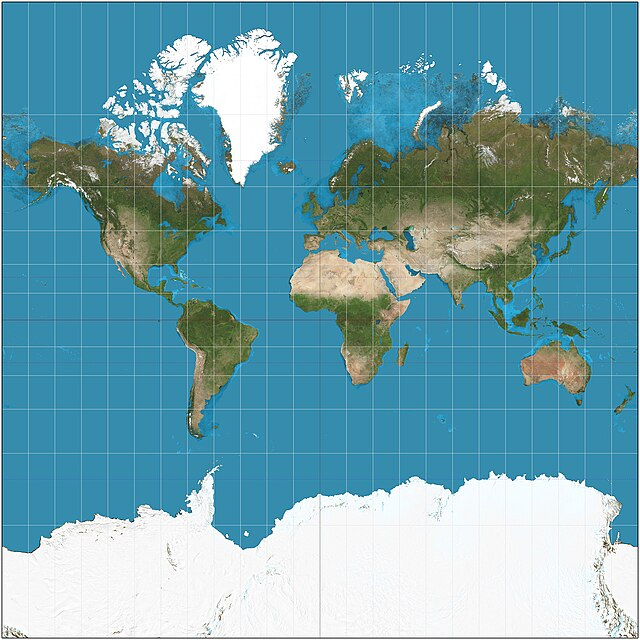 | Direction | Size (especially near poles) | Navigation & marine maps |
Gall-Peters 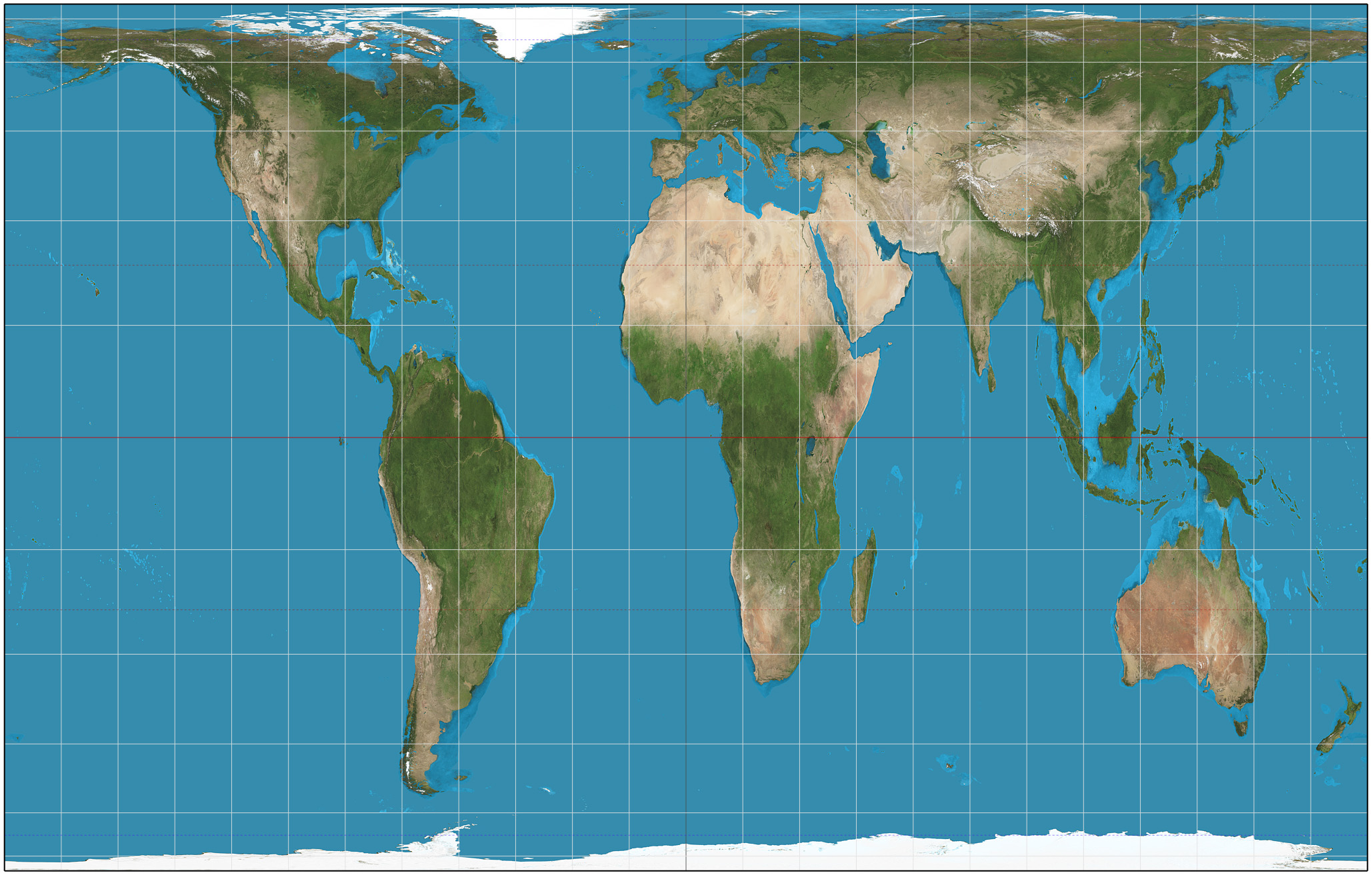 | Area | Shape (stretched continents) | Political & social justice maps |
Robinson 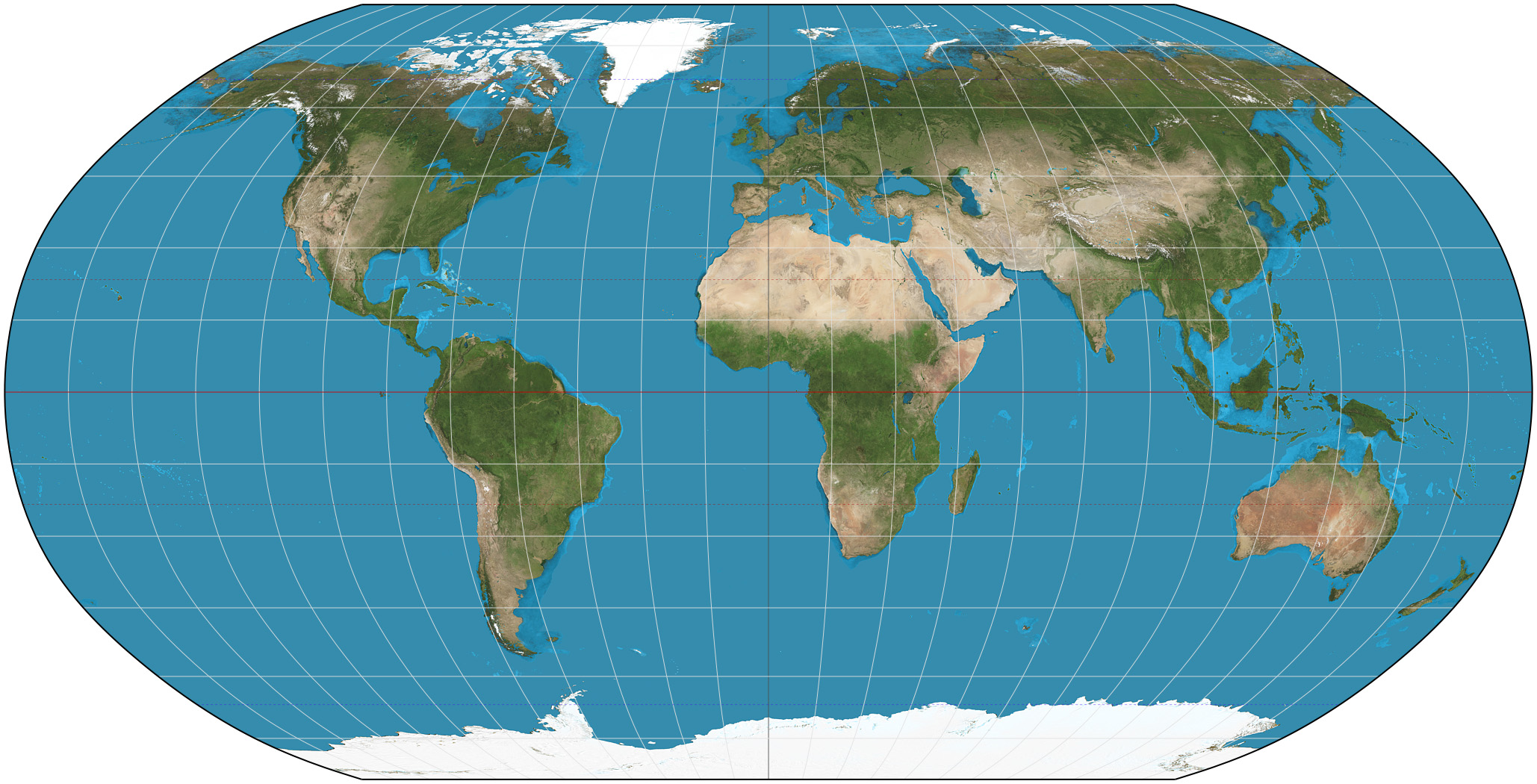 | Balance (size & shape) | Everything slightly | General world maps |
Winkel Tripel 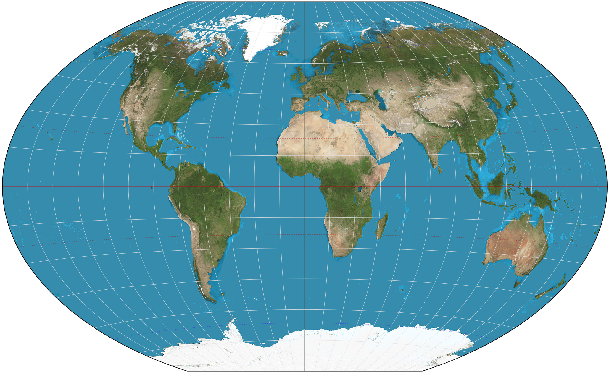 | Overall balance | Minimal distortion | Official National Geographic maps |
Azimuthal (Polar)  | Distance & direction from center | Shape & size at edges | Arctic, Antarctic, & airline routes |
Goode’s Homolosine  | Area & shape | Distance & direction | Thematic maps |
Thematic Maps
Overview of Thematic Maps
Thematic maps focus on specific themes or data sets, providing insights into particular aspects of geography.
They are used for analysis and understanding of trends and patterns.
Choropleth Maps

Choropleth maps use color shading to represent data density, making it easy to visualize variations across regions.
They are effective for displaying demographic information, such as population density.
Dot Distribution Maps

Dot distribution maps use dots to represent the presence of a feature, helping to visualize spatial distribution.
They are useful for understanding the concentration of phenomena, such as population or resources.
Graduated Symbol Maps

Graduated symbol maps use varying sizes of symbols to represent quantitative data.
They can be complex to interpret but provide a clear visual representation of data magnitude.
Isoline Maps

Isoline maps connect points of equal value, often used for weather data like temperature or precipitation.
They are less effective for pinpointing specific locations but excellent for showing gradients.