Notes on Graphical Descriptions of Data and Frequency Distributions
Graphing Data: Overview
Objective: Describe data visually using graphs. The session focuses on graphing data; a future session covers describing data through central tendency and dispersion. (Note: a third method is mentioned as part of the big three, but not detailed here.)
Graphing data helps you quickly assess the data without listing every value.
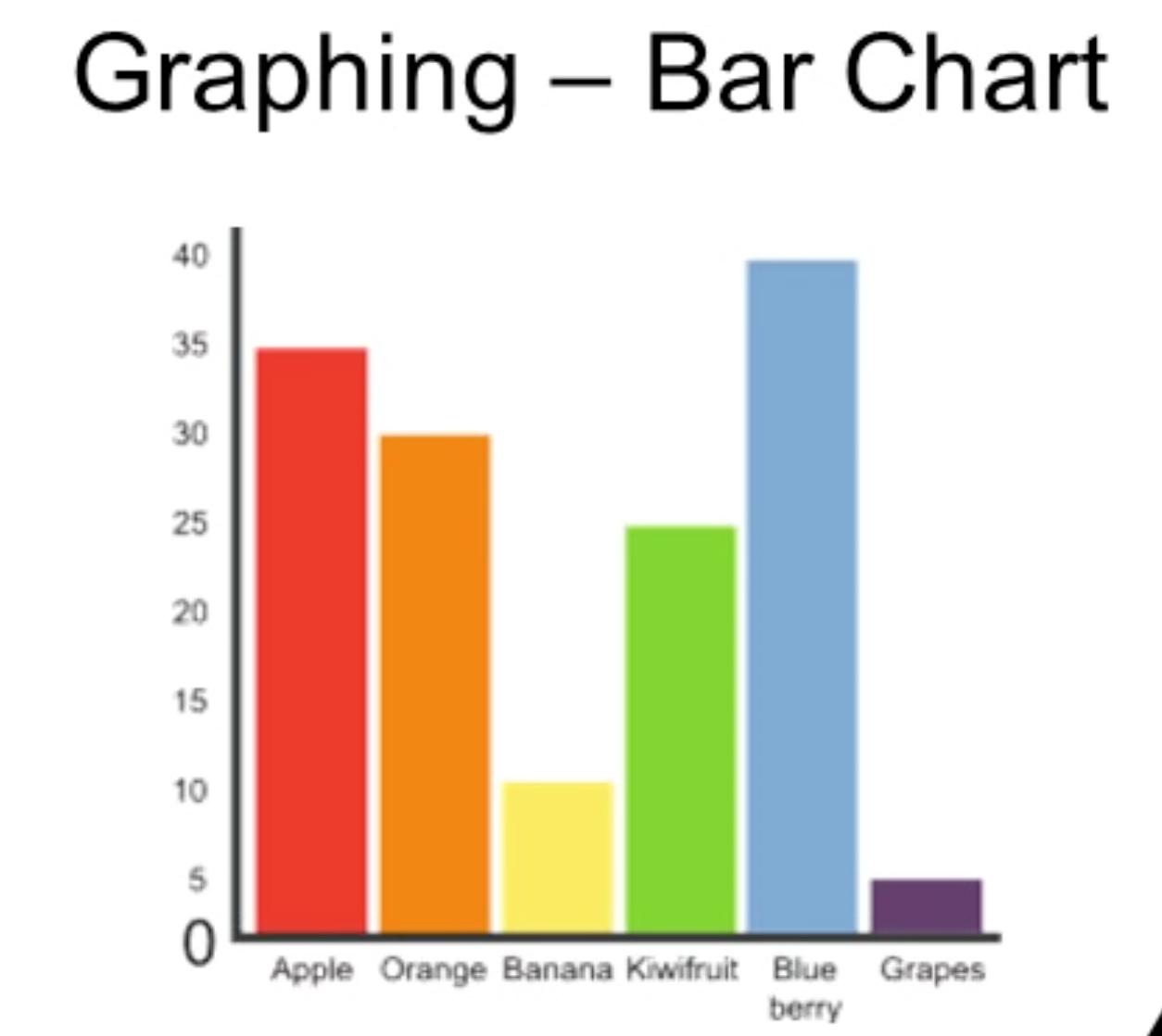
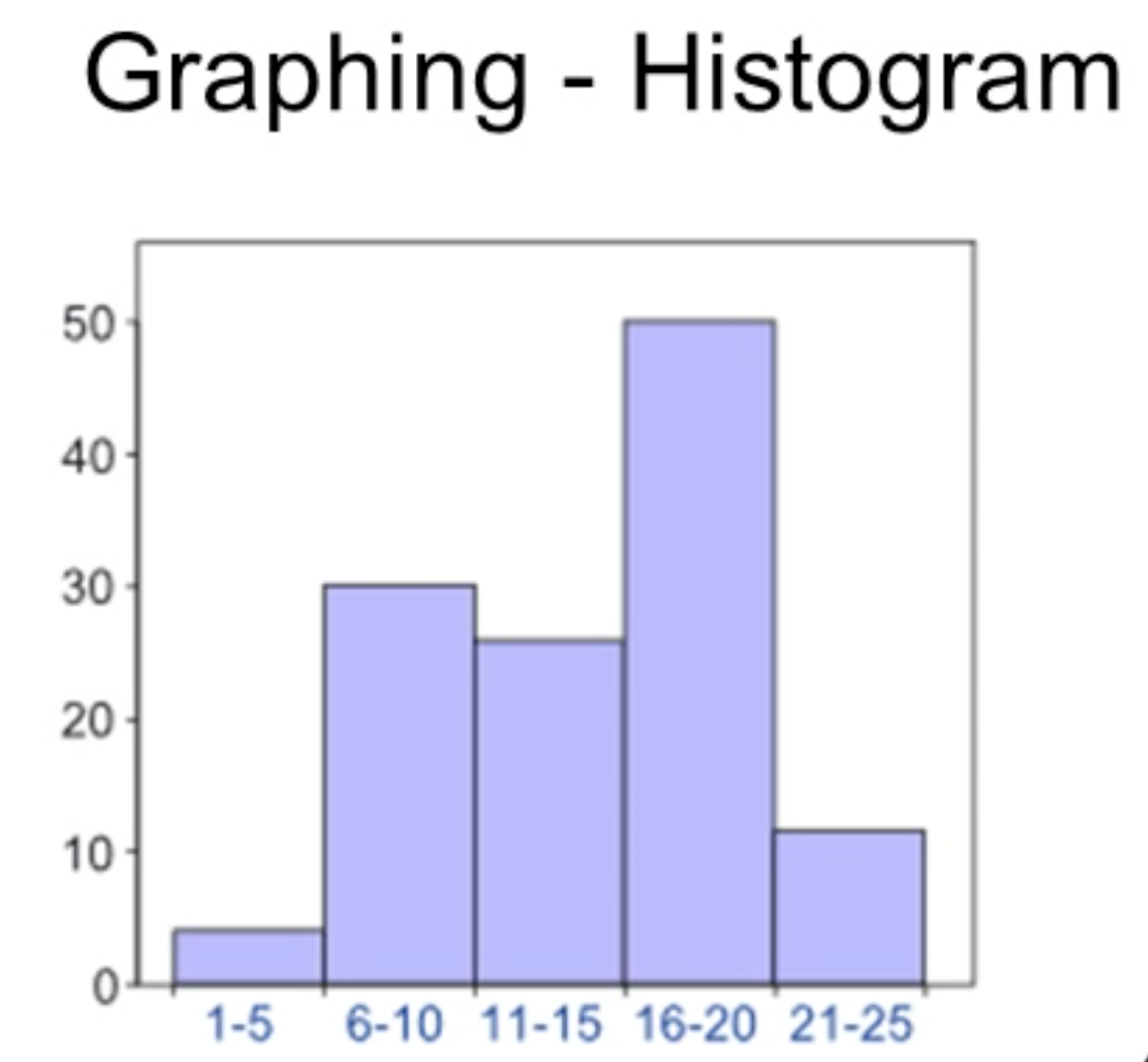
Bar charts vs histograms
Bar chart: bars have space between them; bar height/proportions reflect the number of cases in each category (or category frequency).
Histogram: bars touch each other; used for continuous data binnings.
Example interpretation: bar charts make it easy to see which categories are most or least common (e.g., blueberries most common, grapes least common).
Bar charts and histograms: practical tips
When examining a bar chart, compare bar heights to gauge relative frequencies.
Histograms convey distribution of continuous data across intervals; lack of gaps indicates continuous binning. (No Bars)
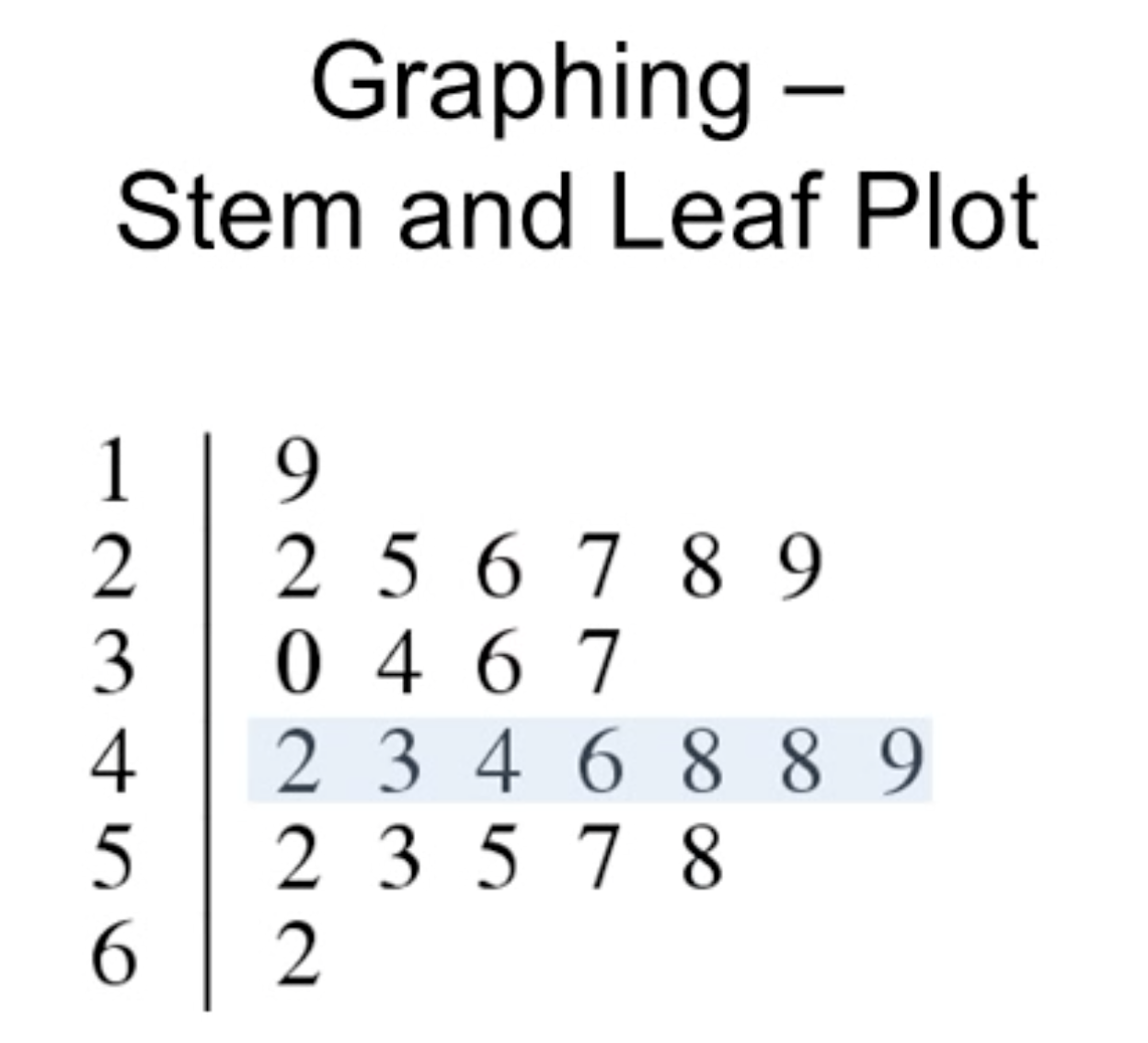
Stem-and-leaf plots
Purpose: A graphical data display that resembles a bar chart/ histogram on its side; often found in the literature.
Concept: Left column is the stem; right-side digits are leaves.
Reading example:
The data values can be reconstructed by combining stem and leaf digits (e.g., stem 1 and leaf 9 give 19; stem 2 and leaf 2 give 22; other values include 25, 26, 27, 28, 29).
Interpretation cues:
The left stem corresponds to the tens (e.g., 1 for 10s, 4 for 40s).
The row with the 4s (forties) is the most common range in the example.
In the 40s row, there were two leaves ‘8’ (i.e., two 48s), indicating multiple observations equal to 48.
Takeaway: Stem-and-leaf plots show both the distribution shape and the exact data values; useful for reading raw data directly from literature.
Reading and interpreting frequency tables (SPSS output)
SPSS: a widely used statistical software package; outputs are common in literature and coursework.
You do not need SPSS to complete the course, but you will encounter outputs like this and should be able to read them.
Key columns in the frequency table:
Frequency: raw count of observations at each score/value.
Percent: proportion of total observations (out of N, including missing data).
Valid Percent: proportion of observations among those with valid (non-missing) data, i.e.,
ext{ValidPercent}i = \frac{fi}{N_{valid}} \times 100\%.Cumulative Percent: running total of percentages for values up to and including the current value.
Important concepts:
If there are missing values, Percent and Valid Percent can differ because Percent uses total N and Valid Percent uses N_{valid}.
The cumulative percent column shows the percentage of cases scored at or below each value; e.g., a value like 70 with a cumulative percent around 50% indicates about half the students scored 70 or lower.
Example interpretation (from the transcript):
There is a score of 35 with Frequency = 1 and Percent = 1%.
Other scores in the lower range include 45 and 100, with 100 having Frequency = 2 (i.e., two students scored 100).
Total N = 100 (i.e., 100 students took the test).
Valid Percent equals Percent when there are no missing data; otherwise, they can differ.
Practical note:
This format lets you assess distributions, identify missing data impact, and understand how many students fall into specific score bins.

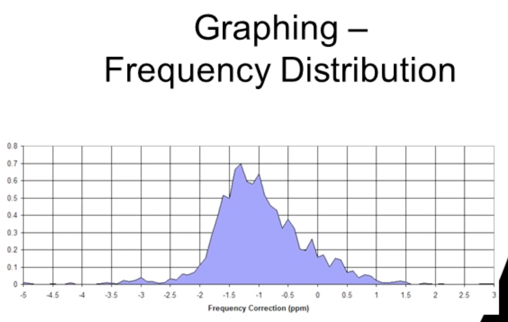
Frequency distributions and distribution shapes
Frequency distributions summarize continuous data by grouping into intervals or bins and plotting the distribution of frequencies across those bins.
They can resemble a smooth curve (e.g., a normal distribution) or more irregular shapes depending on the data.
Reading a frequency distribution: you’re looking at the overall shape of the data rather than individual values.
Common shapes observed in frequency distributions:
Normal distribution (bell-shaped curve).
Skewed distributions:
Positive skew (skew to the right): more values on the left with a tail extending to the right.
Negative skew (skew to the left): most values on the right with a tail extending to the left.
Kurtosis (peakedness):
Leptokurtic: very peaked distribution.
Platykurtic: flatter, broader peak.
Box plots (box-and-whisker plots)
Box plots summarize distribution using quartiles and central tendency.
Key components:
Median: the middle value of the data (center line inside the box).
Box boundaries: Q1 (25th percentile) and Q3 (75th percentile).
Whiskers: extend to the range of the data outside the box; outliers are typically shown as individual points beyond the whiskers.
Mean (often shown as a point in some plots, though the box plot primarily highlights the median).
Interpretive notes (as described in the transcript):
25% of scores fall between the median and the 25th percentile (Q1).
75% of scores fall within the 75th percentile (Q3) and above.
Outliers are indicated as separate points beyond the whiskers.
Terminology:
Box and whisker plot is another name for box plot.
Example intuition:
A box plot comparing traffic on different days (e.g., Friday vs Sunday) might show differences in central tendency and spread; an outlier such as 49 cars on a Sunday could indicate a holiday or special event.
Practical interpretation:
Box plots allow quick visual comparison across groups (e.g., days of the week) and identification of outliers.
Practical example: traffic data visualization
Example setup described: comparing Friday vs Sunday traffic.
On average, Friday traffic around ~20 cars; Sunday around ~15 cars.
One Sunday had a spike (e.g., 49 cars), illustrating an outlier.
How to use this visualization:
Assess typical vs. atypical days.
Consider possible reasons for spikes (holiday, event) and plan further investigation.
Conceptual takeaway:
Box plots and other graphs facilitate quick, visual comparisons across categories or groups (e.g., days of the week).
Connections to broader course concepts and real-world relevance
Graphing data is a foundational step in exploratory data analysis (EDA) and precedes formal statistical testing.
Reading different graph types prepares you to interpret results from studies, including those reported in SPSS outputs.
Understanding distribution shapes (normal, skewness, kurtosis) informs expectations about statistical methods (e.g., assumptions of normality for parametric tests).
Awareness of missing data and the distinction between Percent and Valid Percent helps you avoid misinterpretations when data are incomplete.
Box plots are commonly used in systematic reviews and literature to compare distributions across studies or groups.
Ethical/practical implications:
Misinterpreting skewness or ignoring outliers can lead to incorrect conclusions.
Missing data can bias Percent-based interpretations; always check Valid Percent and N_{valid}.
Formulas and numerical references (LaTeX)
Cumulative percent for a value xi: \text{CumPercent}(xi) \,=\, \left(\sum{j \le i} fj\right) / N{valid} \times 100\%, where $fj$ is the frequency of value $j$ and $N_{valid}$ is the number of valid (non-missing) observations.
Percent of observations at value xi: \% = \dfrac{fi}{N} \times 100\%, where $N$ is the total number of observations (including any missing data).
Valid percent of value xi: \text{ValidPercent}i = \dfrac{fi}{N{valid}} \times 100\%.
Mean (for reference, not explicitly shown in the box plot discussion but commonly used):
\bar{x} = \dfrac{1}{N} \sum{i=1}^{N} xi.Box plot quartiles and IQR (definitions):
Q1 = 25\text{th percentile},\quad Q2 = \text{median},\quad Q3 = 75\text{th percentile},\quad \text{IQR} = Q3 - Q_1.Skewness intuition (qualitative):
Positive skew: tail to the right (more small values, few large outliers).
Negative skew: tail to the left (more large values, few small outliers).
Kurtosis intuition (qualitative):
Leptokurtic: more peaked than normal.
Platykurtic: flatter than normal.
Summary of key takeaways
Graphical methods (bar charts, histograms, stem-and-leaf plots, frequency tables, frequency distributions, and box plots) are essential tools for describing data visually and reading raw data when needed.
SPSS outputs are common in literature; you should be able to read frequencies, percents, valid percents, and cumulative percents, and recognize how missing data affect Percent vs Valid Percent.
Understanding distribution shape (normal, skewness, kurtosis) and central tendency measures (median, mean) informs appropriate analysis choices and interpretation.
Box plots provide a concise view of central tendency, dispersion, and outliers, and are especially useful for comparing groups (e.g., days, conditions) across studies or time.