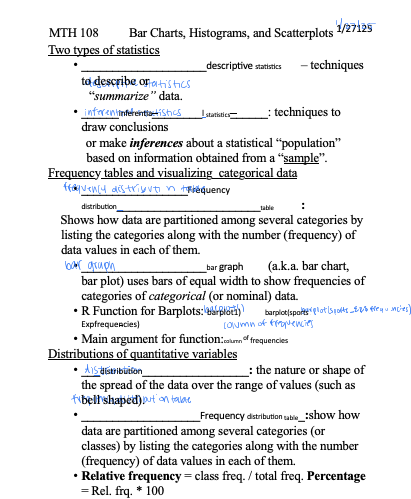
Bar Charts, Histograms, and Scatterplots
MTH 108 Bar Charts, Histograms, and Scatterplots 1/27125
Two types of statistics
• ____________________descriptive statistics – techniques to describe or
“summarize” data.
• ______inferentia________l statistics______: techniques to draw conclusions
or make inferences about a statistical “population” based on information obtained from a “sample”.
Frequency tables and visualizing categorical data
• _________________Frequency distribution_______________________table :
Shows how data are partitioned among several categories by listing the categories along with the number (frequency) of data values in each of them.
• ____________________bar graph (a.k.a. bar chart, bar plot) uses bars of equal width to show frequencies of categories of categorical (or nominal) data.
• R Function for Barplots: barplot1) barplot(sports -Expfrequencies)
• Main argument for function:column of frequencies
Distributions of quantitative variables
• ___distribution_________________: the nature or shape of the spread of the data over the range of values (such as bell shaped).
• ___________________Frequency distribution table_:show how data are partitioned among several categories (or classes) by listing the categories along with the number (frequency) of data values in each of them.
• Relative frequency = class freq. / total freq. Percentage = Rel. frq. * 100
• ____________________histogram is a graph consisting of bars of equal width drawn adjacent to each other. The horizontal scale represents classes of quantitative data values, and the vertical scale represents frequencies.
Important Uses of a Histogram:
1. 2.
3. 4.
Making a histogram.
The blood pressure of fourteen different second-year students in the university were measured. The systolic readings (mm Hg) are listed below: 5 classes
1381111111111 , 132 , 134 , 136 , 120 , 126 , 120 , 131 , 132 , 145 , 136 ,
138---, 129, 137
Visually display the shape of the distribution of the blood pressure data using histogram.
Step 1: Calculate the class width as shown below.
Step 2: Find minimum of data and add the class width to get the second lower class limit Step 3: Continue to add the class width until we have five lower class limits.
Step 4: Count how many data points fall into each interval (frequency table).
Step 5: On the vertical axis, place frequencies. On the horizontal axis, place the lower value of each interval.
1) in+5= 105+5= 135
↑->+45 t
213) - +5=
1+5 = -
125,
• Function for scatter plots in R: hist()
• Main argument for function: column of BP
Common distribution types
• Normal distribution bellshaped-symmetrical
• Uniform distribution flattop -every valvenas equal likelihood
• Right-skewed distributionasymmetrical -extreme high values
• Left-skewed distribution - asymmetrical -extreme low values
• Bimodal distribution2peaks -may indicate important divisionin a
population
Paired quantitative variables
• A ____________________scatterplot is a graph of the relationship between two quantitative variables.
• A scatterplot can be used as a visual aid in determining whether there is a correlation (or association) between the two variables.
Draw a scatter plot to illustrate the relationship between a bear’s chest size and weight.
Bears | A | B | C | D | E | F | G |
Chest (in.) | 26 | 45 | 54 | 49 | 35 | 41 | 41 |
Weight (lb) | 80 | 344 | 416 | 348 | 166 | 220 | 262 |
Deceptive graphs
• 1. Non-zero vertical axis
• 2. Pictographs (the picture graph)